Runtime Behaviors
Overview
This chapter covers the following topics:
Validation Models
-
(OMS-76001) All Applications screens validate input on a per-field basis. Explicitly coded validation rules must issue a brief but meaningful message when the rules are violated. Oracle Forms itself will issue messages for certain validation failures, such as missing required fields, or incorrect date or number formats.
-
(OMS-60055) In certain circumstances it is not possible to validate all input at field level, such as:
-
Performance of heads-down entry screens would be dramatically compromised.
-
Cross-validation rules exist between fields, and cannot be evaluated until the entire record is entered (such as Field Ranges).
In these exceptional cases, validation is performed when the user attempts to leave the record (by navigation, saving, etc.). Should validation fail, specific error messages indicating the invalid fields, and corrective actions to be taken, must be issued. The cursor should be moved to the first of the invalid fields, if possible.
-
-
Some validation is replicated at both field level and commit time, such as uniqueness and referential integrity checks. Oracle Forms itself can trap several of these error conditions automatically.
-
(OMS-76002) Fields which cannot currently be validated, because they require some other field(s) to be entered first, prevent input until the other fields(s) are populated and validated.
-
(OMS-76003) No data entry can be performed in a detail block until a master record has been entered or queried.
-
(OMS-76004) Default values for a field appear immediately upon navigating to a new record. As data is entered in a record, if a "master" field value is changed, "dependent" fields are immediately repopulated, either with "null" or with a default value if one exists.
Related Topics
Saving Changes
The user explicitly saves changes by invoking "File--> Save" from the menu, or by pressing the "Save" button on the toolbar.
Note: When the user selects a form to open from the Navigator, it is invoked in a separate database session and commit cycle. Thus, the Save action only applies to the current form from which it is applied.
Other methods of saving changes are described in the remainder of this section.
Save and Proceed
This function allows a user to save changes on the current set of records, then place the form in a mode ready to start the next transaction. Depending on the form, this may cause any of the following after the data itself is saved:
-
The form returns to the exact state it was when first invoked.
-
Navigation proceeds to the next master record currently queried.
-
A Find window appears if there are no more records left and if the Find window appears when the form is first entered.
A "Save and Proceed" textual button may be coded in modal windows that need the functionality.
Next Step
This function is enabled when a form is opened by using the Processes tab in the Navigator. When selected, it saves any changes in the current form, closes it, and advances the current workflow process to the next sequential node.
Implicit Saves
Several types of actions require that data be saved to the database in order for the actions to be performed, or the action logically saves the changes automatically.
-
(OMS-76047) The user should be prompted to save changes if any are pending when an action either requires data to be saved before it can be processed, or does a save itself. If the user decides not to save, then the action is terminated.
-
An action may save automatically before or after it is completed if it is reasonable to assume the user expects that behavior. For example, if the user invokes the "Update Order Pricing" action, then it is reasonable to assume that they want to save that transaction upon completion. Furthermore, such an action may mimic the "Save and Proceed" function if that is the expected, and most useful, behavior of that action.
-
An application may save automatically as the user moves between records, but this should be avoided unless it is reasonable (that is, the user would be annoyed by having to perform the Save themselves in complex master-detail forms).
Buttons that perform the "Save" action
(OMS-76048) Often it is unusual to think of "saving" certain types of data, such as the parameters entered to run a report. In those cases, provide a button which replicates the save action, but is labeled consistently with the intent of the form. The "Save" entries on the menu and toolbar would, of course, perform the exact same function as the button.
Examples are:
-
"Submit" button on the "Submit Requests" form
-
"Import" button on the "Import Requisitions" form
-
"Transfer" button on the "Transfer Items" form
Navigation Within Forms
Visual Indicators
The strongest visual indicator of navigation sequence is simply the layout. Follow a left-to-right, top-to-bottom scheme, except where the information is typically presented in a specific format (such as Addresses), and the navigation sequence would still be predictable.
Other indicators regarding navigation are as follows:
-
(OMS-76042) Text items which currently are not editable are shown with a gray background.
-
(OMS-76044) Buttons, check boxes, and option buttons that are disabled (thus nonnavigable) are dimmed.
Navigation with the Keyboard
-
(OMS-76005) Keyboard navigation allows the user to move focus to all editable items, and invoke all functions without mouse intervention.
-
(OMS-76006) In some cases there may be noneditable fields that are skipped in the Tab sequence. For example, if there is an item and an item description field, such that the item field is enterable but the description field is not, then the description field should not be included in the [Tab] sequence. However, users should be able to [Shift][Tab] (backward tab) to the description field from the next item in the navigation sequence if they want to scroll the description or get help. If a field which the user may need to scroll comes after all enterable fields, it must be made navigable.
-
(OMS-76049) In query-only blocks, all items are navigable.
-
Map item navigation to record and/or block navigation when necessary in order to visit all the blocks drawn in a single window (which the user perceives as a single object.)
For example, a Purchase Order consists of the Header, Lines, and Shipments blocks. The Header and Lines are drawn in one window; the Shipments in a different window. Pressing [Tab] may move the cursor between the Header and Lines blocks, but never moves between the Lines and Shipments blocks, because they are in different windows.
-
(OMS-76007) A user can [Tab] past a required field if it is null (it will be trapped when they try to leave the record).
-
(OMS-76008) Behavior of [Up arrow] and [Down arrow]
-
When [Down arrow] causes a new record to be instantiated, the cursor moves to the first sequenced item on that record (this is native Oracle Forms behavior).
-
When [Down arrow] or [Up arrow] would cause the cursor to move to an item that is disabled on the target record, the cursor moves to the first sequenced item on that record (this is native Oracle Forms behavior).
-
-
(OMS-76009) Behavior of [Tab] vs. [Return]
-
[Tab] is used to move between fields. [Return] accepts the default button if there is one and does nothing otherwise.
-
Navigation with the Mouse
-
(OMS-73002) Allow the input focus to move to any field at any time, provided that it is meaningful in the current context, and can be validated.
To disable items, Oracle E-Business Suite applies a combination of UPDATEABLE, INSERT_ALLOWED, and NAVIGABLE properties, rather than utilizing the DISABLED property because of the side effects this property has, especially in multi-row blocks. This combination allows the cursor to move to a "disabled" item if it is clicked on, but prevents the user from changing the value. For a complete discussion of the reasons for this, see the Oracle E-Business Suite Developer's Guide.
-
(OMS-76010) A disabled field may still accept input focus, but it prevents typing.
-
(OMS-76011) A user cannot click out of a field that contains invalid data. However, a user can click out of a required field if it is null (it will be trapped when they try to leave the record).
-
(OMS-76012) A user cannot click out of a window that is modal.
Keyboard Navigation to Control Elements
-
(OMS-76013) Navigation should proceed to all control elements, except the following:
-
Query Control poplists
-
Buttons below a multi-record block
-
Buttons that apply only when the cursor is on a particular field
-
Tab labels
-
"Clear" buttons
All such widgets must have a keyboard equivalent to activate them, such as Access keys and the tab control list.
-
Behavior of Next Block
-
Next Block is the mechanism for moving "down" the hierarchical blocks of a complex object.
-
(OMS-76014) When no child block exists for the current block, Next Block issues the message "At last block."
-
(OMS-76015) When only one child block exists for the current block, Next Block moves the input focus to that child, possibly opening another window.
-
(OMS-76016) When more than one child block exists, then only one block becomes the "next" block, decided as follows:
-
There is an obvious "dominant" child, or
-
The child blocks have a sequence, and the "first" of these is the "next" block. Such a sequence is indicated by the button layout to access the blocks, with the "first" block button positioned as the rightmost action button.
-
-
Next Block must support movement between sibling blocks when those blocks are displayed in the same window to facilitate keyboard-only use.
-
(OMS-76017) A user can visit a child block when the master record is empty, although no data entry or queries will be allowed.
-
(OMS-76018) Next Block from a modal window always issues the message "At last block."
-
(OMS-76019) Next Block from the Summary window of a combination block moves to a child block, not the Detail window.
-
(OMS-76020) Next Block from a Find window moves to the appropriate results window and performs the indicated query.
Behavior of Previous Block
-
Previous Block is the mechanism for moving "up" through the hierarchical blocks of a complex object.
-
Always move the input focus to the master block, possibly de-iconifying the parent window.
-
(OMS-76021) From the first block of the form, issue the message "At first block."
-
(OMS-76022) Previous Block from a modal window always issues the message "At first block."
-
(OMS-76023) Previous Block from a Find window moves to the appropriate Results window without performing the indicated query.
Forward Navigation from the last item of a Block
-
(OMS-58527) In a multi-record block, pressing [Tab] while on the last item of the record will move to the first item of the next record.
-
(OMS-58140) In a single-record block, the behavior is dependent on where child blocks are rendered:
-
If any child block is rendered in the same window, then pressing [Tab] while on the last item of the record will move to the first item of the "current" record in the child block.
-
If no child block is rendered in the same window, then pressing [Tab] will move to the first field of the current record of the same block.
-
Previous Navigation from the first item of a Block
-
(OMS-58141) Behavior is dictated by the Forward navigation requirement. No concession is made to optimize the behavior of "previous" navigation.
Tab or Region Navigation
-
(OMS-76026) When the cursor is about to enter a tab region area the target field is the first item of the first tab region, which is not necessarily the region currently displayed. This implies that navigation into that area may alter the region currently displayed. This is consistent with the model for keyboard navigation, where [Tab] visits every item within a block sequentially.
-
(OMS-76027) Within a tab region, [Tab] moves the cursor to the next sequenced item, regardless of whether it is within the currently shown region or not.
-
(OMS-76028) Within a tab region, [Down arrow] and [Up arrow] navigation preserves the currently displayed region, unless it is inappropriate for the new record, in which case the first tab region is displayed, and the cursor moves to the first item of the record.
-
(OMS-76029) Tabbing or selecting a choice from the tab control poplist moves the cursor to the first item of the selected region. However, if the cursor is currently in a different block, the appropriate region is merely shown and the cursor focus does not change.
Related Topics
The Navigator
The Navigator (or "Navigate Window") is the means for opening another form while in an application. The Navigate window is always available during a session.
The Navigate Window
If the Navigate window is hidden behind another window or is minimized, choose View--> Show Navigator to bring it to the front.
The following figure is an example of a Navigate window that appears after signing on to Oracle E-Business Suite and choosing a Forms-based function. Users use this window to navigate to forms. The Navigate window is always present during a session of Oracle E-Business Suite using Oracle Forms and displays the name of the current responsibility as part of its window title.
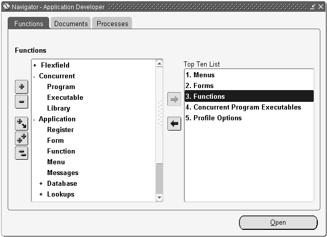
Refer to the Oracle E-Business Suite Developer's Guide for information regarding functions and responsibilities. The three modes of the Navigator are briefly discussed in this chapter.
Functions
The Functions tab is the primary navigation mechanism. It enables the user to select a particular function and then open that form.
Each user can place up to 10 functions in the Top 10 list for rapid access.
Documents
The Documents tab shows records that were stored with the "Place on Navigator" menu option. This feature is only enabled in specific product forms.
Processes
The Processes tab shows workflow processes to which the current user has access, as well as running instances of them.
A user can launch a process, which then guides them through a specific transaction established by a System Administrator at their company. If a form is opened by using the Processes flow, selecting Next Step from the File menu advances the process to its next sequential step.
Linked Forms
Open Form
The Open Form feature of Oracle Forms allows two or more forms to run simultaneously, but independently of each other. The Navigator is the "launching pad" from which a user opens the screens associated with the current responsibility, and each form opened runs independently.
Specific behaviors of screens in this environment are as follows:
-
"File -> Save" only saves the changes in the current form.
-
"File -> Close Form" closes only the current form, and asks to save changes if any are pending.
-
"File -> Exit Oracle Applications" closes all currently open forms, asking to save changes on a form-by-form basis if any changes are pending.
Developer-Defined Links
A developer may tie two or more forms together with the Open Form feature, when a related inquiry or entry form exists for the current form, and context can be passed. For example, it is very convenient to be able to open the Customers form directly from the Sales Orders form, in order to allow entry of a new customer while creating a new order, or to view details of a customer that has already been defined. These forms should be made available on the Tools or Special menu.
If there is a weak link between two forms, or one that would be used infrequently, do not provide a mechanism on the first form to directly invoke the second; the user can open that form easily from the Navigator instead.
Zoom
The Zoom feature allows customers to create links between Oracle E-Business Suite forms and forms they code. Oracle E-Business Suite ships with no Zooms defined, and the Zoom entry on the View menu is disabled. A customer may add their own code that enables this menu entry on a per-form or per-block basis. When the user selects this entry, the customer's code can execute any logic required, including opening another form and passing context to it. For more information, see the section on Zoom in the Oracle E-Business Suite Developer's Guide.
Call Form
Call Form is a Form Builder feature that allows one form to invoke another. While the second form is active, the first form is "suspended." Because of the modal nature of this invocation, and other technical problems, Oracle Application products can not use Call Form.
Disabled Functions
Functions that are never applicable during a session
Functions may not be available to a user for a variety of reasons:
-
Function Security for their responsibility excludes it. For example, a particular responsibility may allow viewing of Sales Orders, but not approval of them.
-
Based on the setup of a product, the function is not available. For example, "Check Funds" only applies when encumbrance accounting has been turned on.
-
Based on the existence of a product. For example, if Oracle Personnel is installed, the employee screens within Oracle Purchasing must not allow certain actions.
These functions can be disabled as follows (in decreasing order of preference):
-
(OMS-76030) Widgets should be hidden. This is achieved most easily by positioning such items last in the block or region. Occasionally items surrounding these items can be resized or moved to "fill the gaps." Buttons that might be hidden should be on the left side of the window.
-
Such items should be placed in their own region or window if possible, and should never appear as a valid choice in any navigation list.
-
If the item cannot be hidden for technical reasons, then it should be disabled at form startup. This is considered an exception, however.
In extreme cases, an entire form may not be accessible. If this cannot be determined before opening the form, then when the form is run it should immediately show an error message, which exits the form when acknowledged.
Items that are disabled and enabled during a session
Certain items need to change their ability to accept user input while the form is running as context changes:
-
(OMS-76031) To enforce the field-validation model, dependent fields must be disabled until their master fields are validated. For example, on a Sales Order you can only enter a Customer Site after a Customer Name has been entered and validated. Thus, the Site field is disabled until Name is valid.
-
A field may become inapplicable as data is changed. For example, on an Order Line when a service is ordered the Amount field is enabled and the Quantity field is disabled. When goods are ordered, the Quantity field is enabled and the Amount field is disabled.
Disable as follows:
-
In general do not hide items that are not currently applicable, then display them when they become applicable. There are times, however, either due to the complexity created by having all possible buttons and fields shown, or due to lack of space for all possible buttons and fields to be shown at once, where it is acceptable to break this rule. The only place this rule must always be adhered to is in pull-down menus.
-
Avoid dynamically disabling buttons except when the state is reasonably fast to determine programmatically, and users will generally understand why it is disabled. Instead, allow a user to press the button, and issue a message stating exactly why the function cannot be invoked.
Examples:
-
Only text editors of type "OSM" can have tokens defined.
The button that allows access to the tokens window is disabled for all records that are not of editor type OSM.
-
A document can be approved only if it is in a certain state.
The "Approve" button is always enabled, and if pressed, a lengthy process to determine the state of the document is executed. The approval process is either performed, or a message is presented to the user indicating exactly why the process cannot be done.
If the state of a button is dependent on entering a value in a text field, the button should not be dynamically disabled, since this requires the user to figure out that they must tab out of the field to enable the button.
-
"Inappropriate" Functions
(OMS-76032) Standard Oracle Forms functions that do not apply in a particular situation are disabled. Examples of such functions are:
-
Attempting to move to the next record of a single-record dialog block
-
Invoking Edit Field on anything but a Text Item
-
Attempting to create a new record in a display-only block
Such functions are disabled as follows:
-
Oracle Forms automatically prevents their invocation, such as Edit Field on a check box.
-
Functions within Oracle Forms that can be declaratively disabled, such as querying or inserting new records, will automatically issue a message similar to "This function is not allowed here."
-
Functions such as Next Block or Down that can be invoked with the keyboard and cannot be declaratively disabled should issue a "beep" when pressed.
-
(OMS-58168) Menu and toolbar entries are disabled (dimmed) when inappropriate for the current block, record, and field.
-
If it is not clear why a particular function cannot be invoked, display a message explicitly stating the reason, rather than issuing a "beep," or relying on the Oracle Forms message.
Do not map a function to a "best guess" alternative. For example, do not map Next Record in a dialog block to be the same as Next Item.
Irreversible Actions
(OMS-76033) Any function that may cause irreversible data changes must prompt the user for confirmation. For example, the action of deleting a record might use the following confirmation: "Delete this Purchase Order? (Delete/Cancel)." More specific delete messages are used where appropriate.
The delete action, invoked by selecting Delete from the Edit pull-down menu or by selecting the Delete button on the toolbar, is the standard way for the user to permanently remove records, whether the actual processing behind the scenes involves 1 or 100 records and whether it will be done online or in a batch job. A button with a more specific label (such as "Purge Journal") may be included if it clarifies the action, but this is always done in addition to enabling the standard invocation mechanisms (the menu and toolbar).
The default button within the confirmation window should be the one that confirms the action. Only in cases where the action (if accidentally taken) has the potential to be exceptionally destructive should the default be to cancel the action. The confirmation may explain that it will be deleted in a job later.
Running Totals
-
(OMS-76034) Totals show the cumulative values for all rows, not just the subset of rows currently queried or displayed.
-
(OMS-76035) Fields that serve as running totals of detail records are usually drawn in the master block.
-
(OMS-76036) In single-record blocks, when a running total field shows a total for multiple fields that are all visible, the fields should be laid out with a one-character vertical gap below the multiple fields and above the total field, with a zero-height frame (horizontal line) in the middle of the gap.
The decimal places of the Total field must align with those of the fields being totaled.
-
(OMS-76037) In multi-record blocks, totals may be indicated in two ways:
1. If a master block exists, as a field within the master block.
2. As a separate field below the column that is being totaled.
The decimal places of the field must align with those of the column.
-
[Translation] The field must be long enough to display the expected maximum length of the total in any currency.
Field Ranges (From/To Field Pairs)
A pair of fields used to represent a range has specific cosmetics and behaviors.
Behaviors
-
Ranges are validated only at record level. When an error occurs, such as the From value is greater than the To value, an error message is shown indicating the fields in error, such as, "The range of Hire Dates entered is not valid."
In Find windows, this validation occurs when the user presses the Find button or does a Next Block. If the From or To values are invalid, a message is displayed and the cursor is moved to the From field in the Find window.
-
The only field-level validation that should occur is the validation of the data entered in the field itself. No cross-field validation with the other field of the pair is done at field level.
-
For date ranges, the From field on a new record can default to the current date unless such a default would be incorrect most of the time or might have negative consequences. For example, defaulting the current date into a field that controls the first date of data to be purged would probably not be useful.
-
In Find windows, when the focus moves into the To field, if it is blank and there is a value in the From field, copy the value from the From field to the To field. Outside the Find window context, the To value should not be defaulted unless it is most likely that the dates will be the same.
-
Ranges are interpreted as listed in the following table:
From Value To Value Interpretation null null all values null 31-DEC-2007 all dates up to and including 31-DEC-2007 01-JAN-2007 null all values including and after 01-JAN-2007 01-MAY-2007 01-MAY-2007 only values that exactly match 01-MAY-2007 01-MAY-2007 05-MAY-2007 all dates from 01-MAY-2007 to 05-MAY-2007 inclusive
Any time component that may be seen on the actual database column being queried should be ignored if the Find fields merely allow a date entry.
Single-Record Blocks
Range fields may be painted one of two ways: horizontally with a single prompt (such as "Hire Dates") in front of the "From" field and a dash between the fields as in "Hire Dates _____ - ____", or vertically stacked with the prompts From (the upper field) and To with a region frame and title that describes the range (such as "Hire Dates").
In the example above, the prompt for the combined range fields is plural, and the separator between the fields is a dash (boilerplate, not a prompt) centered on three character cells between the two fields of the range. This is the recommended style. Note that the "To" field must have either a hidden prompt or Hint Text because it has no visible prompt of its own.
The style in the following example should only be used if a vertical orientation is aesthetically better or required for translation reasons.
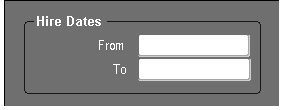
Note that in this example, each field must have Hint Text that combines the frame title and field prompt.
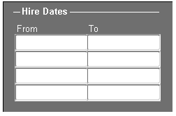
If multiple field ranges exist, and the fields are of different widths, try to arrange them with the From fields and the To fields stacked as shown in the following picture:

Note that each field must have Hint Text, such as "Hire Dates: From."
Multi-Record Blocks
In multi-record blocks, range fields are always adjacent fields with the prompts From and To, with a spanning region title for the range contents, as shown in the following example:
Currency
Currency Code
(OMS-76038) Display the currency code rather than the symbol associated with the currency.
(OMS-76045) Always put the currency code before amounts on forms, letting the value's general label (for example, "Amount") apply to both the currency code and the amount fields. Do this for both input and display-only cases.
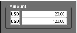
Note: The currency field must still have either a hidden prompt or Hint Text.
Alternatively if all the amounts on the window are in the same currency, you can use a single separate field labeled "Currency" to indicate the currency type for amounts on that window.
The currency code can be left off completely (as shown below) if only functional currency is supported for that command.
The prompt for the currency code field can be omitted in a multi-row display-only block.
Field Alignment
(OMS-76039) Currency codes are start-aligned.
(OMS-76040) Currency amounts are end-aligned.
Decimal character (Radix)
Currency amounts must be displayed with the appropriate decimal character. For example, the comma is the appropriate decimal character for German currency (9.123,45) whereas for American currency the appropriate decimal character would be the period (9,123.45).
Field Widths
The numeric field widths that are standard for certain Oracle E-Business Suite fields (typically 1.2" or 1.6") are sufficiently large to handle all necessary group separators, decimal characters, and bevels around the field.
Leave 0.4" for the currency field.
Negative Formatting
The format for negative numbers is determined by the profile option "Currency:Negative Format." The default identifier is a hyphen ( - ) preceding the currency amount, as in "-23." Other display possibilities are 23-, <23>, (23), and [23].
Note: Fields with negative values may also be color-coded if highlighting them is useful.
Validation Messages
If a user changes the currency code when its associated amount(s) are already entered (nonzero), the user should be warned with a message to verify that the amount is correct for the new currency. This is particularly important because in some cases precision may be truncated by the currency change.
If changing the currency code causes an overflow in the amount field(s) (the amount is larger than the acceptable number of digits), blank out the amount(s) and display a message telling the user what has been done. If the amounts cannot be blanked out (such as if the amounts show in saved child records), instead present an error when the currency code field is changed and force its correction or do the change only from a dialog box so the child records can be changed.
Places where extra precision is needed
There are a few places where in the input of prices, quantities, and costs the user may require extra precision beyond the normal precision displayed for a value. In those places allow the decimal point to float as needed and display the amount of precision the user enters. This will upset the numeric alignment in multi-row displays, so it should be done only where such extra precision input may be necessary.
Multiple-Record Selection
Multiple-record blocks may allow a user to take an action on several records at once. For instance, a screen designed to post Journals allows selection of any number of records, and then invoking the "Post" function operates on all the currently selected records.
Behaviors
-
A selected record is displayed with a colored background. This includes all text items and poplists of the record.
-
All menu items and action buttons which can act on multiple records, display the number of records selected. For example, if four records are selected to be posted in the Post Journals form the Post button label would be displayed as "Post 4."
Note: Initially and anytime no records are explicitly selected the menu items and buttons display "1" as in, "Post 1" to show they will act on the current record.
-
A single record is selected or deselected by holding down the Control key and clicking on the record.
-
A continuous range of rows is selected by holding down the Shift key and clicking on the record. This selects all rows between and including the current record and the last record selected.
-
All records can be selected by choosing "Select All" from the Edit menu.
-
All records can be deselected by choosing "Deselect All" from the Edit menu.
-
After the desired function is invoked for the selected records, their appearance onscreen should be altered (typically a status field is updated, or the record is cleared entirely if it can no longer be acted on). If the records are not cleared they should remain highlighted.
-
A confirmation window should always appear when there is any uncertainty as to what records may be affected or when it is irreversible or destructive, for example, "Delete 3 records?"
Highlighting Information
In certain cases, it may be desirable to make a value or even an entire row stand out to the user. The following are methods for making data stand out from the information around it:
-
Required fields on the current record automatically render with a yellow background.
-
While in enter-query mode, queryable fields are drawn with a light blue background.
-
A particularly important row may be highlighted by changing the background color of all fields.
-
A value may be rendered in color to indicate a certain attribute. For example, red is often used for errors and negative values. Be mindful of using color when modifying text as certain colors are commonly used for specific attributes. Distinct explanations or descriptions may be required.
Important: (OMS-76046) In order to support users who are color blind, any use of color coding must be used to augment only. For example, a financials total may be rendered in red if negative, but should also be drawn such that it is readable without the aid of color (such as with a hyphen preceding the value).
-
In the case where a group of two or more enterable fields are related such that filling in one field results in automatic calculation and display of the values in the other fields, it is acceptable to display the calculated value(s) in regular weight (non-bold) font. For example, a discount on a price may be represented by three fields: discount (absolute amount), percent discount, or negotiated price. Any one of the three fields may be entered and appropriate values are then calculated and displayed in the other two fields. It may be necessary (for example, in case the list price changes) to know which value was entered and which values were subsequently calculated. For this reason, the calculated values should be displayed in regular weight font.
Printing
The "Print..." action from the File menu may invoke either of the following responses:
-
If there are no reports associated with the task at hand (the task being worked on in the current form or window), then the standard print dialog appears allowing the user to print the current window.
-
If there are one or more reports associated with the task at hand and which require minimal (if any) extra parameters to run, then a dialog appears that allows the user to select a particular report, or to invoke the standard print dialog to print the window. If a selected report requires additional parameters that cannot be defaulted, then either additional fields may be presented directly in the dialog, or upon selection of the report, the Submit Requests form may be opened.
Note: This dialog should not list all reports related to the entity being worked on, but rather just the reports directly related to the task at hand.
The option to print just the current screen is always last in the choices, and is the default.
Examples:
-
Several reports exist for the current form, and all require multiple parameters that cannot be automatically defaulted:
Selecting "Print..." will bring up a dialog box containing an option group with choices "Reports" and "Print Screen" and buttons "OK" and "Cancel."
Selecting "Reports" will open the SRS form; selecting "Print Screen" will open the platform-specific print dialog.
-
One report exists that needs a single additional parameter to be run, and several more complex reports also exist:
Selecting "Print.." will bring up a dialog box containing an option group with choices "Accrued Receipts," "Other Reports" and "Print Screen" and buttons "OK" and "Cancel."
Long-Running Processes
Long-running processes should be handled in the following ways:
-
(OMS-76041) Any process which may take more than two seconds to run should change the pointer to a busy indicator (typically the stopwatch or hourglass).
-
Any process which may take a substantial amount of time (such as 2 or 3 minutes) should show a progress indicator which shows percent completion, or if the total processing time is not known, it should display the current state of the processing.
Ordering of Displayed Records
This section gives recommendations for allowing a user to specify the order (ascending or descending, for example) of queried records. In general, these ideas are intended to go into a form's Find window, if it has one.
-
Use a region titled "Order By" in the lower left of the Find window. This region should have an option group for specifying the order by criteria. This is the preferred method of specifying order by criteria.
-
Provide a poplist with "Order By" choices in the Find window. Use this method when the first method is inadequate.
-
For the most complicated cases, use an LOV of "order by" choices or an "Order By" region with several poplists (labeled to their left with 1., 2., 3., and so forth, and to their right with ascending/descending icons that can be toggled) for specifying the ordering conditions.
Requerying Records After Changing Order By
In the cases where "Order By" is specified directly on the Results window (not in the Find window), changing the "Order By" should bring up a message "Reorder records now?" with choices Yes and No (with Yes as the default). If the user chooses Yes, the previous query is run so that the user can see the reordered data.
Record History...
A user chooses "Help -> Record History" in order to see the information automatically supplied by the Applications Object Library "WHO" columns, such as:
-
Created By
-
Creation Date
-
Table Name
-
Updated By
-
Update Date
These fields are not shown on the form unless they are critical attributes of the entity.
For information on maintaining WHO information, see the Oracle E-Business Suite Developer's Guide.
About Oracle Applications...
To see basic information about the product being run select "Help -> About Oracle Applications..." from the pull-down menu bar. The About Oracle Applications window provides details about the version of the Oracle E-Business Suite components, login information, and information about the current form and environment.