Configuring Desktop Components
This chapter covers the following topics:
- Production Scheduling Desktop Overview
- Configuring the Model Workspace
- Configuring Toolbars
- Customizing Colors
- Configuring Schedule Views
Production Scheduling Desktop Overview
-
Data editors.
-
Key performance indicators (KPI) view.
-
Workbook Area and Tabs.
-
Log window.
-
System icons.
The Production Scheduling desktop is the main user interface for creating production schedules and solving production schedule problems.
The Production Scheduling desktop is the principal user interface for all production scheduling activities. The desktop interface enables you to create and revise production schedules, solve production schedule problems, and view graphical representations of schedule data. This example shows the principal areas of the Production Scheduling desktop:
The File, Edit, View, Tools, Window, and Help menus appear at the top. The application toolbars appear below the window menus. A variety of toolbars are available and display based on the current view. The toolbars display icons to perform a variety of actions when working with your schedule. The Model Workspace, which contains the tree structure of your scenario, appears to the left below the toolbars.
The Workbook area tabs appear at the bottom of the screen and are used to navigate between open view or editors. The Message bar appears in bottom right corner of the window.
The majority of the screen is occupied by your scenario views, such as the Gantt chart, Item graph, and so on.
Data Editors
Data editors are views that enable you to record events, administer orders, and monitor supply and demand information. The following data editors are available:
-
Changeover Editor.
-
Supply & Demand Editor.
-
Work Order Editor.
-
Calendar Editor.
Changeover Editor
The Changeover Editor enables you to record precise information about the time required to modify a machine between different operations. Using the Changeover Editor, you can define relationships that enable you to define sequence dependent changeover relationships. In addition, you can create groups to save time when entering changeover information. All of the information entered into the Changeover Editor is automatically saved in the schedule.
Supply & Demand Editor
The Supply & Demand Editor enables you to add, delete, change, or view the properties of any supply or demand order or line item. It also enables you to add details about customers. Supply and demand information is usually imported.
Work Order Editor
Use the Work Order Editor to add, modify, delete, and view production orders, maintenance orders, and Enterprise Asset Management orders.
Calender Editor
Use the Calendar Editor to view and modify calendar and shifts, and add and modify calendar and shift events.
The Calendar Editor enables you to record downtime events and delay time events. An operation must end before a downtime event starts. An operation may be interrupted by a delay event and will resume after the delay event has completed.
Resource availability for crews, machines, tools, and machine changeovers runs according to a specified calendar and shift, which enables you to create as many calendars and shifts as necessary to accurately define the time constraints that impact your resources. No downtime or delays are scheduled in the default calendar that ships with Production Scheduling.
The Calendar Editor enables you to create recurring patterns, select multiple events in a user-defined range, and edit all events at one time.
Key Performance Indicators (KPIs) View
The Key Performance Indicators view displays schedule performance measurements. Performance indicators for all schedules in the model can appear at the same time or be analyzed to view a particular schedule. Key Performance Indicators (KPIs) are organized by the following categories:
-
Customer Service
-
Materials
-
Costs
-
Manufacturing
-
Maintenance
By adjusting scenarios and then comparing KPIs, you can determine the effect of the adjustments on your schedules. In addition, you can compare a baseline schedule to another schedule using the comparison capabilities at the bottom of the Key Performance Indicators view.
For more information, refer to "Working with Key Performance Indicators," Evaluating Production Scheduling, Production Scheduling Implementation Guide.
Workbook Area and Tabs
The Workbook area displays object windows, model editors, schedule views, and system messages. The Workbook area provides flexibility for viewing different types of Production Scheduling information. Use the Workbook area tabs to identify and navigate to displayed views.
You can display the Workbook area with or without tabs for each open diagram or model editor. You can display up to 26 windows simultaneously.
To display Workbook tabs, select Workbook on the View menu.
You can have several views displayed at one time. For example, you can display the Key Performance Indicators view, the Production Pegging view as well as several data editors at the same time. The tabs automatically resize to fit your screen.
To hide the Workbook area tabs, deselect the Workbook option from the View menu.
With Workbook tabs hidden, you can still toggle between windows by making a selection from the Window menu.
Logs Window
The Log window appears by default each time the application is opened. The Log window displays two tabs, the Progress Log and Event Log. The Progress Log displays the solver output results. This output consists of a report about the solve and any problem messages. The Event Log tab is used to access the following solver events:
-
Error events
-
Warning events
-
Informational events
-
Headline events
To access log information:
-
Select the Logs workbook tab.
-
To view solver output information and details, select the Process Log tab.
To search the contents of the Progress Log, right-click and select Find. Enter your search criteria in the Find dialog and click Find.
-
To view solver events, click the Events Log tab.
-
To filter events from the Event Log tab, perform the following:
-
To filter the event types, use the Show event buttons. Highlighted buttons indicate events appear within the tab.
-
If your model contains multiple scenarios, you can use the For scenario list to filter events based on the selected scenario. The wildcard list option (*) is used to view events within all model scenarios.
-
Use the Information detail level list to filter the event details.
-
-
Click View Log File button to display the event log text file (PsLog.txt).
-
Click View Solver Statistics File button to display the solver statistics text file (SolverStatistics.txt).
-
Click Export to Log File button to save the log results.
The Log file is saved to the location defined in the Logging tab in the Options window. To access the logging options, select Options from the Tools menu, and click the Logging tab.
Using Model Workspace System Icons
System icons are compact graphical elements that denote items such as activities, groups, folders, and resources in the Model Workspace. These icons help you identify objects in your model. This table describes the available system icons:
| Icon Name | Description |
|---|---|
| Operation or Routing folders | Represents either an operation or a routing folder. Both operations and routings can be organized in folders for better accessibility. |
| Operation | Represents an operation to which resources are attached. The icon appears automatically in an Object window when the Open Diagram menu option is selected. This icon can be dragged from the Model Workspace into a routing diagram. |
| Operation Group folder | Represents an operation group folder. Operation groups can be organized into operation group folders for better accessibility. |
| Operation or Resource Group | Represents resources that are grouped for analysis purposes. Machine resources groups can be available within the Changeover editor. Like resources, operations can be grouped together in operation groups. |
| Routing | Represents operations and routings that are connected in a specific order. |
| Operations, Resource, or Visits folder | Represents an organization, resource, or visits folder. Operations, resources, and visits can be organized in folders for better accessibility. |
| Visit | Represents a group of aircraft maintenance requirements and tasks assigned to a given organization. Visits are typically comprised of logical milestones, which are groups of tasks that must be finished before proceeding with the next milestone, or groups of tasks. |
| Crew | Displays details about Crew resources, including properties. You can drag Crew resources into operation diagrams from the Model Workspace. |
| Item | Displays details about Item resources, including properties. You can drag Item resources into operation diagrams from the Model Workspace. |
| Storage Space | Displays details of Storage spaces, including the name of the Storage space and its properties. |
| Machine | Displays details of Machine resources, including properties. You can drag Machine resources into operation diagrams from the Model Workspace. Machine resources appear in the Changeover editor. |
| Vendor | Displays details about Vendor resources, including properties. You can drag Vendor resources into operation diagrams from the Model Workspace. |
| Tool | Displays details about Tool resources, including properties. You can drag Tool resources into operation diagrams from the Model Workspace. |
| Schedule folder | Represents schedules that are organized into folders. |
Configuring the Model Workspace
This section provides information about the following:
-
Hide the Model Workspace.
-
Customize the Model Workspace.
-
Displaying workbook tabs.
-
Arrange window views.
Model Workspace Overview
The Model Workspace contains a tree structure, which contains all the scenarios that make up your model, and the operations, resources, and schedule views that make up each scenario.
When you create a new scenario, you need to define all of your resources first, then all of your operations, and finally all of the routings in your model. You can create several different scenarios to optimize your schedule. Create what-if scenarios that duplicate the scenario, and then modify the schedule and see how the modifications affect production. Once you have a satisfactory production schedule, save the modifications as a new model. To increase the available workspace in the Workbook area, hide the scenario workspace.
The Model Workspace contains one or more scenario folders for your model. Each scenario folder contains all of the individual scenarios and schedules that you have created for the current model. Scenarios allow the operations and resources of a model to be manipulated to create what-if situations. You can analyze different scenarios using various KPIs to determine the ideal schedule.
When you create a new scenario, Production Scheduling automatically sets up these subfolders organize the information:
-
All Exceptions
For more information, refer to "Working with Exceptions," Evaluating Production Schedules, Production Scheduling Implementation Guide.
-
All Attributes
-
All Resources
For more information, refer to "Defining Resources," Creating Production Scheduling Models, Production Scheduling Implementation Guide.
-
All Resource Groups
For more information, refer to "Defining Resource Groups", Creating Production Scheduling Models, Production Scheduling Implementation Guide.
-
All Assets
-
All Suppliers
-
All Visits
For more information, refer to "Defining Visits," Creating Production Scheduling Models, Production Scheduling Implementation Guide.
-
All Operations
For more information, refer to "Defining Operations," Creating Production Scheduling Models, Production Scheduling Implementation Guide.
-
All Operation Groups
For more information, refer to "Defining Operations," Creating Production Scheduling Models, Production Scheduling Implementation Guide.
-
All Routings
For more information, refer to "Defining Routings," Creating Production Scheduling Models, Production Scheduling Implementation Guide.
-
All Buffers
For more information, refer to "Defining Routings," Creating Production Scheduling Models, Production Scheduling Implementation Guide.
In addition to the folders, the scenario contains the following data editors to manage your schedule:
-
Changeover Editor
For more information, refer to "Defining Changeover Rules," Creating Production Scheduling Models, Production Scheduling Implementation Guide.
-
Supply & Demand Editor
For more information, refer to "Specifying Supply and Demand Events," Creating Production Scheduling Models, Production Scheduling Implementation Guide.
-
Work Order Editor
For more information, refer to "Working with Work Orders," Creating Production Scheduling Models, Production Scheduling Implementation Guide.
-
Calendar Editor
For more information, refer to "Defining Work Patterns and Availability (Resource Calendars)," Creating Production Scheduling Models, Production Scheduling Implementation Guide.
Schedule Groups
Schedule groups enable multiple operations and resources to be combined as a group when viewed in the Model Workspace and in the schedule views. Using the Model Workspace, you can organize resources and operations into logical groupings to help you organize your model data. You can create a default resource group for each schedule that appears when views are first opened.
All schedule views, except the Production Pegging view, have a menu at the top of the view that lists the defined groups. When you select a group from the menu, the schedule view changes to display only those resources or items belonging to the group. Each schedule view can have its own default group view. The current default group in each view appears with a check mark next to its name.
Hiding the Model Workspace
To hide the Model Workspace, perform one of the following:
-
Select Model Workspace from the View menu.
-
Click Hide/Toggle Model Workspace button from the toolbar.
Customizing the Model Workspace
To customizing the Model Workspace:
-
Access the Model Workspace.
-
Right-click the window pane above the Model Workspace heading and below the toolbars.
-
From the menu, select an option.
Model Workspace Option Description Allow Docking Select to allow the Model Workspace window to move anywhere on the screen and attach to any side. To dock the Model Workspace to a specific side, move the window as close as possible to that side. The window expands to full size and locks in place when you release the mouse.
When Allow Docking is cleared and Float in Main Window is selected, the Model Workspace moves anywhere within the Production Scheduling window and does not attach to a side.
When this option is not selected, select the Float in Main Window option to ensure that the right-click menu is available in the Model Workspace.
Clear the Float in Main Window option and select the Allow Docking option when you want to dock the Model Workspace window again.Hide Click the window's close button to hide the Model Workspace. To display the Model Workspace again, select Model Workspace from the View menu. Float in Main Window Select to move, or float, the Model Workspace anywhere inside the application window. -
To change the background color for the Model Workspace, perform the following:
-
Click the Customize Colors button from the toolbar.
-
Select General from the Show colors for list.
-
Select Model Workspace background from the Display items list.
-
Select a color from the Item color list.
-
To reset the color to the application default, click Default Color.
-
Click Close.
-
Displaying Workbook Tabs
Use the workbook tabs across the bottom of Workbook area to navigate between the editors and views currently open.
To display workbook tabs:
-
To display multiple view tabs, select Workbook from the View menu. A check mark appears next to Workbook when selected.
The open workbooks appears as tabs across the bottom of the window. Select a tab to display a workbook.
-
To hide the workbook tabs, deselect Workbook from the View menu. When hidden, you can navigate between open views by selecting the view or editor name from the Window menu.
Arranging Window Views
To arrange windows within the Workbook area:
-
Access the Model Workspace and double-click the editors you want displayed, or select a the schedule views from the View bar.
-
Select the Windows menu. The Window menu displays all open windows.
-
Select one of the following options:
-
Cascade - Select to display the views stacked on top of each other.
-
Tile - Select to tile the views within the same window.
-
Configuring Toolbars
This section provides information on the following:
-
Toolbars overview
-
Hide toolbar options.
-
Create a custom toolbar.
Toolbars Overview
Use the toolbars to perform tasks within Production Scheduling. Toolbar buttons display tooltips to indicate button name. The status bar, located at the bottom of the window, also displays information about the button.
Production Scheduling enables you to build a model of your process. By using the Production Scheduling tools located in the toolbar, you can create a graphical representation of the model. After the model is built, you can then access and view every element of the model with just one mouse click.
The Production Scheduling toolbars are context-sensitive; therefore, different sets of toolbars appear based on the task that you are performing. For example, the Alignment toolbar appears only when you are working with an Operation or Routing diagram.
Tools are arranged in sets on the toolbar. Use different sets when navigating different views. The following table describes the toolbars that are available in the Production Scheduling desktop:
| Toolbar Name | Description |
|---|---|
| File | Use this toolbar to:
|
| Solve | Use this toolbar from the standard or combined views to:
|
| Gantt Chart | Use this toolbar from the scheduled views to:
|
| Operation Instances | Use this toolbar in operation scheduled views to:
|
| Demand | Use this toolbar from scheduled views to:
|
| Attributes Filter | Use this toolbar for resource Gantt scheduled view to:
|
| Graph | Use this toolbar from the schedule view graphs to:
|
| Item Gantt | Use toolbar from item Gantt schedule views to sort items. |
| Resource Contention | Use this toolbar in resource contention scheduled views to define the bucket set time period. |
| Calendar Events | Use this toolbar for calendar scheduled views to:
|
| Zoom & Pan | Use this toolbar from the operation and routing diagrams to:
|
| Diagram | Use this toolbar to:
|
| Alignment | Use this toolbar to:
|
| Changeover | Use this toolbar from the Changeover Editor to:
|
| Supply and Demand | Use this toolbar from the Supply & Demand Editor to:
|
| Work Order | Use this toolbar from the Work Order Editor or the scheduled views to show or hide the work order tree. |
| Calendars | Use this toolbar from the Calendar Editor to:
|
| KPI | Use this toolbar from the Key Performance Indicators view to customize KPI colors. |
Hiding Toolbar Options
-
From the menu bar, select Tools, then Customize to display the Customize window.
-
Click the Toolbars tab.
-
Select a toolbar from the list, and then select the toolbar options that you want to use on the toolbar.
Toolbar options that are unchecked do not appear on the toolbar.
-
Click OK.
Creating a New Toolbar
-
From the menu bar, select Tools, then Customize to display the Customize window.
-
Click the Toolbars tab.
-
Click New.
-
Enter a name for the toolbar and click OK. The new toolbar appears.
-
Select the Commands tab, and then select a category.
-
Drag and drop the buttons you want displayed to the new toolbar.
-
Click OK.
Customizing Your Toolbars
Use the Customize window to show or hide tooltips, change buttons appearance, or reset the toolbar defaults.
To customize your toolbars:
-
From the menu bar, select Tools, then Customize to display the Customize window.
-
Click the Toolbars tab.
-
Perform the following as needed:
-
Select Show Tooltips to view help about the tool that is currently selected. To hide tooltips, deselect this option.
-
Select Cool Look to remove the button-like appearance.
-
Select Reset to restore toolbars to the default setting and layout.
-
-
Click OK.
Customizing Colors
Use the Colors window to define the colors used within the Production Scheduling application, its views and editors. Color settings can also be saved and loaded as themes from the Colors window, making them available in other scenarios.
To customize colors:
-
Select the Customize Colors button from the toolbar.
-
Use the Color theme list to select an existing color theme. Available themes include PS Classic, Oracle Look and Feel, and 256 Colors.
Color themes can be duplicated and then modified to create new themes based on your color selections.
To duplicate and customize a theme:
-
Select a theme from the Color theme list.
-
Click Duplicate and enter a theme name.
-
Follow the procedures below to select the editor, view, or general color settings and define the item colors as needed.
-
-
From the Show colors for region, select a view, editor, or general option.
When the Colors window is accessed from a view or editor, the view or editor is selected by default from the Show colors for region.
-
From the Display items region, select the item to be modified.
-
Use the Item color list to assign a color the item.
-
Use the Item color list options to select the type of color options. Available options include Standard Colors, HTML colors, Window Colors, Color Shades, and More Colors.
-
To set a Display item to its default color, click Default Color button.
-
To save your color preferences as a Production Scheduling color theme, click Save As. Define the file name and location and click OK. Once a theme is saved, it can be applied to other Production Scheduling scenarios as needed.
-
To load a saved Production Scheduling color theme to a scenario, click Load. Locate and select the Production Scheduling Color Theme file, and then click OK. The theme settings are loaded into your scenario and the color settings are applied.
-
When you have finished customizing your color preferences, click Close.
Configuring Schedule Views
This section discusses how to:
-
Create new group views.
-
Configure the Production Pegging layout.
-
Set Multi-Capacity Resource Graph colors.
-
Set Item Graph colors.
-
Set Item Gantt colors.
-
Set Resource Contention view colors.
Creating New Group Views
Create a new group view to add to the navigation pane view list bar. By default, Production Scheduling provides to two groups in the navigation list bar, Views and Combined), but you can create additional groups as needed. Once a group is created, you can add schedule views to the group as needed.
To create a new group view:
-
Access a schedule view.
-
Right-click within the schedule view navigation pane list bar and select Add Group. You can right-click from any of the navigation pane view list bars (for example, Views or Combined).
-
Enter a name for the new group and click OK.
The new group is added to the navigation pane view list bar.
-
Click the new group in the navigation pane view list bar to display its affiliated views or to add new views to your group.
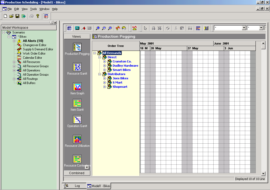
Configuring the Production Pegging Layout
From the Production Pegging view, access the Production Pegging Layout dialog box to define layout options used within the view.
To configure the Production Pegging layout:
-
Access the Production Pegging view.
-
Right-click the Order Tree header and select Layout Options.
-
In the Production Pegging Layout dialog box, select a layout type:
-
Show individual routing instances.
Each operation and routing instance appears in a single line.
-
Show merged routing instances.
All routings of the same type are grouped in a single line.
-
-
If you selected the layout type for merged routing instances, select one or both of these options:
-
Group multiple operation lines in a folder.
All operations of the same type are grouped together in an operation folder.
-
Automatically expand operation folders.
Operation folders automatically expand to display their contents. This option is available only if you selected the option to group multiple operation lines in a folder.
-
-
Show resource alternates as a set.
Setting Multi-Capacity Resource Graph Colors
To set Multi-Capacity Resource Graph colors:
-
Click the Customize Colors button.
-
Double-click one of these options to configure the color scheme:
-
Graph Background
-
Used Capacity Graph
-
Maximum Capacity Graph
-
-
Click OK to change the color scheme.
Setting Item Graph Colors
-
Click the Customize Colors button.
-
Select an appropriate color option from the available options:
-
Graph Color
-
Minimum Level Color
-
Maximum Level Color
-
Background
-
-
Click the Close button in the Color Selection window to exit.
Setting Item Gantt Colors
-
Click the Customize Colors button.
-
Click and drag a marker to the desired percentage.
By default, the system displays color representations of inventory levels between - 10 and 110 percent of the minimum and maximum levels.
-
To assign a color to a percentage range, right-click the color bar.
-
In the Color dialog box, select a new color and click OK.
-
Click Update Slider when you have completed the changes to the color scheme.
-
Click Apply and then click OK.
Note: To return all of the values to the default colors and to the default number of color markers, click the Default button.
Setting Resource Usage Level Colors
You can adjust the resource contention and resource Gantt view colors (for multi-capacity resources) assigned to usage levels.
To set the resource usage level colors:
-
Click the Customize Colors button.
-
From the Show colors for region, select Resource Level Color Ranges.
-
From the Display items region, select a resource usage range and click Customize, or double-click the resource usage range.
-
From the Resource Level Color Ranges dialog, set the following as needed:
-
In the End % field, enter the ending percentage value.
-
Use the Color list to change the color assigned to the level.
-
To set the percentage color range values to their default setting, click Reset Ranges.
-
To set levels to their default color, click Reset Colors.
-
To display levels as gradient colors, click Make Color Gradient.
Click OK to save your changes and close the Resource Level Color Ranges dialog.
-
-
Click Close.