
 Read more...
To define a single drag object, you will add a special attribute to the image component, then specify
the new attribute as the drag source that will be passed to the target when the image is dragged to a target component.
To define the first single drop target object, you will specify an attribute on the input text component as the target to receive a drag source when a component is dropped on it.
Next you will create a custom drop event listener method in a JavaBean to programmatically handle a drop event. To define the second drop target object, you will register the custom listener on the listbox component.
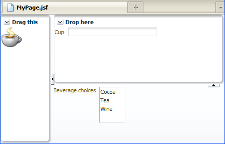
The final page will look like this:
| Purpose | Duration | Application |
|---|---|---|
This tutorial shows you how to add drag and drop functionality on a page by defining ADF Faces components as drag sources and drop targets. To see the complete application you will create, click the Download button to download a zip of the final application, and then unzip it in your JDeveloper mywork folder. |
40 minutes |  |
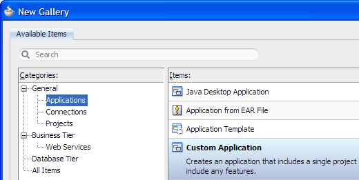
From the main menu, choose File > New. In the New Gallery, expand the General category and select Applications. Then in the Items list, select Custom Application and click OK.
To follow along with the example, enter
DndAppas the application name and click Finish.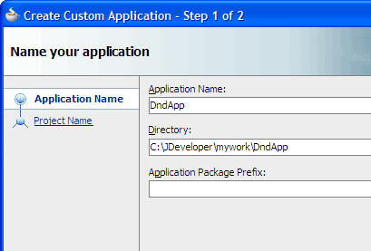
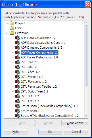
In the Application Navigator, double-click the project you just created to open the Project Properties dialog. Select JSP Tag Libraries and Distributed libraries, then click Add.
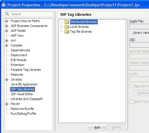
In the Choose Tag Libraries dialog, select ADF Faces Components 11 and click OK twice to close both dialogs.
Click
 Save All to save your work.
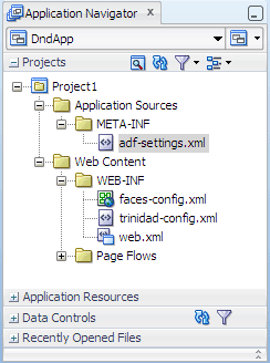
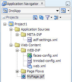
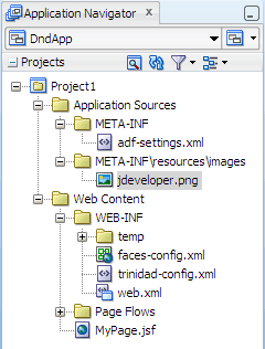
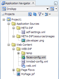
The Projects panel in the Application Navigator should look like this:
Read more...
At the same time, it keeps track of your projects and all
environment settings.Based on prebuilt templates, a JDeveloper application allows you to specify a predefined type of environment, depending on the type of application you want to create (web application, Java application, and so on). Application templates provide you with a quick way to create the project structure for standard applications with the appropriate combination of features already specified. The application template also filters the work you do in JDeveloper such that the choices available are focused only on the features you are working with.
In this tutorial, you will use the Custom Application template, which makes available objects associated with all the features that JDeveloper supports in a single project.
Once you have created an application using a suitable template, you can still add new projects to the application and specify what features are to be included. To do this, in the Application Navigator, right-click the application name and choose New Project. In the New Gallery, you can select any type of project in the Items list.
Read more...
The project or projects in the application define the associated features.
A JDeveloper project, which is used to logically group files that are related, keeps track of the source files, packages, classes, images, and other elements that your program may need. Projects manage environment variables such as the source and output paths used for compiling and running your program. Projects also maintain compiler, runtime, and debugging options so that you can customize the behavior of those tools per project.
You can add multiple projects to your application to easily access, modify, and reuse your source code. Different projects might contain files representing different tiers of a multi-tier application, for instance, or different subsystems of a complex application. These files can reside in any directory and still be contained within a single project.
Read more...
ADF Faces provides the ADF Faces Components JSP tag library. When you add the ADF Faces Components tag library, JDeveloper adds the name and location of the tag library descriptor (TLD) file, the unique identifier of the tag library, the Java library names required to execute tags from the tag library at runtime, and the preferred value for the prefix of tags when the library is used in a JSF page.
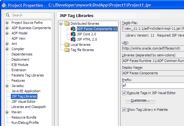
By default, JDeveloper will display the ADF Faces tags on the ADF Faces page of the Component Palette, and execute all tags in the tag library in a simulated JSP/Servlet container available in the JSP visual editor. To customize the tags that should be executed during design time, select the tag library in the JSP Tag Libraries page of the Project Properties dialog, and click Customize.
Read more...
Projects are displayed as the top level in the hierarchy in the Application Navigator. The Custom Application template
that you used for your application creates one project using a default project name (or the project name you entered).
In the Application Navigator you can collapse and expand any panel. You adjust the size of panels by dragging the splitter between two panels. To group and sort items in the Projects panel, use the
 Navigator
Display Options dropdown menu. For application operations, you can
click
Navigator
Display Options dropdown menu. For application operations, you can
click  Application Menu and choose an
option from the dropdown menu.
Application Menu and choose an
option from the dropdown menu.
JDeveloper has the capability of recognizing many different file types, displaying each in its appropriate viewer or editor when you double-click the file in the Application Navigator. Closing an application or project closes all open editors or viewers for files in that application or project and unloads the files from memory.
Note: Nodes in italics in the Application Navigator mean that the elements have not yet been saved. A project node is bold when a file in the project is selected.
From the main menu, choose Application > Show Overview. The Application Overview window opens in the editor window area.
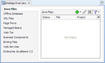
All objects that you create within JDeveloper appear in the Application Overview file summary pages, arranged by object type. As you create new files and artifacts, you can view them filtered by status and project.
You can optionally close the Application Overview window, since you will not be using it to create objects for this application.
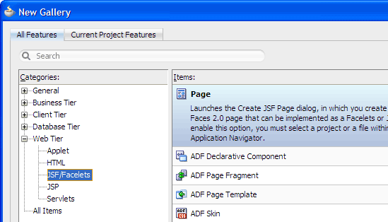
In the Application Navigator, right-click the project and choose New > Web Tier > JSF/Facelets > Page, then click OK.
-
Enter
MyPage.jsfas the file name. Make sure Facelets is the selected document type.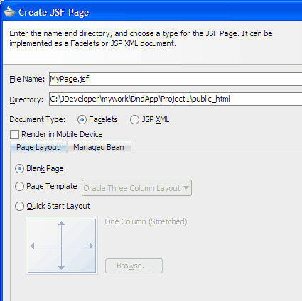
The New Gallery
The JSF navigation diagrammer
The ADF task flow diagrammer (available only in the Studio edition of JDeveloper)
On the Page Layout page, select Quick Start Layout, then click Browse.
-
In the Component Gallery, select the Two Column category on the left. Then on the right, select the third type and the third layout.
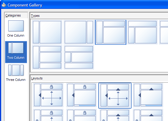
You should see Two Column Left, Partial Header (Two Splits, Stretched) in the Options box.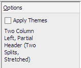
Click OK.
The Create JSF Page dialog should now display the quick start layout selection you made: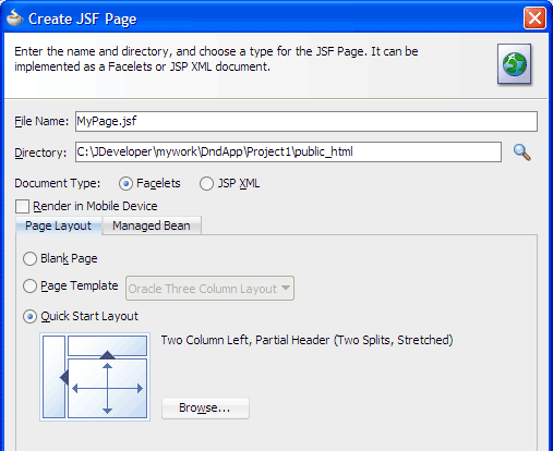
Click Managed Bean and select Do Not Automatically Expose UI Components in a Managed Bean.
Click OK.
By default JDeveloper opens the new page in the visual editor, showing the first facet of the horizontal panel splitter as selected.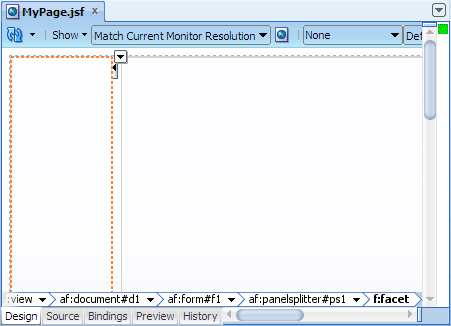
Click
Save All to save your work.Web Content folder: Contains the pages you create, along with other files that must be visible to the client browser (such as stylesheet files and images) for your application.
/WEB-INF/ folder: Contains the required Web Application Deployment Descriptor (
web.xml) and the JSF configuration file (faces-config.xml).web.xml file: The web application deployment descriptor for your application. This is an XML file describing the components that make up your application, along with any initialization parameters and container-managed security constraints that you want the server to enforce for you.
faces-config.xml file: Where you register the JSF application's configuration resources, such as validators, converters, managed beans, and navigation rules.
trinidad-config.xml file: Where you configure ADF Faces features such as skin family and level of page accessibility support.
jsf) or JSP documents written in XML syntax (which have file extension .jspx).
Read more...
You can create both types of JSF pages with the Create JSF Page dialog, opening it from:
Read more...
JDeveloper includes pre-defined page layouts that use these layout components to provide you with a
quick and easy way to correctly determine the layout of your pages.
In the Component Gallery of quick start layouts, you can choose from one, two, or three column layouts, and then determine how you want the columns to behave (for example, fixed widths or stretched). You can also choose to add color and styling to the quick start layout you select by checking the Apply Themes checkbox.
Read more...
By default components are not exposed to managed beans. If you wish to bind components to managed beans, select one of the automatic binding options on the Managed Bean page in the dialog.
The option to bind to an existing managed bean is enabled only if the application has a managed bean already configured.
If you choose to automatically expose UI components in a managed bean, JDeveloper automatically creates a backing bean for any new JSF page that you create. When you drop a component on the page, JDeveloper inserts a bean property for each component, and uses the
binding attribute to bind component instances to those properties, allowing the
bean to accept
and return component instances.
Note: If you intend to add ADF bindings to a page, do not use the automatic binding feature. If you use the automatic binding feature, you will have to remove the managed bean bindings later, after you have added the ADF bindings.
Read more...
In the visual editor, the breadcrumb links just above the editor tabs (near the bottom of the editor window) show the path from the currently
selected component back to its root parent component. The last component in the path (shown in bold font) is the currently selected component; the component names preceding the
selected component comprise the path of parent components. Clicking any component in the path selects that component on the page.
To view the page code, click the Source tab to switch from the visual editor to the XML editor. For example, the following code is generated for a Two Column Left, Partial Header (Two Splits, Stretched) layout:
<!DOCTYPE html PUBLIC "-//W3C//DTD XHTML 1.0 Transitional//EN"
 "http://www.w3.org/TR/xhtml1/DTD/xhtml1-transitional.dtd">
<f:view xmlns:f="http://java.sun.com/jsf/core"
        xmlns:af="http://xmlns.oracle.com/adf/faces/rich">
  <af:document title="MyPage.jsf" id="d1">
    <af:form id="f1">
      <af:panelSplitter orientation="horizontal" splitterPosition="100"
                        id="ps1">
        <f:facet name="first"/>
        <f:facet name="second">
          <!-- id="af_twocol_left_partial_header_twosplits_stretched" -->
          <af:panelSplitter splitterPosition="50"
                            orientation="vertical" id="ps2">
            <f:facet name="first"/>
            <f:facet name="second"/>
          </af:panelSplitter>
        </f:facet>
      </af:panelSplitter>
    </af:form>
  </af:document>
</f:view>.jsf) has one xmlns attribute for the JSF Core tag library and one
xmlns attribute for the ADF Faces tag library. The other elements included in the starter file are elements for
laying out a page, specifically everything else within <f:view> and </f:view>.
Once your page file is created, you can add UI components and work with the page source.
Read more...
In the project, the folders and files that conform to the Java EE Web module directory structure are:
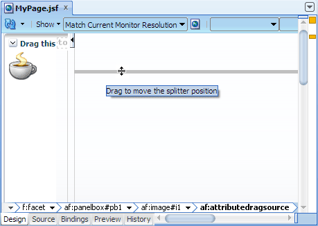
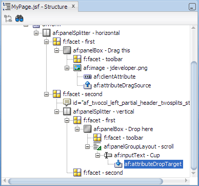
You will insert an image to be used as the UI component to drag on the page. To define a single drag object, you will add a special attribute to the image and then specify the newly added attribute as the drag source.
-
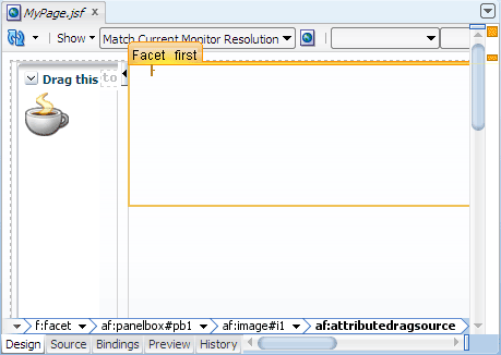
In the Component Palette, ADF Faces page, Layout panel, Interactive Containers and Headers section, drag and drop
 Panel Box
into the first facet of the horizontal panel splitter on the left side of the page.
Panel Box
into the first facet of the horizontal panel splitter on the left side of the page.
When you drag the component to the facet, you should see a target rectangle with the name Facet first on the page; this means the component you are dragging will be inserted inside that target.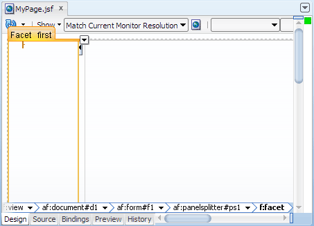
In the Property Inspector, Common section, change the Text attribute value to
Drag this.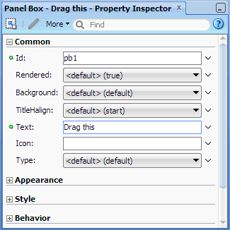
In the Component Palette, General Controls panel, drag and drop
 Image
into the panel box you just added.
Image
into the panel box you just added.-
In the Insert Image dialog, from the
 dropdown menu next
to the Source field, choose Edit.
Then use the dialog to locate and select an image file.
dropdown menu next
to the Source field, choose Edit.
Then use the dialog to locate and select an image file.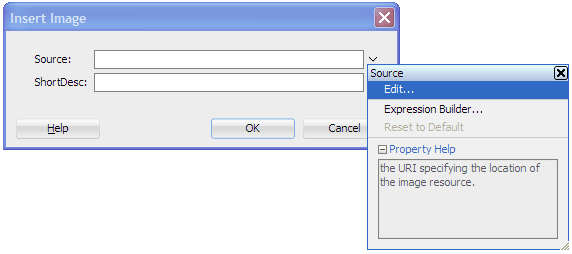
-
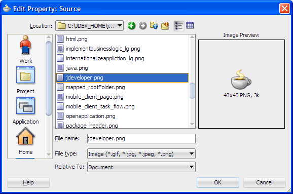
Click OK. When prompted, click Yes to add the image under the resources directory, then click Save.
You should see#{resource['images:jdeveloper.png']}in the Source field.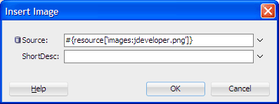
Click OK to close the Insert Image dialog.
In the Component Palette, expand the Operations panel. Drag and drop
 Client Attribute
into the image component you just added.
Client Attribute
into the image component you just added. -
In the Property Inspector for Client Attribute, enter the following values:
Field Value Name cupValue Coffee In the Component Palette, Operations panel, Drag and Drop section, drag and drop
 Attribute Drag Source
into the image component.
Attribute Drag Source
into the image component.In the Insert Attribute Drag Source dialog, enter
cupin the Attribute field or select it from the dropdown list. Then click OK.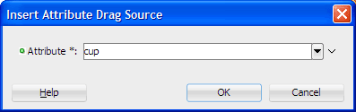
Click
Save All to save your work.
The page in the visual editor should look similar to this: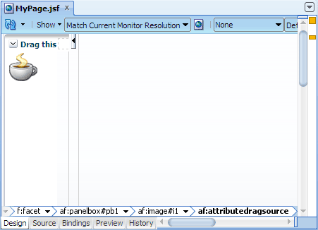
<jdev_home>/jdeveloper/ide/lib/ folder
and double-click oicons.jar to open it.
Read more...
Then navigate to oracle/javatools/icons/header and select the image file jdeveloper.png.
af:clientAttribute lets you specify the name and value of an attribute to add to a component.
Read more...
For example:
<af:image source="/jdeveloper.png">
  <af:clientAttribute name="cup" value="Coffee"/>
</af:image>value attribute would be an EL expression pointing to a bound attribute (for example, #{bindings.Departmentname.inputValue}). At runtime the EL expression will evaluate to a value.
By embedding
af:clientAttribute into a component, at runtime, the added attribute is made available both on the
client side as well as on the server side.
af:attributeDragSource tag lets you specify a component attribute to use as the drag source.
Read more...
In the example, by adding
af:clientAttribute to the image component and also using af:attributeDragSource to specify the added attribute as the
drag source, at runtime when the user drags the image, the added attribute becomes the component attribute to use as the
drag source.
<af:image source="/jdeveloper.png">
  <af:clientAttribute name="cup" value="Coffee"/>
  <af:attributeDragSource attribute="cup"/>
</af:image>af:clientAttribute. For example, the following code uses the output text component's value attribute as the drag source:
<af:outputText value="Drag me">
  <af:attributeDragSource attribute="value"/>
</af:outputText>ADF Faces provides two other tags for declaratively enabling a component as a drag source, namely,
af:componentDragSource and af:dragSource.
For details on how to use the tags, see the ADF Faces Tag Reference documentation.
Read more...
You will insert an input field to be used as the UI component to accept a dragged component. To define a single drop target object, you will specify an attribute on the input field that will be used as the target to receive a drag source.
In the visual editor, drag the horizontal splitter bar down to about half the page.
-
In the Component Palette, ADF Faces page, Layout panel, Interactive Containers and Headers section, drag and drop
Panel Box
into the first facet on the right side of the page.
In the Property Inspector, Common section, change the Text value to
Drop here.-
In the Component Palette, Layout panel, drag and drop
 Panel Group Layout
into the panel box component you just added. In the Property Inspector, Common section, change
the Layout value to scroll.
Panel Group Layout
into the panel box component you just added. In the Property Inspector, Common section, change
the Layout value to scroll. -
In the Component Palette, Text and Selection panel, drag and drop
 Input Text
into the panel group layout component you just added. In the Property Inspector, Common section,
change the Label value to
Input Text
into the panel group layout component you just added. In the Property Inspector, Common section,
change the Label value to Cup.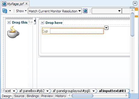
In the Component Palette, Operations panel, Drag and Drop section, drag and drop
 Attribute Drop Target
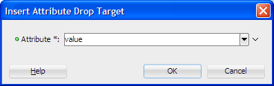
into the input text component.
Attribute Drop Target
into the input text component. In the Insert Attribute Drop Target dialog, select value from the Attribute dropdown list, and click OK.
-
In the Application Navigator, right-click MyPage.jsf and choose Run.
If the Create Default Domain dialog displays, enter the default password, for exampleweblogic1, in the Password and Confirm Password fields, then click OK.
The page in the browser should look similar to this: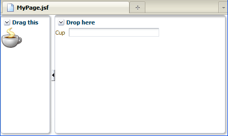
Starts Integrated WebLogic Server, if not already running.
Compiles and deploys the application to Integrated WebLogic Server.
Launches the application in your default browser using the following default address:
http://<your_machine_IP_address>:<http_port>/<your_application_name>-<your_project_name>-context-root>/faces/<path_to_the_page>-
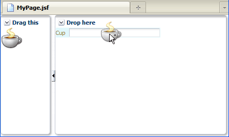
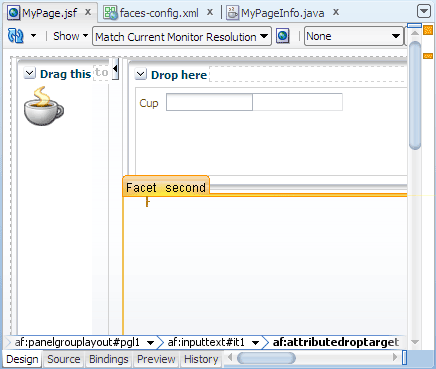
Drag the image and position it over the Cup input field.
As you position the cursor over the input field, the background color of the field changes, indicating the mouse cursor is over an acceptable area on the page where the image can be dropped.
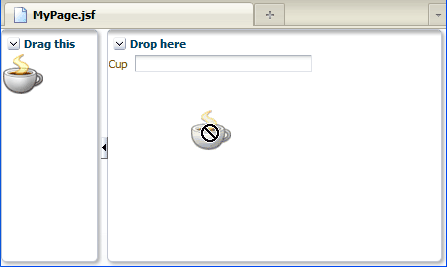
If the mouse cursor is not over an acceptable drop target, the cursor changes to a circle with a slash across it.
When you release the mouse button to drop the image on the input field, you should see the wordCoffeein the Cup input field.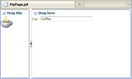
af:attributeDropTarget tag lets you specify a component attribute to be set (such as value) when a compatible
value is dragged and dropped onto the target component.
Read more...
In the Structure window, you should see the component you have defined as the drop target.
In the example, by embedding
af:attributeDropTarget within af:inputText and specifying value as the drop
target attribute, at runtime when a compatible drag source is dropped on the input text component, the input component will automatically refresh to
show the value of the source.
<af:inputText label="Cup"..>
  <af:attributeDropTarget attribute="value"/>
</af:inputText>Note: You can drag a single object and drop it to another single object only. Similarly, you can drag a collection and drop it to another collection only. You cannot drag and drop a single object to a collection, and vice versa.
ADF Faces provides three other tags for declaratively enabling a component as a drop target, namely,
af:collectionDropTarget, af:calendarDropTarget, and af:dropTarget.
For details on how to use the tags, see the ADF Faces Tag Reference documentation.
Read more...
Integrated WebLogic Server is a Java EE runtime service for packaged archive deployment. Based on zero-copy deployment, Integrated WebLogic Server lets you run and test an application and its projects as a Java EE application in a Java EE container. No special connection setup is required to use Integrated WebLogic Server. You can run the entire application, a project, or individual JSF pages.
When you run a JSF application in the IDE, JDeveloper automatically:
 Terminate in JDeveloper and choose the application bound instance DndApp
from the dropdown menu.
Terminate in JDeveloper and choose the application bound instance DndApp
from the dropdown menu.
Note: Terminating the application stops and undeploys the application from Integrated WebLogic Server but it does not terminate Integrated WebLogic Server.
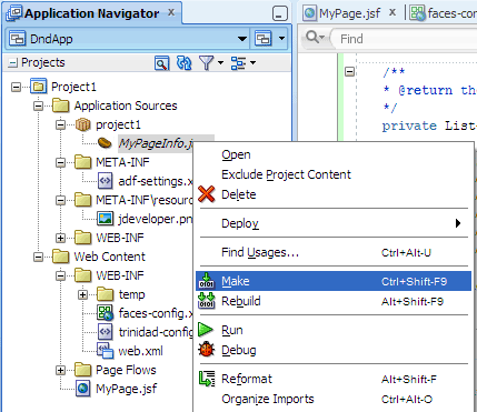
You will create a Java class and listener method for handling a drop event. The class will be registered as a managed bean using annotations.
-
In the Application Navigator, double-click faces-config.xml to open the file in the editor window.
-
Click the Overview tab at the bottom of the editor window. Then in the Managed Beans section of the overview editor, click
 to open the Create Managed Bean dialog.
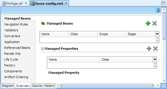
In the Create Managed Bean dialog, enter the following values or select the options, then click OK.
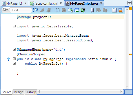
Field or Option Value Bean Name dndClass Name MyPageInfoPackage project1Extends java.lang.ObjectScope session Registration Annotations application: The bean is available for the duration of the web application. This is helpful for global beans such as LDAP directories.session: The bean is available to the client throughout the client's session.request: The bean is available from the time it is instantiated until a response is sent back to the client. This is usually the life of the current page.none: The bean is instantiated each time it is referenced. This is helpful if the bean is referenced within another bean.If necessary, in the editor window click the MyPageInfo.java tab at the top to bring the document forward.
Note the managed bean annotations JDeveloper added for you:
@ManagedBean(name="dnd")
@SessionScoped
public class MyPageInfo implements Serializable {
...
}
Java Code Insight, the Java-specific implementation of completion insight
 Code Assist to fix common problems
Import statement assistance and sorting
Automatic doc comment templates
Customizable sorting and expansion for the Structure window
Distinctive highlighting for syntax and semantic errors
Customizable code separators
In the source editor, add custom code to handle a drop event.
For example, you can add code that inserts a dropped value to a list of items in a listbox. To achieve this, first you add a property and getter method that creates a list of items for populating a select input component. Then you create aDndActionmethod that handles a drop event.
Instead of writing your own code, you can use the sample code provided. In the source editor, delete all the generated code and replace with this:In the Application Navigator, right-click MyPageInfo.java and choose Make.
You should see the messageSuccessful compilation: 0 errors, 0 warningsin the Messages Log window.
faces-config.xml.
Read more...
A managed bean is any application JavaBean that is either registered in the JSF configuration file
faces-config.xml or
has special managed bean annotations in the bean class.
Note: If you are creating an application that also uses ADF data bindings and task flows, you should add managed beans to either the
adfc-config.xml file or the task flow definition file.
In this step, you are merely using the
faces-config.xml overview editor to access the Create Managed Bean dialog and let JDeveloper create the Java class file for you.
 Read more...
Then you use the symbolic name to refer to the bean's properties and methods.
Because you are using a symbolic name rather than referring to the bean directly, the presentation is kept separate
from the application logic, which means that you can change the model without affecting the view.
Read more...
Then you use the symbolic name to refer to the bean's properties and methods.
Because you are using a symbolic name rather than referring to the bean directly, the presentation is kept separate
from the application logic, which means that you can change the model without affecting the view.
Scope: The scope of a managed bean determines the scope within which the bean is stored. The following are the valid scopes for a bean:
faces-config.xml.
When you choose to use managed bean annotations, JDeveloper adds the annotations in the JavaBean class file. For example:
@ManagedBean(name="backing_mypage")

      @RequestScoped

      public class MypageInfo {

        ...


      }
If you choose to register JavaBeans in
faces-config.xml,
JDeveloper automatically updates the faces-config.xml file for you with the necessary configuration elements.
For example:<managed-bean>
<managed-bean-name>dnd</managed-bean-name>
<managed-bean-class>MyPageInfo</managed-bean-class>
<managed-bean-scope>session</managed-bean-scope>
</managed-bean>
As you can see, using managed bean annotations reduces the size and complexity of the
faces-config.xml file, which can grow quite substantially.
When the JSF application starts up,
faces-config.xml is parsed and registered managed beans (if any) are made available. Also,
any JavaBeans marked by annotations become managed beans at runtime. Whenever a managed bean
is referenced (for example in an EL expression as a value for a component's tag attribute - called a value expression), the
Managed Bean Creation Facility instantiates the bean by calling the default constructor method on the bean. If any properties
are also declared, they are populated with the declared default values.
Read more...
import java.io.Serializable;
import javax.faces.bean.ManagedBean;
import javax.faces.bean.SessionScoped;
import java.util.ArrayList;
import java.util.List;
import javax.faces.model.SelectItem;
import oracle.adf.view.rich.datatransfer.DataFlavor;
import oracle.adf.view.rich.dnd.DnDAction;
import oracle.adf.view.rich.event.DropEvent;
@ManagedBean(name="dnd")
@SessionScoped
public class MyPageInfo implements Serializable {
public MyPageInfo() {
}
/**
* @return the beverage items
*/
private List<SelectItem> _choices;
public List<SelectItem> getChoices() {
if (_choices == null) {
_choices = new ArrayList<SelectItem>();
_choices.add(new SelectItem("Cocoa", "Cocoa"));
_choices.add(new SelectItem("Tea", "Tea"));
_choices.add(new SelectItem("Wine", "Wine"));
}
return _choices;
}
/**
* Drop event handler
*/
public DnDAction handleItemDrop(DropEvent dropEvent) {
try {
DataFlavor<String> df = DataFlavor.getDataFlavor(String.class);
String droppedValue = dropEvent.getTransferable().getData(df);
if (droppedValue == null) {
return DnDAction.NONE;
} else {
_choices.add(new SelectItem(droppedValue, droppedValue));
}
return DnDAction.COPY;
} catch (Exception ex) {
System.out.println("item drop failed with : " + ex.getMessage());
return DnDAction.NONE;
}
}
}
Read more...
The drop event listener is a method in a managed bean that contains your custom code for handling and
processing the drop event. At runtime, when a source component is dragged and dropped on the target component, the drop event
listener method is automatically invoked.
In the example, you create a drop event listener method that adds a dropped value to a list of items in a listbox. You also create a property and getter method to dynamically populate the listbox with an initial list of items.
The first method is a getter method for returning a
List of javax.faces.model.SelectItem instances. This is for
populating a listbox component, which you will add later. To write the method, first declare a property of
type List<SelectItem>, then use a set of add(new SelectItem("some value", "some label")) statements
to create the list.
The second method is a drop event listener method. A drop event listener method takes a
DropEvent event as a parameter and returns oracle.adf.view.rich.dnd.DndAction. For example:
public DnDAction handleDrop(DropEvent dropEvent) {
   // handle drop event here
}DndAction. If accepted, valid values must be one or more NMTOKENS from the set
of COPY, MOVE, LINK (in any order). If rejected, DndAction.NONE should be
returned.
In the drop method logic, retrieve the dropped value and use the dropped value as the value and label for a new select item to add to the
SelectItem list.
At runtime, when an item is dropped on the listbox, the listbox refreshes to show the new list of items.
For more details about retrieving data from a transferable object in a drop event, see the Javadoc for
oracle.adf.view.rich.event.DropEvent and oracle.adf.view.rich.datatransfer.
You will add a listbox component to serve as a new drop target on the page, then register the listener method on the target.
In the editor window, click the MyPage.jsf tab at the top to bring the page forward.
In the Component Palette, ADF Faces page, Text and Selection panel, drag and drop
 Listbox
into the second facet on the page.
Listbox
into the second facet on the page.
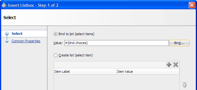
In the Insert Listbox dialog, Select page, make sure Bind to list (select items) is selected. Click Bind... next to the Value field.
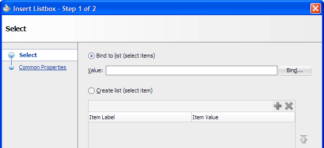
-
In the Expression Builder, expand JSF Managed Beans | dnd. Select choices to create the expression
#{dnd.choices}, then click OK.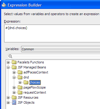
#{foo}#{foo.bar}#{foo.bar.baz}#{foo[bar]}#{foo["bar"]}#{foo[3]}#{foo[3].bar}#{foo.bar[3]}#{foo.bar == "Hello World"}#{(foo.bar) / 5 * 3}Offer Valid from #{offer.validFromDate} to {offer.validToDate}#{expression.value}#{expression[value]}Arithmetic:
+,-(binary),*,/anddiv,%andmod,-(unary)Logical:
and,&&,or,||,not,!Relational:
==,eq,!=,ne,<,lt,>,gt,<=,ge,>=,le. Comparisons can be made against other values, or against boolean, string, integer, or floating point literals.Empty: The
emptyoperator is a prefix operation that can be used to determine whether a value isnullor empty.Conditional:
A ? B : C. EvaluateBorC, depending on the result of the evaluation ofA.Then click Finish to complete inserting the listbox.
In the Property Inspector for the select one listbox component, Common section, change the Label value to
Beverage choicesand press Enter.
The page in the visual editor should now look like this: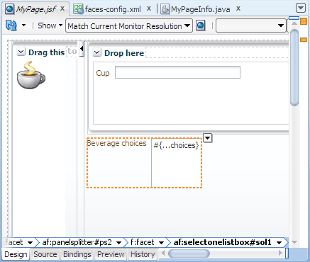
In the Component Palette, Operations panel, Drag and Drop section, drag and drop
Drop Target
into the select one listbox component on the page. In the Insert Drop Target dialog, choose Edit from the
dropdown menu next to
the DropListener field. In the Edit Property dialog, select dnd from the Managed Bean dropdown list, then select handleItemDrop from the Method dropdown list. Click OK.
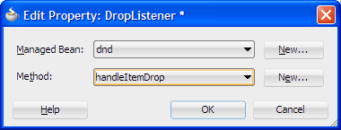
You should see#{dnd.handleItemDrop}in the DropListener field.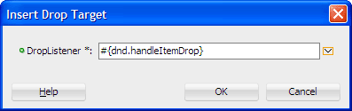
Click OK to close the Insert Drop Target dialog.
In the Insert Data Flavor dialog, enter
java.lang.Stringin the FlavorClass field, and click OK.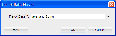
In the Application Navigator, right-click MyPage.jsf and choose Run.
The page in the browser now looks similar to this:Drag the image and drop it on the list of beverage choices.
Upon a successful drop action, the drop target rerenders by partial page rendering, thus you should see the new item Coffee appended to the list of existing beverage choices in the listbox: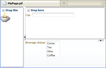
af:selectOneListbox component and use it as the drop target.
Read more...
The
af:selectOneListbox component (and other similar select input components) can
contain one f:selectItems component for representing the items in the list. For
the af:selectOneListbox component to be populated with an initial list of items at runtime, you value bind
the f:selectItems component (through its value attribute) to a getter method on a managed bean
that returns an array of javax.faces.model.SelectItem instances.
When you add the
af:selectOneListbox component, the Insert Listbox dialog displays for you to create
individual, static items for the list, or to bind to a list that is populated dynamically through a managed bean.
Since you have already created a property and a getter method in a managed bean that can populate the list dynamically, you will
choose to bind to a dynamic list.
Read more...
The unified EL continues to let page authors use EL expressions to bind UI component values and objects
to backing bean properties or reference backing bean methods from UI component tags.
Two kinds of expressions are defined in the unified EL: value expressions and method expressions. Value expressions allow both getting and setting data on external objects through bean properties, and can reference lists, maps, arrays, implicit objects, and resource bundles. Method expressions reference methods that handle component events, or validate or convert component data.
Value Expressions
The syntax for value expressions follows that same syntax used by JSP 2.0 expression language. Examples of value expressions follow:
Method expressions must use one of the following patterns:
expression can be any EL expression as described earlier for value expressions; the value must be an identifier that
matches a method name on the object in the expression.
Operators
Expression language provides the following operators, in addition to the
. and [] operators:
af:dropTarget tag with a component to
make that component eligible for accepting drops.
Read more...
The
af:dropTarget tag has a dropListener attribute, which enables you to register your custom drop
event listener method on the drop target.
af:dataFlavor tag with the af:dropTarget tag,
Read more...
and specify one or more data flavors (such as java.lang.String or java.util.Collection).
In the example you specify a data flavor of
java.lang.String because the client attribute value you are using as
the drag source is a String.
After binding, the complete code for the select one listbox component is this:
<af:selectOneListbox label="Beverage choices"..>
  <f:selectItems value="#{dnd.choices}"../>
  <af:dropTarget dropListener="#{dnd.handleItemDrop}">
    <af:dataFlavor flavorClass="java.lang.String"/>
  </af:dropTarget>
</af:selectOneListbox>- Use JDeveloper wizards and dialogs to create applications and starter pages
- Use the visual editor, Component Palette, Property Inspector, and Structure window to create UI pages
- Add a client attribute to a component
- Specify a single component attribute as a drag source or a drop target
- Create a drop event listener method to invoke custom code for handling a drop action
- Use Integrated WebLogic Server to run an ADF Faces application
 Expand all |
Hide all
Expand all |
Hide all