Working With Visualizers
The window that contains the data being printed or displayed is called a visualizer. Figure 5-3 shows a visualizer for a 3-dimensional array.
Figure 5-3 Visualizer for a 3-Dimensional Array
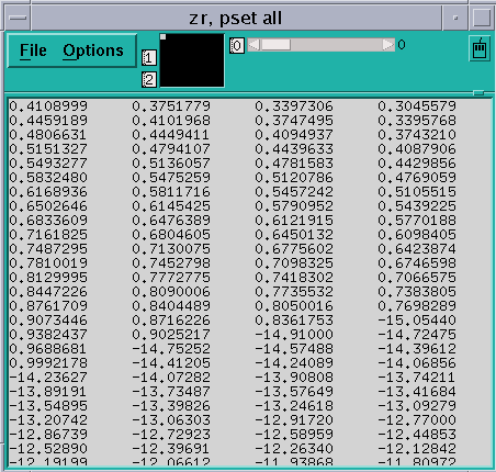
The visualizer consists of two parts: the data navigator and the display window. There are also File and Options pulldown menus.
The data navigator shows which portion of the data is being displayed, and provides a quick method for moving through the data. The appearance of the data navigator depends on the number of dimensions in the data. It is described in more detail in " Using the Display Window in a Visualizer".
The display window is the main part of the visualizer. It shows the data, using a representation that you can choose from the Options menu. The default is text: that is, the data is displayed as numbers or characters. Figure 5-3 is a text visualizer. The display window is described in more detail in " Using the Options Menu".
The File menu lets you save, update, or cancel the visualizer; see " Using the File Menu" for more information. The Options menu, among other things, lets you change the way values are represented; see Section " Using the Options Menu".
Using the Data Navigator in a Visualizer
The data navigator helps you move through the data being visualized. It has different appearances, depending on the number of dimensions in your data. If your data is a single scalar value, there is no data navigator.
For 1-dimensional arrays and parallel variables, the data navigator is the scroll bar to the right of the data. The number to the right of the buttons for the File and Options menus indicates the coordinate of the first element that is displayed. The elevator in the scroll bar indicates the position of the displayed data relative to the entire data set.
For 2-dimensional data, the data navigator is a rectangle in the shape of the data, with the axes numbered. The white box inside the rectangle indicates the position of the displayed data relative to the entire data set. You can either drag the box or click at a spot in the rectangle. The box moves to that spot, and the data displayed in the display window changes.
For 3-dimensional data, the data navigator consists of a rectangle and a slider, each of which you can operate independently. The value to the right of the slider indicates the coordinate of the third dimension. Changing the position of the bar along the slider changes which 2-dimensional plane is displayed out of the 3-dimensional data.
For data with more than three dimensions, the data navigator adds a slider for each additional dimension.
Changing the Axes
You can change the way the visualizer lays out your data by changing the numbers that label the axes. Click in the box surrounding the number; it is highlighted, and an I-beam appears. You can then type in the new number of the axis; you don't have to delete the old number. The other axis number automatically changes; for example, if you change axis 1 to 2, axis 2 automatically changes to become axis 1.
Using the Display Window in a Visualizer
The display window shows the data being visualized.
In addition to using the data navigator to move through the data, you can drag the data itself relative to the display window by holding down the left mouse button; this provides finer control over the display of the data.
To find out the coordinates and value of a specific data element, click on it while pressing the Shift key. Its coordinates are displayed in parentheses, and its value is displayed beneath them. If you have set a context for the visualizer, you also see whether the element is active or inactive (see " Using the Options Menu"). Drag the mouse with the Shift key pressed, and you see the coordinates, value, and context of each data element over which the mouse pointer passes.
You can resize the visualizer to display more (or less) data either horizontally or vertically.
Using the File Menu
Click on File to pull down the File menu.
Choose Update from this menu to update the display window for this variable, using the value(s) at the current program location. See " Updating and Closing the Visualizer" for more information on updating a visualizer.
Choose Save or Save As to save the visualizer's values to a file. See " Saving the Values of a Variable" for more information.
Choose Diff or Diff With to compare the visualizer's values with values stored in a file. See " Comparing the Data" for more information.
Choose Snapshot to create a copy of the visualizer, which you can use to compare with later updates.
Choose Close to cancel the visualizer.
Using the Options Menu
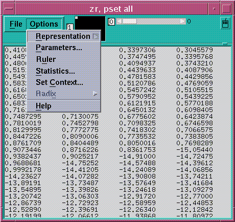
Click on Options to pull down the Options menu. See Figure 5-4.
Figure 5-4 Options Menu in a Visualizer
Choosing the Representation
Choose Representation from the Options menu to display another menu that gives the choices for how the values are represented in the display window. The choices are described below. You can control aspects of the way these visualizers appear by changing their parameters, as described later in this section.
-
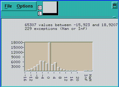
Choose Histogram to display the values of an array or parallel variable in a histogram. See Figure 5-5 for an example.
The vertical axis displays the number of data points; the horizontal axis displays the range of values. Prism divides up this range evenly in creating the histogram bars. It prints summary data above the histogram.
Shift-click on a histogram bar to display the range and number of data points it represents.
Note that the histogram represents all the values of the variable, not just those shown in the 2-dimensional slice of data that happens to be displayed in other representations.
Figure 5-5 Histogram Visualizer
-
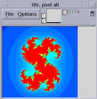
Choose Dither to display the values as a shading from black to white. Groups of values in a low range are assigned more black pixels; groups of values in a high range are assigned more white pixels. This has the effect of displaying the data in various shades of gray. Figure 5-6 shows a 2-dimensional dither visualizer. The lighter area indicates values that are higher than values in the surrounding areas; the darker area indicates values that are lower than surrounding values.
-
You can left-click on a histogram visualizer bar to get a pop-up window, showing its contents.
For complex numbers, Prism uses the modulus.
Figure 5-6 Dither Visualizer
-
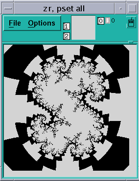
Choose Threshold to display the values as black or white. By default, Prism uses the mean of the values as the threshold; values less than or equal to the mean are black, and values greater than the mean are white. Figure 5-7 shows a threshold representation of a 3-dimensional array.
For complex numbers, Prism uses the modulus.
Figure 5-7 Threshold Visualizer
-
Choose Colormap (if you are using a color workstation) to display the values as a range of colors. By default, Prism displays the values as a continuous spectrum from blue (for the minimum value) to red (for the maximum value). You can change the colors that Prism uses; see " Changing Colors".
For complex numbers, Prism uses the modulus.
-
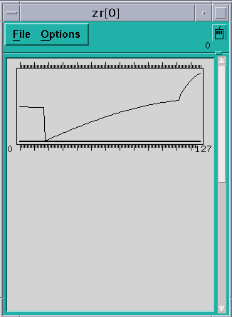
Choose Graph to display values as a graph, with the index of each array element plotted on the horizontal axis and its value on the vertical axis. A line connects the points plotted on the graph. This representation is particularly useful for 1-dimensional data, but can be used for higher-dimensional data as well; for example, in a 2-dimensional array, graphs are shown for each separate 1-dimensional slice of the 2-dimensional plane.
Figure 5-8 shows a graph visualizer for a 1-dimensional slice of an array.
Figure 5-8 1-Dimensional Graph Visualizer
-
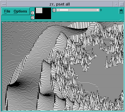
Choose Surface (if your data has more than one dimension) to render the 3-dimensional contours of a 2-dimensional slice of data. In the representation, the 2-dimensional slice of data is tilted 45 degrees away from the viewer, with the top edge further from the viewer than the bottom edge. The data values rise out of this slice. Figure 5-1 is an example.
Figure 5-9 Surface Visualizer
Note -
If there are large values in the top rows of the data, they may be drawn off the top of the screen. To see these values, flip the axes as described earlier in this section, so that the top row appears in the left column.
-
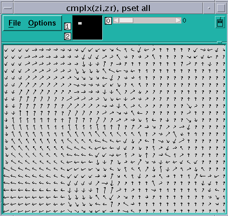
Choose Vector to display data as vectors. The data must be a Fortran complex or double complex number, or a pair of variables to which the CMPLX intrinsic function has been applied (see " Using Fortran Intrinsic Functions in Expressions"). The complex number is drawn showing both magnitude and direction. The length of the vector increases with magnitude. There is a minimum vector length of five pixels, because direction is difficult to see for smaller vectors. By default, the lengths of all vectors scale linearly with magnitude, varying between the minimum and maximum vector lengths. Figure 5-10 shows a vector visualizer.
Figure 5-10 Vector Visualizer
Setting Parameters
Choose Parameters from the Options menu to display a dialog box in which you can change various defaults that Prism uses in setting up the display window; see Figure 5-11. If a parameter is grayed out or missing, it does not apply to the current representation.
Figure 5-11 Visualization Parameters Dialog Box
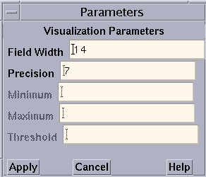
The parameters (for all representations except the histogram representation) are:
-
Field Width - Type a value in this box to change the width of the field that Prism allocates to every data element.
For the text representation, the field width specifies the number of characters in each column. If a number is too large for the field width you specify, dots are printed instead of the number.
For dither, threshold, colormap, and vector representations, the field width specifies how wide (in pixels) the representation of each data element is to be. By default, dither, threshold, and colormap visualizers are scaled to fit the display window. Note, however, that for dither visualizers, the gray shading may be more noticeable with a smaller field width.
For the graph representation, the field width specifies the horizontal spacing between elements.
For the surface representation, it specifies the spacing of elements along both directions of the plane.
-
Precision - Type a value in this box to change the precision with which Prism displays real numbers in a text visualizer. The precision must be less than the field width. By default, Prism prints doubles with 16 significant digits, and floating-point values with 7 significant digits. You can change this default by issuing the set command with the $d_precision variable (for doubles) or $f_precision variable (for floating-point values). For example,
set $d_precision = 11
sets the default precision for doubles to 11 significant digits.
-
Minimum and Maximum - For colormap representations, use these variables to specify the minimum and maximum values that Prism is to use in assigning color values to the data elements. Data elements that have values below the minimum and above the maximum are assigned default colors.
For graph, surface, and vector representations, these parameters represent the bottom and top of the range that is to be represented. Values below the minimum are shown as the minimum; values above the maximum are shown as the maximum.
By default Prism uses the entire range of values for all these representations.
-
Threshold - For threshold representations, use this variable to specify the value at which Prism is to change the display from black to white. Data elements whose values are at or below the threshold are displayed as black; data elements whose values are above the threshold are displayed as white. By default, Prism uses the mean of the data as the threshold.
The parameters for the histogram representation are:
-
Bar Width - Specifies the width in pixels of each histogram bar (except for the bars representing infinities and NaNs, which must be wide enough to fit the Inf or NaN label underneath). The default is 10 pixels.
-
Bar Height - Specifies the height in pixels of the largest histogram bar. The default is 100 pixels.
-
Minimum - Specifies the minimum value to be included in the histogram. By default the actual minimum value is used.
-
Maximum- Specifies the maximum value to be included in the histogram. By default the actual maximum value is used.
If you specify a different minimum or maximum, values below the minimum or above the maximum are not displayed in the histogram, but are counted as outliers instead; the number of outliers is displayed above the histogram.
-
Max Buckets - Specifies the number of "buckets" into which values are to be poured--in other words, the number of histogram bars to be used. The default is 30. (Prism may use fewer to make the horizontal labels come out evenly.)
Displaying a Ruler
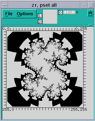
Choose Ruler from the Options menu to toggle the display of a ruler around the data in the display window. The ruler is helpful in showing which elements are being displayed. Figure 5-12 shows a 3-dimensional threshold visualizer with the ruler displayed.
In the surface representation, the ruler cannot indicate the coordinates of elements in the vertical axis, since they change depending on the height of each element. However, you can press the Shift key and left-click to display the coordinates and value of an element.
Figure 5-12 Threshold Visualizer With a Ruler
Displaying Statistics
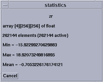
Choose Statistics from the Options menu to display a window containing statistics and other information about the variable being visualized. The window contains:
-
The name of the variable
-
Its type and number of dimensions
-
The total number of elements the variable contains, and the total number of active elements, based on the context you set within Prism (see the next section for a discussion of setting the context)
-
The variable's minimum, maximum, and mean; these statistics reflect the context you set for the visualizer
Figure 5-13 gives an example of the Statistics window.
Figure 5-13 Statistics for a Visualizer
For complex numbers, Prism uses the modulus.
Using the Set Context Dialog Box
Choose Set Context from the Options menu to display a dialog box in which you can specify which elements of the variable are to be considered active and which are to be considered inactive. Active and inactive elements are treated differently in visualizers:
-
In text, graph, surface, and vector visualizers, inactive elements are grayed out.
-
In colormap visualizers, inactive elements by default are displayed as gray. You can change this default; see " Changing Colors".
-
Context has no effect on dither and threshold visualizers.
Figure 5-14 shows the Set Context dialog box.
Figure 5-14 Set Context Dialog Box

By default, all elements of the variable are active; this is the meaning of the everywhere keyword in the text-entry box. To change this default, you can either edit the text in the text-entry box directly or click on the Where button to display a menu. The choices in the menu are everywhere and other:
-
Choose everywhere, as mentioned above, to make all elements active.
-
Choose other to erase the current contents of the text-entry box. You can then enter an expression into the text-entry box.
In the text-entry box, you can enter any valid expression that will evaluate to true or false for each element of the variable.
The context you specify for printing does not affect the program's context; it just affects the way the elements of the variable are displayed in the visualizer.
See "Setting the Context" above for more information on context. See " Writing Expressions in Prism" for more information on writing expressions in Prism.
Click on Apply to set the context you specified. Click on Cancel or press the Esc key to close the dialog box without setting the context.
Changing the Radix
Choose Radix from the Options menu to change the radix used in the text representation of a value.
Choosing Radix pulls down a submenu with four selections: Decimal, Hex, Octal, and Binary. Choosing one of these changes the value to the specified radix. Prism continues to use this radix if the visualizer is updated.
By default, Prism displays values in decimal. You can change this default via the set $radix command; see " Changing the Default Radix". You can also override it for a specific print or display command; see " Printing and Displaying From the Command Window".
Updating and Closing the Visualizer
If you created a visualizer by issuing a display command, it automatically updates every time the program stops execution.
If you created the visualizer by issuing a print command, its display window is grayed out when the program resumes execution and the values in the window are outdated. To update the values, choose Update from the visualizer's File menu.
To close the visualizer, choose Close from the File menu, or press the Esc key.
- © 2010, Oracle Corporation and/or its affiliates
