Color Usage in Icons
When designing icons for a desktop application, you must be aware of the available color palette and the dynamic mapping of colors.
Icon Color Palette
The icons in the desktop use a palette of 22 colors:
-
Eight static grays
-
Eight static colors: white, black, red, blue, green, cyan, magenta, and yellow
-
Five dynamic colors: Foreground, Background, TopShadow, BottomShadow, and Select
-
A transparent "color" which allows the background to show through
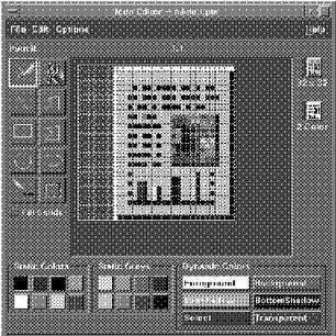
These colors are the default colors in the Icon Editor, which is the recommended tool for creating desktop icons (see Figure 4-7). This set of colors provides a reasonable palette with which to create icons. This limited palette was chosen to maximize the attractiveness and readability of icons without using an unnecessary number of colors.
If you use colors other than the ones listed here, then your icons may experience color flashing effects that can make the icon unreadable. The best way to ensure predictability of appearance of your icons is to use only the 22 colors in the desktop palette.
|
Recommended |
ez: |
Icons should use only the palette of 22 colors. |
Figure 4-7 Icon Editor, showing the 22 Common Desktop Environment colors available for icons

Dynamic Colors
It is important to understand the limited role of the dynamic colors. These represent the colors used to display the user interface elements on which your icon appears. If your icon appears in File Manager, File Manager determines what the background color is. If the user changes the color palette in Style Manager, the colors in the user interface change to match, and the background color the icons are displayed on changes.
In general, these colors have little use in most icons. There are two ways they are used:
-
If your icon does not fill the entire bounding box, then fill the unused area with the transparent color.
-
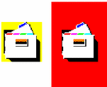
You can draw a shadow under your icon. This is only recommended for Front-Panel-style icons. Do not use this for File Manager icons. See "Optional Front Panel Icon Style" for more detail.
Figure 4-8 Example of dynamic color shadows

- © 2010, Oracle Corporation and/or its affiliates
