Chapter 15 Icon Editor
The Icon Editor allows you to create your own black-and-white or color icon images. You can display your icon images in the File Manager by binding them to applications and data files using the Binder. Programmers can use the Icon Editor to create application cursors, glyphs, and icons, and save them in a format for inclusion into a C program.
To open Icon Editor, choose Workspace -> Programs -> Icon Editor.
Icon Editor Icon and Base Window
The Icon Editor icon is shown in Figure 15-1.
Figure 15-1 The Icon Editor Icon
When you start the Icon Editor, the base window is displayed, as shown in Figure 15-2.
Figure 15-2 Icon Editor Base Window
The Icon Editor controls are described in the following sections.
Icon Editor Drawing Controls
The controls that you use to draw an image in the canvas appear to the left of the preview area, and are shown in Figure 15-3.
Figure 15-3 Icon Editor Drawing Controls
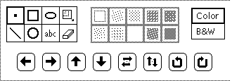
This section describes the Icon Editor drawing control menus and buttons.
Drawing Mode Choices
To draw an icon, choose a drawing mode from the choices in Figure 15-4.
Figure 15-4 Drawing Mode Choices
The Mode choice items function as follows:
-
Choose Point to insert one black pixel at a time in the canvas. To draw a point, move the pointer to the desired position in the canvas and click SELECT. You can continuously hold down SELECT and move the pointer to create a freehand drawing. When you lift your finger from the mouse button, you end one drawing segment. When you continue this process, you begin a new drawing segment. Undo here only removes the last drawing segment. You can also point to a black or color pixel and click ADJUST to turn the pixel from black to white.
-
Choose Line to draw a line that is 1-pixel wide. To draw a line, position the pointer at one end of the line, press SELECT, drag the pointer to the other end of the line, and release SELECT.
-
Choose Square to draw open or filled squares or rectangles using any of the fill patterns described in the section "Fill Choices". (The fill patterns are active only when the Draw option is a fillable shape, such as a square, circle, or ellipse.) Position the pointer at one corner of the square, press SELECT, drag the pointer to the opposite corner of the square or rectangle, and release SELECT.
-
Choose Circle to draw open or filled circles using any of the fill patterns. Position the pointer at the center of the circle and press SELECT, drag the pointer to any point to the outside radius of the circle, and release SELECT.
-
Choose Ellipse to draw open or filled ellipses. Position the pointer at the center of the ellipse and press SELECT, drag the pointer to the outside radius of the ellipse, and release SELECT. If you define a horizontal or vertical line, the ellipse is interpreted as a straight line.
-
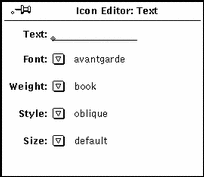
Choosing Text (abc) displays a pop-up window, shown in Figure 15-5, that allows you to type text that is associated with the icon.
Figure 15-5 Text Pop-up Window
Adding Text to the Canvas
To add text to the canvas, follow these steps:
-
Click SELECT on the Text drawing mode option.
This displays the Text pop-up window.
-
Choose the font you want to use from the Font menu.
-
Choose the text weight, style, and size from the relevant menus.
The items on the Weight, Style, and Size menus depend on the font that you have chosen. For example, some fonts may have many available choices for size, while others only have one default choice.
-
Type the text you want in the Text field.
-
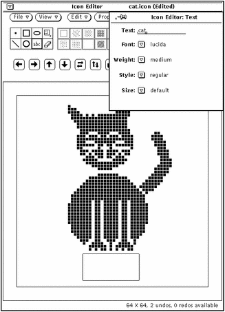
When you have typed the text in the text field, insert it in the icon by moving the pointer onto the desired spot on the canvas and pressing SELECT.
A rectangle is displayed that shows you the size of the text to be inserted, as shown in the example in Figure 15-6. You can move the rectangle anywhere within the canvas to position it as long as you continue to press SELECT.
Figure 15-6 Adding Text to Your Icon
-
Drag the pointer to position the rectangle, and when it is positioned correctly, release SELECT.
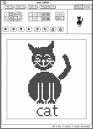
The text is added to the canvas, as shown in the example in Figure 15-7.
Figure 15-7 Text Added to an Icon
Once you have added text to the canvas, you can edit it as you would any other part of the image:
-
Choose Region (the rectangle within a rectangle) to define a rectangular region on the canvas and move, flip, or rotate it by clicking SELECT on any of the Move buttons.
-
Choose Erase to erase any pixels on the canvas by moving the cursor onto the canvas, clicking SELECT, and dragging the eraser cursor over the areas you want to erase. Only the pixel under the front tip of the eraser is actually erased.
-
Editing Images
At any time, you can:
Undo the last change or addition you made by choosing Edit -> Undo from the control area.
The remaining editing commands in the Edit menu behave the same as those in a Text Editor window.
Cutting a Portion of an Image
To cut a portion of the drawing, create a rectangular outline around the area to be cut. To do this:
-
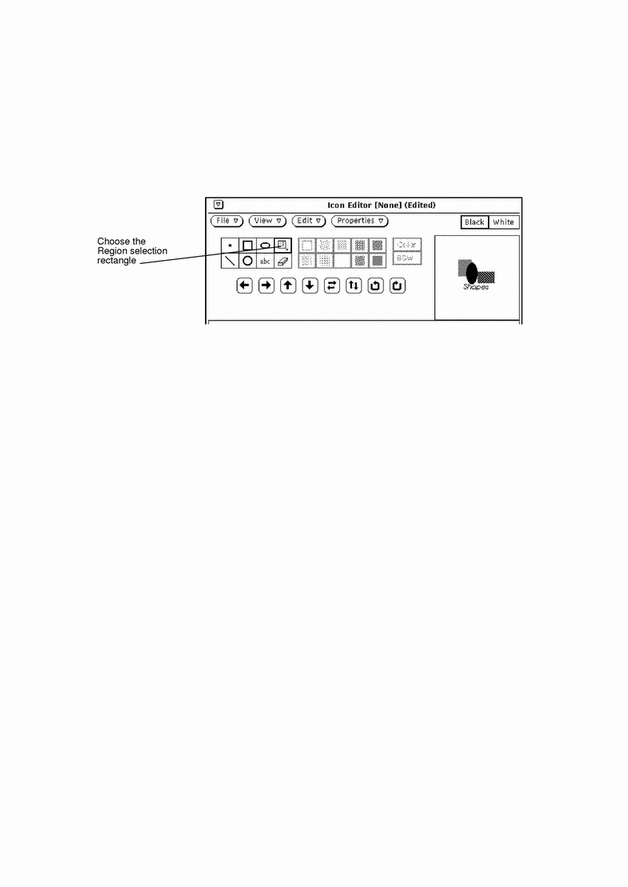
Click SELECT on the rectangular icon next to the oval in the control area.
This enables you to define a region to cut.
Figure 15-8 Region Selection Rectangle
-
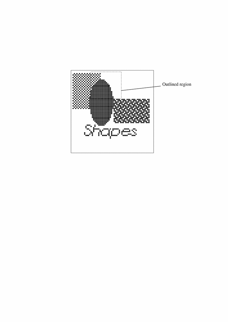
Position the pointer on the canvas window at one corner of the portion to cut, press SELECT and drag the pointer diagonally to the opposite corner, then release the mouse button.
Figure 15-9 shows how the area to be cut is surrounded by a rectangular region.
Figure 15-9 Selecting a Portion of an Icon Image to Cut
-
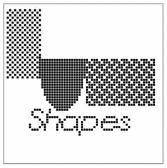
Choose Edit -> Cut.
This cuts the outlined portion of the image and places it in a system clipboard. You can then paste it elsewhere, if needed. Figure 15-10 shows the icon image with the portion cut away.
Figure 15-10 Icon Image with a Portion Cut Away
Erase
The small rectangular object next to the abc button on the Icon Editor control area is an eraser. The icon for the eraser is shown in Figure 15-11.
Figure 15-11 Icon for the Eraser
To erase a portion of an image:
-
Click SELECT on the eraser icon.
-
Move the pointer to the area in the canvas window that you want to erase.
-
Press SELECT and drag the pointer over the area you want to erase.
If you lift your finger from the mouse button frequently to end the current input segment, you can undo the last segment at any time without losing all of the changes you've made. You can undo the last input (erase) you made at any time by choosing Undo from the Edit menu, or from the pop-up menu in the Icon Editor window pane (canvas).
Fill Choices
The Fill choices, shown in Figure 15-12, allow you to choose an outline or one of 10 fill patterns for drawing squares, circles, or ellipses. This menu is only active when the current mode is a fillable shape (square, circle, or ellipse).
Figure 15-12 The Icon Editor Fill Choices

The first fill choice, an open square, draws an outline of the chosen shape, using a 1-pixel wide black pattern. The other fill choices represent patterns, from white to black, that you can use to fill the square, circle, or ellipse modes.
Icon Editor Color Controls
You can create color or black-and-white icons by choosing Color or B&W, as shown in Figure 15-13. Color is not available if your workstation is black-and-white.
Figure 15-13 Icon Editor Color Choice

When the Color choice is selected, you can draw using black, white, or any of the colors provided on the Color Chooser window. You display the Color Chooser with the Palette button on the Icon Editor header. When you select a color from the Color Chooser, the cursor changes to that color as a reminder of your current color choice. See the section "Icon Editor Color Chooser Palette" for information about using color.
When the B&W choice is selected, only the colors black-and-white are available. The Palette button on the Icon Editor header changes to a Black or White choice setting. When Black is selected, your icon is drawn with a black pen. When White is selected, your icon is drawn with a white pen.
If the icon you are creating is currently in color when you select B&W, the icon becomes black-and-white.
If you change your icon from color to black-and-white, the colors will not be restored when you switch back to color. If you inadvertently switch from color to black-and-white, use the Undo item on the Edit menu to restore the color.
Move Buttons
Use the move buttons (the arrows shown in Figure 15-14) to adjust the position of the drawing on the canvas, or to move a region within the canvas. To move a selected region, click SELECT on one of the left, right, up, or down arrow buttons to move the region one pixel in the designated direction. If no region is selected, the entire drawing is moved.
Figure 15-14 Icon Editor Move Buttons
Note -
If you move or rotate part of the image off the canvas, the pixels are cropped from the image and are not restored when you move the image in the opposite direction. Use the Undo item on the Edit menu to restore the image.
To move a region:
-
Choose Region from the Mode choices.
Region is the last item on the top row of the Mode choices.
-
Move the pointer to the corner of the region you want to move and press SELECT.
-
Drag the pointer to define the region and release SELECT.
-
Click SELECT on one of the arrow buttons to move the region one pixel in the designated direction.
You can repeat this operation as often as you like.
The fifth and sixth buttons shown in Figure 15-14 flip the selected region from left to right or top to bottom. If no region is selected, the entire image on the canvas is flipped. The right two buttons shown in Figure 15-14 rotate the region or the image 90 degrees in the direction of the arrow.
Filing Options
You use the File menu to load, save, and print icons.
Loading and Saving a File
For information on loading and saving files, refer to Chapter 1, Introduction to the Solaris User Environment.
Saving a New Icon
If you have drawn a new icon image, you can save it to a new file as follows:
-
Choose File Save As.
You see the Save As window.
-
Save the file.
For complete information on saving a file, refer to Chapter 1, Introduction to the Solaris User Environment.
Saving a Modified Icon
If you have modified an existing icon image, you can save it to a new file, which preserves the original image, or save it to the same file. For complete information on saving files, refer to Chapter 1, Introduction to the Solaris User Environment.
The formats available for saving an icon are the following:
-
If your icon is in color, it will be saved as a color X pixmap image. This type of icon might be used for some XView applications.
-
If your icon is black-and-white, you can use the Save menu to choose among saving the icon as a regular Xview icon, as an X bitmap, or as a Monochrome X pixmap image. Save the icon as an Xview icon if you want to display your icon in the File Manager by binding it to an application or data file using the Binder. See Chapter 16, Binder for more information. Save the icon as an X bitmap if you want to include it in a C program.
If a file of the same name already exists, a Notice is displayed asking you whether you want to overwrite the existing file or cancel the operation.
Clearing the Canvas
To clear the canvas for another drawing, choose Edit Clear.
Printing an Icon
Use the Print window, shown in Figure 15-15, to print icon files. This window displays when you choose Print from the File menu.
Figure 15-15 Icon Editor Print Pop-up Window
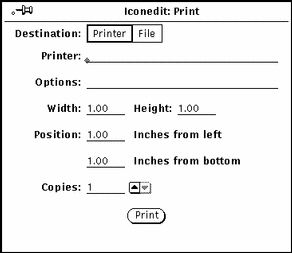
You can specify the following options from the Icon Editor Print window:
-
Destination of the printed output (Printer or File)
-
Printer name and printer options, or file destination and file name
If the Destination is Printer, as in Figure 15-15, a field called Options is displayed. You can type in UNIX commands in this field to customize your printer option defaults.
-
Width and height of the printed image
-
Left and bottom margins of the printed image
-
Number of copies to print
When you've chosen your Printer Settings, click SELECT on the Print button to print the icon.
View Menu
The View menu provides the option to display a Grid on the canvas.
Grid Display
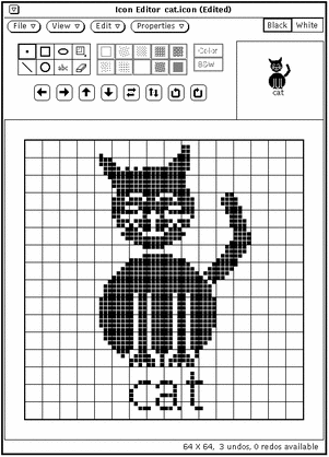
Choose Grid On (or just click SELECT on the View button) to display a 4-pixel grid for the canvas. The grid is useful for aligning and centering all or parts of the icon.
When the grid is turned on, the View menu item changes to Grid Off. Therefore, you can toggle the grid on and off by clicking SELECT on the View button.
Figure 15-16 shows an example with the grid turned on.
Figure 15-16 Grid Turned On
Edit Menu
The Edit menu provides standard editing options, as described in the following sections. The items on the Edit menu are also available on the pop-up menu in the Icon Editor canvas pane.
Undo and Redo
You can undo up to seven of your last actions by choosing Undo from the Edit menu. After choosing Undo, you can then choose Redo to repeat the original action, which restores the canvas to its condition before you chose Undo. You never need to worry about what an action will do to your icon because of this feature. If you don't like the results, simply use Undo and Redo to restore the icon to the way you like it best.
Each time you Undo an action, that action becomes available to you as a Redo action (up to a maximum of seven actions). Each Redo performs the most recent Undo action. The number of Undo actions and Redo actions that are available to you at any time is displayed in the Icon Editor footer.
Clear
You can clear the canvas by choosing Clear from the Edit menu. No warning notice is displayed. If you change your mind, choose Undo from the Edit menu.
Cut, Copy, and Paste
You can use the Cut, Copy, and Paste items to move and copy regions of your icon, or the entire icon.
When you choose Cut on the Edit menu, the current region is removed from the icon and put on the clipboard. If you don't have a region currently defined, the entire icon is deleted and put on the clipboard.
To define a region, choose the Region drawing mode, move the pointer to the canvas where you want to start the region, press SELECT, drag the pointer to the opposite corner of the desired region, and release SELECT. The region is displayed by a dashed-line border. The lines of the border appear to be blinking, like the lighted sign of a theater marquee.
When you choose Copy on the Edit menu, the current region is copied to the clipboard but is not removed from the icon. If you don't have a region currently defined, the entire icon is copied to the clipboard.
Before choosing Paste on the Edit menu, define the region where you want to paste the contents of the clipboard. When you choose Paste on the Edit menu, the contents of the clipboard are copied to the icon, placed so that the upper left corner of the clipboard contents matches the upper left corner of the current region.
If you choose Paste from the keyboard (depending on your keyboard type), the contents of the clipboard are placed so that the upper left corner of the image goes to the position of the mouse.
Invert
Choose the Invert item on the Edit menu when you have a black-and-white icon to change black pixels to white, and vice-versa, in your current region. If you do not have a region selected, Invert works on the entire icon. If your icon is color, the Invert item is dimmed and unavailable.
Properties Menu
The Properties menu provides options to change the icon format and size.
Icon Format
Use the Format item to specify the default format for the icon to be saved in. After you select a format, that format will be used when you choose Save on the File menu. That format also becomes the default item of the Save menu on the File pop-up window. See "Loading and Saving a File" for more information.
The following icon formats are available:
-
If your icon is in color, it can be saved as a color X pixmap image. This type of icon might be used for some XView applications.
-
If your icon is black-and-white, it can be saved as a regular Xview icon, as an X bitmap, or as a Monochrome X pixmap image. Save the icon as an Xview icon if you want to display your icon in the File Manager by binding it to an application or data file using the Binder. See Chapter 16, Binder for more information. Save the icon as an X bitmap if you want to include it in a C program. A monochrome X pixmap image might be used for some XView applications.
Icon Size
The Size item provides five standard icon image sizes:
-
16 by 16 pixels (typical cursor size)
-
32 by 32 pixels (the required size for File Manager data file icons)
-
48 by 48 pixels
-
64 by 64 pixels (typical application icon size)
-
128 by 128 pixels
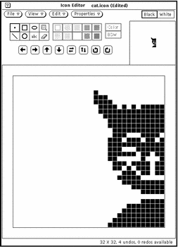
If you change the size of the canvas when an icon file is loaded, the file is read from the upper left corner. Larger images are cropped to fit the existing size of the canvas. In the example shown in Figure 15-17, the canvas with the cat.icon file has been resized to 32 by 32 (XView format) pixels.
Figure 15-17 Changing the Size of an Existing Icon
Icon Editor Color Chooser Palette
You can create a multi color icon if you have a color workstation. You can save the color icon as a color X Pixmap file to be used with your own X applications. If you are using the Icon Editor to create new icons for File Manager, you should create black-and-white icons. You can use the Binder to specify foreground and background colors for your File Manager icons.
If you want to create a color icon, select the Color choice in the Icon Editor drawing controls area, as described in the section "Icon Editor Color Controls". When you are creating a color icon, the rightmost button in the Icon Editor header is labeled Palette. (When you are creating a black-and-white icon, this button is replaced with a Black or White choice setting.) Click SELECT on the Palette button to display the Color Chooser, shown in Figure 15-18, which you can use to specify the color to draw with.
Figure 15-18 Color Chooser for Icon Editor
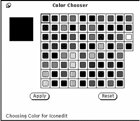
The current color that the Icon Editor will use for drawing is displayed in the upper left corner of the palette shown in Figure 15-18.
To use any of the colors displayed in the Color Chooser palette for the Icon Editor:
-
Click SELECT on the desired color in the Color Chooser palette.
The selected color is highlighted and displayed in the Color Chooser preview area. The preview area is the large square at the left of the palette.
-
Click SELECT on the Apply button to record the color change.
-
Move the pointer back to the Icon Editor to draw your icon with the chosen color.
The color of the pointer changes to the selected color you are drawing with.
- © 2010, Oracle Corporation and/or its affiliates
