The UISelectItem, UISelectItems, and UISelectItemGroup Components
UISelectItem and UISelectItems represent components that can be nested inside a UISelectOne or a UISelectMany component. UISelectItem is associated with a SelectItem instance, which contains the value, label, and description of a single item in the UISelectOne or UISelectMany component.
The UISelectItems instance represents either of the following:
-
A set of SelectItem instances, containing the values, labels, and descriptions of the entire list of items
-
A set of SelectItemGroup instances, each of which represents a set of SelectItem instances
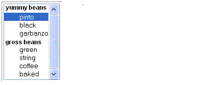
Figure 11–6 shows an example of a list box constructed with a SelectItems component representing two SelectItemGroup instances, each of which represents two categories of beans. Each category is an array of SelectItem instances.
Figure 11–6 An Example List Box Created Using SelectItemGroup Instances

The selectItem tag represents a UISelectItem component. The selectItems tag represents a UISelectItems component. You can use either a set of selectItem tags or a single selectItems tag within your selectOne or selectMany tag.
The advantages of using the selectItems tag are as follows:
-
You can represent the items using different data structures, including Array, Map and Collection. The data structure is composed of SelectItem instances or SelectItemGroup instances.
-
You can concatenate different lists together into a single UISelectMany or UISelectOne component and group the lists within the component, as shown in Figure 11–6.
-
You can dynamically generate values at runtime.
The advantages of using selectItem are as follows:
-
The page author can define the items in the list from the page.
-
You have less code to write in the bean for the selectItem properties.
For more information on writing component properties for the UISelectItems components, see Writing Bean Properties. The rest of this section shows you how to use the selectItems and selectItem tags.
Using the selectItems Tag
Here is the selectManyCheckbox tag from the section Rendering Components for Selecting Multiple Values:
<h:selectManyCheckbox
    id="newsletters"
    layout="pageDirection"
    value="#{cashier.newsletters}">
    <f:selectItems
        value="#{newsletters}"/>
</h:selectManyCheckbox>
The value attribute of the selectItems tag is bound to the newsletters managed bean, which is configured in the application configuration resource file. The newsletters managed bean is configured as a list:
<managed-bean>
    <managed-bean-name>newsletters</managed-bean-name>
    <managed-bean-class>
        java.util.ArrayList</managed-bean-class>
    <managed-bean-scope>application</managed-bean-scope>
    <list-entries>
        <value-class>javax.faces.model.SelectItem</value-class>
        <value>#{newsletter0}</value>
        <value>#{newsletter1}</value>
        <value>#{newsletter2}</value>
        <value>#{newsletter3}</value>
    </list-entries>
</managed-bean>
<managed-bean>
<managed-bean-name>newsletter0</managed-bean-name>
<managed-bean-class>
    javax.faces.model.SelectItem</managed-bean-class>
<managed-bean-scope>none</managed-bean-scope>
<managed-property>
    <property-name>label</property-name>
    <value>Duke’s Quarterly</value>
</managed-property>
<managed-property>
    <property-name>value</property-name>
    <value>200</value>
</managed-property>
</managed-bean>
...
As shown in the managed-bean element, the UISelectItems component is a collection of SelectItem instances. See Initializing Array and List Properties for more information on configuring collections as beans.
You can also create the list corresponding to a UISelectMany or UISelectOne component programmatically in the backing bean. See Writing Bean Properties for information on how to write a backing bean property corresponding to a UISelectMany or UISelectOne component.
The arguments to the SelectItem constructor are:
-
An Object representing the value of the item
-
A String representing the label that displays in the UISelectMany component on the page
-
A String representing the description of the item
UISelectItems Properties describes in more detail how to write a backing bean property for a UISelectItems component.
Using the selectItem Tag
The selectItem tag represents a single item in a list of items. Here is the example from Displaying a Menu Using the selectOneMenu Tag:
<h:selectOneMenu
       id="shippingOption" required="true"
     value="#{cashier.shippingOption}">
    <f:selectItem
        itemValue="2"
        itemLabel="#{bundle.QuickShip}"/>
    <f:selectItem
        itemValue="5"
        itemLabel="#{bundle.NormalShip}"/>
    <f:selectItem
        itemValue="7"
        itemLabel="#{bundle.SaverShip}"/>
 </h:selectOneMenu>
The itemValue attribute represents the default value of the SelectItem instance. The itemLabel attribute represents the String that appears in the drop-down menu component on the page.
The itemValue and itemLabel attributes are value-binding-enabled, meaning that they can use value-binding expressions to refer to values in external objects. They can also define literal values, as shown in the example selectOneMenu tag.
- © 2010, Oracle Corporation and/or its affiliates
