Using Data-Bound Table Components
Data-bound table components display relational data in a tabular format. In a JavaServer Faces application, the h:dataTable component tag supports binding to a collection of data objects and displays the data as an HTML table. The h:column tag represents a column of data within the table, iterating over each record in the data source, which is displayed as a row. Here is an example:
<h:dataTable id="items"
    captionClass="list-caption"
    columnClasses="list-column-center, list-column-left,
         list-column-right, list-column-center"
    footerClass="list-footer"
    headerClass="list-header"
    rowClasses="list-row-even, list-row-odd"
    styleClass="list-background">
    <h:column headerClass="list-header-left">
        <f:facet name="header">
            <h:outputText value=Quantity"" />
        </f:facet>
        <h:inputText id="quantity" size="4"
            value="#{item.quantity}" >
            ...
        </h:inputText>
        ...
    </h:column>
    <h:column>
        <f:facet name="header">
            <h:outputText value="Title"/>
        </f:facet>
        <h:commandLink>
            <h:outputText value="#{item.title}"/>
        </h:commandLink>
    </h:column>
    ...
    <f:facet name="footer"
        <h:panelGroup>
            <h:outputText value="Total}"/>
            <h:outputText value="#{cart.total}" />
                <f:convertNumber type="currency" />
            </h:outputText>
        </h:panelGroup>
    </f:facet>
</h:dataTable>
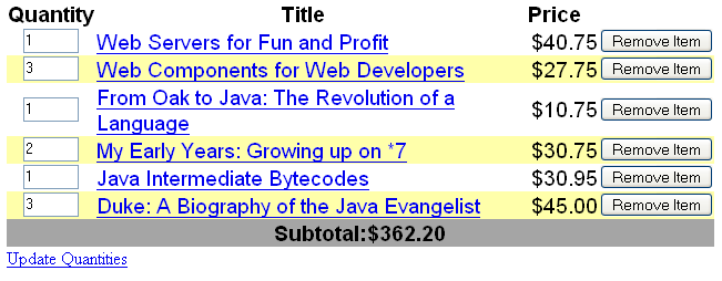
Figure 7–5 shows a data grid that this h:dataTable tag can display.
Figure 7–5 Table on a Web Page

The example h:dataTable tag displays the books in the shopping cart, as well as the quantity of each book in the shopping cart, the prices, and a set of buttons the user can click to remove books from the shopping cart.
The h:column tags represent columns of data in a data component. While the data component is iterating over the rows of data, it processes the column component associated with each h:column tag for each row in the table.
The h:dataTable tag shown in the preceding code example iterates through the list of books (cart.items) in the shopping cart and displays their titles, authors, and prices. Each time the h:dataTable tag iterates through the list of books, it renders one cell in each column.
The h:dataTable and h:column tags use facets to represent parts of the table that are not repeated or updated. These parts include headers, footers, and captions.
In the preceding example, h:column tags include f:facet tags for representing column headers or footers. The h:column tag allows you to control the styles of these headers and footers by supporting the headerClass and footerClass attributes. These attributes accept space-separated lists of CSS classes, which will be applied to the header and footer cells of the corresponding column in the rendered table.
Facets can have only one child, so an h:panelGroup tag is needed if you want to group more than one component within an f:facet. Because the facet tag representing the footer includes more than one tag, the panelGroup is needed to group those tags. Finally, this h:dataTable tag includes an f:facet tag with its name attribute set to caption, causing a table caption to be rendered below the table.
This table is a classic use case for a data component because the number of books might not be known to the application developer or the page author when that application is developed. The data component can dynamically adjust the number of rows of the table to accommodate the underlying data.
The value attribute of an h:dataTable tag references the data to be included in the table. This data can take the form of any of the following:
-
A list of beans
-
An array of beans
-
A single bean
-
A javax.faces.model.DataModel object
-
A java.sql.ResultSet object
-
A javax.servlet.jsp.jstl.sql.Result object
-
A javax.sql.RowSet object
All data sources for data components have a DataModel wrapper. Unless you explicitly construct a DataModel wrapper, the JavaServer Faces implementation will create one around data of any of the other acceptable types. See Writing Bean Properties for more information on how to write properties for use with a data component.
The var attribute specifies a name that is used by the components within the h:dataTable tag as an alias to the data referenced in the value attribute of dataTable.
In the example h:dataTable tag, the value attribute points to a list of books. The var attribute points to a single book in that list. As the h:dataTable tag iterates through the list, each reference to item points to the current book in the list.
The h:dataTable tag also has the ability to display only a subset of the underlying data. This feature is not shown in the preceding example. To display a subset of the data, you use the optional first and rows attributes.
The first attribute specifies the first row to be displayed. The rows attribute specifies the number of rows, starting with the first row, to be displayed. For example, if you wanted to display records 2 through 10 of the underlying data, you would set first to 2 and rows to 9. When you display a subset of the data in your pages, you might want to consider including a link or button that causes subsequent rows to display when clicked. By default, both first and rows are set to zero, and this causes all the rows of the underlying data to display.
Table 7–7 shows the optional attributes for the h:dataTable tag.
Table 7–7 Optional Attributes for the h:dataTable Tag|
Attribute |
Defines Styles for |
|---|---|
|
captionClass |
Table caption |
|
columnClasses |
All the columns |
|
footerClass |
Footer |
|
headerClass |
Header |
|
rowClasses |
Rows |
|
styleClass |
The entire table |
Each of the attributes in Table 7–7 can specify more than one style. If columnClasses or rowClasses specifies more than one style, the styles are applied to the columns or rows in the order that the styles are listed in the attribute. For example, if columnClasses specifies styles list-column-center and list-column-right and if the table has two columns, the first column will have style list-column-center, and the second column will have style list-column-right.
If the style attribute specifies more styles than there are columns or rows, the remaining styles will be assigned to columns or rows starting from the first column or row. Similarly, if the style attribute specifies fewer styles than there are columns or rows, the remaining columns or rows will be assigned styles starting from the first style.
- © 2010, Oracle Corporation and/or its affiliates
