

|
| |
| Sun Java System Identity Manager 6.0 Workflows, Forms, and Views 2005Q4M3 | |
3
Identity Manager Forms
This chapter describes how you can customize the appearance and behavior of selected pages in Sun Java™ System Identity Manager Administrator and User Interfaces by customizing the forms that define these pages.
Topics in this Chapter
This chapter is organized into the following sections:
- Understanding Forms – Introduces basic form concepts and describes how forms are integrated into the Identity Manager system.
- Customizing Forms – Describes form programming syntax and logical guidelines to use when working with forms and provides examples of different form elements. Also describes how to use the Business Process Editor (BPE), a standalone graphical tool, to edit forms.
- Testing Your Customized Form – Provides techniques to use when verifying your form syntax and tracing field logic in your custom forms.
Related Chapters
See these related chapters:
- Views – Identity Manager forms interact with an internal Identity Manager data structure called the user view. When customizing a form, you can call view attributes.
- HTML Display Components – You use the HTML component language to create field definitions when editing a form.
- XPRESS Language – You use expressions to include logic in your forms.
- Introduction to the Business Process Editor in Identity Manager Deployment Tools– Introduces the Business Process Editor (BPE) and describes how to start the tool, set editor options, save, and debug forms.
Understanding FormsTo customize Identity Manager’s Web-based user interface appearance and function, you must modify the form associated with the web page you want to edit.
The term form can describe both the web page where users enter information and the object that contains rules about how to display data in the view. Throughout this guide, the term form typically refers to the object that contains rules about how to display data in the view.
This section covers the following topics:
What Are Forms?
A form is an object associated with a page that contains rules about how the browser should display user view attributes on that page. Forms can incorporate business logic and are often used to manipulate view data before it is presented to the user.
For example, to create a new user account, you use the Create User page, in which you enter information about the new user. This page is generated using an object (a form) in the Identity Manager repository named Tabbed User Form. This form specifies which fields are visible on the Create User page and which HTML form element (for example, text box, check box, or select box) is used to represent each field. This form also specifies additional logic for disabling fields, populating empty fields with default values, and calculating field values from the values of other fields.
What Forms Control
Forms control:
- Layout and display characteristics of the page
Forms are composed of fields. Visible field types include simple text boxes, radio buttons, and selection boxes with multiple values. Fields can also have values based on other fields and can be either read-only or be hidden from view.
- Data that is used on the page
Data can be captured dynamically from a resource or be calculated from other fields. With the Identity Manager expression language called XPRESS, field data can be calculated, concatenated, and logically evaluated.
- Data that is coming into the system
Forms can be the interface from web pages as well as from noninteractive systems such as ActiveSync resources. In this role, the form has no visual fields, but still provides rules to set default values and other field values.
For example, the Full Name field might not be visible to the administrator using the page, but can be set based on the values that the user enters into the First Name, Middle Name, and Last Name fields. Populating fields from other fields reduces the data entry that users and administrators must perform, consequently reducing potential data entry errors. Likewise, by providing option menus in the place of text input fields, an administrator can select a department from a list instead of entering the department name. For information on the specific HTML components that define the default Identity Manager forms, see HTML Display Components.
- Identity Manager background processing
Forms are also used within Identity Manager in the background processing. For example, forms can work in conjunction with resource adapters to process information from an external resource before storing it in the Identity Manager repository.
When creating forms to manipulate data in the background, you focus primarily on encoding logic because the appearance is irrelevant in forms that are not visible to users. For more information on using hidden (nonvisible) components, see the section titled Using Hidden Components.
Sample Form and Displayed Browser Page
The following Identity Manager page presents four fields to a user:
The user enters information into the First Name and Last Name fields, and the system calculates the value of the last field, Full Name, from the values of these two fields.
Sample Browser Page
The rendering of this form in the browser is shown in the following illustration.
Figure 1. Form for Entering User First Name and Last Name
Sample Form
The following XML example defines the form fields that are used to render the browser fields in the preceding illustration. It specifies how the user’s full name is built out of the information entered into the First Name and Last Name fields.
<Field name='waveset.accountId'/>
<Display class='text'>
<Property name='title' value='AccountID'/>
</Display>
</Field>
<Field name='global.firstname'>
<Display class='Text'>
<Property name='title' value='First Name'/>
<Property name='size' value='32'/>
<Property name='maxLength' value='128'/>
</Display>
</Field>
<Field name='global.lastname'>
<Display class='Text'>
<Property name='title' value='Last Name'/>
<Property name='noNewRow' value='true'/>
<Property name='size' value='32'/>
<Property name='maxLength' value='128'/>
</Display>
</Field>
<Field name='global.fullname'>
<Display class='Text'>
<Property name='title' value='FullName'/>
<Property name='size' value='32'/>
<Property name='maxLength' value='32'/>
</Display>
<Expansion>
<concat>
<ref>global.firstname</ref>
<s> </s>
<ref>global.lastname</ref>
</concat>
</Expansion>
</Field>
Why Edit Forms?
Why customize the default Identity Manager pages, which already provide all the fields that you need to perform actions within the product? Customizing the default forms allows you to better enforce your company’s policies and processes:
- Preserve privacy by limiting the amount of user account information displayed on the screen. You may not want to present all of the information available for a user account depending on who is viewing the information because of concerns for privacy or to reduce the distraction from nonessential information.
- Provide context-specific help on individual fields. This can reduce confusion and calls into your help desk.
- Reduce the distraction of nonessential information for users performing a specific task. Typically, the most effective way to present information is to display only the fields you need to accomplish the current task.
Customizing the default fields in Identity Manager forms allows you to extend and customize the application for your environment. Specifically, you can customize the default forms to:
- Address the specific needs of the users in your organization. This is particularly important when several different types of administrators must access different portions of the same view data and should not view all data attributes. For example, a human resources administrator may need to access a different subset of user account attributes than a help desk administrator.
- Control the display and content of the user account attributes, particularly attributes displayed on the Create User and Edit User pages. These pages contain most of the attributes that need to be controlled.
- Define default values for user view attributes and their associated attributes. For example, you could define a default home directory for a user instead of the administrator having to key in the path.
- Pre-process user view attributes before they are displayed. For example, department or division codes that are stored as acronyms or by numeric ID in your resource can be represented with more human-readable full names to your user.
- Post-process user view attributes data entry. For example, you can automatically create a mail account based on the value of a location field.
- Control screen real estate by positioning multiple fields on one line. By customizing the arrangement of fields in an Identity Manager form, you can make it more closely resemble a printed form or pre-existing web form.
- Define rules for the way hidden attributes are calculated. For example, a user’s email address can be calculated to be the user’s first name, a period, their last name, then the mail domain: joe.user@sun.com
Example Scenario
Forms are especially useful in environments where people with varying needs and purposes must access the same data.
For example, you can create a form that hiring managers at your company will use to create a new employee account. The default Tabbed User Form displays more information than the hiring managers need. Rather than displaying all 99 fields in a distractingly busy form that might complicate the user’s task, you can create a form in which the hiring managers must fill in only 10 attribute fields and the other 89 attributes are set based on rules that you, the administrator, define.
Identity Manager Pages that Use Forms
Identity Manager forms are typically classified into one of two categories:
- Forms that drive the GUI. These forms, which can be part of either the Identity Manager Administrator or Identity Manager User Interface, include the pages that users use when:
- Changing passwords
- Performing self-service
- Administrative tasks that involve account creation, system configuration, and workflow tasks.
You can use the default forms that ship with Identity Manager as springboards for creating your own custom forms. While you will probably want to copy and directly edit only a subset of these forms (see the section titled Commonly Edited Forms), you can peruse other forms for examples of how to encode particular attributes or behaviors.
- Forms that perform background-processing on information being imported into Identity Manager from an external resource. This chapter does not discuss how to use forms for background processing. For example, as part of the process of reading information from a PeopleSoft database into Identity Manager, a form checks employee status on incoming records. If the employee status is not active (A), the form defines a field that disables the Identity Manager account for that user.
The following table shows some of the Identity Manager pages that use forms of the first type. Use this table to identify the form that controls the display characteristics of the page you want to edit.
Commonly Edited Forms
Of the default forms that ship with Identity Manager, you will probably edit one of the following five forms:
These commonly edited forms control the creation and modification of users and the display of the main menu that the user sees. They are described in greater detail in the following sections.
End User Menu Form
End User Menu Form controls the display of the main menu in the Identity Manager User interface. Typically, this form contains links for changing the user's password, editing account attributes, and changing answers to authentication questions.
You can customize End User Menu Form to add links to launch special workflow processes that are accessible to the user (for example, a process to request access to a system).
For example, to present the End-User Test Process as a link to click from the end user pages, add the following:
<Configuration id='#ID#Configuration:EndUserTasks' name='End User Tasks'>
<Extension>
<List>
<List>
<String>End-User Test Process</String>
<String>An example end-user workflow</String>
</List>
</List>
The Identity Manager User Interface displays a list of self-service processes for selection. This is expected to be a list of lists. The first element of the sublist displays the process name, and the second element describes what the process does.
Anonymous User Menu Form
Anonymous User Menu Form controls the display of the main menu in the Identity Manager User interface when an unknown user logs in.
Identity Manager uses the anonymous end user pages for users who are not defined in the system through the process of user self-provisioning. For example, a Identity Manager administrator can set up pass-through authentication for an Active Directory resource. As a result, any person who has an Active Directory account can log in to the Identity Manager User interface. You can customize those pages so that when a user who does not have a Identity Manager account logs in, an Identity Manager user object is created and the Active Directory resource is added. Subsequently, through a series of questions, the system can set up the user’s role, organization, and other resources.
You can customize Anonymous User Menu Form to launch workflow processes to request services before an Identity Manager user exists.
Tabbed User Form
Tabbed User Form is the default form used for user creation and modification in the Identity Manager Administrator Interface. You can customize a copy of this form by extending it with a form of your design.
Tip Do not directly edit the Tabbed User Form. Instead, Sun recommends that you make a copy of this form, give it a unique name, and edit the renamed copy. This will prevent your customized copy from being overwritten during service pack updates and upgrades.
Customize your copy of Tabbed User Form to:
- Restrict the number of attributes that are displayed on the Edit User page. By default, this page displays every attribute that is defined on the schema map for a resource, which can result in an overwhelming list of attributes for a hiring manager to fill out.
- Set the default field types to more helpful select boxes, checkboxes, and multi value fields. By default, every attribute defined on a resource assigned to a user will appear on the Create User and Edit User pages as a text box (or as a checkbox for Boolean values).
- Include additional forms to allow common forms to be used on multiple pages.
Basic Fields
Tabbed User Form contains these fields:
- accountId
- firstname
- lastname
- role
- organization
- password
- confirm password
- resource list
- application list
- MissingFields
Note The MissingFields field is not actually a field but an element that indicates to the form generator that it should automatically generate text fields in the global namespace for all attributes that can be pushed to the assigned resources that are not explicitly declared in the Tabbed User Form. Remove this field if you do not want the form locator to explicitly generate these fields.
By default, every attribute defined on a resource that is assigned to a user appears on the Create User and Edit User pages as a text box (or checkbox for Boolean values).
End User Form
End User Form controls the page that the system displays when a user selects Change Other Attributes from the /user/main.jsp on the Identity Manager User interface. From this page, a user can change his password, authentication questions, and email address.
You can customize End User Form to grant users control over other fields, such as those that handle phone numbers, addresses, and physical office locations. For example, you can add a field through which users can request access to additional NT groups through the Identity Manager pages.
Approval Form
Approval Form controls the information that is presented to a resource, role, or organization owner when he is designated an approver of user requests. By default, this page displays a set of read-only fields that contain the name of the administrator that started the process. It also displays information about the user, including the account ID, role, organization, and email address.
This form ensures that the resource owner gets a last chance to change a user value before the user is created. By default, approving a user displays all the user attributes in read-only fields.
You can customize Approval Form to:
- Add and remove information about a user.
- Assign the approver the ability to edit this information so that he can modify the information entered on the initial user form.
- Create your own approval forms for different purposes. For example, you can create different approval forms for use when an administrator or resource owner initiates account creation or deletes a user.
How Do Forms Work?
Various factors affect how the browser displays a form. However, form behavior within the browser is primarily determined by:
- View associated with the form. All forms are used with views. The most common view used with forms is the user view. The view defines the data that is available when the form is evaluated.
- Undefined attributes. The Tabbed User Form provides a mechanism for automatically generating text fields to edit resource account attributes for which fields are not explicitly defined. You can disable this feature in the form.
- How forms interact with other Identity Manager components. This includes the process by which Identity Manager evaluates the form, or form evaluation. All form-driven pages are processed similarly. For an overview of how Identity Manager evaluates a form, see Form Evaluation.
- Display components used in the form. Form fields can be associated with a display component that determines how the field is displayed in the browser.
User View and Forms
The user view is a data structure that contains all available information about an Identity Manager user. It includes:
Views contain many attributes, and a view attribute is a named value within the view (for example, waveset.accountId is the attribute in the user view whose value is the Identity Manager account name).
Most form field names are associated with a view attribute. You associate a field with a view attribute by specifying the name of the view attribute as the name of the form field. For more information, see Defining Field Names.
For more information on the user view, including a reference for all attributes in the user view, see the chapter titled Views.
Undefined Attributes
When a resource or role is assigned to a user through the administrative interface, a refresh occurs. The new resource account attributes are then defined in the User view. <FormRef name = 'Missing Fields'/> in the Tabbed User Form indicates to the form generator that text fields should be generated for any resource account attributes that do not have a corresponding field explicitly defined in the form. To disable this feature in the Tabbed User Form, delete <FormRef name = 'Missing Fields'/>.
Form Evaluation
How the system processes a form helps determine the behavior of the form in the browser. All form-driven pages are processed similarly, as described below:
- A page is requested from the Identity Manager User or Administrator Interface.
- The interface requests a view from the server. A view is a collection of named values that can be edited. Each view is associated with a form that defines how the values in the view are displayed to the user.
- The server assembles a view by reading data from one or more objects in the repository. In the case of the user view, account attributes are also retrieved from resources through the resource adapter.
- Derivation expressions are evaluated. These expressions are commonly used to convert cryptic, encoded values from the resource into values that are more meaningful to the user. Derivations are evaluated when the form is first loaded or data is fetched from one or more resources.
- Default expressions are evaluated. These fields are set to the default value if the field is null.
- HTML code is generated. The system processes view data and the form to produce an HTML page. During this processing, the allowedValues properties within expressions are evaluated to build Select or MultiSelect HTML components.
- The page is presented in the browser, and the user can edit the displayed values. During editing, the user typically modifies fields, which can result in a refresh or recalculation of the page. This causes the page to be regenerated, but the system does not yet store the edited data in the repository.
- Modified values are assimilated back into the view. When a refresh event occurs, the interface receives values for all the form fields that were edited in the browser.
- Expansion expressions are evaluated. This can result in additional values being placed into the view. Expansion rules are run whenever the page is recalculated or the form is saved.
- The view is refreshed. The interface asks the server to refresh the view and provides the current set of edited values. The server may insert more values into the view by reading data from the repository or the resources.
- Derivation expressions are evaluated. Typically, derivation expressions are not evaluated when a view is refreshed. In some complex cases, the system can request derivations after the refresh.
- The system processes the refreshed view and form and builds another HTML page, which is returned to the browser. The user sees the effects of the refresh and continues editing. The user can cause the view to be refreshed any number of times (repeating steps 7 through 12 each time) until the user either saves or cancels the changes.
- A. If the edit is canceled, all the data accumulated in the view is discarded, and the server is informed. As a result, the server can release any repository locks, and control passes to a different page.
B. If the edit is saved, the interface receives the values that have been modified and assimilates them into the view (see step 8).
- Validation expressions are evaluated. If field values do not meet required specifications, then an error is presented and the field values can be corrected. Once the changes have been made, the process returns to step 13.
- Expansion expressions are evaluated one last time (see step 9).
- If the server saves the view, this typically results in the modification of one or more objects in the repository. With user views, resource accounts may also be updated.
Several of the preceding steps require iteration over all the fields in the form. These include the evaluation of Derivation expressions, the evaluation of Default and Validation expressions, the generation of HTML, and the evaluation of Expansion expressions. During all field iterations, Disable expressions are evaluated to determine if this field should be processed. If a Disable expression evaluates to true, the field (and any nested fields it contains) is ignored. See Defining Field Elements in this chapter for more information on these special types of expressions.
Customizing FormsAfter familiarizing yourself with the default operation of the Identity Manager product, you can identify pages you’d like to customize.
This section covers the following topics:
Overview of Customization
You can customize a form to make it more user-friendly, change its display characteristics, or include logic for processing field data.
Basic Steps
The basic steps for customizing any form in the Identity Manager system include:
- Selecting a form to customize. Describes how to identify which form to customize.
- Editing and saving the form. Presents basic information about using the BPE to modify the default end user and administrator forms shipped with the product.
- Testing your changes. Suggests guidelines for testing your changes before loading them into your production environment and turning on error logging.
Typical Tasks
When you edit a form, you typically perform the following tasks:
- Add and remove fields in the form. Typical tasks include removing some default fields or adding additional fields that have been customized for your environment.
- Define how a field is displayed within a form. This requires using a library of HTML components shipped with Identity Manager. For information on editing a field’s display characteristics, see the section titled Defining Fields Display.
- Set the logical expressions that define the field’s value. To do this, you must create logical expressions using the XPRESS language. For information on working with XPRESS, see XPRESS Language.
Using the Business Process Editor (BPE)
The Business Process Editor (BPE) application is a standalone, Swing-based Java application that provides a graphical and forms-based view of Identity Manager forms, rules, workflows, and email templates. It also permits the display of view attributes for reference while you customize forms and rules.
For guidelines on starting the BPE and using keyboard shortcuts, see Introduction to the Business Process Editor. This chapter also discusses how to use the BPE debugger to debug forms, workflows, and rules.
To display information about forms in the BPE:
Loading a Form
To load a form into the Business Process Editor (BPE):
The BPE displays a list of items to select. The specific objects displayed depend upon the contents of your repository and your access permissions.
The BPE displays a list of items to select, which include:
Getting Around in the Business Process Editor
Before you start customizing a form, you should know how to work, view and enter information, and make selections in the BPE.
The BPE interface includes a menu bar and dialogs for selections. When editing a form, the primary display is divided into three panes: the tree view, the property view, and the graphical view.
Tree View
The tree view (in the left interface pane) shows a hierarchical view of a task, form, view, or rule. It lists each element in order, nesting sub-elements under their parent.
Figure 2. Tree View Display of Form (Expanded)
The tree view displays form elements as:
Using the BPE to create these form elements is covered in later sections.
Property View
The property view appears in the upper right interface pane, and provides a schematic representation of form elements. Each entry in the property view represents a form element.
You can change form elements in the Property view, then select Refresh from the action menu. The Graphical pane of the main display changes to reflect your changes if the changes affect the visible features of the form.
Figure 3. Property View of Form
This view provides the following information about form elements:
Graphical View
The graphical view of the form appears in the lower right pane of the BPE display. It displays the form HTML as displayed by Identity Manager.
Right-clicking in this area of the display accesses the action menu that contains the following options:
- Create a Shortcut – Creates a shortcut to this HTML form file on your desktop.
- Add to Favorites – Adds this HTML form file to your list of Internet Explorer favorites.
- View Source – Displays form source. Right-click to display the action menu, then select View Source. A Notepad window displaying the source for the form as displayed in the graphical view.
- View Encoding – Displays options for various available language sets, including ISO and MS.
- Print – Opens a standard print dialog.
- Refresh – Refreshes the graphical display, updating it to display any element changes you’ve made in the current BPE session.
- Export to Excel – Opens an Excel spreadsheet.
- Properties – Displays information about general form characteristics such as size and creation and modification dates and, where relevant, security certificates.
Form Dialogs
Each form and form element has an associated dialog that allows you to define the element type and its characteristics.
The major form dialogs include:
The following sections give general tips on working with form-related dialogs.
Form Dialog
Use the Form dialog to view and set the essential characteristics of a form. Double-click the form name in the tree view to display this dialog.
Four views of information on the selected form are accessible from this dialog:
Main Tab
Click to display the Main view (typically displayed by default).
Figure 4. Main Tab View of Form (AIX Create Group Form)
Set the characteristics in the following table from the Main tab view.
To edit a display property, double-click the item in the Properties area.
To delete a display property, click to select it, and then click Delete.
The properties you can edit are listed in the Main menu (title, subTitle, and width). The value of the property can be a simple string or computed by an expression. If you use an expression, click Validate to test it. Click OK to save the values.
Property Tab
Figure 5. Properties Tab View of Form
Includes Tab
Click the Includes tab to list the names and types of files, form fields in external forms, or view attributes to be included in the selected form. The referenced form must exist in the Identity Manager repository when this form is loaded into Identity Manager.
Figure 6. Includes Tab View of Form
This view displays the following fields:
Type – UserForm
Name – Lists full path of the file or view attribute being included.
XML View
Click the XML tab to display a formatted XML version of the form.
Figure 7. XML Tab View
Creating a Field
Figure 8. New Field Dialog
Required attributes include:
For a description of these elements, see Form Element Dialog later in this chapter.
Tip A field name is often a path expression into the view that is being used with this form, and is typically associated with a particular attribute on a resource. To browse a list of resources and their attributes, click Browse resources. The Browse resource dialog opens, displaying an expandable tree of resource types. Click the name of the resource type to display a list of resource instances and the names of their attributes. To use the name of resource attribute as your new form field name, click the resource attribute name, then click OK. This inserts the attribute name into the Name field.
Creating a Loop
Figure 9. New Loop Dialog
Required values:
Iteration Variable – Variable that defines the element over which you want to iterate.
Source List – Data type of the source list. Valid types include String, List, Expression, and Rule).
Creating a Reference to Another Form or Field
Figure 10. New Reference to Form/Field Dialog
Name -- Identifies the name for this form field, typically a path expression in to the view that is used with this form.
Base Context -- Path used when building dynamic lists of DN strings.Base context identifies the underlying Map (specifically, com.waveset.object.GenericObject and is typically named user or userview. In the administrative interface, the editing context is user, so the base context reference is left blank. In forms launched from manual actions, such as approvals, the workflow context is the context of the form.
Creating an Expression
Note See XPRESS Language for information on using the XPRESS language.
- In the Properties view, right-click to select New Expression from the actions menu. The BPE displays a new, unlabeled field icon in the tree view of the form.
- Double-click the new expression icon to display the Expression popup, which you can use to create an expression.
Figure 11. Expression Popup
- In the Expression popup, right-click to access an actions menu, from which you can choose New option, where option represents one of the following types of expressions:
You can also use this menu to delete code, clear the Expression window, and change the popup display.
Adding a Reference to an External Form Field
To include a reference to a form field in another form
- Click the Includes tab. BPE displays the Includes view, which lists the names and types of all fields and files included in the selected form.
- Click the New button. The Reference dialog opens.
Figure 12. Reference Dialog
- From the drop-down options menu, select the form that contains the field you want to include.
- In the Name field, enter the name of the field you want to include. This creates a <FieldRef> element in the form.
- Click OK.
Adding a Property
Figure 13. Available Properties Popup
OR
Select the Properties view by clicking the Properties tab. From this view, click the New Property button. The New Property Name dialog opens, which you can use to enter the name of the new property.
Figure 14. New Property Name popup
Changing Display Class
Use the options menu to select a new HTML component display class to render this form element. Note: Refer to Display Class Reference for brief descriptions of each display class. Options include the components in the following table:
Form Element Dialog
Double-clicking a form element name in the tree view opens the Form Element dialog. From this dialog, you can view or change the following types of information about the element.
This dialog provides two views of the element information:
Main View
Click the Main tab on the Element dialog to display this view (typically the default display).
Figure 15. Form Element Dialog (Main View)
This dialog closely resembles the Form dialog. Not all fields in the following table are displayed for each selected element. For example, the maxLength property is displayed for text elements only.
From this tab, you can change the data type of the following form elements:
Drop-down options menus adjacent to the field displays the valid data type options.
XML View
Click the XML tab to display the XML for the selected form element.
Figure 16. XML View of MultiSelect Element
About the Forms Toolbox
Use the toolbox to quickly drag and drop form elements into the BPE property view.
Figure 17. Forms Toolbox Dialog
To open the toolbox, right-click in the diagram view and select the toolbox option.
Default Services
Toolbox elements are divided into two categories: Basic and user.
Additional Customization-Related Topics
The following topics are covered in this section:
Form Structure
Forms are stored as XML objects within the Identity Manager repository. Each form is stored as its own object with the following structure.
Note You do not need to know the XML structure of a form. The Business Process editor simplifies working with form structure. This information is supplied for your reference only.
The following stub form illustrates the general structure of a form.
<?xml version='1.0' encoding='UTF-8'?>
<!DOCTYPE Configuration PUBLIC 'waveset.dtd' 'waveset.dtd'>
<!-- id="#ID#UserForm:EndUserMenu" name="End User Menu"-->
<Configuration id='#ID#UserForm:EndUserMenu' name='End User Menu' createDate='1012185191296' lastModifier='Configurator' lastModDate='1013190499093' lastMod='44' counter='0' wstype='UserForm'>
<Extension>
<Form name='End User Menu'>
<Display class='LinkForm'>
<Property name='title' value='User Self Service'/>
<Property name='subtitle' value='Select one of the following options'/>
</Display>
… Field content
</Form>
</Extension>
<MemberObjectGroups>
<ObjectRef type='ObjectGroup' id='#ID#Top' name='Top'/>
</MemberObjectGroups>
</Configuration>
Form Components
The following table identifies form components in the order in which they appear in the form. Each form component is discussed in greater detail below.
Header
The form header includes:
- Standard introductory information included in XML files: the XML declaration and documentation declaration, including the DTD associated with this XML file. In the preceding example, this introductory information is:
<?xml version='1.0' encoding='UTF-8'?>
<!DOCTYPE Configuration PUBLIC 'waveset.dtd' 'waveset.dtd'>
This system appends this information to the file. Do not edit.
- Start tags for the <Extension> and <Configuration> elements, which surrounds the HTML components that describe the form’s appearance and behavior. The Configuration element contains attributes that describe the form object properties.
The header contains information about the form, including internal identification such as date of creation, login of whoever last modified the file, and the form type. The page processor typically generates this information.
Note: The system generates the following information for internal use only. Do not edit these attributes.
Form Body
The form body is composed of:
- Form properties, which include title, subtitle, and width. These properties are defined in the table titled Form Properties.
- Field elements, which you use to determine the appearance and function of the fields as they appear to the user in the product interface. Fields can also contain XPRESS logic to calculate information. For more information on using the XPRESS language, refer to XPRESS Language.
The following table lists form header properties.
Form Element
The <Form> element must surround all Field elements and contains the unique name of the form. The elements listed on the previous page are contained within the beginning and ending Form tags.
<Form name='Create User Form'
<Field name='waveset.accountId'>
… additional fields
</Form>
Additional example:
<Form name='Task Launch Form'>
<Display class='EditForm'>
<Property name='title' value='Task Launch'/>
<Property name='subTitle' value='Enter task launch parameters'/>
</Display>
...
</Form>
Display Element
A Display element within the Form element describes the component that will be used to render the form. By default, this Display element is the commonly used EditForm component. You will rarely need to change the Form component class, but you can set component properties. The two most common properties to specify are title and subTitle.
EditForm also supports the adjacentTitleWidth property, which can be used to set the width of the titles of adjacent fields. If this property is not defined, it defaults to zero.
If you define adjacentTitleWidth as equal to zero, columns titles will automatically resize. If set to a non-zero value, then the title width of adjacent columns (for example, the second and third columns) will be the value of adjacentTitleWidth.
<Form name='Default User Form' help='account/modify-help.xml'>
<Display class='EditForm'>
<Property name='titleWidth' value='120'>
<Property name='adjacentTitleWidth' value='60'>
</Display>
Field Element
The Field element is the main element used within the form body. Fields are used to define each of the user's attributes. You can use Field elements to include XPRESS logic in form fields. For more information on working with form field elements, refer to the section titled Defining Fields.
The following example creates an editing field with the label Email address.
<Field name='waveset.email'>
<Display class='Text'>
<Property title='Email Address'/>
<Property size='60'/>
<Property maxLength='128'/>
</Display>
...
</Field>
The name of an editing field is typically a path expression within a view that is being used with the form. In this example, waveset.email refers to the email address associated with a user object in the Identity Manager repository.
Footer
The footer contains information about the Identity Manager object group or organization with which the form is associated. It also contains the closing tags for the </Form>, </Extension>, and </Configuration> elements or other elements opened in the header. The footer in the preceding example is:
</Form>
</Extension>
<MemberObjectGroups>
<ObjectRef type='ObjectGroup' id='#ID#Top' name='Top'/>
</MemberObjectGroups>
</Configuration>
<MemberObjectGroups> identifies the object group or organization into which the system stores an object. If you do not specify an object group, by default the system assigns the object to the Top organization. For Configuration objects that contain forms, are typically found in the All group with this syntax:
<MemberObjectGroups>
<ObjectRef type='ObjectGroup' name='All'/>
</MemberObjectGroups>
What Is a Form Field?
The form body contains Field elements that define how each element of the Web page appears and behaves. Each Field can contain other fields, each with its own display component.
Form fields comprise several parts, which are encapsulated by the <Field> tag set:
- Value Expressions. The field can contain a number of XPRESS expressions, which calculate the value of the field or define the set of allowed values. For example, <Default> is used to define the default value of a field, and <Derivation> is used to derive the value for the field when the form is first loaded. Not all field elements contain expressions. See the section titled Defining Field Names.
- HTML Display Components. Display components determine how visible elements are displayed. In Identity Manager form fields, display components (defined in the form by the <Display> element) determine the behavior and appearance of form fields. You can specify only one display component for each field. These display components are described in detail in the section titled HTML Display Components.
- Disable Expressions. Fields can be conditionally included in the form by using Disable expressions. If the Disable expression evaluates to true, the field is ignored.
In the BPE Tree view, form fields are displayed with the field icon

Creating Variables
Use the following syntax to include variables that contain long lists of constant or static data. This syntax builds a static list once and reuses it on each reference
<defvar name='states'>
<List>
<String>Alabama</String>
...
</List>
</defvar>
The former syntax is preferable to <list><s>Alabama</s>...</list>, which builds a new list each time it is referenced.
Defining Fields
This section describes procedures you perform when customizing any form. These procedures include:
- Defining field names
- Defining field elements
- Adding a visible field
- Hiding a field. When you hide a field, the field (and any fields nested within it) is not displayed on the page, but its value is included in the form processing.
- Disabling a field. When you disable a field, the field (and any fields nested within it) is not displayed in the page, and its value expressions are not evaluated. If the view already contains a value for the disabled field, the value will not be modified.
- Setting a field value
- Calling functions
Using the BPE to Define a New Field
From the BPE, you can add field to a form by:
- Right-click in the Property view in the Main display of the form to access the actions menu.
- Select New -> Field. BPE displays a field icon below the last field icon in the expanded Tree view of the form. No field name follows the icon.
- Click the new field icon to display a Form Field dialog. Define the field characteristics.
- When you’ve finished setting field characteristics, click OK.
The following sections discuss in more detail the field characteristics you will set.
Defining Field Names
You use the field name to match the attribute defined on the resource to the text entry field that is displayed on the web page. When the resource is defined, the system sets up a schema map that maps resource account attributes to Identity Manager attributes. For example, your Active Directory resource might have attributes that include firstname, lastname, and Office Phone. When referring to these attributes in the form, you must know the name of the attribute on the Identity Manager schema plus the path to the attribute from the view.
There are two ways of defining the name attribute of the Field element:
- The name attribute typically contains a path to an attribute within the user view.
- The name attribute is used to identify the field so that it can be referenced by other fields in the form or by a FieldRef element. This occurs when fields are defined to represent containers of other fields and do not correspond to any one attribute of the view.
Determining whether a Field name represents a path expression for the view or is simply a reference name depends on the value of the class attribute selected in the Display element. If the display class is the name of an editing component class, then the name is expected to be a path expression for the view. See the section titled HTML Component in the HTML Display Components chapter for a detailed explanation of the component classes.
Creating a Path Expression to a View Attribute
Typically, you define a Field name by including the path to an attribute in the user view (the path expression). For a list of these attributes, see Views.
Example
The following field definition renders a text field to edit the Identity Manager email address:
<Field name='waveset.email'>
<Display class='Text'>
<Property name='size' value='60'/>
</Display>
</Field>
The string waveset.email is a path expression for the user view that targets the email address stored in the Identity Manager repository.
Example
This example field edits the email address defined for a particular resource account. The field name references a resource in the account:
<Field name='accounts[Microsoft Exchange].email'>
<Display class='Text'>
<Property name='size' value='60'/>
</Display>
</Field>
The string accounts[Microsoft Exchange].email is a path expression to another location within the user view that holds information about account attributes for a specific resource. In this example, the resource named Microsoft Exchange.
Example
This example field defines the email address for all resources including Identity Manager that contain an attribute named email on the left side of the schema map.
<Field name='global.email'>
<Display class='Text'>
<Property name='size' value='60'/>
</Display>
</Field>
Identifying the Field for Reference
Naming a field provides you a way to reference the field value in other fields. Use the <ref></ref> tag set to reference a field value from another field. The following example concatenates into the fullname field the firstname and lastname field values with a string, a comma, and a space such as: lastname, firstname. The <s> tag designates a string.
Example
<Field name='global.firstname'>
<Display class='Text'/>
</Field>
<Field name='global.lastname'>
<Display class='Text'/>
</Field>
<Field name='global.fullname'>
<Expansion>
<concat>
<ref>global.lastname</ref><s>, </s> <ref>global.firstname</ref>
</concat>
</Expansion>
</Field>
Not all Field names represent path expressions for the view. Some fields are defined to represent containers of other fields and do not correspond to any one attribute of the view. In these cases, the Field name is used to identify the field so that it can be referenced by a FieldRef element. If the field does not need to be referenced, you do not need to specify the name.
For example, a form button performs an action, but does not contain a value or need to be referenced by another form. Therefore, it does not need a field name:
<Field>
<Display class='Button'>
<Property name='label' value='Recalculate'/>
<Property name='command' value='Recalculate'/>
</Display>
</Field>
For more information on user views, see the section titled User Views and Forms.
Field Display Properties
The Display element is common to all visible form fields. Display elements contain Property elements that define the characteristics of the field rendered by the browser. By defining a Display element for a form, it will be visible on the screen unless there is a Disable element in the field that evaluates to true. There can be conditions in which the form is displayed until another field or value is set and when the form recalculates the field can become hidden from the screen. See the section titled Disabling Fields.
Defining Element Display Type in the BPE
- In the Form Element dialog, click on the Display Class dropdown menu icon. BPE displays a menu of the available display class types.
Figure 18. Display Class Area of Form Element Dialog
- After you choose the display class type, the dialog changes and shows attributes relevant to the display type. For example, if you select Text from the Display Type pull-down menu, the dialog changes to display the size and maxLength fields.
Display
Describes class and properties of the visible field. This element specifies a component class to instantiate and a set of property values to assign to the instance.
Example
<Display class='Text'>
<Property name='size' value='20'/>
<Property name='maxLength' value='100'/>
</Display>
The class attribute of the Display element must be the name of a Component class. By default, these classes are expected to reside in the com.waveset.ui.util.html package and include Applet, Button, and DatePicker among others. A list of all the default classes and their descriptions can be found in the Base Component Class section of the HTML Display Components chapter. To reference a class that is not in this package, you must use a fully qualified class name for the class attribute. All classes described in this document are in the default package and do not require qualified names.
Property
Occurs within the Display element. These define the names and values of properties that are to be assigned to the component. The property name is always specified with the name attribute.
Specifying Property Values for a Display Element
You can specify the Property value for a Display element through the use of:
For most property values, you can use the value attribute and let the system coerce the value to the appropriate type.
Use of the value Attribute
The most common way of specifying the property value is with the value attribute. The value of the value attribute is treated as a string, but if necessary, the system will coerce it to the data type desired by the component. (See the section titled Data Types for more information on type coercion.) In the previous example, the property size is set to the integer value 20, and the property maxLength is set to the integer value 100.
Example of Display Element in a Field Component
The following example creates a field that uses SimpleTable to organize several subfields. Within XML forms, the most common Container components used are SimpleTable and ButtonRow.
<Field name='SelectionTable'>
<Display class='SimpleTable'>
<Property name='columns'>
<List>
<String>Account</String>
<String>Description</String>
</List>
</Property>
</Display>
<Field name='accounts[LDAP].selected'>
<Display class='Checkbox'>
<Property name='label' value='LDAP'/>
</Display>
</Field>
<Field>
<Display class='Label'>
<Property name='text' value='Primary Corporate LDAP Server'/>
</Display>
</Field>
<Field name='accounts[W2K].selected'>
<Display class='Checkbox'>
<Property name='label' value='Windows 2000'/>
</Display>
</Field>
<Field>
<Display class='Label'>
<Property name='text' value='Primary Windows 2000
Server'/>
</Display>
</Field>
</Field>
The browser displays the preceding code as shown below.
Figure 19. SimpleTable and ButtonRow Components as Displayed in the Browser
Within the Display element are zero or more Property elements. These define the names and values of properties that are assigned to the component. The Property name is always specified with the name attribute. The property value is most commonly specified with the value attribute. The value of the value attribute treated as a string, but if necessary it will be coerced to the data type desired by the component.
Use of XML Object Language
You can also specify property values using the XML Objects language. This approach is useful primarily when specifying list values. This language provides a syntax for describing several standard Java objects as well as other objects defined by Identity Manager.
The more common Java XML objects include:
When you use the XML Object syntax to specify property values, an element is placed inside the Property element. For more information on the XML Object language, see XML Object Language.
Example
<Property name='size'>
<Integer>10</Integer>
</Property>
<Property name='title'>
<String>New Password</String>
</Property>
<Property name='leftLabel'>
<Boolean>true</Boolean>
</Property>
<Property name='allowedValues'>
<List>
<String>Texas</String>
<String>Iowa</String>
<String>Berkshire</String>
</List>
</Property>
All properties that expect list values recognize the List element. Most attributes, in addition, recognize the comma list syntax for specifying lists.
Use of an Expression to Calculate the Value
You can also specify a Property value through an expression. This allows a value to be calculated at runtime, possibly combining fixed literal values with variable values defined by the page processor.
Example
<Property name='title'>
<concat>
<s>Welcome </s>
<ref>waveset.accountId</ref>
<s>, select one of the following options.</s>
</concat>
</Property>
In the preceding example, waveset.accountId is a reference to a variable. When the system generates the HTML for this component, the page processing system supplies the value for the waveset.accountId variable. The names of the variables that can be referenced are defined by the page processor. In most cases, these are defined by a view that is used with the XML form. Form designers must be aware of the view with which the form will be used and only reference attributes defined by that view.
Defining Field Elements
To create any type of field element using the BPE
Disable Element
Calculates a Boolean value. If true, the field and all its nested fields will be ignored during current form processing.
Example
This example illustrates a field definition that uses an expression within the <Disable> element to control the visibility of the field. accountInfo.typeNames is used to find the type of all resources that a user is assigned to. The type returned is a list of all the user’s resource types (for example, Windows NT). If the list of returned type names contains Solaris, then this field is displayed on the screen. Otherwise, this field is disabled.
<Field name='HomeDirectory' prompt='Home Directory'>
<Display class='Text'/>
<Disable>
<not>
<contains>
<ref>accountInfo.typeNames</ref>
<s>Solaris</s>
</contains>
</not>
</Disable>
</Field>
From the BPE, you set a Disable element from the Form element dialog for the selected element.
Default Element
Calculates a value to be used as the value of this field, but only if the field does not already have a non-null value. Default is essentially the same as Derivation, except that the value applies only if the current value is non-null. Default expressions are calculated when:
Example
This example shows a field definition that uses string manipulation expressions to return a default account ID composed of the first initial of the first name plus the user’s last name.
<Field name='waveset.accountId'>
<Display class='Text'>
<Property name='title' value='AccountID'/>
</Display>
<Default>
<concat>
<substr>
<ref>accounts[Exchange].firstname</ref>
<i>0</i>
<i>1</i>
<ref>accounts[Exchange].lastname</ref>
</substr>
</concat>
</Default>
</Field>
From the BPE, you set a Default element from the Form element dialog for the selected element.
Derivation Element
Unconditionally calculates a value for the field. Whenever a Derivation expression is evaluated, the current field value is replaced.
Derivation expressions are calculated when the form is first loaded or data is returned from one or more resources
Example
The following example shows a field definition that uses conditional logic to map one set of values into another set. When this field is processed, the expression in the <Derivation> element is evaluated to determine the descriptive value to be displayed for this field based on the location code returned from the resource.
<Field name='location'>
<Display class='Text'>
<Property name='title' value='Location'/>
</Display>
<Derivation>
<switch>
<ref>accounts[Oracle].locCode</ref>
<case>
<s>AUS</s>
<s>Austin</s>
</case>
<case>
<s>HOU</s>
<s>Houston</s>
</case>
<case>
<s>DAL</s>
<s>Dallas</s>
</case>
<case default='true'>
<s>unknown</s>
</case>
</switch>
</Derivation>
</Field>
From the BPE, you set a Derivation element from the Form element dialog for the selected element.
Expansion Element
Unconditionally calculates a value for the field. It differs from Derivation in the time at which the expression is evaluated.
Expansion statements are calculated when:
Example
The following example shows a field definition that uses conditional logic to convert the value derived for the location field in the previous example back into a three-letter abbreviation that will be stored on the Oracle resource. Notice the difference in the field names. The location field value is not saved on any resource. It is used to calculate another field.
<Field name='accounts[Oracle].locCode'>
<Expansion>
<switch>
<ref>location</ref>
<case>
<s>Austin</s>
<s>AUS</s>
</case>
<case>
<s>Houston</s>
<s>HOU</s>
</case>
<case>
<s>Dallas</s>
<s>DAL</s>
</case>
</switch>
</Expansion>
</Field>
From the BPE, you set an Expansion element from the Form element dialog for the selected element.
Validation Element
Determines whether a value entered in a form is valid. Validation rules are evaluated whenever the form is submitted.
Example
This example Validation rule checks to make sure that a user’s zip code is five digits.
<Validation>
<cond>
<and>
<eq><length><ref>global.zipcode</ref></length>
<i>5</i>
</eq>
<gt><ref>global.zipcode</ref><i>99999</i></gt>
</and>
<null/>
<s>zip codes must be five digits long</s>
</cond>
</Validation>
From the BPE, you set a Validation element from the Form element dialog for the selected element.
Editing and Container Fields
When the Display element appears with the Field element, it describes the component that will be used to render that field. There are two types of fields:
Editing fields must have names and are always used with one of the editing components such as Text or Checkbox.
Example Editing Field
<Field name='waveset.email'>
<Display class='Text'>
<Property title='Email Address'/>
<Property size='60'/>
<Property maxLength='128'/>
</Display>
...
</Field>
The name of an editing field is typically a path expression within a view that is being used with the form. In the preceding example, waveset.email refers to the email address associated with a user object in the Identity Manager repository.
A Container field may not have a name and is always used with one of the Container components, such as ButtonRow, SimpleTable, or EditForm.
One common type of container is the EditForm container, which builds an HTML table that contains titles in one column and components in another. These titles are defined in the title property and are rendered on the Identity Manager page associated with the form.
Disabling Fields
When you disable a field, the field (and any fields nested within it) is not displayed in the page, and its value expressions are not evaluated or incorporated in to any global.* attributes. If the view already contains a value for the disabled field, the value will not be modified.
<Disable></Disable>
Example
<Field name='waveset id'>
<Display class='Text'>
<Property title='accountId'>
</Display>
<Disable>
<eq><ref>userExists</ref><s>true</s></eq>
</Disable>
</Field>
Note Disable expressions are evaluated more frequently than other types of expression. For this reason, keep any Disable expression relatively simple. Do not call a Java class that performs an expensive computation, such as a database lookup.
Use caution when referencing fields with Disable rules. Otherwise, fields inside containers might be disabled.
Hiding Fields
When you hide a field, the field (and any fields nested within it) is not displayed on the page, but its value is included in the form processing.
To hide a field, simply do not assign a Display class to the field.
<Field name='field A'/>
You can use the BPE to hide fields in two ways:
Calculating Field Values
Field values can be calculated from the values of other fields or any logical expression. For example, you can calculate the user’s full name from the first name, middle initial and last name.
Example
<Field name='global.fullname'>
<Expansion>
<concat>
<ref>global.firstname</ref>
<s> </s>
<ref>global.middle</ref>
<s> </s>
<ref>global.lastname</ref>
</concat>
</Expansion>
</Field>
Setting Default Values
You can set the email address based on the user’s first initial and the first seven characters of the user’s last name. In this example, the system performs an additional check to ensure that the values have been set before performing the concatenation. This additional check is performed to:
Example
<Field name='global.email'>
<Default>
<and>
<notnull><ref>global.firstname</ref></notnull>
<notnull><ref>global.lastname</ref></notnull>
</and>
<concat>
<downcase>
<substr>
<ref>global.firstname</ref>
<i>0</i>
<i>1</i>
</substr>
</downcase>
<downcase>
<substr>
<ref>global.lastname</ref>
<i>0</i>
<i>6</i>
</substr>
</downcase>
<s>@waveset.com</s>
</concat>
</Default>
</Field>
Deriving Field Values
Some fields are used on the form solely to calculate other fields. These fields cannot be stored on any resource to which the user belongs. When the user record is edited, each of the resources is contacted and the field values for the attributes are populated. To populate the fields that are used for calculations, you can write derivation rules.
Example
A phone number field can be represented on the form as a single text box. However, a more advanced form might have three fields for the area code and phone number, which are used to calculate the phone number that is saved to the resource.
In the simple case of representing a phone number, you can have form fields that resemble the ones listed below.
Example
<Field name='P1'>
<Display class='Text'>
<Property name='title' value='Office Phone Number'/>
<Property name='size' value='3'/>
<Property name='maxLength' value='3'/>
</Display>
</Field>
<Field name='P2'>
<Display class='Text'>
<Property name='title' value='-'/>
<Property name='size' value='3'/>
<Property name='maxLength' value='3'/>
</Display>
</Field>
<Field name='P3'>
<Display class='Text'>
<Property name='title' value='-'/>
<Property name='size' value='4'/>
<Property name='maxLength' value='4'/>
</Display>
</Field>
<Field name='global.OfficePhone'>
<Expansion>
<concat>
<ref>P1</ref><s>-</s>
<ref>P2</ref><s>-</s>
<ref>P3</ref>
</concat>
</Expansion>
</Field>
Example
The following example expands on the field definition for the field P1 defined above. It defines how a phone number attribute is read into the form, and consequently expands into the three field displays.
<Field name='P1'>
<Display class='Text'>
<Property name='title' value='Office Number'/>
<Property name='size' value='3'/>
<Property name='maxlength' value='3'/>
</Display>
</Field>
When a user enters data into Identity Manager, the form can ensure the data is entered properly. However, Identity Manager cannot ensure that data entered directly into the resource meets the same requirements. For example, over the years, administrators might have entered the phone number as 123-4567 (8 characters), 123-123-4567 (12 characters), or (123) 123-4567 (14 characters).
Example
The definition of the OfficePhone field remains the same as described previously, but each of the three fields (P1, P2, and P3) should be updated to use derivation rules, as this example illustrates for the P1 field.
<defvar name='lenOfficePhone'>
<length><ref>Office Phone</ref></length>
</defvar>
<Field name='P1'>
<Display class='Text'>
<Property name='title' value='Office Phone Number'/>
<Property name='size' value='3'/>
<Property name='maxLength' value='3'>
</Display>
<Derivation>
<or>
<cond><eq>
<ref>lenOfficePhone</ref>
<s>8</s></eq>
<s> </s></eq>
</cond>
<cond><eq>
<ref>lenOfficePhone</ref>
<s>12</s></eq>
<substr>
<ref>Office Phone</ref>
<i>0</i>
<i>1</i>
</substr>
</cond>
<cond><eq>
<ref>lenOfficePhone</ref>
<s>14</s></eq>
<substr>
<ref>Office Phone</ref>
<i>0</i>
<i>1</i>
</substr>
</cond>
</or>
</Derivation>
</Field>
When you are calculating fields, you must consider the data’s current format and quality in the resource. It is much easier to ensure the correct field values when creating new users. It is much harder to get existing data to conform to the field when reading it off the resource. You can use derivation rules for any field to check the format of the attribute as it is being read in.
Recalculating Fields
The system performs field calculations many times when a user is working on a form. The field is calculated when it is first displayed, which sets any default values, and the form is calculated when the user clicks Save. Two other actions can cause the form to be evaluated: clicking Recalculate on the Edit User page and action fields.
Example
<Field>
<Display class='Button'>
<Property name='label' value='Recalculate'/>
<Property name='command' value='Recalculate'/>
</Display>
</Field>
To ensure that the system recalculates the value of a field, set action to true in the Display class element as shown below:
<Display class='Select' action='true'>
Add this value only to fields that the user selects or clicks on. Do not add it to test or text area fields. When a field has action=true set, the form recalculates this form whenever the field is modified in the browser.
Example
<Field name='Region'>
<Display class='Select' action='true'>
<Property name='title' value='Geographic Region'/>
<Property name='allowedvalues' value='North, South,
Central, Midwest'./>
<Property name='nullValue' value='Select a region'/>
</Display>
</Field>
Guidelines for Structuring a Form
Use the following guidelines when creating the structure of your new form or editing an existing form.
- List field elements in the order in which you want them displayed on the page. The order of the field elements in the form determines the order in which the elements are displayed in the browser.
- Place the referenced field before the field referencing it. If a field has an expression that references a value in another field, place the referencing field after the referenced field.
- Disabled fields are ignored when logically true. If any field defines a Disable expression, it is evaluated. If the result of the Disable expression is logically true, the field will be ignored during form evaluation.
Optimizing Expressions in Form Fields
Some activities performed in forms can call out to resources external to Identity Manager. Accessing these resources can affect Identity Manager performance, especially if the results are long lists of values (for example, compiling a list of groups or email distribution lists). To improve performance during these types of calls, follow the guidelines in the section titled Using a Java Class to Obtain Field Data.
Example Scenario
The following example illustrates a type of expression optimization.
If you want to query a database for information that is not stored in Identity Manager or accessible as a resource account attribute, follow these general steps:
Using a Java Class to Obtain Field Data
You will need to write a Java class that has methods that can be called to retrieve information. The example in the following section, Defining a Hidden Form Field, uses the getJobGrade method, which is a custom method. You should locate this custom class in the idm\WEB-INF\classes\com\waveset\custom directory structure. (If these directories do not exist on your system, you must create them.)
Follow these guidelines when writing this class:
- If the method performs an expensive operation, such as a database request, you should make the call in the Default expression of a hidden form field. This will cause the value to be stored in the view when the form is first loaded. The value can then be referenced many times without incurring database overhead.
- If the method being called has not been declared static, use the new element to instantiate the class first, as shown in the following example.
Defining a Hidden Form Field
First define a hidden form field that uses a default expression to call the Java class by not including any Display class in the field definition:
<Field name='jobGrade'>
<Default>
<invoke name='getJobGrade'
class='com.waveset.custom.DatabaseAccessor'>
<ref>waveset.accountId</ref>
</invoke>
</Default>
</Field>
Default expressions are evaluated only if the view does not contain a value for the attribute jobGrade. Once the default expression has been run, the result is stored in jobGrade, and the expression is not run again.
From the Form Element dialog for the element
Referencing the Hidden Attribute
Once you have defined a hidden attribute, you can reference it in other expressions, such as:
<Field name='secureKey'>
<Disable><lt><ref>jobGrade</ref><i>10</i></lt></Disable>
...
</Field>
You can use XPRESS defvar variables to hold the results of a computation, but the results are typically not as efficient as using a hidden form field.
Note about Optimizing Variables Beyond a Single Iteration
XPRESS variables typically persist for only a single iteration over the form fields. As a result, you can use a variable within an Expansion phase but not on a subsequent Derivation phase. If you need a computed value to remain relevant beyond one field iteration, use a hidden form field instead. Hidden field values are stored in the view and will persist until the editing session is either canceled or saved.
Calling Resource Methods from Forms
You can invoke methods on a resource from a form by using the invoke method.
The invoke method is called by specifying the class name and name of the method. Arguments can also be passed to the method within the invoke tags as shown in the following example.
<Default>
<block>
<defvar name='vmsResName'>
<index i='0'>
<ref>accountInfo.accounts[type=vms].name</ref>
</index>
<defvar>
<invoke name='callResourceMethod'
class='com.waveset.ui.FormUtil'>
<ref>display.session</ref>
<ref>vmsResName</ref>
<null/>
</invoke>
</Default>
From the Form Element dialog for the field
Referencing a Form from Another Form
You can reference particular fields in a separate form (rather than a complete form) through the use of the <FormRef> element.
Use the <FormRef> element to include another form from within an external form. The following example calls the form named MissingFields.
<FormRef name='MissingFields'/>
<FieldRef name='AuthenticationAnswers'/>
<FieldRef name='AccountInformation'/>
<Field name='waveset.backgroundSave'>
<Display class='Hidden'/>
</Field>
Using the BPE to Reference Another Form
Referencing Fields from Another Form
You can reference particular fields in a separate form (rather than a complete form) through the use of the <FieldRef> element.
Use the <FieldRef> element to include a specific field from within an external form. Include:
- The name of the form in which the field resides. This must be listed in the include section of the form header with the <ObjectRef> element. The type property specifies the name of the form (UserForm) and its unique configuration ID. The name property identifies the name of the field you will later reference.
Example
<Include>
<ObjectRef type='UserForm'
id='#ID#04F5F14E01889DFE:2E5C94:F131DD723D:-7FE4'
name='Password Library'/>
<ObjectRef type='UserForm'
id='#ID#04F5F14E01889DFE:2E5C94:F131DD723D:-7FE3'
name='Account Summary Library'/>
<ObjectRef type='UserForm'
id='#ID#UserForm:UserFormLibrary'/>
<ObjectRef type='UserForm' name='Global Attributes'/>
</Include>
Example
<Field name='global.fullname' hidden='true'>
<Expansion>
<cond>
<and>
<ref>global.firstname</ref>
<ref>global.lastname</ref>
</and>
<concat>
<ref>global.firstname</ref>
<s> </s>
<ref>global.lastname</ref>
</concat>
</cond>
</Expansion>
</Field>
Example
In the following example, the <FieldRef> element identifies the name of the attribute you want to reference.
<Field>
<Disable>
<isnull>
<ref>waveset.id</ref>
</isnull>
</Disable>
<FieldRef name='DynamicChangePasswordFields'/>
</Field>
Using the BPE to Add a Reference to a Field in Another Form
- Create a new field by right-clicking in the Property view, then selecting New Field Reference.
- Double-click on the new Field Reference icon in the tree view. The select field reference element’s dialog opens.
- In the Form Element dialog, select FormRef from the Display Class menu.
- After completing the Name and Base Context fields, click OK.
Editing a FormYou can edit a form to change its display characteristics or add logical processing to select fields or components. This section divides form-related editing tasks into these two categories:
- Working with display elements. This section discusses changing the display characteristics of basic page components when editing an Identity Manager form, especially one that is visible to users. These components include buttons, radio buttons, and checkboxes.
- Working with hidden components. These components are the HTML elements you add to Identity Manager forms that are used for background processing or for adding logical processing to visible forms. These elements include the <Disable> and <Expansion> components and the FormUtil methods.
The HTML components described in this task-oriented section are listed in alphabetical order in the chapter titled HTML Display Components.
Working with Display Elements
The display elements you will most commonly modify or add to an Identity Manager form are buttons, fields, and text entry boxes. Other display elements include tables and section headers.
Any display element that does not have a specified Display class will be hidden.
Using the BPE to Change Display Class
In the BPE, you work on all display elements from the Field dialog associated with the selected field element.
To select an element’s display class
- Double-click the element icon in the tree view.
- Click the Display Class button.
- Select a display class from the options menu of available display classes that opens.
- Click the New Property button, which displays the Select Property popup.
- From the Select Property popup, select a property you want to assign to the element.
- Click OK. The popup closes, and a field associated with the property you selected appears on the Form Element dialog immediately below the Display class button.
- Complete the newly displayed fields.
Buttons
To create a typical push button, use the <Button> component.
To align multiple buttons in a horizontal row, use the <ButtonRow> component. For more information on this component, see the section titled Aligning Buttons with <ButtonRow> Component.
Example
<Field>
<Display class='Button'>
<Property name='location' value='true'/>
<Property name='label' value='Cancel'/>
<Property name='command' value='Cancel'/>
</Display>
</Field>
To position the button in a button row, include the following code in your button definition: <Property name='location ' value=' button '/>. If you do not set this Property field, the button will appear in the form in the order in which you include it in the form.
From the Form Element dialog in the BPE
Assigning or Changing a Button Label
When defining a button, its label is identified by the value setting in the label property as indicated below.
<Display class='Button'>
<Property name='label' value='Cancel'/>The browser displays the preceding code as a button labeled Cancel.
From the Form Element dialog in the BPE
Overwriting Default Button Names
Two buttons typically are displayed at the bottom of Identity Manager forms. By default, the buttons are labeled Save and Cancel. To change the names of these buttons, modify the form as follows:
- On the line that defines the form name (in the header), change the name field
<Form name='Anonymous User Menu'>
to
<Form name='Anonymous User Menu' noDefaultButtons=true>
- At the bottom of the form, add the following fields for the Save and Cancel buttons, and change the labels as desired:
<Field>
<Display class='Button'>
<Property name='label' value='Submit'/>
<Property name='name' value='submitButton'/>
<Property name='value' value='true'/>
<Property name='command' value='Save'/>
</Display>
</Field>
<Field>
<Display class='Button'>
<Property name='label' value='Cancel'/>
<Property name='command' value='Cancel'/>
<Property name='location' value='true'/>
</Display
</Field>
From the Form Element dialog in the BPE, select the No Default Button option.
Command Values and Buttons
Note This section is important only if you are building Button objects. If you are building components from XML forms, you can assume that the values in the following table are recognized.
All pages in the Identity Manager interfaces have used the post data parameter named command as a mechanism to convey which form submission button was pressed. Page processing systems using components are not required to follow the same convention, but there are some components that contain special support for the command parameter, in particular the Button component.
Some page processing systems, notably the one that processes XML forms, expect the command parameter to be used. Further, several command parameter values have been used to indicate particular actions. These values are described in the following table.
Any value can be used for the command parameter, but you must know which command values are recognized by the page processing system. Posting an unrecognized command value usually results in a redisplay of the page.
Aligning Buttons with <ButtonRow> Element
To align multiple buttons in a row, use the ButtonRow element.
Example
<Field name='OrganizeButtons'>
<Display class='ButtonRow'>
<Property name='title' value='Choose a Button'/>
</Display>
<Field name='ChangePassword'>
<Display class='Button'>
<Property name='label' value='Change Password'/>
<Property name='value' value='Recalculate'/>
</Display>
</Field>
<Field name='ResetPassword'>
<Display class='Button'>
<Property name='label' value='Reset Password'/>
<Property name='value' value='Recalculate'/>
</Display>
</Field>
Text Fields
You can include both single-line and multi-line text entry boxes in a form. To create a single-line text entry field, use the <Text> element. To create a multi-line text entry field, use the <TextArea> element.
Example of <Text>
<Display class='Text'>
<Property name='title' value='Zip Code'/>
<Property name='size' value='10'/>
<Property name='maxLength' value='10'/>
<Property name='required' value='true'/>
</Display>
Using the BPE to Work with Text Fields
From the Form Element dialog in the BPE
Assigning or Changing a Field Label
When defining a text field or area, its label is identified by the value property of the label property as indicated below.
<Display class='Text'>
<Property name='label' value='Input'/>
The browser displays the preceding code as a text entry field labeled Input.
Containers
Some display elements are contained within components called container components. Container components offer a way to:
- Collect multiple components to visually organize in a particular way. Simple containers can concatenate the components horizontally or vertically. Other containers allow more flexible positioning of components and can add ornamentation around the components.
- Group components that you want to hide or disable on a form.
Creating a container class typically results in the generation of an HTML table tag.
Typical container components are described in the following table.
You manipulate container components in the BPE in the same way that you work with other display components.
Creating a Simple Table
The <SimpleTable> component is a frequently used container component in Identity Manager forms. It arranges components in a grid with an optional row of column titles at the top. The only property for this display component is columns, which assigns column titles and defines the width of the table as defined in a list of strings.
Example
In the following example, a field that uses SimpleTable to organize several subfields:
<Field name='SelectionTable'>
<Display class='SimpleTable'>
<Property name='columns'>
<List>
<String>Account</String>
<String>Description</String>
</List>
</Property>
</Display>
<Field name='accounts[LDAP].selected'>
<Display class='Checkbox'>
<Property name='label' value='LDAP'/>
</Display>
</Field>
<Field>
<Display class='Label'>
<Property name='text' value='Primary Corporate LDAP Server'/>
</Display>
</Field>
<Field name='accounts[W2K].selected'>
<Display class='Checkbox'>
<Property name='label' value='Windows 2000'/>
</Display>
</Field>
<Field>
<Display class='Label'>
<Property name='text' value='Primary Windows 2000 Server'/>
</Display>
</Field>
</Field>
A browser displays the preceding code as follows:
Figure 20. Simple Table
Grouping Components
To group multiple components on a form to hide or disable them, use the <SimpleTable> container as shown in the following example.
Example
<Field>
<Disable>
<not>
<contains>
<ref>accountInfo.typeNames</ref>
<s>Windows Active Directory</s>
</contains>
</not>
</Disable>
<Field name='accounts[AD].HomeDirectory'>
<Display class='Text'>
<Property name='title' value='Home Directory'>
</Display>
</Field>
</Field>
Working with Lists
The component you use to create a list depends upon list length and whether the user can select more than one option simultaneously.
Text boxes often supply a list of options from which a user can select. These lists are populated by specifying choices within a property called allowedValues or by obtaining values dynamically through a method call (FormUtil class methods) to the resource. For information on populating text areas with lists, see the section titled Populating Lists.
The following table describes typical list types and the HTML display components used to create them.
Creating a Checkbox
Use the <Checkbox> component to display a checkbox. When checked, the box represents a value of true. An unselected box represents a false value. You can change the checkbox name by editing the value of the label property.
Example 1
<Field name='accounts[LDAP].selected'>
<Display class='Checkbox'>
<Property name='label' value='LDAP'/>
</Display>
</Field>
Example 2
<Field name='global.Password.Expired'>
<Display class='CheckBox'>
<Property name='title' value='User must change password at
next login'/>
<Property name='alignment' value='left'/>
</Display>
</Field>
From the Form Element dialog in the BPE
Creating a Radio Button
Use the <Radio> component to display a horizontal list of one or more radio buttons. A user can select only one radio button at a time. If the component value is null or does not match any of the allowed values, no button is selected.
Example
<Field name='global.EmployeeType'>
<Display class='Radio'>
<Property name='title' value='EmployeeType'/>
<Property name='labels' value='Employee, Contractor, Temporary, Part Time'/>
<Property name='required' value='true'/>
</Display>
</Field>
From the Form Element dialog in the BPE
Creating a Single-Selection List
Along with the <MultiSelect> component, the <Select> component provides a list of items to select from. With longer lists of values to select from, the radio buttons can begin to take up precious space on a form. Alternatively, select lists can provide a way for the user to select from a long list of possible values. This list supports type-ahead if the list is ordered. You can use the allowedValues property to specify the choices from which the user can pick.
Example
<Field name='global.title'>
<Display class='Select'>
<Property name='title' value='Title'/>
<Property name='allowedValues'>
<List>
<String>Staff</String>
<String>Manager</String>
<String>Director</String>
<String>VP</String>
</List>
</Property>
</Display>
</Field>
Creating a Multiselection List
The <MultiSelect> component displays a multiselection list box. This textbox displays as a two-part object in which a defined set of values in one box can be moved to a selected box. Values for the list box can be supplied by allowedValues elements or obtained dynamically through a method call, such as getResources.
Along with the <Select> component, the <MultiSelect> component can dynamically provide a list of items from which to select. These lists are populated by specifying choices within a property called allowedValues or by obtaining values dynamically through a method call to the resource. For information on populating lists within a multiselection entry box, see the section titled Populating Lists.
Example
<Field name='waveset.roles'>
<Display class='MultiSelect' action='true'>
<Property name='title' value='Roles'/>
<Property name='availableTitle' value='Available Roles'/>
<Property name='selectedTitle' value='Current Roles'/>
<Property name='allowedValues'>
<invoke name='getObjectNames' class='com.waveset.ui.FormUtil'>
<ref>display.session</ref>
<s>Role</s>
<ref>waveset.original.roles</ref>
</invoke>
</Property>
</Display>
</Field>
The browser displays a multiselection box as follows:
Figure 21. MultiSelection Box in Browser
Alternative Display Values in a Select List
You can create a Select list that displays a different set of values than the values that will actually be assigned to the field. This is often used to provide more recognizable names for cryptic values, or to perform internationalization. This is accomplished by using the valueMap property to associate the displayed value with the actual value.
<Field name='waveset.organization'>
<Display class='Select'>
<Property name='title' value='Add Account'/>
<Property name='nullLabel' value='Select...'/>
<Property name='valueMap'>
<list>
<s>Top</s>
<s>Top Level</s>
<s>Top:OrgB</s>
<s>Ted's Organization</s>
<s>Top:OrgC</s>
<s>Super Secret Org</s>
</list>
</Property>
</Display>
</Field>
In the preceding example, the value map is specified as a list of pairs of strings. The odd-numbered strings are the actual values that are assigned to this field. The even-numbered strings are the values that are displayed in the select list. For example, if the select list entry Ted's Organization is selected, the value of this field becomes Top:Orgb.
Populating Lists
Lists are frequently populated with options that are dynamically calculated from information that resides in the user object or an external resource. When creating this type of list, you must first create the HTML list components in the form before populating the list. (For additional information on using the HTML text box components, see the sections titled Creating a Single-Selection List and Creating a Multiselection List.)
There are two ways to populate these lists, including the methods covered in this section:
See the section titled Representing Lists in XML Object Language Instead of XPRESS for a discussion of the advantages to using XML Object language rather than XPRESS for certain tasks.
Populating Lists of Allowed Values
The most typical way of populating lists in forms is through the use of the allowedValues property. From this property, you can specify an optional list of permitted values for <Select> and <MultiSelect> elements. The value of this component is always a list and usually contains strings.
Example of allowedValues Property
<Field name='department'>
<Display class='Select' action='true'>
<Property name='title' value='Department'/>
<Property name='allowedValues’>
<List>
<String>Accounting</String>
<String>Human Resources</String>
<String>Sales</String>
<String>Engineering</String>
</List>
</Property>
</Display>
</Field>
Dynamically Populating a Multiselection List of Groups
Multiselection lists typically contain two parts:
- The left side of the list displays the items that are available for selection. These values are defined by the allowedValues property. This property can be a list of strings, a list of XML object strings, or a list of strings returned from a call to a Java method.
- The right side of the list displays the items that are currently selected. These values are set by selecting one or more items from the left side’s allowedValues list and pushing these selections to the selected list. The right side of the list is also populated when the form is loaded and the current settings are retrieved.
Adding a Multiselection List of Groups
To add a multiselection list of groups that is populated dynamically from the resource
- Add groups to the right side of the schema map. The values displayed in the right side of a text area that displays a multiselection list are populated from the current value of the associated view attribute, which you identify through the field name.
- Add the following text to any form, changing only the Field name, prompt, availabletitle, selectedtitle, and the name of the resource as needed.
Note In the following example, the : (colon) that precedes display.session indicates that you can ignore the base context of the form and reference objects from the root of the workflow context.
Example
<Field name='global.AD Groups'>
<Display class='MultiSelect' action='true'>
<Property name='title' value='AD Group Membership'/>
<Property name='availableTitle' value='Available AD Groups'/>
<Property name='selectedTitle' value='Selected AD Groups'/>
<Property name='allowedValues'>
<invoke class='com.waveset.ui.FormUtil' name='listResourceObjects'>
<!-- send session information which will be used by the method to validate authorization user -->
<ref>:display.session</ref>
<!-- resource object type – This will differ from resource to resource, but common types are account, group, and “distribution list” -->
<s>Group</s>
<!—- Name of resource being called -->
<s>AD Resource Name</s>
<!-- options map – Some resources have options like the context that the group is listed in. For example, active directory has multiple containers. By default, the container used will be the one specified on the resource. The value can be overridden by specifying it here. If the resource does not support options, the value should be <null/> -->
<Map>
<MapEntry key='context' value='ou=Austin,ou=Texas,dc=Sun,dc=com'/>
</Map>
<!-- cacheList – specify true or false whether you would like this list to appear in the Resource Object List Cache-->
<s>true</s>
</invoke>
</Property>
</Display>
</Field>
Notes:
If the resource does not support options, the value of options map should be null. Some resources have options such as the context that the group is listed in. For example, Active Directory has multiple containers. By default, the container used will be the one specified on the resource. This value can be overridden by specifying it here.
Specify the value of cacheList as true or false to designate whether this list should be stored in the Resource Object List Cache. This will cause the method to be run once, and the results are stored on the server.
Creating a Text Entry Field in a Selection List
There are some conditions under which you’d like to include an option in a selection list in which the user can enter a value instead of choosing from the list. You can create this feature by implementing the three fields as shown in the following example.
- This example creates a selection box with the text string Other in it and an adjacent text box. When the user selects the Other option from the selection box, the page presents a new field in which the user can enter custom information.
- Implements the defvar element to create a variable that defines a list of job positions from which a user can select a relevant position.
Note Consider putting into a rule any variables that will be referenced in a form multiple times. In the following example, a list of items to select from is stored in a variable (in the example, titleList), which allows the Derivation rule to search through it.
The following example is interspersed with descriptive text.
Example
<defvar name='titleList'>
<list>
<s>Manager</s>
<s>Accountant</s>
<s>Programmer</s>
<s>Assistant</s>
<s>Travel Agent</s>
<s>Other</s>
</list>
</defvar>
The next part of this example contains two visible fields called title and otherTitle. The otherTitle field is displayed only if the user chooses the other option on the selection list. The third hidden field is global.Title, which is set from either Title or otherTitle.
The Title field is the main field that the user will select from. If the user cannot find the item that he wants in the list, he can select Other. This is a transient field and is not stored or passed to the workflow process when Save is pressed. A Derivation rule is used to send the value from the resource and determine if the value is in the list.
Note In the following example, action is set to true to ensure that form fields populate automatically.
<Field name='Title'>
<Display class='Select' action='true'>
<Property name='title' value='Title'/>
<Property name='allowedValues'>
<Property name='nullLabel' value='Select …"/>
<expression>
<ref>titleList</ref>
</expression>
</Property>
</Display>
<Derivation>
<cond>
<isnull><ref>global.Title</ref></isnull>
<null/>
<cond>
<eq>
<contains>
<ref>titleList</ref>
<ref>global.Title</ref>
</contains>
<i>1</i>
</eq>
<ref>global.Title</ref>
<s>Other</s>
</cond>
</cond>
</Derivation>
</Field>
The Other field will appear on the form only if the user has selected Other from the title field. The value of the Other field is set when the form is loaded. It is based upon the value of the Title field and the global.title field.
<Field name='otherTitle'>
<Display class='Text'>
<Property name='title' value='Other Title'/>
<Property name='rowHold' value='true'/>
<Property name='noWrap' value='true'/>
<Property name='size' value='15'/>
<Property name='maxLength' value='25'/>
</Display>
<Disable>
<neq>
<ref>Title</ref>
<s>Other</s>
</neq>
</Disable>
<Derivation>
<cond>
<eq>
<ref>Title</ref>
<s>Other</s>
</eq>
<ref>global.Title</ref>
</cond>
</Derivation>
</Field>
The value of Field is based on the value of the Title field. If the value of this field is set to Other, then the field value is defined by the value of the otherTitle field. Otherwise, it will be the value of the Title field.
<Field name='Title'>
<Expansion>
<cond>
<eq>
<ref>global.fieldTitle</ref>
<s>Other</s>
</eq>
<ref>otherTitle</ref>
<ref>Title</ref>
</cond>
</Expansion>
</Field>
Filtering the List of Resource Accounts before Display in a Form
You can filter the list of resource accounts before displaying them in a form. By default, no filters are applied, except with the Change Password Form in the User Interface, which preserves the default behavior of filtering disabled accounts from the list displayed to the user.
This Exclude filter is defined as a Form property. The filter is a list of one or more AttributeConditions that, when evaluated, determine if a given resource account should be excluded from the displayed list.
Forms that Support This Feature
The following Forms support the specification of an Exclude filter as a Form property:
Change Password Form (User Interface)
Administrator Interface Forms:
<Exclude> Property Format
The Exclude Form Property takes the following form:
<Configuration wstype='UserForm' ...
<Extension>
<Form noDefaultButtons='true'>
...
<Properties>
To include disabled resource accounts in the list of displayed accounts, remove the disabled attribute condition from the list.
<Property name='Exclude'>
<list>
<new class='com.waveset.object.AttributeCondition'>
<s>disabled</s>
<s>equals</s>
<s>yes</s>
</new>
</list>
</Property>
</Properties>
...
</Form>
</Extension>
</Configuration>
Valid View Attributes
The list of valid attribute names are those exposed by the views that are associated with each Form listed above for each instance of a currentResourceAccounts object. Valid attributes include:
Example: Excluding an LDAP Resource Type from a List of Resource Accounts
To exclude from the list of any given form all resource accounts of type LDAP that are not directly assigned, set the Exclude property as follows:
<Property name='Exclude'>
<list>
<new class='com.waveset.object.AttributeCondition'>
<s>type</s>
<s>equals</s>
<s>LDAP</s>
</new>
<new class='com.waveset.object.AttributeCondition'>
<s>directlyAssigned</s>
<s>equals</s>
<s>false</s>
</new>
</list>
</Property>
Calling a FormUtil Method from within the allowedValues Property
From within the allowedValues property, you can also call FormUtil methods that permit you to dynamically retrieve and process information from a resource external to Identity Manager, such as a database.
This example shows how to call a FormUtil method to populate a <Select> list. In the following example, the method is called from within the allowedValues property. The getOrganizationsWithPrefixes method (or any FormUtil method) is invoked from within an expression.
Example
<Field name='waveset.organization'>
<Display class='Select'>
<Property name='title' value='Organization'/>
<Property name='autoSelect' value='true'/>
<Property name='allowedValues'>
<expression>
<invoke class='com.waveset.ui.FormUtil'
name='getOrganizationsWithPrefixes'>
<ref>:display.session</ref>
</invoke>
</expression>
</Property>
</Display>
</Field>
XPRESS also supports the ability to invoke calls to Java methods from within a resource or ActiveSync adapter. The results of the calls can then be used to populate multiselection or select lists. For information on invoking methods from an expression, see XPRESS Language.
Creating a Label Field
Labels are useful components for displaying the value of a read-only field. Properties of the <Label> component permit you to define the display characteristics of the label, including color, value (string), and font style.
Example
<Field>
<Display class='Label'>
<Property name='text' value='Primary Corporate LDAP
Server'/>
</Display>
</Field>
The value attribute is always a string.
Working with Other Display Elements
Other display elements that you might want to incorporate into a form include:
Adding a Section Heading to a Form
Section heads are useful to separate sections of long forms with a prominent label. The <SectionHead> element displays a new section heading defined by the value of the title (prompt) property. It is an extension of the Label class that sets the font property to a style that results in large bold text. It also sets the pad property to zero to eliminate the default two-space padding.
Example
<Field>
<Display class='SectionHead'>
<Property name='title' value ='Calculated Fields'/>
</Display>
</Field>
From the Form Element dialog in the BPE
Adding a Calendar Icon to a Form
You can add a calendar icon to a page with the DatePicker element. The user can click this icon to select a calendar date and populate a page field. For example, the Identity Manager Create Audit Report page uses this component to select start and end dates.
The DatePicker element returns a date object. Most resource attributes that you set using DatePicker require a date in the form of a string. The extra text field performs the conversion of the new date object into a string or displays the current setting.
You can obtain the date in one of several formats by passing a different format string to the invoke dateToString method as indicated in the following table.
Example
<Field name='aix_account_expire'>
<Display class='DatePicker'>
<Property name='title' value='Set Password Expiration Date'/>
</Display>
</Field>
The field defined below displays the password expiration date as found in the /etc/security/user file. It also displays any new date selected by the aix_account_expire field if the refresh or recalculate is performed after selecting a new date.
The following code example uses two fields. One field presents the Datepicker calendar to the user, and the other converts the time into the specified format for the resource.
The following field example looks to see if the aix_account_expire date field has been set (not null) from the DatePicker field.
If this date field has been set, an invoke method is called to convert the date object into a string in the specified format: MMddHHmmyy.
Otherwise, display the current date as set on the AIX OS: accounts[AIX].aix_expires.
<Field name='accounts[AIX].aix_expires'>
<Display class='Text'>
<Property name='title' value='Current Password
Expiration Date'/>
<Property name='noNewRow' value='true'/>
<Property name='readOnly' value='true'/>
<Property name='size' value='10'/>
</Display>
<Expansion>
<cond>
<notnull>
<ref>aix_account_expire</ref>
</notnull>
<invoke name='dateToString'
class='com.waveset.util.Util'>
<!-- First argument to dateToString method is a dateobject -->
<ref>aix_account_expire</ref>
<!-- Second argument is the format you want the
converted date/string in -->
<s>MMddHHmmyy</s>
</invoke>
<ref>accounts[AIX].aix_expires</ref>
</cond>
</Expansion>
</Field>
From the Form Element dialog in the BPE
Adding a Back Link
You can add a component that behaves the same as the browser Back button. This component permits you to add a back link anywhere on the form.
Example
<Field name='back'>
<Display class='BackLink'>
<Property name='title' value='Back'/>
<Property name='value' value='previous page'/>
</Display>
</Field>
From the Form Element dialog in the BPE
Positioning Components on a Form
The location of a component on a form is determined by the following factors:
- The Java Service Page (JSP) associated with this form. The title and subtitle of the form can be set here.
- Order in which the components are listed in the form. The browser will display form fields in the order in which they are included in the form.
- Use of container forms. For example, to create a vertical row of buttons, use the <ButtonRow> container component.
Using Hidden Components
Many forms are not visible to the user but help process data from an external resource through the resource adapter before passing it into Identity Manager. In visible forms, too, some components can be hidden. These hidden components are used to process this incoming data as well as to transform data in visible forms.
Some hidden processing within forms is carried out by the methods in the FormUtil Java class. These are frequently used when populating lists in forms from information retrieved dynamically from an external resource.
This section discusses the following tasks, which permit you to process data and optionally hide this processing in forms. Typical tasks include:
Including XPRESS Logic Using the Derivation and Expansion Elements
Typically, a field will have either a Derivation rule or an Expansion rule. If a field includes both types of rules, make sure that these fields do not conflict with each other.
You implement the <Expansion> and <Derivation> components to use XPRESS to calculate values for form fields. These expressions are similar, differing only in the time at which the expression is evaluated. Derivation rules are typically used to set the value of the field when the form is loaded. Expansion rules are used to set the value of the field whenever the page is recalculated or the form is saved.
Examples of <Derivation> Statement
The following two examples illustrate the potential use for the Derivation
Example 1
<Derivation>
<or>
<ref>accounts[AD].fullname</ref>
<ref>accounts[LDAP].fullname</ref>
</or>
</Derivation>
The preceding example uses the first value, if defined. If the first value is not defined, then it uses the second value.
Example 2
The following example of using the <Derivation> element shows a field definition that uses conditional logic to map one set of values into another set.
In this example, the resource account attribute accounts[Oracle].locCode is evaluated against the AUS case element first. If it is true, then the second value is the value returned and displayed in the location field. If no cases are matched, then the value of the default case is returned. When a matching abbreviation is found as the first expression within a case expression, the value of the second expression within the case expression is returned as the result of the switch expression.
<Field name='location' prompt='Location'>
<Display class='Text'/>
<Derivation>
<switch>
<ref>accounts[Oracle].locCode</ref>
<case>
<s>AUS</s>
<s>Austin</s>
</case>
<case>
<s>HOU</s>
<s>Houston</s>
</case>
<case>
<s>DAL</s>
<s>Dallas</s>
</case>
<case default='true'>
<s>unknown</s>
</case>
</switch>
</Derivation>
</Field>
Examples of <Expansion> Statement
The following two examples illustrate the potential use for the Expansion element.
Example 1
Expansion rules transform information that has been entered into a field into values that match the format expected by the resource or established by a rule. For example, a free-form text box in which a user enters a name can include an Expansion rule that capitalizes the first initial and lowercases the others.
The use of the global attribute in fields sets any of the resources that have this value when the form is saved. When you load this form, Identity Manager loads the values from each resource (unless the field is disabled). The last resource load sets the value in the form. If a user has made a local change, this change may not show up. Consequently, to ensure that the correct value for the attribute is used, you can use a Derivation rule to specify one or more of the resources as an authoritative source for the field.
<Field name='global.lastname'>
<Display class='Text'>
<Property name='title' value='Last Name'/>
<Property name='size' value='32'/>
<Property name='maxLength' value='128'/>
<Property name='noNewRow' value='true'/>
<Property name='required'>
<Boolean>false</Boolean>
</Property>
</Display>
<Expansion>
<block>
<defvar name='lname'>
<downcase>
<ref>global.lastname</ref>
</downcase>
</defvar>
<defvar name='nlength'>
<sub>
<length>
<ref>global.lastname</ref>
</length>
<s>1</s>
</sub>
</defvar>
<concat>
<substr>
<upcase>
<ref>global.lastname</ref>
</upcase>
<s>0</s>
<s>1</s>
</substr>
<substr>
<ref>lname</ref>
<s>1</s>
<ref>nlength</ref>
</substr>
</concat>
</block>
</Expansion>
</Field>
As the preceding XPRESS logic could be implemented in multiple fields, consider presenting it in a rule.
Example 2
In the following example, this field is also hidden by the absence of any Display class definition. The lack of Display class definition prevents the field from being displayed in the form, but the field is still considered to be an active part of the form and will generate values for resource attributes through its <Expansion> expression.
<Field name='accounts[Oracle].locCode'>
<Expansion>
<switch>
<ref>location</ref>
<case>
<s>Austin</s>
<s>AUS</s>
</case>
<case>
<s>Houston</s>
<s>HOU</s>
</case>
<case>
<s>Dallas</s>
<s>DAL</s>
</case>
</switch>
</Expansion>
</Field>
In this example, it performs the reverse of the mapping performed by the location field.
Example of <Validation> Statement
Validation expressions allow you to specify logic to determine whether a value entered in a form is valid.
The validation expression returns null to indicate success, or a string containing a readable error message to indicate failure. The system displays the validation error message in red text at the top of the form.
The following example contains the logic to determine whether the age entered by user in a field is greater than 0. This expression returns null if the age is greater than or equal to zero.
<Field name='age'>
<Validation>
<cond>
<lt>
<ref>age</ref>
<i>0</i>
</lt>
<s>Age may not be less than zero.</s>
</cond>
</Validation>
</Field>
Calling Methods to Populate Lists
Lists in single-selection and multiselection text boxes are often populated with choices that are derived from information from external resources. You can populate lists dynamically with this information by calling one of the FormUtil methods supplied by Sun. These common methods can perform the following tasks:
For information on the <Select> and <MultiSelect> components and the allowedValues property, see the section titled Populating Lists.
Constructing Hash Maps
The listResourceObjects and callResourceMethods methods accept hash maps. Hash maps can be constructed with the <Map> element.
In the following example, the <Map> element builds a static map that never changes.
<Map>
<MapEntry name='key1' value='value1'/>
<MapEntry name='key2' value='value2'/>
</Map>
You can also construct maps with an XPRESS expression through the use of the <map> element. You can use the <map> element to dynamically build a map whose contents are defined by other expressions.
For information on using the XPRESS language to construct a map, see the section titled Constructing Maps in the XPRESS Language chapter.
Resource Object Names
To search for or request information on a resource and import it into Identity Manager, you must use object definitions supported by Identity Manager.
The following table lists the object types supported by Identity Manager.
Obtaining a List of Resource Object Names
To obtain a list of object names defined for your particular resource, use the listResourceObjects method. You can obtain a list with or without map options. Map options are used only on resources that have a directory structure that permit the filtering of returned values to a single container instead of returning the complete list.
To ensure that you get the resource object list from the resource and not from the server's cache, first invoke the clearResourceObjectListCache() method or set the cacheList argument to false. However, using the cache improves performance on large lists. The resource is contacted only once, and the results are stored on the cache. Consequently, Sun recommends using the cache.
In addition, you can specify a set of one or more key/string value pairs that are specific to the resource from which the object list is being requested.
The following table lists the object types that are supported by each resource.
Obtaining a List of Resource Objects without Map Options
To obtain a list of resource objects without map options, specify the resource object type and resource name. Note: Some resources support acting on a subset of a list. You can do this by specifying a starting directory.
Example
In the following example:
- The <UnassignedTokens> string identifies the resource object type that you want to get. Other common resource object types are groups, distribution lists, and accounts.
- The <SecurID> string identifies the resource from which the object type is retrieved.
- null value indicates no map options.
- value of true tells the server to cache the results.
<invoke name='listResourceObjects'
class='com.waveset.ui.FormUtil'>
<ref>:display.session</ref>
<s>UnassignedTokens</s>
<s>SecurID</s>
<null/>
<s>false</s>
</invoke>
Obtaining a List of Resource Objects with Map Options
To obtain a list of resource objects with map options, specify the resource object type, resource name, and a map option that defines the directory to start the search in. The resource must be directory-based.
For example, you can get a list of all Active Directory groups in the Software Access directory by building a map option that performs the search in the directory path (ou=Software Access, dc=mydomain, dc=com).
Example
In the following example
- The Group string identifies the resource object type that you want to get. Strings that identify resource object types are identified in the table titled Available Resource Object Types.
- The AD string identifies the resource name from which to retrieve the object type. Map options specify the directory from which to retrieve the list.
- A value of true tells the server to cache the results.
- A value of false tells the server not to cache the results.
<invoke name='listResourceObjects'
class='com.waveset.ui.FormUtil'>
<ref>:display.session</ref>
<s>Group</s>
<s>AD</s>
<Map>
// This allows you to return a list of groups only in
and below the specified container/organizational
unit
<MapEntry key='container’
value='LDAP://hostX.domainX.com/cn=Users,dc=domainX,dc=com'/>
</Map>
<s>false</s>
</invoke>
Building DN Strings
With a given user ID and base context, you can dynamically build a list of distinguished names or a single distinguished name. This method does not return a list and is typically used within an Expansion rule.
Building a Dynamic List of DN strings
You can dynamically build a list of DN strings if you specify a user ID and base context.
Example
The following example shows how to use user IDs and base context to build a dynamic list of DN strings.
The following code first defines the base context to append to users.
<Field name='baseMemberContextContractor'>
<Default>
<s>ou=Contractors,dc=example,dc=com</s>
</Default>
</Field>
<Field name='baseMemberContextEmployee'>
<Default>
<s>ou=Employees,dc=example,dc=com</s>
</Default>
</Field>
The user of this form enters data in the following field. This is a likely place for providing a dynamically generated list of user IDs.
<Field name='userIds'>
<Display class='TextArea'>
<Property name='title' value='UserIds'/>
</Display>
</Field>
The following hidden field includes logic that calculates values.
<Field name='Members'>
<Expansion>
<switch>
// Look at the role assigned to the users
<ref>waveset.role</ref>
<case>
// If user has "Contractor Role" then build DN like this:
// ex: CN=jsmith,ou=Contractors,dc=example,dc=com
<s>Contractor Role</s>
<invoke name='buildDns' class='com.waveset.ui.FormUtil'>
<ref>userId</ref>
<ref>baseMemberContextContractor</ref>
</invoke>
</case>
<case>
// Otherwise, if user has "Employee Role", then build DN like this:
// ex: CN=jdoe,ou=Employees,dc=example,dc=com
s>Employee Role</s>
<invoke name='buildDns' class='com.waveset.ui.FormUtil'>
<ref>userId</ref>
<ref>baseMemberContextEmployee</ref>
</invoke>
</case>
</switch>
</Expansion>
</Field>
Building a Single DN String
You can call the buildDn method to populate a list or text area with a single DN.
Example
<invoke name='buildDn' class='com.waveset.ui.FormUtil'>
<s>jdoe</s>
<s>dc=example,dc=com</s>
</invoke>
This example returns CN=jdoe,dc=example,dc=com.
Getting a List of Unassigned Resources
To retrieve a list of all resources to which the user ID could potentially have permission to view but is currently unassigned, call the getUnassignedResources method.
The <ref> statements identify the view attribute that contains information about the specified user.
Example
<invoke name='getUnassignedResources' class='com.waveset.ui.FormUtil'>
<ref>:display.session</ref>
<ref>waveset.role</ref>
<ref>waveset.original.resources</ref>
</invoke>
Retrieving a List of Accessible Object Types
To get a list of object types that the session owner currently has access to, use the getObjectNames method.
You can request the following object types:
For a complete list of object types, see the List Objects option on the Debug page.
Example
<invoke name='getObjectNames' class='com.waveset.ui.FormUtil'>
<ref>:display.session</ref>
<s>UserForm</s>
</invoke>
Retrieving a List of Object Types Accessible by the Session Owner
To get a list of object names for which the session owner has access, use the getObjectNames method.
Example
<invoke name='getObjectNames' class='com.waveset.ui.FormUtil'>
<ref>:display.session</ref>
</invoke>
Getting a List of Organizations with Prefixes
To get a list of organizations with prefixes (for example, TOP, TOP:IT, TOP:HR), use the getOrganizationsWithPrefixes method.
Example
<invoke name='getOrganizationsWithPrefixes'
class='com.waveset.ui.FormUtil'>
<ref>:display.session</ref>
</invoke>
Getting a List of Organizations without Prefixes
To retrieve a list of organizations without prefixes (for example, TOP, TOP, TOP), use the getOrganizations method.
Example
<invoke name='getOrganizations'
class='com.waveset.ui.FormUtil'>
<ref>:display.session</ref>
</invoke>
Getting a List of Organizations Display Names with Prefixes
To retrieve a list of organization display names with prefixes, use the getOrganizationsDisplayNamesWithPrefixes method.
<invoke name='getOrganizationsDisplayNamesWithPrefixes'
class='com.waveset.ui.FormUtil'>
<ref>:display.session</ref>
</invoke>
Retrieving a List of Applications Unassigned to the User
To get a list of applications to which the user is not currently assigned, use the getUnassignedApplication method.
Example
<invoke name='getUnassignedApplications' class='com.waveset.ui.FormUtil'>
<ref>:display.session</ref>
<ref>waveset.roles</ref>
<ref>waveset.original.applications</ref>
</invoke>
Disabling Fields
When you disable a field, the field (and any fields nested within it) is not displayed in the page, and its value expressions are not evaluated. If the view already contains a value for the disabled field, the value will not be modified.
<Disable></Disable>
Note Keep in mind that global.* attributes are derived from enabled fields only. If a form dynamically disables a field (instead of hiding it), this field value will not be available through the global.* attributes.
Example
<Disable>
<eq><ref>userExists</ref><s>true</s></eq>
</Disable>
Note Disable expressions are evaluated more frequently than other types of expression. For this reason, keep any Disable expression relatively simple. Do not call a Java class that performs an expensive computation, such as a database lookup.
Hiding Fields
When you hide a field, the field (and any fields nested within it) is not displayed on the page, but its value is included in the form processing.
To hide a field, specify that a particular field is hidden by not defining a Display property for the field. (This is not conditional.)
<Field name='field A'/>
Calculating Values
Methods for dynamically calculating values within forms include:
Generating Field Values
In some forms, you might want to first display a set of abstract derived fields to the user, then generate a different set of concrete resource account attribute values when the form is submitted. This is known as form expansion. Expanded fields are often used in conjunction with derived fields. For an example of <Derivation> and <Expansion> elements, see the section titled Using the Derivation and Expansion Elements to Include XPRESS Logic in a Form Field.
Including Rules in Forms
In forms, you typically call a rule to calculate the allowedValues display property or within a <Disable> expression to control field visibility. Within forms, rules could be the most efficient mechanism for storage and reuse of:
For a comprehensive discussion of rules, see the chapter titled Rules in Identity Manager Deployment Tools
Including XPRESS Statements
The XPRESS language is an XML-based expression and scripting language. Statements written in this language, called expressions, are used throughout Identity Manager to add data transformation capabilities to forms and to incorporate state transition logic within Identity Manager objects such as Workflow and forms.
XPRESS is a functional language that uses syntax based on XML. Every statement in the language is a function call that takes zero or more arguments and returns a value. Built-in functions are provided, and you can also define new functions. XPRESS also supports the invocation of methods on any Java class and the evaluation of Javascript within an expression.
For a comprehensive discussion of XPRESS features, see XPRESS Language.
Why Use XPRESS?
Expressions are used primarily for the following Identity Manager tasks:
- Customizing the end-user and administrator forms. Forms use XPRESS to control the visibility of fields and to transform the data to be displayed and saved.
- Defining flow of control in Workflow. Workflow uses XPRESS to define transition conditions, which determine the order in which steps in the workflow process are performed.
- Implementing workflow actions. Workflow actions can be implemented using XPRESS. Action expressions can perform simple calculations, or call out to Java classes or JavaScript to perform a complex operation.
The expressions contained in these elements can be used throughout Identity Manager.
Example Expression
In the following example, the <add> element represents a call to the XPRESS function named add.
<add> <ref>counter</ref> <i>10</i> </add>
This function is passed two arguments:
- first argument – value is determined by calling a function named ref. The argument to the ref function is a literal string that is assumed to be the name of a variable. The value returned by the ref function is the current value of the variable counter.
- second argument -- value is determined by calling a function named i. The argument to the i function is a literal string that is an integer. The value that the i function returns is the integer 10.
The value returned by the add function will then be the result of adding the integer 10 to the current value of the variable counter. Every function call returns a value for the next operation to use. For example, if the ref call returns the value of the counter, then the <i> call returns the integer 10, then the <add> call returns the addition of the two calls.
Example of Expression Embedded within Form
The following example shows the use of XPRESS logic embedded within a Identity Manager form. XPRESS is used to invoke one of the FormUtil Java methods that will produce the relevant role-related choices for display in the browser. Note that the expression is surrounded by the <expression> tag.
<Field name='waveset.role'>
<Display class='Select' action='true'>
<Property name='title' value='Role'/>
<Property name='nullLabel' value='None'/>
<Property name='allowedValues'>
<expression>
<invoke class='com.waveset.ui.FormUtil' name='getRoles'>
<ref>:display.session</ref>
<ref>waveset.original.role</ref>
</invoke>
</expression>
</Property>
</Display>
</Field>
Adding Guidance Help to Your Form
Identity Manager supplies two types of online help:
How to Specify Guidance Help for a Component
You can associate guidance help text with any component, although it is currently displayed only by the EditForm container. You can specify guidance text in one of three ways:
- Explicitly assign it the component with the help property. See the section titled Using the help Property.
- Indirectly assign it to the component with the helpKey property, which references an entry in a help catalog. See the section titled Using the helpKey Property.
- Indirectly associate it with the component by matching the component's title property with an entry in a help catalog. See the section titled Matching the Component's title Property with a Help Entry.
How Identity Manager Evaluates Help Resources
When the system renders a component, it will first check to see if the help property is set. If it is, it will use that text. Next, it checks to see if the helpKey is set and searches the catalog for an entry with that key. If the helpKey property is not set, or there is no matching key in the catalog, the system will then try to use the component title as a help key.
Using the help Property
The simplest way to define guidance text is to set the help property. When using XML forms, this means that the help text will be embedded within a potentially large amount of XML, which makes review and editing of the help text more difficult. An alternative is to use a help catalog to store the help text, then reference entries in the catalog from the component.
Using the helpKey Property
Each entry in a help catalog has a unique name or key. One way to reference a catalog entry from a component is by setting the helpKey property. When set, the system assumes that this is the value of a key in the current help catalog and loads the associated help text when rendering the component.
Matching the Component’s title Property with a Help Entry
You can also automatically associate help catalog entries with components by using key values in the catalog that are the same as component titles. When using XML forms, a component title can be specified explicitly with a Property element. Otherwise, it will be taken from the value of the prompt attribute of the containing Field element.
How to Use Help Catalogs
A help catalog is a file that contains XML text. The system determines which help catalog to use for a component in the following way:
- The page processing system can specify the catalog by assigning its name to the helpCatalog property of the HtmlPage object before HTML is generated.
- If no helpCatalog property value has been assigned, HtmlPage next attempts to locate a catalog through a naming convention that is based upon the request URL. HtmlPage takes the URL (typically the URL of a .jsp page), strips off the trailing .jsp and the leading base context, prefixes this with the Identity Manager installation directory, and suffixes it with -help.xml.
For XML form designers, the form processing system automatically locates a suitable catalog. Occasionally though, you might prefer more explicit control over which catalog file is used. You can use the help attribute of the Form element to specify the help catalog to be used by that form. For example:
<Form name='Task Launch Form' help='task/common-help.xml'>
...
</Form>
You might find this useful when sharing a single help catalog among forms that can be referenced through several request URLs.
Help Catalog Syntax
The syntax of a help catalog file is relatively simple. You must use the document element WebHelp, which contains one or more Page elements. These Page elements in turn contain one or more Item elements. Each Item element must have a key attribute, which is the catalog key for the help text. The content of the Item element is the help text.
Although the syntax of the help catalog allows you to specify more than one Page element, no page processing system currently supports more than one element.
Example Simple Help Catalog File
An example of a simple help catalog file follows:
<?xml version='1.0' encoding='UTF-8'?>
<!DOCTYPE WebHelp>
<WebHelp>
<Page name='user/changeAll.jsp'>
<Item key='Account Information'>
Miscellaneous information about your accounts.
</Item>
<Item key='Passwords'>
<![CDATA[
<b>Passwords</b><br>Enter and confirm a new password.
]]>
</Item>
</Page>
</WebHelp>
Specifying Help Text within the Item Element
You can specify the help text within the Item element in two ways:
- Working with simple text. If you are working with simple text, enter the text between the Item tags as shown in the Account Information item of the preceding example. The browser removes any leading or trailing new line characters in the help text.
- Including embedded HTML markup in the help text to specify fonts or insert line breaks. When presenting help text this way, it is usually more convenient to wrap the text in what XML calls a CDATA marked section (for example, see the Passwords item of the preceding example). The text ““ is not part of the help text. Instead, they are special XML declarations that cause the parser to treat the content as unparsed character data. This means that elements such as <b> found within the marked section are not to be interpreted as XML elements, but as literal text.
If you do not use a CDATA marked section, you must "escape" every use of the less-than character in the help text by substituting the string < as indicated by the following example:
<b>Passwords</b><br>Enter and confirm a new password.
Overriding Guidance Help
You can use a custom message catalog to override the guidance text that displays in a pop-up window. If you name your custom message catalog defaultCustomCatalog, Identity Manager recognizes and uses it automatically. Alternatively, you can choose a different name, and then specify that name in System Configuration object under the customMessageCatalog name
For example:
<Attribute name='customMessageCatalog' value= 'sampleCustomCatalog' />
The following sample custom catalog displays "Waveset Lighthouse 4.1 SP2" as the flyover text for the Help tab.
<Waveset>
<Configuration name="sampleCustomCatalog">
<Extension>
<CustomCatalog id="defaultCustomCatalog" enabled="true">
<MessageSet language="en" country="US">
<Msg id="UI_END_USER_VERSION">Waveset Lighthouse 4.1 SP2</Msg>
</MessageSet>
<MessageSet language="es" country="ES" variant= "Traditional">
<Msg id="UI_END_USER_VERSION">Sun Lighthouse 4.1 SP2</Msg>
</MessageSet>
<MessageSet language="fr">
<Msg id="UI_END_USER_VERSION">Waveset Lighthouse 4.1 SP2</Msg>
</MessageSet>
</CustomCatalog>
</Extension>
</Configuration>
</Waveset>
Note To override display of the version number in flyover text, you can replace the UI_END_USER_VERSION message with an empty string.
Other Form-Related Tasks
Miscellaneous form-related tasks include:
Invoking the FormUtil Methods
The FormUtil class is a collection of utility methods that you can call from XPRESS expressions with form objects. They can be used to populate lists of allowed values and validate input. The FormUtil methods are typically called to assist the definition of the allowed values in a list or field.
For a list and description of these methods, see the section titled FormUtil Methods. Use the following syntax to invoke the FormUtil methods from within a form:
<invoke class = 'com.waveset.ui.FormUtil'
name = 'listResourceObjects'>
</invoke>
where the name field identifies the name of the method.
For examples on using these methods within forms, see the section titled Using Hidden Components.
Inserting JavaScript into a Form
To insert pre-formatted Javascript into a form, use the <JavaScript> component, especially when using the onClick or onChange properties in components and want to call custom Javascript functions.
The component has an extended property named script that can contain the Javascript text.
Alternatively, you can include Javascript by setting the source property. This should be a string that contains a URL fragment relative to the base context. It is the Javascript contained in the indicated file to be loaded by the browser.
Using the BPE to Insert JavaScript into a Form
From the Form Element dialog in the BPE
Testing if an Object or User Exists
You might want to check whether an object exists before performing an action. For example, you could look to see if a user name exists in Identity Manager before creating a new user, or validate whether a manager name entered in a field is valid.
To test if an object exists, use the testObject method. To specify an object type when using this method, use the object types listed in the section titled Retrieving a List of Accessible Object Types. In the following example, the user type is identified as <s>User</s>. The second string gives the value of the object type (in this example, joe).
Example
<invoke name='testObject' class='com.waveset.ui.FormUtil'>
<ref>:display.session</ref>
<s>User:</s>
<s>jdoe</s>
</invoke>
The testObject method returns true on successful find of an object. Otherwise, this method returns null.
To test if a user exists, use the testUser method. The <s> element identifies the name of the user object to find.
Example
<invoke name='testUser' class='com.waveset.ui.FormUtil'>
<ref>:display.session</ref>
<s>jdoe</s>
</invoke>
This method returns true on successful find. Otherwise, this method returns null.
Wizard and Tabbed Forms
Both wizard and tabbed forms are mechanisms for structuring unwieldy, single-page forms into more easily managed, multiple-paned forms. Both contain separators between logical sections, or pages. These page separators can be tabs located at the top of the form -- like the tabbed user form -- or a wizard form, which guide the user through the pages using the next/back navigation buttons.
See Tabbed User Form later in this chapter for the XML version of the default Tabbed User Form.
What Is a Wizard Form?
Wizard forms can be a convenient alternative to launching multiple forms from a task when:
Wizard forms contain the two rows of buttons described below.
This second row of button can vary as follows:
Wizard page
Default buttons
first page
Next, Cancel
intermediate pages
Prev, Next, Cancel
last page
Prev, Ok, Cancel
Implementing a Wizard Form
The BPE does not support a visual way to define a tabbed or wizard form containers, so you must configure a tabbed or wizard form using XML.
Wizard form syntax closely resembles tabbed user form structure. To create a wizard form,
The following example provides comments for guidance purposes:
<Form>
<Display class="HtmlPage"/> ----- If not set, causes indentation and color problems
…
<Field name='MainTabs'> -- Name of the top container that wraps the tab pages
<Display class='TabPanel'/> -- Display class for the top container: either TabPanel or WizardPanel
<Field name='Identity'> -- Label of the Tab
<Display class='EditForm'> -- Each “page” must be an Edit Form
<Property name='helpKey' value='Identity and Password Fields'/>
</Display>
<Field name='waveset.accountId'>
<Display class='Text'>
<Property name='title' value='_FM_ACCOUNT_ID'/>
</Display>
<Disable> <ref>waveset.id</ref> </Disable>
</Field>
…
</Field>
…
</Field>
Tips and Workarounds
- Validation errors appear on the last page that the user was on rather than the page on which the attribute appears. To work around this, include information in the validation message to assist the user in navigating back to the correct page.
- For complex wizards, give users some visual clue as to where they are in the process. Using labels or section heads at the top of every page that displays text similar to Page 1.
- We do not recommend using conditional navigation in wizard forms. If you must implement it, use Disable expressions for each of the immediate children of the WizardPanel. For example:
<Field name='Page2'>
<Display class='EditForm'/>
<Disable><neq><ref>showPage2</ref><s>true</s></neq></Disable>
...
</Field>
- Put fields or buttons on previous pages that cause their gating variables to be set. Disabled pages are automatically removed from transition logic.
Alternatives to the Default Create and Edit User Forms
When an administrator uses the default User form to edit a user, all resources that are owned by a user are fetched at the moment an administrator begins editing a user account. In environments where users have accounts on many resources, this potentially time-intensive operation can result in performance degradation. If you are deploying Identity Manager in this type of environment, consider using scalable forms as an alternative to the default Create and Edit User interfaces.
Overview: Scalable Forms
Scalable forms are customized forms that help improve the performance of Identity Manager’s Edit and Create User interfaces in environments with many users and resources. This improved performance results from several features, including:
Identity Manager provides scalable versions of the default Edit and Create User forms.
Incremental Resource Fetching
Incremental resource fetching describes one method used by the Identity Manager server to directly query a resource for information over a network connection or by other means. Typically, when an administrator edits a user using the default user form, all resources that are owned by a user are fetched at the moment an administrator begins editing a user account. In contrast, the intent behind the design of scalable forms is to limit fetching by fetching only those resources that the administrator wants to view or modify.
Selective Browsing
Selective browsing, another feature incorporated into scalable forms, permits an administrator to incrementally view resources based on their owning role, on their resource type, or from a list of resources.
Multiple Resource Editing
Multiple resource editing allows an administrator to select subsets of resources for editing resource attributes. An administrator can select subsets based on roles, resource types, or from a list of resources.
When to Use Scalable Forms
Consider using scalable forms when
- Administrators are manually editing users who have many resource accounts. Implementing a scalable form under these circumstances allows administrators to selectively edit specific resource accounts without incurring the overhead of fetching the user's data for all resource accounts. This mechanism is particularly useful when a certain type of resource responds much slower than the other resource types associated with a user.
- Custom provisioning processes, such as ActiveSync, target only specific resources for updates
Note Do not use scalable forms when form logic includes attributes that reference other resources. In this configuration, these cross-reference attributes will either not be populated with the latest data, or these resources should be fetched together.
In addition, the scalable version of the Create User form provides limited benefit over the standard default version because a new user has no resources to begin with.
Available Scalable Forms
Identity Manager ships the following two scalable user forms, which are described below:
Dynamic Tabbed User Form
Provides an alternative to the default Tabbed User form, which fetches all resources as soon as an administrator begins editing. In contrast, Dynamic Tabbed User form features incremental fetching and editing of multiple resources based on resource type.
Note For detailed implementation information, see the comments associated with each user form in WSHOME/samples/form_name.xml.
Importing and Mapping the Form
Three forms are involved in the substitution of Dynamic Tabbed User form for the default Tabbed User form.
Installing Dynamic Tabbed User form involves two steps: importing the form, and changing the form mapping.
Step 1: Import the Form
- From the Identity Manager menu bar, select Configure Import Exchange File.
- Enter the file name (dynamicformsinit.xml) or click Browse to locate the dynamicformsinit.xml file in the ./sample directory.
- Click Import. Identity Manager responds with a message that indicates that the import was successful.
Step 2: Change Form Mapping
There are two methods of assigning a user form to an end user. Select a method to edit these form mapping depending upon how administrators in your environment will be using these forms. These methods include:
- Assign Scalable User Form as the default User Form for all administrators. If this is your choice, see Assign Scalable User Form as the Default User Form. Identity Manager administrators can assign one form that all administrators will use.
- Separately assign the Scalable User Form to a particular administrator(s). If this is your choice, see Assign Scalable User Form per Administrator.
Assign Scalable User Form as the Default User Form
Assign Scalable User Form per Administrator
Resource Table User Form
The Resource Table User Form contains most of the driving logic of the scalable version of the Edit User form. This form implements incremental fetching and multiple resource editing based on resource type.
For additional implementation information, see the comments in WSHOME/samples/resourcetableformsinit.xml.
Importing and Mapping the Form
Five forms are involved in the substitution of Resource Table User form for the default Tabbed User form.
Installing Resource Table User form involves two steps: importing the form, and changing the form mapping.
Step 1: Import the Form
Step 2: Change Form Mapping
Customizing Scalable Forms
After importing and mapping the scalable user form, you must customize it. To enable incremental fetching, you must identify:
Both the Dynamic User Forms and the Resource Table User Forms use resource-specific forms for displaying a user's resource-specific attributes. The following user forms are located in the WSHOME/sample/forms directory and have been adapted for use by scalable forms.
- ./ACF2UserForm.xml
- ./ActivCardUserForm.xml
- ./ADUserForm.xml
- ./AIXUserForm.xml
- ./BlackberryUserForm.xml
- ./ClearTrustUserForm.xml
- ./Exchange55UserForm.xml
- ./HP-UXUserForm.xml
- ./NDSUserForm.xml
- ./OS400UserForm.xml
- ./PeopleSoftCompIntfcUserForm.xml
- ./RACFUserForm.xml
- ./SAPPortalUserForm.xml
- ./SolarisUserForm.xml
- ./SunISUserForm.xml
- ./TopSecretUserForm.xml
These forms are automatically imported along with both Dynamic Tabbed User Forms and Resource Table User forms.
If a deployment is using a resource type other than a type listed above, the scalable forms display a default User form that simply lists all attribute name and values specified in the schema mapping. To use an existing customized resource user form other than those listed above, you must make certain modifications in order to ensure compatibility with the scalable forms. The following procedure describes some of the steps necessary to ensure compatibility.
Note Refer to any one of the forms in this list as an example of this modification.
Customizing a Resource Form for Compatibility with Scalable User Forms
To add your own customized resource form for use with either the Dynamic Tabbed or Resource Table user forms, follow these general steps.
Step One: Modify Dynamic Resource Forms
Instructions for adding your own resource form are provided in the dynamicformsinit.xml file. Search within this file for the Dynamic Resource Form and follow the steps provide with the form.
Note The steps described within the form are presented in comments, and are not displayed in the form once it is imported.
Step Two: Modify Your Resource Form (if not using one from the list above)
You will need to modify your resource form so that it is compatible. Refer to any of the files listed above for examples. Instructions are listed on the top of each resource form.
Customizing Tabbed User Form: Moving Password Fields to the Attributes Area
To update two resources with different passwords simultaneously, you must generate a separate password field for each assigned resource. For example, you can have an Exchange password field on the Exchange resource Attribute area (on the Accounts page) that still conforms to password policies that can be set separately from other resources.
Default Password Policy Display
By default, Identity Manager displays password policy information on the Accounts > Identity area, as shown below.
Figure 22. Default Identity Area on the Accounts Page
To move the password fields from their default position on the Identity area to the Attribute area, you must disable the default Identity Manager password synchronization mechanism by following these three steps:
These steps are described in more detail below.
Step One: Set the manualPasswordSynchronization Checkout Property
Specify the manualPasswordSynchronization view check out option by adding the following property to the form:
<Form>
<Properties>
<Property name='manualPasswordSynchronization' value='true'/>
...
</Properties>
...
</Form>
When manualPasswordSynchronization is set to true, Identity Manager displays per-resource password fields rather than using the password synchronizer.
Step Two: Turn Off Password Synchronization
You can disable password synchronization by turning off the selectAll flag under the Password view. To do this, add the following fields to the default forms:
<Field name='password.selectAll'>
<Comments>
Force the selectAll flag off so we do not attempt synchronization.
Necessary because it sometimes is set to true by the view handler.
</Comments>
<Expansion><s>false</s></Expansion>
</Field>
<FieldLoop for='res'>
<expression>
<remove>
<ref>password.targets</ref>
<s>Lighthouse</s>
</remove>
</expression>
<Comments>
Also must force the individual selection flags to false and display
a password prompt for each resource since the view handler will
default to true for new accounts.
</Comments>
<Field name='password.accounts[$(res)].selected'>
<Expansion><s>false</s></Expansion>
</Field>
</FieldLoop>
Step Three: Add Resource-Specific Password Fields to Attributes Page
Write resource specific password fields for each resource as follows:
<Field name='accounts[resname].password'>
Testing Your Customized FormYou can gather information about edited forms before implementing them in your runtime environment through the following ways:
- Check for errors with the expression statements within your form fields through the use of error logging.
- Use the Form Editor to validate the syntax of individual expression statements. The Form Editor displays syntax error messages from the parser in a pop-up window. For information on using the Form Editor, see the online help that is associated with the Form Editor.
Turning On and Off Error Logging
The Identity Manager logging utility reports to standard output any problems with the syntax of form expressions. Once XPRESS tracing is turned on, you can limit log messages to XPRESS statements for a subset of the form with the <block> tag. To obtain more information about the processing of XPRESS statements, a configuration option in the waveset.properties file, xpress.trace, can be set to true. When this option is set to true, all evaluations of XPRESS statements will generate trace messages to the console. This can be used to debug statements that are evaluated inside a running application whose code cannot be changed to enable tracing through the XPRESS API.
You can turn on XPRESS tracing for all XPRESS fields through either the command line or the Identity Manager Administrator Interface. Turning on tracing this way affects all fields. To limit log messages to a subset of the form, use the <block> tag set to limit error tracing to only code within the <block></block> tags.
To turn on error logging from the command line for all expression evaluations in Identity Manager:
Alternatively, you can use the Identity Manager Administrator Interface to turn on and off error logging.
To turn tracing off for XPRESS, set the xpress.trace value to false, and reload the waveset.properties file.
Sample Forms and Form Fields
This section provides examples of the default forms that ship with the product. It also describes how to incorporate sample forms in your environment.
Note Note that the versions of forms that ship with your version of Identity Manager may differ slightly from these samples.
User Form Library
A form can be used as a container for a collection of fields rather than being used in its entirety. Identity Manager supports this use of forms with an object called User Form Library, which contains complex fields related to granular resource selection, such as those used for changing passwords.
The following table summarizes each of the libraries associated with User Library
User Form Library
This library contains only fields that are related to the Resource Accounts views which include:
The library primarily consists of tables that display information about the resource accounts associated with an Identity Manager user and allows them to be selected for various operations.
Sample Forms
The following table lists the sample forms that are shipped with Identity Manager and their location on the product CD. All are located in the sample\forms.
Using the Sample Forms Library
You can include the sample forms shipped with Identity Manager in any of the forms you are customizing through the use of the <FormRef> element.
Follow these general steps to add sample forms to your environment:
Step 1: Import the Rule
Step 2: Import the Form
Step 3: Create a New Form from the Default Form (Add Include References and Add the Form Reference)
Step 1: Import the Rule
Use the Identity Manager Administrator Interface to load the sample rules. To do this:
- From the Identity Manager menu bar, select Configure Import Exchange File.
- Enter the sample file name or click Browse to locate the file in the idm\sample\rules directory.
Sample common rule file names are:
- sample\rules\ListGroups.xml
- sample\rules\NamingRules.xml
- sample\rules\RegionalConstants.xml
Sample resource rule file names are:
- sample\rules\ADRules.xml
- sample\rules\NDSRules.xml
- sample\rules\NTRules.xml
- sample\rules\OS400UserFormRules.xml
- sample\rules\RACFUserFormRules.xml
- sample\rules\TopSecretUserFormRules.xml
- Click Import. Identity Manager responds with a message indicating that the import was successful.
Step 2: Import the Form
Use the Identity Manager Administrator Interface to load the sample form. To do this:
- From the Identity Manager menu bar, select Configure Import Exchange File.
- Enter the sample file name or click Browse to locate the file in the idm\sample\forms directory. Sample form file names are:
- sample\forms\ACF2UserForm.xml
- sample\forms\ AIXUserForm.xml
- sample\forms\Exchange55UserForm.xml
- sample\forms\HP-UXUserForm.xml
- sample\forms\NDSUserForm.xml
- sample\forms\NTform.xml
- sample\forms\OS400UserForm.xml
- sample\forms\SecurIDUserForm.xml
- sample\forms\SolarisUserForm.xml
- sample\forms\TopSecretUserForm.xml
- sample\forms\vitalStatform.xml
- Click Import. Identity Manager responds with a message indicating that the import was successful.
Step 3: Update the Tabbed User Form (Add Include References)
Add an include reference to the sample form from the Tabbed User Form or a main form you created. To do this:
http://ApplicationServerHost:Port/idm/debug
After you authenticate, Identity Manager displays the System Settings page.
- Select the UserForm option from the Type list, and then click List Objects.
- Click Edit next to the <CompanyName>tabbedUserForm (or the main form you created).
- Change the includes area of the form to add each sample form, shown in the following example in bold text:
<Include>
<ObjectRef type='UserForm' id='#ID#UserForm:UserformLibrary' name='UserForm Library'/>
<ObjectRef type='UserForm' name='UserFormName'/>
<Include>Values for UserFormName can be:
- ACF2 User Form
- AIX User Form
- Exchange55 User Form
- HP-UX User Form
- LDAP Active Sync User Form
- Netegrity Siteminder Admin Form
- Netegrity Siteminder LDAP User Form
- Netegrity Siteminder ExampleTable User Form
- NDS User Form
- NT User Form
- Open Networks User Form
- OS400 User Form
- Oracle ERP User Form
- RACF User Form
- RSA ClearTrust User Form
- SecurID User Form
- Skeleton Database Active Sync User Form
- Solaris User Form
- Tivoli Access Manager
- Top Secret User Form
- Global Attributes (vitalStatform.xml)
Continue with the next section before saving the form.
Step 4: Update the Tabbed User Form (Add the Form)
Add a FormRef for each sample form to add it to the main form.
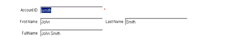
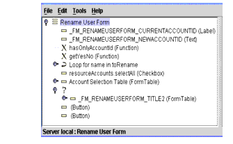
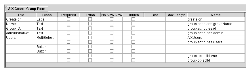
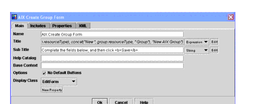
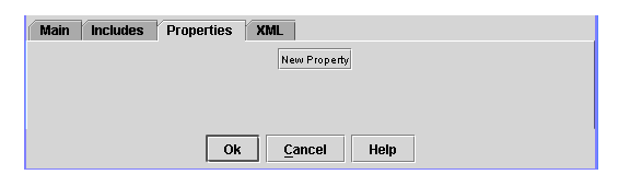
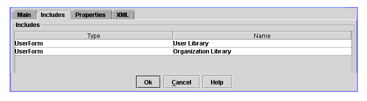
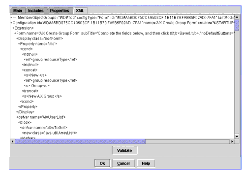
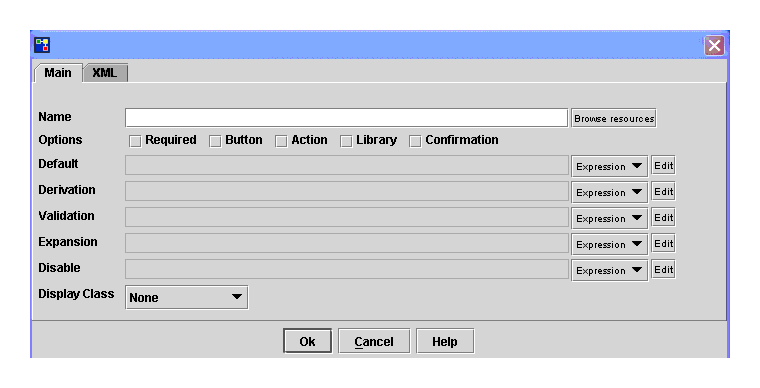
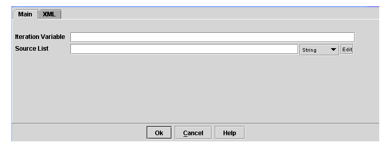
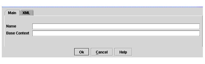
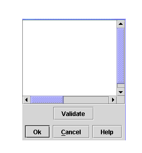
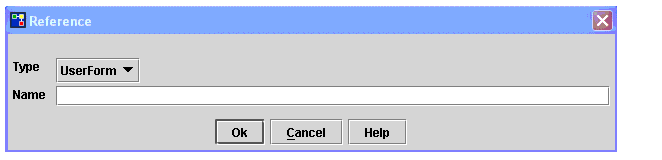
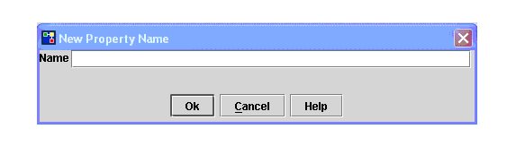
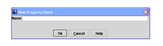
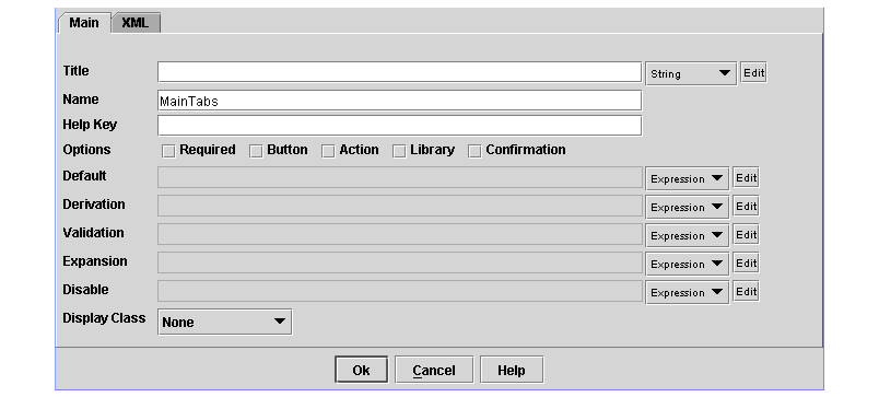
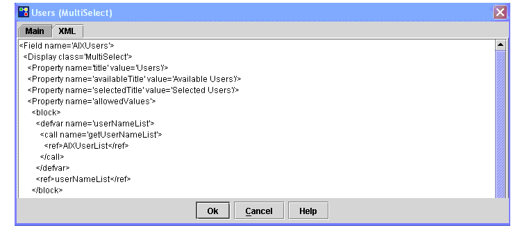
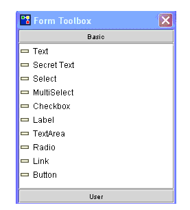
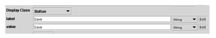
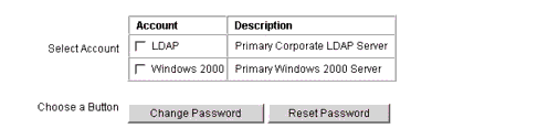

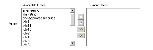
 .
.