Understanding Page-Level Items
An item is part of an HTML form. An item can be a text field, text area, password, select list, check box, and so on. Item attributes affect the display of items on a page. For example, these attributes can impact where a label displays, how large an item is, and if the item will display next to or below the previous item.
See Also:
"Understanding Application-Level Items", "How Item Attributes Affect Page Layout", "About the Item Finder", and "About Page Specific Utilities"Differences Between Page Items and Application Items
There are two types of items: page items and application items. Page items are placed on a page and have associated user interface properties, such as Display Only, Label and Label Template. Examples of page-level items include a check box, date picker, display as text, file browse field, popup list of values, select list, or a text area. Application items are not associated with a page and therefore have no user interface properties. You can use an application item as a global variable.
See Also:
"Understanding Application-Level Items"Viewing Items on the Page Definition
You create and edit page-level items on the Page Definition. In both Component and Tree view, items section appears in the Page Rendering section. See "Switching Between Tree and Component View".
Viewing Items in Tree View
In Tree view, items display within a tree under the region which contains them.
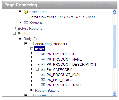
Description of the illustration pg_def_items_tree.gif
To edit or add an item, right-click to display a context menu. Then, make a selection from the context menu.
Tip:
You can also edit an item by double-clicking the item name or selecting the name and pressing ENTER. See "Editing a Page in Tree View".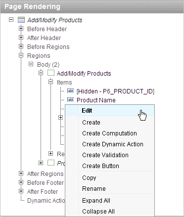
Description of the illustration pg_def_item_menu.gif
To edit multiple items at once, right-click Items and select Edit All. The Items page appears. See "Editing Multiple Items Simultaneously".
You can interactively reorder items within a given region or move them to another region by dragging and dropping them.
Viewing Items in Component View
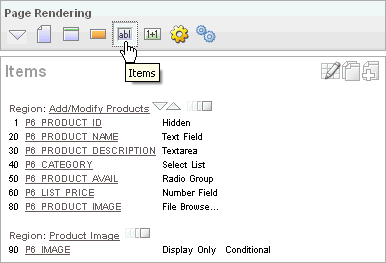
Description of the illustration pg_def_items.gif
In Component view, items display under the Items. You can temporarily hide all other subsections by clicking the Items icon. To restore the view, click Show All. The Show All icon resembles an inverted triangle.
The following icons display next to the section title:
-
Edit All. The Edit All icon resembles a small grid with a pencil on top of it. Use this icon to edit all items at once. See "Editing Multiple Items Simultaneously".
-
Copy. The Copy icon resembles two small overlapping pages. Use this icon to make a copy of an existing item.
-
Create. The Create icon resembles a plus (+) sign overlapping a small page. Click this icon to create an item.
Items are organized by region. To edit an item, click the item name.
About the Drag and Drop Icon
You can quickly change the appearance of a page by clicking the Drag and drop icon to access the Drag and Drop Layout page. The Drag and drop icon resembles a rectangle and displays to the right of the Reorder Region Items icon.
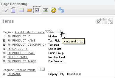
Description of the illustration drag_drap_ico.gif
You can use the Drag and Drop Layout page to interactively reorder items within a given region, change select item attributes, create items, or delete existing items. See "Using the Drag and Drop Layout Page".
About the Reorder Items Icon
You can quickly edit the label and position of items in a region by clicking the Reorder Region Items icon on the Page Definition. This icon resembles a light green down or up arrow.
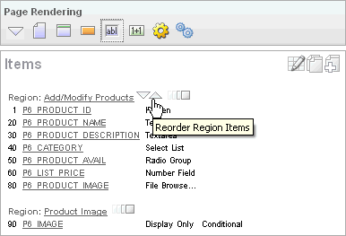
Description of the illustration reorder_items.gif
Creating Page-Level Items
You can create page-level items by running the Create Item Wizard.
About Item Naming Conventions
When specifying an item name, remember the following rules. Item names must:
-
Be unique within an application.
-
Not include quotation marks.
-
Begin with a letter or a number, and subsequent characters can be letters, numbers, or underscore characters.
-
Be case-insensitive.
-
Should not exceed 30 characters. Items longer than 30 characters cannot be referenced using bind variable syntax. See "About Bind Variable Syntax".
-
Cannot contain letters outside the base ASCII character set
As a best practice Oracle recommends including the page number when naming items. By default, wizards prefix page item names with P<page no>_ (for example, P1_NAME.
Creating a Page-Level Item on the Page Definition
You create a page-level item by running the Create Item Wizard from the Page Definition.
To create a page-level item:
-
Navigate to the appropriate Page Definition. See "Accessing the Page Definition".
-
If necessary, create an HTML region. See "Understanding Regions".
-
To access the Create Item Wizard:
-
Tree view - Under Page Rendering, right-click the region to contain the item and select Create Page Item.
-
Component view - Under Items, click the Create icon.
The Create Item Wizard appears.
-
-
Select an item type. See "About Item Types".
When creating a Popup LOV, Color Picker, or Text Field with Calculator Popup, select Popup List of Values and then the specific popup list of values type.
-
For Display Position and Name:
-
Item Name - Enter a name used to retrieve the value of the item. See "About Item Naming Conventions".
-
Sequence - Specify the sequence for this component. The sequence determines the order of evaluation.
-
Region - Select a region to contain this item.
-
Click Next.
-
-
Follow the on-screen instructions.
-
To learn more about a specific field, click the field label.
When help is available, the item label changes to red when you pass your cursor over it, and the cursor changes to an arrow and question mark. See "About Field-Level Help".
Creating a Static List of Values
One way to create a static list of values is to edit an item's List of Values definition. Note that this type of list of values is not reusable. As a best practice, create a list of values as a shared component whenever possible.
To create a static list of values:
-
Navigate to the appropriate Page Definition. See "Accessing the Page Definition".
-
Access the attributes page for the item:
-
Tree view - Right-click the item and select Edit.
-
Component view -Under Items, select the item name.
The Edit Page Item page appears.
-
-
Under Name, specify how the item will be rendered. From Display As, select Select List.
-
Scroll down to List of Values.
-
Under List of Values, create a static list of values:
-
From Named LOV, select Select Named LOV.
-
In List of values definition, enter a definition using the following syntax:
STATIC[2]:Display Value[;Return Value],Display Value[;Return Value]
Where:
-
The first keyword may be
STATICorSTATIC2.STATICresults in the values being sorted alphabetically by display value.STATIC2results in the values being displayed in the order they are entered in the list. -
A semicolon separates the display value from the return value in each entry.
-
Return Valueis optional. If aReturn Valueis not included, the return value is the same as the display value.
-
-
-
To learn more, see item Help. To view help for a specific item on a page, click the item label.
When help is available, the item label changes to red when you pass your cursor over it and the cursor changes to an arrow and question mark. See "About Field-Level Help".
-
Click Apply Changes.
The examples that follow demonstrate syntax for three different static LOVs.
Example 1: Four Values Displayed in Alphabetical Order
In this example, the list of values has four values (Cow, Dog, Cat, and Lion) that display in alphabetical order. The return value of each entry equals the display value.
STATIC:Cow,Dog,Cat,Lion
Example 2: Ten Values Displayed in the Order Listed
In this example, the list of values has ten values that display in the order listed in the definition. The return value of each entry equals the display value.
STATIC2:10,15,20,25,50,100,200,500,1000,10000
Creating a Cascading List of Values
By creating a cascading list of values (LOV), one item on a page determines the list of values for another item. Application Builder includes cascading LOV support for the following item types: Select List, Shuttle, Checkbox, Radio Group, Popup LOV, and List Manager. To learn more about item types, see Appendix A, "About Item Types".
You create a cascading LOV by creating two items. To populate the second item, you specify a Cascading LOV Parent Item when running the Create Item Wizard or by editing the item's attributes.
The following example demonstrates how to create two related select lists where the value of the first list populates the second.
To a cascading list of values:
-
Create the first item and name it P1_DEPTNO:
-
Create a select list item. See "Creating a Page-Level Item on the Page Definition".
-
For Item Type, select Select List.
-
For Display Position and Name:
-
Item Name - Enter:
P1_DEPTNO
-
Accept the remaining defaults and click Next.
-
-
For Item Attributes:
-
Label - Enter
Department -
Accept the remaining defaults and click Next.
-
-
For Settings, accept the defaults and click Next.
-
For List of Values:
-
Display Null Value - Accept the default, Yes.
-
Null Display Value - Enter - Select Department -
- Select Department -
-
In List of values definition, enter:
SELECT dname as d, deptno as r FROM dept ORDER BY dname -
Click Next.
-
-
Accept the remaining defaults.
-
Click Create Item.
-
-
Create the second item named
P1_EMPNO:-
Create a second item. See "Creating a Page-Level Item on the Page Definition".
-
For Item Type, select Select List.
-
For Display Position and Name:
-
Item Name - Enter:
P1_EMPNO
-
Accept the remaining defaults and click Next.
-
-
For Item Attributes:
-
Label - Enter
Employee. -
Accept the remaining defaults and click Next.
-
-
For Settings, accept the defaults and click Next.
-
For List of Values:
-
Display Null Value - Accept the default, Yes.
-
Null Display Value - Enter - Select Department -
- Select Employee -
-
From Cascading LOV Parent Item(s) - Select P1_DEPTNO.
-
In List of values definition, enter:
SELECT ename as d, empno as r FROM emp WHERE deptno = :P1_DEPTNO ORDER BY ename -
Click Next.
-
-
Accept the remaining defaults.
-
Click Create Item.
-
Two select lists appear. Making a selection in the Department select list, determines which individuals display in the Employees select list.
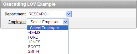
Description of the illustration cascading_lov.gif
See Also:
, "Editing Page-Level Items"Creating Multiple Items Using a Tabular Form
To create multiple items simultaneously:
-
Navigate to the appropriate Page Definition. See "Accessing the Page Definition".
-
If necessary, create an HTML region. See "Understanding Regions".
-
To access the Create Item Wizard:
-
Tree view - Under Page Rendering, right-click the region to contain the item and select Create Page Item.
-
Component view - Under Items, click the Create icon.
The Create Item Wizard appears.
-
-
Click the Create multiple items using tabular form link at the bottom of the page.
-
On the Create Multiple Items page, specify the following:
-
Create Item(s) in Region - Select the region to contain the items.
-
Item Template - Select an item template.
-
For each item, enter the Sequence, Name, Label, Type and specify whether the item should be cached.
-
-
Click Create Multiple Items.
See Also:
"About the Drag and Drop Icon"Creating Multiple Items Using Drag and Drop
To create multiple items using the Drag and Drop Layout page:
-
Navigate to the appropriate Page Definition. See "Accessing the Page Definition".
-
If necessary, create an HTML region. See "Understanding Regions".
-
To access the Drag and Drop Layout page:
-
Tree view - Under Page Rendering, Right-click the region and select Drag and Drop Layout.
-
Component view - Under Items, click the Drag and Drop Layout icon.
The Drag and Drop Layout page appears.
-
-
Select an item from the palette on the left side of the page and drag it to the appropriate position on the page.
-
Edit the item attributes.
-
Item Name - Enter a name used to retrieve the value of the item. See "About Item Naming Conventions".
-
Label - Enter the label for this item. You may include HTML, JavaScript, and shortcuts. You can also use the substitution string
#CURRENT_ITEM_NAME#to obtain the name of the item associated with this label. -
Display Type - Select a display type (if applicable). See "About Item Types".
-
-
To edit an existing item, select the item and then edit the Item Name and Label fields, or select a new Display Type at the top of the page.
-
Click Next.
-
Optionally, edit the each item's Name and Label.
-
Click Apply Changes.
See Also:
"Using the Drag and Drop Layout Page"Editing Page-Level Items
You can edit page-level items by editing page item attributes or using the Edit All or Reorder Items icons.
Editing Page Item Attributes
Once you create a page item, you can edit it on the Edit Page Item page.
To edit page item attributes:
-
Navigate to the appropriate Page Definition. See "Accessing the Page Definition".
-
Access the attributes page for the item:
-
Tree view - Right-click the item and select Edit.
-
Component view -Under Items, select the item name.
Tip:
You can also edit an item by double-clicking the item name or selecting the name and pressing ENTER. See "Editing a Page in Tree View".The Edit Page Item page appears.
-
-
To learn more about a specific attribute on a page, click the attribute label.
When help is available, the item label changes to red when you pass your cursor over it, and the cursor changes to an arrow and question mark. See "About Field-Level Help".
-
Click Apply Changes.
See Also:
"How Item Attributes Affect Page Layout" and "Understanding Cross-Site Scripting Protection"About Navigation Alternatives
The Edit Page Item page is divided into sections. The sections that display depend upon the Display As attribute.
You can access these sections by scrolling down the page, or by clicking a navigation button at the top of the page. When you select a button at the top of the page, the selected section appears and all other sections are temporarily hidden. To view all sections of the page, click Show All.
Defining Default Values
You define default values for an item using the attributes under Default on the Edit Page Item page. The default value is used when the item's value is not derived from session state and when the source value is NULL.
To define a default value for an item:
-
Create the item. See "Creating Page-Level Items".
-
Navigate to the appropriate Page Definition. See "Accessing the Page Definition".
-
Access the attributes page for the item:
-
Tree view - Right-click the item and select Edit.
-
Component view -Under Items, select the item name.
The Edit Page Item page appears.
-
-
Scroll down to Default.
-
In Default Value, enter a value.
-
From Default Value Type, select one of the following:
-
Static Text with Session State Substitutions
-
PL/SQL Function Body
-
PL/SQL Expression
-
-
Click Apply Changes.
Creating a Quick Pick Selection
If the item type supports quick pick selection, use the Quick Picks attributes to define up to ten selections that display under a give item. Clicking on a quick pick sets the value of item. The following example shows quick picks for 5%, 10%, 15%, and 20%.
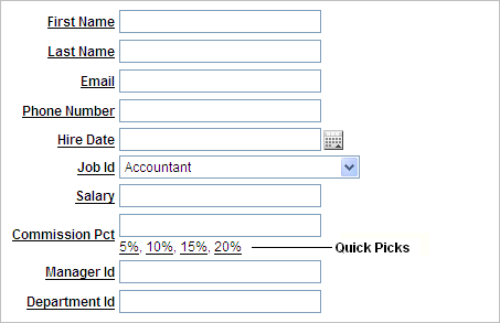
Description of the illustration quick_pick.gif
To create a quick pick:
-
Create the item. See "Creating Page-Level Items".
-
Navigate to the appropriate Page Definition. See "Accessing the Page Definition".
-
Access the attributes page for the item:
-
Tree view - Right-click the item and select Edit.
-
Component view -Under Items, select the item name.
The Edit Page Item page appears.
-
-
Scroll down to Quick Picks.
-
From Show Quick Picks, select Yes.
-
Define the Label and Value for each quick pick:
-
Under Label, enter the label to display for each selection.
-
Under Value, enter the corresponding value.
-
-
In Link Attributes, enter additional attributes for the quick picks.
-
Click Apply Changes.
Editing Multiple Items Simultaneously
Item attributes control how items display on a page. You can use the Page Items page to edit the sequence, field label, template, region, and overall position for all items on a page. The sections that follow describe how to edit items using these pages.
See Also:
"How Item Attributes Affect Page Layout"Items
To edit multiple items simultaneously:
-
Navigate to the appropriate Page Definition. See "Accessing the Page Definition".
-
Access the Page Items page:
-
Tree view - Right-click Items and select Edit All.
-
Component view - Under Items, click the Edit All icon. The Edit All icon resembles a small grid with a pencil on top of it.
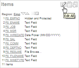
Description of the illustration edit_all_item.gif
The Items tab appears.
A Navigation bar displays at the top of the page. Use the Page field to navigate to another page. To limit the display to just items in a specific region, make a selection from Regions list.
See Also:
"Editing Page Item Attributes"The Page Items page displays items in an editable report. Table 7-9 describes each editable attribute.
Table 7-9 Editable Attributes on Page Items
Attribute Description Sequence
Specify the display sequence for this component. The sequence determines the order of evaluation.
Prompt
Enter the label for this HTML form element. You may include HTML, JavaScript, and shortcuts. You can also use the substitution string #CURRENT_ITEM_NAME# to obtain the name of the item associated with this label.
Field Template
Determines the label template. Label templates enable you to define the user interface attributes in a central place and share that definition among many labels.
Region
Defines the region in which the item displays. All items must be in a region.
New Line
Determines whether this item displays on the same line as the previous item or whether it displays on the next line. Items are laid out in an HTML table. Select Yes to have an item display as the first field in a new row in the table.
New Field
If set to Yes, this item will be rendered into its own HTML table cell which is the default. If set to No, the item will be rendered into the same HTML table cell as the previous page item.
Note that rendering into the same table cell will look more attached to the previous page item.
Width
Specifies the length (in characters) of the form element that displays for this item.
Height
Specifies the height (in lines) for text areas and multi select lists.
Column Span
Items are laid out in HTML tables. This property defines the value to be used for the
COLSPANattribute in the table cell.Row Span
Items are laid out in HTML tables. The attribute determines the value to be used for the
ROWSPANattribute in the table cell that the item displays in.Post Element
Text or HTML code will be rendered immediately after the page item element.
-
Reassign Region Items
Use the Reassign Region Items page to assign items to a new region.
To assign items to a new region on the Reassign Region Items page:
-
Navigate to the appropriate Page Definition. See "Accessing the Page Definition".
-
Access the Page Item page:
-
Tree view - Right-click Items and select Edit All.
-
Component view - Under Items, click the Edit All icon. The Edit All icon resembles a small grid with a pencil on top of it.
The Page Item page appears.
-
-
Click Reassign Region Items.
The Reassign Region Items page appears.
Use the Navigation bar at the top of the page to narrow or broaden the display. Available options include:
-
Page - Select or enter a new number and click Go.
-
Show Region(s) - Select a region to display and click Go.
-
-
To reassign an item to another region:
-
Select the items to reassign.
-
From Assign to Region, select a new region.
-
Click Reassign.
-
Tip:
In Tree view, you can also reassign region items by simply dragging and dropping to a new location.Delete Multiple Items
Use the Delete Multiple Items page to simultaneously delete multiple items.
To delete multiple items:
-
Navigate to the appropriate Page Definition. See "Accessing the Page Definition".
-
Access the Page Item page:
-
Tree view - Right-click Items and select Edit All.
-
Component view - Under Items, click the Edit All icon. The Edit All icon resembles a small grid with a pencil on top of it.
The Page Item page appears.
-
-
Click Delete Multiple Items.
The Delete Multiple Items page appears.
Use the Navigation bar at the top of the page to narrow or broaden the display. Use the Page field to navigate to a new page. Select or enter a new number and click Go.
-
To delete an item:
-
Select the items.
-
Click Remove Items.
-
Viewing Item Utilities
The Utilities page includes Grid Edit pages and reports Utilities that enable you to edit multiple pages within a selected application.
To access the Utilities page:
-
Navigate to the appropriate Page Definition. See "Accessing the Page Definition".
-
Access the Page Item page:
-
Tree view - Right-click Items and select Edit All.
-
Component view - Under Items, click the Edit All icon. The Edit All icon resembles a small grid with a pencil on top of it.
The Page Item page appears.
-
-
Select one of the following reports:
Using the Drag and Drop Layout Page
You can use the Drag and Drop Layout page to interactively reorder items within a given region, change select item attributes, create items, or delete existing items.
Accessing the Drag and Drop Layout Page
You access the Drag and Drop Layout page by either:
-
Tree view - Under Page Rendering, Right-click the region and select Drag and Drop Layout.
-
Component view - Under Items, click the Drag and Drop Layout icon.
About the Drag and Drop Layout Page
The Drag and Drop Layout page is divided into two sections: Item palette and Layout region.
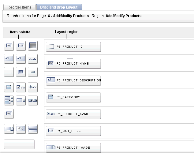
Description of the illustration drag_drap_pg.gif
The Item palette displays on the left side of the page. You add items by clicking an item type on the palette and dragging it to the correct position in the Layout region. Note that when you position the cursor over an item type, a tooltip appears.
Use the right side of the page (or Layout region) to position items. To move an item vertically, click the Add Row button to insert an empty row. Then drag and drop the item into the empty row.
See Also:
"Deleting Items"Creating a New Item
To create a new item on the Drag and Drop Layout page:
-
Navigate to the Drag and Drop Layout page. See "Accessing the Drag and Drop Layout Page".
-
Click an item type in the Item palette on the left side of the page and drag it to the appropriate location in the Layout region.
Note that when you position the cursor over an item type, a tooltip appears.
-
You can reposition the item:
-
To move an item horizontally, select the item and drag it to the appropriate position on the page.
-
To insert an existing or new item between two existing rows, click the Add Row button and drag it between the existing rows. This creates an empty row where you can then move the item.
-
-
Edit the item attributes.
-
Display Name - Enter an item name. Use this name to retrieve the value of the item. Item names longer than 30 characters cannot be referenced using bind variable syntax.
-
Label - Enter the label for this item. You may include HTML, JavaScript, and shortcuts. You can also use the substitution string
#CURRENT_ITEM_NAME#to obtain the name of the item associated with this label. -
Display Type - Select a display type (if applicable). Note that the select list is restricted to options corresponding to the type of item you are creating. See "About Item Types".
-
-
Click Next.
-
Optionally, edit the each item's Name and Label.
-
Click Apply Changes.
About List of Values
If you create an item that requires a list of values (LOV), the Drag and Drop Layout Wizard creates a static inline LOV for you. Note you must edit and fix this LOV once you complete the layout process.
See Also:
"Creating a Static List of Values"Editing Existing Items
To edit an existing item on the Drag and Drop Layout page:
-
Navigate to the Drag and Drop Layout page. See "Accessing the Drag and Drop Layout Page".
-
To reposition the item:
-
To move an item horizontally, select the item and drag it to the appropriate position on the page.
-
To insert an existing or new item between two existing rows, click the Add Row button and drag it between the existing rows. This creates an empty row where you can then move the item.
-
-
If required, select an item and edit its attributes.
-
Display Name - Enter an item name. Use this name retrieve the value of the item. Item names longer than 30 characters cannot be referenced using bind variable syntax.
-
Label - Enter the label for this item. You may include HTML, JavaScript, and shortcuts. You can also use the substitution string
#CURRENT_ITEM_NAME#to obtain the name of the item associated with this label. -
Display Type - Select a display type (if applicable). Note that the select list is restricted to options corresponding to the type of item you are creating. See "About Item Types".
-
-
Click Next.
-
Optionally, edit the each item's Name and Label.
-
Click Apply Changes.
Note:
To change the region in which an item resides, you must edit the item attributes. See "Editing Page Item Attributes".Deleting Items
To delete an item, click it and drag it to the Recycle box at the bottom of the page. If you delete an existing item, it appears in the Recycle box and can be retrieved until you click Apply Changes on the next page. Note that if you drop a new item you have just created in the Recycle box, it instantly disappears and cannot be retrieved.
Using the Reorder Region Items Icon in Component View
You can quickly edit the label and position of items in a region by clicking the Reorder Region Items icon on the Page Definition. This icon resembles a gray down and up arrow.
To use the Reorder Region Items icon:
-
Navigate to the appropriate Page Definition. See "Accessing the Page Definition".
-
Under Items, click the Reorder Region Items icon.
The Reorder Region Items page appears with items laid out in tables. You can edit the position of an item by selecting values for New Line, New Field, Column Span, and Label Alignment attributes.
-
To edit an item label, enter a new title in the Label field.
-
To change the position of an item, edit the following attributes:
-
New Line. Determines if the item displays on the same line as the previous item, or displays on the next line. Select Yes to have an item display as the first field in a new row in the table.
-
New Field. Determines if the item displays in the next column or in the same column as the previous item. Select Yes to have the label and value for the item display in a new HTML table cell. Use this attribute in combination with the New Line and Span attributes to control layout.
-
Column Span. Defines the value to be used for the
COLSPANattribute in the table cell. TheCOLSPANattribute defines the number of columns that it spans across the table.
-
-
To change label alignment, make a selection from the Label Alignment list.
-
To change the order in which items display, click the up and down arrows in the far right column. Clicking the arrow moves the item one row up or down.
Note that the order you specify here translates to sequence number in the Sequence attribute on the Edit Page Item page. See "Editing Page Item Attributes".
-
Click Apply Changes.
Tip:
You can also use the Drag and Drop Layout feature to reorder items. See "Using the Drag and Drop Layout Page".Note:
To change the region in which an item resides, you must edit the item attributes. See "Editing Page Item Attributes".Referencing Item Values
You can reference item values stored in session state in regions, computations, processes, validation, and branches. Table 7-10 describes the supported syntax for referencing item values.
See Also:
"Managing Session State Values"Table 7-10 Syntax for Referencing Item Values
| Type | Syntax | Description |
|---|---|---|
|
SQL |
|
Standard bind variable syntax for items whose names are no longer than 30 bytes. Use this syntax for references within a SQL query and within PL/SQL code. |
|
PL/SQL |
|
PL/SQL syntax referencing the item value using the Avoid this syntax in SQL statements. It may result in performance problems. See Also: Oracle Application Express API Reference |
|
PL/SQL |
|
Standard PL/SQL syntax referencing the numeric item value using the Avoid this syntax in SQL statements. It may result in performance problems. See Also: Oracle Application Express API Reference |
|
Static Text (exact) |
|
Static text. Exact Substitution. Note: Exact substitution syntax should be avoided in SQL or PL/SQL code because it can result in SQL Injection vulnerabilities. |
You can set the value of an item in your application using any of the following methods:
-
For page-level items, use the Source Attribute to set the item value.
From the Page Definition, select the item name to view the Edit Page Item page. Scroll down to Source and edit the appropriate fields.
You can also set the value of an item in any region based on PL/SQL or a process using the following syntax:
BEGIN
 :MY_ITEM :=  'new value';
END;
-
Pass the value on a URL reference using
f?psyntax. For example:f?p=100:101:10636547268728380919::NO::MY_ITEM:ABC
-
Set the value using a computation. Computations are designed to set item values. For example:
TO_CHAR(SYSDATE,'Day DD Month, YYYY');
-
Use the PL/SQL API to set an item value within a PL/SQL context. For example:
APEX_UTIL.SET_SESSION_STATE('MY_ITEM',SYSDATE);
Displaying Conditional or Read-Only Page Items
You can choose to have an item display conditionally or as read-only by editing attributes on the Edit Pages Item page.
Displaying Conditional Page Items
To display a conditional or read-only item:
-
Create the item. See "Creating Page-Level Items".
-
Navigate to the appropriate Page Definition. See "Accessing the Page Definition".
-
Access the attributes page for the item:
-
Tree view - Right-click the item and select Edit.
-
Component view -Under Items, select the item name.
The Edit Page Item page appears.
-
-
To display an item conditionally:
-
Scroll down to Conditions.
-
Make a selection from the Condition Type list.
-
Enter an expression in the fields provided.
-
-
To make an item read-only:
-
Scroll down to Read Only Display Settings.
-
Make a selection from the Read Only Condition Type list.
-
Enter an expression in the fields provided.
-
-
Click Apply Changes.
Displaying Read Only Page Items
To display a read-only item:
-
Create the item. See "Creating Page-Level Items".
-
Navigate to the appropriate Page Definition. See "Accessing the Page Definition".
-
Access the attributes page for the item:
-
Tree view - Right-click the item and select Edit.
-
Component view -Under Items, select the item name.
The Edit Page Item page appears.
-
-
To display an item conditionally:
-
Scroll down to Read Only.
-
Make a selection from the Condition Type list.
-
Enter an expression in the fields provided.
-
-
To make an item read-only:
-
Scroll down to Read Only Display Settings.
-
Make a selection from the Read Only Condition Type list.
-
Enter an expression in the fields provided.
-
-
In Read Only Element Table Cell(s) Attributes, enter attributes to be included in the HTML table cell tag,
<td>, that contains the item when displayed in read only mode. For example:bgcolor="#FF0000"
-
Click Apply Changes.
Working with Multiple Select List Item
A multiple select item renders as a multiple select list form element which can be either a Multiselect List or Shuttle item type. When submitted, selected values are returned in a single colon-delimited string. You can handle values in this format in three ways:
-
Using the
INSTRfunction -
Using the
APEX_UTIL.STRING_TO_TABLEfunction -
Creating a shuttle
Using APEX_UTIL.STRING_TO_TABLE to Convert Selected Values
Suppose you had a report on the EMP and DEPT tables that is limited by the departments selected from a Department multiple select list. First, you create the multiple select item, P1_DEPTNO, using the following query:
SELECT dname, deptno
FROM dept
Second, you return only those employees within the selected departments as follows:
SELECT ename, job, sal, comm, dname
FROM emp e, dept d
WHERE d.deptno = e.deptno
AND instr(':'||:P1_DEPTNO||':',':'||e.deptno||':') > 0
Next, assume you want to programmatically step through the values selected in the multiple select item, P1_DEPTNO. To accomplish this, you would convert the colon-delimited string into a PL/SQL array using the APEX_UTIL.STRING_TO_TABLE function. The following example demonstrates how to insert the selected departments into an audit table containing the date of the query.
DECLARE
    l_selected APEX_APPLICATION_GLOBAL.VC_ARR2;
BEGIN
  --
  -- Convert the colon separated string of values into
  -- a PL/SQL array

  l_selected := APEX_UTIL.STRING_TO_TABLE(:P1_DEPTNO);

  --
  -- Loop over array to insert department numbers and sysdate
  --

  FOR i IN 1..l_selected.count
  LOOP
    INSERT INTO report_audit_table (report_date, selected_department)
        VALUES (sysdate, l_selected(i));
  END LOOP;
END;
See Also:
"STRING_TO_TABLE Function" in Oracle Application Express API ReferenceCreating a Shuttle Item Type
Suppose you have a form on the DEPT table that shows which employees are assigned to a given department. To make assigning employees to a department easier, you can create a shuttle item that lists employees alphabetically.
To create a shuttle item:
-
Create a new Form page on DEPT using Form on a Table with Report:
-
On the Workspace home page, click the Application Builder icon.
-
Select an application.
-
Click Create Page.
-
For Page Type, select Form.
-
Under Forms, select Form on a Table with Report.
-
Select the appropriate schema.
-
For Table/View Name, select DEPT.
-
Accept the remaining defaults and follow the on-screen instructions. To learn more about a specific field, click the item label.
-
-
Create a shuttle named P2_EMP_LIST and the form page.
-
Go the Page Definition for the form page.
-
Right-click the region containing the form and select Create Page Item.
-
For Item Type, select Shuttle.
-
For Item Name, enter
P2_EMP_LISTand click Next.Tip:
In this example, "P2" in the item nameP2_EMP_LISTindicates the item resides on page 2. -
For Item Attributes, accept the defaults and click Next.
-
For Setting, accept the defaults and click Next.
-
For List of Values:
-
List of Values Query - Enter:
SELECT ename, empno FROM emp ORDER BY 1
-
Click Next.
-
-
For Source:
-
Source Type - Select SQL Query (return color separated value)
-
Item Source Value - Enter:
SELECT empno FROM emp WHERE deptno = :P2_DEPTNO ORDER BY ename
-
Click Create Item.
-
-
Run the page by clicking the Run Page icon.
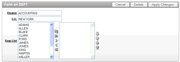
Description of the illustration shuttle_example.gif
-