 Understanding Scroll Areas and Grids
This chapter provides an overview of grids and scroll areas and discusses how to:
Navigate through data.
View data in scroll areas.
View data in original grids.
View data in scrollable grids.
Use the Customize link to personalize grids.
Use effective-dated scroll areas and grids.
Use multiple scroll areas and grids on a page.
Work with analytic grids.
Understanding Scroll Areas and Grids
Scroll areas and grids serve as containers or organizers for multifield data entry. You can think of all of the fields in each of these controls as belonging to one table in your database. In scroll areas, the fields appear on the page in a freeform manner. In grids, fields appear as columns similar to those on a spreadsheet. Most scroll areas appear with even and odd rows in different colors. This enables you to visually distinguish rows at a glance. Additionally, when you select a row with the mouse, the row changes color to distinguish a selected row from other rows.
Three types of grid layouts appear in PeopleSoft applications:
Original grids.
Scrollable grids.
Analytic grids.
Original Grids
Original grids are the standard grid layout in releases prior to PeopleTools 8.50. With original grids, you can see navigation headers and footers; insert, multi-row insert, and delete buttons; and grid separator tabs. If the Customize link is enabled by the developer, you can search for data within the grid, sort grid data; and rearrange, freeze, and hide columns to personalize your grids.
See Viewing Data in Original Layout Grids.
Scrollable Grids
Unlike original grids, scrollable grids take advantage of AJAX technology, which enables you to change the grid structure and content directly on the grid. You can make changes to scrollable grids directly from the transaction page without using the Customize link. Additionally, scrollable grids can be configured to scroll data within the grid control so as to keep frozen columns or column headers from scrolling out of view and scrollable grids enable you to navigate from cell to cell vertically and horizontally.
See Viewing Data in Scrollable Layout Grids.
Analytic Grids
Analytic grids look and function differently than original and scrollable grids. Analytic grids specifically retrieve data from the analytic server and display it in a grid format on a PeopleSoft Pure Internet Architecture page. The analytic grid is the centerpiece for the Analytic Calculation Engine user interface, enabling end users to view, edit, and drag and drop data from an analytic model cube collection.
See Working with Analytic Grids.
Navigating Through Data
Scroll areas and grids contain similar navigation structures . You can use navigation buttons, links, and grid scroll bars to navigate through data. Buttons and links appear in the navigation header, within the row itself, or to the right of the tabs in a tabbed grid, as appropriate. Certain options, such as embedded horizontal and vertical scroll bars, the Customize link, and the zoom and download to spreadsheet icons, appear only on grids.
This section discusses how to:
Use navigation buttons and links.
Add rows.
Delete rows.
Select rows.
Find data.
 Using Navigation Buttons and Links
You can view data in grids and scroll area by using navigation buttons and links. The following table describes the buttons and links that might appear on your grid or scroll area.
There are also keyboard shortcuts for all of the above buttons and links.
See Using Hot Keys.
In addition to these links and buttons, there is a numbering system for the rows. For example, if a grid or scroll area were set to view only one row at a time, the navigation header might read 1 of 2 or 1 of 20, depending on how many entries there were. If the grid or scroll area were set to view three rows of data at a time, it might read 1-3 of 20. Click the arrows to view the next or previous series of rows. In the Messages scroll area, for example, the count indicates that it contains 560 total rows of data, displaying just one row at a time. Select View 100 to see the rows in groups of 100 at a time.
The example shows “View 100” in the example above instead of “View All” because of the personalization (GRDRWS) that limits the number of rows to display in “View All” mode. Setting it too high could impact performance; the default setting is 100.
See Understanding Navigation Personalizations.
Note. Be aware of the differences between the grid or scroll area navigation header, which can appear as a header and a footer in any grid or scroll area control, and the universal navigation header, which appears in the upper-right corner of every page.
Adding Rows
You can click the Add or + button to add an empty row after the current row
In some cases, you can add several rows at once to your grid or scroll area by clicking the +... (multi-row insert) button. When you click this button, the system prompts you to specify the number of rows needed. You can add up to 99 rows at once. This option is not available unless configured by the application developer.
When a grid or scroll area references a table with no data in it, the runtime system presents a dummy row to allow the user to access the add row button. This row might have default data in some fields, but has no instantiation on the database unless the user enters data on this row and clicks the Save button. Deleting the dummy row results in a new dummy row being added to the display.
Note. If you do not insert a new row, any data that you enter overwrites the existing data in the current row. However, the changes that you make do not take effect until you save the page. If you exit the page without saving, the original data remains intact. When working with effective dated tables, you can only make changes to existing data when in Correction mode.
Deleting Rows
You can also delete rows of data from a grid or scroll area. To delete a row of data, click the Delete or – button associated with the row you want to delete. The system confirms the deletion by asking if you want to proceed. It also reminds you that the row will not be deleted from the database until you save the transaction; however, the row is automatically removed from the grid or scroll area. To retrieve the row, click the Back button in your browser. You can also retrieve the deleted row by closing the transaction without saving your changes, however, all changes to the entire component since the last save are lost.
Selecting Rows
For certain grids and scroll areas, you can select a single row or multiple rows in case you need to batch a number of processes. Single-row selection is available when the system displays a radio button to the left of each grid row or in the upper-left corner of a scroll area. Select a row by selecting one of the radio buttons in front of the row. Multiple-row selection is available when the system displays a check box to the left of each grid row and in the upper-left corner of a scroll area. Select as many rows as you need by selecting each check box. This option must be enabled by the application developer.
In this example, the Process List grid shows check boxes, which enable you to select multiple rows for processing.
Finding Data
The find feature on grids and scroll areas enables you to locate specific data, which is particularly useful if your table contains hundreds of rows. Note that this feature enables you to search the data within a specific grid or scroll area only. It does not search for any data outside the control. The find feature looks for matches in edit boxes, display-only fields, disabled or shaded fields, dynamic links, and text in long edit boxes. It does not find column headings, field labels, text values on icons, static links, and hidden fields. Find searches from the left-most visible object of the current row down, based on the text that you enter in the search prompt.
The Find link represents the find feature in the navigation bar of your grid or scroll area. Clicking this link displays a dialog box prompting you to enter your search string. The find feature searches through all rows of data in the buffer and brings the first occurrence in your search string to the top of the row list in the grid. If you are in a scroll area that displays only one row of data at a time, the find feature opens that row of data. To find the next occurrence, click the Find link and enter your search string again.
If your search string does not appear in the currently visible rows, the find feature opens a new display of rows so that the row containing the search string appears in the grid.
On tabbed grids, the find feature searches all tabs to locate the search string. If your search string does not appear in the currently active tab, the find feature moves to the tab where the row containing the search string appears in the grid and makes active the tab where the string is found.
Each grid or scroll area control, if it is set up to perform a find, has a separate Find link in the navigation header of that control. When there are nested grids or scroll areas within a scroll area, the find feature searches only the current scroll level; it does not search the nested lower-level data.
Note. Your browser may also have a find feature. This tool, however, does not search through data in the entire data buffer for the grid or scroll area. It searches the HTML code for what appears on the current open page only. Thus, it searches field headings, read-only text, and headings in grids, group boxes, and scroll areas only.
Viewing Data in Scroll Areas
This section provides an overview of displaying data in scroll areas and discusses how to collapse and expand scroll areas.
Understanding Data in Scroll AreasIn a scroll area each self-contained occurrence represents one row of data in the database. Within a scroll area the fields might be randomly arranged rather than arranged like a spreadsheet. These field groupings, although not necessarily displayed in a row, should still be considered as rows of data in the database.
A scroll area looks like a group box with navigation buttons and links in the navigation header. Scroll areas do not contain scroll bars. Instead, you use the buttons and links in the navigation header to scroll through the data rows.
You click the Insert Row (+) and Delete Row (-) buttons to enter data in and remove data from the database tables.
Here you see the Messages scroll area:
Collapsing Scroll Areas
Some scroll areas are configured so that you can collapse them so that only the header shows. This capability is indicated by a triangle that displays at the right-most side inside the navigation header. Click the triangle to toggle between the expanded (visible) and collapsed (hidden) views.
These examples show both the collapsed and expanded states of the Department Details scroll area.
Note. Application developers set whether the initial state of the grid is collapsed or expanded in Application Designer.
See Using Scroll Areas and Scroll Bars.
Viewing Data in Original Layout Grids
Original layout grids offer several functional benefits scroll areas do not. This section discusses how to:
Work with grid tabs.
Move, freeze, and resize columns.
Change column sort order.
Remove user-specific grid settings.
Download grid data.
Collapse grids.
Display grids in modal windows.
Working with Grid Tabs
If the number of columns in a grid precludes you from viewing all of the grid data simultaneously without the page being cluttered, developers might design the grid so as to group and separate columns with tabs. This section discusses: grid tabs and navigating through cells.
Grid tabs
Cell navigation
Grid Tabs
Grid tabs enable you to view groups of data columns simultaneously with little or no scrolling of the entire page to the right.
In this example, you see the Define Personalizations grid and the Definition, Format, and Explanation tabs. Notice the Show All Columns button to the right of the Explanation tab.
To view all columns without tabs:
Click the Show All Columns button just below the grid's navigation header
Showing all columns can expand the width of the web page so that a browser scroll bar appears at the bottom of the browser window.
Alternatively, some grids may have an Expand All button to the right of the tabs, which enables you to expand the grid columns to the right so that no tabs appear.
You use the browser scroll bar to scroll left and right to view the data columns.
Note. When in the expanded view, you cannot freeze columns, as the entire grid moves with the page.
To restore the grid to its original state, click the Show Tabs button.
In original grids, you can navigate through cells in these ways:
Press Tab to move one field or page element to the right.
Movement continues from row to row and outside the grid.
Press Shift + Tab to move one field or page element to the left.
Movement continues from row to row, into the column headers, and outside the grid.
Moving, Freezing and Resizing ColumnsYou can move and freeze columns by using the Customize link only.
Only application developers can resize columns in an original layout grid by accessing the grid properties in Application Designer.
See Customizing Grid Column Appearance.
See Inserting and Resizing Grid Controls.
Changing Column Sort Order
You can change the sort order of a grid column directly on the transaction page. Sorts persist only as long as you are on the page.
You can toggle between ascending and descending order by repeatedly clicking the column header. The last column header that you click becomes the primary sort for the grid. Grids enable you to have primary, secondary, and tertiary sorts. Original layout grids have no visual cue to indicate the sort order.
You can also change the sort order by using the Customize link. This type of sort persists until you change it by using the Customize link again.
See Using the Customize Link to Personalize Grids.
See Removing User-Specific Grid Settings.
Removing User-Specific Grid Settings
You can remove user-specific settings such as sorts and column changes, which restores the default grid settings. To remove user-specific grid settings:
Click the Customize link.
On the Personalize Column and Sort Order page, click the Delete Settings link.
Note. If there is no Delete Settings link, click the OK button and the default settings are restored.
On the Delete Settings page, click the Delete button.
On the Personalize Column and Sort Order page, click the OK button and the default settings are restored.
Downloading Grid Data
Some grids enable you to download grid data to a Microsoft Excel spreadsheet. The download feature extracts all active, unhidden rows, regardless of whether the rows are visible on your screen.
To download grid data:
Click the Download button in the grid's navigation bar.
A new browser window opens, showing the data in a spreadsheet-like format.
Select File, Save As and save the data as a Microsoft Excel (.xls) file.
Note. The system downloads all field types (columns) with the exception of images. Hyperlinks and buttons are downloaded as quoted text of the field labels, even though the labels may contain numeric values. If any numeric calculations are to be performed based on hyperlink or button labels, you must convert the text strings to numeric values after downloading.
Note. If you use Microsoft Office 2007, then when performing a download-to-Excel, you might encounter a Microsoft Office Excel warning message suggesting you verify that the file is not corrupted and that it is from a trusted source before opening it. You should click theYes button in this situation.
Collapsing Grids
You might also encounter grids that you can collapse or expand. Click the right-pointing triangle in front of the grid heading to expand a grid that is hidden from view (collapsed).
These examples show both the collapsed and expanded states of the Component Interfaces grid.
Note. Application developers set whether the initial state of the grid is collapsed or expanded in Application Designer.
See Using Scroll Areas and Scroll Bars.
Displaying Grids in Modal Windows
Some grids enable you to zoom the grid to a modal window. When you click the Zoom icon, the grid and its data appear in a modal window over the main page, which is grayed out.
While in the modal window, you can work with the grid just as you would if the grid were on the primary page, for example, you can insert and delete rows. You must return to the primary page to save any changes to your data.
To return to the primary page, click the Return button that you find at the bottom of the grid in the modal window.
Note. You can disable the Display in Modal Window functionality for a grid by changing its properties in Application Designer.
See Display Options.
Viewing Data in Scrollable Layout Grids
Scrollable grids offer several functional benefits that original grids and scroll areas do not. This section discusses how to:
Work with grid tabs and scroll bars.
Move, freeze, and resize columns.
Change column sort order.
Download grid data.
Collapse grids.
Display grids in modal windows.
Working with Grid Tabs and Grid Scroll Bars Developers might design the grid so as to group and separate columns with tabs. Developers might also include vertical and horizontal scroll bars in the grid control. Both grid tabs and scroll bars enable you to view all data columns and have some advantages when used together in scrollable grids. This section discusses:
Grid tabs
Grid scroll bars
Cell navigation
Grid tabs enable you to view groups of data columns without scrolling to the right. By clicking the Show All Columns button just below the grid's navigation header, you can view all columns in the grid. Showing all columns, if used in conjunction with grid scroll bars, cause a horizontal grid scroll bar to appear.
To view all columns without tabs:
Click the Show All Columns button just below the grid's navigation header
When the grid expands, use either the horizontal grid scroll bar, if enabled, or the browser scroll bar to scroll left and right to view the data columns.
Note. If the expanded grid has many frozen columns, the page might expand so that the horizontal browser scroll bar appears and must be used to view all columns.
To restore the grid to its original state, click the Show Tabs button.
On scrollable grids, developers can configure horizontal and vertical scroll bars to appear within the grid control, which enables you to scroll through data within the grid. Note these points about grid scroll bars:
An advantage of grid scroll bars is that frozen columns and column headers are stationary.
Another advantage is that you can scroll data within the grid without having use the browser scroll bar, thus other data on the page stays in view
Application developers can configure a scrollable grid to display the horizontal and vertical scroll bars independently of one another.
Grid scroll bars and grid tabs can be configured to work together or separately.
In this example, you see the Define Personalizations grid showing the Definition, Format, and Explanation tabs. Notice the horizontal and vertical scroll bars inside the grid control.
Note. Be aware that the horizontal and vertical scroll bars for the grid appear at the far right and bottom sides within the grid control; the horizontal and vertical scroll bars for the browser appear at the far right and bottom sides of the browser window.
See Using Grids.
Grid Scroll Bar Popup Menus
If you right-click on the horizontal and vertical grid scroll bars, contextual popup menus appear.
In this example, you see the a scroll bar contextual popup menus:
This table explains the contextual popup menu options:
|
Scroll Here |
Select to move the scroll slider so that the center of the slider is located under the cursor. |
|
Left Edge |
Select to move the horizontal scroll slider to the far left of the grid. |
|
Right Edge |
Select to move the horizontal scroll slicer to the far right of the grid. |
|
Top |
Select to move the vertical scroll slider to the top of the grid. |
|
Bottom |
Select to move the vertical scroll slider to the bottom of the grid. |
|
Page Up |
Select to move the rows up the length of one visible set of rows. For example, if there are 12 rows showing in a grid, selecting this option moves the rows in increments of 12 rows at a time. The bottom row becomes the top row. |
|
Page Down |
Select to move the rows down the length of one visible set of rows. For example, if there are 12 rows showing in a grid, selecting this option moves the rows in increments of 12 rows at a time. The top row becomes the bottom row. |
|
Page Left |
Select to move the columns to the left the width of one visible set of columns. The far right column row becomes the left-most column in view. |
|
Page Right |
Select to move the columns to the right the width of one visible set of columns. The far left column row becomes the right-most column in view. |
|
Scroll Up |
Select to move the rows up one row. |
|
Scroll Down |
Select to move the rows down one row. |
|
Scroll Left |
Select to move the scroll slider five pixels to the left. |
|
Scroll Right |
Select to move the scroll slider five pixels to the right. |
In scrollable grids, you can navigate through cells in these ways:
Press Shift + Up Arrow to move up one cell.
Movement ceases at the top of the column.
Press Shift + Down Arrow keys to move down one cell.
Movement ceases at the bottom of the column.
Press Shift + Right Arrow keys to move right one cell.
Movement ceases at the end of the row.
Note. If you do not hold the Shift key, the cursor moves only within the current field.
Press Shift + Left Arrow keys to move left one cell.
Movement ceases at the beginning of the row.
Note. If you do not hold the Shift key, the cursor moves only within the current field.
Press Tab to move one field or page element to the right.
Movement continues from row to row and outside the grid.
Press Shift + Tab to move one field or page element to the left.
Movement continues from row to row, into the column headers, and outside the grid.
Note. When using these methods to navigate, the cursor will move to fields within the grid. If grid scroll bars are present, the cursor will cause the grid to scroll as it moves through rows. If grid tabs are present, the cursor will not cause the tab to change as it moves through rows.
Important! If the grid navigation header is not present or if the Customize link is not present in the navigation header, cell navigation is identical to that of the original layout grid.
Moving, Freezing, and Resizing ColumnsYou can change the column order, freeze columns, and resize columns in a scrollable grid directly within the grid control. Moving and freezing columns persist until you change them. Resizing columns persists until you leave the page.
Important! If the grid navigation header is not present or if the Customize link is not present in the navigation header, you cannot move, freeze, or resize grid columns.
To move columns:
Place the cursor on the column header label.
The cursor image becomes a hand.
When the cursor changes shape, click the column label and drag the column to its new location.
As you drag the column, a border appears around the column header label, and the label moves with the cursor.
When you have the column in the desired location, release the mouse to drop the column.
In this example, the user is moving the Description column.
You can also change the column order by using the Customize link.
Note. Drag and drop is enabled only if the grid can be customized. If you do not see the Customize link in the grid header, you can not drag and drop columns.
A grid can be divided into left and right panes. If the grid is divided, the left pane contains the frozen columns and right pane contains the other columns. If enabled, a horizontal scroll bar appears in the right pane if the columns are wider than that right panel width. If the grid has frozen columns, you can freeze other columns on the transaction page.
Place the cursor on the column header label.
The cursor image becomes a hand.
When the cursor changes shape, click the column label and drag the column to its new location.
As you drag the column, a border appears around the column header label, and the label moves with the cursor.
When you have the column in the frozen column area (to the left of the leading edge of the horizontal scroll bar), release the mouse to drop the column.
You can unfreeze columns by dragging them out of the frozen area.
Note. If the grid has only one frozen column, the grid does
not allow you to unfreeze that column by dragging it. You must use the Customize link.
Likewise, if you see no frozen columns, you cannot drag a column to freeze
it; you must use the Customize link.
If the grid has multiple tabs, you can drag a column into the frozen
area on the first tab only.
Note. Drag and drop is enabled only if the grid can be customized. If you do not see the Customize link in the grid header, you can not drag and drop columns.
To resize columns on the transaction page.
Move the cursor into the column header.
When the mouse changes to the hand, click and drag to resize the column.
When you have the column at its new size, release the mouse.
Note. Columns cannot be resized smaller than the column header width.
In this example, the user is resizing the Description column.
Removing User-Specific Grid Settings
You can remove user-specific settings, thereby restoring the default grid settings. To remove user-specific grid settings:
Click the Customize link.
On the Personalize Column and Sort Order page, click the Delete Settings link.
On the Delete Settings page, click the Delete button.
On the Personalize Column and Sort Order page, click the OK button.
See Also
Using the Customize Link to Personalize Grids
Changing Column Sort Order
You can change the sort order of grid columns without leaving the transaction page. Click a single column header to toggle between ascending and descending order. Click multiple column headers in the reverse order that you want to sort them with the last column header that you click becoming the primary sort for the grid. Grids enable you to have primary, secondary, and tertiary sorts. A dark blue arrow to the right of a column header indicates a primary sort; a light blue arrow indicates a secondary or tertiary sort. Any sort changes that you make to a grid remain in place until you change them.
See Removing User-Specific Grid Settings.
In this example of the Define Personalizations grid, the Description field displays the primary descending sort, the Option Category Group field displays the secondary descending sort, and the Option Category field displays no sort.
You can also change the sort order by using the Customize link.
See Also
Using the Customize Link to Personalize Grids
Downloading Grid Data
Some grids enable you to download grid data to a Microsoft Excel spreadsheet. The download feature extracts all active, unhidden rows, regardless of whether the rows are visible on your screen.
To download grid data:
Click the Download button in the grid's navigation bar.
A new browser window opens, showing the data in a spreadsheet-like format.
Select File, Save As and save the data as a Microsoft Excel (.xls) file.
Note. The system downloads all field types (columns) with the exception of images. Hyperlinks and buttons are downloaded as quoted text of the field labels, even though the labels may contain numeric values. If any numeric calculations are to be performed based on hyperlink or button labels, you must convert the text strings to numeric values after downloading.
Note. If you use Microsoft Office 2007, then when performing a download-to-Excel, you might encounter a Microsoft Office Excel warning message suggesting you verify that the file is not corrupted and that it is from a trusted source before opening it. You should click theYes button in this situation.
Collapsing Grids
You might also encounter grids that you can collapse or expand. Click the right-pointing triangle in front of the grid heading to expand a grid that is hidden from view (collapsed).
These examples show both the collapsed and expanded states of the User Roles grid.
Note. Developers set the initial state of the grid in Application Designer.
See Display Options.
Displaying Grids in Modal Windows
Some grids enable you to zoom the grid to a modal window. When you click the Zoom icon, the grid and its data appear in a modal window over the main page, which is grayed out.
While in the modal window, you can work with the grid just as you would if the grid were on the primary page, for example, you can insert and delete rows. You must return to the primary page to save any changes to your data.
To return to the primary page, click the Return button that you find at the bottom of the grid in the modal window.
Note. You can disable the Display in Modal Window functionality for a grid by changing its properties in Application Designer.
See Display Options.
Using the Customize Link to Personalize Grids
This sections presents an overview of customization and discusses how to:
Customize grid column appearance.
Manipulate grid column sort order
For most grids, including some analytic grids, you can use the Customize link to change the order of the columns, the sort order, which columns are frozen, and which columns are hidden. You can also share your grid customizations with other users or copy another users' settings. You control these settings on the Personalize Column and Sort Order page, which you open by clicking the Customize link in the grid's navigation header. Any personalizations that you make to a grid remain in place until you change them.
Access the Personalize Column and Sort Order page (Click the Customize link on a grid).
Note. If there are grid tabs, they remain active so that you can view all sample data.
Use the following page elements to personalize the grid:
Use the following toolbar buttons to personalize your grid:
Understanding Customizing GridsFor most grids, including some analytic grids, you can use the Customize link to change the order of the columns, the sort order, which columns are frozen, and which columns are hidden. You can also share your grid customizations with other users or copy another users' settings. You control these settings on the Personalize Column and Sort Order page, which you open by clicking the Customize link in the grid's navigation header. Any personalizations that you make to a grid remain in place until you change them.
Access the Personalize Column and Sort Order page (Click the Customize link on a grid).
Note. If there are grid tabs, they remain active so that you can view all sample data.
Use the following page elements to personalize the grid:
Use the following toolbar buttons to personalize your grid:
Customizing Grid Column AppearanceWhen customizing the grid column appearance, you can:
Change the column order.
Hide columns.
Freeze columns.
Changing the Column Order
To change the column order:
Under Column Order, select the column that you want to move.
To select multiple adjacent columns, press and hold the Shift key as you select additional column names. To select multiple nonadjacent columns, press and hold the Ctrl key as you select additional column names.
If the grid contains tabs, the system displays the tab separators in the Column Order list. You can move the tab separator just as you would a regular column, thus altering the number of columns that the system displays on a particular tab at once.
Click the up or down arrow buttons to move the column up or down in the list.
If you move a frozen column below an unfrozen column, the system disables the frozen setting.
Repeat steps one and two to move any additional columns.
Click OK to save your changes and return to the transaction page.
Hiding Columns
To hide columns:
Under Column Order, select the column that you want to hide.
To select multiple adjacent columns, press and hold the Shift key as you select additional column names. To select multiple nonadjacent columns, press and hold the Ctrl key as you select additional column names.
Select the Hidden check box.
Note. When you use the find feature in the grid, the system will not search any columns that you set as hidden.
Click OK to save your changes and return to the transaction page.
Freezing Columns
To freeze columns:
Under Column Order, select the column that you want to freeze.
Note. Any columns that the developer already defined as frozen appear with the Frozen check box selected. You can override this setting by clearing the check box.
Select the Frozen check box.
The system automatically freezes the selected column and all columns above it. If you move a frozen column after an unfrozen column, the system disables the frozen setting.
Click OK to save your changes and return to the transaction page.
Frozen columns appear on all the tabs within the grid.
Manipulating Grid Column Sort OrderUnder Sort Order on the Personalize Column and Sort Order page, you can alter the grid column sort order. Any sort order changes that you save remain in place until you change them again.
To specify a persistent sort order for a grid:
Under Column Order, select the column on which you want to sort.
Note that you can sort hidden columns; however, you cannot select the following column types for sorting:
Tab separators.
Images.
Buttons or links.
HTML areas.
Click the right arrow to display that column under Sort Order.
To select multiple adjacent columns, press and hold the Shift key as you select additional column names. To select multiple nonadjacent columns, press and hold the Ctrl key as you select additional column names.
If you have moved more than one column to Sort Order, you can select a column and click the up and down arrow button to alter the sort hierarchy.
You can sort multiple columns at once. The system considers the first column in the list the primary sort, the second the secondary sort, and so on.
To sort columns in descending order (instead of the default ascending order), select the Descending check box for the highlighted column.
The (desc) text appears next to the column name to indicate which columns are sorted in descending sort order.
Click OK to save your changes and return to the transaction page.
The system saves your sort settings until you change them again or until you click the Restore Defaults button in the Personalization page.
You can override the sort order of a column in a grid directly in the transaction page without altering the personalization settings. To do so, click the column heading link (not underlined) for the column that you want to sort. This sorts the column in ascending order. You can toggle between ascending and descending order by repeatedly clicking the column heading link. The last column heading link that you click becomes the primary sort for the grid. Note that this type of sorting is only temporary. When you exit the transaction, the system does not save the sort order that you just performed.
Using Effective-Dated Scroll Areas and Grids
Many scroll areas and grids are controlled by an effective date and an effective-dated status. These scrolls can have two values: active and inactive. The active and inactive values enable you to keep a complete history of data for every value that you add. In most cases, you never want to delete a value; you only make it inactive. Thus, you can retain a complete history of all your data and table values—whether you changed them two years ago or want them to go into effect in two months—for trend analysis and other historical reports.
With all this information at your fingertips, you can "roll back" your system to a particular point from which you can perform analyses or projections for your company. You can also maintain all data on your employees as it changes over time.
For example, when going through the employee review process, it is important to maintain records of past reviews so that you can refer back to see how an employee has improved over time. Then, as employee review time arrives again, you simply add a new row of data to the table by clicking the Add button rather than by typing over the existing row. When you add a new row, the Eff Date (effective date) field automatically populates with the system date, which is usually today’s date. You can keep this date or change it to a future date if the information that you are entering does not take effect until later.
Because the system date is at or after the new effective-dated row that you created, the new information becomes the current row and the previous row is now historical information. If you returned to this page and clicked the Update/Display button, which displays only current and future rows, you would see only the last data row that you entered. If you also wanted to see older data rows, you would have to click the Include History button.
To correct incorrect data already in the system, click the Correct History button. (You should take this approach rather than inserting a row with corrected data.)
See Also
Using Multiple Scroll Areas and Grids on a Page
Some PeopleSoft applications include pages that contain multiple scroll areas and grids. These scroll areas and grids may be one above the other, side by side, or contained within each other (nested). The fields controlled by one scroll area or grid are associated with only one database table. Pages with multiple scroll areas or grids read from and write to multiple tables.
The Competency Assignment page in the following example contains two grids side by side. With this format, you can transfer data from one grid to the other. In the example, you select a value from the Category and Type drop-down list boxes to populate the Source Competencies grid. To select the descriptions that you want to appear on Tom Green’s evaluation, select the appropriate check boxes under the Description field in the Source Competencies grid. Then click the double left arrow button to move those descriptions to the Assigned Competencies grid.
Once you have assigned the competencies to the evaluation, you can evaluate Tom using the Competency Rating page. The Competency Rating page in the following example contains the Assigned Competencies grid nested within the Competency Evaluation scroll area.
The Evaluation ID/Type fields associated with the outer scroll area refer to the type of evaluation. The fields associated with the Assigned Competencies inner scroll area refer to the specific competencies included in the evaluation.
Another way of looking at nesting is to think of the scroll area and grid as having a parent and child relationship. The table that stores information about individual competencies is a child of the table that stores information about particular evaluations. Child tables share the same key structure as the parent tables, plus one or more additional keys to uniquely identify individual rows.
Working with Analytic Grids
This section provides an overview of analytic grids and discusses how to:
Navigate through analytic grid data.
Download analytic grid data.
Pivot data cubes and dimensions.
Expand and collapse dimension data.
Slice analytic grid data.
Saving customized analytic grid layouts.
Understanding Analytic Grids
Analytic grids are specific to PeopleSoft Analytic Calculation Engine, PeopleSoft's multidimensional reporting tool. Within PeopleSoft Analytic Calculation Engine, analytic models define the rules for calculating data. These analytic models consist of data cubes and dimensions. Data cubes are categories of data; you create one for each kind of information in your analytic model—for example, one for sales, one for rent, and one for salary. Dimensions are a list of one kind of data that can span various contexts—for example, months or product codes. You organize data cubes and dimensions into cube collections. Single members of data cubes or dimensions—such as one month—are known as members.
When the analytic grid is in Freeze Column mode, you can load into it data that does not come from the Analytic Calculation Engine.
PeopleSoft Pure Internet Architecture pages containing analytic grids display data from cube collections. You can use the analytic grid to edit your data, pivot data cubes and dimensions (move them between the row and column axis of the grid) to gain a different view of your data, and view selected “slices” of your data. Within an analytic grid, you can expand and collapse those dimensions that have a hierarchical structure; you can also drill down into such dimensions. Finally, you can modify preferences within an analytic grid—saving a particular layout that you have created or returning to the default grid layout.
See Enterprise PeopleTools 8.51 PeopleBook: Analytic Calculation Engine.
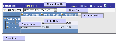
Analytic grid components
Navigating Through Analytic Grid Data
For the most part, the navigation bar at the top of the analytic grid is much like the one associated with an ordinary grid.
In addition, in an analytic grid you can:
Collapse or expand the slice bar by clicking on the arrow to the right of the analytic grid's name (the name is “Analytic Grid” by default), which appears in the grid's upper-left corner.
Collapse and expand the entire grid, provided that the application developer has activated this feature (via the Collapsible Data Area check box on the Use tab of the Analytic Grid Properties dialog box). To do so, you use the arrow to the left of the analytic grid title, which is “Analytic Grid” by default.
Collapse or expand dimensional data by clicking on the expand node or expand all icons.
Editing Analytic Grid Data
Editing data in an analytic grid is somewhat different from editing data in a standard grid:
Some cells are editable but some cells may be designated as read only.
Calculated cells are read only
In hierarchies (trees), only the lowest level is potentially editable.
The root and total are not editable.
Downloading Analytic Grid DataYou can download the contents of an analytic grid to a Microsoft Excel spreadsheet, much as you can download the data from a regular grid.
See Viewing Data in Scroll Areas.
Dragging and Dropping Data Cubes and Dimensions
This section outlines the ways in which you can drag and drop data within an analytic grid:
|
Location |
Drag and Drop Possibilities |
|
Row axis |
You can drag from here to the column axis or the slice bar. |
|
Column axis |
You can drag from here to the row axis or the slice bar. |
|
Slice bar |
You can drag from here to the row or column axis. You cannot, however, drag to rearrange objects within the slice bar. |
|
Dimensions |
You cannot drag to rearrange objects within dimensions, whether they are hierarchical or not. |
|
Data cubes |
You cannot reorder data cubes, either on the column or the row axis. |
Note. If an application developer specifies No Drag Drop mode for an analytic grid, you cannot drag or drop any item in an analytic grid. In addition, if Freeze Column Mode is specified, you cannot move frozen columns.
Pivoting Data Cubes and Dimensions
Using drag and drop, you can easily change the orientation of data cubes and dimensions within an analytic grid to get a different perspective on your data. For example, if your analytic grid initially displays the Month dimension across the columns, and the Products data cube down the rows, you could pivot the report to display the Months dimension down the rows and the Products data cube across the columns.
Next to the navigation elements is an icon that provides help text for novice users to perform drag and drop operations successfully. Clicking the icon toggles the display of the help text.
To pivot cubes and dimensions within an analytic grid:
Move the mouse pointer over the bullet icon representing a dimension or the cube icon representing a data cube.
The mouse pointer turns into a move cursor (a four-headed arrow), with an associated grabber hand.
Drag the bullet or cube icon from a column heading to a row heading or vice versa.
As you drag, the grabber hand will turn into an international no sign (circle with slash) when you are over locations where you cannot drop. You will instead see a bullet icon (for dimensions) or cube icon (for data cubes) when you drag over locations where you can drop the data cube or dimension.
Note. You can drop data cubes and dimensions onto the row axis, the column axis, and the slicer bar.
Slicing Analytic Grid Data
Slicing allows you to view a subset of your data. You can slice your data by choosing from any list—representing data cubes or dimensions—that appears on the slice bar by default. In addition, you can add data cubes or dimensions to the slice bar and use them to view alternate slices of your data. You can place multiple data cubes or dimensions on the slice bar. You can also slice your data further (viewing subsets of subsets) by choosing members from various data cubes and dimensions upon which to slice.
Note. You can add as many data cubes or dimensions to the slice bar as you like. Three fit per row, so if you add more than three, the fourth and so on are added to a second row on the slice bar. However, note that you can place only a single data cube on the slice bar. When you do so, the analytic grid reflects the data for that data cube only.
To slice your data based on a data cube or dimension that already appears on the slice bar:
Use the list box on the slice bar to display the values for the relevant data cube or dimension.
As an example, for a Months dimension, it would contain a list of months.
Select the desired value from the list box.
The analytic grid changes to show only data related to that value. For instance, if you select the month of March, you will see only data for that particular month.
To add a data cube or dimension to the slice bar and use it to slice your data:
Drag the desired data cube or dimension to the slice bar.
Select a member.
You will now see data related to that member only.
Dimensions that have filter functions applied will behave differently depending on whether they reside on the column axis/row axis or the slice bar. See the following for details.
Working with Hierarchical Dimension Data
Some dimension data has a hierarchical structure. When this is the case, you can expand and collapse dimension data within the analytic grid. In addition, you can drill down into the hierarchy to get a closer look at a particular subset of the data.
To expand or collapse dimension data:
Click the plus sign to the left of the dimension name to expand that dimension, showing all subdimensions immediately underneath it.
This approach expands the dimension one level at a time. If you click the multiple plus sign to the left of the single one, all the dimensions are expanded.
Click the plus sign to the left of any “subdimensions” to expand them as well.
Click the minus sign to the left of any dimension to collapse it.
To drill into and out of dimension data:
Click any dimension or subdimension that has elements beneath it in the hierarchy. (It is underlined and has a plus or minus sign to its left.)
The plus or minus sign changes into a Drill out this node arrow, and you see only the dimension or subdimension you clicked on, plus any elements directly underneath it in the hierarchy.
Click the Drill out this node arrow to drill back out within the hierarchy.
The dimension now shows the node you clicked on plus one level above it.
Saving Customized Analytic Grid Layouts
You have learned how to customize the initial layout of the analytic grid by pivoting data cubes and dimensions, viewing selected slices of your data, and more. In addition, you can save your customizations and return to them later. If you have saved a customized layout, you can also easily return the analytic grid to its original settings.
Note. The configuration of the Preferences dialog box changes depending upon whether there is a cube in the column header. If there is one, you have the option to hide nondimensional fields. If not, this option isn't available.
To save a customized analytic grid layout:
Modify the grid's layout as desired.
Click the Preferences link.
The Preferences dialog box appears.
If applicable, select which nondimensional fields to hide by selecting them and clicking the Hidden check box.
You can hide all nondimensional fields but one. For example, if you have three, you can hide two; if you have four, you can hide three; and so on.
Select the Save Layout check box and click OK.
To restore an analytic grid's default settings:
Click the Preferences link.
The Preferences dialog box appears.
Click Delete Settings.
Note. Delete Settings restores the analytic grid's default layout, and also “unhides” hidden nondimensional fields.