 Understanding Page Design and Development
Pages are the graphical interface between your users and your application database. As a system designer, you configure or build pages that meet the data requirements of the application and that are easy to use and understand. Using PeopleSoft Application Designer, you can create, modify, and delete page definitions in your PeopleSoft system.
This chapter provides an overview of page design and development and discusses how to:
Use page development tools.
Create new page definitions.
Add page controls.
Manipulate page controls.
Set page field properties for controls.
Modify the rich text editor user interface.
Create display control and related fields.
Order and space page controls.
Design inquiry pages.
Align page controls.
Maximize performance.
Access PeopleCode in page definitions.
View pages in the browser.
Produce pages.
Work with pages in foreign languages.
Understanding Page Design and DevelopmentThis section discusses:
Level-based controls.
Keys for accessing pages.
Multiple occurrences of data.
Prompt fields.
Derived and work fields.
Sensitive data.
Hidden pages.
Upgrade considerations.
End-user page personalization.
 Level-Based Controls
You determine your page design based on the type of data that you plan to access and maintain. In some cases, a page references a single record definition; in others, you may want to reference multiple records. To accommodate a variety of page designs, PeopleSoft Application Designer uses level-based controls. The three level-based controls are:
Grids
Scroll areas
Scroll bars
You specify the level of these controls by setting the occurs levels on the Record tab of the page field properties dialog box for the level-based control that you are configuring. Level-based controls have four levels:
Level 0
This level directly corresponds to the high-level key information of the underlying record. Level 0 fields are usually physically located at the top of the page, set to be display-only, and display the data that the user entered on the initial search page.
Levels 1−3
These levels correspond to lower level key information that is subordinate to the Level 0 key values. Level 1 is subordinate to Level 0; Level 2 is subordinate to and nested within Level 1; and Level 3 is subordinate to and nested within Level 2.
Note. You can nest level-based controls up to three levels.
The first occurs level on a page is Level 0. In general, this level is reserved for the primary key fields that are used to search for data. A page might not contain any level-based controls; in such a case, all fields are set to Level 0. This case is particularly true for secondary pages or subpages that contain few data entry fields, as shown in the following example. The third column, Lvl (Level), that appears in the grid on the Order tab indicates that all fields on the page are at Level 0:
When you add a level-based control, a scroll area or a grid, to your page, the default occurs level for that control is set to 1 in the properties dialog box. If you place a field in or below that scroll area, it is also set to Level 1 on the Order tab, even if it is another level-based control. If necessary, you can use the Set to Level 0 feature of the horizontal rule control to restart the occurs level on a page.
Note. You can have any number of level-based controls at the same level.
Nesting controls involve two or more level-based controls on a page, such as two scroll areas, when the second scroll area has an occurs level of 2. You nest controls when the new data that you want to add is a repeating set of data for each entry in your first level-based control. In doing so, you create a hierarchical, or parent and child, relationship between the controls and the processing of the record definitions. The Level 2 control is the child of and is subordinate to the Level 1 control.
For example, on the Compensation page, the Level 2 grid is nested in the Level 1 scroll area. On the Amounts tab of the grid, each compensation action in the Level 1 scroll area has two rate codes:
This example of the Additional Pay 1 page shows three levels of data, two of which are nesting scroll areas in the Earnings scroll area:
In this case, we want to maintain information about the compensation history for a single employee and, for each change or override in compensation status, enter details about that change. The first scroll area, Earnings, associates the earning code with the second, subordinate scroll area, Eff Date (effective date) and Default Job Data, which enables the user to enter the effective date for the status change. The third scroll area, Or Overrides to Job Data, which is subordinate to the second, enables the user to enter the overrides to the default job data that appears in the second scroll area.
For each of the three scroll areas, you can have several rows of data. While you do not see actual scroll bars on your page, the navigation buttons and links in the navigation bars for each scroll area enable you to navigate or scroll through the rows.
As shown previously, you can nest a grid in a scroll or scroll area. The following example shows the Other Earnings grid at Level 3, which is nested in the Earnings scroll area at Level 2, which is nested in the Paysheet Details scroll area at Level 1. A nested grid serves the same function as a nested scroll area. It can offer a more compact way of viewing many fields of data, particularly if you use a tabbed grid.
Note. You can nest a grid in a scroll area, but you cannot nest a scroll area in a grid or a grid in another grid.
Levels play an important role in runtime processing. The component processor relies on the level at which you place a field on a page to determine how to process any PeopleCode attached to the field in the record definition.
Effective Dates and Level-Based Controls
The EFFDT (effective date) field must be the only key field that is controlled by level-based controls that you create to help users maintain multiple occurrences of data that is keyed by effective date. Otherwise, the effective date processing for update actions does not function correctly.
See Also
Referencing Data in the Component Buffer
Keys for Accessing Pages
No matter how much time you spend defining and refining your page, your work is useless unless the user can access it. You must add it to a component, and then you must add that component to a menu. When you add a page to a component, you determine what actions the user must perform to access the page and the keys that are required to retrieve rows of information.
The search record that you define for a component determines the key list; that is, search keys for which users are prompted when they select a page and an action. A search record can be either a view that concatenates information stored in several tables or the underlying table itself. Select the search record that contains all of the key items for the primary record underlying the page.
The keys for which the search dialog box prompts should populate the high-level (Level 0 in the page definition) key controls on a page. These key controls always appear before any level-based control on the page and are typically display-only. A search record might differ from a primary record definition, but it must contain all of the Level 0 keys that you placed on the page.
When you create a view that should use key values from a page, each key must be:
Listed as an output column from the view (not just referenced in the WHERE clause of the view).
Marked as a key field of the view.
For example, suppose that a page has PERSON.PERSONID as a Level 0 field. PERSONID is the key of the PERSON record. A grid on the page uses the PERSON_ADDRESS_VW view to display addresses for the current person. The SQL statement for the view cannot only mention PERSON.PERSONID in the WHERE clause; PERSONID must be both an output column of the view and a key field of the view.
See Also
Creating Component Definitions
Multiple Occurrences of Data
On some pages, you may want a few of the field controls to display multiple rows or occurrences of data. To do this, you can add a level-based control: a scroll area, a grid, or a scroll bar. Users can then add, edit, delete, find, and scroll through multiple occurrences of data in a page control or group of controls using action buttons, links, or the browser scroll bar, depending on how you set the occurs count. Using a scroll area or a grid, rather than a scroll bar, is the preferred page design to show multiple occurrences of data.
For example, this Checklist Table page contains the Assignment Checklist Item grid with an occurs count of 5. The Checklist Item scroll area in which it is nested must have an occurs count of 1 since we can see only one row of data in the scroll area:
To see the next set of five rows in the Assignment Checklist Item grid, a user can click the right arrow button. To see all rows of data at once, in either the grid or scroll area, the user can select the View All link in the navigation bar.
In PeopleSoft Application Designer, you set the occurs count for a level-based control on the General tab in the properties dialog box. You can set the occurs count to any number. You also have the option of selecting Unlimited Occurs Count so that the user sees all rows of data. If the page has more options than can be viewed in the window at runtime, the browser displays a scroll bar enabling the user to scroll to the bottom of the page.
Note. When an occurs count is set to a number other than 1, the grid displays the specified number of rows. However, when it is set to 1, the grid displays as many rows as possible within the given space allocated for the grid control at design time.
Prompt Fields
You can enable your users to look up the valid values that they can enter in a field. For this, PeopleSoft Application Designer provides prompts, or lookup buttons. Your PeopleSoft applications use the following three types of prompts:
This type of prompt generates a list of values, which appears directly below the prompt field when the user clicks the down arrow that appears beside the field.
The drop-down list box is a predefined control that you place on your page. The Job Indicator field on the Work Location page is an example of drop-down list box.
Calendar prompt
This type of prompt generates a small calendar, which appears next to the date field, when the user clicks the calendar button. Users can navigate the calendar to find and select a date. The Effective Date, Position Entry Date, and Department Entry Date fields on the Work Location page are examples of calendar prompts. The calendar prompt appears automatically as part of any edit box control that you associate with a date field as long as the Show Prompt Buttoncheck box display option on the Record tab is selected.
Note. The calendar prompt feature is not supported on all browsers.
See “PeopleTools 8.4x - 8.52 Troubleshooting Browser Limitations” available at http://support.oracle.com
Lookup button
A prompt or lookup button opens a lookup page in the user's browser populated with up to 300 available values for that field. The user can then either select the desired value or refine their search further. For extremely large tables, the system administrator has the option of excluding that table from auto prompting on the Lookup Exclusion Table via PeopleTools, Utilities, Administration.
In PeopleSoft Application Designer, you can only associate a lookup button with an edit box control. The look up button appears automatically as part of any edit box control as long as the Show Prompt Buttoncheck box display option on the Record tab is selected and the record field with which you associate the edit box lists values in either the Translate table or a prompt table.
See Also
Specifying Date Field Attributes
Derived and Work Fields
You can use a field definition from a derived or work record to store a temporary value that PeopleCode uses to determine the values of other field controls on the page.
For example, for a budgeting transaction in PeopleSoft General Ledger, assume that you have an annual amount that you must spread to multiple accounting periods. You can create a page that includes both a field control from a derived record for the annual amount and an amount control for each accounting period. You then write PeopleCode to derive the amount per accounting period from the annual amount. When a user enters the annual amount in the derived field control, PeopleCode calculates the amount per accounting period and inserts it into each accounting period field control. The annual amount is not stored in the database, but the period amounts are.
Sensitive Data
You can allocate sensitive data to a single page and limit access to that page to the users who need to update it. Alternatively, you can enter PeopleCode to hide certain fields on pages based on appropriate criteria. The page approach is simpler, however, and can be used in most situations. For secondary pages, this sort of security is more complex to manage.
See Also
Hidden Pages
Hidden pages are work pages that are associated with derived or work records; they are often used in work groups. You can store all of your work field controls on hidden pages. Create these pages when you want PeopleCode calculations to be performed in the background so that the user does not see them. As a convention, the names of work pages that are delivered with your application names end with the suffix _WRK; you should follow the same naming convention. An example name is: MC_TYPE_WRK.
Hide a page by selecting the Hidden check box in the component grid as you set up the component definition.
See Also
Upgrade Considerations
If you adapt a PeopleSoft application, you might affect your use of future PeopleSoft releases. The closer your PeopleSoft system is to the standard product, the easier your upgrades will be. Avoid superfluous or cosmetic changes to data structures in the standard product. Document all of your changes in the comment area on the General tab in the Page Properties dialog box.
End-User Page Personalization
End users of PeopleSoft applications can personalize various settings on a page, including tab order, the display state of scroll areas and grids, and the state of collapsible sections. Users can also choose that the default page display for a component each time they open that component. In addition, users can choose to share their personalization settings with or copy settings from another user.
The page personalization option is set in the Component Properties dialog box, Internet tab. The Personalize Page Link check box is selected by default to enable the Personalize Page link in the pagebar at runtime for all pages.
See Also
Using Page Development ToolsThis section discusses how to:
Use page definition menus.
Use page definition toolbars.
Use the page layout grid.
Using Page Definition MenusAs you build pages, use the tools and options in these menus:
In addition to the standard options for opening, deleting, and renaming pages, use this menu to access the definition (page) properties and project properties.
Access the page field properties from this menu. To find out what other definitions reference the active page, select Find Definition References. You can also search for a text string in types of PeopleCode or SQL objects.
Select View Definition to view the underlying definition, such as the subpage or record, for the selected control.
You can view the PeopleCode for the page or the underlying record definition.
The properties Edit Fill Display, Edit Fill All, and Edit Fill None refer to how controls appear only during design time. They do not affect the page during runtime.
Use the Show Page Control Inspector tool to view summary data of the selected page field.
Use Show Grid to display or hide a layout grid on the page that you are designing to help you place controls more accurately.
Use this menu to insert different types of controls on your page. You can also insert the page on which you are working into a project.
This menu provides access to various utilities, such as data administration, change control, upgrade, and translate.
Use this menu to modify the number of pixels between points on the layout grid. Options on this menu also enable you to align page controls, align page control labels, view the processing order of the controls on the page, and test the tab order between fields on your page.
Use the Align functions to move selected page controls or page control labels to ensure consistency of vertical and horizontal placement among the selected elements. All selected elements align to the last element that you select in the set.
Use the Auto Size Page function to resize your page to the best height and width that accommodates your page controls.
Use the View in Browser function to see a very general image of the page in the selected browser without data. Note, however, that PeopleCode is not run on this page rendering, so the page may look significantly different to users if PeopleCode is used to hide or unhide page fields.
Use the Generate HTML function to create a text file containing the HTML for your page. The file is saved to the TEMP directory of your local drive. Note that the HTML that is generated contains no data or context. It is, therefore, likely to differ from the HTML on a page at runtime.
Using Page Definition Toolbars
The toolbars in PeopleSoft Application Designer change, depending on the active window. When a page window is active, you see the page definition toolbar and the page control toolbar.
Page Definition Toolbar
The page control toolbar contains a button for each type of page control that you insert. The buttons display images that look like the controls that they insert. You can move this toolbar on your workspace independently of the system toolbar or the other half of the page definition toolbar.
|
|
|
|
|
|
|
|
|
|
|
|
|
|
|
|
|
|
|
|
|
|
|
|
|
|
|
|
|
|
|
|
|
|
|
|
|
|
|
|
|
|
|
|
|
|
|
|
|
|
|
|
|
|
|
|
|
|
|
|
|
|
Using the Page Layout Grid
When you open a page definition, evenly spaced dots appear in the workspace. This is the page layout grid that you use to align controls. When you run applications, the grid does not appear on pages. It appears only as a design aid in the page definition. This example shows the Layout Grid dialog box:
The default grid spacing is 4 × 4, which means that each row has one dot per 4 pixels and that the rows are 4 pixels apart on the vertical axis. Most pages in PeopleSoft applications are built using this grid. To change the spacing, open the Layout Grid dialog box by selecting Grid Settings from the Layout menu.
You can turn off the grid view of your page by clicking the Toggle Grid button in the page definition toolbar.
Changing Page Layout Grid Settings
To change grid spacing:
Select Layout , Grid Settings.
Enter values for the width and the height, which is the spacing of the dots in pixels.
The smaller the value, the finer the grid. The finer the grid, the more difficult it is to align fields precisely without using the align functionality. Note that if either the width or height is set to one, then the grid will be slightly off.
Select a Show Grid option to activate or deactivate the page grid.
If you copy an existing page and save it by another name, you also copy the grid settings that were used to create the original page. For example, if the original page was built with a 5 × 5 grid, then your new page also will have a 5 × 5 grid, by default. You can change the grid settings anytime while working on a page. Doing so has no effect on the position of a field.
The snap-to-grid functionality is only available when the layout grid is showing.
Creating New Page Definitions
To create a new page definition, either clone an existing page or begin with a blank page. Cloning is more efficient because you do not have to recreate controls that are common to all pages. You can also create a template that contains only the controls that you need.
This section discusses how to:
Clone page definitions.
Create a blank page.
Note. When saving new definitions, always make sure to adhere to accepted naming conventions.
See Saving Definitions.
Cloning Page DefinitionsTo clone a page definition:
Select File, Open.
The Open Definition dialog box appears.
Specify Page for the definition and locate the page that you want to clone.
When the system retrieves the page definition, select File, Save As.
If you save after you make modifications, you might accidentally overwrite the old page definition.
To create a new page template, name the page so that it appears at the top of your page list.
Click OK.
Note. Record definition names are restricted to a maximum of 15 characters; page names can have up to 18 characters.
See Also
Creating a Blank Page
To create a new page without copying an existing page, select File, New, Page.
When saving the page, make sure that you adhere to the accepted naming conventions.
See Saving Definitions.
Adding Page ControlsYou can add page fields to a page in a number of ways. You can copy page fields from one page and paste them onto another, or you can drag-and-drop page fields from one page to another. In addition to these basic methods, this section discusses how to:
Drag field definitions from a record onto a page.
Drag record fields from the project workspace onto a page.
Drag record definitions onto a page.
Use the page control toolbar.
Use the Insert menu.
Important! While PeopleSoft Application Designer does not limit the number of page controls you can add to a page, you might experience unexpected performance issues when you develop pages that contain very high numbers of page controls.
Dragging Field Definitions From a Record Onto a Page
To drag field definitions from a record onto a page:
Open an existing record definition by selecting File, Open, Record.
Open a new page by selecting File, New, Page.
Drag field definitions from the record to the page.
The system selects the page definition control type based on the record field attributes. In the preceding page, the EMPLID (employee identification) field was defined as a prompt table edit in the record, so a Prompt button was added for EmplID when it was dragged onto the page.
Double-click the new page field to set the properties.
When you drag field definitions, the properties from the record definition are used to set page field default properties. You can alter the properties using the Properties dialog box.
Dragging Record Fields From the Project Workspace Onto a Page
To drag record fields from the project workspace onto a page:
Open the project that you want to drag from an existing or new page.
Drag record fields from the project workspace to the page.
Double-click the new page field to set the properties.
Note. When you drag fields from the project workspace, use fields that are contained in records (as in record.fieldname), not field definitions.
Dragging Record Definitions Onto a Page
You can add an entire record definition to a page at once, which can save a great deal of time when generating pages. You can then arrange the fields as desired on the page.
Note. You can also drag an entire record definition into a grid control that you have placed on a page.
See Inserting and Manipulating Grid Columns.
To drag record definitions onto a page:
Open the project that you want to drag from an existing or new page.
Drag the record definition onto the page.
PeopleSoft Application Designer positions the record fields on the page as page fields in a cascading manner. Fields are in the order that they appear in the record with the appropriate control value assigned to each one.
Reposition the fields as necessary on your page.
Double-click each new page field to set its properties.
Using the Page Control Toolbar
You can insert page controls by using the page control toolbar. When you click one of the page control buttons, the cursor changes to a cross-shaped icon or hand, depending on which control type you select. You can then move the cursor to where you want to position the control and click once. If you select a control from the toolbar erroneously and want to cancel the selection, press the Esc key and then select the desired page control button.
If the control is a fixed size during insertion, the cursor changes to a cross-shaped icon. If the control type requires that you define the size of the control at the time of insertion, the cursor changes to the monogrammed hand icon. When a hand-shaped icon appears, press and hold the left mouse button as you drag the hand diagonally downward to where you want the lower, right-hand corner of the frame. Release the mouse button.
If the control is not correct the first time that you draw it, you can easily adjust it. The dotted box and black or blue handles surrounding the control indicate that it is selected. Use any of the four directional arrow keys on the keyboard to move the frame one page grid unit in the indicated direction. You can also use Shift+ the arrow key to resize the page control.
Using the Insert Menu
Select the control that you want to add to your page from the Insert menu. Your cursor changes to a cross-shaped icon or a hand, depending on which control type you select. Move the cursor to where you want to position the control and click once.
Manipulating Page Controls
After you place a control on a page, you have several choices for manipulating it.
This section discusses how to:
Select controls.
Resize controls.
Use the Page Control Inspector.
Delete controls.
Move controls on the same page.
Copy and move controls to another page.
Position page control labels.
Selecting Controls
Before you manipulate a control, you must select it. You can do this by clicking the control or by using the Edit menu. A check mark beside the option in the menu indicates which of these modes you are in:
|
Select Field |
Select one control on the page by clicking on it. To deselect a control, click once outside the dotted box. Deselected is the default mode. |
|
Select a group of controls by drawing a box around the controls that you want to select. You can also activate this option by clicking and dragging over the target fields. Note. You are in Select Group mode when the cursor changes to a pointing finger. If the cursor does not change when you select Edit, Select Group, try first selecting an individual control on the page and then selecting Edit, Select Group again. |
|
|
Select All |
Select all of the controls on the active page. The result is the same as using the Select Group option to draw a box around the controls. |
Resizing Controls
You can adjust the size or shape of any page control that displays selection handles when it is selected:
Note. Some browsers do not support the resizing of certain control types. In these cases, changing the size in PeopleSoft Application Designer has no effect upon the runtime size of the field.
See Troubleshooting Browser Limitations available on the My Oracle Support website. support.oracle.com
To resize a control, use one of these methods:
Select the control and drag a handle to adjust the height or width.
Note. For some control types, you can adjust only the width.
Hold down the Shift key while pressing the Up Arrow, Down Arrow, Left Arrow, or Right Arrow key.
The frame size is adjusted one grid unit in the indicated direction.
Note. The position of the top, left corner of the frame does not change; resizing with the keyboard occurs by adjusting the position of the bottom, right corner.
Using the Page Control Inspector
The Page Control Inspector provides location, size, type, and data source information for the selected page control on the page. The first six values, Left, Width, Right, Top, Height, and Bottom, display the exact bounding coordinates in pixels of the control on your page in PeopleSoft Application Designer. The remaining values help distinguish the selected control from others on the page.
Access the Page Control Inspector from the View menu or by clicking the Toggle Inspector button on the page definition toolbar. When you finish viewing the values for one control, click another control to view its values. You can check multiple controls on a page in quick succession.
Note. The HTML that is generated
for your page uses table layout, rather than pixel layout. You should preview
how your page might look in the PeopleSoft Pure Internet Architecture as you
design it. Spacing of fields at runtime may not appear exactly the same as
during design time.
While the Page Control Inspector
displays values for a grid, no information is available for individual grid
columns.
Deleting Controls
If you remove a control from a page, look for other controls that are related to it, such as display controls or invisible controls used by PeopleCode. You may need to delete them as well or alter their attributes so that they can be standalone fields.
Check for PeopleCode that references this control on the page by opening the field definition and selecting View, Find Definition References. If any references exist, modify or delete them because the control no longer exists on the page.
To delete controls from a page:
Select the controls.
Select Edit, Clear.
Moving Controls on the Same Page
To move controls to another position on the same page, use one of these methods:
Select a control and drag it to the new position.
Select a control and press the Up Arrow, Down Arrow, Left Arrow, or Right Arrow key.
The control moves one grid unit in the indicated direction.
Select a group of controls and drag them to the new location.
Moving Controls on Long Pages
Long pages are too big to be seen in their entirety in the definition workspace. Scroll bars appear on the right and bottom enabling you to move about the page. To move controls that appear in the visible area of the page to an area that is outside the visible area:
Select the set of controls by using Edit, Select Group.
Click and hold the set of controls.
Without releasing the mouse button, scroll the mouse wheel to move up or down the page.
Release the button to place the controls.
Save the page.
Copying and Moving Controls to Another PageTo copy a single control to another page, drag the control from one page to the other. For a group of controls, you also can select the controls and use the copy and paste functionality.
To move a group of controls to another page, cut and paste the group onto the new page.
Positioning Page Control Labels
PeopleSoft Application Designer enables you to change the relative position of most page controls and their labels. This section discusses how to:
Move page control labels.
Prevent translation buffer overlap.
Moving Page Control Labels
To move page control labels, use one of these methods:
Select multiple labels and either click one of the Align Label (position) buttons in the toolbar or select Layout, Align, Align Label (position).
PeopleSoft Application Designer aligns the selected labels based on the last label that you select. Alignment is based on the first letter, last letter, or middle letter of the labels; the translation buffer is ignored.
Select the label and drag it to the new position on the page.
Select the label and use a directional arrow key on the keyboard to move the label one grid unit in the indicated direction.
Access the control properties dialog box, select the Label tab, and then select an option in the Position group box (the Location group box for radio button and check box controls). The Custom option is informational only; it does not move the label. All other options move the label to the selected position when you click the OK button.
Click the Left label position button in the toolbar to move the label to the default left position of the page control.
Note. Select the control itself when you want to move both the control and its label and retain their relative positioning.
Preventing Translation Buffer Overlap
Often, when you translate your own field labels, the label in the new language requires more space than the English label. When you create or modify pages, you need to accommodate this requirement by leaving additional space between the label and the field control. This space is called the translation buffer. If you do not account for the translation buffer during page design, labels and controls can overlap, which can interfere with readability after the translation.
PeopleSoft Application Designer automatically calculates the translation buffer size as 30 percent of the current label length + the length of 2 upper case'Ns. The calculation uses the number of characters, but it ignores the individual character itself. The combined character length and translation buffer length is limited to 60 characters for static text labels, 30 characters for RFT_LONG labels, and 15 for RFT_SHORT labels.
Based on the calculation, a page control label appears with dashed lines that surround and extend beyond the label, visually indicating the appropriate translation buffer. PeopleSoft Application Designer appropriately moves and adjusts the translation buffer indicators whether you align your labels to the left, right, or center. For most page controls, the translation buffer indicators envelope only the label. However, the translation buffer indicators for push buttons and links enclose the entire control because these labels are embedded in the controls themselves. By default, PeopleSoft Application Designer resizes push buttons and links automatically to accommodate the combined length of the label and the translation buffer.
Note. Group box, grid, and scroll area controls do not display translation buffer indicators.
When you save a page, PeopleSoft Application Designer warns you if the page control label translation buffer overlaps a control. When you dismiss the warning dialog box, PeopleSoft Application Designer brings focus to the problematic page control. If more than one label is inappropriately positioned, the first one receives the focus. When your page contains no translation buffer overlaps, the page saves without warning.
Note. Translation buffer indicators appear even if you do not translate your labels. Translation buffer overlap, however, is inconsequential to English language pages.
Example: Translation Buffer Indicators
In this example, you see the translation buffer indicators for seven page controls. The link and the push button demonstrate center label alignment. The Employee ID , Employment Status, and Flag for Review labels demonstrate left alignment. The Description and Option 1 labels demonstrate right alignment:
Example: Translation Buffer Overlap
In this example, the Effective Date label maintains the translation buffer, but the Short Description label does not maintain the translation buffer and overlaps the associated edit box page control:
Setting Page Field Properties for Controls
For each page control that you add to a page you can control how it looks and functions in your application page by setting page field properties. In most cases, you access the property settings by double-clicking the control. Alternatively, you can highlight the control and select Page Field Properties from the Edit menu or the pop-up menu, which is activated by right-clicking the control.
This section discusses how to:
Set record properties.
Set label properties.
Set use properties.
Set general properties.
Set option properties.
Setting Record Properties
For most controls, you must set record properties to assign the control to a specific field in a record definition. No distinct correlation exists between the field types in a record definition and the controls in a page definition.
Use this table to select the appropriate page control type to associate with the corresponding field in your record definition:
|
Record Definition Field Type |
Page Definition Control Type |
|
Character |
Edit box |
|
Character (Yes or No Table Edit) |
Check box Edit box |
|
Character (Translate Table Edit) |
Radio button Edit box Drop-down list box |
|
Long Character |
Long edit box, HTML area Note. Do not associate Long Character fields to edit box controls; use a long edit box control. Associating a Long Character field to an edit box control can produce unexpected behavior on the page. |
|
Number |
Edit box |
|
Signed Number |
Edit box |
|
Date |
Edit box |
|
Time |
Edit box |
|
DateTime |
Edit box |
|
Subrecord |
Not applicable Note. A direct association to subrecords is not available. |
|
Image |
Image |
To set the record properties for a page control, access the page field properties for the control and select the Record tab:
Note. This section applies to both edit boxes and long edit boxes. Other controls may contain only a few, if any, of the properties listed in the following tables. Refer to the discussion of the specific control for more information.
|
Record Name |
Select the record name of the record definition where the field is located. If you already added a field to your page and associated it with a record definition, the system uses the last record definition name that you entered. |
|
Field Name |
Select the field name. If the field is a related display field that contains a long name or short name from the Translate Table, use PSXLATDEFN as the record definition name. The field name is either a long name (30 characters) or a short name (10 characters). |
After you link a control with a record name and field, the system automatically calculates the page control size. The size is based on the length of the field that is defined in your record definition, the font metrics of the field style, and any formatting options (currency symbol, 1000 separators, and so on) that apply. Because many fonts have variable width characters (for example, a W character is wider than a l character) three size options are available.
Note. Some browsers do not support custom sizing for edit boxes, long edit boxes, drop-down list boxes, and push buttons.
See Troubleshooting Browser Limitations available on the My Oracle Support website. support.oracle.com
|
Average |
Select to provide sufficient space to display the field control length in average-width characters. |
|
Maximum |
Select to provide enough space to display the field control length in maximum-width characters. |
|
Select to define a custom size for edit boxes that are not display-only. If you set a display-only edit box to Custom, it appears as its defined length. If your edit box is in a grid, this field wraps. |
Alignment indicates the runtime alignment of data within a page field. These settings have no affect on the relative alignment of page fields.
|
Auto |
Select to left-justify the content of character fields and right-justify the content of number and signed number fields. This value is the default. |
|
Left |
Select to left-justify the content of a field. Note. If the field is not display-only, the alignment is always left-justified. If the field is display-only, the system uses the alignment that you specify. |
|
Right |
Select to right-justify the content of the field. Do not use this option in the PeopleSoft Pure Internet Architecture for fields that are not display-only. |
|
Family Name |
Displays the current family name, which was set when the field was created, if it is applicable to your control. |
|
Display Name |
Select an option to override the display format that is associated with a field. |
Display Options
This table shows how the Auto Decimal option affects a numeric field control with a length of 4.2, depending on what you enter online:
|
Entered |
Displayed |
|
100 |
1.00 |
|
100. |
100.00 |
|
1 |
0.01 |
Setting Label Properties
The Label tab enables you to set the label that appears on a control. This label can be the long or short name that is specified in the record definition or in other text. Use this tab to verify the label ID that is used as the internal reference.
Access the page field properties for the control and select the Label tab.
Note. This section applies to the following controls: edit boxes, long edit boxes, check boxes, drop-down list boxes, group boxes, radio buttons, and static text.
Select the type of label. If you want the label to remain blank, you must first set up a blank label in the field definition that you are using. The blank label then appears as an option in the Label ID drop-down list box.
|
None |
Select to display no control label on the page. Use this option for controls such as related displays. |
|
Select to display text that you enter in the Text field. The default text is the long name for the field from the associated record definition. For translation purposes, avoid using this option if possible. |
|
|
Select to display the RFT short name for the field from the associated record definition. |
|
|
RFT Long (record field table long) |
Select to display the RFT long name for the field from the associated record definition. This value is the default. |
|
Enter the text exactly as it should appear on the page. The default is Dummy Name until you assign a record and field to the control. This field is only enabled if you selected Text as the type. Otherwise, the system displays the label text assigned to the field for the Label ID you select. |
|
|
Select from the drop-down list box the label you want to appear for the page field. The available choices are based on the Label ID column and the Long Name column for the selected field definition. The default setting for this option is Use Default Label. This default is determined by the label you select as the default for the field definition. |
|
|
Context |
Displays text to assist the translation team determine the context of the field label to be translated. The context is determined by the field name and label ID combination. If no contextual information exists in the database, then no text appears in this field. This property appears on edit box, long edit box, drop-down list box, push button, image, chart, tree, group box, and check box page controls. Application users define the contextual information on the Context Information page. See |
|
Click to split your control label into multiple lines at the position of the cursor in the Text field. A thick vertical bar character appears in the Text field. When you close the properties dialog box, the label is split into multiple lines. This option is only active when you select Text for the type. |
|
|
Select an option to control the color, font, and other characteristics of a label. If you do not select a label style that is different than the default, Use Default Style, then the system uses the label style specified on the style sheet on the PeopleTools Options page. |
The label alignment in the page field properties controls the alignment for both page fields placed on a page and page fields as grid columns. For a grid column, the label becomes the column heading and is aligned within the column boundaries as specified by this attribute, either left, centered, or right.
|
Left |
Select to align the label to the left-of-center horizontally. This value is the default. |
|
Centered |
Select to center the label horizontally. |
|
Right |
Select to align the label to the right-of-center horizontally. |
Note. Push buttons with images or text are automatically center aligned when in a grid. Push buttons with images or text are automatically left aligned when not in a grid.
These position options are available for edit boxes, long edit boxes, and drop-down list boxes only.
|
Left |
Positions label immediately adjacent to the left side of the field. Left is the default position of the label for fields newly added to the page. If you move the label on the page from the left position, PeopleSoft Application Designer changes the selection to Custom. |
|
Top |
Positions label above the field. Selecting this option automatically moves the label to the top of the field. If you later move the label on the page from the top position, PeopleSoft Application Designer changes the selection to Custom. |
|
Custom |
Indicates that the label was manually moved on the page. Labels can be adjusted using the keyboard arrows. Selecting this option does not automatically move the label on the page. |
To set labels to the left position for individual page fields:
Select the control that you want to affect.
Select Layout, Left Label Position.
The Left Label Position option is only enabled if the label is set to the custom position. The system moves the label for the selected control to the left position. The position indicator in the page field properties does not change from Custom. Note that you may need to readjust the positioning of other fields and labels to accommodate this change.
Note. If you move a page field label manually on the page, the label position in the page field properties dialog box automatically updates to Custom.
|
Select to display the label only with the first occurrence of a child page field in a scroll area. |
|
|
Select this option if you do not want a colon to appear at the end of the label text. This option is selected by default for edit boxes, long edit boxes, and check boxes. |
If you add a related display page control with a label type of None, enter an information-only label that identifies the related field but that is not identical to the label on the control field. A little documentation now can save you time in the future if you modify this page again. For example:
|
Control Label |
Related Field Label (Information-Only) |
|
Department |
Department Description |
|
Jobcode |
Jobcode Description |
|
Regular/Temporary |
Regular/Temporary XLAT (XLAT is from the Translate Table) |
When defining labels for columnar controls in a multi-occurrence scroll, you can apply several techniques. The first technique is to select First occurs only. This selection limits the appearance of the label to the first scroll occurrence on the control, allowing the label to be used as a column heading. The second technique is to select No colon to omit the colon from the label (column headings typically do not need a colon).
Setting Use Properties
The Use tab defines how a field functions on a page. Use this tab to disable or hide fields; to define the display and related control fields and the processing of the control; and to define a field as a mouse over pop-up field.
Access the page field properties for the page control and select the Use tab.
Note. These controls contain the same or similar use properties: edit boxes, drop-down list boxes, check boxes, images, long edit boxes, push button/hyperlinks, and radio buttons.
Field Use and Other Options
Note that long edit boxes have slightly different field use options.
Display-Only Appearance Option
The Display-Only Appearance option attributes, Text Only option, and Disabled Edit Control option apply only to edit boxes and drop-down list boxes. These properties, in conjunction with other attributes you apply to the field, such as Display Only on the Use tab, or the Gray function or the Enabled property in PeopleCode to disable the field, and whether or not the field is in a grid control the base style that the system uses to render these controls at runtime.
The default base style for a normal edit box, meaning editable and enabled (as opposed to display-only or disabled), is PSEDITBOX. The default base style for drop-down list boxes is PSDROPDOWNLIST. The base style then changes depending on the attributes that you select and where you place your field, as shown by the default base style examples in the following table.
If you choose a custom base style for the field on the Record tab of the control properties, then the system uses the associated display-only and disabled variants of the style as appropriate to create the additional looks. For example, if you select XYZ base style and set the field as display-only, then the related XYZ_DISPONLY style is used if it exists; otherwise, the base XYZ style is used.
|
Display-Only Appearance Option |
Normal Edit Field |
Display-Only Edit Field |
Disabled Edit Field |
|
Text Only |
Non-Grid: PSEDITBOX Grid: PSEDITBOX |
Non-Grid: PSEDITBOX_DISPONLY Grid: PSEDITBOX_DISPONLY |
Non-Grid: PSDISABLED Grid: PSEDITBOX_DISPONLY |
|
Disabled Edit Control |
Non-Grid: PSEDITBOX Grid: PSEDITBOX |
Non-Grid: PSDISABLED Grid: PSDISABLED |
Non-Grid: PSDISABLED Grid: PSDISABLED |
Note that for Text Only disabled edit boxes using the default PSEDITBOX base style, the system applies PSDISABLED to non-grid fields and PSEDITBOX_DISPONLY to fields in a grid. As a result, these fields render differently at runtime, as shown in the following example. If the field is outside of a grid, for example, selecting the Display Only field use option with the Text Only appearance option displays the field value as disabled text within a grayed border, whereas if the field is located in a grid with the same attributes, the field value renders as display only text without a border.
Note. Depending on the style sheet that your application uses, the appearance of your pages and fields might deviate slightly from the appearance of the page and fields in the previous example.
Select the Display Only check box to enable the Mouse Over Popup options. Select from these mouse over pop-up options:
|
No Popup |
Select to have no pop-up page. This value is the default. |
|
Page Popup |
Select to associate the edit box with a pop-up page that you choose from the drop-down list box. Only pop-up pages appear in the Page Popup drop-down list box. |
|
Message Catalog Popup |
Select to associate this edit box with a pop-up page that displays a message from the message catalog. You can design and implement message catalog pop-up pages to be context sensitive. See PeopleBooks and the Online PeopleSoft Library,“Managing the PeopleSoft Online Library and PeopleBooks,” Integrating Context Sensitivity. See Enabling Message Catalog Pop-up Pages. See Message Catalog. |
|
Message Set/Number |
Enter the message set number and the message number of the message whose text you want to appear in the pop-up window. |
|
Text |
This field displays the message of the message catalog entry that you enter in the message set/number fields. |
Note. If you associate a mouse-over pop-up page to an edit box, then do not attempt to make the edit box editable at runtime, for example by using PeopleCode; the operation will fail.
Setting General Properties
The General tab enables you to specify an optional internal page field name that is referenced by the page.
Access the page field properties for the control and select the General tab.
Note. For most controls, the General tab contains only the Page Field Name and Enable as Page Anchor settings. Grids and scroll areas have additional settings on the General tab that are described later. The Enable as Page Anchor check box is available for all controls that have a page field name.
|
Enter a name for the page field that you are creating. This is a system-only setting. It does not appear as the label for the page field. The page field name enables you to refer to a particular field on a page using PeopleCode. This setting is optional unless you select the Enable as Page Anchor check box. |
|
|
Select to apply an anchor tag to the current page field on the page. If you select this check box, you must add a page field name to identify this field when setting the related control for the link. This check box is deselected by default. |
Setting Options Properties
The Options tab enables you to add rich text editing capabilities to the long edit box.
Access the page field properties for the long edit box page control and select the Options tab.
Note. This section applies to long edit boxes only.
Note. At design time, standard long edit boxes and rich text-enabled long edit boxes look the same.
|
Enable Rich Text |
Select to enable rich text editor functionality for the long edit box. Selecting this check box enables the remaining fields on this tab. Note. When you select this option the Multi-Currency and Wrap Long Words properties on the Use tab are disabled; and the Allow Deferred Processing property on the Use tab is selected and disabled. |
|
Configuration Settings Id |
Select a value to use a custom configuration file that modifies the editor toolbar. By default, this field is blank and the system uses the default configuration file with the default toolbar settings. HTML definitions that are prefixed with PT_RTE_CFG appear in this drop-down list box. |
|
Image Location URL Id |
Select a value to indicate the storage location of any images inserted as part of the text in the long edit box. The default value for this field is the PT_RTE_IMG_DB_LOC URL. URL IDs that are prefixed with PT_RTE_IMG appear in this drop-down list box. The URLs must be stored in the application by using the URL Maintenance page. See URL Maintenance. Note. The URL format for file attachments stored in the database is record://recordname, as in record://PTRTDB. |
|
Plugin File Id |
Select a value to enable plug ins for this instance of the rich text editor. By default, this field is blank. HTML definitions that are prefixed with PT_RTE_PLUGIN appear in this drop-down list box. |
|
Template File Id |
Select a value to enable an alternative template definition for this instance of the rich text editor. By default, this field is blank. HTML definitions that are prefixed with PT_RTE_TMPL appear in this drop-down list box. |
|
Style File Id |
Select a value to enable an alternative style sheet definition for this instance of the rich text editor. By default, this field is blank. HTML definitions that are prefixed with PT_RTE_STYLE appear this drop-down list box. |
Modifying the Rich Text Editor User InterfaceThe rich text editor extends the capability of a long edit box so that, at runtime, it can display rich text as you see here:
The rich text editor enables you to add rich formatting of text content, including common structural treatments such as lists; formatting treatments such as bold, underline, and italic text; drag-and-drop inclusion; paste-as-text; and sizing of images. The rich text editor toolbar is extensible by using a custom settings configuration file so that you can design and implement an interface that is specific to the needs of your users.
This section discusses how to:
Create custom configuration files.
Create custom template files.
Create custom style files.
Create custom plug-in files.
Modify the default image storage location.
Important! Use caution when modifying the rich text editor interface; it is recommended that you never include or enable the View Source button in the toolbar.
See Also
Working With Rich Text Editor Fields
Creating Custom Configuration FilesThe default configuration filename is config.js. You can locate this file in the <PS_HOME>\webserv directory.
To create a custom configuration file:
Copy the code in the config.js file.
Open Application Designer and create a new HTML definition.
Paste the code into the HTML definition.
Save the HTML definition. Prefix the definition name with PT_RTE_CFG for example, PT_RTE_CFG_MYCONFIG.
Note. Only HTML definitions with the PT_RTE_CFG prefix appear in the Configuration Settings Id drop-down list box.
Modify the code in the HTML definition as necessary and save. The code might look like this example:
CKEDITOR.editorConfig = function( config )
{
	config.toolbar =
[
	['Templates','Styles','Cut','Copy','Paste','Bold','Italic','Underline','Strike'],

];
};
In this example, the Cut, Copy, Paste, Bold, Italics, Underline, and Strike buttons and the newly created custom templates and the styles appear in the toolbar at runtime.
To use the file, select the new configuration file name in the Configuration Settings Iddrop-down list box on the Options tab of a long edit box page field control.
Creating Custom Template FilesThe rich text editor delivers templates that help you format the text in predetermined ways. The default configuration file is default.js and is in the <PS_HOME>/webserv/.../templates folder.
To create a custom template file:
In Application Designer, create an HTML definition and save it as PT_RTE_TMPL_TEMPLATE. The definition name should always be prefixed with PT_RTE_TMPL, for example:
CKEDITOR.addTemplates('pt_rte_template',{imagesPath:CKEDITOR.getUrl⇒
(CKEDITOR.plugins.getPath('templates')+'templates/images/'),templates:[{title:⇒
'Image and Title',image:'template1.gif',description:'One main image with a title⇒
 and text, which surrounds the image.',html:'
<h3><img style="margin-right: 10px" height="100" alt="" width="100" align="left"⇒
/>Type the title here</h3>
<p>Type the text here</p>'}]});
Note. In this template example, the name 'pt_rte_template' is the fixed name, which has to be set for any custom template that you create. The template name should be exactly the same as mentioned above.
Save the HTML definition.
Note. It is recommended that if you create a custom template file, that you create a custom configuration file for it to reference.
Access the long edit box and select the new template in the Template File Id field.
Click the OK button.
Save the page definition.
Note. When associated to a long edit box, all templates in an HTML definition are available to all users. To limit the available templates for specific rich text enabled long edit boxes, create a new template HTML definition to contain only the templates that you would like for the application user to see and associate that definition to the field.
Creating Custom Style FilesThe rich text editor delivers styles to assist you in entering data using specific styles that combine color, font and format. The default configuration file is default.js and is in the <PS_HOME>/webserv/.../styles folder.
To create a custom style file
In Application Designer, create an HTML definition and save it as PT_RTE_STYLE_MYSTYLE.
The HTML Object name used for defining styles should always be prefixed by PT_RTE_STYLE.
This is sample code for an HTML style definition:
CKEDITOR.addStylesSet('pt_rte_style',[{name:'Blue Title',element:'h3',styles:⇒
{color:'Blue'}}]);
Note. In this style example, the name 'pt_rte_style' is the fixed name, which has to be set for any custom style that you create. The style name should be exactly the same as mentioned above.
Access the long edit box and select the new style in the Style File Id field
Click the OK button.
Save the page definition.
Note. When associated to a long edit box, all styles in an HTML definition are available to all users. To limit the available styles for specific rich text enabled long edit boxes, create a new style HTML definition to contain only the styles that you would like for the application user to see and associate that definition to the field.
Creating Custom Plug-In FilesA plug-in enables you to create an application-specific toolbar button.
See Creating Custom Plug-In Files for the Rich Text Editor.
Modifying the Default Image Storage LocationBy default, when you upload images the system stores them in the PTRTDB table. The default URL ID is PT_RTE_IMG_DB_LOC. To create a different storage location and URL ID, follow these steps:
Create a new record definition.
Insert the FILE_ATTDET_SBR subrecord.
Save and then build the record definition.
Clone these record definitions:
PTRTDB_BMP
PTRTDB_GIF
PTRTDB_JPG
Save the record definitions, name them like this: <myrecord>_BMP, <myrecord>_GIF, and <myrecord>_JPG.
For each record, open the SQL Editor and change the FROM statement in the SQL to this:
FROM PS_<your record name from step 3>
Save and build each view.
Note. FTP storage is not supported.
Creating Display Control and Related Fields
This section discusses how to:
Use display control and related fields.
Create related edit fields.
Create invisible control fields.
Using Display Control and Related Fields
A related display field is for display purposes only—it always references a row that’s not being updated from the current page. The display control and related display fields must both be at the same level. In the Work Location page, the Regulatory Region, Company, Business Unit, Department, and Location fields all show related display fields to their right. Search level fields, such as those shown above the Work Location group box, are display-only fields.
Because of the nature of control fields and related fields, PeopleSoft recommends that you:
Place them side-by-side on a page to indicate their relationship.
Provide adequate space between the fields.
Do not overlap them; otherwise, they appear skewed when viewed through the browser.
Change the label type for the related field to None so that it doesn't appear on the page.
Enter a text description to document the purpose of the field.
Note. The display control and related fields must be in the correct order on the order page. The display control field must be positioned before the associated related field; otherwise, a warning dialog box appears when you save the page. Also, fetching the related field after the control field is entered requires a transmission to the server at runtime.
Creating Related Edit Fields
Related edit fields are slightly different from related display fields. Related edits enable users to enter descriptive values instead of code values and enable prompting on those descriptive values. Changing the value in the control field updates the related edit field, and changing the value in the related edit field updates the value in the control field. If appropriate, the control field can be display-only or even invisible to hide code values from the user.
At runtime, when a user edits a related edit field, it is treated as if the user changed the control field directly. Edits, including any assigned PeopleCode, are run on the control field. PeopleCode is not run for the related edit field.
The following partial screen shot is an example of a related edit field with a control field that is available for entry. When entering company information, the data-entry clerk may not have all company codes memorized, but instead knows just the name of the company. By entering the more descriptive company name in the Description field, (the related edit field) the company code (display control field) is automatically populated in the Company field.
If the user enters Payroll in the Description field and exits that field, the system searches for a match to this value and populates the field if only one is found. The field reads Payroll Services Technology. If more than one match is found, the field turns red, and an error message appears indicating that the user must use the lookup page to view all related values. Alternatively, the user could enter more detailed information in the field before clicking the prompt to further narrow the search.
Related edit field
At design time, you set up a related edit field in the same way that you create a related display field, except that you clear the Display Only check box in the Field Use Options group box so that the field is active at runtime. The control field's prompt table is used. You do not need to define a prompt table for the related edit field, just the control field. The related edit field must be a key or an alternate key in the prompt table. PeopleSoft recommends that the related values in your prompt table be unique so that there is a one-to-one mapping to the control values. This prevents the user from receiving a warning and having to access the prompt page to select the proper value.
In some instances, you may not want the control field to be apparent to the user. PeopleSoft Global Payroll, for example, relies heavily on PINs. While PINs are key values, and therefore very important for tracking and storing information in the database, you may not want to distract the user with such a number. However, you still want this data to be entered into the database with the transaction. Related edit fields are particularly helpful in these situations. You can associate the PIN field with a descriptive field and have only the descriptive, related edit field appear on your page. To do so, hide the control field using PeopleCode.
Note. If the hidden control field that you select is a required field, PeopleSoft Pure Internet Architecture changes the related edit field into a required field as well. At runtime, an asterisk appears next to the field label, marking the field as required. If the user does not enter information in the related edit field, the system displays an error message.
See Also
Creating Invisible Control Fields
Your page design may require an invisible control field. For example, if users are interested only in the contents of the related display field, then make the control field invisible. Unlike visible control fields, you can overlap an invisible control field and its related display field.
Note. If you specify a field as invisible in PeopleSoft Application Designer, you cannot make it visible using the UnHide property in PeopleCode.
To add an invisible control field with a visible label:
Access the properties dialog box for the invisible control for which you want the label to appear.
Select the Use tab.
Set the appropriate field use options:
Select Display Only, Invisible, and Show Label to make the field invisible and its label visible.
Select Display Control Field.
Select OK.
Add an edit box to your page.
Place this edit box directly to the right of the display control field that you just set.
Access the properties dialog box for the new edit box.
Select the Use tab.
Select Related Field.
Select the appropriate control field from the Related Control Field drop-down list box.
Select OK.
Ordering and Spacing Page Controls
This section provides an overview of page control order and spacing and discusses how to:
Order controls visually.
Order controls logically.
Test page control order.
Apply control order rules.
Change control order using the order list.
Find a field on a page definition.
Use default order.
Space controls on pages.
Understanding the Page Definition Order TabPage definitions include an Order tab. Here, the system populates a grid with the names and properties of the page controls associated with the page definition. Properties, which appear as grid column headings, include:
Tab Order
Field ID
Level
Label
(Control) Type
Field
Record
Display Control
Related Field
Control Field
Page Field Name
Allowed Deferred Processing
Popup Help
You can use the Order tab as a diagnostic tool, which can save time in addressing issues your page might have with page field processing order and page field tab order among other visual and logical page-processing properties. All values on the Order tab are display-only. Some property values, such as record and field names appear as text; other values, such as Popup Help appear as check boxes in which case, a check indicates that the property is applicable to the page control.
Understanding Page Control Order and SpacingThe order of the page controls that are on your new page is important to both how your users interact with the page and how the component processor interprets the underlying record and field relationships.
Two types of page control order are important on pages:
The order in which you visually arrange controls on the page.
The logical processing order—governed by levels—that the system requires to correctly process the page data.
As you add controls to a page, the system automatically builds a processing control order list that can be viewed on the Order tab of the page definition. Usually, you don't want to preserve this order for processing, so you can reorder your controls on the Order tab to indicate how the system should process your page.
Ordering Controls Visually
Organize fields from top left to bottom right in a page. Include most important information at top. Use group boxes to group related fields and indicate the hierarchy of information on a page. Guidelines for grouping information include:
Group all key fields at the top of a page (such as Business Unit, Employee ID, and SetID).
Level 1−3
Controls at these levels must be enclosed by a scroll area or grid. At design time, these levels can be stacked. At runtime, they appear nested.
Ordering Controls Logically
Tab ordering through a page at runtime is strictly defined by page field ordering. When you add a control to a page, PeopleSoft Application Designer automatically inserts it in the order list based on where you position it on the page. You can manipulate the ordering of fields on your page by moving them up or down on the Order tab in the page definition. In doing so, you also change the tab order that users follow as they move through fields on the page.
In general, field tab order should flow from top left to bottom right on a page. The flow should reflect the way that the eye naturally scans information. On a page with multiple scroll levels, the tab order should follow the scroll level order, from Level 0 to Level 1, and so on. In a noncolumnar page, the tab order should go from left to right on each line from top to bottom as depicted in this figure:
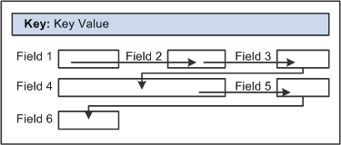
Example flow of noncolumnar page
In a columnar page, the tab order should go from the top to the bottom of the first column, then from the top to the bottom of the second column, and so on.
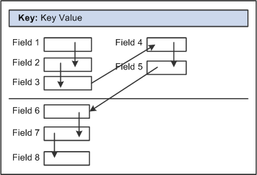
Example flow of columnar page
Fields that share the same label should follow consecutively in the tab order from left to right.
Testing Page Control Order
After you have placed all of the controls on your page, you should test the tab order. You can do this using either the test mode or by viewing the page in the browser. Using the View Page in Browser mode is more useful because you can also check the placement of controls and subfields that are on your page. In these testing modes, you can enter data into edit boxes and select radio buttons and check boxes. However, you cannot save data that you enter, and push buttons and links do not function.
Note. The tab order that you establish at design-time may not apply for all browsers.
See Troubleshooting Browser Limitations available on the My Oracle Support website. support.oracle.com
To test tab flow using View Page in Browser mode:
Open the page in PeopleSoft Application Designer that you want to test.
Select Layout, View in Browser.
Select the appropriate browser from the drop-down list box.
Press the Tab key to move from one field to the next.
Press Shift+Tab to move to the previous field.
Applying Control Order Rules
If you’re working with a complex page or you’re new to order lists, you might print out a page definition and work on the hard copy. The sequence number of each control is reflected in the Num column on the page report. You can easily mark where you need to move a control to make your page function properly, or you can look at the Lvl column on the Order tab of the page definition.
Use these rules to order your controls:
For radio buttons to function in a single group, they must be associated with the same record field and be listed together on the Order tab of the page definition. The only control that you can place between related radio buttons is the static text control to extend radio button labels. Put the text immediately after the radio button to which it relates.
List level-based controls (scroll areas, grids, and scroll bars) immediately before the first control that they govern, followed by the controls that are directly governed by that control. Level-based controls directly govern all controls that are listed below them on the order list until they encounter another level-based control that is at the same or lower level (higher occurs level number).
Place display controls before related displays that they govern. The related display controls don't have to follow the display controls immediately, but they must be inside the same scroll area or scroll. However, if you have more than one related display control, placing each immediately following its display control makes the order page easier to read and understand.
Changing Control Order Using the Order Tab
The Order tab of the page definition displays attributes about each of the page controls and their processing order. The Field ID column represents the order in which the control was added to the page. If you modify the order of page fields on the page, note that the numbers assigned to each field remain constant. Thus the IDs might not always appear in sequential order. When a database compare is performed, the Field ID appears on the Compare report to assist you in identifying specific page fields.
Reorder page fields on the Order tab by dragging them in the same view. Changing the order list doesn't change the physical location of controls on the page. It changes only the logical order or tab order in which controls are processed. When you have added and arranged all of your controls, you may want to print your page definition to see how you might need to reorder your controls.
The Order tab also governs processing rules for scrolls and record or field relationships. Consider which controls are associated with which scroll area or scroll bar and which secondary relationships are important to page processing.
To change the order list:
Open the page.
Select the Order tab on the open page.
The Order view appears. Use this view to change the logical processing order of fields on your page.
To move a control to another position in the control order list, select the control that you want to move.
Press the Shift key to select multiple controls.
Drag the selected control to the new position on the Order view.
The system moves the control to the new location in the list. The ID value remains static. The visual display of the page still looks the same—changing the order list doesn't move the control on the page, only the logical processing order of the control.
Important! When viewing your page in “Test Mode,” page fields cannot be accessed, moved, or modified from the Order tab if the page definition contains a sub page. Exit “Test Mode” to rearrange page fields in the order list.
Finding a Field on a Page Definition
Use the Order view to locate a field on a page definition. Using this method of locating fields is useful when you are working with detailed page definitions that contain many fields.
To find a field on a page:
Access the Order tab of your page definition.
Select the field that you want to locate on the page.
Select the Layout tab.
The field that you selected on the Order tab is selected in the Layout view.
Using Default Order
You can reorder the field list on the Order tab so that the logical control order reflects the physical control order as shown on the Layout tab. Do so by selecting Layout, Default Page Field Ordering. You can use this tool in either the Layout or Order view for your page definition. The system creates the default order by reading the page as though it was on a pixel-by-pixel grid, from top to bottom and left to right.
Note. Use the default ordering option sparingly on existing pages. It may offset any previous order that was created. However, on new pages, you may find default ordering a useful starting point for your control order list.
Spacing Controls on Pages
Provide adequate space between controls on a page so that fields and their labels don't touch or overlap other controls or labels in PeopleSoft Application Designer. If they do, then when your page appears in the browser, the label is offset automatically and the overlapped control might shrink.
You can layer or overlap fields only if the one that you are overlapping is set to Invisible on the Use tab of the properties dialog box for that control. When you move through the data entry controls on a page, the component processor recognizes only visible, unhidden fields as available for entry.
You can layer multiple invisible fields. However, you must set up your stacks of edit boxes so that all but one field in the stack are invisible or hidden at RowInit time.
Designing Inquiry Pages
You can design pages for inquiry purposes only. Inquiry pages are usually based on search records that extract specific information from different tables to display different views of your database, such as a summary of expenses by department.
To create an effective inquiry page:
Make all of the fields display-only.
Build in sufficient display control and related field relationships to show relevant descriptions.
When using level-based controls, disable the row action buttons so that the user cannot add or delete rows.
Aligning Page Controls and Page Control LabelsWhen you are in page design mode, the Align and Align Label buttons on the page definition toolbar enable you to align your page controls and their labels relative to each other, both horizontally and vertically.
PeopleSoft Application Designer uses relative alignment; the last item that you select is the guide, or anchor. All selected page controls or page control labels align relative to the anchor. The anchor does not move when you select an alignment option.
You can align page controls and their labels together by using the Align buttons. Both the control and its label move when you use this option. You can also align labels by themselves without moving the associated controls by using the Align Label buttons. The Align and Align Label buttons are enabled when you select two or more page controls or page control labels.
In addition to using the Align buttons, from the menu you can also select Layout, Align and then the control or label alignment position.
Note. Align the page controls before you align their labels.
Aligning Page Controls
To align page controls:
Select the controls that you want to align by pressing Ctrl and then clicking each page control.
Note. You can also select multiple page fields by clicking and dragging the cursor around the controls. However, for relative alignment purposes, the Ctrl + click is the preferred method of selection, because it enables you to explicitly set the anchor control.
Click the appropriate Align button in the toolbar: Align Left, Center, Right, Top, Middle, or Bottom.
When the page controls move, their labels move with them maintaining relative positioning to the associated controls.
You can manually move page controls after relative alignment, though previous alignment is not preserved.
Aligning Page Control Labels
To align page control labels:
Select the labels that you want to align by pressing Ctrl and then clicking each label or control.
Click the appropriate relative alignment button in the toolbar: Align Label Left, Center, or Right.
When the labels move, their controls remain stationary.
You can manually move labels after relative alignment, though previous alignment is not preserved.
See Also
Maximizing Performance
Page definitions permit controlled access to application data. The system can validate the data, write it to the database, and then retrieve and display it upon request. Behind the scenes, the component processor—the PeopleTools runtime processor—builds SQL statements that are based on the actions that you perform on pages. The component processor:
Manages the flow of data processing as users enter information on pages.
Issues INSERT, DELETE, and UPDATE statements to maintain data in the database and SELECT statements to retrieve data.
As you design your pages, some features can adversely affect page performance. There's always a tradeoff between eliminating a useful feature and speeding up page processing. Guidelines for improving page performance include:
Be judicious about references to record definitions other than the primary record definition under each scroll area.
References to other record definitions can include:
Related display controls.
PeopleCode references (such as edits and defaults) to other records.
Defaults to fields on other record definitions.
Field controls on derived or work records.
Put the field control on the appropriate derived or work record, rather than on a regular data record definition to derive its value.
For example, FTE (full-time equivalent) on the JOB record definition would be moved to the DERIVED_HR derived or work record because its value is derived by the system.
Use as few record definitions as possible in a component.
When you open a page in a component, the system loads all record buffers from the entire component into buffers.
Do not remove table edits to improve performance, even though an edit against another table causes a short pause.
Eliminating them may compromise data integrity.
Frames, scroll areas, scroll bars, grids, and group boxes all create HTML tables, which, in some browsers, might slightly degrade the performance of your system.
Be judicious about the number of these types of controls that you use on a page.
Apply deferred processing when possible to fields, pages, and components.
See Also
Designing Pages for Optimal Performance
PeopleCode and the Component Processor
Accessing PeopleCode in Page DefinitionsPage fields are associated with a specific record field. You can access the PeopleCode for that record field from the page field in the page definition. You might add PeopleCode to a field to achieve a variety of tasks, ranging from real-time editing of fields to altering the appearance of fields on a page. You can also associate PeopleCode with a component, component record, and component record field.
To edit or add record field PeopleCode through a page definition:
Select File, Open to open the page definition through which you want to access PeopleCode.
Select the field on the page for which you want to view the associated PeopleCode.
Select View, View Record PeopleCode.
The PeopleCode editor appears, providing access to all of the PeopleCode for the record that owns that field.
Select the PeopleCode event type from the drop-down list box in the PeopleCode editor.
You can also select other fields in the primary record from that drop-down list box.
Select File, Save to save your changes.
See Also
Accessing PeopleCode and Events
Viewing Pages in the Browser
This section discusses how to:
Work with the View in Browser feature.
Change the default browser.
Generate HTML.
View the HTML for a page.
Identify page definitions online.
Working With the View in Browser Feature
During the page design process, you should periodically view how your page looks in the browser. How you design your page in PeopleSoft Application Designer may look different when viewed online, particularly if you are using subpages that contain multiple fields.
To do this, select Layout, View in Browser. This feature is helpful if you are changing any of the style characteristics of the page or aligning and spacing controls, such as scroll areas.
This is the PSOPTIONS page definition:
This is the same definition in View In Browser mode.
The View in Browser feature provides only a rough idea of how your page might look. For a more complete view of the page at runtime, including the navigation header, assign your page to a component and add it to the existing menu structure using the Registration Wizard. You can then access the page from the menu in the PeopleSoft Pure Internet Architecture.
Changing the Default Browser
You can test your page in any browser by changing the default browser to one other than Microsoft Internet Explorer. After you set up a new browser, you can select in which browser you want to view your pages.
To change the default browser:
Open a page in PeopleSoft Application Designer.
Select Layout, View in Browser, Edit Browser List.
The Browsers dialog box appears.
Click the Add button.
Click the Browse button to locate the browser to add.
You must select the correct path and browser application for the new browser to function properly.
Enter the name, type, and version of the browser.
The name that you enter appears in the Layout, View in Browser menu.
Generating HTML
The PeopleSoft Pure Internet Architecture system automatically writes HTML forms or tags for all of the page controls that you add to a page. You do not need to know how to write HTML code to create pages in PeopleSoft Application Designer and then view them in the browser. The table shows this conversion:
Page Controls as HTML
|
Page Controls |
HTML Forms |
Static HTML Tags |
|
N/A |
|
|
N/A |
|
|
N/A |
|
|
N/A |
|
|
N/A |
|
|
N/A |
|
|
N/A |
HTML text |
|
|
N/A |
|
|
|
N/A |
|
You can view the HTML that is created for your page by using the Generate HTML feature. The Generate HTML feature writes the HTML code to a file on the local drive. This feature is mainly used for debugging purposes and is not needed for the creation of pages.
To generate HTML for a page:
Open the page for which you want to generate the HTML.
Select Layout, Generate HTML.
Select the browser type and version.
PeopleSoft Application Designer generates the HTML to the c:\TEMP\pshtml directory. The file is named according to the page name and the browser that you select. For example, the Absence History page is named ABSENCE_HISTORY IE5.00.html.
Viewing the HTML for a PageTo view the HTML for your page:
Open the generated HTML file.
The selected browser appears, displaying how your page appears at runtime.
Select View, Source in your browser window.
Notepad or another text-based application appears with the HTML that was used to create your page.
Note. Different browsers
might have different methods for viewing the HTML for your page.
To adjust the look or function of how your page looks in the browser,
do so in PeopleSoft Application Designer. If you make changes directly to
the HTML in Notepad, your changes are not saved
to the system. Each time that you open the page in the browser, it reverts
to the settings of the original page definition.
Identifying Page Definitions Online
In many cases, the page name online differs from the actual name of the page definition in PeopleSoft Application Designer. While viewing a page in the browser, locate the page definition name by pressing Crtl + J. A browser page appears revealing the name of the page, along with other system elements:
You can also right-click the page and selecting View Source from the drop-down menu. The HTML code appears for your page in a text application, such as Notepad. In most cases, the page name is in the sixth or so line of code after Page:. You can also identify the component and menu definitions for your page next to the page definition name.
Producing Pages
This section provides an overview of page production and discusses how to:
Change general page information.
Change page use information.
Save pages.
Rename and delete pages.
Print page definitions.
Alter page setup.
Read a page definition report.
Understanding Page ProductionIf you change pages or delete controls in the page definition, use the tools in the Edit and File menus. To avoid making changes that might adversely affect your application database, review your plans with your database administrator. Together, you can evaluate the effect that your actions might have on the system database as a whole.
Several additional steps in the page design process help make future editing of page definitions easier.
After you design a page, you must set the attributes for how the page should function and make sure that you have the proper documentation to assist you when performing upgrades. Access the Page Properties dialog box by selecting File, Definition Properties in page definition mode.
Use the General tab in the Page Properties dialog box to document the page. Enter both short and long descriptions of the page here. You can also document what changes have been made, or must be made, to a page.
Changing General Page Information
Access the Page Properties dialog box and select the General tab. Enter a description and any comments about the page and assign an Owner ID.
Changing Page Use Information
Access the Page Properties dialog box and select the Use tab.
|
Page Type |
Select Standard page, Subpage, Secondary page, or Popup page from the drop-down list box. See Understanding Secondary Pages. See Using Pop-up Pages. |
To accommodate different types of workstation monitors, you can adjust the page size.
|
Select a different style sheet for a specific page to override the style sheet that is selected for the application. If you do not select a different page style sheet (keeping ***Use Default Style***), the system uses the style sheet that is specified on the PeopleTools Options page. |
|
|
Select a different page background style class to override the background style of the page style sheet specified above. If you keep the ***Use Default Style*** setting, the system uses the default background of the page style sheet. |
Note. The style options that you select in the design time environment might look different at the runtime rendering of the page. For example, font and page control sizing metrics are different in the design time Windows environment and the runtime browser environment. As such, when developing pages, do not rely entirely on the rendering of the page in PeopleSoft Application Designer to gauge layout considerations, such as font size and the placement of controls. You should view all pages in the runtime browser environment and adjust them accordingly.
Additional Settings
|
Select to set the page to resize automatically when hidden fields are present. |
|
|
Pop-Up Menu |
|
|
Deselect if you want the page and all of its fields to follow standard processing. Deferred processing is the default. |
These options are available when you select Secondary page as the page type.
|
None |
Select to have the secondary page appear in the target area of the browser, similar to standard transaction pages. |
|
Display in Modal Window |
Select to have the secondary page appear in its own window, hovering over the transaction page, which is grayed out until you dismiss the secondary page. |
Saving Pages
To save your work, select File, Save or File, Save As.
When you save your page, the system performs various edits and issues warning messages as appropriate. The warning explains any errors that are associated with each control. You can disregard these messages and save your work anyway, but you cannot view the page in the browser until all errors are corrected.
Access the explanation of an error message by clicking the Explain button in the warning message box. You can fix the problem immediately or save the page and return later to correct it.
Renaming and Deleting Pages
If you rename a page, the change is reflected throughout the system, including in PeopleCode, so you do not have to change the page name anywhere else.
To delete a page, particularly a subpage or a secondary page, first use the Find Definition References option to determine which page, component, and menu definitions refer to or use the page you want to delete.
See Also
Printing Page Definitions
To keep track of your application definitions and refinements, print your page definitions and keep a log or binder with your new and revised pages as you reconfigure your applications. You may want a reference for each page that includes both the onscreen image and the page control information (the record definitions and special uses or edits that you applied), as well as the information for any subpages that are included in the page definition.
Printing page definitions also helps you debug during testing. Each report includes a unique identifier that the system automatically increments each time you change the page.
To print a page definition:
Open the appropriate page.
Select File, Print.
Altering Page Setup
Access the Print Setup dialog box by selecting File, Print Setup.
All print options are selected by default.
|
Select to print the list of fields on the page and all of the parameters that you set for each one. |
|
|
PeopleCode |
Select if you used PeopleCode to design your page |
|
Select to provide a snapshot of your page design. Graphics generally take longer to print than page descriptions or PeopleCode reports. |
|
Select to print a header at the top of the report indicating the date and time that you printed the report and the database name, page name, version number, and page number. This option is selected by default. |
|
|
Select to print a footer at the bottom of the report indicating the date and time that you printed the report and the database name, page name, version number, and page number. This option is deselected by default. |
|
|
Select to print a border or box around a page report. This option is deselected by default. |
|
|
Border Space (mm) (border space (in millimeters)) |
Select to insert a set amount of space between a graphical border around the page report and the margins of the report. Deselect this option to print in character mode (faster) rather than in graphics mode (slower). The default space is 3 mm, but you can change it. |
Set the distance, in millimeters, from the edge of the page to the left, right, top, and bottom edges of the page image or report. The defaults are:
Top: 20.
Bottom: 5.
Left: 10.
Right: 0.
Note. The HP LaserJet printer is the default.
Reading a Page Definition Report
This table lists the columns on the page definition report and describes their content:
|
Column |
Content |
|
Num (Number) |
Sequential number that shows the relative position of the field in the field order list for the page. |
|
Field Type |
Field type, such as edit box. |
|
Label Text |
The label associated with the field, regardless of whether the label appears on the page. |
|
Label Type |
|
|
Record Name |
Record name where the field is located. |
|
Field Name |
Field name on the record definition with which the page field is associated. |
|
Siz (size) |
Field size (custom, minimum, or maximum). |
|
Alg (alignment) |
Alignment (left or right). |
|
On |
Value of the radio button or the on value of the check box (typically Y). |
|
Off |
The value of the radio button or the off value of the check box (typically N). |
|
DSP (display) |
Yes indicates a display-only field. |
|
INV (invisible) |
Yes indicates an invisible field. |
|
CTL (control) |
Yes indicates a display control field. |
|
REL (related) |
Yes indicates a related display field. |
|
RelNum (related number) |
Number (Num column) of the display control field for this related display field. |
|
CUR (currency) |
Yes indicates a multicurrency field that does not appear unless the user is operating in multicurrency mode. |
|
DER (derived) |
Yes indicates a field from a derived or work record. |
|
OccLvl (occurs level) |
Occurs level of scroll bar that governs this field. |
You may see additional reference lines following each field or at the end of the report:
|
Reference |
Description |
|
Page Help Context: nnn |
Indicates that the page was assigned a page help context number that links it to a help file that describes how the field is used wherever it appears in the database. |
|
Field Help Context: nnn |
Indicates that this field, as used on this page, was assigned a record field help context number that links it to a help file that describes how the field is used only as it appears in this record definition. |
Working with Pages in Foreign LanguagesThis section provides an overview of working with pages in a foreign language and discusses how to:
Perform a Save As using foreign language pages.
Delete foreign language pages.
Understanding Working with Pages in a Foreign LanguageMany organizations are multinational, operating their business in multiple countries and continents. For efficiency, these organizations typically deploy a single application in multiple languages. However, because internal application developers and administrators may not be familiar with each language in which applications are deployed, this can cause difficulty when updating or maintaining the applications. To assist developers at multinational organizations, PeopleSoft provides a Save As option and a Delete option when working with foreign language pages.
Performing a Save As Using Foreign Language PagesPeopleSoft Application Designer enables developers to modify pages in their base language and save the page in another language. This capability decreases the time required to develop pages in other languages, and it relieves developers from having to modify pages in languages they do not understand. To open a page definition in your base language and save the changes to another language, use the Save As option.
The Language drop-down list box on the Save As dialog box is only available when you are signed onto the database in the base language. When performing the Save As, select the appropriate language from the Language drop-down list box.
If the page definition exists in the foreign language (in the nonbase language), the system prompts you to confirm an overwrite of the definition.
Note. You can save modifications to a nonbase language only if the base language definition already exists. If the base language page does not exist, then the system saves the page to the base language, regardless of the language selected.
Note. After doing a Save As to another language, the page will still appear in PeopleSoft Application Designer in the base language.
Deleting Foreign Language PagesWhen you are signed onto the database in the base language, the Delete dialog box contains the Language drop-down list box. The Language drop-down list box enables you to delete multiple pages from multiple nonbase languages.
Note. Deleting the base language page automatically deletes all translated pages for the deleted base language page.