 Understanding Style Sheets and Style Classes
This chapter provides an overview of style sheets and style classes and discusses how to:
Create standard and sub style sheets.
Set style class attributes.
Work with free form sub style sheets.
Work with default style sheets.
Override default page style properties.
Modify page tabs.
Modify push buttons in SWAN style sheets.
Understanding Style Sheets and Style Classes
This section discusses:
Overview of style sheets and style classes.
Style sheet types.
Style classes.
 Overview of Style Sheets and Style Classes
Style sheets are definitions that store margins, spacing, fonts, borders, color and other layout settings for particular elements of a page. When you use a style sheet, the system applies the predefined layout settings or style classes to every page in an application. By storing all page layout settings in a style sheet definition, you eliminate the need to redefine the same settings for each page separately, you can quickly reconfigure and apply new settings, and you maintain a consistent appearance throughout the application.
In PeopleSoft applications, a style sheet is a definition, like a record or page definition, that you create and maintain in PeopleSoft Application Designer. A style sheet is a standalone definition that you can upgrade, delete, rename, and so on.
You define style sheets by using the Fixed Form and Free Form tabs.
In this example, you see the Fixed Form tab, which you access to insert style sheets, sub style sheets, free form sub style sheets, or style classes into a definition:
In this example, you see the Free Form tab, which you access to enter text when you create a free form sub style sheet. For standard style sheets and sub style sheets, use this view to examine or copy the text that is generated by the style sheet definition:
Note. For standard style sheets and sub style sheets, the Free Form tab text is read-only.
Style Sheet Types
You can create three style sheet types using PeopleSoft Application Designer:
Standard style sheet
Sub style sheet
Free sorm sub style sheet
This is an example of a standard style sheet:
Standard style sheets are the primary organizers for working with style sheets and style classes. Standard style sheets are containers that can include sub style sheets, free form sub style sheets, and style classes in any combination; however, standard style sheets cannot contain other standard style sheets.
Standard style sheets can inherit style classes from other standard style sheet definitions through the Parent Style Sheet property. The parent style sheet propagates all of its style classes to the child style sheet. Only standard style sheets can have parent style sheets and be used as parent style sheets.
This is an example of a sub style sheet:
In the same way that PeopleTools supports subrecords, you can define sub style sheets. The primary purpose of sub style sheets is to organize and reuse style classes. You can insert sub style sheets into standard style sheets as well as into other sub style sheets. Sub style sheets neither have parent style sheets nor can be used as parent style sheets.
To use sub style sheets, you must insert them into standard style sheets.
This is an example of a free form sub style sheet:
Free form sub style sheets are text-based sub style sheets that enable you to take advantage of Cascading Style Sheets - Level 2 (CSS2), AJAX, and DHTML features. With a free form sub style sheet, you can create the style sheet in a third-party editor and then copy the style sheet text into the Free Form tab of the free form sub style sheet. On free form sub style sheets, the Fxed Form tab is grayed out because free form sub style sheets do not support inheritance or aggregation. Free form sub style sheets cannot have parent style sheets nor can they be used as parent style sheets.
Note these important points regarding the use of free form sub style sheets:
Like other sub style sheets, to use free form sub style sheets you must insert them into a standard style sheet or into a sub style sheet that is part of a standard style sheet.
When creating free form style sheets, style class names must be identical to the PeopleTools default style class names.
If you replace the default style sheet or override the page style sheet with a style sheet that includes only free form text, the free form sub style sheet must define and include all default style classes used by the application. Unexpected results will occur in both PeopleSoft Application Designer and PeopleSoft Internet Architecture pages if a default style class is missing.
At runtime, style classes in free form sub style sheets take precedence over PeopleTools-formatted style classes of the same name.
Note. Free form sub style sheets are supported in PeopleTools release 8.50 and higher. If you attempt to import a free form sub style sheet into an earlier release, the free form sub style sheet imports as an empty standard style sheet.
Style Classes
Access a style class dialog box.
Standard style sheets and sub style sheets comprise standard style classes. The style class determines the visual properties of pages and page controls by controlling a broad range of characteristics, including font size, spacing, alignment, border width, font weight, and color.
Style classes in different style sheets are independent of each other. You can copy existing style classes and paste, or insert, them into any style sheet. However, the most efficient way to share style classes across multiple style sheets is to group style classes into sub style sheets.
Default style classes are the PeopleTools style classes that the system explicitly associates with a page element, such as the page, each page control type, page control labels, and so on. PeopleSoft applications use the default style classes to render the page and all page elements at design time and at runtime, unless you specify a style property override.
See Overriding Default Page Style Properties.
Note these points about default style classes:
If you change an attribute of a default style class, the change affects every occurrence of the page element throughout an application, except the instances that do not use the default style.
The application style sheet (or any page level override) must include all default style classes for the system to render pages correctly at design time and at runtime. The default style classes can be accounted for in standard or free form format in any combination. However, unexpected results will occur in both PeopleSoft Application Designer and PeopleSoft Internet Architecture pages if a default style class is missing.
Note. PeopleTools style sheets include all default style classes. You should not modify any PeopleTools style sheets or the attributes of default style classes.
Most default style class names enable you to easily identify the page element with which they are associated. For example, PSEDITBOX is the name of the default style class for all edit box page controls. When you examine a specific edit box control, the value in the Style field, however, is not the name of the default style class. The Style field value of ***Use Default Value*** identifies any page element using its default style class.
This PeopleBook includes an appendix that lists and describes the default style classes.
This list includes some examples of custom style classes:
Creating new PeopleTools style classes, inserting them into standard style sheets, and using them as style overrides to create unique pages in an application.
Creating and inserting override style classes that supplant style classes inherited from a parent style sheet.
Overriding page style classes with non-default, existing PeopleTools style classes.
Creating free form style sheets that reconfigure one or more default style classes.
Creating Standard and Sub Style Sheets
This section discusses how to:
Create standard style sheets or sub style sheets.
Rename standard style sheets or sub style sheets.
Delete standard style sheets or sub style sheets.
Insert sub style sheets into style sheets.
Insert style classes into style sheets.
Inserting override style classes into style sheets.
Creating Standard Style Sheets or Sub Style SheetsTo create a new standard style sheet or sub style sheet:
Select File, New.
Select Style Sheet from the Definition drop-down list box and click the OK button.
Select the style sheet type.
Click the OK button.
Select File, Definition Properties.
Select the style sheet type and parent style sheet.
The Parent Style Sheet field is enabled if you create a standard style sheet only. The default parent style sheet is the application style sheet that you set on the PeopleTools Options page.
Enter a description.
Save the style sheet.
Renaming Standard Style Sheets or Sub Style SheetsTo rename standard or sub style sheets:
Select File, Rename.
Select Style Sheet in the Definition drop-down list box and then enter search criteria to find the style sheet definition that you are deleting.
Click the Rename button; the definitions that match the search criteria appear in the list box.
Double-click the style sheet definition that you want to rename.
Enter the new name of the style sheet definition in the highlighted area and press the Enter key.
Click the OK button to confirm the rename.
Note. When you rename a standard or sub style sheet, PeopleSoft Application Designer automatically renames all references to the style sheet.
Deleting Standard Style Sheets or Sub Style SheetsTo delete standard or sub style sheets:
Select File, Delete.
Select Style Sheet in the Definition drop-down list box and then enter search criteria to find the style sheet definition that you want to delete.
Press the Delete key; the definitions that match the search criteria appear in the list box.
Click the style sheet that you want to delete and press the Delete key.
Click the OK button to confirm the deletion or click the Cancel button to cancel the operation.
Note. When you delete a style sheet, PeopleSoft Application Designer automatically deletes all references to the deleted style sheet. If you delete a style sheet that contains sub style sheets, the sub style sheets are not deleted; they become independent definitions.
Inserting Sub Style Sheets into Style Sheets
You can insert a sub style sheet into a standard style sheet or another sub style sheet.
To insert a sub style sheet into style sheets:
Create or open the receiving style sheet.
Select Insert, Insert Sub Style Sheet.
In the drop-down list boxes, select the sub style sheet type and the sub style sheet that you want to insert.
Click the OK button.
Save the sub style sheet.
You can remove sub style sheets from within other style sheets by highlighting the sub style sheet and pressing the Delete key. This action does not delete the definition from the database; it removes the sub style sheet from the current definition only.
Inserting Style Classes into Style Sheets
You can insert style classes into any standard style sheet or sub style sheet.
To insert a style class into a style sheet:
Open the style sheet in which you want to create the new style class.
Select Insert, Insert Style Class.
Enter the name of the new class.
Copy attributes from another style class by selecting the style class name from the Copy Values From Style Class drop-down list box.
Leave the Copy Values From Style Class field empty if you want to set all style class properties manually.
Click the OK button.
Configure style class attributes, as necessary.
You can remove a style class from a style sheet by highlighting the class and pressing the Delete key. This action does delete this instance of the style class from the database.
Note. For efficiency, clone style classes from other style sheets. Then, either use the Insert menu or paste the style class into the new style sheet. At that time, the system enables you to enter the new style class name. Be aware that when copying style classes, the copy or clone will not contain any of the related language data associated with the original.
Inserting Override Style Classes into Style SheetsWhen you create a style sheet and configure the Parent Style Sheet property, the new style sheet inherits all of the style classes of the parent. If you want to change the attributes of an inherited default style class in the new style sheet, you insert an override style class. To insert an override style class into a style sheet:
Open the style sheet.
Verify that the Parent Style Sheet property is configured correctly.
Select Insert, Override Style Class.
Select the style class name from the Style Class drop-down list box and click the OK button.
The class properties dialog box appears showing the old settings.
Configure the override style class, as necessary.
Click the OK button.
Save the style sheet definition.
Setting Style Class Attributes
This section provides overviews of class attributes and fonts and discusses how to:
Access class attributes.
Specify fonts.
Set font attributes for a specific language.
Specify spacing and alignment.
Specify background attributes.
Reference a background image URL.
Specify border attributes.
Specify margins.
Specify miscellaneous attributes.
Understanding Class AttributesClass attributes are grouped into categories and appear in a tabbed dialog box for each class.
Note. PeopleSoft Application Designer does not render certain style class formatting attributes at design time. You might be able to see the attribute at runtime only. Also, not all browsers support every style class attribute.
PeopleSoft Pure Internet Architecture supports the attributes that are listed in the World Wide Web Consortium (W3), Cascading Style Sheets, Level 1.
See http://www.w3.org/TR/REC-CSS1
Every class has each of these major attributes, which correspond to a tab in the Class dialog box.
|
Controls the font in which text appears. If more than one font is specified, the browser displays the first font; if it cannot find it, it displays the next font. |
|
|
Controls the spacing in addition to the default spacing. You can specify additional spacing between words and between letters. You can also specify the alignment, height, indent, and white space. |
|
|
Controls the background colors for the page control. If the background is an image, you can select how the image appears. |
|
|
Controls the border that appears around the element. You can specify width, color, and style. |
|
|
Controls the margins and padding on each side of the element. |
|
|
Controls the display of list-item markers, URLs, and cursor formats. |
Understanding Generic and Installed Fonts
When you add a font, the dialog box provides a choice between generic fonts and installed fonts.
Generic fonts can appear in all browsers. This table lists examples of some of the generic fonts:
|
Generic Font |
Example |
|
Cursive |
Zapf-Chancery |
|
Fantasy |
Western |
|
Monospace |
Courier |
|
Sans serif |
Helvetica |
|
Serif |
Times New Roman |
Installed Fonts
Installed fonts are installed on your computer. If you use an installed font for a style class, you should:
Verify that all users of your application have the same installed font.
Specify the installed font first, followed by a generic font.
If the installed font is not available to users of your application, they can use the generic font.
Accessing Class Attributes
To access class attributes:
Open a style sheet.
Double-click the class name.
Specifying Fonts
Access the class dialog box and select the Font tab.
Specify the font in which you want the text to appear. You can specify more than one font so that if the browser cannot display the first font, it will attempt to display the next font, and so on, until it finds a font that it can display.
|
Absolute |
Select to use a size from the drop-down list box (xx-small, x-small, small, medium, and so on). Adjacent sizes have a scaling factor of 1.5 between them. |
|
Length |
Specify the size with a number and select the measurement type from the drop-down list box (em, ex, Pixels, Inches, Millimeters, and so on). |
|
Percentage |
Specify a number, followed by a percent sign (%). Percentage values are always relative to the parent element. |
|
Relative Larger and Relative Smaller |
Select to interpret the font relative to the table of font sizes and the font size of the parent element. For example, if the parent element has a font size of medium and you select Relative Larger, this font size is large. |
|
Select the weight of the font. The values 100 to 900 form an ordered sequence in which each number indicates a weight that is at least as dark as its predecessor. The value Normal is synonymous with 400, and Bold is synonymous with 700. |
|
|
Font Style |
Select the style of the font. Values are: Normal, Italic, or Oblique. These values are matched to existing fonts with those names. |
|
Font Variant |
Select a variant. Values are: Normal or Small Caps. In a small caps font, the lowercase letters look similar to the uppercase ones, but they are a smaller size and have slightly different proportions. |
|
Specify a color or select a color from a color palette. |
Setting Font Attributes for a Specific Language
You can change the fonts that are available based on the base language settings. The default for the base language is English, providing generic fonts. If these fonts are not appropriate for a particular language, you must set the language preference before opening a style sheet. You can then set the font name list, font size, or font weight for the selected language.
To set font attributes for a specific language:
Select PeopleTools, Utilities, International, Preferences from your browser.
Select the appropriate language for the style sheet from the drop-down list box.
Save the new selected language as the base language.
Open the style sheet definition in which you want to save the font name list, font size, or font weight for the selected language.
Specifying Spacing and Alignment
Access the class dialog box and select the Spacing/Alignment tab.
|
Word Spacing and Letter Spacing |
Select Normal or Length. If you select Length, specify a number to indicate an addition to the default space between words or letters. Values can be negative, but implementation-specific limits might exist. |
|
Vertical Alignment |
Select the vertical positioning of the element. Values are: Baseline: Aligns the baseline (or the bottom if the element does not have a baseline) of the element with the baseline of the parent. Sub: (subscript) Aligns the top of the element with the baseline of the parent element. Super: (superscript) Aligns the baseline of the element with the top of the parent element. Top: Aligns the top of the element with the tallest element in the line. Text Top: Aligns the top of the element with the top of the parent elements font. Middle: Aligns the vertical midpoint of the element (typically an image) with the baseline plus half of the x-height of the parent. Bottom: Aligns the bottom of the element with the lowest element on the line. Text Bottom: Aligns the bottom of the element with the bottom of the parent elements font. Percentage: Refers to the value of the line-height property of the element itself. It raises the baseline (or the bottom if it has no baseline) of the element to the specified amount above the baseline of the parent. Negative values are possible. For example, a value of −100% lowers the element so that the baseline of the element is where the baseline of the next line should have been. This setting allows precise control over the vertical position of elements (such as images that are used in place of letters) that do not have a baseline. Note. Using the top and bottom alignments could cause a loop in which element dependencies occur. |
|
Line Height |
Set the distance between the baselines of two adjacent lines. When a numerical value is specified, the line height is provided by the font size of the current element multiplied with the numerical value. This differs from a percentage value in the way it inherits. When a numerical value is specified, child elements inherit the factor itself, not the resultant value (as is the case with percentage and other units). Negative values are not allowed. |
|
Text Indent |
Specify the indentation that appears before the first formatted line. This value can be negative, but implementation-specific limits might exist. An indentation is not inserted in the middle of an element that was broken by another. |
|
Text Align |
Specify how text is aligned in the element. Because Text Align inherits, all block-level elements inside the DIV element with CLASS=center are centered. Note. Alignments are relative to the width of the element, not the canvas. |
|
White Space |
Specify how to handle white space inside the element. Values are: Normal: White space is collapsed. Pre: Behaves like the PRE element in HTML. Nowrap: Wrapping is done only through elements with a line break. |
Specifying Background Attributes
Access the class dialog box and select the Background tab.
|
Background Color |
Specify the background color of an element. |
|
Set the background image of an element to an image file that was previously defined. When you set a background image, also set a background color to use when the image is unavailable. When the image is available, it appears on top of the background color. |
|
|
Background Repeat |
If you specify a background image, indicate whether the image is repeated and, if it is, how many times. |
|
Background Attachment |
If you specify a background image, indicate whether it is fixed to the canvas or whether it scrolls along with the content. |
|
Background Position |
If you specify a background image, set its initial position. Values are: Top: Aligns the background to the top of the element. Left: Aligns the background to the left of the element. Center: Aligns the background to the midpoint of the element (typically an image). Bottom: Aligns the background to the bottom of the element. Right: Aligns the background to the right of the element. Length: Specifies the length of the background and the unit of measure. Percentage: Refers to the value of the line-height property of the background itself. It raises the baseline of the element (or the bottom, if it has no baseline) the specified amount above the baseline of the parent. Negative values are possible. For example, a value of −100% lowers the element so that the baseline of the element is where the baseline of the next line should have been. This setting allows precise control over the vertical position of elements without a baseline, such as images used in place of letters. |
Examples of Percentage and Length Value Pairs and Keywords
This table lists background positions, value pairs, and their effect:
|
Background Position |
Value Pair |
Effect |
|
Percentage |
0 and 0 |
Places the upper, left-hand corner of the image in the upper, left-hand corner of the box that surrounds the content of the element (that is, not the box that surrounds the padding, border, or margin). |
|
Percentage |
100 and 100 |
Places the lower, right-hand corner of the image in the lower, right-hand corner of the element. |
|
Percentage |
14 and 84 |
Places the point that is 14 percent across and 84 percent down the image at the point that is 14 percent across and 84 percent down the element. |
|
Length |
2cm and 2cm |
Places the upper, left-hand corner of the image 2 centimeters (cm) to the right and 2 cm below the upper, left-hand corner of the element. |
|
Top Left or Left Top |
NA |
The same as 0 percent and 0 percent. |
|
Top Center or Center Top |
NA |
The same as 50 percent and 0 percent. |
|
Right Top or Top Right |
NA |
The same as 100 percent and 0 percent. |
|
Left Center or Center Left |
NA |
The same as 0 percent and 50 percent. |
|
Center and Center |
NA |
The same as 50 percent and 50 percent. |
|
Right Center or Center Right |
NA |
The same as 100 percent and 50 percent |
|
Bottom Left or Left Bottom |
NA |
The same as 0 percent and 100 percent. |
|
Bottom Center or Center Bottom |
NA |
The same as 50 percent and 100 percent. |
|
Bottom Right or Right Bottom |
NA |
The same as 100 percent and 100 percent. |
Note. If you set only one percentage or length value, the system sets the horizontal position only and the vertical position becomes the default 50 percent. If you set two values, the first one is the horizontal position. You can set negative positions and combinations of length and percentage values, for example 50 percent and 2 cm.
Referencing a Background Image URL
To specify a background image URL, select from a drop-down list box that is populated by entries in the URL Maintenance table. To reference a background image file on a designated server, add its location to the URL Maintenance table.
You reference a background image in the URL Maintenance table in the same way you would register any other URL.
See URL Maintenance.
Specifying Border Attributes
Access the class dialog box and select the Border tab.
|
Border Width |
Specify the width of each line in the border. Values are:Thin, Medium, or Thick, or you can specify Length, which enables you to specify a font size (with a number) and the measurement type from the drop-down list box (Pixels, Inches, Millimeters, and so on). |
|
Specify the color of each line in the border. You can specify a hexadecimal value for the color or select the color from a color palette. |
|
|
Border Style |
Specify the style of line in the border. Values are: None: No border is drawn (regardless of the <border-width> value). Dotted: Border is a dotted line that is drawn on top of the background of the element. Dashed: Border is a dashed line that is drawn on top of the background of the element. Solid: Border is a solid line. Double: Border is a double line that is drawn on top of the background of the element. The sum of the two single lines and the space between equals the <border-width> value. Groove: Border is a three-dimensional groove that is drawn in colors based on the <color> value. Ridge: Border is a three-dimensional ridge that is drawn in colors based on the <color> value. Inset: Border is a three-dimensional inset that is drawn in colors based on the <color> value. Outset: Border is a three-dimensional outset is that is drawn in colors based on the <color> value. |
Specifying Margins
Access the class dialog box and select the Margins tab.
|
Margin and Padding |
Specify the margin and padding for each side of the element. Values are: Length: Specify a font size and the measurement type from the drop-down list box (pixels, inches, millimeters, and so on). Percentage: Specify a number, followed by a percent sign (%). The percentage value is relative to the parent element. Auto: The system calculates the width. Do not use negative values for padding. |
|
Width and Height |
Set the width and height of text elements. These properties are most useful with replaced elements, such as images. The system scales the image to fit the value that you specify. If you set either property to Auto and the image needs scaling, the system preserves the aspect ratio of the image. Do not use negative values. Note. If the width and height of a replaced element are both set to Auto, the system sets these properties to the intrinsic dimensions of the element. |
Specifying Miscellaneous Attributes
Access the class dialog box and select the Miscellaneous tab.
|
Specify the appearance of the list-item marker if the List Style Image URL field is blank or if the system cannot display the image that the URL referenced. |
|
|
List Style Image Url (list style image URL) |
Specify the URL containing the image to display as the list-item marker. |
|
List Style Position |
Specify how the list-item marker is drawn relative to the content. Values are: Inside and Outside. |
|
Display |
Specify how an element appears on the canvas, which might be a printed page or a computer display. Values are: Block: Opens a new box. The box is positioned relative to adjacent boxes. Typically, elements like H1 and P are block types. ListItem: Similar to block except that a ListItem marker is added. In HTML, LI typically has this value. Inline: Results in a new inline box on the same line as the previous content. The box dimensions are based on the formatted size of the content. If the content is text, it might span several lines and each line will have a box. The margin, border, and padding properties apply to inline elements but do not affect line breaks. None: Deactivates the display of the element, including children elements and the surrounding box. |
|
Float |
Specify how the element floats with the text. Values are: None: Causes the element to appear where it appears in the text. Left and Right: Causes the element to move to the left or right, and the text wraps on the right-hand or left-hand side of the element, respectively. With a Left or Right value, the system treats the element as block-level and ignores the Display property. |
|
Clear |
Specify the sides of an element on which floating elements are not accepted. Values are: Left: An element appears below any floating element on the left-hand side. Right: An element appears below any floating element on the right-hand side. Both: An element appears below any floating element on the left-hand and the right-hand side. None: Floating elements are allowed on all sides. |
|
Transform |
Use for text elements only. Values are: Capitalize, Uppercase, Lowercase, and None. |
|
Specify the appearance of the cursor when it passes over an element. |
|
|
Disabled Field |
Specify the appearance of the link when the link (or field) is disabled. |
|
WSRP Style (web services for remote portlets style) |
Pseudo classes are mechanisms that extend the expressiveness of style sheets. Using pseudo classes, you can change the style of page links based on whether and when the links have been visited. Pseudo classes do not exist in HTML; that is, they are not visible in the HTML code.
PeopleSoft applications uses pseudo classes to specify how a browser indicates to a user the status of links in a document that the user is viewing. For example, a browser might display a document link in a different color than the rest of the text.
|
Link |
Specify the normal appearance of a link. |
|
Active |
Specify the appearance of a link that is actively selected. |
|
Visited |
Specify the appearance of a link that has been visited. |
|
Hover |
Specify the appearance of a link when it is designated but not activated. For example, when the cursor hovers over a box that an element generated. |
|
Position |
The position property places an element in a static, relative, absolute, or fixed position. Static: The page element always has the position the normal flow of the page gives it (a static element ignores any top, bottom, left, or right declarations). This value is the default. Relative: The page element moves relative to its normal position, for example, left:20 adds 20 pixels to the left position of the element. Absolute: The page element is positioned at the specified coordinates relative to its containing block. The position of the element is specified with the left, top, right, and bottom properties. Fixed: The page element is positioned at the specified coordinates relative to the browser window. Absolute: The page element is positioned at the specified coordinates relative to its containing block. The position of the element is specified with the left, top, right, and bottom properties. |
|
Z-Index |
Positioning of elements in CSS occurs in three dimensions, not just two. The placement of elements along this third axis, a z-axis, is exactly what this property controls. The third dimension is perpendicular to the screen, giving the screen a sense of depth. Elements can be overlapped, with higher or closer elements obscuring elements that are lower or farther away (element transparency becomes an important issue with this capability). The rendering box for each element is automatically assigned an integer z-index stacking level based on its context in the document. Boxes with greater z-axis numbers will appear in front of boxes with lower z-axis numbers (0 and negative numbers are allowed). Explicitly setting the z-index property for an element box not only sets its z-position relative to other element boxes in its current context, it also initiates a new stacking context hierarchy that affects the current element box and its child elements. If two or more boxes have the same stacking level within the same context, then they are rendered back to front in the order of the document tree. If no z-index property is set for an element box, then it inherits the stacking level of its parent element box. |
|
Overflow |
This property specifies whether the content of a block-level element is clipped when it overflows the element box (which acts as a containing block for the content). Visible: This value indicates that content is not clipped; it may be rendered outside the block box. Hidden: This value indicates that the content is clipped and that no scrolling mechanism should be provided to view the content outside the clipping region; users will not have access to clipped content. You specify the size and shape of the clipping region using the Clip property. Scroll: This value indicates that the content is clipped and that if the user agent uses scrolling mechanism that is visible on the screen (such as a scroll bar), a box should display the mechanism whether any of its content is clipped. This setting avoids any problem with scroll bars appearing and disappearing in a dynamic environment. When this value is specified and the target medium is print or projection, overflowing content should be printed. Auto: The behavior of this value is user agent-dependent, but it should cause a scrolling mechanism to be provided for overflowing boxes. |
|
Visibility |
This property specifies whether the boxes generated by an element are rendered. Invisible boxes still affect layout (set the Display property to None to suppress box generation altogether). Visible: The generated box is visible. Hidden: The generated box is invisible (fully transparent) but still affects layout. Collapse: This property may be used in conjunction with scripts to create dynamic effects on rows and columns. If used on elements other than rows or columns, Collapse has the same meaning as Hidden. |
Working With Free Form Sub Style SheetsThis section discusses how to:
Create free form sub style sheets.
Insert free form sub style sheets into standard style sheets.
Convert standard style sheets into free form sub style sheets.
Rename free form sub style sheets.
Delete free form sub style sheets.
Include meta variables and comments in free form sub style sheets.
Change font and color settings in free form sub style sheets.
Creating Free Form Sub Style Sheets
To create a free form sub style sheet:
Select File, New.
Select Style Sheet from the list.
Select the Free Form Sub Style Sheet style sheet type.
Select File, Definition Properties to enter a description for documentation purposes; when done, click the OK button.
Select the Free Form tab and enter the text for the style sheet.
Save the style sheet.
Important! The Style Sheet Editor does not perform any syntax checking on free form sub style sheets. You must verify and correct any style errors that occur at runtime.
Inserting Free Form Sub Style Sheets into Standard Style SheetsTo insert a free form sub style sheet into a standard style sheet:
Open the receiving standard or sub style sheet.
Click the Fixed Form tab.
Select Insert, Insert Sub Style Sheet.
Select Freeform Sub Style Sheet from the Sub Style Sheet Type drop-down list box.
Select the free form style sheet from the Sub Style Sheet drop-down list box.
Click the OK button and save the style sheet.
Converting Style Sheets to Free Form Sub Style Sheets
To convert a style sheet to a free form sub style sheet:
Open a standard style sheet or sub style sheet.
Select File, Definition Properties.
In the Style Sheet Type drop-down list box, select Freeform Sub Style Sheet and click the OK button.
Note. You will be warned that once the style sheet is saved as a free form type the style sheet data cannot be converted back to the standard or sub style sheet type.
Dismiss the warning dialog box.
Save the style sheet.
Note. You should not modify a PeopleTools style sheet; instead, clone the style sheet and make changes to the copy.
Renaming Free Form Sub Style SheetsTo rename a free form sub style sheet:
Select File, Rename.
Select Style Sheet in the Definition drop-down list box and then enter search criteria to find the style sheet definition that you are renaming.
Click the Rename button; the definitions that match the search criteria appear in the list box.
Double-click the style sheet definition that you want to rename.
Enter the new name of the style sheet definition in the highlighted area and press the Enter key.
Click the OK button to confirm the rename.
Note. When you rename a free form sub style sheet, PeopleSoft Application Designer automatically renames all references to the style sheet.
Deleting Free Form Sub Style SheetsTo delete a free form sub style sheet:
Select File, Delete.
Select Style Sheet in the Definition drop-down list box and then enter search criteria to find the style sheet definition that you are deleting.
Press the Delete key; the definitions that match the search criteria appear in the list box.
Click the style sheet that you want to delete and press the Delete key.
Click the OK button to confirm the deletion or click the Cancel button to cancel the operation.
Note. When you delete a style sheet, PeopleSoft Application Designer automatically deletes all references to the deleted style sheet.
Including Meta Variables and Comments in Free Form Sub Style SheetsThis section discusses:
Meta variables.
Comments.
Meta Variables
Free form sub style sheets support these PeopleTools meta variables:
%AlignStart
%AlignEnd
%AlignAmount
%Image
See Meta-HTML.
Note. The system ignores any other meta variables.
Meta variables in the free form sub style sheet are resolved at runtime before the style sheet is downloaded to the client. Meta variable processing does not occur at design time. In PeopleSoft Application Designer, if you select Layout, View in Browser, you do not see any results from meta variable processing.
Comments
To insert comments, include the text between /* and */.
The use of // is not supported.
Changing Font and Color Settings in Free Form Sub Style Sheets
When entering code in the Free Form tab of free form sub style sheets, the appearance of the various elements of the code, such as comments, is based on the default font and color settings in the Font and Color Settings dialog box.
Access the Font and Color Settings dialog box. (Open a free form sub style sheet and select Edit, Display Font and Colors.)
|
Color |
Select the item whose color you want to change. Values are: Text Text Selection Comment |
|
Foreground |
Click to select a font color. |
|
Background |
Click to select the color of the background behind the font. |
|
Choose Font |
Click to select a font. |
|
Reset All |
Click to reset all defaults to the original settings. |
You can change the default font and color settings for free form sub style sheets.
Changing the Default Font and Color Settings
To change a default font and color setting:
In the Color group box, select an item from these choices:
Text
Text Selection
Comment
Select a color from the Foreground drop-down list box.
Select a color from the Background drop-down list box.
Click the Choose Font button to select another font.
Click Reset All to restore the settings to the default settings.
Click the OK button.
Working with the Default Style Sheet
Applications use a default style sheet that contains all default style classes for PeopleSoft applications. You specify the default application style sheet on the PeopleTools Options, System Options, and Registry Options pages. When you install PeopleSoft applications, PSSTYLEDEF is the application style sheet for PeopleSoft applications before and including application release 9.0. PSSTYLEDEF_SWAN is the default application style sheet when you install PeopleSoft applications for releases 9.1 and newer.
This section discusses:
Configuring PSSTYLEDEF as the default style sheet.
Configuring PSSTYLEDEF_SWAN as the default style sheet.
Configuring other default style sheets
Note. You can only use standard style sheets as a default application style sheet.
Important! Oracle has updated the styles that define the
PeopleSoft user interface. This PeopleSoft PeopleTools release delivers the
classic (old) style as well as two new styles: a dark blue style and a light
blue style. PeopleSoft 8.4 applications and pre-8.50 PeopleSoft PeopleTools
system databases use the classic style, but all other applications use the
new dark blue style. The dark blue style is set as the default. To use another
interface, you have to delete the sub style sheets associated with the dark
blue style and replace them with either the classic or light blue sub style
sheet. The classic and light blue styles are considered deprecated as of PeopleTools
8.50.
To enable a deprecated user interface, consult your upgrade and installation
documentation.
Important! After installing PeopleSoft translations using the Global Multi-Language CD-ROM, you must rerun the UPGPT850SWAN Application Engine program if your application uses a SWAN style sheet as the default style sheet.
Configuring PSSTYLEDEF as the Default Style Sheet
PSSTYLEDEF is the default application style sheet. The PSSTYLEDEF style sheet comprises all default style classes and consists of these sub style sheets:
JSR168STYLEDEF: Defines PeopleSoft Portlet default style classes.
PAALTERNATE: Defines PeopleSoft Portal Solutions alternatives to PS default style classes.
PSACE: Defines analytic calculation engine and analytic grid default style classes.
PSALTERNATE: Defines application alternatives to PS default style classes.
PSCHARTSTYLE: Defines charting default style classes.
PSORGCHART: Defines organization chart default style classes.
PSRATEBOX: Defines rating box default style classes.
PTSTYLEDEF: Defines the standard PeopleSoft Pure Internet Architecture and portal default style classes.
PSNAV2: Defines the 8.5x Menu navigation style classes.
This sub style sheet is free form.
PSPOPUP_CSS: Defines the pop-up dialog box page style classes.
This sub style sheet is free form.
PSTAB_PTCSS: Defines the page tab style classes.
This sub style sheet is free form.
Note. You should not modify PSSTYLEDEF or other PeopleTools style sheets; instead, clone existing style sheets and make changes to the copy.
To change the default application style sheet to PSSTYLEDEF:
Note. PSSTYLEDEF is the default; you should only perform these steps if you are reverting to PSSTYLEDEF after implementing another style sheet.
In the browser, select PeopleTools, Utilities, Administration, PeopleTools Options.
Enter PSSTYLEDEF in the Style Sheet Name field.
Save the page.
Select PeopleTools, Portal, Portal Utilities, System Options.
Enter PSSTYLEDEF in the Style Sheet Name field.
Save the page.
In the browser, select PeopleTools, Portal, Portal Utilities, Registry Options.
Select the desired registry.
Enter PSSTYLEDEF in the Style Sheet Name field.
Save the page.
Run the UPGPT850SWAN Application Engine program.
Stop the web server, delete all cache files, and restart the web server.
Stop the application server, delete all cache files, and restart the web server.
Configuring PSSTYLEDEF_SWAN as the Default Style Sheet
The style classes in the PSSTYLEDEF_SWAN style sheet are comparable to those in the PSSTYLEDEF style sheet. The page styles provided by PSSTYLEDEF_SWAN are the standard design for all Oracle Applications Unlimited products.
Note. The My Reports pagelet contains exceptions to the SWAN style sheet and might appear to look different from the standard SWAN style.
Note. Any custom style sheets or sub style sheets that you use with PSSTYLEDEF_SWAN must include SWAN in the definition name.
JSR168STYLEDEF_SWAN: Defines PeopleSoft Portlet default style classes.
PAALTERNATE_SWAN: Defines PeopleSoft Portal Solutions alternatives to PS default style classes.
PSACE_SWAN: Defines analytic calculation engine and analytic grid default style classes.
PSALTERNATE_SWAN: Defines application alternatives to PS default style classes.
PSCHARTSTYLE_SWAN: Defines charting default style classes.
PSORGCHART_SWAN: Defines organization chart default style classes.
PSRATEBOX_SWAN: Defines rating box default style classes.
PTSTYLEDEF_SWAN: Defines the standard PeopleSoft Pure Internet Architecture and portal default style classes.
PSNAV2_SWAN: Defines the 8.5x Menu navigation style classes.
This sub style sheet is free form.
PSPOPUP_CSS_SWAN: Defines the pop-up dialog box page style classes.
This sub style sheet is free form.
PSTAB_PTCSS_SWAN: Defines the page tab style classes.
This sub style sheet is free form.
Note. You should not modify PSSTYLEDEF_SWAN or other PeopleTools style sheets; instead, clone existing style sheets and make changes to the copy.
To change the default application style sheet to PSSTYLEDEF_SWAN:
In the browser, select PeopleTools, Utilities, Administration, PeopleTools Options.
Enter PSSTYLEDEF_SWAN in the Style Sheet Name field.
Save the page.
Select PeopleTools, Portal, Portal Utilities, System Options.
Enter PSSTYLEDEF_SWAN in the Style Sheet Name field.
Save the page.
In the browser, select PeopleTools, Portal, Portal Utilities, Registry Options.
Select a registry.
Enter PSSTYLEDEF_SWAN in the Style Sheet Name field.
Save the page.
Note. Repeat Steps 7 through 10 for each portal registry.
Run the UPGPT850SWAN Application Engine program.
Stop the web server, delete all cache files, and restart the web server.
Stop the application server, delete all cache files, and restart the application server.
Important! After installing PeopleSoft translations using the Global Multi-Language CD-ROM, you must rerun the UPGPT850SWAN Application Engine program if your application uses a SWAN style sheet as the default style sheet.
Important! Do not use the *_SWAN images in any customized code. These images are used by an Application Engine program to toggle between the new appearance and classic appearance. Using these images or modifying them in any way changes the attributes and has unexpected distortions in the appearance of your application pages. In addition, these images are subject to change in future releases of the application.
Configuring Other Default Style SheetsYou can use other style sheets as the default, including those that comprise free form text only, as long as the style sheet contains all default style classes.
To change the default application style sheet:
In the browser, select PeopleTools, Utilities, Administration, PeopleTools Options.
Enter the style sheet in the Style Sheet Name field.
Save the page.
Select PeopleTools, Portal, Portal Utilities, System Options.
Enter the style sheet name in the Style Sheet Name field.
Save the page.
In the browser, select PeopleTools, Portal, Portal Utilities, Registry Options.
Enter the style sheet name in the Style Sheet Name field.
Save the page.
Stop the web server, delete all cache files, and restart the web server.
Stop the application server, delete all cache files, and restart the application server.
Overriding Default Page Style PropertiesUnless you override the default style sheet at the page level, the browser renders all pages and page fields based on the default style classes that comprise the application style sheet. If you want to use different styles to create subtle changes or entirely unique pages, you can override styles at the page and page field levels.
This section discusses how to:
Override the default page style sheet.
Override the default page background style.
Override default page field styles.
Overriding the Default Page Style Sheet
You can override the default page style sheet by accessing the page properties dialog box of any PeopleSoft page. When you override the default page style sheet, you are not changing the default style classes for the page; you are indicating to the system to select the default style classes from a nondefault style sheet. Note these points when overriding the page style sheet:
Changing the page style sheet overrides the default style sheet only for the selected page.
Only the custom and default style classes that comprise the current page style sheet—whether default or override—are available for use by the page and its elements. Style classes on other style sheets are inaccessible.
If you select a page style sheet that comprises only free form sub style sheets, the system constrains all subordinate page elements to their default style classes.
If you select a page style sheet that comprises only free form sub style sheets, the page designer renders the page using the application style sheet, not the free form style sheet.
To override the default page style sheet:
Open the page in PeopleSoft Application Designer.
Select File, Definition Properties to access the Page Properties dialog box.
Select the Use tab.
Click the Page Style Sheet drop-down list box and select a style.
Click the OK button and save the page.
Select Layout, View in Browser to preview the page.
Unlike the page designer view, this option renders the page with all style classes, including free form styles.
Overriding the Default Page Background StyleThe page background derives from the Background tab of the PSPAGE style class contained in the current page style sheet, whether default or override. You can override the default page background style.
Note these points about changing the default value of the page background style:
Changing the page background style value for a specific page overrides the background properties of only the current page.
If the current page style sheet comprises only free form sub style sheets, the system constrains the page background style to the default style class.
The Page Background Style drop-down list box displays only the style classes that comprise the current page style sheet, whether default or override. Style classes that do not appear in the current page style sheet do not appear in the list.
To override the default page background style:
Open the page in PeopleSoft Application Designer.
Select File, Definition Properties to access the Page Properties dialog box.
Select the Use tab.
Click the Page Background Style drop-down list box and select a style.
Click the OK button and save the page.
Select Layout, View in Browser to preview the page.
Unlike the page designer view, this option renders the page with all style classes, including free form styles.
Overriding the Default Page Field StylesYou can override the default style of most page field controls, such as edit boxes, drop-down list boxes, and so on. Many page field controls include a separate label style that enables you to override the label style independent of the control style itself.
Note these points about changing the default style of a page field:
The Style drop-down list box displays only the style classes that comprise the current page style sheet, whether default or override. Style classes that do not appear in the current page style sheet do not appear in the list.
If the page style sheet comprises only free form sub style sheets, then the system constrains all page field controls to the default style despite the Style field value.
To override the default page field style:
Open a page in PeopleSoft Application Designer.
Double-click the page field control to access the Properties dialog box.
Select the Record tab.
Click the Style drop-down list box and select a new style.
Click the Label tab.
Click the Style drop-down list box and select a new style.
Select Layout, View in Browser to preview the page.
Unlike the page designer view, this option renders the page with all style classes, including free form styles.
Save the page.
In addition to setting the style property at design time, you can also use the PeopleCode Field object Style property to programmatically change the style class of a field at runtime.
See Using the Field Object Style Property.
Modifying Page Tabs
This section provides an overview of tabs and discusses how to:
Create tab images.
Customize page tab style sheets.
Understanding TabsTo provide a greater degree of and simpler user-level configuration, PeopleSoft applications use the sliding door technique for tabs. Cascading style sheets (CSS) have the advantage of layering background images, which enables them to slide over each other to create visually interesting effects.
The default style sheet and the SWAN style sheet contain CSS tabs. You can, however, change the background colors of these CSS folder and grid tabs. To change the background colors of tabs, you should have a basic understanding of how tab definitions are constructed and stored in the database.
Sliding Doors Technique
Sliding door tabs expand and contract based on the size of the text by using two separate background images: one image to render the left side of a tab and the other image to render the right. Think of these two images as the sliding doors that complete one opening. The doors slide together and overlap more to fill a narrower space, or slide apart and overlap less to fill a wider space. The background images only show in the available doorway of the element to which they are applied (content area plus padding). The two images are anchored to the outside corners of their respective elements. The visible portions of these background images fit together inside the doorway to form a tab-like shape.
Sliding Door Tab Images
You need to know the following image names to modify the style sheets that ship with PeopleSoft applications.
For the dark blue look and feel, folder tabs and grid tabs use these images:
PSTAB_LEFT.gif
PSTAB_RIGHT.gif
For the SWAN look and feel, the folder tabs and the grid tabs use these images:
PSTAB_LEFT_SWAN.gif
PSTAB_RIGHT_SWAN.gif
The CSS code behind the rendering of the tab image is:
#PSTAB a { background:transparent url(%IMAGE(PSTAB_LEFT)) no-repeat left top; padding:0 2px 0 5px; } #PSTAB a span { font-size:9pt; background:transparent url(%IMAGE(PSTAB_RIGHT)) no-repeat right top; padding:4px 14px 2px 5px; }
When working with sliding door tabs, the images load faster, are simpler to maintain, and the text within them can be scaled up or down significantly in size without breaking the page. Along with these new images, applications take advantage of the CSS background-position property to move into view the appropriate portion of the combined-state background image when the user hovers over a tab.
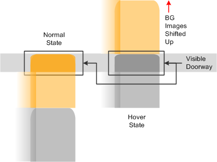
Style sheet sliding door tab preload technique
Applications use the shifted background positions from the active, inactive, and hover states.
Creating Tab ImagesBefore you can assign a new background color to the active, inactive, and hover states of the tabs, you must create the necessary tab images in that color. To produce tabs in a different color combination:
In PeopleSoft Application Designer, open the image definitions for the tabs that you want to change.
Select File, Export Image and, in the Save Image dialog box, select the directory in which you want to place the images.
Use any image editor to alter the image colors to the same as the new background color you choose.
Note. Do not replace any of the transparent pixels with solid pixels. Additionally, you should leave the size and shape as they are even though the style sheets allows you to alter the size and shape of images.
Select File, New, Image to add the new image definitions to the database.
Save the new image files under the appropriate names.
Customize the tabs.
Customizing Page Tab Style SheetsAfter you create the new images, you must change the properties of the style classes rendering the new sliding door tabs. The style classes that render the folder tabs and the grid tabs are PSTAB and PTGRIDTAB, respectively. Both style classes are part of the PSTAB_PTCSS free form style sheet.
To modify the tab properties:
Open the appropriate free form style sheet, PSTAB_PTCSS if you are using the default style sheet or PSTAB_PTCSS_SWAN if you are using the SWAN style sheet.
For folder tabs, modify the PSTAB style class; for grid tabs, modify the PTGRIDTAB style class.
For example, if you have two new folder tab images, the left and the right image of the tab, each has a different name and you must change the code as you see here:
#PSTAB a
{
background:transparent url(%IMAGE(<newlyCreatedLeftSideTabImageName>)) no-repeat⇒
 left top;
....
}
#PSTAB a span
{
font-size:9pt;
background:transparent url(%IMAGE(<newlyCreatedRightSideTabImageName>)) no-repeat⇒
 right top;
....
}
Note. You must replace <newlyCreatedLeftSideTabImageName> and <newlyCreatedRightSideTabImageName> with the names of the new images that you create. You might have to modify the position property if the new images vary in size from the original images.
Because the image contains all active, inactive, and hover color properties, you only need to change the pixel properties and background positioning if the delivered images have changed in size and shape.
You can modify style class properties such as border, padding, font, and text to create the required look for the tabs you are implementing.
You can override the tab bottom line by changing the following code: #PSTAB #TABBOTTOMLINE { Color: #809EBA; background: repeat-x right 18px; }
You can adjust the hover properties as shown in this example: #PSTAB a:hover a { color: #555555; } #PSTAB a:hover span {font-size:9pt; background-position:100% -50px; }
Note. The <span> element renders the main part of the tab. Adjust any necessary properties, such as background-position in the <span> element to render the image correctly. The left image is small, and you need to adjust only the color and possibly the border properties.
Save the style sheet.
Stop the application server, clear the cache, and restart the application server.
Stop the web server, clear the cache, and restart the web server.
Modifying Push Buttons in SWAN Style Sheets
This section provides an overview of push buttons in the SWAN style sheet and discusses how to:
Create SWAN style sheet push button images.
Customize SWAN push buttons in HTML areas.
Understanding Push Button in the SWAN Style SheetPeopleSoft applications provide the PTPUSHBUTTON free form style sheet as part of the SWAN style sheets. You can edit all properties in the PTPUSHBUTTON style sheet to change the look and feel of the classic yellow push button. Like sliding door tabs, push buttons expand and collapse to accommodate the button text, and the buttons come with a left and right image. The left image is associated with the <a> element, and the right image is associated with the <span> element. The <span> element contains text and font properties for the button. The PTPUSHBUTTON free form style sheet overrides the existing properties provided in the PSPUSHBUTTON style class in the PSSTYLEDEF_SWAN style sheet. You edit push buttons similarly to the way that you edit sliding door tabs.
See Also
Creating SWAN Style Sheet Push Button ImagesAll the steps for altering sliding door tab images are the same as for sliding door buttons. Do not alter the size of a button because doing so willaffect the way the background position is defined for the button.
See Also
Customizing SWAN Push Buttons in HTML AreasIf any custom-defined push buttons in HTML areas appear in the yellow button background, you can change them to look like the SWAN push button style. To customize SWAN push buttons in HTML areas:
Open the HTML area that contains the push button you want to modify.
Locate the <input type=button.../> tag.
Following the <input type...> tag, insert the following tags: <a class=’PSPUSHBUTTON’><span> ... </span></a> .