Text
Overview
This chapter describes rules for text, with special considerations for translation requirements. Conventions for displaying messages to the user are also described. Specifically, the topics covered in this chapter are as follows:
General Properties
-
Due to the use of proportional fonts, it is difficult to guarantee that a specific number of characters will always be visible in a field. When sizing widgets, assume that an "average" character has a width of 0.1." Each widget has additional sizing requirements described below.
-
[Translation] (OMS-75001) All text (except text that has a known translated length) must be able to expand by at least 30%. Translation lengths for many common terms are listed in the section Terms with No Abbreviation. This 30% expansion rule applies to the number of "average" characters, not inches. The 30% rule applies to different types of text differently, as listed in the following table:
Text type Requirement Prompt on left of field Leave 30% expansion room to left of prompt. Prompt above left -justified field or list Leave 30% expansion room to right of prompt. Prompt above right-justified field Leave 30% expansion room to left of prompt. Prompt above center-justified field or check box Leave 30% expansion room, divided equally to the left and to the right of the prompt (15% on each side) . Buttons Size to allow 30% expansion of the label + 0.2." Check boxes in single-record blocks Size to allow 30% expansion of the label + 0.3." Poplists Size to allow 30% expansion + 0.5." Option Groups Size every button the same, such that the widest label can expand 30%. Frame Titles Size underlying frame such that title can expand to the right by 30%. Display-only fields Size 30% wider than needed in English, except for fixed-width fields (for example, date or time).
-
(OMS-75002) [Translation] All prompts must have a minimum of 1" (10 "average" characters) total space available in which to expand when translated. This rule may not apply if the translated length is known ahead of time.
The minimum of 1" is in addition to the 0.2," 0.3," or 0.5" necessary for the cosmetics of buttons, check boxes in single-record blocks, and poplists respectively. For example, a button with a short label must be at least 1.2" wide (1" minimum plus 0.2" for the cosmetics of the button).
-
Text items that must fully show between 1 and 10 characters should be sized one character wider than the maximum width of the contents to guarantee that the contents will be fully visible. This rule does not apply for fields that will show only numbers or to fields that have standard lengths (the standard lengths should account for the extra size requirement) (OMS-74008).
Important: The two prior standards are commonly referred to as the 30%/1" rule. It is important to remember that these are the minimum spacing requirements. Whenever possible leave additional space for translation.
-
(OMS-75003) [Translation] Items that show text but are not scrollable (such as poplists and buttons) must be coded to display the maximum expected length of text in all languages.
-
(OMS-75022) All prompts and labels are in mixed case, except for the following, which are in lower case:
-
Articles (such as "the")
-
Coordinate conjunctions (such as "and")
-
Prepositions (such as "with")
-
The "to" infinitives
These words should, of course, be capitalized when they are at the beginning of the prompt or label.
-
-
(OMS-75023) Errors, messages, questions, etc., that contain text that appears on the form as labels or prompts should use the same capitalization conventions as the text on the form.
-
Avoid abbreviations if possible. Some abbreviations have been approved for use in Oracle E-Business Suite and are listed in the section Abbreviations.
If you have room, use the full (unabbreviated) version of the term. When using the full versions of these terms, it is not necessary to leave 30% extra for expansion as an approved abbreviation can be used upon translation if necessary.
-
Every item must have Hint Text, a Label, a Prompt, or Tooltip Text associated with it (except special fields like current record indicators, which act as controls, not as fields). This is so that devices utilized by a challenged user can clearly communicate a label and value as focus moves.
Properties of Prompts and Titles
The following characteristics of prompts and titles apply:
-
(OMS-75004) [Translation] Each prompt and title must have a minimum of 1" of space available horizontally (including the text itself) in which to expand when translated.
Only the following cases are exempt from this rule:
-
Text for which exact translation lengths are known ahead of time.
-
Prompts in folder blocks, which a user can alter and resize as needed. Such prompts only need to be sized properly for the base language they are developed in.
-
-
(OMS-58012) All prompts and titles share the same font type - MS Sans Serif or Helvetica (either produces the desired result).
-
(OMS-75006) All prompts have the following characteristics:
Font: 10 point, medium weight
Text color: Black when on a light background, or white when on a dark background
-
(OMS-75007) All titles have the following characteristics:
Font: 10 point, bold weight
Text color: Black when on a light background, or white when on a dark background
-
(OMS-75008) Prompts should only use Start, Center, or End for alignment settings.
-
Display items may be used to show dynamic prompts and titles (OMS-74018). Guidelines for such use are as follows:
-
[Translation] Size such a field so that when translated the text will not be clipped. Always allow as much space as possible but never less than the 30%/1" expansion rule minimum.
-
The text must not be cleared when a user performs a "Clear Form" action.
-
A display item acting as a prompt or title must have a height of 0.2," and be positioned 0.05" below a gridline (OMS-74022).
-
Font and color must match standard prompt and title settings.
-
A field with a display item acting as its prompt must have text supplied for either its Hint Text or a hidden Prompt (a Prompt with Display Style "Hidden").
-
-
(OMS-75024) All fields require unique prompts to identify them, except for some display-only fields whose prompts are obvious. Examples are:
-
Adjacent Vendor Name and Vendor Number fields: the word Vendor can be omitted from the second field prompt.
-
Adjacent Item and Item Description fields: the displayed prompt for the second field can be omitted when the description field is display only:
-
Adjacent Amount and Currency fields can share the single displayed prompt of Amount if the currency type is defaulted:
For all fields that do not have a displayed prompt, text still must be available to uniquely identify the field. Either a hidden prompt or Hint Text must be supplied for each instance.
-
-
Because a frame title is not linked to fields within the frame, all fields inside a frame must have Hint Text that combines the frame title and Prompt, in the format: .
-
Fields that are part of a matrix layout, with prompts for the rows and columns, must have Hint Text that combines these prompts in the format: <row label>: <column label>.
Single-Record Block Prompts
-
Prompts are positioned to the left of an item, with 0.1" between the rightmost character of the prompt and the start of the item (OMS-75009).
-
Prompts should normally be drawn on a single line. In the case of a multi-line field, the prompt may occupy multiple lines but should still be a single boilerplate item (with a return between lines) and should not extend below the bottom of the field. Prompts may also be in multi-line format for T-lists. Multiple line prompts may also be used for isolated fields that are not stacked immediately above or below another field.
-
(OMS-75009) Specific settings are enumerated below:
-
Prompt Display Style: First Record
-
Justification: End
-
Attachment Edge: Start
-
Alignment: Center
-
Attachment Offset: 0.1"
-
Alignment Offset: 0.0"
-
-
Prompts may be drawn above a field where items are part of a two-dimensional matrix. (OMS-75025)
-
When a poplist is used as a prompt, the poplist should have a font weight of medium (OMS-74030). The background color must match the canvas color.
(OMS-75026) Each prompt value in the list should have a trailing colon (for example, "Name: "). In addition, once a value is selected from the poplist, the cursor should automatically move to the field that the poplist identifies, and clear the previous data if it is no longer applicable.
Multi-Record Block Prompts
-
Prompts are positioned above the first record of each item. (OMS-75109)
-
Prompts for text items are start, center, or end-aligned similarly to the data in their corresponding text fields, except in the case of long prompts that use connecting lines (discussed in the next section). (OMS-75011)
-
Prompts for poplists are always left-aligned. (OMS-75011)
-
Prompts for check boxes are centered above the box, except in the case of prompts that use connecting lines (discussed later). Do not use the "label" property for check boxes in a multi-record block. (OMS-75011)
Long Prompts
(OMS-75027) There are several options when there is not enough space to fit the length of the prompt or the length of the prompt plus its translation allowance. Four options are discussed below, in order of most to least preferred:
-
When prompts contain too much text to fit on one line, a multi-line boilerplate item should be used. Use a "return" character to advance to the next line of text, and divide the prompt into lines of approximately the same number of characters each.
-
If a prompt is wider than its corresponding field, and a multi-line prompt cannot be used or still does not solve the problem, then leave a gap to the left or right of the field to accommodate the width of the prompt. Never widen a standard length field to fill this gap. If the field does not have a standard length, it should be widened to fill the gap, but the displayed length should never be made longer than the database length.
-
Prompts may be connected to their fields with a line consisting of a frame of zero width.
For multi-record block prompts that must use a connecting line, align the prompt with the left side of the field and draw the connecting line from the leftmost character of the prompt to the leftmost character of the field (regardless of how the data in the field is justified) or to the center of the first character cell for a check box.
When the prompt cannot overflow to the right (for example, when the check box or field is on the right side of the block), align the prompt to the right side of the field or center of the check box and draw the connecting line from the rightmost character of the prompt to the rightmost character of the field, or to the center of a check box (in other words, exactly the mirror image).
In either case, the connecting line should be drawn in the center of the appropriate character cell and the origin of the prompt should be in the center of the same character cell (i.e. a half character cell (0.05") in from the appropriate edge of the field or in the center of a check box).
-
[Translation] The prompt of a field may overlap an adjacent field if the maximum translated length of each prompt would still leave a 1" gap between them. This technique can only be used when a left-aligned and right-aligned field are adjacent, and one of them is substantially longer than the other.
Specific Settings
The following enumerates some of the specific settings for multi-record block prompts, including prompts over check boxes and prompts that use connecting lines.
-
(OMS-75010) All prompts for multi-record blocks have the following vertical placement settings:
-
Display Style: First Record
-
Attachment Edge: Top
-
Attachment Offset : 0.0"
-
-
(OMS-75011) Horizontal placement is determined as follows:
For left-justified data elements, including lists:
-
Justification: Start
-
Alignment: Start
-
Alignment Offset: 0.05"
For center-justified data, including check boxes (except when using connecting lines with check boxes):
-
Justification: Center
-
Alignment: Center
-
Alignment Offset: 0.0"
For right-justified data:
-
Justification: End
-
Alignment: End
-
Alignment Offset: 0.05"
Note: The 0.05" offset of the prompt from the right or left edge of the field is done to account for the bevel width.
-
Identical Blocks
(OMS-75028) Occasionally two multi-record blocks are shown in the same window, one above the other, where the only difference is the set of rows they retrieve. In this case, you do not need to replicate the prompts for the lower block.
Conventions
Button Labels
Button labels should always be short and succinct. The following table contains examples of good and bad button labels:
| Good | Bad |
|---|---|
| Lines | Enter Order Lines |
| Run Print Report | |
| Margins | Set Document Margins |
| Apply Notes | Automatically Apply Notes |
Ellipses
(OMS-75012) Ellipsis points (...) are used at the end of a menu entry or button label in the following cases:
-
The entry or button opens a modal window (for example, the menu entry "About Oracle Applications...".
-
The user needs to provide further information about the action in another window (modal or not) before the action can be completed.
Button examples with ellipses:
-
Copy to...
-
Find Exceptions...
(OMS-75029) Ellipsis points should not be used at the end of a menu entry or button label if:
-
-
the button is used to open a non-modal window that does not require further information before the current action can be completed.
-
the button or menu entry opens a confirmation window because it invokes a potentially destructive or irreversible action, but does not require additional information to carry out its function.
Percent Fields
-
(OMS-75013) Do not include the word "Percent" in the prompt - always use the symbol "%".
In any case where the percent sign is used, do not enclose it in parentheses or any other delimiters.
-
(OMS-75014) Single-record percent fields should have the prompt before the field and a percent sign as boilerplate immediately after the field (no gap).
In this case, Hint Text must be added to the field, like "Prompt %".
-
(OMS-75015) Multi-record fields have a prompt above the field such as "Prompt %":
-
If the only reasonable prompt is "Percent," then only use "%" after the field or above the column. This occurs when the qualifying word is part of the region title.
Hint Text for these fields must be "Quota To Date: Total" and "Quota To Date: %".
-
(OMS-75030) The data in a percent field should always be right-aligned.
-
Percent fields should specify range limits of 0 to 100 if appropriate.
Ranges
(OMS-75031) Use the terms "From" and "To" to identify fields involved in a range rather than "Start" and "End" or "Low" and "High."
Note: If there is a standard industry term that is more appropriate for your product, use it instead of the generic "From" and "To" terminology. You may alternatively place the range fields horizontally with a single prompt (such as "Hire Dates") in front of the "From" field and a dash between the fields as in "Hire Dates _____ - ____" instead of spelling out the prompts From and To.
For the second field, Hint Text must be provided, such as "Hire Dates: To."
Access Keys (Mnemonics)
Controls that can be operated with direct keyboard access provide an access key (underlined mnemonic access character) to invoke them.
-
(OMS-75016) Provide access keys on the following objects:
-
All textual buttons, except "OK" and "Cancel." However, these buttons must have access keys if OK is not the default, and if Window Close does not perform the Cancel action.
-
Option buttons and check boxes should have access keys. If the item is not navigable, then it must have an access key. Note that only a check box or option button in a single-record block can have an access key, because the label property is not used in multi-record blocks; therefore, in multirow blocks, these items must be navigable.
-
-
(OMS-75032) In order of preference:
-
First letter of button or of key word.
-
First letter of the nonkey word.
-
Second letter of button label, such as C for Activate.
-
A strong letter of the label, such as X for Exit.
-
-
Try not to underline letters with descenders such as y, j, q, or p because the underline and letter overlap (y, j, q, or p).
-
Follow common conventions where applicable.
-
(OMS-75017) Access keys must be unique within a window, and must not conflict with the keys used by the pull-down menu (F, E, V, L, T, W and H) even if those menus are not accessible.
-
Oracle E-Business Suite will automatically determine unique access keys within a window. The letter you supply for buttons and other widgets will be used unless it is already employed, in which case another letter will be selected at runtime.
-
(OMS-75033) Use the following access keys for these common terms:
C for Clear, F for Find, C for Cancel, N for New, O for Open, and D for Done.
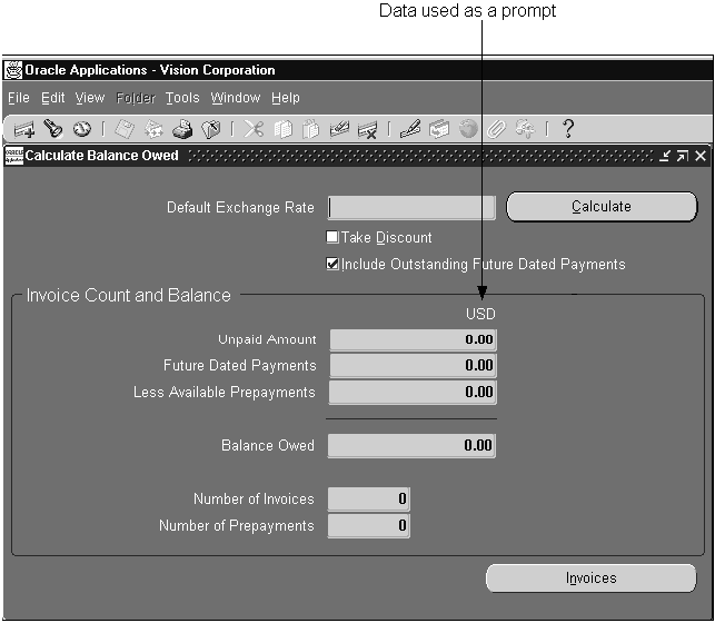
Using Data as Prompts
Occasionally the prompt for a field is a data value that is entered or derived elsewhere. For example, in an Accounts Payables screen, a comparison of values of balances can be made by specifying the exact rows of data to analyze, and the currency of interest. In this case, the currency code (such as USD) may be used as a prompt.
Errors
-
Errors are messages that indicate serious problems which the user must acknowledge in order to continue processing.
-
(OMS-75018) Error messages show a graphic depiction of an alarm bell, the message text, and the "OK" button.
Examples:
"Please enter a unique Territory Code."
"Field must be entered."
"You cannot delete this Customer because it is referenced on an Order."
"You do not have sufficient authority to approve this Order."
-
(OMS-75034) Standard Forms function keys pressed at inappropriate times, where no explanation is necessary, should merely beep.
Warnings
-
Warnings are messages in the form of a question that the user must respond to. Warnings allow the user to continue or terminate an action.
-
Warnings should be direct and concise. For example, use "Delete this Order?" rather than "Do you really want to delete this Order?"
-
(OMS-75019) Warning messages show a "yield" sign, the message text (ending with a question mark), and relevant buttons (such as "Yes" and "No" or "Delete" and "Cancel").
-
Examples:
"Delete this Purchase Order?"
"Cancel this Order?" ("Yes" & "No" buttons)
"Copy all the Lines on this Invoice?"
"This customer is on Credit Hold. Continue the Order?"
-
(OMS-75035) The standard generic delete message used in Oracle E-Business Suite is "Delete this record? (Cancel/Delete)" with Delete as the default button on the right. More specific delete messages are used where appropriate.
Questions
-
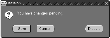
Questions are used when the message is not intended to provide a way for a user to terminate an action. Questions allow for three-state decision making, such as "Yes," "No," and "Cancel." Such a message is displayed when the user must perform some other action before the desired action can continue.
(OMS-75020) Questions show a "question mark" icon, the message text (ending with a question mark), and the "Yes" and "No" buttons (or buttons specified by the developer).
Example:
In response to clearing a block:
"Do you want to save your changes?" (buttons "Yes," "No," and "Cancel")
Note: The three-state message is used when the application is in a state where the desired action can be performed, but there is a prior step which the user most likely would want to perform. Selecting "No" in the case above will still cause the desired action to be performed. "Cancel" will result in the data not being cleared.
-
Always provide specific button labels, rather than "Yes" and "No," when a clearer meaning can be expressed in one or a few words.
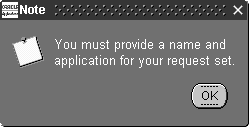
Information
-
Information messages are messages that the user must acknowledge, but do not require the user to make any choice.
-
Information messages show an "information" notepad, the message text, and the "OK" button. (OMS-75021)
-
Examples:
"Line and Shipment Quantities currently do not match."
"There are items awaiting your attention."
"The Concurrent Request ID for this report is 123."
"There have been 3 unsuccessful login attempts since your last login."
Hints
-
Hints are messages that are of very little consequence, or a "progress indicator" message, that never require any acknowledgement.
-
Hints appear on the status bar only. (OMS-75036)
-
Examples:
"Working..."
"Processed Order line 12 of 37..."
"At first record."
"At last block."
Messages
This section gives guidelines for writing messages.
-
Make messages short and avoid redundancy.
-
Do not use a Cause/Action format.
-
Provide as much detail as the user needs to fix the problem, but no more than necessary.
-
Use short but complete sentences. Use proper grammar, punctuation and capitalization.
-
Avoid ambiguous words. Try to use words having only one meaning. Avoid words with data processing connotations unless you are referring to a specific application function.
-
Say "please" wherever possible. When a message contains instructions, use please.
-
Use vocabulary consistent with forms boilerplate. Refer to a field by its correct name. If a field is labeled "Sales Representative," don't use the message "Please enter a different salesperson."
-
Address the user as "you." Talk to the user, not about the user. Users prefer friendly messages that address them directly and make them feel they control the application. "You" is also more concise and forceful than "The user...."
-
Avoid nonspecific future tense. Use future tense only when your message refers to a specific time or event in the future. In other cases, "will" is usually ambiguous. For example, "Please select an invoice to cancel" is correct; whereas, "Please select an invoice that you will cancel" is incorrect.
-
Use active voice when possible.
-
Avoid accusatory messages. Do not insinuate that the user is at fault. Do not mention a user's mistake unless it pertains to the problem's solution.
-
Use imperative voice. For example, the message "Enter a commission plan" is better than "You can enter a commission plan."
-
Avoid conditionals. Use positive, imperative statements over statements containing conditionals.
-
Use "can" to indicate either capability or permission. Auxiliaries such as "could," "may," and "might" are ambiguous and imply more uncertainty than "can." Limit the range of uncertainty by using "can," which always implies capability or permission but does not imply chance or luck. For example, the message "You cannot delete a printed release" is preferable to "You may not delete a printed release."
-
Use only idiomatic abbreviations that match those used in your application's forms. If the forms that use a message do not abbreviate a term, do not abbreviate that term in a message.
-
Try to avoid messages with multiple possibilities, such as "Value is invalid or already exists." This requires the user to figure out which message applies to the error.
-
Use message numbers if there is any reasonable chance the user will need to refer to the message when communicating with Technical Support. Do not use them for simple problems like "Invalid Date."