HTML-Based Applications
Using HTML-Based Applications
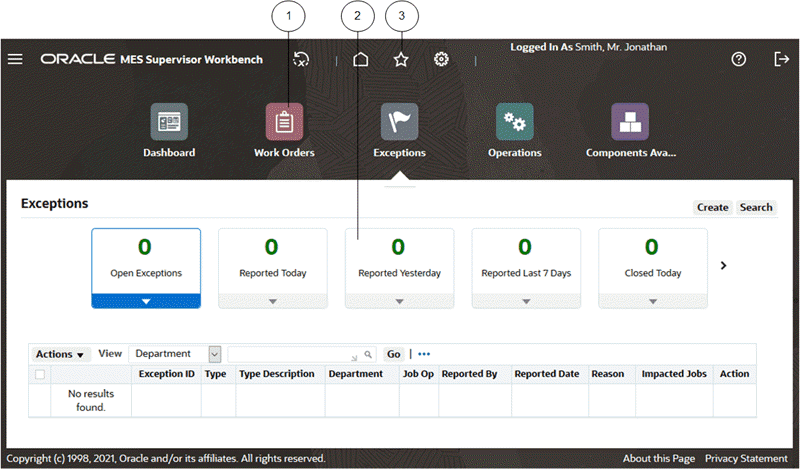
HTML-based applications use many common components in the user interface (UI):
-
Top-level Menu
-
Tiles (Infotiles)
-
Global Links
-
Process Train
-
Date Picker
-
Table Toolbar (Table Actions Menu)
-
List of Values Icon
UI Components in HTML-Based Applications
More UI Components in HTML-based Applications
Note that in the first figure, the page has a Redwood Theme with the preference Page Header Display Style set to Icons, the preference Top-level Menu Display Style set to Icons and Links, the profile option "Navigator and Favorites" enabled, the profile option "Infotile View for Query Beans" enabled, and the profile option "Simple Table Control Bar" enabled.
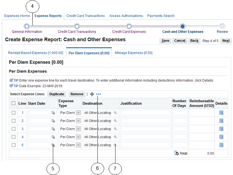
The page shown in the second figure has the profile "Top Level Menu Display Style" set to 'Links Only' and the profile option "Simple Table Control Bar" enabled.
Navigating
Navigate to functions in an HTML-based application using tabs, subtabs, and side navigation elements. As you drill down through these elements, locator links display your navigation path.
When you navigate through steps of a task, use the Back and Next buttons.
Important: Use these forward and backward navigation elements provided by the application. Do not use your browser's buttons.
Multiple Browser Tabs
Unless otherwise noted in your specific product or its documentation, using HTML-based applications over multiple tabs in the same browser is not supported. That is, you cannot access an application in multiple browser tabs and then perform concurrent independent transactions from these tabs.
Top-level Menu
The top-level menu entries can be displayed as links, or icons and links. You can choose your display choice in the Preferences page or by setting the FND: Top-Level Menu Display Mode profile option.
Tiles
A tile consists of a header box and an associated content region. Each tile provides a description of its detailed region. When you select a given tile, the details related to that tile are shown in the region.
Process Train
If you are running a process, a process train shows the location of the current page in the process. Some process trains are interactive. These allow you to jump one or more steps backward in the process by selecting the step icon.
Locator Links
Locator links (sometimes called "breadcrumbs") are series of links and text that show your navigation path through an application. Use the links to return to a previous point in your navigation path.
Tabs
Available pages are presented as a series of tabs.
Subtabs
A subtab displays a single page's contents in a tabbed layout.
Subtabs can be displayed horizontally or vertically.
Panel Splitter
Some pages may have a panel splitter. With a panel splitter, a single region may be split into two separate resizable and collapsible regions, or panels, using a splitter bar.
Layered Layouts
Some pages have multiple layers instead of multiple subtabs. You can switch between layers using the title bar.
Table Toolbar
The table toolbar contains multiple table actions and settings as one Actions menu button which looks like an ellipsis (...) for manipulating the display of data in a table.
Mobile Devices and Gesture Support
HTML-based applications are certified with the Safari browser on Apple iPad and the Chrome browser on Android tablets. See the "Mobile Applications" topic in the Oracle Application Framework Developer's Guide available from My Oracle Support article KB852704 for caveats and known limitations before running on these platforms.
The following gestures are supported for these mobile devices:
-
Single Tap
-
Double Tap
-
Hold/Press/Press and Hold
-
Pan/Drag
-
Swipe/Flick
-
Spread
-
Pinch
-
Check Mark/Tick
-
X-Mark/Cross
See the "Gesture Support" topic in the Oracle Application Framework Developer's Guide available from My Oracle Support article KB852704 for a full description of these gestures and their use cases.
Querying and Viewing Data
Pages that allow you to search for data display a Search panel that generally includes a search region and a results region.
Many search panels contain an Advanced Search button that allows more detailed searches using additional criteria.
When you enter characters in a search field, a wildcard is implicitly added to the end of the string.
Note: Enter exact values for number and date fields.
The results region displays search results in a table. Columns that are sortable have an arrow icon to indicate if the column is unsorted or sorted in ascending or descending order.
Click the column heading of a sortable column to sort by that column. Click it again to toggle between ascending and descending order.
Many pages allow you to save searches and personalize the display tables. See Personalizations.
If exporting is enabled, then you can select the Export Table Data to Excel icon for a table to create the corresponding spreadsheet. See: Creating a Spreadsheet, Oracle Web Applications Desktop Integrator Implementation and Administration Guide.
Using List Search
Some product pages allow you to search using filters and an associated List Search panel. You can search for records either using the filters provided or filters you have added. Some pages with List Search enabled also allow you to perform either a Quick Search based on a single field, or a Keyword Search based on predefined keywords.
The List Search feature also allows you to save your search criteria and manage your saved searches. For example, you can update the name of a saved search, set one saved search as your default search, or reorder the listing of saved searches.
Where List Search is enabled, you can sort the results in the table using the Advanced Sort window, in which you can specify up to three sort criteria and the sort direction.
Note: Ask your system administrator which product pages have List Search enabled.
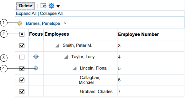
Using a Hierarchical Grid (HGrid)
Components of an HGrid
-
Locator links define the position of the displayed grid in the navigation hierarchy.
-
Use the tri-state checkbox to select or deselect all of the rows.
-
Use the Hide/Show icon to expand and collapse the branches of the tree.
-
Use the Focus icon to display only a specific branch in the tree.
Using a Rich Table or HGrid
Rich tables and HGrids enable you to personalize how you interact with a table or HGrid and its data. With a rich table or HGrid, you can:
-
Resize a column.
-
Reorder columns.
-
Scroll horizontally if the contents of a table exceeds the browser width.
-
Freeze a set of columns to remain in view while horizontally scrolling.
-
Vertically scroll a table.
-
Hide/Show a column.
-
Detach a table from the base page using the Detach Table icon. HGrids do not support table detaching.
-
Reset a table back to its original definition.
-
Refresh a table by querying for the latest records in case simultaneous modifications were made elsewhere.
-
Select or deselect all of the rows using the tri-state checkbox in a Select column.
The three states are:
-
Unchecked - when no row in current range is selected.
-
Checked - when all rows in current range are selected.
-
Partially checked - when some row(s) in current range are individually selected.
-
To use these features, you must have the following profile option set:
-
FND: Enable Rich Table Interactions profile option to "True"
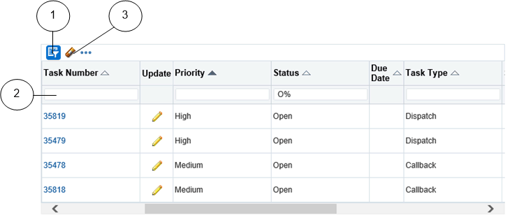
Using Query By Example on Tables
Components for Query By Example on Tables
-
Query By Example icon
-
Query By Example header row
-
Clear Filter icon
If available, you can use Query By Example (QBE) on tables to filter records based on query criteria.
Click the Query By Example icon to display the QBE header row.
Enter your filter into one of the text fields in the QBE header row, and select Enter.
Possible filter criteria include:
| Operator | Meaning | Example Expression |
|---|---|---|
| = | equals | = 'Janet', = 107 |
| != or <> | is not | != 'Bob', != 109 |
| > | greater than | > 99.1, > '01-JAN-04' |
| >= | at least | >= 55 |
| < | less than | < 1000.00 |
| <= | at most | <= 100 |
The character % allows you to perform a wildcard search on text fields. For example, 'P%' could return "Penelope" or "Peter".
You may also select a date filter or choose a filter from a list.
You can use multiple filters and then perform the query. "Match All" is applied for multiple filters. To clear a filter, use the Clear Filter icon.
If you wish to hide a column where a filter is applied, then clear that filter first.
Sorting Columns
Some table columns allow for sorting. Indicators next to the column titles indicate their sorting status.
Sorting Terminology
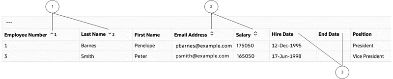
-
Sorted columns with numeric labels that show the order of sorting.
-
Sortable columns with sorting icons.
-
Non-sortable columns do not have indicators.
Exporting Table Data
Some tables allow you to export data to PDF or Microsoft Excel.
Two related options allow you to export selected columns of table data:
-
On any supported operating system, you can export to PDF.
-
On Windows, you can export to Microsoft Excel.
Note: This feature must be enabled by your system administrator through the profile option FND: Enable BNE Table Integration.
Using Accordions
Accordions allow for flexible access to multiple panels in a restricted screen area. Panels can be expanded or collapsed.
Using Pop-up Windows
Pop-up windows provide additional information on top of the current page. They appear when you hover over an item or click on it with the left mouse button. Pop-up windows are available on some components of these types:
-
Text
-
Image
-
Link
-
Button
Entering Data
Entering Data in a List of Values (LOV) Field
Three basic options are available here:
-
If you know the full value you are looking for in a field, enter it and press the Tab key.
-
If you know the beginning of the value, start typing characters into the LOV field and then either select the desired value from the matches that are displayed inline by the look-ahead capability, or wait for the Search and Select page to launch.
-
If you do not know any part of the value, choose the List of Values icon to launch the Search and Select page. Optionally, you can limit the results by entering a partial value first. If the partial value you enter matches only a single value, the field auto-fills and the Search and Select page does not launch.
Note: If it is available, the Look Ahead LOV is enabled by default. When it is enabled, a dimmed downward arrow appears in the lower right corner of the LOV field. The Look Ahead LOV can be disabled by your system administrator through a profile option.
Note: For some fields, the Look Ahead LOV includes searching on all search-allowed columns for the Look-Ahead LOV instead of only the first column.
Some Search and Select pages support alternative search criteria. You can use the Search by pulldown list to select a different search field. Enter the search string and select the Go button. Select the value from the Results region, and choose the Select button.
Some pages allow the display of multiple records which can then be selected individually.
LOV Choice List
When a field has a long list of possible values from which a small subset is commonly used, you may see an LOV choice list. The LOV choice list displays the most commonly-used values for easier selection and includes a More... option. Choosing More... launches the LOV Search and Select page.
When you choose a value that is not in the LOV choice list, it is added to the list.
Personalizing an LOV Choice List
An LOV choice list may allow you to customize the list with the values that you use most frequently.
To personalize an LOV choice list
-
Select the Personalize button next to the LOV choice list to open the Personalize page.
-
To add a value, select it and choose the Add button.
-
To delete a value, select the icon in the Delete column.
Note: Some values cannot be deleted.
-
To reorder the list, select the Reorder button. In the Reorder page, select a value you want to move and use the Move icons to position it in the list. When finished, select the Apply button.
Entering Dates and Times
Enter a date directly in a field using the format defined in your Preferences. Alternatively, select the Calendar icon to launch the Date Picker pop-up window. When you select a date, the window closes and inserts the date into the field.
Some features allow you to specify a time while choosing a date from the Date Picker calendar.
Entering Data Through Desktop Integration
Some applications provide integrators that let you use a Microsoft Excel spreadsheet on your desktop to download, edit, and upload Oracle E-Business Suite data.
See: Oracle Web Applications Desktop Integrator Implementation and Administration Guide and your product-specific documentation.
Using Flexfields
A flexfield is a flexible data field that can be customized by your enterprise. Oracle E-Business Suite uses two types of flexfields:
-
Key flexfield - a field you customize to enter multi-segment values, such as part numbers or account numbers.
-
Descriptive flexfield - a field you customize to enter additional information not provided by Oracle E-Business Suite.
See: Flexfields.
Key Flexfields
A key flexfield is composed of segments, where each segment has both a value and a meaning. For example, an Accounting Flexfield can be composed of segments that represent Company, Department, and Account. The segments are delimited by a segment separator (usually a "." or a "-").
Descriptive Flexfields
A descriptive flexfield is also composed of segments and can have context-sensitive fields that appear only when needed.
Scheduling Requests and Request Sets
For information on how to schedule a request or request set, see Running Reports and Programs.
Monitoring Requests
The Monitor Requests pages provide a summary of requests and details of each request.
Select the Search button to specify your search criteria.
Related Topics
Monitoring Requests in Forms-Based Applications
Using Attachments
Use the Attachments feature to link text or other files to a record.
The method to initiate an Attachments flow will vary, depending on how the feature is implemented on your page.
With the Inline Attachments feature, if you hover over the Add icon or the Attachments icon, an inline window appears and allows you to add or view attachments in a table without navigating to the separate Attachments page. Text attachments can be edited inline. A badge on the Attachments icon indicates the number of attachments for that record. An Action list provides options to Update, Publish, Delete, Print, and Record History.
To add a new attachment
-
Using the Add poplist, select how you want to add the attachment:
From a Desktop File/Text/URL
-
Select the attachment Type:
-
File - Specify a file name to upload. Enter the file location, or use the Browse button to locate the file.
-
URL - Enter the URL for a Web page.
-
Short Text - Enter text that is less than 2000 characters.
-
Long Text - Enter text that is more than 2000 characters.
-
-
Select a Category from the list of values. The Category defines the purpose of an attachment, and controls which forms or pages can access it.
From the Document Catalog
-
Use the Search regions to query existing documents.
-
Select the Document Name link to view a document before attaching it.
-
Select the document(s) to attach.
-
Select the Apply button.
-
-
Give your attachment a title and description.
Save your work in the application page from which you launched the attachments flow. The attachments are not added until you save your work in the parent region.
To view an attached document
In the Attachments page or Attachments table, select the File Name link.
-
If the attachment is a URL, the Web page will launch.
-
If the attachment is a file, a dialog box prompts you to open or save the file.
-
If the attachment is text, the View Attachment page displays the text content.
To edit an attachment
-
Display the Attachments page or Attachments table.
-
Select the Update icon (for the Attachments page), or choose Update from the Action list (for inline attachments).
-
In the Update Attachment page, edit only the information as it pertains to the attachment. For example, you can update the URL for a Web page attachment, but you cannot change it to a File attachment.
-
Select the Apply button.
-
Return to the application page from which you launched the attachments flow and save your work.
Tip: Attachment updates must be saved in the associated parent region.
To delete a record's attachment
In the Attachments page, select the Delete icon. For inline attachments, select Delete from the Action list.
Using the Document Catalog
Only Standard and Template documents can be retrieved from the Document Catalog. The catalog is accessed from the Attachments page which is configured with associated categories. There are two criteria for the Templates and Standard documents that are retrieved - they must be associated with the categories associated with the function and the security context must be set if the document is secured.
When creating attachments directly using the Attachments page, the document is created as a One-Time document. One-Time documents are not available in the Document Catalog. To publish the document to the catalog for sharing, select the option Publish to Catalog and select the option to publish as a Standard document or Template. If you choose Standard, the document is converted to a Standard document. If you choose Template, a copy is made of the document.
A document may be removed from the Document Catalog by deleting or end-dating it in the Documents window.
Personalizations
Some tables allow you to save queries and personalize the presentation of data. If a table can be personalized, you see the Views panel or the Save Search button.
Note: Pages can have predefined personalizations available from the View list. Some pages with no personalizations saved do not show the Views panel until a search has been saved.
Personalizing Tables
To create a personalized view
-
Use the search panel to query for results in the table.
-
Select the Save Search button or the Views button.
-
The Save Search button launches the Create View page.
-
The Views button displays the Views panel. Select the Personalize button to launch the Personalize Views page. This page displays existing views. Select the Create View button to launch the Create View page.
-
-
On the Create View page, enter a View Name.
-
Specify the number of rows to display in the table.
-
Choose the Set as Default checkbox to make this view the default when you navigate to this page.
-
Personalize other available options.
Note: Personalizable options vary by table. Some tables allow you only to save the search criteria. Others allow you to change more options, such as columns displayed, column order, sort order, and headings.
-
Select the Apply button.
To duplicate, update, or delete a personalized view
-
Select the Personalize button to launch the Personalize Views page.
-
Select the view from the list.
-
Select Update to update the options for this view.
-
Select Delete to delete the view.
-
Select the Duplicate button to create a duplicate of the selected view. Enter a new View Name. Make other modifications as desired and select Apply.
-
Personalization Workbench
The Personalization Workbench provides an alternative page that allows you to reorder components or change prompts in-place. For more information see the Oracle Application Framework Personalization Guide.
Administrator Personalizations
Administrators can make additional personalizations for you, including:
-
Apply a shipped theme or create a new theme using Theme Editor to change the look and feel. See: Themes, Oracle Application Framework Personalization Guide.
-
Use the Custom Look-and-Feel (CLAF) feature. See: Customizing Look-and-Feel (CLAF), Oracle Application Framework Personalization Guide.
-
Change data table properties and other UI features. See: Administrative-Level Personalizations: Overview, Oracle Application Framework Personalization Guide.