Enterprise Command Centers
Overview of Enterprise Command Centers
Enterprise Command Centers (ECC) provide information discovery along with visualization and exploration capabilities embedded within Oracle E-Business Suite user interfaces. Oracle Enterprise Command Center Framework enables the creation of business dashboards in different functional areas. Oracle E-Business Suite users navigate transactional information using interactive visual components and guided discovery capabilities allowing exploratory data analysis. Mobility and responsive design are built into the Oracle Enterprise Command Center Framework, and all dashboards automatically adjust the layout to better fit a desktop or mobile device form factor. Oracle Enterprise Command Center Framework automatically adheres to existing Oracle E-Business Suite security. The dashboard content a user sees is completely consistent with the Oracle E-Business Suite context and security.
Each Oracle Enterprise Command Center extends the owning Oracle E-Business Suite application with discovery-oriented dashboards that bring together diverse operational data from across the Oracle E-Business Suite. ECC dashboard users identify and act on top priorities without the need for custom operational reporting, and use information-driven navigation. With tools and visualizations such as actionable indicators, tag clouds, interactive charts, and consumer-like search and filters, users can browse and drill on whatever engages their attention. With each drill-down or search refinement, the data engine recalculates indicators, tag clouds, charts, and search choices to provide the user with new information on which to base the next discovery steps. Through this "conversation with the data", users narrow in on today's most important business challenges, all without predefined navigation paths, structured queries, or operational reports.
Having identified the most pressing business challenges, users seamlessly transition to detailed transaction screens to take immediate and informed action. Transaction screens are pre-populated with the results of information discovery; no re-querying of data is required. Users can switch between information discovery and transaction screens as they work their way through a set of identified problems, retaining the current discovery context.
Oracle Enterprise Command Center Framework is built on scalable architecture comprising the following three main layers:
-
ECC User Interface and UI Designer - Modern and interactive UI components with a browser-based designer that allows dashboard content creation through a drag-and-drop framework and fully declarative controls.
-
ECC Service Interface - REST-based APIs that control the creation and retrieval of data and metadata. They provide advanced capabilities for data retrieval such as aggregations, associations, rollups, and more.
-
ECC Core - A storage and query engine that enables the definition of data sets along with customized behaviors, relationships, calculations, and more.
Using Oracle Enterprise Command Centers, you can:
-
Browse and drill on actionable indicators
-
Use consumer-like search and filters
-
Drill down with all indicators and search choices recalculated
-
Through "conversation with the data", narrow in on most important priorities
-
Navigate to selected transactions to take action
For more information, see: Using Enterprise Command Centers and Highlights of an Enterprise Command Center.
Using Enterprise Command Centers
Example of an Enterprise Command Center Dashboard
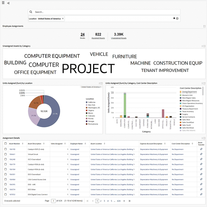
Each Enterprise Command Center has a set of features that allows users to answer essential questions, uncover business insights, and drill down to take the relevant action. It helps users quickly and intuitively analyze data so they can make confident decisions driven by data.
Oracle Enterprise Command Center Framework brings an interaction paradigm between business users and data in their system of records. Oracle Enterprise Command Center Framework helps create an interactive engagement rather than using simply operational reporting, whether custom or out of the box, or traditional search-and-results interfaces.
Oracle Enterprise Command Center Framework relies on the concept of guided navigation through data to achieve information discovery. This approach presents a high level overview of the data to users, based on their roles and access levels. Users then take whatever path they want through the data to explore different aspects. Oracle Enterprise Command Center Framework guides users through their interactions with multi-faceted search, cascaded drill-downs, type-ahead suggestions, highlighted keywords, and more.
For information on administering or extending Enterprise Command Centers, refer to the separate documentation on the Oracle E-Business Suite Documentation Library.
Note: Some of the screenshots used in this chapter were captured on an earlier release. Although the colors and interface elements of these images consequently have a different appearance, the functionality they illustrate also applies to the current release.
For more information, see: Highlights of an Enterprise Command Center.
Highlights of an Enterprise Command Center
Oracle Enterprise Command Center Framework provides a flexible toolset for creating dashboards in different functional areas. The following are some features that enable you to handle diverse scenarios and obtain several types of insights.
Oracle Enterprise Command Center Dashboard
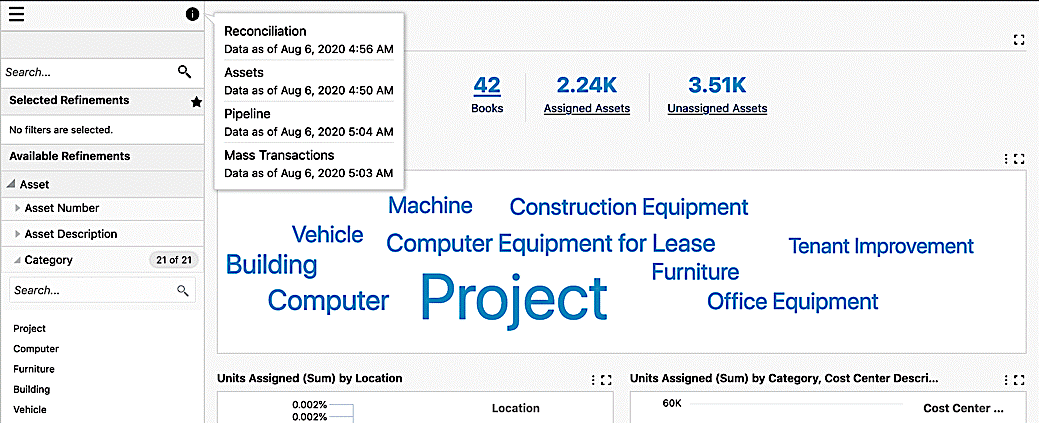
Data Load Details
Every dashboard shows the last data load date and time for all the data sets associated with the application. You can access the data load details by clicking on the Information icon.
Example of Data Load Details
Page Layout
Oracle Enterprise Command Center Framework provides the following page layouts:
-
Side Navigation (default): In this default page layout, the side navigation panel that contains the search, selected refinement, and available refinements components are always displayed on the page.
-
Collapsed Side Navigation: In this page layout, the side navigation panel is collapsed by default and can be expanded by clicking the "Toggle Navigation Panel" icon. When the side navigation panel is collapsed, the Selected Refinements component is displayed as a floating icon on the page. When the side navigation panel is expanded, this icon no longer appears.
-
No Side Navigation: This page layout lets you display a page without the side navigation panel. This layout is best suited for a landing page or home page that will not have any navigation components. However, the Selected Refinements component is displayed as a floating icon after any filter is applied.
-
Above the Fold Layout: Introduced in V14, the Above the Fold Layout divides the dashboard into two sections with a 70-30 visual split. This layout supports a flexible design with a collapsible pane which allows you to quickly reference related information such as supplier performance along with purchase orders. It is designed to balance the primary workflow in the 70% section with auxiliary information in the 30% section, so back-and-forth navigation is not necessary.
The Above the Fold Layout displays charts, summary bars, and tag clouds without borders. Chart legends always appear on the right side for consistency. Maximize and other runtime options are not available in this layout. Only four summary bars are displayed in a two-by-two vertical tile format, regardless of the number of items configured. Aggregated tables display only the first five rows based on the configured sort.
On smaller screens, only the 70% section is shown, and the 30% section is collapsed by default. If the screen width is between 700-768 pixels, the 30% section remains collapsed but can be expanded. If the screen width is less than 700 pixels, the 30% section is completely hidden to optimize space.
During PDF export, the 30% section will appear below the 70% section. This section will begin with the subtitle "Above the Fold Layout: Supporting Insights" to distinguish the Above the Fold Layout.
The Above the Fold Layout is also supported as part of power user personalization, allowing users to customize their dashboards based on individual preferences. Refer to Power User Personalization for more information.
Side Navigation
Search
Oracle Enterprise Command Center Framework comes with search capabilities that allow users to search for a term within a particular string of data. To do a basic search, type your search term into the search box. A list of attribute values containing the search terms is displayed, and you can select a value from the list to search for it or click on the magnifying glass (search icon) to retrieve all records containing this value.
Search Box Example
The Search box supports the following capabilities:
-
Look and Feel: The search box appears at the page level instead of in the side navigation panel. This look and feel provides easy-to-read search term highlighting and keyboard navigation for the auto-suggestion list.
Search Box Look and Feel
Search Box Look and Feel with Auto-Suggestion
-
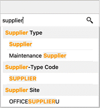
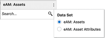
Multi-Data Set: In the products where the search box is configured with more than a single data set, the user can switch among the data sets to search for values from each data set to apply as filters. The name of the selected data set then appears above the component.
Example 1 of a Search Box with a Multi-Data Set
Example 2 of a Search Box with a Multi-Data Set
-
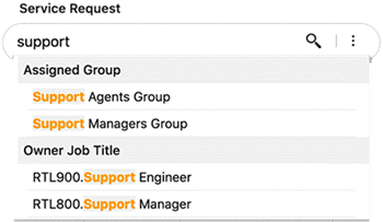
Search Attribute: You can choose a context under which you want to perform your search. The context can be configured to refer to any attribute in the system. Inline search within the context attribute is also supported.
For example, if you are using Oracle iProcurement and would like to shop for a monitor, you can select the Computer Monitor category from the Search drop-down menu. Then you start searching for a monitor, a specific list appears that applies to the selected category.
-
Search Behavior: If you select a search attribute, additional controls let you choose how to display the remaining values of context attributes based on the current filter state on the page.
You can remove applied filters from the search box by changing their selection from the attribute list.
-
Hyperlink: You can now search and navigate to another page and apply the search term as a filter on the destination page.
-
Condition: The search box supports applying a data set condition on the suggestion list results.
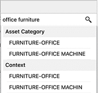
If you search for two terms in the search box, the
ANDoperator is applied by default between the terms. Values that match each term are returned, even if the terms are not in the same order. For example, a search for 'office furniture' returnsfurniture-officebecause it matches bothofficeandfurniture.
Search Example using 'AND'
Oracle Enterprise Command Center Framework also has advanced search capabilities in the search box as wildcard, phrase, and Boolean search with complex expressions.
Value Search
You can search across attributes for values with matching names. The search returns single values that match all your search terms organized. by attribute.
A value search must include three or more characters.
Record Search
You can perform a keyword search against specific attribute values assigned to records.
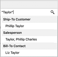
Phrase Search
Phrase Search allows you to search for an exact sequence of terms using quotation marks (" "). For example, searching for "phillip taylor" returns only records with phillip taylor (case-insensitive).
Phrase Search Example
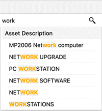
Wildcard Search
Wildcard or partial search used when you are searching for a term where you only know a few letters. By default when you start typing your search term in the search box, a trailing wildcard (*) is implicitly added at the end of the word. For example, a search for work returns all values with terms that start with work; for example, PC WORKSTATION, and WORKSTATIONS.
Example of a Wildcard Search
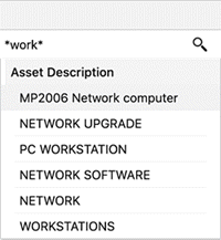
Also, you can use (*) or (%) at the beginning and end of the search term, and the results will match any text that contain the characters between the search operators, even if the text occurs in the middle of a word. For example, with a search for *work* or %work%, all values that have 'work' are returned in the search results. (*) or (%) perform a multiple character wildcard search that looks for 0 or more characters. For example, a search for *work* returns values such as PC WORKSTATION, NETWORK, and WORKSTATIONS.
Example of a Search using '*'
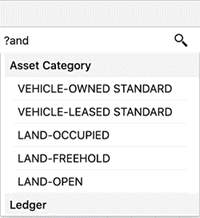
To perform a single (one and only one) character wildcard search use the "?" symbol. For example, a search for ?and returns LAND, and a search for ??and returns STAND.
Example of a Search using '?'
Boolean Search
You can include logical operators in the search to set more precise search logic based on the operators listed below:
Note: Boolean operators must be in capital letters only: AND, OR, and NOT.
| Boolean Search Operator | Purpose | Example Usage and Results |
|---|---|---|
| AND | Returns results with all specified terms. | cip AND additionReturns results with both 'cip' and 'addition' |
| OR | Returns results with any specified terms. | desktop OR laptopReturns results with either 'desktop' or 'laptop' |
| NOT | Negates the following term (Will not retrieve records that have the unwanted keyword). | desktop NOT monitorReturns results with 'desktop' but not 'monitor' |
Operator precedence is determined in the following order:
-
Any sub-expressions in parentheses are evaluated first
-
NOT is evaluated before other operators
-
AND is evaluated after NOT
-
OR is evaluated after AND
Expressions
An expression is used to build a more complex search query. You can combine keywords with AND, OR, or NOT. Use parentheses () to determine the relationship between operators when more than one operator is used. For example, a search for (computer OR desktop) NOT monitor returns records that contain both the words 'computer' and 'desktop' but do not contain 'monitor'.
Category Search Features
Beginning with V11, a designer may customize the search experience in a dashboard so that users can search within the context of applied filters only. Alternatively users can search across everything regardless of applied filters. A designer may choose to expose this option of selecting the search experience at runtime to users.
For example, if an administrator has enabled runtime search scope selection and enabled Category search, then you will have runtime options from which you can set the search scope. "Search Within" is set by default. If there are multiple data sets, you can select choose one data set and select the "Search Scope" option.
If "Search Within" is disabled then you can search across everything irrespective of applied filters.
The following are the different functional behaviors when "Category Search and "Search Scope" are used in unison:
-
"Category Search" is enabled, and "Search Scope" is "Search Without":
-
If a category is selected at runtime, then it will guide/restrict the search.
-
Once the search is applied then the "Category Search" goes back to "All" thereby allowing you to search across everything. If you select a category again, then it will again guide the search. If you select something now, then it will override all previous search filters and the search category will go back to "All."
-
-
"Category Search" is not enabled, and "Search Scope" is "Search Without":
-
You are able to search across everything and are not limited to any applied filter.
-
If you now select something, then it will override all previous search filters, if any.
-
-
"Category Search" is enabled, and "Search Scope" is "Search Within":
-
If a category is selected at runtime, then it will guide/scope the search.
-
Once the search is applied then the "Category Search" reflects the category and therefore limits you to only Search Within that category. Any additional search will be on top of existing search filters.
-
-
"Category Search" is not enabled, and "Search Scope" is "Search Within":
-
You can search across everything on the first attempt. Any subsequent search will be within the context of the applied search filters.
-
If you select something now, it will be added to the existing search filters.
-
Image Search
The Image Search feature, introduced in V14, allows you to search for products using images or text descriptions. This feature enhances search accuracy, reduces errors, and improves productivity by enabling you to find products based on visual or descriptive attributes.
Key features include:
-
Image Search Icon: A new icon is displayed in the search bar when Image Search is enabled. Hovering over the icon shows the tooltip "Image Search."
-
Upload Image: You can upload an image (one at a time) to search for visually similar products.
-
Search by Description: You can input a text description (for example, "red pens") to find related products.
-
Search Chip Label: Displays the uploaded image thumbnail and description text beside the label "Image Search."
-
Image Upload Indicator: Shows "Uploading..." text beside the image thumbnail during the upload process.
-
Search Combination: You can combine regular search results with image search results for more precise results.
-
Supported image formats: GIF, PNG, JPG, and WEBP.
-
File size limit: Two (2) MB per image.
Image Search Window

-
Image Search icon
-
Region for uploading an image
Note: Oracle Enterprise Command Center Framework utilizes advanced AI models (sentence transformers and vision models) to facilitate image search. While it strives for accuracy and reliability for the search results, the AI-driven solutions are not always accurate and occasionally produce unexpected matches.
Users should exercise their own judgment when interpreting the search results and verify that the retrieved content matches their search criteria before making decisions or taking actions. The use of this application is at your own discretion, and Oracle Corporation and its affiliates disclaim any liability for any damages caused by use of this software.
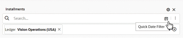
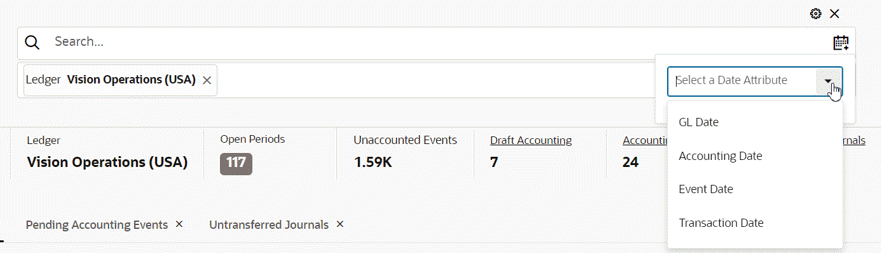
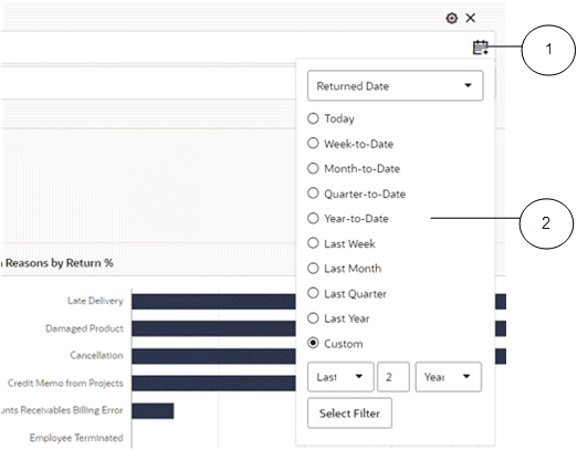
Quick Date Filter
Beginning with V12, the quick date filter feature facilitates swift selection of date filters without the need to navigate to available refinements. You can easily choose date attributes, select from predefined time ranges, and employ relative date ranges such as "last seven days" or "previous month."
Example of a Quick Date Filter Icon and Tooltip
Example of a Quick Date Filter with Expanded List
Note: The Quick Date Filter does not apply to date subsets or fiscal years.
This feature is integrated with the search box.
In scenarios involving multiple datasets, the date list is sourced from the default dataset configured under search settings. You can select from a variety of quick filtering options and even apply custom relative date filters. Additionally, you have the flexibility to opt for filtering at the hour and minute levels for date-time attributes..
Upon application, quick date filters are incorporated into selected refinements as regular date filters, allowing you to modify them and switch between list, range, and relative range type date filters as required.
Example of a Quick Date Filter
-
Quick Date Filter icon
-
Filter options for a range of dates
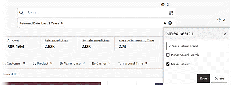
You can also add a quick date filter as a "Saved Search."
Example of a Quick Date Filter Added as a Saved Search
Negative Refinement from Search
Beginning with V14, negative refinements from the search box are supported to allow you to exclude specific values from their search results for greater efficiency.
Enhancements to the Search Feature
In V14, the search interface has been improved for a more intuitive and efficient user experience. Updates include a refined layout, better alignment, and enhanced usability.
Key enhancements are:
-
Streamlined search bar: Now aligned to the left, taking up 70% of the page width for better visibility.
-
Updated icons and labels:
-
The star icon for saved searches is now inside the search box.
-
The Clear All button replaces the reset icon, making it more recognizable.
-
-
Enhanced filter visibility: Applied filters now have a distinct background color for better readability.
Adaptive layout behavior allows the search interface to dynamically adjust based on panel visibility:
-
Default view: The search bar occupies 70% of the page width.
-
One Panel Open: The search bar expands to fill the remaining space (70%).
-
Both Panels Open: Each panel takes 30%, with the search bar adjusting accordingly.
User experience improvements include:
-
Intuitive refinements: Applied filters are displayed as individual chips. When no filters are selected, the area remains empty.
-
Consistent spacing: Optimized padding for search elements, including dataset names, icons, and buttons.
-
Smart button placement: The Clear All button position is adjusted when power user controls are enabled.
Finally, personalization options allow power users can customize their search experience based on the configuration. See the Personalization section in Oracle E-Business Suite Extending Enterprise Command Centers for more information.
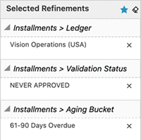
Selected Refinements
The Selected Refinements region allows you to view and understand how the applied filters are displayed and grouped based on refinement operator.
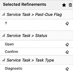
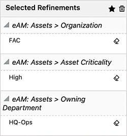
In the Selected Refinements region, filters are grouped as described below:
-
With the same attribute and same operator, filters are displayed in the same accordion
Example of the Same Attribute and Operator in Selected Refinements
-
With the same attribute but different operators, filters are displayed in different accordions
-
With different attributes and different operators, filters are displayed in different accordions
Example of Different Attributes and Operators in Selected Refinements
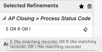
Descriptions of Refinements
You can access the meaning of the filters applied from the metric refinements in the selected refinements component. Hover over the applied filters codes to see the descriptions of the codes.
Example of Selected Refinements with Applied Filters Codes
Filter Chips
Beginning with V14, the Filter Chips feature provides predefined filters for quick access, enhancing efficiency and productivity. This feature simplifies filter management by allowing you to add, remove, and modify filters using visual chips for a more streamlined and intuitive experience.
Example of Filter Chips

-
Filter Chip
The figure above shows the Filter Chip interface in the Asset Costs dashboard. You can easily add, remove, and modify filters using visual chips. The filter chips display up to three selected values, with additional values indicated by side arrows (>>).
Key features and behavior of the Filter Chip feature are:
-
Clear filter visualization:
-
Applied filters: Applied filters and their values are displayed in the filter chips, allowing you to quickly understand the filter criteria.
-
Progress bars: In the filter chip window, selected values are displayed with corresponding progress bars representing the aggregation metric (for example, SUM, AVG, COUNT).
-
-
Easy filter resetting: You can reset all filters using the Clear All button.
-
Customization: Filter chip selections are saved as part of the user preferences, enabling a personalized experience.
-
Runtime behavior:
-
Display: Filter chips display up to three selected values. If more than three values are selected, side arrows (>>) indicate additional selections.
-
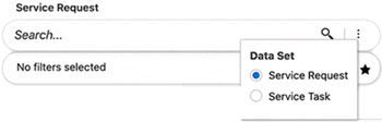
No Filters message: When no filters or filter chips are configured, the message "No filters selected" is displayed in the Selected Refinements section.
-
-
Power user personalization: The Filter Chip feature supports power user personalization, allowing power users to customize the display and behavior of filter chips based on their preferences.
Breadcrumbs
The Breadcrumbs feature is an intuitive representation of the selected refinements as a trail of filters.
The Breadcrumbs feature is configured along with the search box on the page. It places emphasis on the sequence, or path, that the user has chosen to arrive at the current state of the dashboard.
Filters in the sequence are separated by their corresponding data set names with controls to remove individual values. Filters of the same attribute are placed next to one another, and hierarchical filters are separated by '>'.
Each attribute used in the refinement is shown in a box. Hovering over the attribute name displays the dataset name.
If there are more than three filters of the same attribute, all the filters are grouped and collapsed with an icon. Clicking on the icon displays all the filters of the attribute. You can also remove all the filters of this attribute at once.
You can replace or apply additional filters from the selected refinement.
If you click on the attribute name, then you can select another value and apply it as a filter on top of the existing one from the same attribute. If you click on the attribute value, then you can select another value and replace it with the existing one from the same attribute.
Note that this usage applies to multiple assigned attributes with 'OR' and 'AND'.
If you filter by one of the context attributes (single assign) in the dashboard, such as an operating unit, and then click on the attribute name or value, the applied filter will be replaced by the new value.
If you applied a date range filter, you can click on the attribute name or attribute value and replace the existing filter with the same attribute. Also, with a date range filter, if you click on the attribute name or value and switch from range to list or from relative range to list, then filtered by one value or more from the list, then these filters will be applied on top of the existing range filter applied from the same attribute.
If you applied a numeric range filter, you can click on the attribute name or attribute value and replace the existing filter.
Beginning with V10, you can make your selections by clicking on an attribute, or by checking the boxes for multiple selections, and then clicking the Select filter button. Use the negative refinement icon to exclude an attribute.
Example of Breadcrumbs for Selected Refinements
-
Breadcrumbs
-
List of attributes for selection
Saved Search
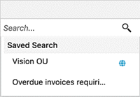
Oracle Enterprise Command Center Framework provides an option to save frequently-applied filters or preferred filters as saved searches, allowing users to reuse them. All saved searches are context-sensitive to the page and are part of the search suggestions. The list of saved searches appears when the focus is on the search component. Saved searches are searchable by their titles, filter attributes, and filter values.
Three types of saved searches are available for users: seeded, public, and private. Seeded saved searches are published along with the product. Administrators can create public saved searches. Users can create their own private saved searches. Private saved searches are accessible only by the users who created them whereas public saved searches are accessible by all the dashboard users.
To create a saved search:
-
Add refinements to the dashboard.
-
Click the star icon in Selected Refinements header.
-
To create a public saved search, check the Public Saved Search checkbox.
-
Enter a title for the saved search and click Save.
-
Once a saved search is created, the star icon is highlighted.
Example of Creating a Saved Search
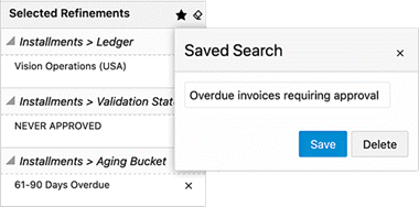
Saved Search Example
To search and apply a saved search:
-
Place your cursor inside the search box to get a list of saved searches.
-
All seeded searches are grouped separately, and public saved searches are marked.
-
Enter a search query to refine the list.
-
Click on a saved search.
Example of Applying a Saved Search
To delete a saved search:
-
Apply a saved search.
-
Click the star (highlighted) icon.
-
Click Delete.
To edit the name of a saved search:
-
Apply a saved search.
-
Click the star icon.
-
Update the name.
-
Click Save.
To edit the filter state:
-
Delete the saved search.
-
Update filter state.
-
Click the star (highlighted) icon.
-
Enter the previous saved search's name.
-
Click Save.
To copy or modify a public saved search:
-
Apply a public saved search.
-
Add or delete filters, if necessary.
-
Click the star icon.
-
Update the name.
-
Click Save to create a private saved search.
You can create a private saved search and make it your default search for applied refinements when you navigate to a dashboard.
Beginning with ECC V8, administrators can create a public saved search and make it the default search for applied refinements in a dashboard for all users.
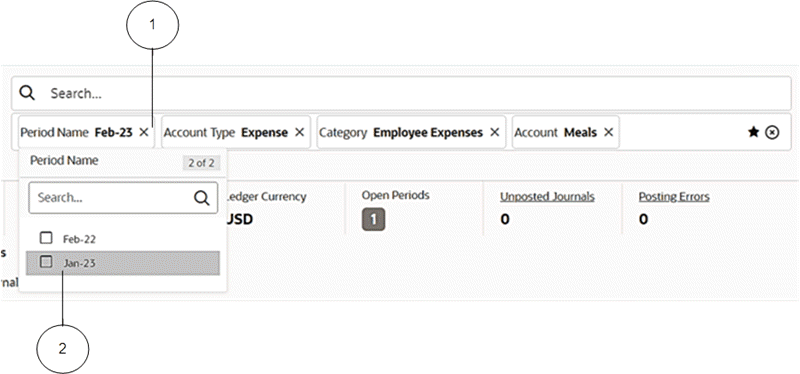
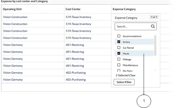
Available Refinements Overview
Available Refinements
The Available Refinements region allows interactive navigation of the data without your having prior knowledge of its spread and characteristics. Available Refinements presents you with all available possible values of an attribute through facets, date ranges, and number ranges.
As you interact with available refinement components or perform filtering operations from other components on the page, Available Refinements will dynamically update its list to display relevant attributes and attribute refinements. This navigation is data driven and supports progressive disclosure of additional options as appropriate, according to your navigation path through the data.
You can search for a specific attribute value using the search box embedded in the Available Refinements region. The minimum number of search characters is 2 to help you to find some search terms like 'IT'.
The Available Refinements feature includes an option to perform a 'Like' search. This type of search supports pattern matching when you enter a search string with wildcards or a Boolean expression. Click the magnifying glass icon displayed next to the attribute for the search to take effect on all page components.
Example of a Date Range in Available Refinements
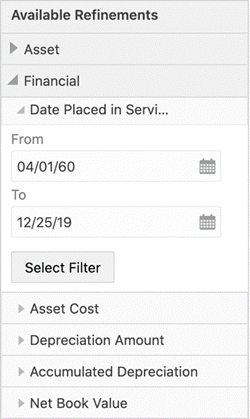
The Available Refinements feature also supports categorizing the attributes in a logical grouping using attribute groups.
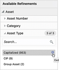
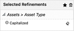
Negative Refinements
Negative Refinements allows you to refine the data by filtering out the selected values. Such refinements are displayed in selected refinements with an "Exclude" icon indicating them as negative refinements. To apply a negative refinement, you click the "Exclude" icon. The icon is visible only when hovered on the attribute value or navigated using the keyboard.
Example of Selecting a Negative Refinement
Example of a Negative Refinement
You can also exclude more than one attribute by clicking the icon for all the required exclusions.
Also, if a search is done, the Exclude All button excludes all the search results.
Negative refinements change the refinement behavior of multi-select AND attribute to multi-select OR as well as conversely.
| Negative Refinement Selection | Single Assignment, Positive | Single Assignment, Negative | Multiple Assignment, Positive | Multiple Assignment, Negative |
|---|---|---|---|---|
| Single Selection | = |
< > |
N/A | N/A |
Multiple Selection OR |
N/A | N/A | OR |
NOT X AND NOT Y |
Multiple Selection AND |
N/A | N/A | AND |
NOT X OR NOT Y |
Range Filter
You can switch between the range and list for date and numeric attributes in the available refinements and breadcrumbs features.
Relative Date Filter
A Relative Date Filter allows you to filter the dashboard based on a sliding window of time and take advantage of the default saved search with the relative date.
You can apply time-based filters to any date and date-time column in the dashboard using the relative date icon.. For example, users can use the relative date filter to show only sales data that's happened within the last 30 days (calendar months).
The default filter is "Today". You can specify a relative date period as either an explicit number of past or future time units (for example, two years) or specify a previous period.
The type of filter defines the range that you want to filter.
-
Yesterday: Starts on the day before the current day.
-
Today: Current calendar day.
-
Tomorrow: Starts on the day after the current day.
-
Last: Specifies a period to apply to the selected date level (Years, Quarters, Months, Weeks, Days, and includes Hours, Minutes, if the column is a DateTime column). For example, "Last 7 Days" means to start seven days before the current day and continue up to the current day.
-
Next: Specifies a future period number to apply to the selected date level (Years, Quarters, Months, Weeks, Days, also Hours, Minutes, and Seconds if the column is a DateTime column). For example, "Next 3 Days" means to start at the beginning of the current day and continue for three days. (The range includes today.)
-
Current: Specifies a present period to apply to the selected date level (Years, Quarters, Months, Weeks, Days, and includes Hours, Minutes, if the column is a DateTime column). For example, "Current Week" starts on the first day of the current week and continues for seven days.
-
Week to Date: Starts on the first day of the current week and continues up to the current day. (The range includes today.)
-
Month to Date: Starts on the first day of the current month and continues up to the current day. (The range includes today.)
Quarter to Date: Starts on the first day of the current quarter and continues up to the current day. (The range includes today.)
Year to Date: Starts on the first day of the current year and continues up to the current day. (The range includes today.)
In a relative date filter, the period defines the relative date range period. For example, the period could be 7 or 10 days. The date measurement defines the range unit. It could be Day, Week, Month, Quarter, or Year. Hours and Minutes are included if the column is a DateTime column.
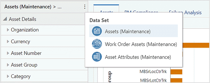
Multi-Data Set
The Available Refinements feature also allows you to apply the appropriate filters from multiple data sets. When two or more data sets are configured under Available Refinements, you can switch among the data sets to find and apply your desired refinements. The name of the data set selected appears in the component header as a title.
Example of a Multi-Data Set
Attribute Group
An attribute group is a logical grouping of attributes for display purposes. Attribute groups provide ease of navigation through Available Refinements.
For example, in an Assets application, the attributes could be grouped into the following: Asset Details, Category, Financial Details, Sources, and Assignments. The Asset Details attribute group contains the attributes Manufacturer Name, Model Number, Serial Number, and so on.
Attributes are then displayed in a hierarchical order based on the attribute groups.
Oracle Enterprise Command Center Framework supports advanced scrolling functionality by limiting the height of refinements section by the height of the dashboard.
Dashboard Components
Oracle Enterprise Command Center Framework has a set of graphs and charts that provide a powerful way of summarizing and presenting data that are critical in decision making in an easily comprehended manner. You can find insights, detect outliers, filter the data directly from the charts, and drill down to a deeper level of details. This section describes how charts and graphs are used to detect and solve problems or highlight bottlenecks and exceptions.
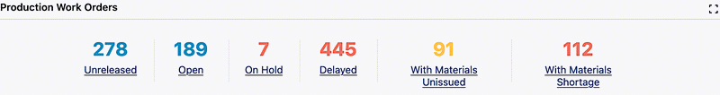
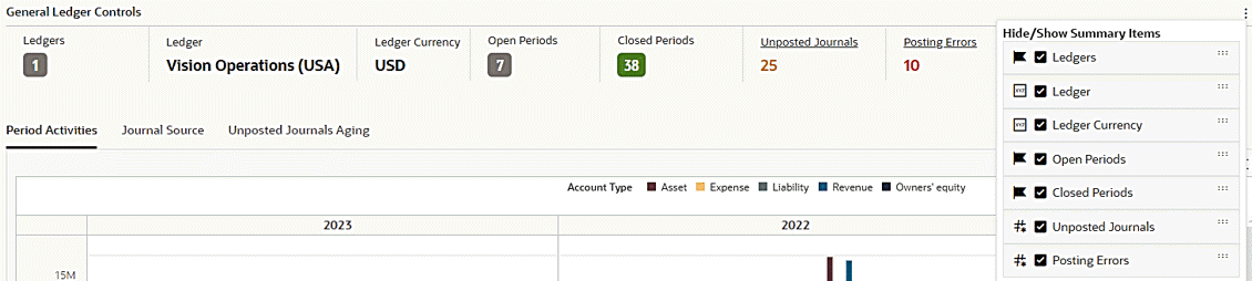
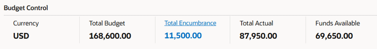
Summarization Bar
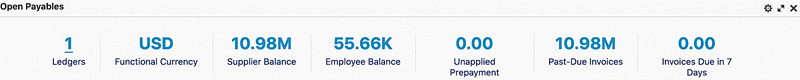
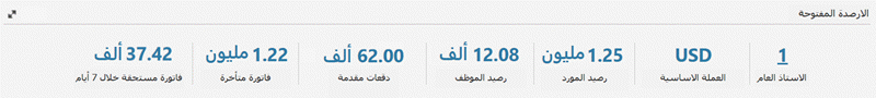
As the name implies, metrics, flags and dimensions in the bar summarize important aspects of the data displayed. All values are updated with new calculation results when you change the focus as you filter the data.
The summarization bar supports conditional formatting. With conditional formatting, a metric item can be displayed in a specific color based on a specific value or range of values, so that the color changes depending on the value of the metric.
Summarization Bar Example
You can apply a filter from a metric item in the summarization bar; this filter can be based on a static condition. For example, "Draft Orders" could be based on static conditions (open flag = Y AND booked flag = N). Also, the filter can be based on a variable condition. For example, the "My SRs" metric is based on service requests assigned to the logged-in user. In this case, the condition changes based on the logged-in user.
Beginning with V12, the metric refinement is enhanced to support aliases, or aliasing. An Enterprise Command Center designer can specify an alias as an optional parameter. If the parameter is not specified, the component title is used as an alias to provide a meaningful name in the selected refinement. Upon hovering, you can find out details of the refinements applied under a metric refinement.
Example of a Metric Refinement with Aliasing
Beginning with V10, a window with a list of flags is available and includes data bars for metrics. The flag list is sorted in descending order by default, based on the defined metric. When more than one metric is defined, the sorting is done based on the first metric.
Example of a Flag Pop-Up Window
Beginning with V12, the flag summary item supports searching within the flag pop-up window. The search capability allows you to search within the entire list rather than being restricted to the 100 items displayed. This search feature only works on the dimension.
Example of Searching within a Flag Pop-up Window
You can personalize the summarization bar component through runtime options. Personalizations included showing or hiding summarization bar items and reordering the list of items.
Example of Summary Bar Runtime Options
Numbers may be abbreviated for improved readability. The actual value is displayed in the tooltip.
Example of Abbreviation in Summarization Bar

Values in the summarization bar are displayed according to the number formatting specified for the Oracle E-Business Suite instance and are translatable.
Example 1 of Number Formatting in Summarization Bar
Example 2 of Number Formatting in Summarization Bar
Beginning with V16, the visual appearance of metric items has been enhanced to indicate when a hyperlink is defined. When a metric includes a hyperlink action, the hyperlink is visible and displayed for that metric item, helping business users easily recognize that the metric is clickable and can be used for navigation or drill-down.
This feature enhances discoverability and ensures a more intuitive user experience when interacting with actionable metrics.
Example of Hyperlink Action in Summarization Bar
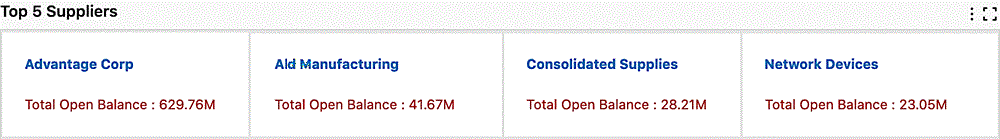
Tag Cloud
A tag cloud highlights keywords in the system based on a configured importance metric. For example, a tag cloud could show top (or bottom) suppliers by invoice count, invoice amounts, and so on.
Example of a Tag Cloud
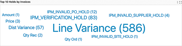
You can change the attributes of the Tag Cloud by using the Options icon.
Charts
Charts depict data trends, distributions, anomalies, and more. You can drill down through different levels of hierarchy and allow the system to expose different levels of details dynamically. You can control which options to slice the data by and affect the whole navigation path by picking filters directly from the charts.
Charts are effective when there is numerical data that splits nicely into different categories so you can quickly see trends within the data, compare related information, and gain immediate insight.
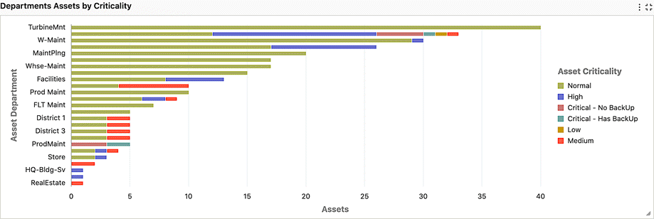
Example of a Horizontal Bar Chart
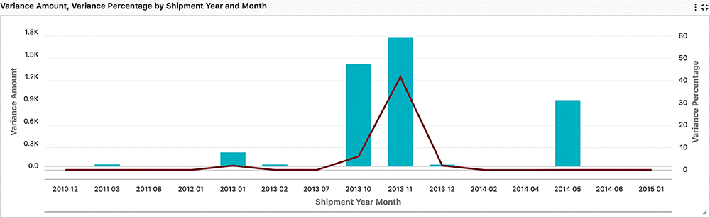
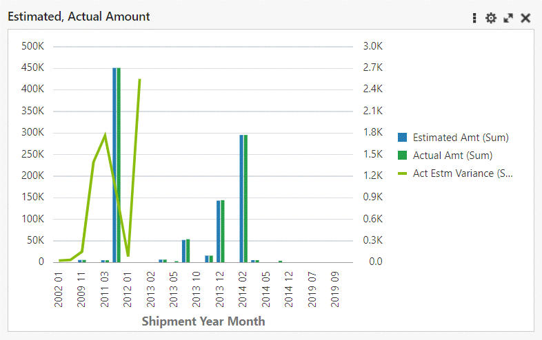
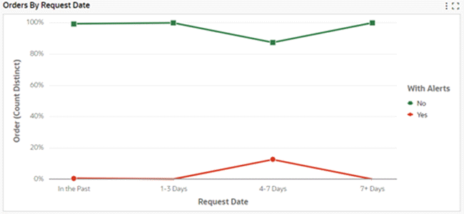
Example of a Bar-Line Chart
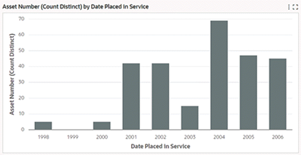
Example of a Vertical Bar Chart
You can refine the displayed data by clicking the data point on the chart. Also, by hovering the mouse over a chart, you can display the dimension and metric value for a data point.
Also, you can make the following refinements:
-
Click a data point on the chart to refine the data by all of the applicable dimension values
-
Click a label on the category axis to refine the data by that value only
-
Click a legend entry to refine the data by that value only
Note: This feature is not available on multi-metric, multi-dataset, and waterfall charts.
Multi-metric Chart
Example of a Multi-Metric Chart
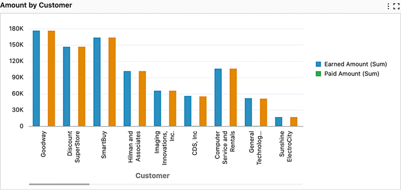
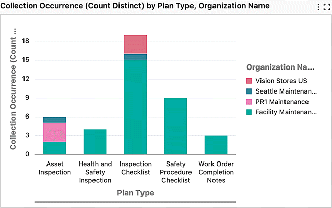
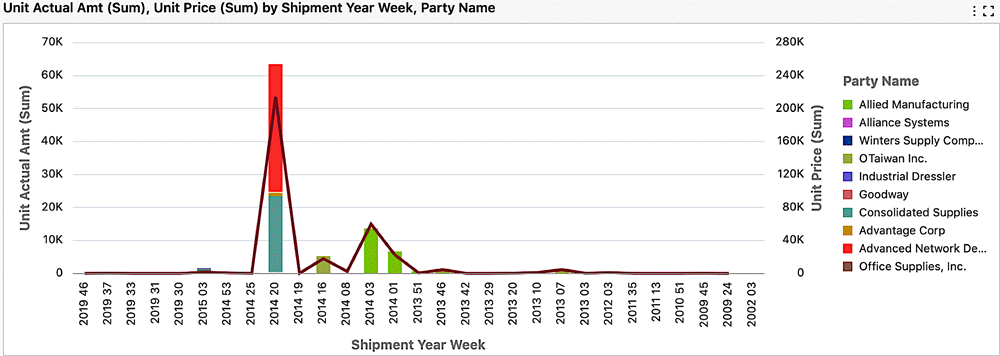
A multi-metric chart supports the display of multiple metrics. Each metric shares the same axis. In a multi-metric chart, the bars are grouped by a series dimension.
With this chart, you can visually compare metrics against a shared dimension. For example, an organization could have a number of projects. A multi-metric chart could be used to compare the planned versus the actual quantity of a resource per project, or it could be used in a comparison of cost and revenue per project.
Multi-metric Bar-Line Chart
A multi-metric bar-line chart supports the display of multiple bar metrics and line metrics. Bar metrics and line metrics have their own axes, respectively. A series of dimension groups the metrics. With this chart, you can visually compare metrics against a shared dimension.
Example of a Multi-Metric Bar/Line Chart
Multi-metric bar and bar/line charts can be designed to span across data in different data sets. For a business user, the experience is the same as with a typical bar or bar/line chart, respectively. However, when a filter is applied from a chart with a multi-data set, then the selected refinements include filters from all the data sets.
In V14, a capability is introduced to switch between bar and line representations in multi-metric charts, offering users more flexibility in how to display the data. This enhancement applies to both bar and bar/line chart types, allowing you to change the representation of each individual metric based on your preferred style.
Example of a Switch between Bar and Bar/Line Representations for a Chart

The visualization style can be controlled from runtime options, enabling users to switch between bar and line views. This applies to both single-metric and multi-metric views, and the selected preference is retained as part of user preferences.
Stacked Bar-Line Chart
A stacked bar-line chart supports the display of bar metrics aggregated over a series dimension and grouped by a group dimension. Line metrics are aggregated over a group dimension. Bar metrics and line metrics have their own axes, respectively.
Example of a Stacked Bar/Line Chart
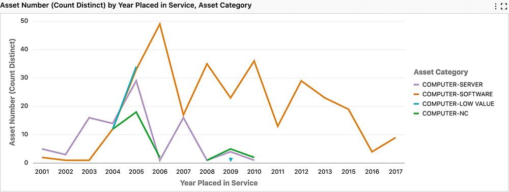
Line Chart (With Group Dimension)
A stacked bar chart can be converted to a line chart at runtime, which then displays the aggregations as lines.
Example of a Line Chart (With Group Dimension)
Line Chart with Data Points
Line charts and Bar/Line charts include a line series with data points, giving a clear indicator of the values. From the runtime options, you can control the display of data points.
Example of a Line Chart with Data Points
Line Smoothing
Line charts and Bar/Line charts can be displayed with smoothed line series. The representation of a smoother line is well-suited for continuous data with minimal variation and can give a clear visualization of trends. You can control the display of data points on the smoothed line through runtime options.
Example of a Line Chart with Line Smoothing
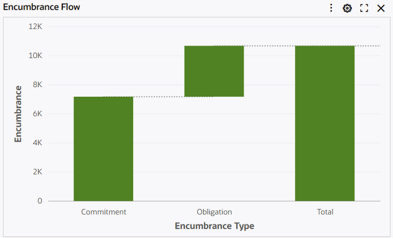
Waterfall Chart
A waterfall chart is useful for visualizing the changes of an attribute over a timeline or over categories. A waterfall chart can also represent the significant contributors to the changes of a value. A waterfall chart connects ends of each bars illustrating the starting values and ending values. You can also choose to display the beginning and final values for understanding the changes from initial state to final state.
Example of a Waterfall Chart
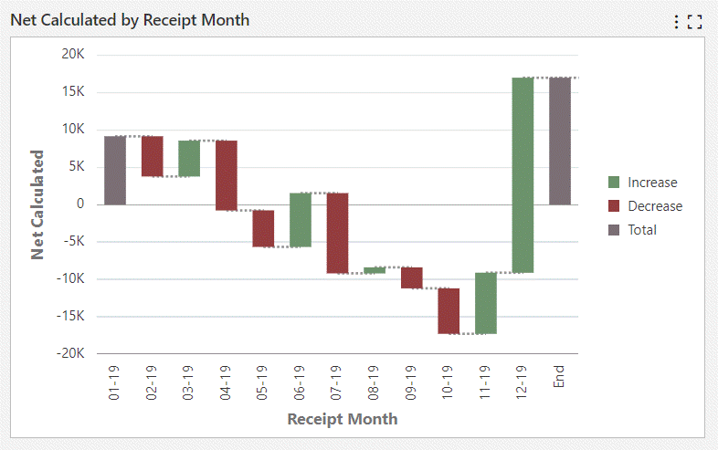
Beginning with V16, a waterfall chart supports a custom label for the Total bar. You can define a meaningful label for the Total bar, allowing better alignment with business terminology and reporting context. This feature increases clarity and flexibility when presenting cumulative results.
Example of a Waterfall Chart with Custom Label for Total Bar
Percent Chart
Beginning with V10, the percent chart is available as an alternative for the stacked bar chart . A percent chart displays the relative percentage of multiple data series in stacked bars. The total of each bar always equals 100%. A percentage chart is a hybrid between a comparison and a composition chart. It helps you visualize part-to-whole relationship changes over time.
Example of a Percent Chart
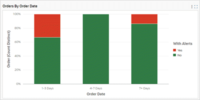
Every stacked bar chart can be converted to a percent chart using runtime options. The runtime option also allows displaying the percent chart as a line.
Example of a Percent Chart as a Line
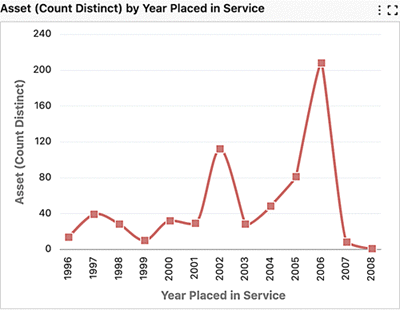
Time Series Chart
Introduced in V10, a Time Series chart displays a series of data points collected over a period of time and are useful in trend analysis. The granularity of time can be altered among monthly, quarterly, and yearly levels. Time Series charts are always ascending by time dimension.
Example of a Time Series Chart
Both the Bar and Bar/Line charts support the time dimension. Stacking is also supported in the time series chart.
A time series chart always shows the time dimension in a continuous manner. The time dimension occurs even when the metric value for a corresponding dimension is zero/null.
Beginning in V11, the time series chart supports finer time grains such as Week, Day, Hour, and Minute. Hour and Minute time grains are only applicable when utilizing the cascading functionality. The cascading dropdown menu will automatically display appropriately-adjusted time divisions from the beginning to the end, based on the attribute profile.
Data Label Support in Bar and Bar/Line Charts
In V14, Data Label support is introduced in charts. This feature enables the display of precise values directly on data points in a chart and thus helps you quickly interpret the data without hovering over elements.
For stacked charts, stack totals can also be shown so you can quickly understand the overall total while still seeing individual segment contributions. It is then easier to compare contributions and understand the cumulative sum.
Example of a Chart with Data Labels

Data labels can be enabled or disabled from runtime options or during configuration, giving you the flexibility to control the display. The selection is saved as part of your preferences, ensuring the preferred view is retained across sessions.
Simple Moving Average
In V12, the Simple Moving Average (SMA) functionality is introduced. This feature allows for smoothing trends and providing a more stable representation of data. SMA is a pivotal tool for identifying underlying patterns and trends within time series data. Its capacity to diminish the impact of short-term volatility empowers you to make well-informed decisions with increased confidence over time. Implemented in bar and bar/line charts, SMA is specifically tailored for time series data.
Example of a Simple Moving Average in a Chart
During runtime, you are able to amend the moving average period.
Note that a moving average does not add any value in a stacked chart setup. Therefore, it is not supported for stacked bar and bar/line charts.
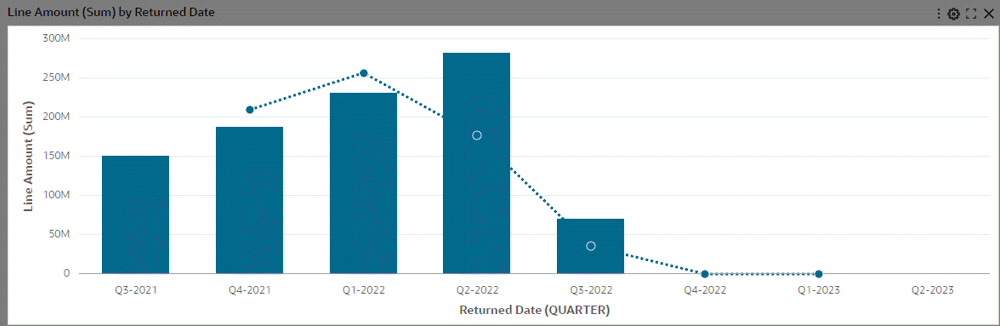
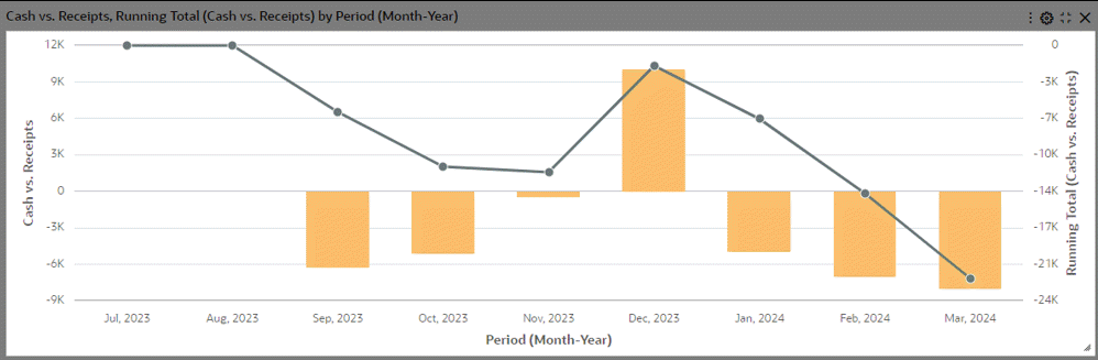
Running Total Support in Bar and Bar/Line Charts
In V12 and later, the running total feature provides a robust tool for obtaining comprehensive insights into cumulative metrics across diverse data aggregations. This feature enables you to compute running totals on any aggregation type, including calculated attributes. Support for the running total feature encompasses all bar and bar/line charts except for the stacked bar chart. You can utilize this functionality to augment your decision-making processes and derive deeper insights from various perspectives.
Example of a Running Total in a Chart
Color Pinning in Charts
Color pinning is the display of context-specific colors on charts to reflect the true meaning of what the chart represents. It thereby enables users to focus on the important attributes of the charts and then take appropriate actions.
Top N in Charts
The Top N feature in charts can be used to include just the essential information by rendering the chart with a subset of dimensions to display only the first N dimensions in the chart. Top N takes the Sort definition into account for considering the first N dimensions. The number of dimensions displayed can be controlled from runtime options, if configured.
Top N is applicable for all chart types apart from pie and donut chart types, if the group dimension is configured.
In Bar and Bar/Line chart types, if the chart has a group dimension, then Top N uses the group dimension; otherwise, it uses the series dimension.
In Bubble and Scatter chart types, Top N always uses the group dimension.
Example of Top N in a Chart
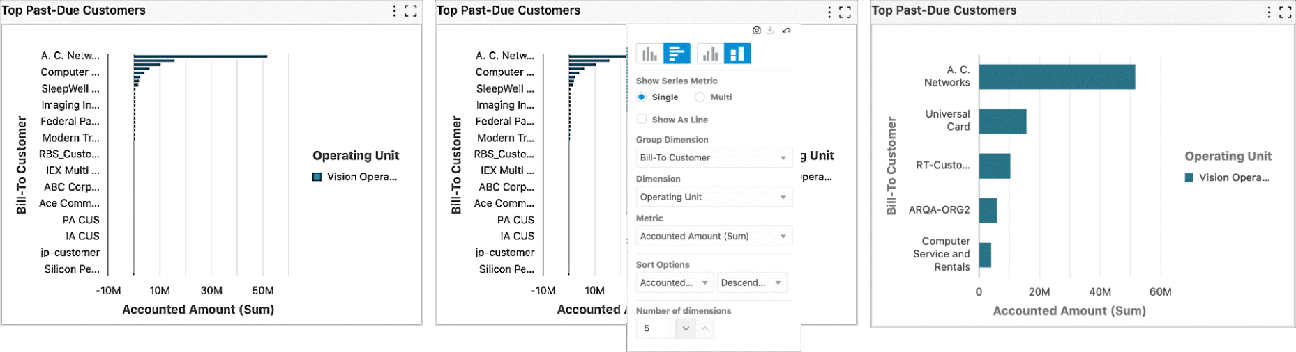
When configured, the order of display is also controlled from runtime options to display the N dimensions from first or last. This is valid for charts with a timeline or a rolling window where the chart renders data for a rolling window of last N days/times.
Example of Top N Chart with Order of Display
Pie and Donut Charts
Pie charts show a single metric aggregated across a group dimension.
Example of a Donut Chart
You can hover the mouse over a wedge or segment to display the corresponding metric value as well as its percent of the total.
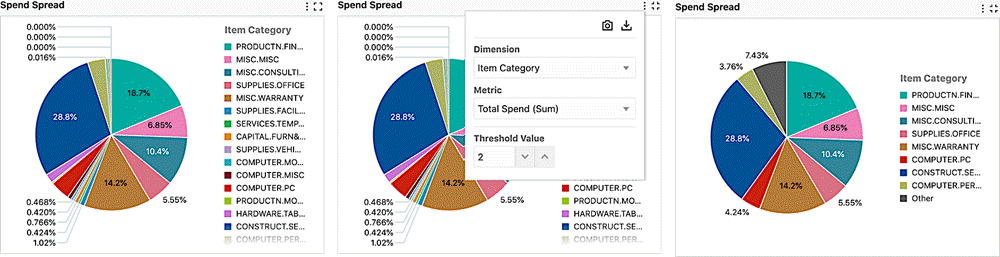
"Other" in Pie/Donut Charts
The readability of the pie chart is improved by grouping dimensions with lower metric values based on a threshold percentage, thereby reducing UI clutter. All the dimensions corresponding to a percentage lower than the threshold are grouped into the "Other" group. If configured, the threshold limit is also controlled from runtime options.
"Other" is always displayed last in the legend. "Other" considers sorting based on the metric -- when sorted in ascending order, "Other" is the first group and when sorted in descending order, "Other" is the last group. "Other" always displayed at the end of the legend regardless of the sorting option on the dimension.
You can filter on the "Other" group from the chart to drill down to data grouped inside the "Other" group. However, you cannot filter by "Other" from chart legend.
Example of "Other" in a Pie Chart
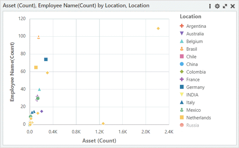
Scatter Chart
A scatter chart is used to plot two metrics against each other. Scatter charts are used to find clusters of data points, to show gaps, and to identify sub-populations. Example use cases include cause and effect analysis (a driving factor and a dependent one), or analysis of the correlation of two variables, for example, the analysis of the relationship between cash inflow and outflow per project.
You can define the dimensions of the data used in the scatter chart. The group dimension (for example, location) controls the shapes of the data point display. The series dimension controls the number of data points with a particular shape. A data point is displayed at the intersection between the x and y metrics.
Scatter Chart Example
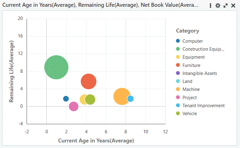
Bubble Chart
A bubble chart is used to plot two metrics against each other with an additional metric represented as the bubble size. Bubble charts are used to show concentrations of data along two axes with magnitude. For example, they could be used to illustrate performance review ratings or customer profitability.
You can define the dimensions of the data used in the bubble chart. The group dimension controls the bubble color. The series dimension controls the number of bubbles with the same color. A data point is displayed at the intersection between the x and y metrics.
Bubble Chart Example
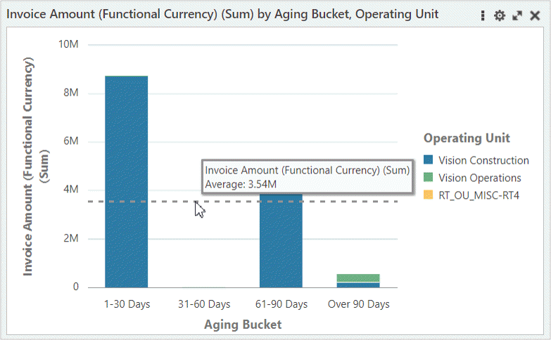
Reference Line
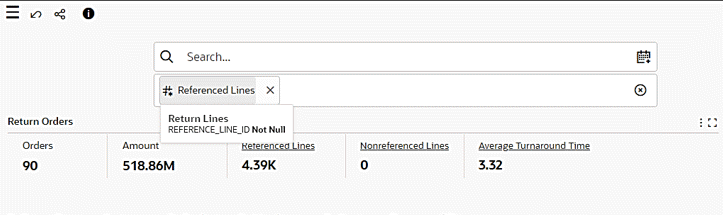
A reference line in a chart can be used to identify a specific value on a chart axis. The value can be based on a function, such as the average, maximum, or minimum. It is a constant value. The reference line is available only for a defined metric; for example, Invoice Amount (sum).
You can add more than one reference line to a chart. You can add a separate line for each metric defined, or you can add several reference lines for the same metric, using different functions associated with each one.
Reference lines are supported in all types of charts except pie and donut charts.
Example of a Reference Line in a Chart
Metrics without Aggregation in Bubble and Scatter Charts
Beginning with V13, Bubble and Scatter charts support metrics without aggregation; that is, you can view their metrics without aggregating them. This feature helps in analyzing pre-aggregated data in these types of charts.
Chart Maximization
The Chart Maximization feature improves the readability of the chart by providing visibility to more dimensions in the chart. You can maximize a chart and increase its height by dragging the right bottom corner of the chart. Change in height scales the axis dynamically and displays the chart height as a tooltip.
Example of Chart Maximization
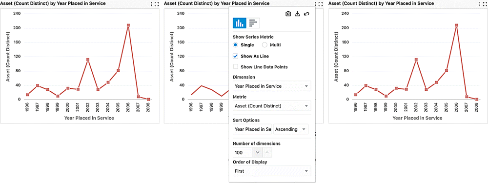
Trellis Chart
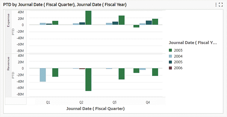
Introduced in V10, the Trellis Chart displays a series of sub-charts that use the same scale and axes, making relationships among the data easier to understand. A trellis chart splits a chart into multiple versions of itself, presented side-by-side (or one above the other), with its data partitioned across these versions by a chosen series dimension (for example, splitting a "sales by category" column chart across product lines or country). For example, a trellis chart could have two versions of a chart for period-to-date balances over journal date, one for expenses and the other for revenue.
Example of a Trellis Chart
Based on how a trellis chart is configured by its designer, you may be able to see the trellis row/ column lists in the runtime options. Also, depending on the configuration, you may be able to completely flip between trellis rows/ columns or remove the Trellis feature from the chart visualization.
Beginning with V11, pie and donut charts, in addition to bar charts, are supported in this feature.
Beginning with V11, you can export a trellis chart in a PDF file at the dashboard level. Note the following:
-
In exporting a trellis chart, all sub-charts that are visible on the dashboard are exported so you can take advantage of the trellis's comparison features in the exported file.
-
The exported trellis chart will be wrapped if the number of column sub-charts exceeds five (5).
-
The trellis chart export feature supports row, column, and row/column trellis charts.
-
The legend display will be limited to only those that are visible without scrolling on the page.
Chart Runtime Options
The Chart component supports a variety of runtime options:
-
Changing orientation
-
Stacking or unstacking
-
Runtime sorting
-
Changing dimensions and metrics
-
Showing series metrics
-
Switching from single to multi-metric
-
Changing sort attribute and order
-
Showing line and data points
-
Splitting the Y-axis
-
Controlling Top N and other features
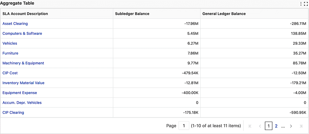
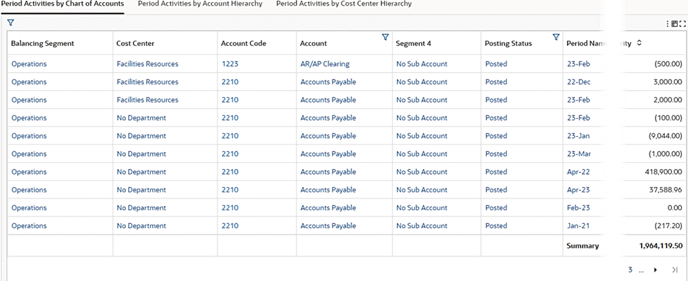
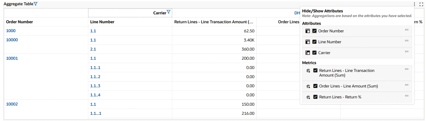
Aggregated Table
An aggregated table displays aggregated metrics in a tabular format. The aggregation level is controlled by all dimensions displayed in the table. Examples of using aggregated tables include comparing financial information of multiple assets or comparing account balances.
The aggregated table displays 50 records per page when maximized.
Example of an Aggregated Table
The granularity of data can be adjusted in an aggregated table by controlling the display of columns from runtime options.
The aggregated table component supports the dynamic display of key flexfield attributes, enabling you to view these attributes based on the context.
In V12 and later, the local filter feature in aggregated tables allows you to focus solely on the records of interest without impacting the global context. The local filter is not supported for metrics or pivot views.
Example of a Local Filter
-
Selected local filter
Once a local filter is applied:
-
The column on which local filter is applied shows a filter icon indicating the application of the local filter.
-
A filter icon appears beside the component title.
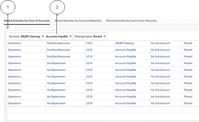
Example of Filters Applied on Account and Posting Status
Note that if the tab already contains the title, then the component title is empty.
-
Clicking on the component title triggers a pop-up window displaying details of all locally applied filters. This window inherits behavior like that of a "selected refinement." You can click on attribute names in the window to select a different value for the attribute, thus replacing the applied filter. Additionally, clicking on attribute values enables you to select a different value for the attribute and append it alongside the existing value.
Example with Multiple Local Filters Applied
-
Filter icon
-
Applied filter
The interaction between local and global filters in the context of search or selected refinements follows specific behavior patterns: When a local filter is already in place within the Aggregated Table, and subsequently, a global filter is applied, the local filter will be reset. The global filter will then take precedence, affecting the displayed records. If a filter from the search or selected refinement (global filter) is first applied, and then a local filter is subsequently added, the aggregated table will showcase records that adhere to both the local and global filters.
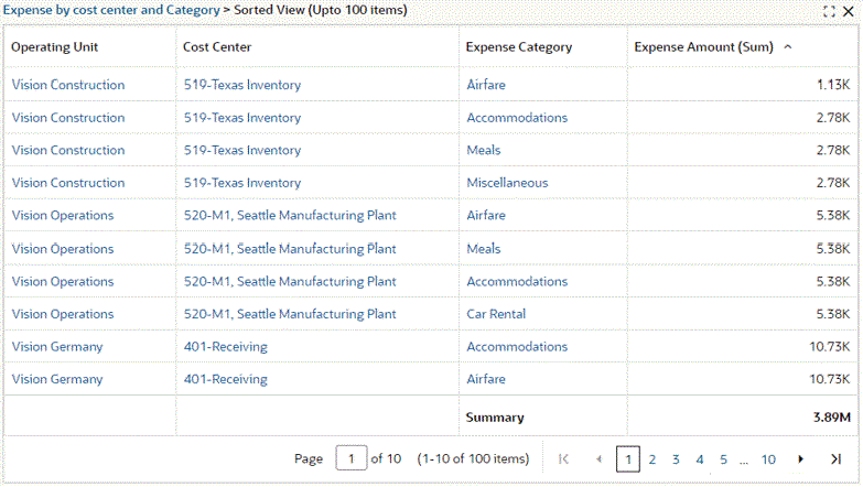
In V12 and later, you can sort by a metric with an aggregated table. Metric sorting allows you to rapidly and effectively analyze, organize, and interpret your data. The sorted view is presented in an inline view. You can then sort again from within the inline view and the sort will be on the full aggregated table and not on the previous sort. The sorted view displays a maximum of 100 records.
Example of an Aggregate Table Sorted by Expense Amount (Sum)
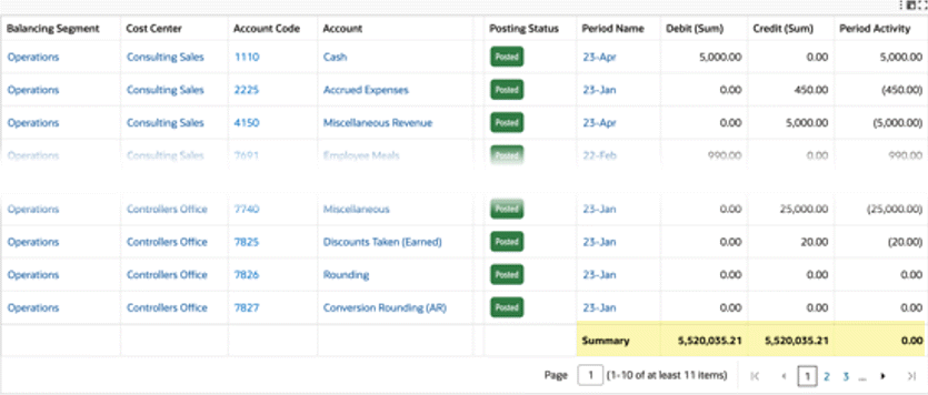
Introduced in ECC V12, a Summary line is displayed for aggregated table metrics at the footer for all records for: Sum, Min, Max, Count, Count Distinct and Average. This summary is impacted by any selected refinement and local filters.
Example of a Summary Line at the Footer of the Aggregated Table
In V14, Data Bar support is introduced in aggregated tables, providing you with a visual cue to compare numeric values across rows. The bar representing the highest value is fully shaded, and all other bars are proportionally shaded based on their values, enabling relative comparison between values. This makes it easier to spot variations, identify large or small values, and interpret data without relying solely on numbers, enhancing the overall readability of tabular data.
Data bars also work alongside conditional formatting, offering an additional layer of visual insight. When conditional formatting rules are applied, the color of the data bars is driven by the color defined for the condition in configuration, helping highlight specific values or exceptions.
Example of Data Bars

-
Data bars
Data bars can be enabled or disabled from the runtime options, allowing users to control their display as per their preference. Users can switch between a standard numeric view and a visual comparison view with Data Bars, adapting the table display to suit their analysis style.
Example of Runtime Options for Data Bars

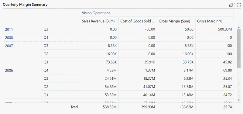
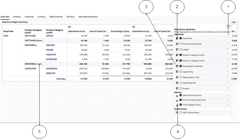
Beginning with V8, aggregated tables also support the display of data in a pivot view. The pivot view allows you to perform comparisons and identify trends across several cross-sections of data.
In a pivot view, the values in the header rows represent every possible grouping of the selected attributes. For example, a cell can have the total sales revenue, total cost of goods sold, total gross margin, and gross margin percentage for a specific combination of the fiscal year, fiscal quarter, and ledger.
Example of a Pivot View
Using the runtime options window, you can choose to hide or show attributes and you can choose which metrics to display. Use the Reset button to reset the display.
Depending on how a pivot view is configured by its designer, it might include a grand summary row and columns for the entire set of pivot data, which aggregate all of the values in a row or column. A pivot view might also be configured to support sorting by dimension or grand summary.
Beginning with V9, you can reorder the columns of an aggregated table using the "..." icons next to the attribute names.
Beginning with V10, the Pivot view also supports a subsummary specific to certain attributes. You can hide or show the subsummary from the runtime options.
Beginning with V11, the runtime options allow you to activate or deactivate Sub-Summary on a per-attribute basis. Changes you make are automatically applied when you click outside the runtime options window.
Example of a Pivot View with Runtime Options and Subsummary
-
Controller to move the attribute up or down in the order
-
Icon identifying that the attribute is used as a pivot row
-
Icon identifying that the attribute is used as a pivot column
-
Controller to hide or show the subsummary
-
Enabled subsummary
Beginning with V10, color pinning is supported. See Color Pinning.
In V15, the Pivot View feature displays the dimension name as the column header when a dimension is used as a column. This change improves the clarity of grouped data, especially with complex pivot configurations. The column header now dynamically reflects the selected dimension, such as "Supplier" or "Period." This enhancement brings several usability improvements to the Pivot View. Column headers now clearly indicate the dimension used for grouping, enabling you to quickly understand the context behind each set of values. The look and feel of headers is consistent with existing pivot formatting, ensuring a seamless visual experience. Localization is also supported, allowing dimension names to appear in your preferred language when available. Additionally, local filters can now be applied to both column and row attributes, so you can focus on relevant subsets of data while the grouped view retains clarity and context.
Example of Period Name Dimension Used as a Column Header
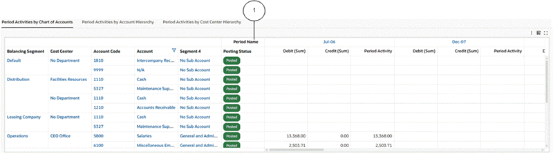
-
Dimension name as a column header
In V15, local filters are supported on both column and row attributes within the Pivot View, so you can apply more targeted filters directly within the pivot structure.
Example of Filter Jul-06 on the Pivot View Column Period Name
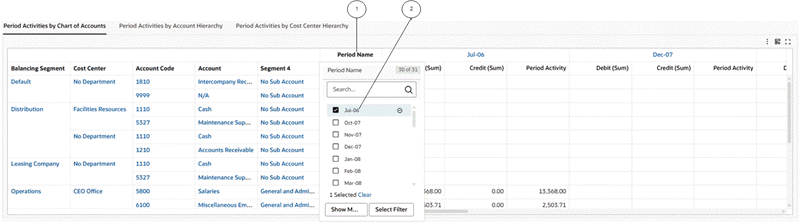
-
Column header
-
Local filter
After the filter is applied, the pivot view shows only the filtered data.
Example of Application of the Jul-06 Filter
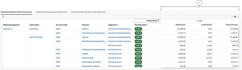
-
Data for
Jul-06only
In V15, the Pivot View feature also supports multiple data sets. The relationship between data sets is established using the common attributes from both data sets. For a pivot view supporting multiple data sets, the runtime option will have a data set alias name as a prefix to the metric definition. Multiple data set support is restricted to Pivot View.
Example of a Multi Data Set Pivot View Showing Information from Order Line and Return Line Data Sets
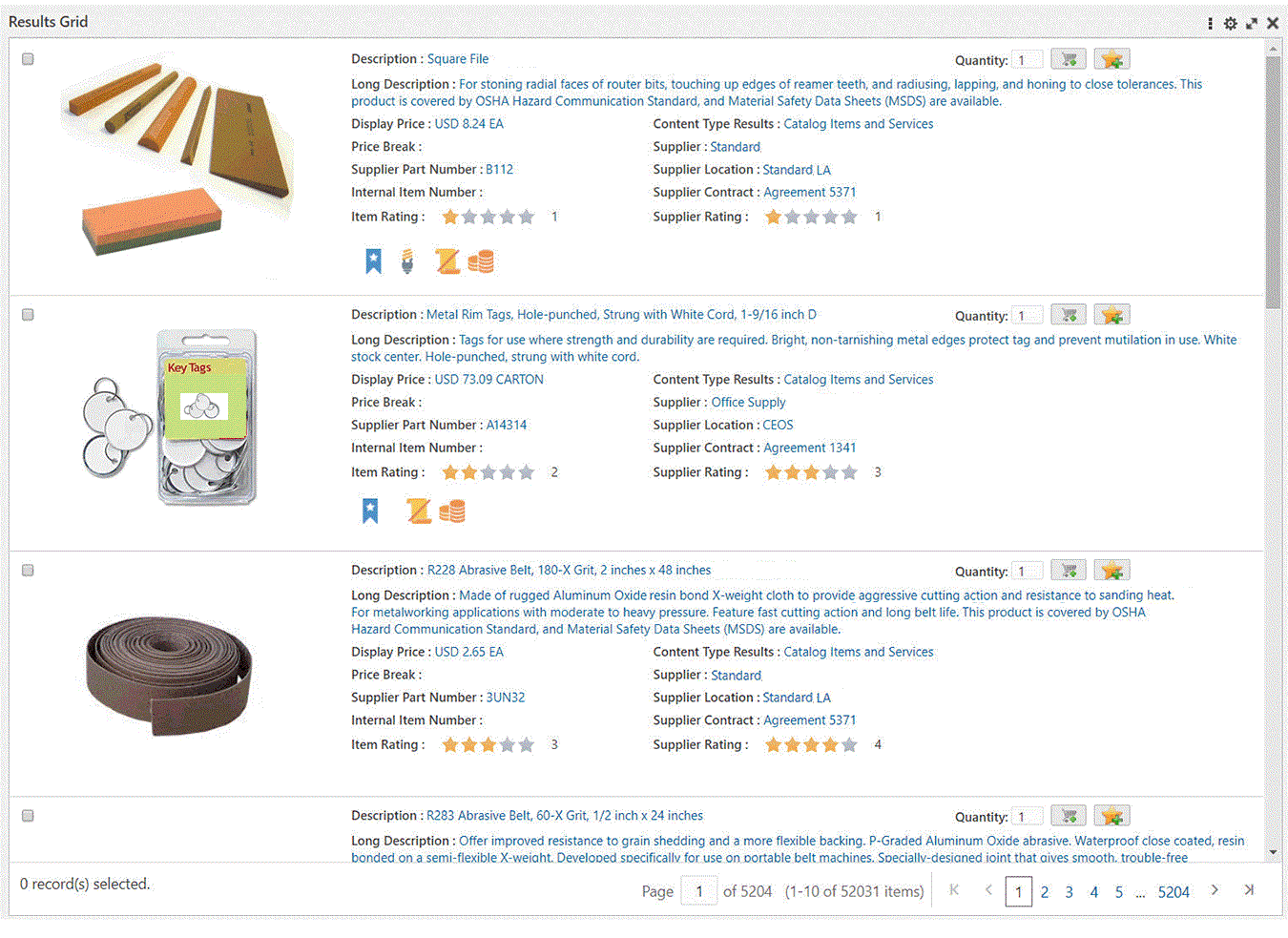
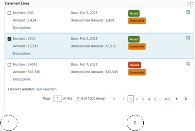
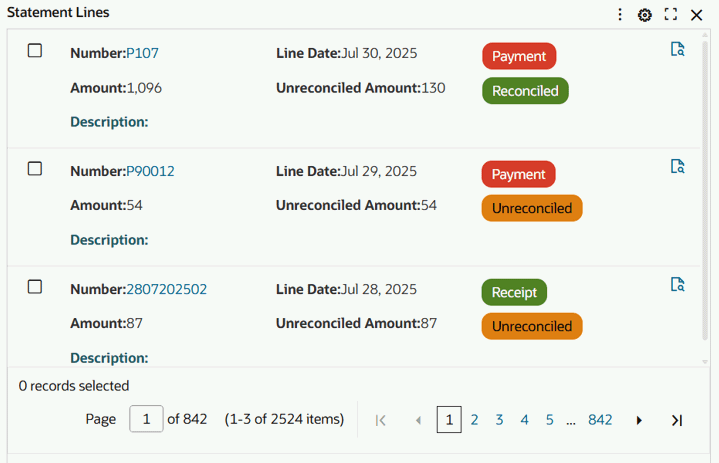
Results Table
A results table displays 10 records per page by default, and when expanded, it displays 50 records per page.
Note: Negative date calculated values are not displayed in the results table.
A results table can include the display of attributes as visual indicators or images.
You can switch among groups to display data corresponding to a group.
A results table supports row-level actions for a single record and menu actions for more than one record.
Example of a Results Table
Depending on the configuration of the results table, users can invoke Oracle E-Business Suite actions directly from the dashboard on a subset of records or all the records in the results table. Actions configured with this functionality become active even when no records are selected.
Example of a Runtime Action with a Postback Enhancement
JavaScript functions can be invoked corresponding to each record in the results table.
Example of Results Table with Function Call
Beginning with V10, the following features are provided:
-
Color pinning is supported. See Color Pinning.
-
Row actions are grouped into a single column at the end of the results table, resulting in a compact and improved user interface. The action column remains frozen at the end of the results table
-
Column freezing is supported. By default, the "Row selection checkbox column" and "Show detail column" are frozen at the beginning, and the "Row Action column" is frozen at the end. Freezing of other columns of the results table may be enabled by the designer.
-
The Results Table footer shows a summary (Sum and Average) of selected records of numerical attributes. The footer summary is activated when you select more than one record and then select a numerical attribute for which summary information needs to be populated.
-
Three different modes of record selection are supported. The mode is set by the designer. The modes are:
-
Only one record may be selected at a time
-
Multiple records can be selected at a time
-
Record selection is disabled
-
In addition, in V10, the Results Table runtime options provide more control to hide, show, and reorder attributes of the table.
Example of Options for Results Table
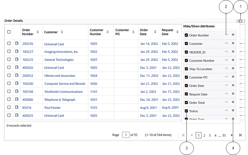
-
Icon for showing/hiding the attribute pop-up window
-
Icon for reordering attributes
-
Box to hide/show an attribute
-
Icon for deleting an attribute from the results table
Beginning with V11, the Results Table supports a local filter that enables you to concentrate solely on the relevant records while keeping the global context unaffected. This functionality is available for all attributes during runtime except for calculated attributes. Additionally, the local filter extends to the inline results table.
To apply a local filter, hover over a column and the local filter icon appears. Select the local filter or filters to apply.
When a filter is applied to the table, a filter icon becomes visible next to the title. Clicking on this icon opens a window that showcases all the currently-applied filters. Within this window, you can remove individual filters or reset all applied filters at once.
The interaction between the local and global filters in the context of search or selected refinements follows specific behavior patterns: When a local filter is already in place within the Results Table, and a global filter is then applied, the local filter will be reset. The global filter will then take precedence, thus affecting the displayed records. If a filter from the search or selected refinement (global filter) is first applied within the Results Table, and then a local filter is subsequently added, the results table will showcase records that adhere to both the local and global filters.
Beginning with V12, the local filter pop-up window also provides you with a convenient means of modifying applied local filters. Triggered by clicking on the component title, a pop-up window showcases all locally applied filters. This window inherits behavior similar to that of a "selected refinement." You can click on attribute names within the window to replace the current filter with a different attribute value. Additionally, clicking on attribute values allows you to append a new value alongside the existing one.
Beginning with V13, the Results Table is enhanced to not display any null column; that is, if a column is completely null, then it will not be included in the table. This enhancement makes the table compact and more effective for analysis.
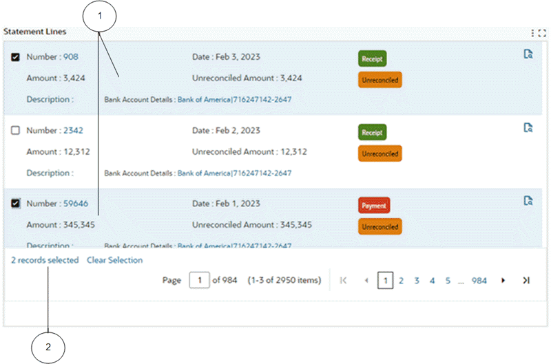
Beginning with V11, the Result Table component includes advanced transactional capabilities, offering a comprehensive view of all chosen records in a single glance. The table's footer includes a hyperlink that becomes visible when records are selected. By clicking on this hyperlink, you get access to a consolidated display of all the selected records within an unified view. This view is superimposed upon the original table, and a breadcrumb trail within the table's title enables you to return to the original presentation.
Example of Selected Records in a Results Table
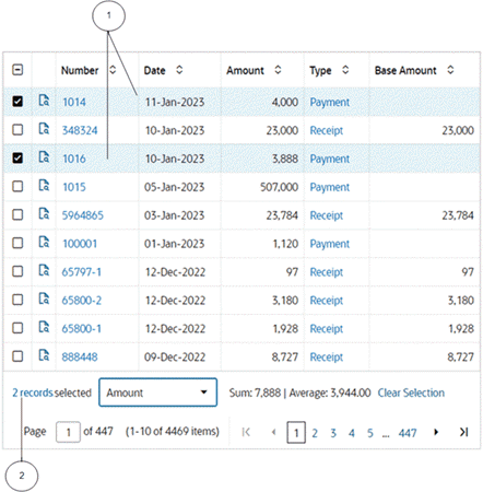
-
Selected records
-
Hyperlink
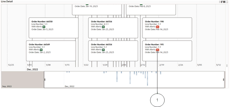
Beginning with V8, the Results Table supports displaying data in a timeline view. The timeline view is an interactive data representation of a time period, with key events marked along in chronological order so you can navigate to events within a defined time range. Each event can have a duration based on the start and end date of that event.
Switch between the results table view and the timeline view using the icons provided.
You can control whether to enable the overview display and the maximum number of events shown using runtime options.
For a specific event, right-click on the event to see available actions in a context menu.
Example of a Timeline View
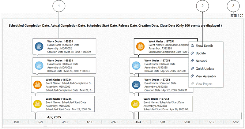
-
Event
-
Context menu
-
Results Table icon and Timeline icon
Note: In Internet Explorer, the event title and description are only displayed in the event bubble. Full event details are displayed in the event tooltip.
Beginning with V9, both the results table and timeline components support indicator icons, which are crucial in differentiating certain events/records from others. The timeline view supports displaying up to four indicators per event bubble. Indicators appear adjacent to the timeline event bubble. Tooltips provide additional details.
Example of a Timeline with Additional Details
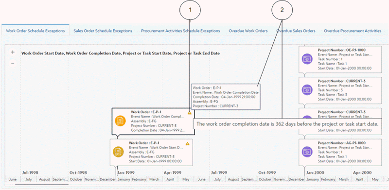
-
Indicator icon
-
Tooltips
Beginning with V10, color pinning is also possible. See Color Pinning.
Example of a Timeline with Conditional Formatting and Color Pinning
-
Badge with a specific color pinned to its attribute
In V13, the Timeline feature includes several usability enhancements:
-
Dynamic event bubble dimensions: The maximum width of timeline event bubbles now dynamically adjusts to accommodate the mandatory parameters, such as Event Name, Title, and Start Date, ensuring they are fully visible without truncation. The height also adjusts based on event parameters, thus optimizing visibility. Text within event bubbles is centrally aligned for consistency, and excessive blank space is minimized, guaranteeing a comprehensive view of all essential details.
-
Enhanced tooltips for better readability
-
Current date reference marker: A distinct "Today" marker is included in the timeline, making it easier to identify the current day. This enhancement significantly improves comprehension by providing a clear reference point within the timeline.
-
Reserved space for the timeline overview: A designated space has been allocated for the timeline overview to prevent it from encroaching on the main component. When the overview feature is enabled, an additional ninety (90) pixels from the component's height is utilized, ensuring seamless integration without compromising functionality.
Grid
Oracle Enterprise Command Centers can offer detailed insights into the data through grids. You can then act on the information by taking the necessary action to resolve a process bottleneck or address an exception, for example.
A grid offers a display of records in a flexible layout.
Example of a Grid
Grid functionality includes:
-
Runtime Sorting: You can sort by any attribute displayed at runtime.
-
Pagination Control and Selection: Pagination control and record selection can be removed from a grid to support additional business use cases for the grid.
-
Text Formatting: You can change the text style, alignment, size, and color.
Beginning with V10, color pinning may also be configured by the grid's designer. See Color Pinning.
Some grids allow you to change the default sort attribute and order.
Beginning with V10, the Results Grid component supports three different modes of record selection. Depending on how the designer configured a particular grid, a user may be able to select single, multiple, or no records.
Example of a Results Grid in Single Record Selection Mode with Conditional Formatting Enabled
-
Single record selected
-
Badge with a specific color pinned to its attribute
Note that beginning with V10, runtime options, maximization, and component borders may be hidden by the grid's designer.
In V11, the Grid component provides a unified view of all selected records. The footer of a grid includes a hyperlink that appears upon selecting record(s). Clicking this link allows access to a consolidated display presenting all the chosen records. These selected records overlay the original grid. A breadcrumb within the grid's title allows you to return to the initial layout.
Example of a Results Grid with Two Records Selected and Hyperlink
-
Selected records
-
Hyperlink
Beginning with V16, grid text formatting is applied exclusively to label columns and no longer affects data value columns. This enhancement improves readability and visual hierarchy by keeping analytical values clean and consistently formatted according to their defined action (such as refinement or hyperlink), while allowing styling to emphasize descriptive labels only.
Example of a Results Grid with Text Formatting (Bold) Applied to the Label
In V16, the Grid component supports Local Filters, enabling column-level filtering directly within the Grid. This enhancement allows you to apply filters that affect only the selected Grid component, without changing the overall dashboard context. It aligns Grid behavior with the existing local filtering capabilities available in the Results Table, Pivot, and Aggregate Table components.
By introducing localized filtering within the Grid, this feature improves usability and user control—particularly in complex data scenarios such as Unapplied Cash Receipts in the Cash Application Dashboard and detailed item lists in iProcurement—allowing you to refine data instantly while keeping the broader dashboard view unchanged.
Example 1 of a Results Grid with Local Filter Support

Example 2 of a Results Grid with Local Filter Support

The Grid feature also supports the display of aggregated metrics. All dimensions in the grid control the aggregation level. Aggregation can include all the visible grid items including images and indicators, and has all the flexible layout and formatting options available for a grid. The aggregated grid can be controlled to display data when a specific condition is met.
Aggregated grids do not have options for comparison and record details. The grid does not allow filtering based on the aggregated value.
Example of an Aggregated Grid
ECC Pop-up
The ECC Pop-up feature allows users to access additional content and take action outside the dashboard without leaving the dashboard. The ECC Pop-up can display actionable content from Oracle E-Business Suite HTML-based pages or other websites.
The results table, grid, and aggregated table components support the ECC Pop-up feature.
Example of an ECC Pop-up
ECC Drawer
The ECC drawer component, introduced in V8, supports linking contents within a panel that slides in and out from the right. You can use an ECC drawer to navigate to another ECC page or an Oracle Application Framework page.
The results table, aggregated table, grid, and diagram components support ECC drawers.
Beginning with V11, the default size of the drawer component is set to 90% of the page size, but you can reduce it to 50%.
Beginning with V16, Navigation Path Tracking within the drawer component is available to improve user orientation and streamline multi-level navigation. When navigating through multiple layers inside a drawer, you can clearly see your navigation path derived from the drawer title and displayed on top of the page. This tracking feature helps you maintain context and move efficiently between levels without losing your place. It also reduces navigation friction and improves the overall user experience when analyzing detailed insights.
Example of a Drawer with Two Level Navigation
Diagram
A diagram provides a visualization of a business process. You can track and trace an entire business activity while getting your required insights in one page. For example, you can trace a damaged lot number to track the customer recipient of this lot while also understanding the manufacturing process and suppliers responsible for the damage.
In V10, the Diagram component has been re-designed, with new colors for the background, links that connect nodes, and a new design for nodes.
Note: The Diagram feature is not supported in Internet Explorer.
Example of a Diagram
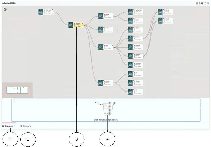
-
Current tab
-
History tab
-
Anchor node
-
Pagination control
You can zoom in to focus on an intermediate process or zoom out to get a perspective of the entire process.
Any filter in selected refinements such as Work Order Number, for example, is considered as an anchor node in the diagram and is highlighted in yellow. The entire diagram shows the business process flows with the anchor node in context. That is, the diagram displays operations that can be related to the anchor node.
You can choose any node in the diagram to be the anchor node using the Diagram Context menu and selecting Make Anchor Node. The diagram immediately shifts the context to the selected node and shows processes related to it.
For example, if the diagram shows transactions from a particular purchase order and finds a work order of interest in between the transactions, then you can select that work order as the anchor node, and the diagram then shows all the entities related to that work order.
A diagram has an upper limit for the number of nodes that can be displayed based on the limit set on the diagram.
You can add filters and the diagram component automatically organizes itself to show the related processes in a page. Pagination allows you to switch among the pages to view other related process flows. Use the pagination control below the diagram to navigate between pages.
For example, if you apply three purchase order numbers as filters, then the first two purchase order processes are represented in the first page, because the diagram understood there are subsequent transactions common to these purchase orders. The remaining purchase order is shown in a different page.
You can also expand any node to display upstream and downstream processes related to that node. You can expand a node by either by clicking the icons on the node or clicking "Show adjacent nodes" in Options.
To view the entire details related to a particular node in a tabular form, click "Show Details". You can export a snapshot of the diagram component for collaboration with other stakeholders. This exported snapshot is saved in PNG or SVG format.
Find Similar
The "Find Similar" feature helps you filter the diagram by a specific value and displays matching flows (diagrams); for example, review other Lots with similar characteristics. This feature is embedded in the Show Details and Compare pop-up windows.
Multi-Select Nodes
The "Multi-Select Node" feature allows you to select more than one node from the same business entity (from the same or different rank), compare between these nodes to spot differences, and find similarities or filter directly by the selected node by making them anchor nodes.
Note: "Show Adjacent Node" and "Show Details" are not supported in multi-select nodes.
Note: If you select multiple nodes from a different business entity, then all previous nodes will be deselected.
Filmstrip Thumbnails and Pagination
Beginning with V7, diagram pagination uses Film Strip Thumbnails to help you explore multiple distinct business processes in a single view per process with an overview of each business process. This feature displays an active image of the current business process flow, page number, and business entity (node) identifiers.
Example of Pagination Filmstrip Thumbnails
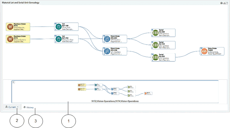
-
Thumbnail diagram in pagination filmstrip
-
Current tab
-
History tab
Pagination Tracking Analysis History helps you visualize history. You can keep track of the previous filter applied on the diagram by clicking on the History tab in the pagination film strip. You can click on the history thumbnails to display the previous business flow without replacing the existing one.
You can click on the current tab to see the applied filters or return to the current view of the business process flow at any time while reviewing the history.
You can click on the arrow on the History tab to apply the previous filters from the history.
Highlighted Path
Use the Highlight Path option to highlight the paths in a different color. This feature also highlights the selected and common nodes in a color different from the color used for queried nodes. You can deselect a highlighted path using the "Unhighlight Path" option in the context menu.
Example of a Highlighted Path
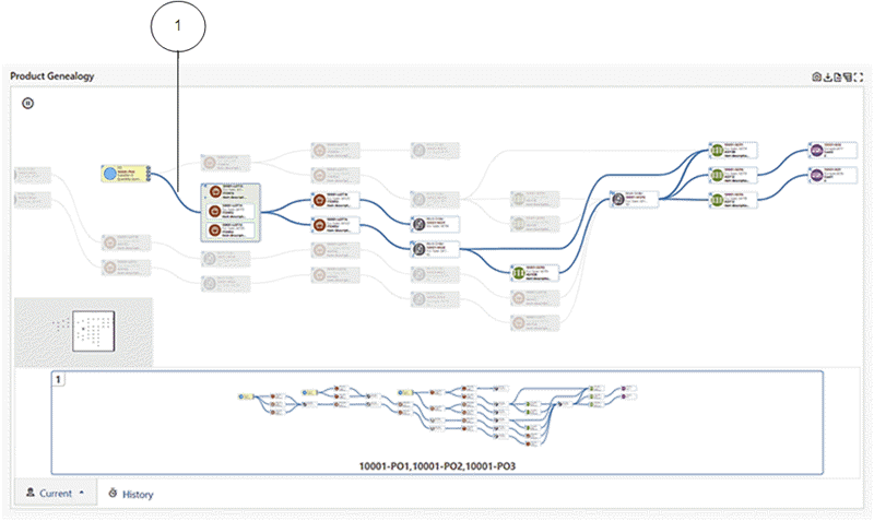
-
Highlighted path
A path can be highlighted at the record level and within grouped nodes. Unrelated nodes are grayed out.
You can view other nodes using the context menu. Right-click on any node, and from the context menu, select "Explore [node title] Node".
Note: Highlighted paths are preserved when navigating between diagram pages.
Grouping Nodes
Nodes can be grouped to display aspects of the diagram nodes at another level of detail. Redundant nodes can be grouped together. Grouped nodes are displayed with (+) sign at the corner of the node, and you can click on the (+) sign to expand the details of the nodes.
Example of Grouping Nodes
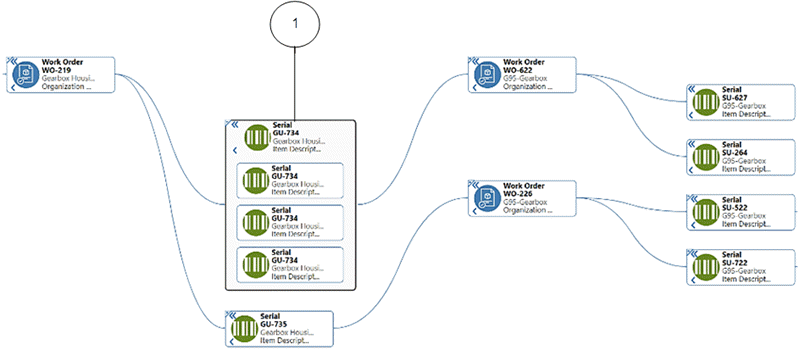
-
Grouped nodes (expanded)
Node grouping supports aggregation at the group level which can bring in additional details.
Row Expander View
Using the Row Expander feature, introduced in V8, you can switch between a diagram display or a multi-level hierarchy layout display.
Example of the Row Expander Feature
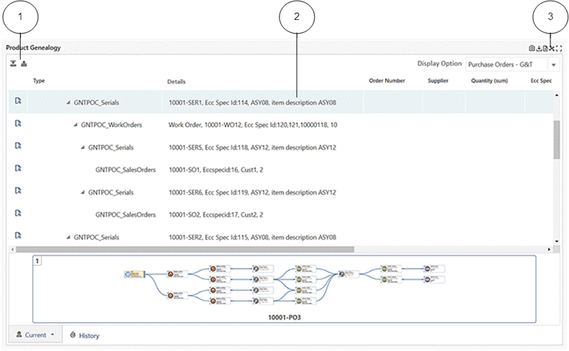
-
Expand All icon and Collapse All icon
-
Row Expander view
-
Network Diagram icon
Beginning with V10, you may be able to freeze columns in the Row Expander view of a diagram, if the designer enabled this feature.
Beginning with V12, the Row Expander feature supports the following:
-
You can "Search Within" the Row Expander view.
-
You can apply the "Highlight Path" option within a Diagram view and then switch to the Row Expander view, where the relevant record is highlighted.
Search Within
Beginning with V10, the Diagram component includes the Search Within capability. This feature allows you to investigate a subset of a larger network diagram to focus on a problem area, perform root cause analysis, or identify an opportunity within the overall diagram.
You can view a specific business flow and apply a filter to create a diagram to visualize that flow. This filter is known as the "Driving Filter." After applying a Driving Filter, you can use a Search Within filter to refine the diagram further and focus on a subset of the diagram. Nodes that satisfy the Search Within condition are highlighted with a more prominent and noticeable border color, and the path which connects them (directly or indirectly) is also highlighted. The nodes and links that are not connected to qualifying nodes are dimmed. This makes the nodes and the path stand out, so you can focus on this subset of the diagram while still viewing the larger context.
After a Search Within filter is applied, the diagram's appearance changes as follows:
-
The nodes which have satisfied the criteria are highlighted with a dark blue border.
-
The nodes which do not directly satisfy the criteria, but have child/ children nodes that do, are left unchanged.
-
The nodes that do not satisfy either of the above conditions are dimmed.
-
The nodes with multiple paths connected to them are highlighted in blue.
-
You can click on the funnel icon and view what Search Within filters have been applied.
Highlight Path versus Search Within in a Network Diagram
The Highlight Path feature is used to focus on a particular node in the network diagram. You can see the chosen node and anything connected to it only; anything that is not directly or indirectly connected to this node is dimmed. The highlighted path is applied only to one node.
The Search Within feature searches for any attribution on any node within the network diagram. Therefore, more than one node can satisfy the criteria, and all the nodes directly or indirectly connected to these nodes (that satisfy the criteria) are highlighted.
The Traversal filter, in the Available Refinements component, behaves like the Search Within feature in a Network Diagram, with the only difference being that the funnel icon is not displayed. Instead, the filter appears in the Selected Refinements box.
Search Within in a Hierarchical Query versus Search Within in a Network Diagram
With Hierarchical Query, because it is based on only one dataset and therefore all nodes have the same attributes, whatever node satisfies the criteria will be displayed along with nodes that do not directly satisfy the criteria but have a child or children that do (although these nodes are dimmed). Any node that neither directly satisfies the filter criteria nor has a child or children that do will be removed from the display.
In a Network Diagram, because of the possibility of the presence of multiple datasets and therefore different sets of attributes, only the node that satisfies the filter criteria will be highlighted. Even in cases where the Network Diagram has only one data set, the node that satisfies the filter criteria will be highlighted.
What happens when the user applies a Search Within from the Network Diagram and then, from Available Refinements, applies another traversal filter or another filter from the same dataset?
The Search Within filter is a local component. Whenever the selected refinement is affected by the user either by applying another traversal filter or other filter from the same dataset, or by removing a filter, the Search Within filter is removed. In addition, the item filter selected from available refinements is then applied. Thus, if a traversal filter is applied from available refinements, then that filter replaces the prior Search Within filter.
What happens when a user applies a traversal filter from available refinements and then from the network diagram applies a Search Within filter?
The Search Within filter will be applied on top of the traversal filter. The two filters will form an AND condition if the Search Within filter was applied on a different attribute, and will form an OR condition if the Search Within was applied on the same attribute.
How can a user reset a Search Within filter?
A user can click on the funnel icon to view the Search Within filters as in a Hierarchical Query. Also as with a Hierarchical Query, a user can click on the Clear button to reset the diagram to its initial state and remove the Search Within filter. This reset affects only the diagram and not the whole page as the Search Within filter is local and only affects the Diagram/ Hierarchical Query component.
Refinement Sets and Traversal Filter
Introduced in V8, a Refinement Set controls how the filters are applied to the diagram without refreshing the display after each filter is applied
Hierarchical Queries
Hierarchical Queries, introduced in V8, allow you to visualize parent/child relationships in the same business entity in a tree or vertical layout. You can expand and collapse the hierarchy levels for better readability.
Example of a Hierarchical Query
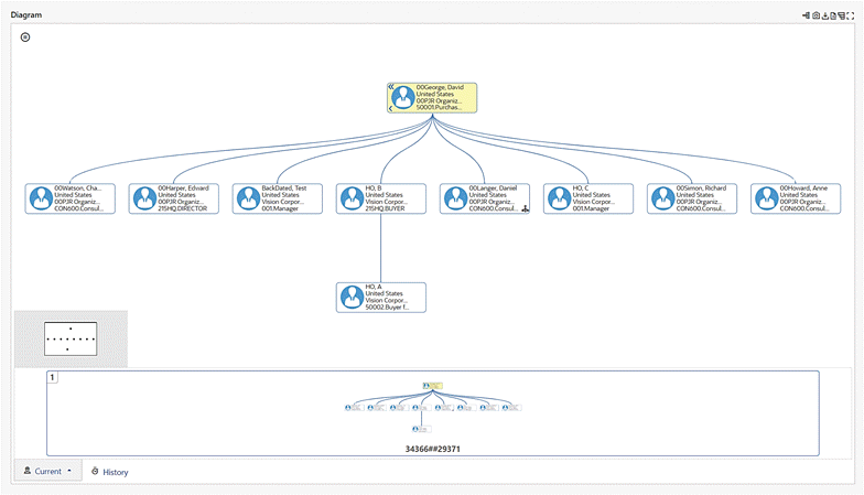
Beginning with V9, you can apply a search within the context of the hierarchical queries. In applying this Search Within feature:
-
The hierarchical connect-by-like queries only return nodes and the child nodes that satisfy the filter criteria.
-
Grayed-out nodes do not fulfill the filter criteria, but their child nodes do.
Sorting is enabled in the Row Expander view beginning with V9.
In V10, the Hierarchical Query design is changed. Updates include a new icon to indicate the hierarchy. When this Hierarchy icon is clicked, the respective node becomes the anchor node. A deep link traversal filter is also introduced.
Beginning with V11, the Hierarchical Query feature supports hierarchical aggregation to present a consolidated view of parent and child level information under a single tree structure. The row expander view also supports hierarchical aggregation.
-
Node-level aggregation applies to all nodes, and it signifies the consolidation specific to an individual node.
-
Hierarchy-level aggregation applies to parent nodes, and it signifies the consolidation encompassing both the node and its child nodes.
-
A custom label enables a clear distinction between node-level aggregation and hierarchy-level aggregation. The custom level for aggregated attributes is determined by the designer.
-
Hierarchical aggregation is calculated when the following conditions are met:
-
The node identifier is defined.
-
"Apply Hierarchical Aggregation" is marked.
-
"HQ view" is selected.
-
The following figure shows an organization hierarchy in which one employed handles one assignment directly, but from a hierarchical perspective, he and his reporting employees have 200 assignments.
Example of an Organization Hierarchy with Hierarchical Aggregation
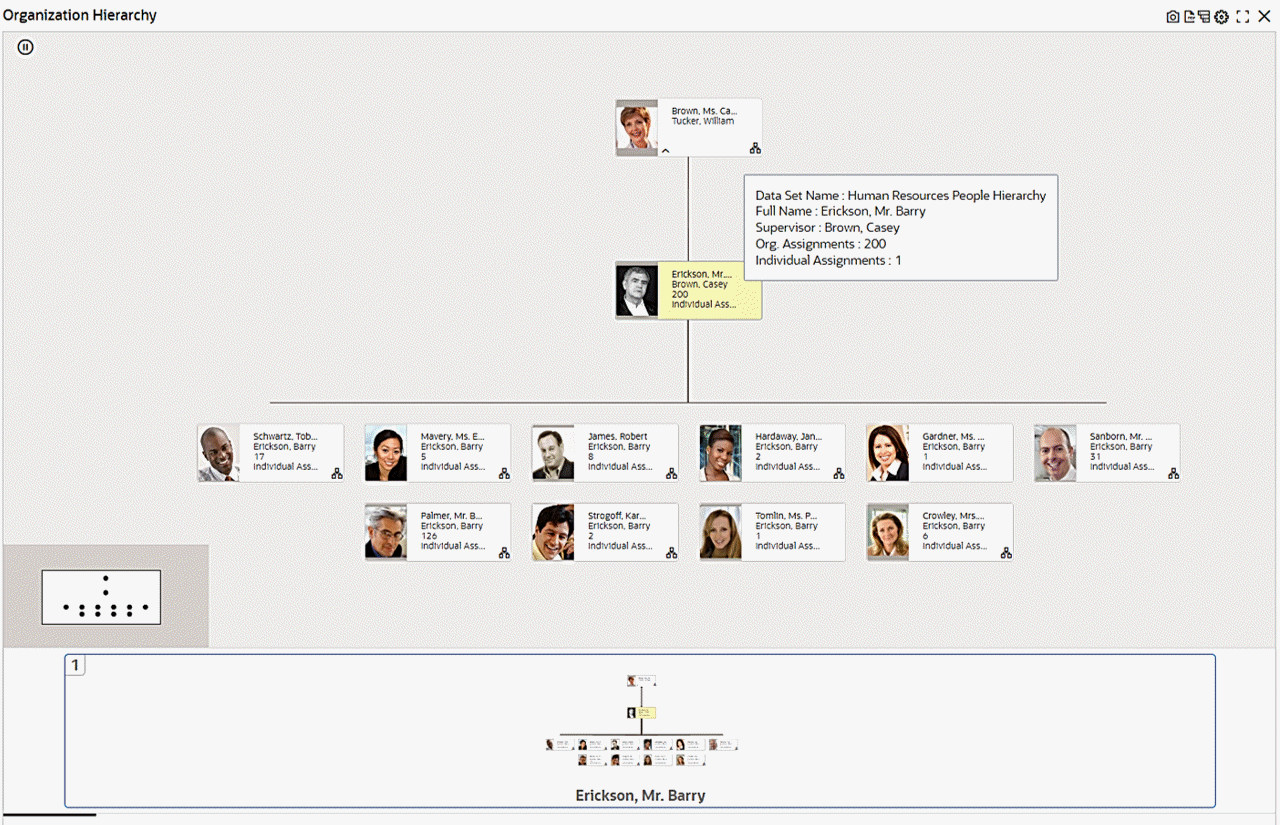
Zoom Window Selection
The Zoom Window Selection feature, also introduced in V8, provides an overview window for the diagram, and focuses on a specific process.
Context Menu
The Diagram context menu includes visual icons reflecting the business functionality for each option in the menu. The context menu can also include hyperlink actions.
Note: The context menu is not supported on iPads.
PDF Inline View
Beginning with V8, you can view a diagram in a PDF Inline View for collaboration. Click on the PDF icon, and then use the inline view option:
-
File Name: PDF file name
-
Option: Choose an option for viewing:
-
Top-Down: view the diagram from top to down
-
Bottom-Up: view the diagram from bottom to up
-
-
Display Option: Select the main node based on which the PDF viewer will show the process flow.
Note: The Display Option list displays the list of business entities, and those entities are not translated.
After selecting your options, click View to view the PDF.
You can print or download the PDF file in the PDF Inline view. In the PDF view, the diagram is displayed in the "Row Expander" view. The PDF view displays:
-
PDF view date/time (server time)
-
Diagram title
-
Refinements applied on the dashboard that shapes the business flow
-
Display option
-
Business flow direction (top/down- bottom/up)
-
Business entity images
Note: Business entity images appear when there is more than one business entity in the diagram.
To return to the diagram view, open the PDF option and select Close Preview.
Timeline View
Beginning with V9, the diagram component supports displaying events from multiple data sets in a timeline view. This feature helps you understand the business flow with a chronological sequence of different events.
The timeline can have more than one event. You can select one or more events to be displayed using the runtime options. In addition, you can control the number of events, or event limit, displayed on the timeline.
The timeline view also supports pagination and history.
Example of a Diagram in a Timeline View indicating the Chronological Sequence of Events from Multiple Related Datasets: Work Order and Purchase Order
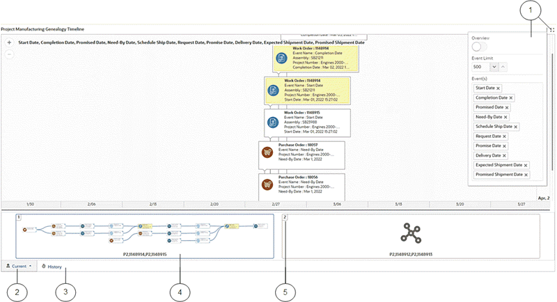
-
Runtime options to enable the overview display, specify the event limit, and select event types
-
Current tab
-
History tab
-
Thumbnail diagram depicting the underlying relationship between datasets in a network view
-
Filmstrip-like pagination support for viewing more than one timeline simultaneously
The diagram component can be presented in three forms: Network Diagram, Timeline, and Hybrid. A hybrid view uses both the network and timeline forms of display.
You can switch between the views as shown in the figures below.
Example of a Diagram in a Hybrid View
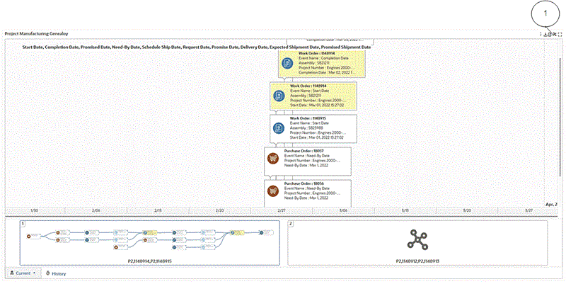
Example of a Diagram in a Network View
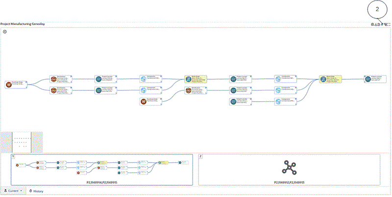
-
Icon to switch to the network diagram view
-
Icon to switch to the timeline diagram view
PDF Export
Beginning with V11, you can export a Diagram/Row Expander/Hierarchical Query component to a PDF file at the dashboard level. The view visible at the dashboard will be exported to the PDF file, and the diagram's visualization and comparison capabilities are carried over to the exported PDF file. Both the Search Within and Highlight Path features are supported for Diagram/Row Expander/Hierarchical Query in exporting to a PDF file.
Tab Layout
Different dashboard components can be grouped into separate tabs based on functionality.
Example of a Tab Layout
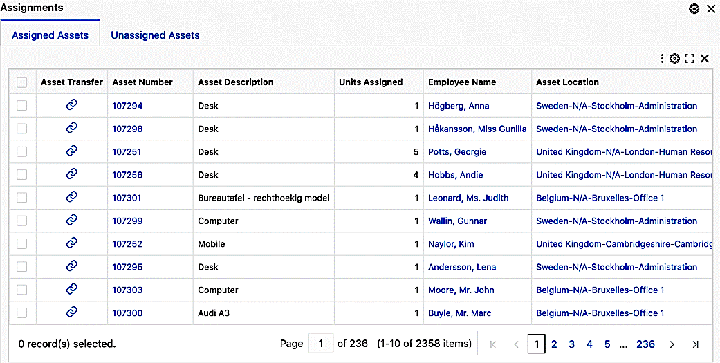
Administrators can delete or reorder tabs.
Inline View
Introduced in V9, the Inline View feature supports accessing linked contents as an overlay on parent visualization. You can access related information through intuitive navigation without leaving the context of the original dashboard.
The result table, timeline, and diagram components support inline view.
Example of Accessing Line-Level Journal Information using an Inline View
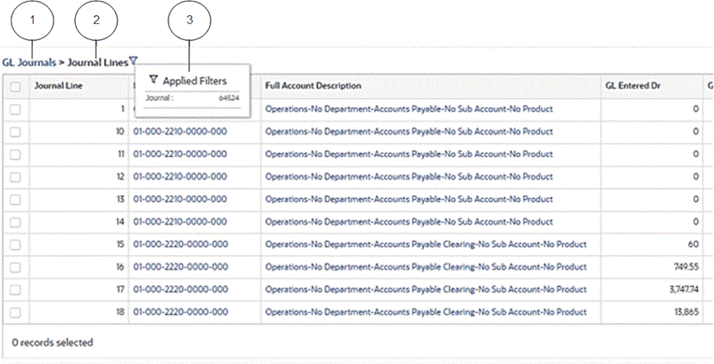
-
Parent Result Table (for example, GL Journals) showing the navigation link to return from the inline view
-
Inline Result Table (for example, Journal Lines) showing the line-level journal information as an overlay on the parent Result Table
-
The refinement used to access related information
In V15, inline views triggered from main components such as a Results Table can now be exported as part of a CSV download. This enhancement allows you to extract not just the primary data but also the contextual details linked to the selected record. The export file clearly labels the parent-child relationship, includes metadata such as export timestamp and applied filters, and retains pagination or selection-based exports where applicable. This feature is particularly valuable for audit trails, offline analysis, and cross-functional collaboration because it ensures no loss of detail between what is shown onscreen and what is shared externally.
Exporting Line-Level Journal Information from an Inline View
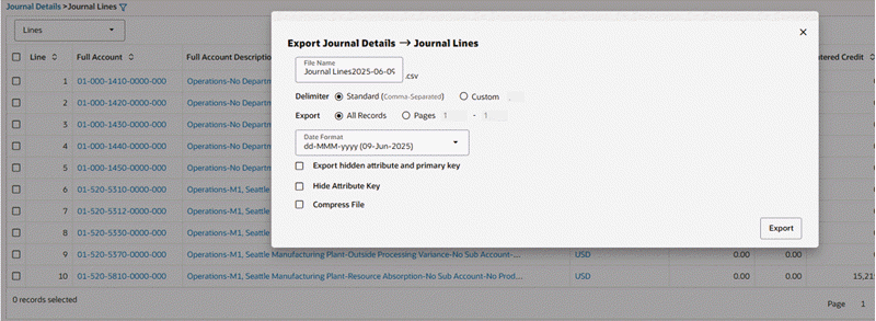
Example Snapshot of Exported Inline Data
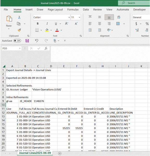
Common Features
Oracle Enterprise Command Center Framework includes features that are used in multiple components.
Comparing Records and Sorting Search Results
Oracle Enterprise Command Centers can offer detailed insights into the data through results tables and grids which help you gain insight as quickly as possible. You can then act on it by taking the necessary action to resolve a process bottleneck or address an exception.
On some results tables and grids you can use the Options icon to compare records or perform other functions.
For record search only, you can control the order of the search results based on the record score in the data set. Data is sorted by "Score" by default. You can override this default order or add more sort options when you configure a dashboard. This ranking is supported only in results tables and grids.
Default Value
You can specify a context-sensitive default value for a data set instead of a NULL value. The default values behave like any other attribute value and can be used for display in the UI components. This capability allows you to refine the dashboard using these values.
For example, for a list of assets, any asset that has not been assigned to an employee could be given the value "Unassigned" for the Employee Name. You can then refine the results of this data set on your dashboard by the value "Unassigned".
Example of a Default Value in a Results Table Column
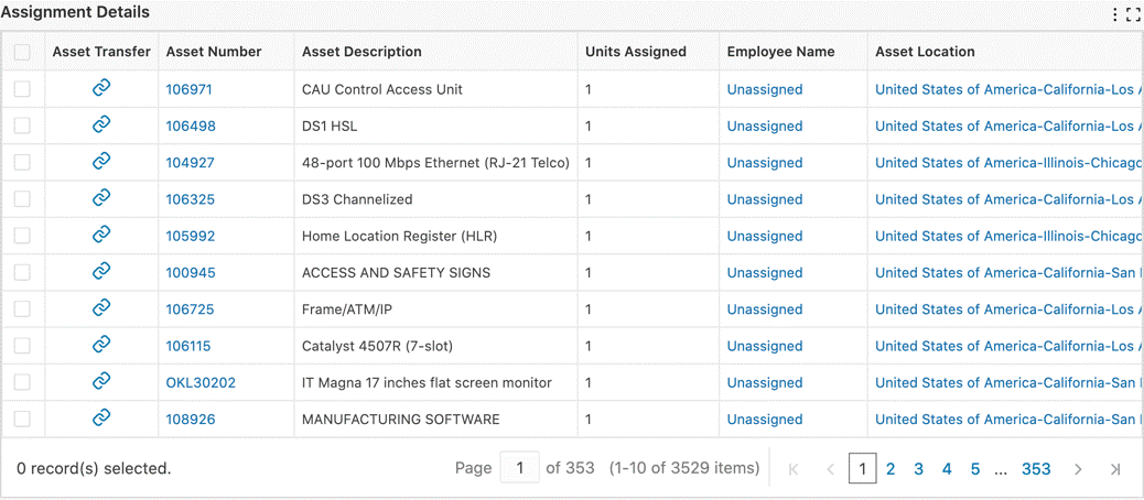
Support for Time Stamps and Time Zones
You can include the time along with the date in a date/time stamp. This capability improves precision in the data displayed and enables you to accurately filter data for the right period. The time stamp is available for all the components. You can use a time range in available refinements to filter the data on the dashboard.
You can leverage the dashboard to view information detail on the level of seconds. Enterprise Command Center dashboards can display the time difference from the current time on the seconds level.
Oracle Enterprise Command Center Framework considers a user's time zone for displaying time-sensitive data. This capability improves information accuracy and reliability.
Example of Time Stamps in Available Refinements
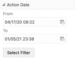
Page Display Preferences
Your changes to the runtime options of components are saved as Page Display Preferences. You can log in again or navigate back to the dashboard to see your changes. These changes persist until you explicitly reset either at the component level or page level.
Resetting options done on the component-level resets the changes done to the component. Resetting page-level changes affects the entire dashboard. The following table lists changes that are maintained across the components:
| Component | Changes Retained |
|---|---|
| Available Refinements | Data set selected |
| Search Component | Data set selected Category value |
| Chart Component | Runtime selection of dimensions and metrics Runtime sorting changes Changes to chart orientation and stacking Show as line Show multi-metric Split Y-axis for bar/line Number of dimensions displayed, order of display Show connecting lines (Waterfall chart) Show totals (Waterfall chart) |
| Tag Cloud | Runtime selection of dimensions and metrics |
| Tab Component | Selected Tab will be stored in session but not as a preference |
| Aggregated Table | Selected Attributes and Metrics from Runtime Runtime Sorting |
| Results Table | Runtime Sorting |
| Grid | Runtime Sorting |
When you change the preferences, a Reset icon is provided for resetting the display. At component level, the Reset icon is in runtime options of the component. At the page level, the component is in the side navigation panel or on the top left of the dashboard.
Cascading Breadcrumbs
Cascading Breadcrumbs display the trail of cascading dimension values that give you an understanding of the drill-downs that display the current dimension. In Chart and Tag Cloud components, cascading breadcrumbs are displayed in the top right corner when the components are cascaded. Cascading breadcrumbs are displayed when you drill down from the component itself or if the component is auto-cascaded due to any filter.
Example of Cascading Breadcrumbs in a Chart
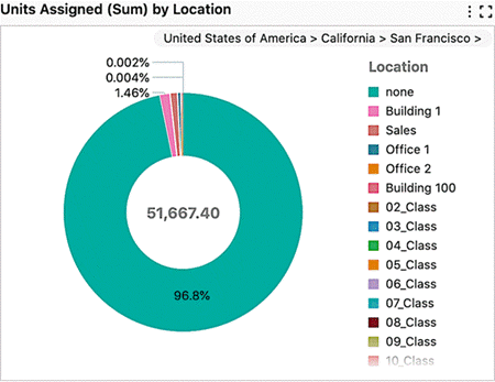
Lookahead Visualization
Charts serve as a powerful visualization tool for information discovery and analysis. The chart tool-tip enables you to look ahead to the next level of detailed available on a chart . For all charts that have cascading enabled, you can hover over the chart series and see the next level of details shown in a similar chart type. This lookahead visualization honors the chart sorting option, user preferences, and cascading breadcrumbs, and is available for all types of charts.
Note: The chart tool-tip is displayed at the last level of cascading.
Date Subsets
Introduced in ECC V8, the Date Subset feature is a transformation that enables the creation of different units from a date or date/time attribute. A date can then have month, year, and quarter attributes. A designer can enable the date subset and then create new attributes for the following time periods:
-
Year
-
Quarter
-
Quarter-Year
-
Month
-
Month-Year
These new attributes can be used as standard attributes under Available Refinements.
Export
Export in Results Table and Grid
Records in results table and grid can be exported in a CSV file format. The exported file contains records organized in a tabular structure with attribute keys and attributes names as table headers. The exported file contains selected refinements on the page and timestamp of export.
Beginning with V10, you can select from four options for the date format in exporting to CSV format. They are:
-
Default date format set as an Oracle E-Busines Suite preference. See: Specifying Settings.
-
ECC Format (2023-02-23T12:51:27Z)
-
MM/dd/yy (02/23/23)
-
dd-MMM-yy (23-Feb-23)
Beginning with V11, you have the option to exclude the attribute key in exporting to a CSV file.
To Export:
-
Click Export in runtime options to open a window with export options. The title of the new window is the component title or data set name when there is no component title, followed by the number of records.
-
Rename the default file name. The default file name is component title or data set name appended by timestamp.
-
Choose standard or custom delimiter.
-
Choose the Attributes to export.
-
Choose the number of records.
-
Choose the appropriate date format.
-
Choose whether to include the attribute key.
-
Choose if hidden attributes and primary key needs to be included.
-
Choose if the file needs to be compressed.
Example of an Export Window
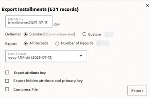
Exporting Records from an Aggregated Table or an Aggregated Grid
Records in an aggregated table or an aggregated grid can be exported in a CSV file format. The exported file contains records organized in a tabular structure with attribute keys and attributes names as table headers.
The exported file honors all the runtime changes and contains selected refinements on the dashboard and timestamp.
Unlike with results tables and grids, Export pop-ups in aggregated tables and aggregated grids do not display the number of records in the pop-up header and pagination range.
To Export:
-
Click Export in runtime options to open a window with export options. The title of this window is the component title, or data set name when there is no component title.
-
Rename the default file name. The default file name is component title or data set name appended with a timestamp.
-
Choose standard or custom delimiter.
-
Choose the number of records (Only for aggregated grid).
-
Choose the appropriate date format.
-
Choose whether to include the attribute key.
-
Choose if the file needs to be compressed.
Example of an Export Window for Aggregated Grid
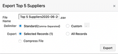
Export in Chart
The Chart component can be exported as a PNG image that contains a snapshot of the chart. The snapshot contains the chart as-is seen on the dashboard to honor runtime changes and any change in size with chart maximization.
To export the chart image, click on the camera icon in runtime options.
Note: Chart Export Image is not supported in Internet Explorer.
Underlying data of the chart component can also be exported in a CSV file. Exported data also honors all the runtime changes. As the underlying data needs to be holistic, exported data of chart contains all the data even if Top N is configured.
-
Click Export in runtime options to open a window with export options. The title of this window is the component title.
-
Rename the default file name. The default file name is component title or data set name appended with a timestamp.
-
Choose standard or custom delimiter.
-
Choose the appropriate date format.
-
Choose whether to include the attribute key.
-
Choose if the file needs to be compressed.
Export in Tag Cloud
The underlying data of the Tag Cloud component can be exported in a CSV file. Exported data also honors all the runtime changes. As the underlying data needs to be holistic, the exported data of a tag cloud will contain all the data irrespective of how many dimensions are displayed.
To Export:
-
Click Export in runtime options to open a window with export options. The title of this window is the component title.
-
Rename the default file name. The default file name is component title or data set name appended with a timestamp.
-
Choose standard or custom delimiter.
-
Choose the appropriate date format.
-
Choose if the file needs to be compressed.
Example of Exporting a Tag Cloud
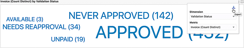
Example of Export Window for a Tag Cloud
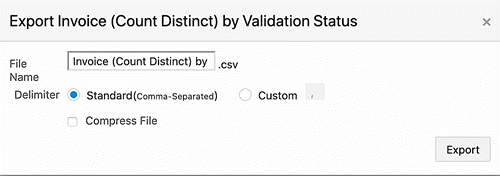
Export Dashboard to PDF
Some solutions require team collaboration, which requires users to share the insights from the dashboard after drilling down to additional details. Sharing the entire dashboard at once improves collaboration between users and allow other users to view the same perspective of the dashboard. The Export Dashboard to PDF feature provides this capability.
To share a dashboard, you can click on the Share icon and export the dashboard to PDF.
Note: This feature is disabled by default. An administrator can enable it.
The export process is initiated immediately after clicking Export to PDF.
Considerations of the Export to PDF feature are:
-
Default Title of PDF is the name of Command Center followed by Dashboard Name and Timestamp and server time zone of the download time
-
Filters applied on the dashboard are displayed at the top of the page.
-
If there are no filters applied, selected refinement is not included in the exported file.
-
Each refinement lists data set name, attribute display name, and filter value.
-
The side navigation panel is not included in the exported file.
-
The PDF has the current state of the dashboard, which includes the filters applied on the dashboard, and changes made by the user through components' runtime options.
-
The entire dashboard with all the visualization components is exported in the PDF file
-
Results table/grid records honor the PDF export limit set in the ECC property file for PDF export limit. (PDF_MAX_EXPORT_COUNT). The default limit for this property is 100 records.
-
Hints are displayed for the Results Table, Grid, and Aggregate Table components, with the records limit.
-
Grid and Aggregated Grid are exported in tabular format and honoring the PDF export limit.
-
The exported file does not contain a visual representation of the following:
-
Images
-
Indicator Icons
-
Star Rating
-
Indicator Bar
The actual attribute value is displayed instead of the visual representation.
-
Limitations of the Export to PDF feature are:
-
Only seven columns of a Results Table or Grid are exported in the PDF file.
-
Grid cells are exported as columns in tabular format and all items in the cell will be exported in the same column.
-
Export to PDF is disabled for RTL languages.
-
Exporting of Charts and Tag Clouds is not supported in Internet Explorer. The exported file does not contain the charts and tag clouds in the exported dashboard.
-
Diagrams are not included in the exported file.
Copy Value
Beginning with V16, you can copy individual field values directly from dashboard visualizations.
When you hover over a value, a Copy Value icon appears. Click the icon to copy the selected value to the clipboard. This lightweight and intuitive interaction allows you to easily transfer information from ECC dashboards to emails, spreadsheets, or other business applications. It also improves overall user experience and streamlines common workflows that require quick data extraction from visual components.
This feature is currently supported in the following components:
-
Selected Refinements
-
Summarization Bar items
-
Results Table
-
Aggregate Table/Pivot
-
Grid/Aggregate Grid
Results Table with a Copy Value Icon
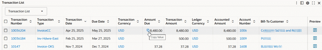
Results Table with Values Copied to Clipboard
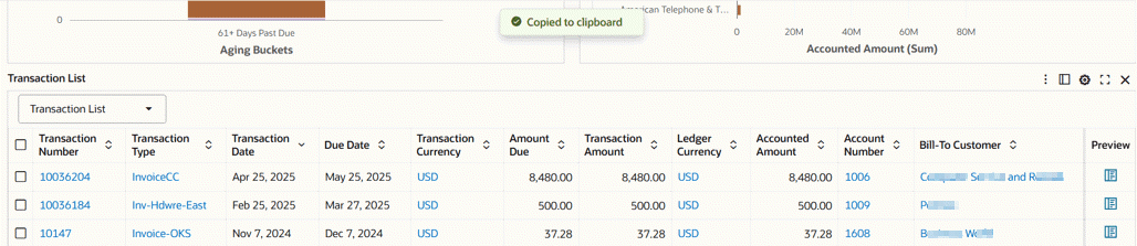
Compare Window
You can compare records in a results table or grid. The Compare window also allows you to compare among the records view information of attribute values. Attributes are organized into corresponding groups if configured.
The Compare window can also have dynamic titles as column headers. The column headers in the Compare window can include tokens to display a dynamic title for each record based on an attribute value.
Grid actions can also be accessible from the column headers of the window.
The Compare window includes the "Find Similar" feature for improved information discovery. The "Find Similar" feature is supported only in non-group based attributes in Results Tables and Grids.
Example of a Compare Window
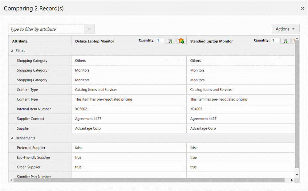
Record Details Window
The Record Details window allows you to view all the significant information of a record in a results table or grid in a tabular format. Attributes in a Record Details window can also be organized into respective groups if configured. Similar to the Compare window, the Record Details window also supports dynamic titles and column header grid actions.
The Record Details window includes the "Find Similar" feature for improved information discovery. The "Find Similar" feature is supported only in non-group based attributes in Results Tables and Grids.
Example of a Record Details Window
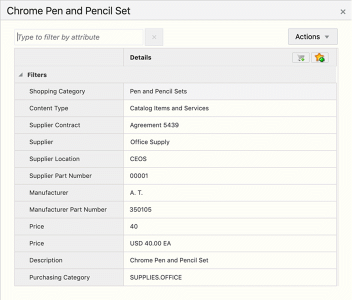
Number Abbreviation
Numbers can be abbreviated for improved readability in summarization bars and aggregated grids.
Number abbreviation is available in the Flags and Metrics of the summarization bar. The actual value is displayed in the tooltip. Any additional tooltip is displayed beneath the value.
Numbers in summarization bars can also use number formatting as defined in Oracle E-Business Suite, and are translatable.
Number Formatting
In V11 and later, designers can specify the formatting of numerical attributes so that these attributes are displayed uniformly in a dashboard.
Three types of number formatting are supported: General, Formatted Number, and Accounting.
For a numeric attribute, a designer specifies a Profile Type of Int/Ints, Long/Longs, or Double/Doubles. and then chooses the type of number formatting. These options are described in the tables below.
| Formatting Type | Formatting Logic | Example |
|---|---|---|
| No Formatting | Comma (,) as the thousands separator |
10,000 -10,000 |
| General | Absence of the thousands separator |
10000 -10000 |
| Formatted Number | Comma (,) as the thousands separator |
10,000 -10,000 |
| Accounting | Comma (,) as the thousands separator Negative numbers within parentheses () |
10,000 (10,000) |
| Formatting Type | Formatting Logic | Example |
|---|---|---|
| No Formatting | Comma (,) as the thousands separator |
100,000 -100,000 |
| General | Absence of the thousands separator |
100000 -100000 |
| Formatted Number | Comma (,) as the thousands separator |
100,000 -100,000 |
| Accounting | Comma (,) as the thousands separator Negative numbers within parentheses () |
100,000 (100,000) |
| Formatting Type | Formatting Logic | Example |
|---|---|---|
| No Formatting | Comma (,) as the thousands separator |
100,000.00 -100,000.1 |
| General | Absence of the thousands separator Non-uniform representation of decimals |
100000 -100000.1 |
| Formatted Number | Comma (,) as the thousands separator Uniform decimal representation to two (2) places |
100,000.00 -100,000.10 |
| Accounting | Comma (,) as the thousands separator Negative numbers within parentheses () |
100,000.00 (100,000.10) |
Custom Labels for Metrics
Introduced in V12, the Custom Label feature enriches effective communication by allowing you to align aggregated data with your organization's or team's internal language and conventions. Furthermore, it boosts flexibility and adaptability by catering to diverse user requirements, ensuring that visualizations resonate with their specific use cases, and thus enhancing their relevance and meaningfulness.
The following table lists components and UI elements that support custom labels.
| Component | UI Element |
|---|---|
| Summary Bar | Flag pop-up metric title |
| Chart |
|
| Aggregated Table (Pivot View) |
|
| Tag Cloud |
|
| Network Diagram |
|
| Grid |
|
Example of a Custom Label in Axis Title, Tooltip, and Runtime Option
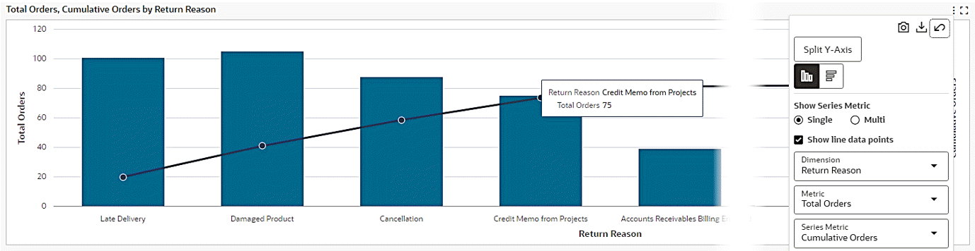
Color Pinning
Color pinning is the display of context-specific colors in a component to reflect the meaning of what the component represents. Color pinning is subject to the designer's control.
Color pinning applies badge-style conditional formatting on categorical attributes. Numerical attributes may also support conditional formatting by highlighting the attribute value using specific colors
Inline Labels in Runtime Options
Beginning with V11, some components include a runtime option for inline labels which can enhance form usability. This additional choice allows you to manage the data presentation.
Assistants in Oracle Enterprise Command Center Framework
Overview
Beginning with V16, Oracle Enterprise Command Center Framework provides a set of assistants that extend the user experience beyond dashboards by answering user questions, helping identify common resolutions for common issues, and assisting with data analysis by automating component creation.
These assistants are embedded in the ECC user interface, operate within the current dashboard context, and leverage Oracle E-Business Suite security.
The available assistants are:
-
Knowledge Assistant
-
Solution Assistant
-
Data Explorer Assistant
Each assistant serves a distinct purpose and is intended for specific user roles within the enterprise. The following table describes the assistant access based on user role:
| Assistant | Business User | Power User | Administrator |
|---|---|---|---|
| Knowledge Assistant | Yes | Yes | Yes |
| Solution Assistant | No | No | Yes |
| Data Explorer Assistant | No | Yes | Yes |
Common Interaction Model
All assistants follow a consistent interaction pattern within ECC. Each assistant includes:
-
A fixed context area
-
A scrollable content region
-
A message input section
Additionally, all assistants support context-aware inquiry by remembering previous questions and carrying forward the context.
The following diagram depicts the common interaction pattern for ECC assistants:
Common Interaction Pattern for ECC Assistants
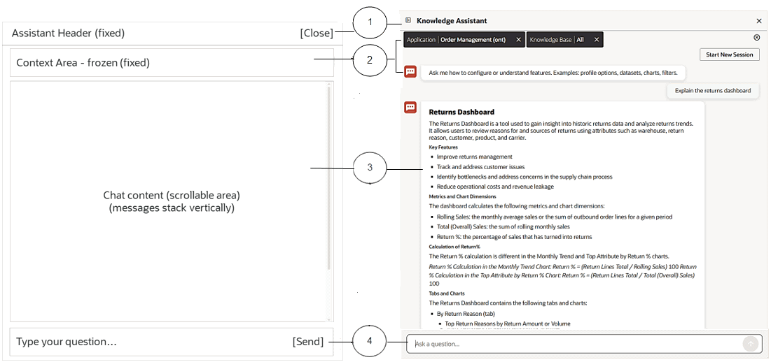
-
Drawer Header (fixed)
This header region contains:
-
Assistant name
-
Close icon
-
-
Context Area - frozen (fixed)
The context area has the following features:
-
It is always visible.
-
It contains ECC style filter chips.
-
Users can change context at any time.
-
Changing context affects future answers, not past ones.
-
-
Scrollbar Area - chat content
This area contains:
-
Welcome message (once)
-
User questions
-
Assistant answers
-
Follow-ups
-
-
Message Input Area (fixed)
This area is at the bottom of the drawer and is always accessible. It contains:
-
Text input area
-
Send icon
-
ECC Assistants
This section explains the usages and functionalities of the ECC assistants and how you can use them to quickly obtain and analyze information or troubleshoot issues for your needs.
Knowledge Assistant
The Knowledge Assistant provides embedded, easier access to documentation on ECC features, configuration, and usage based on user questions.
It enables users to retrieve relevant information without leaving the dashboard, bridging the gap between documentation and execution, and enables users to ask questions such as:
-
How do I create a calculated attribute?
-
What are the profile options for the Payables Command Center?
Key Capabilities
The Knowledge Assistant provides the following key capabilities:
-
Retrieves information from:
-
User Guides
-
Implementation Guides
-
Extending Guide
-
-
Provides contextual responses based on:
-
Current application
-
Selected knowledge base
-
-
Supports follow-up interactions within the same session.
Usage Scenarios
-
Understanding configuration steps (such as calculated attributes, filters)
-
Accessing documentation without navigating outside ECC
Supported Users
-
Business Users and Power Users
See: Accessing and Using the Knowledge Assistant for Business Users and Power Users.
-
Administrators
See: Accessing and Using the Knowledge Assistant for Administrators.
Accessing and Using the Knowledge Assistant for Business Users and Power Users
Business users and power users can find the Knowledge Assistant icon on the top right corner of the summarization bar.
Example of a Knowledge Assistant Icon
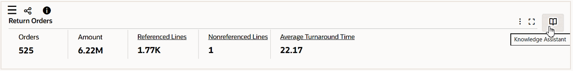
Clicking the icon launches the Knowledge Assistant where business users and power users can use it as a tool to retrieve information and understand the knowledge.
For example, ask the Knowledge Assistant to explain the returns dashboard for Order Management. The assistant in return retrieves information from Order Management documentation and provides the generated context about "Returns Dashboard" as the output results.
Example of a Knowledge Assistant Window
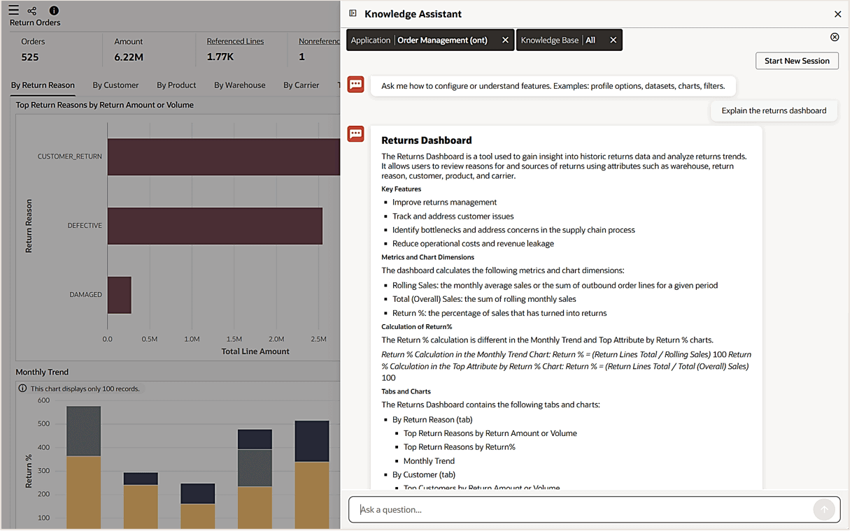
Accessing and Using the Knowledge Assistant for Administrators
Similar to business users and power users, administrators can use the Knowledge Assistant to retrieve configuration information and understand the knowledge.
To launch the Knowledge Assistant in the administration home page, select Knowledge Assistant from the side navigation menu. Administrators can further select desired applications to obtain the information.
Accessing Knowledge Assistant from the Side Navigation Menu
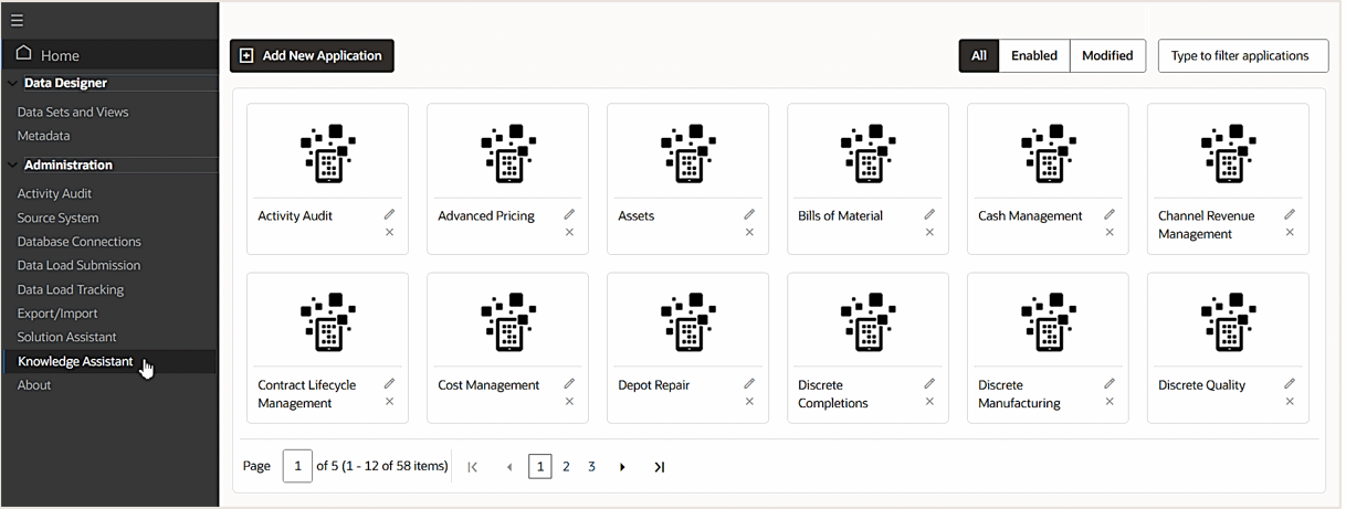
For example, ask the assistant about "What are the profile options controlling inventory?" within the Inventory Management application, the profile options associated with ECC Inventory are retrieved from the relevant documentation as the output.
Example of a Knowledge Assistant Window
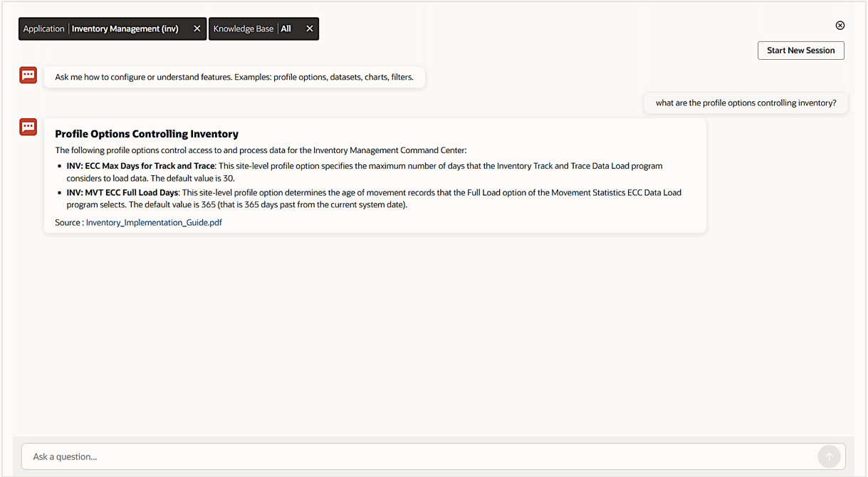
Solution Assistant
The Solution Assistant provides access to a set of applicable solutions for common issues. It evaluates the described issue and returns relevant solutions based on previously resolved scenarios.
Key Capabilities
The Solution Assistant provides the following capabilities:
-
Allows users to select ECC Command Center(s) (such as Inventory, Project, Financials).
-
Allows users to ask questions related to any issue, such as:
-
Installation
-
Data visibility
-
Configuration issues
-
Dashboard behavior
-
-
Returns results based on relevance.
Each result includes:
-
Problem description
-
Category
-
Problem solution
-
-
Provides detailed resolution steps.
Click View More to view step-by-step instructions.
Usage Scenarios
-
Troubleshooting installation issues
-
Troubleshooting missing or incorrect data
-
Resolving configuration issues
-
Investigating unexpected behaviors
Supported Users
-
Administrators only
See: Accessing and Using the Solution Assistant for Administrators Only.
Accessing and Using the Solution Assistant for Administrators Only
Unlike the Knowledge Assistant, the Solution Assistant is only enabled for administrators to diagnose and troubleshoot installation, configuration, and data issues and provide solutions.
To efficiently troubleshoot issues, an administrator can target a desired ECC Command Center, such as ECC Discrete Manufacturing, which allows the assistant to focus on the solutions specifically for this command center.
To access the assistant, select Solution Assistant from the side navigation menu.
Accessing Solution Assistant from the Side Navigation Menu
For example, ask the assistant about data issue, such as "No data displayed in genealogy and trace diagram" within the ECC Discrete Manufacturing, the assistant returns relevant problem results.
Each return result includes problem description, category, and problem solution.
Example of a Solution Assistant Window
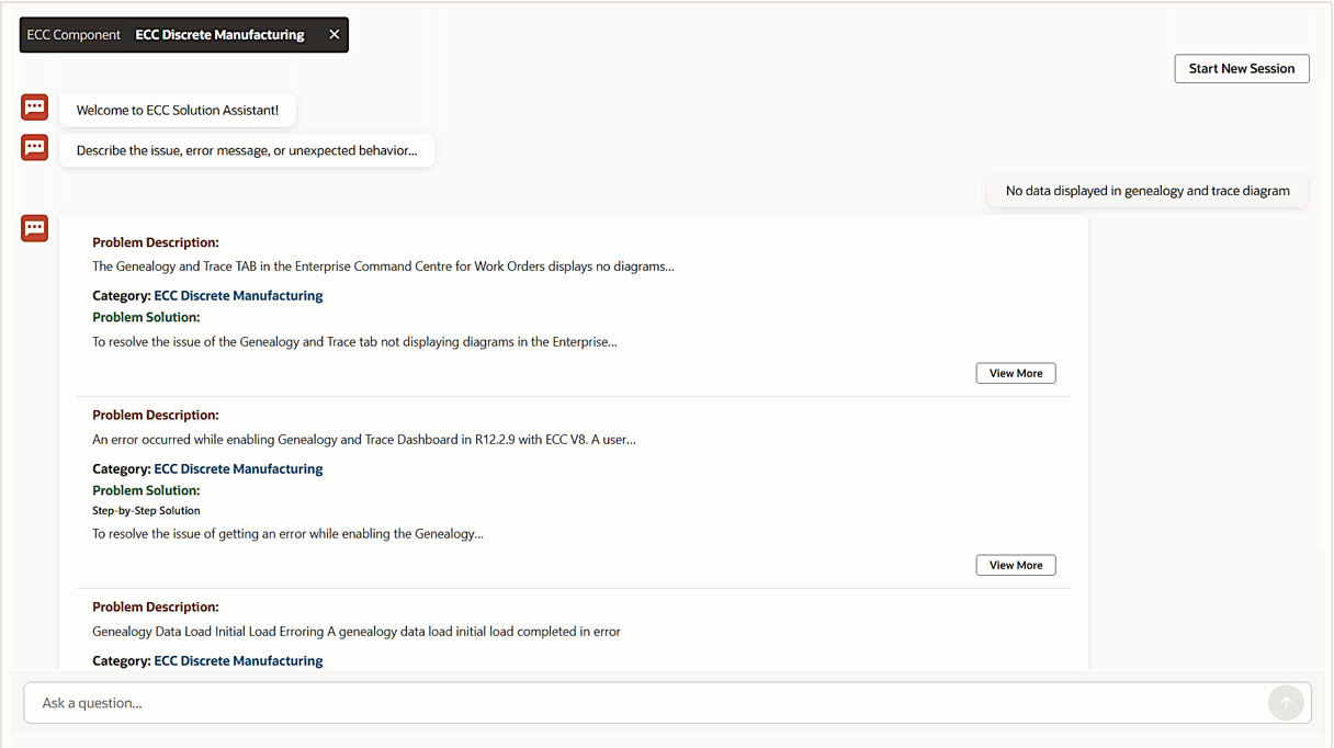
Clicking View More in a result opens the solution details in the Details page.
Example of the Details Page
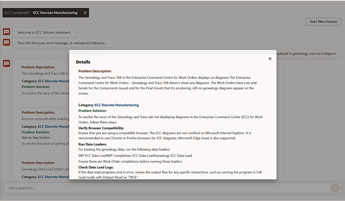
Data Explorer Assistant
The Data Explorer Assistant supports interactive data exploration and helps users create visualizations for ad hoc analysis or add them to the dashboard.
It allows users to:
-
Support self-service data exploration.
-
Assist in building visualizations.
-
Improve usability for dashboard design.
Key Capabilities
The Data Explorer Assistant provides the following key capabilities:
-
Allows users to select and switch between any accessible data sets or views.
-
Allows users to specify visualization components, such as:
-
Bar, pie, or donut chart
-
Result table
-
-
Based on usage patterns and data set design, provides the ability to apply:
-
Record identifiers
-
Condition for display
-
-
Generates visualizations.
-
Allows users to add generated visualizations directly to the dashboard.
-
Allows users to modify and refine the visualizations to match user needs and expectations.
-
The assistant helps in attribute selection, aggregation, and display configuration.
-
Usage Scenarios
-
Creating new visualizations within dashboards
-
Building insights without manual configuration steps
Supported Users
-
Power Users
-
Administrators
See: Accessing and Using the Data Explorer Assistant for Power Users and Administrators.
Accessing and Using the Data Explorer Assistant for Power Users and Administrators
Power users and administrators can use the Data Explorer Assistant to quickly generate desired visualizations in chart or table format within the dashboard.
To launch the Data Explorer Assistant, select the Data Assistant icon on the top left corner of the dashboard.
Example of an Data Explorer Assistant Icon
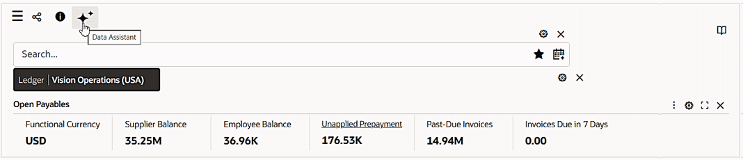
For example, use the Data Explorer Assistant to create a bar chart for total paid amount by Bank Account.
Example of a Bar Chart Generated by Data Explorer Assistant
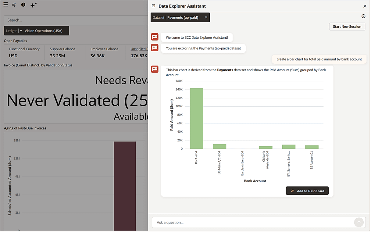
To modify or refine the visualization or display configuration, click the linked text directly in the output statement to open the search selection.
Example of a Search Within the Bar Chart
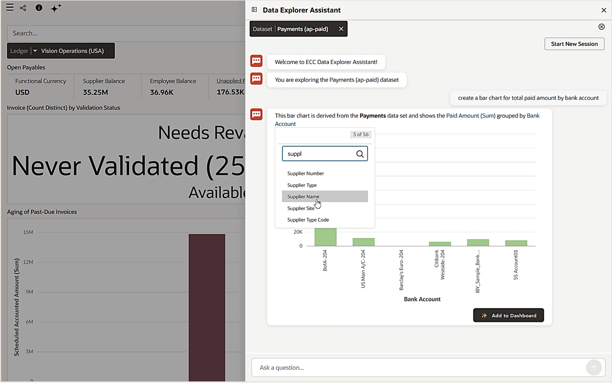
For example, click the "Bank Account" link and then choose "Supplier Name" from the search list of values to change the bar chart display attribute from grouped by Bank Account to Supplier Name.
Example of a New Bar Chart After Modifying a Display Attribute
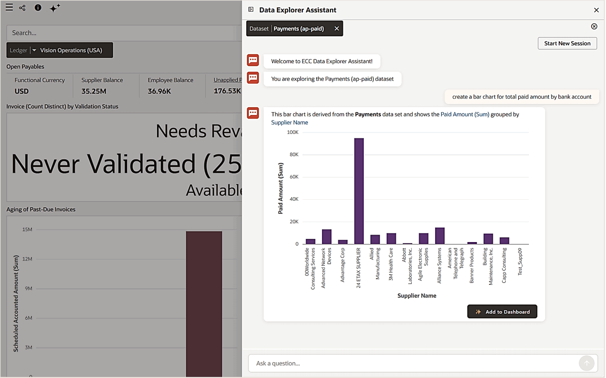
Power users can add the generated visualization to the dashboard by clicking Add to Dashboard. By default, the visualization is placed at the bottom of the dashboard. Also, it can be reconfigured or dragged to any location within the dashboard.
User Personalization
User Personalization is introduced in V10. It consists of two types:
-
End User Personalization, formerly known as User Preferences
-
Power User Personalization
User Personalization
User Personalization (also called End User Personalization) allows users to make changes in the dashboard that will suit their preferences.
User personalization provides the following features:
-
Users can enhance the business user experience by editing components in the dashboard.
-
A user's changes are preserved across the session.
-
The component is displayed according to each user's preferences.
User personalization is available across visualization components such as Summary Bar, Tag Cloud and Charts. It is also available across detailed insights and aggregated components like Results Table/ Timeline, Aggregate Table/Pivot, and Grid/Aggregated Grid. Each component locally has a reset option under its runtime options that can be used to return to the default view of the component. User personalization can be reset either at the Component level or at the Page level. Below are examples of end user personalization done at the Component level.
Chart
You can personalize the chart by flipping the chart layout or using a different metric/dimension.
Tag Cloud
You can personalize the Tag Cloud by using a different metric/dimension.
Summarization Bar
You can personalize the Summarization Bar by reordering summary items or showing/hiding summary items from the view.
Results Table
You can personalize the Results Table by reordering attributes or showing/hiding attributes from the view.
Aggregate Table/Pivot
You can personalize the Aggregate Table/Pivot by reordering attributes, showing/hiding attributes, or enabling/hiding a sub-summary from the view.
Timeline
You can personalize the Timeline by changing the event limit or choosing the types of events shown the view.
Reset End User Personalization at Page Level
End User Personalization can be reset at Page level. This action would reset End User Personalization for all components in the dashboard, because it is performed at the Page level.
Power User Personalization
Power users can modify the dashboard to tailor it based on their business requirements.
Examples:
-
A Credit Manager wants to track top past-due customers based on their profile class so that they can revisit customers' credit ratings and manage or update the payment terms.
-
A Payables Accountant wants to track the cash outflow for invoice payments per bank account so that they can analyze payments trend.
Note the following:
-
A power user has the same designer experience as an administrator user.
-
A user is enabled as a power user through the setting of the profile option "FND: ECC Power User Enabled" at the user level.
-
All personalizations are saved without any deployment.
-
A power user does not have access to the ECC Administrator pages.
Beginning with V11, an "i" icon on the dashboard is displayed for power user personalization. Clicking this icon opens a window with additional information as well as a Personalize button to enable personalization and an Exit button to exit personalization.
| Can Perform | Cannot Perform |
|---|---|
| Add a new component | Create a new data set |
| Modify an existing component | Create a new dashboard |
| Delete a component | Configure a component from a data set that is not part of the application datasets |
| Change dashboard layout | Create a public saved search |
Power user personalizations are preserved during patching. A user is notified when a new version is available. Users can apply the new version and lose all the personalizations, or they can cancel and keep the personalized version.
The following table summarizes the differences between the two types of personalization.
| End User Personalization | Power User Personalization |
|---|---|
| All business users | Power users only |
| Runtime changes | Configuration changes (components) |
| Implicit saving as user utilizes run-time options | Explicitly saving for configuration changes |
| Involves no efforts from the user | Involves efforts from the user |
The Above the Fold Layout, introduced in V14, allows users to divide their dashboard into a 70-30 visual split for viewing primary insights alongside supporting information. It is supported as part of power user personalization, enabling users to tailor the layout to their specific needs.
It is applicable to any ECC dashboard layout. It can be controlled using a toggle switch inside the component panel to enable or disable the Above the Fold Layout. Once enabled, components can be configured dragging and dropping components into the 70% and 30% sections. Power users can copy components across layouts, though drag-and-drop functionality is not yet available.
Example of a Dashboard Layout Personalization

The supported components in Above the Fold Layout are Summary Bar, Tag Cloud, Chart, Aggregated Table, and Grid. A maximum of three components can be added to a page. The Summary Bar shows up to four items, arranged in a two-by-two vertical tile format. The Aggregated Table displays the first five rows based on the configured sort, and Pivot View is not supported. Charts, Summary Bar, and Tag Cloud have a borderless design.
The table below summarizes component specific guidelines for Above the Fold Layout.
| Component | Guidelines |
|---|---|
| Summary Bar | Displays up to four items in a two-by-two vertical tile format. Borderless display in Above the Fold Layout. |
| Tag Cloud | Limit to 10 items for optimal readability. Borderless display in Above the Fold Layout. |
| Chart | Charts with low cardinality dimensions are recommended. Trellis view is not supported. Borderless display in Above the Fold Layout. Legends always appear on the right side. |
| Aggregated Table | Displays only the first five rows based on configured sort. Pivot view is not supported. Summary and footer are not supported. Limit the number of attributes to avoid horizontal scrolling. |
| Grid | Aggregated grids are recommended for better space utilization. A two-by-two grid is recommended for optimal display. Format attributes to display only relevant information. |
Starting with V11, an "I" icon is available on the dashboard. By clicking this icon, users can view information on personalizations, as well as use the buttons Personalize and Exit to enable personalization and exit personalizations respectively.
In V14, the sharing of power user personalizations is made easier, removing the need for administrators to follow the Oracle E-Business Suite Oracle Application Framework personalization process. Power users need to coordinate with the administrator to initiate the site-wide roll-out of a personalization. The administrator has the authority to share personalizations across the site.
Merging Personalizations
In V15, power users can merge their personalized dashboards with newly available versions of the dashboard page. This enhancement allows power users to retain their existing personalizations while selectively adopting new features or changes introduced through either Oracle application updates or internal changes made by an administrator. When a new version of a dashboard page becomes available, power users with personalizations on that page receive a page-level notification prompting them to review and manage their personalizations with options to Cancel, Override, or Merge changes.
Understanding Layout Changes
A layout change refers to any modification that alters the structure or positioning of components on the dashboard page. This includes:
-
Introduction of a new component that results in new positions for existing components on the page.
-
Repositioning an existing component to a different location (for example, from top to bottom or left to right).
-
Deleting a component in a way that causes remaining components to shift or realign.
-
Enabling or disabling the split layout (for example, switching between full-width and 70–30 split view)
-
Add/delete a tab component
Notification Rules
| Scenario | Notification Message | Available Actions | Notification During Post User Action |
|---|---|---|---|
| New or Modified Components This occurs when the new version introduces a new component or updates an existing component that the power user has also modified. |
A new version of this dashboard is available. If you choose to override, all personalizations will be removed. Click “Merge” to selectively apply changes while preserving your personalizations. | Cancel: Retain current personalization. Override: Fully replace personalization with new version. Merge: Preview and selectively apply changes. |
Cancel: Notification is removed for the current session only and reappears on session refresh. Override: Notification is removed permanently until a new version is released. Merge: Notification is removed permanently once all conflicts are resolved. |
| Partial Merge Power user has not resolved all the conflicts, but decided to close the preview drawer. |
Unapplied Changes Detected: Some Component Changes have not been applied. Click Cancel to continue reviewing, or Close to exit the merge preview |
Cancel: Stay in merge preview drawer, and resolve all the unapplied changes. Close: Close the merge preview drawer, and return to the personalized page. |
Cancel: Notification is going to appear as long as all conflicts are not resolved. Close: No access to the Notification as the user comes out of merge preview drawer to access the personalized page. However, the personalized page level notification continues to appear as the merge is not resolved completely. |
| Layout Changes This occurs when the new version alters the layout by deleting or repositioning existing components. |
Layout Difference Detected | View New Version: Preview new layout in read-only mode. Apply: Preview new layout in read-only mode. |
View New Version: Notification remains active until an action is taken. Apply: Notification is removed permanently. |
Merge Rules
-
If the new version introduces a new component:
-
Scenario 1: The new component changes the layout:
-
The power user will receive the option to:
-
Apply the new component.
-
Cancel to keep their current version.
-
-
-
Scenario 2: The new component replaces an existing one in the same position without a layout change:
-
If the power user has not modified the original component, the new component will automatically replace the old one on their page.
-
-
If the power user has modified the original component, they will get the option to apply or cancel the administrator's change.
-
-
If the new version modifies a component:
-
Scenario 1: The power user has not modified the component:
-
The administrator's update will be automatically applied to the power user's page.
-
The power user does not need to take any action.
-
-
Scenario 2: The power user has also modified the same component:
-
The power user will receive the option to:
-
Apply the administrator's updated version.
-
Cancel to keep their current version.
-
-
-
-
If the new version deletes a component:
-
Scenario 1: The power user has not modified the component:
-
The component will be automatically removed from the power user's page.
-
The power user does not need to take any action.
-
-
Scenario 2: The power user has modified the same component:
-
2(a) The power user has changed the layout.
-
The component will not be automatically removed from power user's page.
-
The power user will receive a notification about the layout change due to the administrator's deletion.
-
The power user can choose to "View the new layout" or "Apply the new layout." Applying the new layout will remove the component from the power user's page.
-
-
2(b) The power user has not changed the layout.
-
The power user will not receive any notification.
-
The deleted component will remain in the power user's view.
-
-
-
-
If the new version rearranges components:
-
The system shows a notification to the power user about the layout update.
-
The power user can choose to:
-
View the new layout.
-
Apply the new layout - this action rearranges the component on the power user’s page to match the administrator layout.
-
-