Oracle General Ledger Command Center
This chapter covers the following topics:
- General Ledger Command Center Overview
- Account Analysis Dashboard
- Journal Processing Dashboard
- Balances Dashboard
- Budget/Budgetary Control Dashboard
General Ledger Command Center
General Ledger Command Center Overview
The Oracle General Ledger Command Center offers a centralized platform to manage and monitor various aspects of your business's financial accounts. It provides easy access to critical financial information and functions, allowing you to gain a comprehensive view of the financial health and performance of your organization.
As a chief financial officer, the Command Center empowers you with comprehensive information about your organization's financial position, enabling you to identify and prioritize across different cost center levels. As a financial manager or controller, you can compare numbers across multiple financial periods to monitor financial performance. As a business manager, evaluate your organization's financial performance through a roll-up view of the organization's financial data. As a GL supervisor or a GL accountant, you can use key metrics, drillable graphs, and network diagrams to identify and track journals that require attention. As a financial manager, track the account balances at the end of the fiscal period to monitor the financial activities of the organization. As a financial or budget manager, you can compare budgeted figures with actual amounts to identify variances and get an overview of the organization's financial health. You can gain visibility into available funds, accounting for budgets, actuals, and encumbrances across multiple modules (General Ledger, Procurement, Payables, Projects, Grants, and Contracts), and STAT currency balances for non-monetary budgeting. As an accountant or financial analyst, you can monitor budgets at different levels in the organization to ensure accuracy of financial data and entries in the general ledger.
Depending on your role, use the General Ledger Command Center to:
-
Improve account analysis by reviewing financial data in the following ledger categories.
-
Primary Ledger
-
Secondary Ledger (SL)
-
Alternate Ledger Currency (ALC)
Note: ECC supports Alternate Ledger Currency type for subledger or journal-level reporting currency.
-
-
Gain visibility into Account Analysis.
-
Review posted and unposted account activities.
-
Filter, search, and analyze journal data using the descriptive flexfield (DFF) values.
-
Perform detailed financial analysis using business specific DFF values defined for journal headers and journal lines.
-
Analyze financial trends by reviewing the historical data.
-
-
Examine subledger details and journal sources.
-
Drill down to subledgers and transactions in the subledgers.
-
-
Review business transactions at all levels of the account hierarchy.
-
Review financial data across all levels of the cost center hierarchy to assess overall performance.
-
Gain insight into journal processing for all types of ledgers.
-
Correct interface lines.
-
Edit unposted journals.
-
Process pending journals to keep your accounts up to date.
-
-
Get a comprehensive insight into the General Ledger balances data for all types of ledgers.
-
Review the year-to-date (YTD) beginning and ending balances.
-
Analyze detailed trial balances.
-
Evaluate business performance using balance data, specifically account balances at the end of the fiscal period.
-
Use balance data to communicate financial information.
-
-
Optimize and improve the accounting cycle for all types of ledgers.
-
Maintain accurate financial records.
-
Maintain compliance with accounting standards.
-
Accelerate the financial close.
-
Close ledgers on time.
-
-
Monitor and track budget.
-
Monitor actual budget spend.
-
Examine whether actual spending aligns with the planned budget.
-
-
Review available funds and accounting for budgets, actuals, and encumbrances across multiple modules (GL, Procurement, Payables, Projects, Grants, and Contracts).
-
Identify budget variances at different levels and budget utilization.
-
Identify budget variances and other critical financial indicators.
-
Compare budgeted amounts, encumbrances, and actual amounts side-by-side.
-
Use variances data to investigate overspend and underspend.
-
-
Monitor and analyze the Encumbrance lifecycle.
-
Track the lifecycle of commitments. For example, from requisition to purchase order to invoice to liquidation.
-
Identify delays as commitments move to obligations and then to actuals.
-
Monitor which stage ties up the budget the longest.
-
-
Ensure fiscal discipline and optimize budget utilization.
-
Analyze budget performance and monitor financial health.
-
Respond promptly to financial issues and opportunities.
-
Prevent budget overruns.
-
Take informed decisions on day-to-day basis such as reallocating funds, approving expenditures, or adjusting financial forecasts to maintain control over operational budgets.
-
The General Ledger Command Center contains the following dashboards:
-
Account Analysis: Use this dashboard to review and analyze all account period activities, whether posted or unposted, from open accounting periods or closed periods. See Account Analysis Dashboard.
-
Journal Processing: Use this dashboard to identify journal errors and review journals that are ready for import. See Journal Processing Dashboard.
-
Balances: Use this dashboard to review and analyze year-to-date balances and detailed trial balances. See Balances Dashboard.
-
Budget/Budgetary Control: Use this dashboard to monitor available funds across budgets, encumbrances, and actuals. Analyze budget utilization by parent accounts and chart of accounts, spending trends, and identify variances between budget, funds available, and funds consumed. Review how available funds change over time to monitor budget consumption trends. Visualize budget overruns and risks. See Budget/Budgetary Control Dashboard.
These dashboards are organized by role under the following responsibilities and menus:
| Dashboard | Role | Responsibility and Menu |
|---|---|---|
| Account Analysis | General Accounting Manager, Financial Analyst | General Ledger Super User > General Ledger Command Center |
| Journal Processing | GL Supervisor, GL Accountant | General Ledger Super User > General Ledger Command Center |
| Balances | Financial Manager | General Ledger Super User > General Ledger Command Center |
| Budget/Budgetary Control Dashboard | Financial Manager, Budget Manager, Account, Financial Analyst | General Ledger Super User > General Ledger Command Center |
Note: You can use the General Ledger Command Center only after the installation and common configurations are completed as described in My Oracle Support Knowledge Article KA980, Installing Oracle Enterprise Command Center Framework, Release 12.2. For additional ECC Overview information, see Overview of Enterprise Command Center Framework, Oracle E-Business Suite User's Guide.
Searching Enterprise Command Center Dashboards
To search for and refine (filter) the data on a dashboard, you can select a value from the Available Refinements component or use the Search field to find a keyword, value, or specific record. When you submit a search or select an available refinement, the search term or refinement is added to the Selected Refinements list, and all of the dashboard data is refined. You can add multiple refinements and remove any of them at any time. Use Saved Search to create and save your search. You can edit, delete, or refer to this saved search.
Use an asterisk (*) or a percent sign (%) to perform a partial keyword or record search that matches any string of zero or more characters. You can also use a question mark (?) to perform a partial search matching any character.
Additional Information: For more information about searching for and refining data in enterprise command centers, see Search in Highlights of an Enterprise Command Center, Oracle E-Business Suite User's Guide.
Account Analysis Dashboard
See General Ledger Command Center Overview.
The Account Analysis dashboard offers insight into all PTD (Period-to-Date) account activities, whether posted or unposted, from open and closed accounting periods. It provides an overview of journal entry sources, including chart of account (COA) segments and subledger data with amounts in the journal currency and the ledger currency.
Use the dashboard to:
-
Review debit, credit, and period activities by ledger, accounting period, account type, source, and category for primary and secondary ledgers.
-
Filter, search, and analyze journal data using the descriptive flexfield (DFF) values.
-
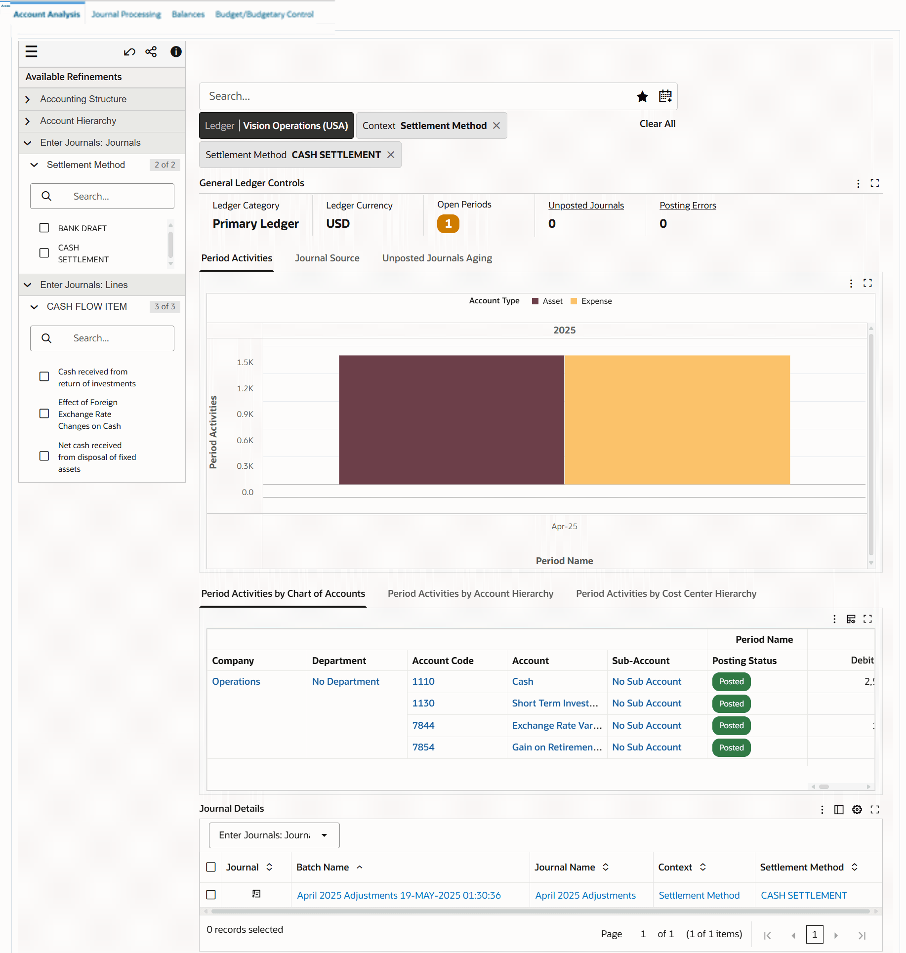
Select Enter Journals: Journal or Enter Journals: Lines in Available Refinements to filter data.
-
Review Enter Journals: Journal search results in the Journal Details results table.
-
Review Enter Journals: Lines search results in the Journal Lines results table.
-
-
Evaluate the financial performance of your company across multiple fiscal years, quarters, or periods; for example, you can perform the year-on-year or quarter-over-quarter comparisons.
-
Review financial data of revenue or expenses over specific periods in the primary and secondary ledgers.
-
Compare historical data across two or more periods using the horizontal analysis technique. For example, as a treasury manager, compare cash on hand at the end of the current accounting period with the previous period to investigate differences.
-
-
Ensure that all accounting distributions are correctly made for accurate checks and balances in your financial system.
-
Get a complete overview of your organization's parent and child accounts of the account hierarchy.
-
Review account balances at the summary level to know the financial position.
-
Make informed financial decisions based on the available data.
-
-
Check the account balances at different levels of cost centers within the cost center hierarchy to track the financial performance of those accounts.
-
Gain a comprehensive view of costs across different levels of the hierarchy, facilitating a holistic understanding of expenditure.
-
-
-
Analyze account activities from posted and unposted journals for all general ledger accounts.
-
Review details for journals to trace each transaction to its source.
-
Use the Network Diagram to track an account balance graphically to find the source of the transaction.
-
Drill down from summary information to a subledger and then to transactions in the subledger.
Access the Account Analysis dashboard using the following navigation:
(N) General Ledger Super User (responsibility) > General Ledger Command Center
Note: The value set for the GL: Data Access Set profile option and the data set definition determine your access to the ledger set or a ledger, and specific balancing segments, or specific management segments within a ledger.
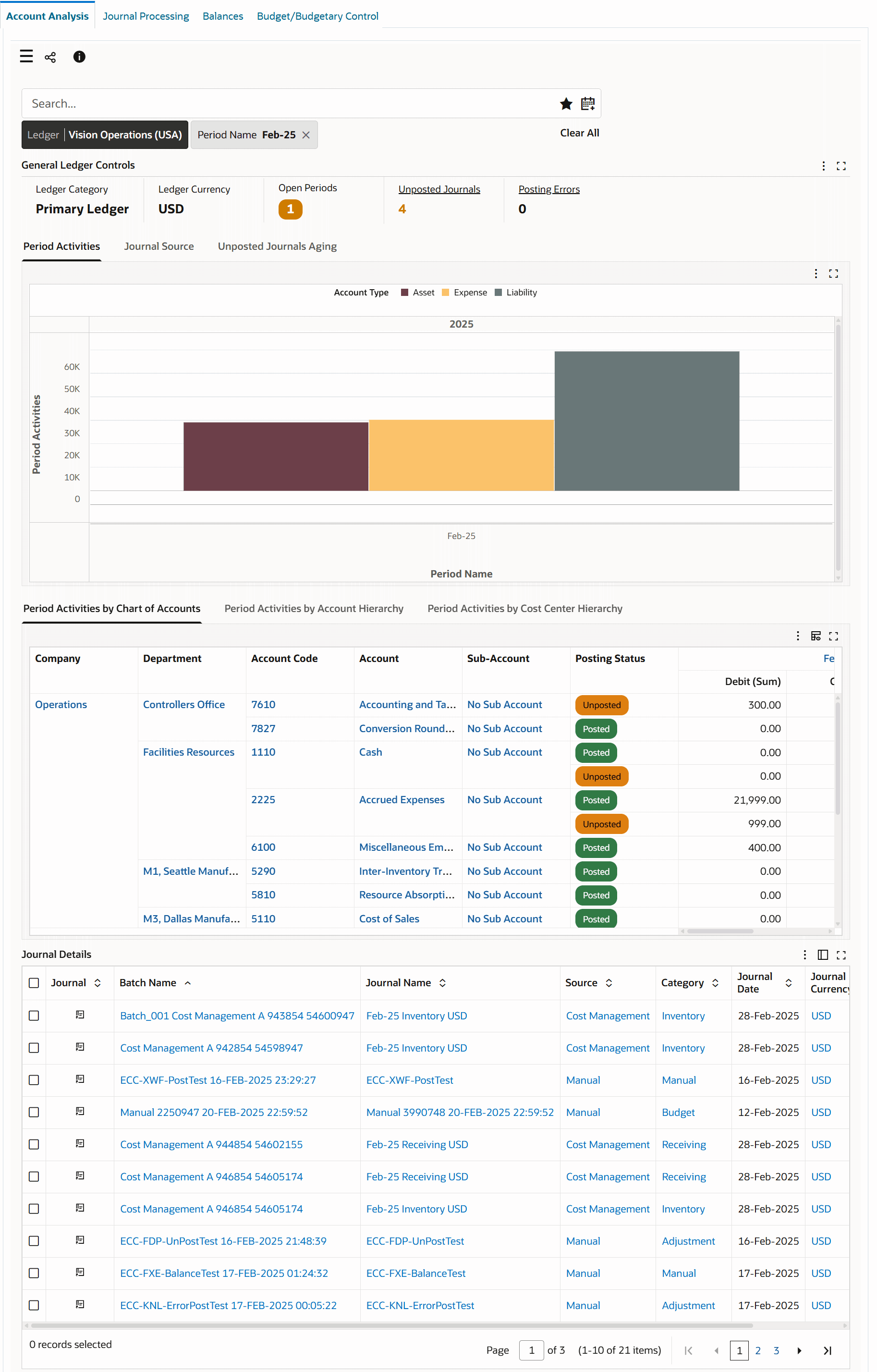
Account Analysis Dashboard
Journal Lines Table
Default Value
The dashboard does not have any default prefilters based on open periods. The number of latest open periods available on the dashboard is determined by the value set for the GL: Number of Latest Open Periods for ECC profile option by your administrator. To view and analyze data, click the Open Periods metric and select the period that you want to work with. You can filter by more than one period to compare data. Note that if you do not select a period, the Period Activities chart shows data only for the latest years.
You must select one or more periods to view data in the following tables:
-
Period Activities by Chart of Accounts
-
Period Activities by Account Hierarchy
-
Period Activities by Cost Center Hierarchy
If you have access to multiple ledgers, select the ledger that you want to work with first.
Viewing Historical General Ledger Data for Comparative Analysis
The Account Analysis dashboard enables you to compare and analyze accounting data across fiscal years, quarters, and periods for primary and secondary ledgers.
You can compare data on the following dashboard components:
-
Period Activities tab
-
Period Activities by Chart of Accounts table
-
Period Activities by Account Hierarchy table
-
Period Activities by Cost Center Hierarchy table
-
Journal Details results table
Viewing Descriptive Flexfields (DFF) Data
Account Analysis - Selecting and Viewing DFFs Data
Journal Lines - Viewing Enter Journal: Lines Attribute
You can select the following DFFs in Available Refinements:
-
Enter Journals: Journals
-
Enter Journals: Lines
Select the refinement and then the context value for which you want to analyze data.
Using the Account Analysis Dashboard
The following table describes the dashboard:
| Component | Description |
|---|---|
| Ledger (filter chip) | The Ledger filter displays the ledger that you can access. The account analysis data is displayed in the context of a ledger. If you have access to multiple ledgers, then first select a ledger to display relevant data based on the selected filter. |
| General Ledger Controls (summary bar) | The summary bar displays key metrics to summarize ledger controls for the selected ledger in the following fields:
|
| Period Activities (chart) | The Period Activities chart by default, shows the amounts for period activities in the functional currency by an account type and period name. If you select more than one period, then the Period Activities chart displays the historical data first followed by the recent data. To view details for a general ledger account from the account type dimension, drill down to general ledger accounts in each category and then to the specific general ledger account. For example, the Asset account type includes categories such as Payments, Purchase Invoices, Receiving, and Sales Invoices. Click the Asset bar graph to drill down to category graphs and from category graphs to general ledger accounts in each category. You can review period activities for a period or compare period activities across multiple fiscal years, quarters, or periods. Using the horizontal analysis technique, you can visually review the accounting differences between periods for each line item. For example, you can perform the horizontal analysis for expenses incurred in Feb-22 and Feb-23 to do a year-to-year comparison. To compare data for multiple periods, you can drill down to general ledger accounts in each category and then to that specific general ledger account. |
| Journal Source (tab) | This tab contains the following charts to gain insight into journal sources.
|
| Unposted Journals Aging (tab) | The Unposted Journals Aging chart shows the number of unposted journals in each predefined aging bucket. Journal aging indicates the number of days a journal has remained in the Unposted status without any action performed on it after being imported into Oracle General Ledger. |
| Period Activities by Chart of Accounts (pivot table) | The Period Activities by Chart of Accounts table displays data for chart of account (COA) segments for the selected ledger, and the segment labels are reflected dynamically on the dashboard within the context of the selected ledger. You can show, hide, or reorder the COA segments using the runtime options. You can view the period, posting status and the sum of debit, credit, and PTD amounts for journals. By default, this table displays only five segments of the accounting structure. You can switch between the aggregated table view and pivot table view using icons. To examine account details for an account using the Account Inquiry drawer, click an account number link in the Account Code column. See Using the Account Inquiry Drawer. |
| Period Activities by Account Hierarchy (pivot table) | The Period Activities by Account Hierarchy table displays the period activities for the account hierarchy of the Natural Account segment. Note: The value set for the FND: KFF Hierarchy Level for ECC profile option determines the account levels that this table displays for the Natural Account segment. For example, if the profile option value is set to 3, then you can view data for three levels of the account hierarchy. This table displays only those accounts that have data. For a parent account, you can view the parent account code, account, account code, posting status, subtotal, and the sum of debit, credit, and PTD amounts. By default, this table displays only five segments of the accounting structure. You can switch between the aggregated table view and pivot table view using icons. To examine account details for an account using the Account Inquiry drawer, click an account number link in the Account Code column. See Using the Account Inquiry Drawer. |
| Period Activities by Cost Center Hierarchy (pivot table) | The Period Activities by Cost Center Hierarchy table displays the period activities for the account balances at different levels of cost centers within a cost center hierarchy. Note: The value set for the FND: KFF Hierarchy Level for ECC profile option determines the account levels that this table displays for the cost center hierarchy. By default, this table displays only five segments of the cost center hierarchy. You can switch between the aggregated table view and pivot table view using icons. To examine account details for an account using the Account Inquiry drawer, click an account number link in the Account Code column. See Using the Account Inquiry Drawer. |
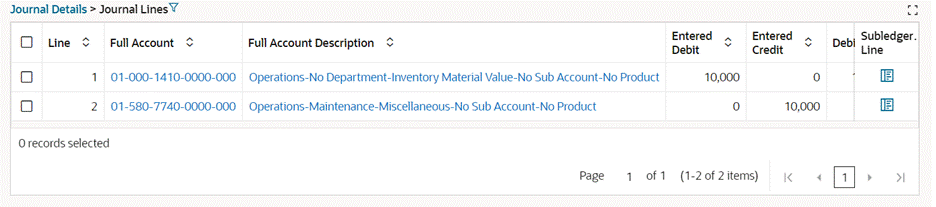
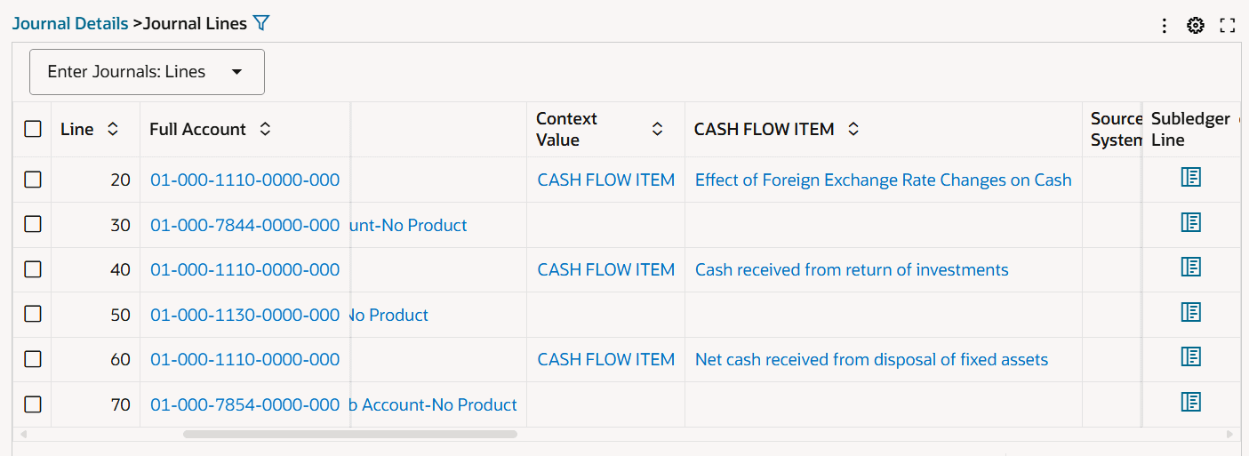
| Journal Details (table) | This table shows the details for general ledger journal headers. To view line details for a subledger line, click the icon in the Journal column of that line. If available, select the Enter Journals: Journals attribute group to view DFF details for the journal header. The Journal Details > Journal Lines table displays details for subledger lines. The currency of the entered debit and the entered credit is the journal currency. If available, select the Enter Journals: Lines attribute group to view DFF details for the journal lines. Click Journal Details to navigate back to the journal headers view. |
Using the Account Inquiry Drawer
The Account Inquiry drawer enables you to graphically track the source of a transaction or the subledger transaction for an account balance. To display the Account Inquiry drawer, click an account number link in the Account Code column in the following tables.
-
Period Activities by Chart of Accounts
-
Period Activities by Account Hierarchy
-
Period Activities by Cost Center Hierarchy
If you select multiple periods to compare data, then the components of this drawer display data for the multiple periods.
The components of this drawer are as follows:
Row Expander
The default view is Row Expander. Click the Balance row to drill down to the Source, GL Journal, and GL Lines rows.
Timeline View
To view creation and posting details for a journal in chronological order, click the Timeline icon.
Using the Network Diagram
Network Diagram
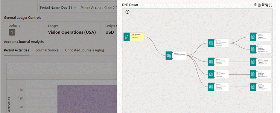
To trace the source of transactions and view details for journal lines, click the Network Diagram icon. For example, you want to review the account activities for the Cost of Sales account with the account code 5110. When you click the Network Diagram icon, the network diagram displays the nodes in the following sequence:
-
The Cost of Sales node.
-
The Cost Management node, which is the source of journals.
-
The Journal nodes for the source with details about each journal.
-
The Journal Line nodes for each journal with details about the journal line.
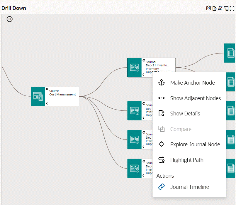
Performing Actions from the Nodes in the Network Diagram
In the network diagram, right-click nodes to perform actions.
Journal Node Actions
Journal Line Node Actions
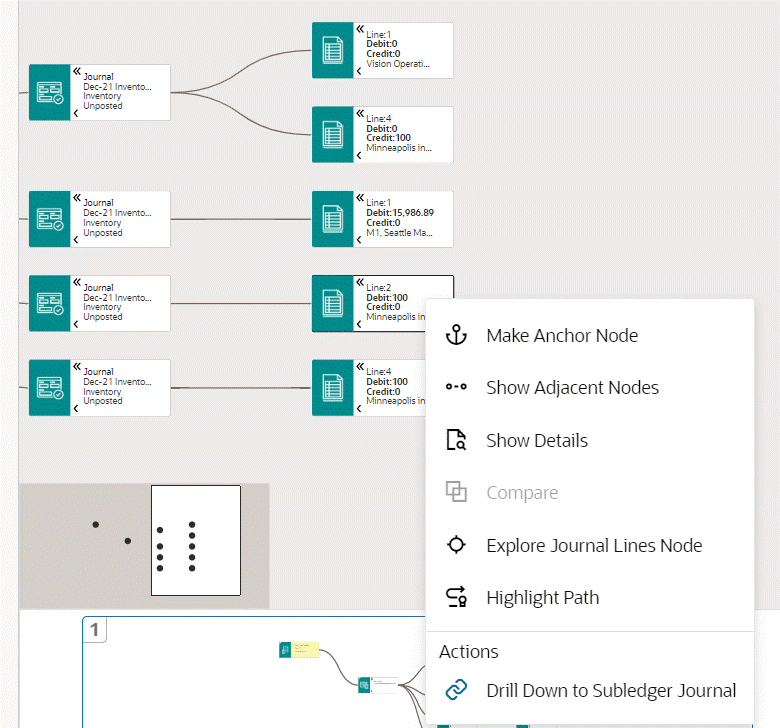
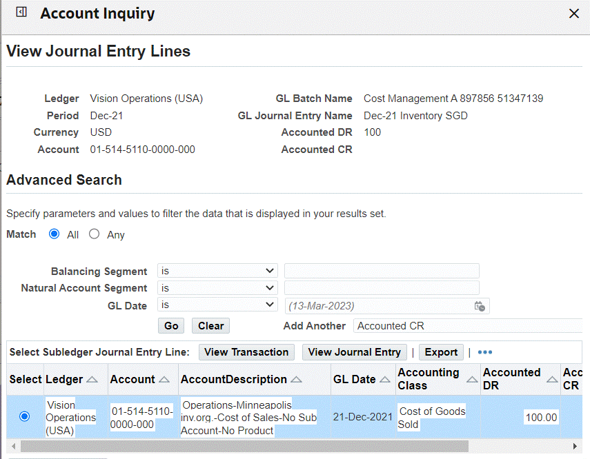
View Journal Entry Lines Page
The following table describes the actions that are available when you right-click a node.
| Node | Action | Action Description |
|---|---|---|
| Journal | Journal Timeline | Use this action to open the timeline of a journal and view details. |
| Journal Line | Drill Down to Subledger Journal | When you select this action the View Journal Entry Lines page opens inline in the Account Inquiry drawer. View details for a subledger journal and source transactions from Oracle E-Business Suite applications and non-Oracle systems. Note that a manual source does not have corresponding subledger journals. |
Journal Processing Dashboard
See General Ledger Command Center Overview.
When you run the Journal Import process, the GL_INTERFACE table is where Journal Import receives the accounting data that you import from Oracle and non-Oracle feeder systems. If journal lines in the GL_INTERFACE table have errors, the journals cannot be imported to Oracle General Ledger. To ensure that Oracle General Ledger has all the primary and secondary ledger journal entries required for financial analysis, use the Journal Processing dashboard to review and resolve journal processing issues.
Use the dashboard to:
-
Identify journal import errors using the Errors metric and the Error Lines table.
-
Track journals import process for all types of ledgers.
-
Review and correct the error lines by drilling down to the Correct Journal Import Data window.
-
Review the interface lines that are ready for import and process these lines in Oracle General Ledger.
Access the Journal Processing dashboard using the following navigation:
(N) General Ledger Super User (responsibility) > General Ledger Command Center
Note: The value set for the GL: Data Access Set profile option and the data set definition determine your access to the ledger set or a ledger, and specific balancing segments, or specific management segments within a ledger.
Default Value
The dashboard does not have any default prefilters based on open periods. The number of latest open periods available on the dashboard is determined by the value set for the GL: Number of Latest Open Periods for ECC profile option by your administrator. To view and analyze data, click the Open Periods metric and select the period that you want to work with.
Journal Processing Dashboard
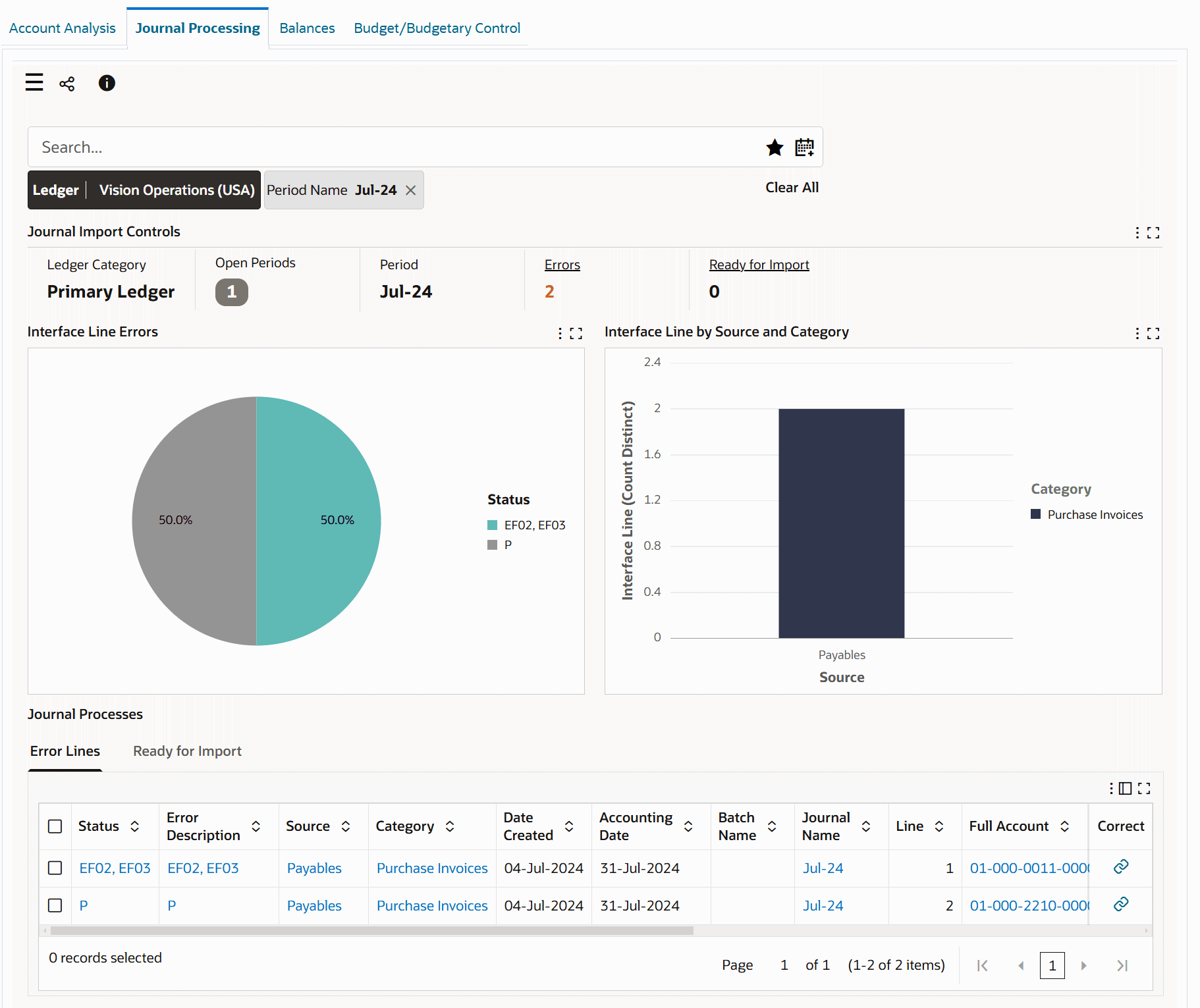
The following table describes the dashboard:
| Component | Description |
|---|---|
| Ledger (filter chip) | The Ledger filter displays the ledger that you can access. The journal processing data is displayed in the context of a ledger. If you have access to multiple ledgers, then first select a ledger to display relevant data based on the selected filter. |
| Journal Import Controls (summary bar) | The summary bar displays key metrics to summarize journal import details in the following fields:
|
| Interface Line Errors (chart) | This pie chart shows the percentage of interface lines in each error status. You can identify the error status using the status code. The hover text for a pie chart segment displays the number of interface lines with error in that error status. |
| Interface Line by Source and Category (chart) | This chart shows the number of interface lines with errors from each journal source and source categories. For example, if the journal source is Cost Management, then Inventory, Receiving, and WIP can be the source categories. |
| Journal Processes (tabbed component) Error Lines (table) |
This table displays details for the error lines such as error, error description, source, category, and group ID. To correct an error line, click the link icon in the Correct column to navigate to the Correct Journal Import window. Note that when you navigate from the dashboard, the line parameters do not default to the Correct Journal Import window. In the Find Journal Import Data window that appears, search for the line that you want to correct by entering the group ID of that line. |
| Journal Processes (tabbed component) Ready for Import (table) |
To import journal entries into Oracle General Ledger, you can use the following methods:
See How to Import Journals. |
Balances Dashboard
See General Ledger Command Center Overview.
The Balances dashboard presents detailed data for year-to-date (YTD) balances and trial balances.
Use the dashboard to:
-
Review year-to-date (YTD) balances for all types of ledgers.
-
Examine the net period activities and closing balances across account types and natural accounts for an accounting period.
-
Drill down to examine the ending balance for each account.
-
Compare balances, for example, Cash and Accounts Receivable accounts to monitor cash flow and then drill down further to review accounts that contribute to the Cash and Accounts Receivables accounts such as Support Sales and Consulting Sales.
-
-
Review accounts at different levels of the cost center hierarchy.
-
Review year-to-date (YTD) balance breakdown by cost center hierarchy.
-
-
Review detailed trial balance data.
-
Monitor the financial activities of the organization by tracking account balances at the end of the fiscal period.
-
Identify trends and patterns in your finances by comparing closing balances.
-
Track changes to General Ledger account balances.
-
Evaluate the organization's financial position by comparing the closing balance of a set of accounts with the same in the previous periods.
-
Important: The Balances dashboard displays balances data only for the "Actual" balance type.
Access the Balances dashboard using the following navigation:
(N) General Ledger Super User (responsibility) > General Ledger Command Center
Note: The value set for the GL: Data Access Set profile option and the data set definition determine your access to the ledger set or a ledger, and specific balancing segments, or specific management segments within a ledger.
Default Value
The dashboard does not have any default prefilters based on open periods. The number of latest open periods available on the dashboard is determined by the value set for the GL: Number of Latest Open Periods for ECC profile option by your administrator. To view and analyze data, click the Periods metric and select the period that you want to work with. You can select one or more periods to review data. If you do not select a period, then the YTD Balances chart shows data only for the latest years. To view data in the Detailed Trial Balance aggregated table, you must select one or more periods. If you have access to multiple ledgers, select the ledger you want to work with first.
Balances Dashboard
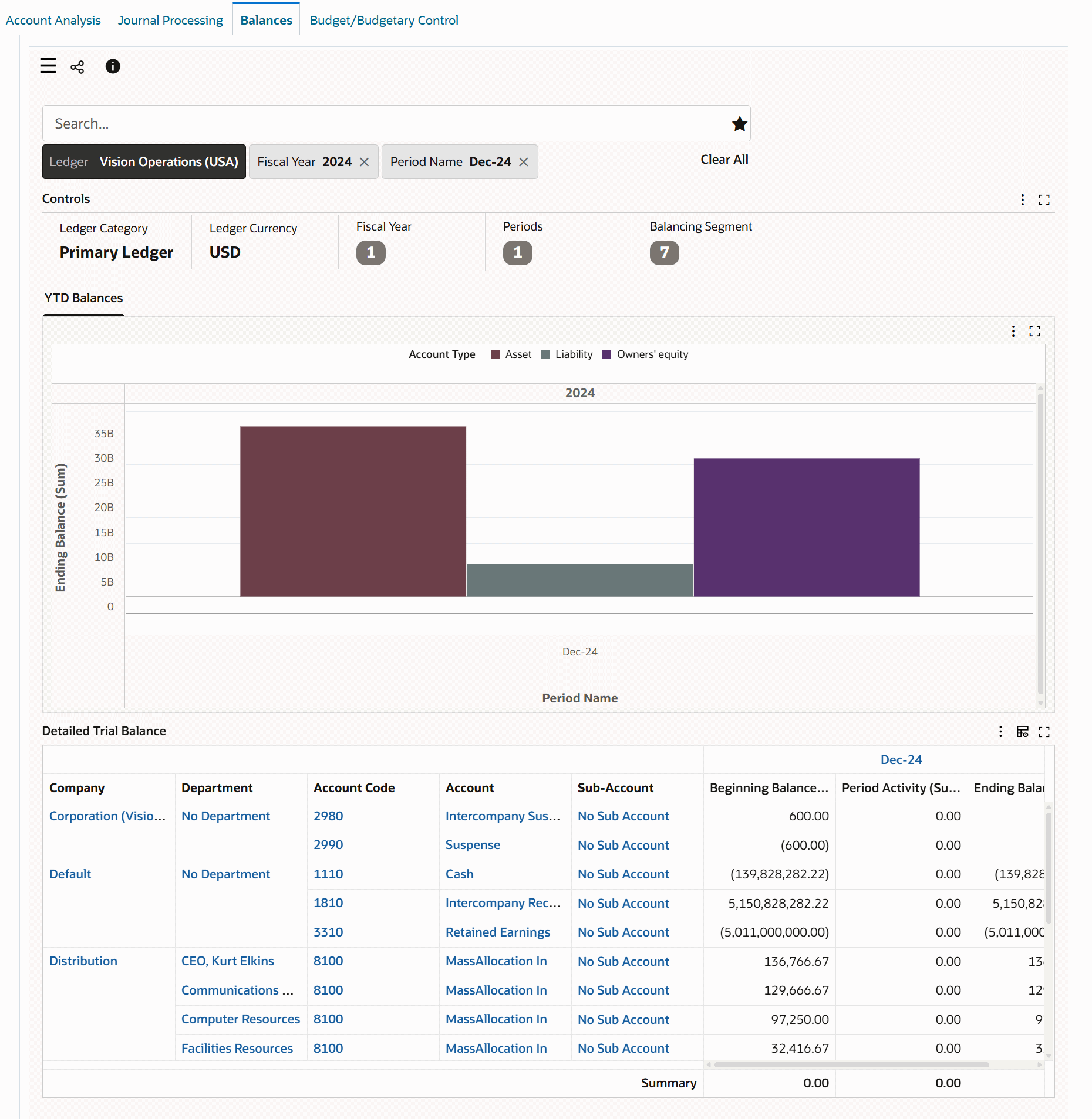
Balances Dashboard Components
The following table describes the dashboard:
| Component | Description |
|---|---|
| Ledger (filter chip) | The Ledger filter displays the ledger that you can access. The balances data is displayed in the context of a ledger. If you have access to multiple ledgers, then first select a ledger to display relevant data based on the selected filter. |
| Controls (summary bar) | The Controls summary bar displays key metrics to summarize balances.
|
| YTD Balances (chart) | This chart shows the sum of ending balances in the functional currency by period name and account type. If you select more than one period, then the chart displays the historical data first followed by the recent data. You can review ending balance amounts across multiple fiscal years, quarters, or periods. Use this chart to track the overall financial health of the company. The chart displays all General Ledger balances, regardless of the account nature (debits as positive amounts and credits as negative amounts). All amounts are positive, and this gives a complete picture of the company's assets, liabilities, equity, income, and expenses. To view ending balances for a natural account for a period, drill down from the account type dimension to a specific account. When you drill down to a specific account, the Detailed Trial Balance table shows the details for that account. |
| Detailed Trial Balance (pivot table) | This table enables you to review summarized actual account balances and activity for a ledger by balancing segment, cost center, account code, account, full account, and account segment values. You can also view the balancing of the accounts at different levels of cost center hierarchy with a subsummary. By default, this table displays only five segments of the accounting structure. The table also displays the beginning balance, period activity, and ending balance for the filtered periods. Amounts are in the ledger currency and display debits as positive amounts and credits as negative amounts. At runtime, you can use the Hide/Show Attributes component to show or hide segments as needed using runtime options. |
Budget/Budgetary Control Dashboard
See General Ledger Command Center Overview.
The Budget/Budgetary Control dashboard offers insight into all PTD (Period-to-Date), QTD (Quarter-to-Date), and YTD (Year-to-Date) budget activities. These activities include budget allocation, budget consumption, monitoring available funds, and commitments. The dashboard provides details about budget utilization by parent accounts and chart of account (COA) segments. The budget analysis includes information about the funds consumed and the source accounts. The dashboard helps you to perform encumbrance analysis to investigate commitments, obligations, and related transactions.
Use the dashboard to:
-
Review budget control metrics.
-
Find the budget amounts allocated to a particular account or project.
-
Track the actual expenditures that are incurred.
-
Review the funds that are not reserved for any purpose and are available to be encumbered.
-
Identify accounts with insufficient funds.
-
Review through visual indicators when available funds approach zero or turn negative.
-
-
Use statistical (STAT) currency to analyze budget data.
-
Track units or other non-monetary metrics alongside monetary balances, for example, employee headcount by department, FTEs, service hours or other operational measurements.
-
-
Gather comprehensive budget and budgetary control data.
-
Analyze budget data within a specific accounting timeframe.
-
Filter data based on budget definitions, budget periods, and COA segments.
-
Compare budget across time ranges.
-
-
Gain insight into budget utilization in your organization.
-
Review budget utilization and funds consumed by COA segments, account, and cost center.
-
Monitor the most utilized budget or underutilized budget for effective financial management.
-
Assess spending by tracking consumption of funds across period, fiscal quarter, or fiscal year.
-
-
Compare budget allocation against actual consumption and remaining funds.
-
Monitor budget consumption trends by examining funds available by period and account type.
-
Investigate specific accounts.
-
-
Use the Encumbrance data to review encumbrance flow and investigate encumbrance by source type.
-
Review total encumbrance by encumbrance type (stage), such as Commitment, Obligation, Invoice, Prepayment, Project Commitment, Grant Reservation).
-
Understand how encumbrance builds up across procurement stages.
-
Identify which stage contributes most to the reserved funds.
-
Use the encumbrance analysis data to monitor procurement-driven encumbrances versus invoice-related ones.
-
Access the Budget/Budgetary Control dashboard using the following navigation:
(N) General Ledger Super User (responsibility) > General Ledger Command Center
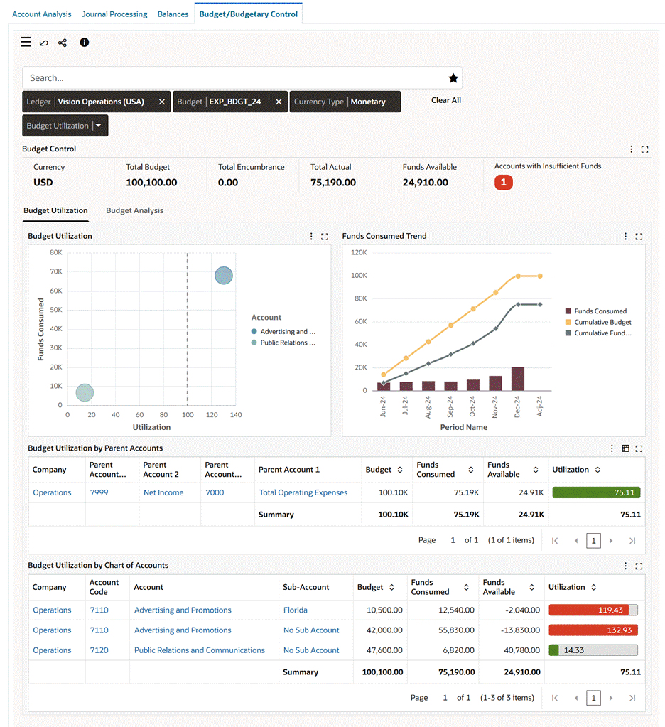
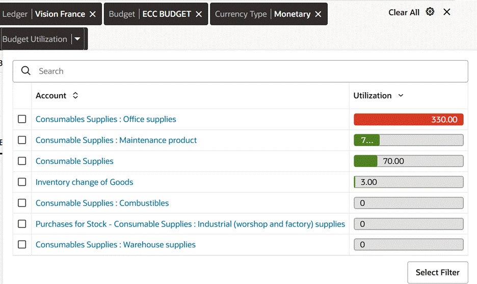
Budget/Budgetary Control Dashboard, Budget Utilization Tab
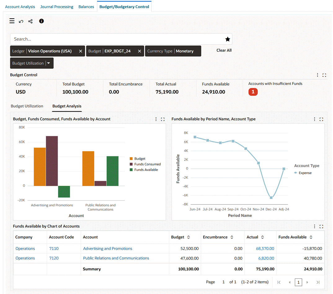
Budget/Budgetary Control Dashboard, Budget Analysis Tab
Note: The value set for the GL: Data Access Set profile option and the data set definition determine your access to the ledger set or a ledger, and specific balancing segments, or specific management segments within a ledger.
Understanding Budget/Budgetary Control Dashboard Calculations and Charts
Variance
To accurately display variance data, the dashboard uses the account type dimension. Note that the positive or negative variance trend depends on the nature of the account type.
Example
-
For an Expense account, a positive variance means actual expense is higher than the budget, which is an unfavorable indicator. While a negative variance means actual expense is lower than the budget, which is favorable indicator.
-
For a Revenue account, a positive variance means actual revenue is higher than budget, which is a favorable indicator. While a negative variance means actual revenue is lower than the budget, which is a favorable indicator.
Variance is calculated as Actual minus Budget: Actual - Budget
Budget Utilization
Budget utilization is calculated as Actual Spend divided by Budget and multiplied by 100.
(Actual Spend/Budget) x 100
Funds Available
Funds available is calculated as Budget minus Actual plus Encumbrance.
Budget - (Actual + Encumbrance)
Budget Dashboard Components
The following table describes the dashboard:
| Component | Description |
|---|---|
| Filter Chips (filter chip) | Select the filter criteria to view the budget data. Based on your filter selection, the budget data is filtered and displayed on different charts and tables.
|
| Budget Control (summary bar) | The Budget Control summarization bar displays the following key metrics:
|
| Budget Utilization (tab) | The Budget Utilization tab shows the following charts:
|
| Budget Utilization by Parent Accounts (pivot table) | This table displays the budget utilization information using the parents account with amounts summed up at higher-level (parent) accounts. Use this table to track the budget amount, funds consumed, funds available and utilization percentage for parent accounts. The table aggregates child account activity under each parent account. The default columns are Parent Account Codes, Budget, Funds Consumed, Funds Available, and Utilization. Use the Hide/Show Attributes feature to add the segments for which you want to view the budget utilization data. The Utilization bar uses the following predefined color key for visual assessment of consumption level:
|
| Budget Utilization by Chart of Accounts (aggregate table) | This is an aggregate or summary-level reporting table which shows how much budget has been consumed versus what was approved across the full Chart of Accounts (COA) structure. The key columns are Code and description for each chart of account segment, Budget, Funds Consumed, Funds Available and Utilization %. Use the Hide/Show Attributes feature to add the segments for which you want to view the budget utilization data. The Utilization bar uses the following predefined color key for visual assessment of consumption level:
Use this table data to review budget and consumption amounts at COA levels.
|
| Budget Analysis (tab) | The Budget Analysis tab shows the following charts:
|
| Funds Available by Chart of Accounts (detailed table) | This table provides a detailed, multi-dimensional analysis of budget, encumbrance, and actuals across the full chart of accounts, enabling analysis at the most granular COA level. It includes key columns for the code and description of each chart of account segment, along with Budget, Encumbrance, Actual, and Funds Available. The table displays budget data at transaction-level detail and includes a summary row that shows totals for the current context. Use the Hide/Show Attributes feature to add the segments for which you want to view the funds available data. Finance and budget owners can investigate specific departments or accounts, understand the drivers of encumbrance or spending, and validate remaining budget using line-level visibility. |
Using the Encumbrance Details Drawer
Encumbrance Details Drawer
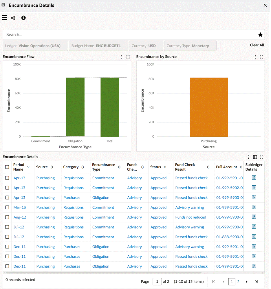
Use the Encumbrance Details drawer to get a detailed breakdown of the transactions that make up the Total Encumbrance metric. You can review and analyze commitments, obligations, and related encumbrance activity. To display the Encumbrance Details drawer, click the Total Encumbrance metric in the Budget Control summary bar.
The Encumbrance Details dashboard opens within the drawer and automatically displays all active global filters from the main dashboard, including Ledger, Budget, Currency type, and any other active refinements. The encumbrance analysis is displayed in the context of the summary value. The transaction details are a breakdown of the selected Total Encumbrance amount.
You can apply additional filters to refine the encumbrance view.
This drawer includes the following components:
-
Encumbrance Flow: This chart shows the total encumbrance amount by encumbrance type. For example, encumbrance type can be commitment, obligation, and invoices. This chart helps you to understand how the total encumbrance accumulates by showing the underlying transactions and where they are in the process, for example, commitments versus obligations. You can identify which stage contributes most to reserved funds to perform faster analysis and take informed decisions about budget availability and spending controls.
-
Encumbrance by Source: This bar chart shows total encumbrance amount by source, which is the default dimension. Select a different dimension to review total encumbrance amount by category, funds check level, or fund check result. This chart helps you to identify which operational areas are driving commitments by sources and patterns behind encumbrance activity. You can use this chart to distinguish and monitor procurement-driven encumbrances versus invoice-related encumbrances, and gain visibility into reserving funds and better control over budget consumption.
-
Encumbrance Details: This results table shows transaction-level details behind encumbrance amounts.
This table shows the following columns and information:
-
Period Name: Accounting period of the encumbrance.
-
Source: Originating module of the encumbrance such as Purchasing.
-
Category: Transaction category such as Requisitions, Purchases.
-
Encumbrance Type: Encumbrance such as Commitment, Obligation.
-
Funds Check Level: This is the level of budgetary control applied.
-
Status: This is the encumbrance status, Approval or transaction status
-
Fund Check Result: Result of funds validation.
-
Full Account: Complete chart of accounts combination.
-
Accounted Dr: Debit accounted for the encumbrance amount.
-
Accounted Cr: Credit accounted for the encumbrance amount.
-
Subledger Details: Click the link icon to navigate to the Subledger Details drawer, which shows the View Journal Entry Lines page. Use this link to drill from encumbrance transactions to underlying subledger journal details. Note: The Subledger Details action is displayed only when a valid journal header exists for the encumbrance record because not all encumbrance records are associated with a posted or created GL journal. The link does not appear for transactions that are not yet transferred to the GL or do not have corresponding accounting because there are no source journals for drill down.
-