Anatomy of Oracle Enterprise Command Center Framework UI Components
Configuration Model
The Oracle Enterprise Command Center Framework configuration model uses a familiar structure that follows that of a SQL query. No coding or custom expressions are required to configure any Oracle Enterprise Command Center Framework component.
For the sake of explaining different configuration options of Oracle Enterprise Command Center Framework components, we will use a SQL query structure to introduce the relevant concept in the Oracle Enterprise Command Center Framework configuration template. Please note that Oracle Enterprise Command Center Framework does not perform a SQL query to display data in a component.
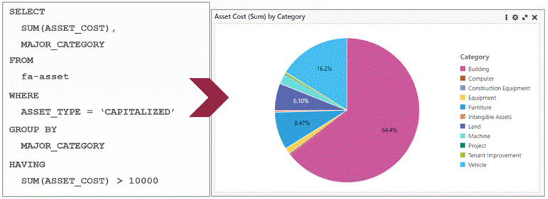
For example, given the SQL query:
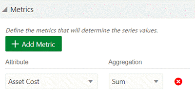
SELECT
   SUM(ASSET_COST),
   MAJOR_CATEGORY
The metric can be added under "Metrics" with the Attribute of "Asset Cost" and Aggregation "Sum".
Example of Defining a Metric
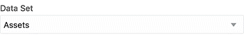
If the SQL statement is:
FROM
  fa-asset
The Oracle Enterprise Command Center Framework Configuration would show fa_asset as the selected data set.
Example of Selecting a Data Set
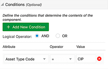
If the SQL statement is:
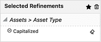
WHERE
  ASSET_TYPE = 'CAPITALIZED'
The Oracle Enterprise Command Center Framework Configuration would have the condition with Asset Type Code for Attribute, = for Operator, and CAPITALIZED for Value.
Example of Setting the Condition
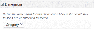
If the SQL statement is:
GROUP BY
  MAJOR_CATEGORY
The Oracle Enterprise Command Center Framework Configuration would have Category listed under Dimensions
Example of Defining the Dimensions
If the SQL statement is:
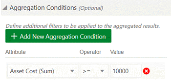
HAVING
  SUM(ASSET_COST) > 10000
The Oracle Enterprise Command Center Framework Configuration would have Asset Cost (SUM) for Attribute, >= for Operator, and 10000 for Value under Aggregate Conditions.
Example of Defining the Aggregation Condition
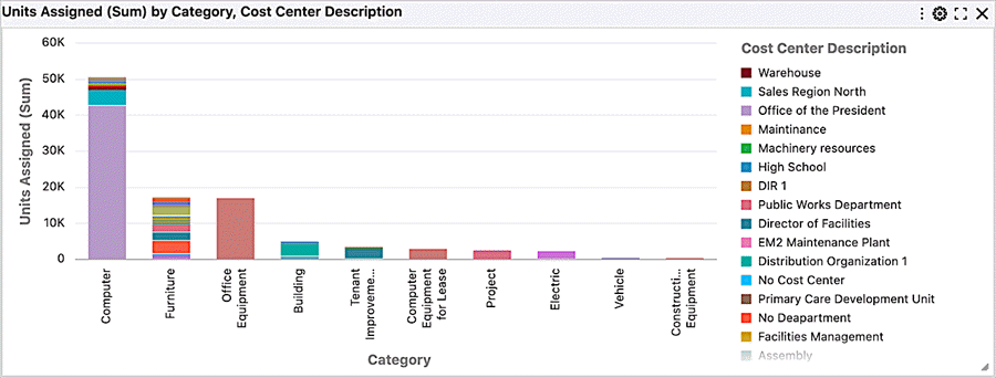
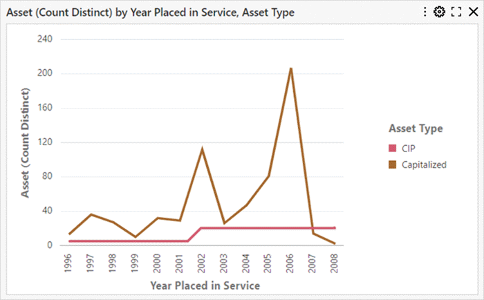
Based on above example, the following chart will be displayed:
Example of a Chart with Asset Cost (Sum) by Category
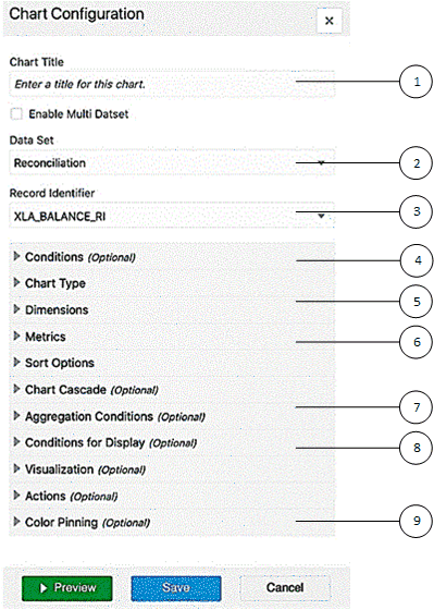
Common Configuration
Many components share common configuration options as follows:
-
Component title
-
Data set name
-
Record identifier
-
Conditions
-
Dimensions
-
Metrics
-
Aggregation conditions
-
Conditions for display
-
Color pinning
Common Configuration Options
Configuration Details
The following table lists descriptions of all configuration options across different components.
| Configuration Option | Mandatory/Optional | Description | Example |
|---|---|---|---|
| Component Title (all) | Mandatory | In navigation components. Title must be Selected Refinements Available Refinements |
|
| Component Title (all) | Optional | Dynamic/Static: in visualization component. Dynamic: displays the metric attribute (aggregation function) by dimension. |
Chart: Asset Cost (Sum) by Category |
| Enable Data Set | Optional | Flag to enable configuration of multiple data sets. | |
| Data Set (all) | Mandatory | The data set display name. | Assets |
| Record Identifier (all) | Optional | Used in case of entities in the data set at a different cardinality than the grain. When no record identifier is specified, records are displayed as-is. Affects aggregation. |
Asset Number |
| Condition (all) | Optional | Applies to both dimension and metric. Compound conditions with logical operators (AND/OR) can be applied among the conditions or among a group of conditions. Note: Condition values in ECC can be static (where the values are hardcoded in the configuration, such as STATUS_CODE = APPLIED) or dynamic (where values are evaluated against a runtime EBS session). For dynamic values, the syntax of the value is ${<VALUE>}. An example is USER = ${USER_ID} At runtime, ECC gets the value of USER_ID from current Oracle E-Business Suite session attributes. If the value of the USER_ID attribute in the EBS session is 123, then ECC tries to evaluate this condition USER=123. If there are no attributes with the name USER_ID in the EBS session, ECC tries to evaluate USER=USER_ID. |
((Record Type = 'I' AND Hold Count >= 0) AND (Discount Amount Available NOT NULL OR Second Discount Amount Available NOT NULL)) |
| Chart Type (chart) | Supports different types of charts: bar, bar/line, pie, donut, scatter, and bubble. Controls how bar, bar/line, and line chart is displayed (vertical/horizontal). Controls how a stacked chart is displayed (stacked/unstacked). Allows enabling zoom. |
Pie | |
| Visualization (chart) | Chart Line Smoothing: Controls display of smoother line for line series. Show Data Points: Controls display of data points on lines that are displayed on the chart. Number of dimensions: Controls how many dimensions are displayed on the chart Show Data Labels: Controls display of metric labels on chart. Show Stack Totals: Controls display of stack totals, applicable only for a stacked chart. Allow runtime changes: Control to allow business users to change the threshold or number of dimensions. For Pie and Donut charts:
Other chart types:
|
||
| Visualization (tag cloud) | Show Metric Value: display the tag cloud term with relative weight Number of items: controls how many terms are displayed |
||
| Dimensions (all visualization components) | Mandatory | Qualitative data (string, strings, and date attributes Define the level of granularity that shows in the component |
Major Category, Minor Category |
| Metrics (all visualization components) | Mandatory | Quantitative data Aggregated based on a given dimension. Supports SUM/AVG/MIN/MAX/COUNT DISTINCT and COUNT Only one metric is displayed at runtime (except multi-metric chart) |
Asset Cost (Sum) |
| Sort Option (Chart, Results Table, and Grid) | Optional | Enables sorting based on the dimension or metric defined. Allows runtime sorting in the chart and results table). | |
| Cascading (Chart, Tag Cloud) | Optional | When the data is refined to a single value for the dimension value, the component is updated to use a different dimension. | Major Category, Minor Category |
| Aggregation Condition | Optional | Allow having condition on the defined metric. | Asset Cost (Sum) >= 10000 |
| Condition for Display | Optional | Controls when the data is displayed on the component. Used when displaying the data within a context. |
Book code (count distinct) = 1 |
Note: Oracle Enterprise Command Center Framework currently does not enforce validations on the component configuration at design time. Any invalid configurations will error out and be displayed in place of the component at runtime. Revisit the configuration and adjust accordingly.
The subsequent sections cover how UI components enable users to handle diverse scenarios and obtain several types of insights.
Navigation Components
Navigation components enable interactive navigation through the data without having prior knowledge of its distribution nor characteristics. Also, they allow searching for a specific keyword or term, apply filters, and reset applied filters.
Search Box
Oracle Enterprise Command Center Framework comes with search capabilities that allow users to search for a term within a particular data set.
Search Box Overview
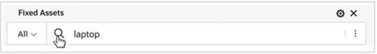
To perform a basic search, type your search term into the search box and Oracle Enterprise Command Center Framework will then list available matches in attribute values. If you select a value from the suggestion list then Oracle Enterprise Command Center Framework will run a specific search on that attribute match. Alternatively, you can click on the magnifying glass (search icon) to retrieve all records containing this value regardless of which attribute matches your search criteria.
You can also switch between the configured data sets to search for available matches within the selected data set. The name of the selected data set will appear on top of the search component.
Introduced in V9, the Search Box and Selected Refinement components have undergone a redesign to conform with the updated Oracle design standards.
Search Box
Oracle Enterprise Command Center Framework has advanced search capabilities in the search box such as wildcards, phrase and Boolean search. These types of searches are described below.
The search box can be dragged to the page to be included as a new component on the page or vice versa. The search component can also be added to the page from the 'Add Components' panel.
Note: Only one search component per page is allowed and can exist either in the navigation panel or on the page but not at both the places.
Search Box Placed on a Page
Search Scope
Beginning with V11, designers can customize the search experience in an ECC dashboard to allow users to search only within the context of applied filters or search across everything regardless of applied filters.
This is possible via the introduction of a new configuration element called "Search Scope," which has two options:
-
Search Within: This option is the default setting, enabling users to search within the context of applied filters.
-
Search Without: By toggling the search scope to "Search Without," users can search across all content regardless of applied filters.
Search Category
The Search Box feature supports the search category, which allows for searching within a specific attribute value.
Search Category in Search Box
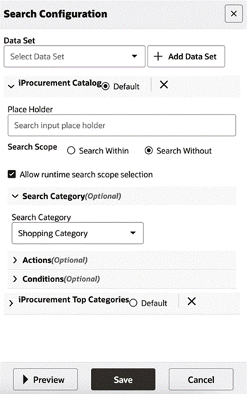
Search Configuration
| Option | Description |
|---|---|
| Data Set | Multiple data sets can be added. The configuration has to be repeated for each data set. |
| Default | Used to configure the data set that is selected by default for the search component at runtime. Only one data set can be configured as the default. |
| Place Holder | String defined to act as a placeholder inside the search bar. Default is: 'Search ...'. |
| Search Scope | Control to configure search experience to be either "Search Within" or "Search Without". |
| Allow runtime search scope selection | Enabling this checkbox allows business users to define search behavior at runtime; that is, users can set the search scope to be either "Search Within" or "Search Without". |
| Search Category | Select the attribute for search. In the runtime, all the values for this attribute are available in a list for the user to select. They can also be searched from an embedded search box. |
| Actions | Select Action Type Refinement: Applies refinement to the page using search value Hyperlink: Navigates to the page provided after applying refinement with search value |
Search Box Configuration
Search Behavior
Various types of searches and the associated behaviors are described below.
Value Search
Upon Selecting an attribute value from category and further selecting another attribute value from suggestion list of search adds both category attribute value and selected attribute value as refinements in selected refinements.
Value Search
Beginning with V6, search suggestions of a value search are subject to a control in metadata. Only the attributes with flag "Search Suggest List?" are part of value search suggestions.
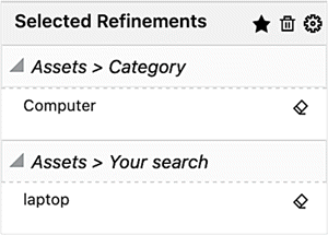
Record Search
Introduced in V6, record search exhibits the same behavior as value search. Search queries are added as refinements by clicking on the magnifying glass. Search queries are applied as refinements to the page under 'Your Search' accordion.
Search Query Example
'Your Search' Accordion Example
Phrase Search
Phrase Search allows you to search for an exact sequence of terms using quotation marks (" "). For example, searching for phillip taylor returns only records with phillip taylor (case-insensitive).
Wildcard Search
Wildcard or partial search is used when searching for a term where you only know a few letters. By default, when you start typing your search term in the search box, a trailing wildcard (*) is implicitly added at the end of the word. For example, a search for work returns all values with terms that start with work; for example, WORKSTATIONS.
Also, you can use an asterisk (*) or percent sign (%) at the beginning of the search term, and the results match any text contains the characters between the search operator, even if they occur in the middle of a word. For example, with a search for *work* or %work%, all values that have 'work' are returned in the search results. The (*) or (%) symbols perform a multiple character wildcard search that looks for 0 or more characters. Thus, a search for *work* returns values such as PC WORKSTATION, NETWORK, and WORKSTATIONS.
To perform a single (one and only one) character wildcard search, use the question mark (?) symbol. For example, a search for ?and returns LAND, and a search for ??and returns STAND.
Boolean Search
You can include logical operators in the search to set more precise search logic based on the operators listed below: Note: Boolean operators must be in capital letters only: AND, OR, and NOT.
Note: Boolean operators must be in capital letters only: AND,OR , and NOT.
The following table describes these operators:
| Operator | Purpose | Example Usage and Results |
|---|---|---|
| AND | Returns results with all specified terms. | cip AND additionReturns results with both 'cip' and 'addition' |
| OR | Returns results with any specified terms. | desktop OR laptopReturns results with either 'desktop' or 'laptop' |
| NOT | Negates the following term (Will not retrieve records that have the unwanted keyword). | desktop NOT monitorReturns results with 'desktop' but not 'monitor' |
Operator precedence is determined in the following order:
-
Any sub-expressions in parentheses are evaluated first
-
NOTis evaluated before other operators -
ANDis evaluated afterNOT -
ORis evaluated afterAND
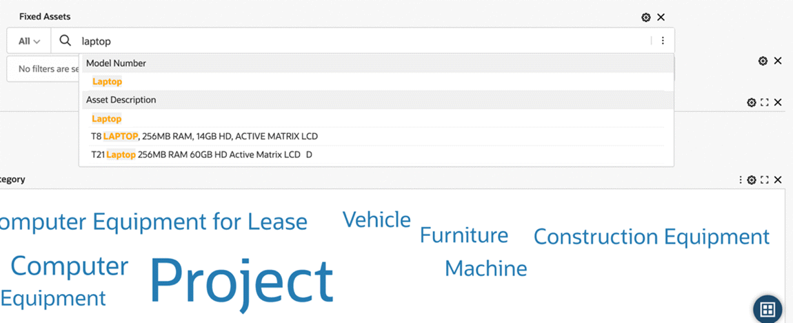
Image Search
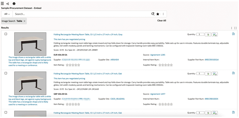
Introduced in ECC V14, the Image Search feature enhances search capabilities by allowing users to find relevant products using images in addition to text. This feature enables users to search by uploading images, combining text and image queries, and refining dashboard results dynamically.
Enabling and Configuring Image Search
Metadata: To enable Image Search, users must first select the data set. For the specific attribute key, the admin must choose the appropriate transformation method, whether image embedding or text embedding. Only attributes with embedding enabled will be available in the Search Configuration section to activate Image Search.
Enabling Image Search
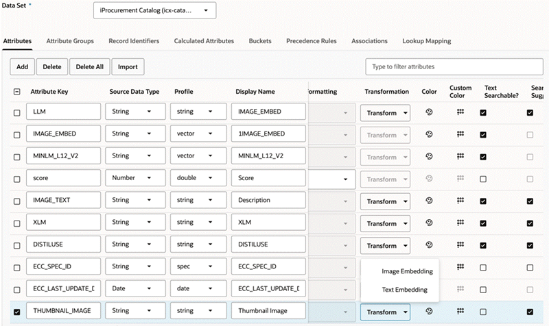
Image Search configuration is as follows:
-
Image Search can be enabled or disabled from Search Configuration. Users will see an Image Search icon in the search bar when enabled.
-
The Search Configuration panel allows power users to set the default behavior of Image Search, including:
-
Enabling/disabling semantic and image-based search
-
Configuring the number of results displayed (minimum: 1, maximum: 100)
-
Defining a label for the image search
-
Selecting the image search attribute
-
Image Search Configuration
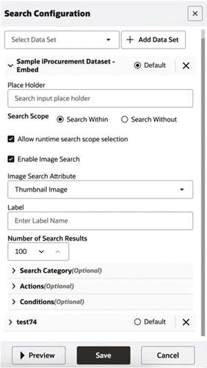
Image Search Functionalities and User Experience
Users can perform searches in the following ways:
-
Upload an image - Users can upload an image to find visually similar results.
-
Search by description - Users can enter text-based descriptions.
-
Combine image and regular value/record/wildcard search - Both input methods can be used together, with an AND condition applied.
For the results display and subsequent refinements:
-
Image search results appear in the Results Grid, with refinements automatically applied across all dashboard components, including Available Refinements, Aggregation Tables, and Charts.
-
Users can refine dashboards by clicking on embedded images in results (provided the attribute has been selected to be embedded in metadata).
-
Sorting is applied after retrieving search results.
Example of Results for an Image Search
Error Handling, Performance Optimization, and Logs
For error handling:
-
If an invalid image format is uploaded, an error message is displayed: "Unsupported file format. Allowed: JPG, PNG, GIF, WEBP."
-
If the image exceeds the size limit, an error message is shown: "Image size limit exceeded. Upload images under 2MB."
-
If the network request fails, the message "Upload failed due to network issues. Please try again." appears.
For performance optimization, image embedding and search operations are optimized to prevent a system lag.
Export and audit logs have the following features:
-
In PDF exports, image search refinements appear under "Applied Filters."
-
Audit logs track "Image Search" actions under filter modifications.
-
Activity logs include:
-
Image search actions recorded as "Image Search Applied."
-
Text-based searches within an image search recorded as "Semantic Search Applied."
-
Expressions
An expression is used to build a more complex search query. You can combine keywords with AND, OR, or NOT. Use parentheses to determine the relationship between operators when more than one operator is used. For example, a search for (computer OR desktop) NOT monitor returns records that contain both the words computer and desktopbut do not contain monitor.
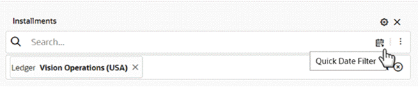
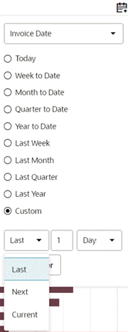
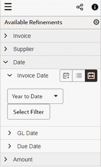
Quick Date Filter
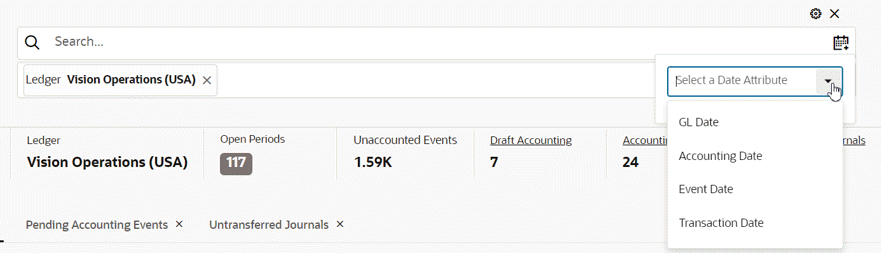
Introduced in V12, the Quick Date Filter feature significantly enhances user experience by allowing users to swiftly select date filters without navigating to available refinements. This feature enables users to select date attributes, choose from predefined time ranges, and utilize relative date ranges such as "last 7 days" or "previous month."
Example of Quick Date Search Icon and Tooltip
Example of Quick Date Filter with Expanded List
Important: Note that Quick Date Filter is not applicable to date subsets or fiscal years.
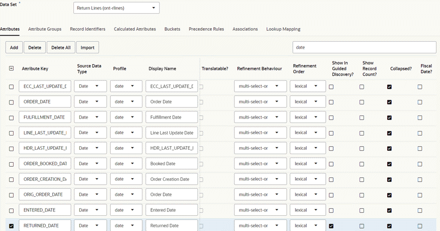
The implementation of this feature requires no configuration changes and is seamlessly embedded within the search box. The date list is generated based on date and date-time attributes marked with the "Show in Guided Discovery" flag in the metadata.
Example of Data Set Page, Attributes Tab, with "Show in Guided Discovery" Selected for RETURN_DATE
In cases of multiple data sets, the date list is derived from the default data set configured under search settings. Users can select from a variety of quick filtering options and even apply custom relative date filters. The levels available are Days, Weeks, Months, Quarters, and Years. Additionally, users have the flexibility to choose filtering at the levels of Hours and Minutes for date-time attributes.
Options to Choose "Last," "Next," and "Current" for a Date
Once applied, quick date filters are added to selected refinements as regular date filters, allowing users to amend them and switch between list, range, and relative range type date filters as needed.
To utilize this feature, ensure that the date or date-time attribute intended for quick filtering is designated as "Show in Guided Discovery?" in the metadata as described above.
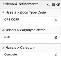
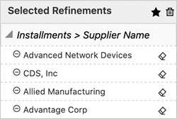
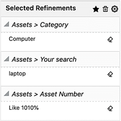
Selected Refinements
Selected Refinements display all values that the user has selected to filter the dashboard, organized by attribute name and data set. The captured filtered can come from user interaction with any of the Oracle Enterprise Command Center components that allow refinements such as search box, tag clouds, charts, and so on.
The Selected Refinements component can additionally control associative filtering behavior and make the dashboard sensitive to refinement state coming from directly or indirectly associated data sets. This is done by specifying the associated data sets in the configuration.
Beginning with V6, a user can view the meaning or values of filters applied in selected refinements by hovering on them. This feature is controlled by Lookup Mapping in metadata. Oracle Enterprise Command Center Framework leverages a mapping between the attribute code and the attribute description to show the description in a tooltip when the hovers on the attribute code in Selected Refinements.
Selected Refinements
Selected Refinements have the look and feel options described in the following table:
| Page Layout | Selected Refinements |
|---|---|
| Default (Side Navigation) | Displayed inside the navigation panel. If the user collapsed the side navigation panel, a funnel icon is displayed at the top of the page. |
| Side Navigation Collapsed | Displayed as a funnel icon. If the user opens the side navigation panel, selected refinements are displayed at the top of the page. |
| No Side Navigation | No selected refinement on the page. |
Configuration
| Option | Description |
|---|---|
| Title | Default title "Selected Refinements" |
| Data Set | Supports more than one data set selection for honoring association and applied filters between defined data sets. |
| Override Applied Filters | With this flag enabled, if the user applies filters from a different data set, then filters from any other data sets are deleted in selected refinements. |
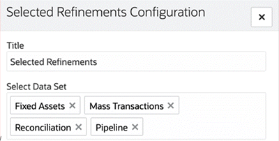
Selected Refinements Configuration
Filter Chips
Introduced in ECC V14, the Filter Chip feature enhances filtering capabilities by providing a compact and interactive way to refine search criteria. By integrating visual chips, users can quickly apply, modify, and reset filters without navigating complex faceted search panels.
Example of Filter Chips
-
Filter Chip
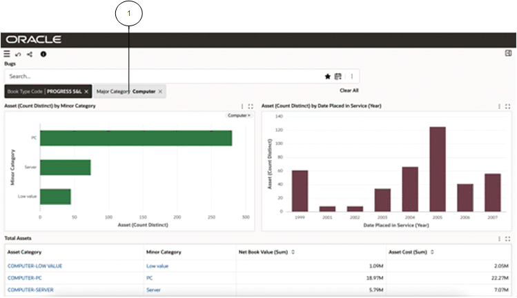
The figure above shows the Filter Chip interface in the Asset Costs dashboard. Users can easily add, remove, and modify filters using visual chips, allowing them to refine their search criteria without confusion. The filter chips display up to three selected values, with additional values indicated by side arrows (>>).
Enabling and Configuring Filter Chips using the Component Control Panel
Filter Chips can be added from the selected refinements configuration.
The Configuration Panel allows power users to:
-
Set Title (optional)
-
Select Data Set (mandatory)
-
Select Record Identifier (optional)
-
Set Conditions (optional)
-
Select Dimension (mandatory)
-
Select Metric (optional)
-
Select Filter Chip Conditions (optional)
-
Select Conditional Formatting (optional)
Configuration Options for the Filter Chip Component
Filter Chip Functionalities and User Experience
Example of Filtering on a Filter Chip
In filter selection, users can refine data using the following mechanisms:
-
Single Attribute Selection - Users can select one attribute per chip.
-
Multiple Value Selection - Users can select multiple values within a chip.
Using filter chips results in the following behavior:
-
The display includes up to three (3) values, with navigation arrows for additional values.
-
Users can expand the chip to view and modify selected values.
-
Filter chips are integrated with Available Refinements, ensuring refined values are displayed within the chip instead of as separate filters.
Example of a Filter Chip with a Refined Value
-
Filter chip containing the refined value
Breadcrumbs
Introduced in Version 4, the Breadcrumbs feature is an intuitive representation of the selected refinements as a trail of filters on the dashboard page. This feature is configured along with the search box on page. It emphasizes the sequence of the steps in the path the user has chosen to arrive at the current state of the dashboard. The Breadcrumbs component can be added in two ways:
-
Dragging the selected refinements section to page area
-
Adding a new component: 'Selected Refinements' from the components list
The Breadcrumbs component shows the data set name on top of each filter. It lists all types of filters available in selected refinements. User can delete individual filters or clear all filters from the breadcrumbs.
If there are more than three filters of the same attribute, all the filters are grouped and collapsed displaying an icon. Clicking on the icon displays all the filters of the attribute. All the filters for such attributes can be removed at once. Users can hover over a refinement to view the data set name.
Beginning with v9, the breadcrumbs for selected refinements was re-designed. A user can hover over a refinement to view the data set name.
Example of Breadcrumbs for Selected Refinements
Beginning with V7, the Breadcrumbs component has been improved to enhance user discovery capabilities by allowing the user to replace or apply additional filters from the selected refinement, inheriting all the refinement behavior as in available refinements.
If you click on the attribute name, then you can select another value and apply it as a filter on top of the existing one from the same attribute.
If you click on the attribute value, then you can select another value and replace it with the existing one from the same attribute.
Note: This behavior is applied to multi-assigned attributes with OR and AND. If you filter by one of the context attributes (single assign) in the dashboard, like a ledger, operating unit, or inventory organization, and then click on the attribute name or value, the applied filter will be replaced by the new value.
If you applied a date range filter, then you can click on the attribute name or attribute value and replace the existing filter with the same attribute.
Also, if you applied a date range filter, and then clicked on the attribute name or value and switched from a range to a list or from a relative range to a list, and next filtered by one value or more from the list, then these filters will be applied on top of the existing range filter applied from the same attribute. The new filter will be added in different accordions because it is based on different operators (in accordance with standard behavior in ECC).
If you applied a numeric range filter, you can click on the attribute name or attribute value and replace the existing filter with the same attribute.
Beginning with V10, Breadcrumbs for Selected Refinements has been enhanced to allow users to make quick selections simply by clicking on the respective attribute. Users can also make multiple selections by clicking on the respective checkboxes, followed by clicking on the Select Filter button. Negative refinements are also simplified as users can click on the negative refinement icon for an attribute to negatively refine the dashboard.
Saved Search
Oracle Enterprise Command Center Framework provides an option to save the frequently applied filters or preferred filters as saved searches for allowing users to reuse them. All saved searches are context-sensitive to the page and are part of the search suggestions. The list of saved searches can be obtained when focused on the search component. Saved searches are searchable by their title, filter attributes and filter values.
Three types of saved searches are available for the users: Seeded, Public, and Private. Seeded saved searches are published along with the product, Public saved searches are created by admin users and all the saved searches created by users are called Private saved searches. Private saved searches are accessible only by the users who created them, whereas public saved searches are accessible by all the dashboard users.
For more information, see Saved Search, Oracle E-Business Suite User's Guide.
Negative Refinements
Negative refinements are possible through quick selection only; that is, a user can click on the negative refinement icon of the respective item to negatively refine the dashboard.
Example of Negative Refinements
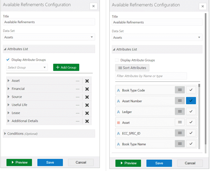
Available Refinements
The Available Refinements feature enables interactive navigation through the data without having prior knowledge of its distribution nor characteristics.
As a user interacts with available refinements components or perform filtering operations from other components on the dashboard, Available Refinements dynamically updates the attribute list to show relevant attributes and attribute refinements. This navigation is data-driven and supports progressive disclosure of additional attributes as appropriate according to the user's navigation path through the data. Data rendered in the attribute value list also honors refinement state and can shrink, expand or be removed based on which subset of data user is exploring.
Available Refinements supports displaying attributes in a grouped list to reduce clutter.
Available Refinements also supports switching between data sets to apply relevant filters from the data sets. The name of the selected data set will appear in the header of the available refinements section.
Oracle Enterprise Command Center Framework supports advanced scrolling functionality by limiting the height of refinements section by the height of the dashboard. Any expansion of refinements due to the addition of selected refinements or expansion of accordions in available refinements will be within this height.
Descriptive flexfield (DFF) attributes can be accessed from available refinements along with customer defined labels for DFF attributes. Oracle Enterprise Command Center Framework allows progressive disclosure for context-sensitive attributes.
Beginning with V6, users can see easily understandable value set descriptions in available refinements instead of simply value set codes.
The Available Refinements feature also supports filtering the dashboard with time-level precision for date-time attributes. A user can select a time range along with a date range.
Available Refinements
Configuration
| Option | Description |
|---|---|
| Title | Default title "Available Refinements". |
| Data Set | Multiple data sets can be added. |
| Default | Only one of the data sets can be selected. Available refinements select that data set as the default data set at runtime. |
| Attribute List | Display Attribute Groups: this checkbox allows selecting and displaying attribute groups. Attribute list: allows controlling of attribute display in the component, and how the attribute is displayed (list/range). These controls are supported in both attributes flat list and attribute groups. |
Available Refinements Configuration
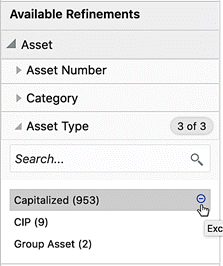
Negative Refinement
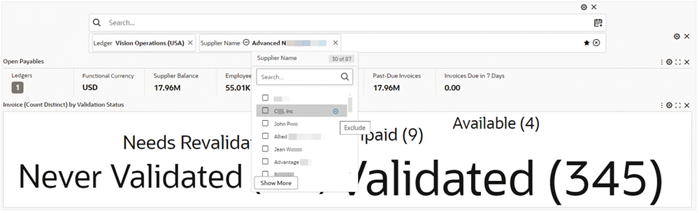
The Negative Refinements feature allows users to refine the data by filtering out the selected values. Such refinements are displayed in selected refinements with an Exclude icon indicating them as negative refinements.
To apply a negative refinement, you can click the Exclude icon. The icon is visible only when hovered on the attribute value or navigated to using the keyboard.
Example of a Applying a Negative Refinement
Example of an Applied Negative Refinement
Also, more than one value can be selected using the Exclude icon for all the desired exclusions.
Example of Multiple Negative Refinements
Example of Multiple Negative Refinements Applied
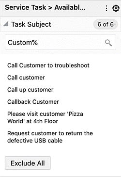
If a search is made, the Exclude All button excludes all the search results.
Negative refinements change the refinement behavior of multi-select AND attribute to multi-select OR and vice-versa.
| Negative Refinement Selection | Single Assignment, Positive | Single Assignment, Negative | Multiple Assignment, Positive | Multiple Assignment, Negative |
|---|---|---|---|---|
| Single Selection | = |
< > |
N/A | N/A |
Multiple Selection OR |
N/A | N/A | OR |
NOT X AND NOT Y |
Multiple Selection AND |
N/A | N/A | AND |
NOT X OR NOT Y |
Advanced String Search (Like Search)
Available refinements support LIKE search for attribute type: 'string' and search queries using operators such as: '*/%' - for zero or more characters and '?' - for one character allowing the user to perform searches with partial matches or exact matches. Search results are immediately applied as refinements in selected refinements.
Clicking the magnifying glass icon performs a LIKE search even when no partial search operators are included in the search query. A partial search operator is implicitly added at the end of the search query if no operator has been mentioned.
Like Search in Available Refinements
Like Search in Selected Refinements
Additional Features for Filters
Range Filter
Beginning with V7, a user can switch between the range display and list display for date and numeric attributes in the available refinements and breadcrumb features.
Also, a slider is available in the numeric attribute to improve user usability for range filters.
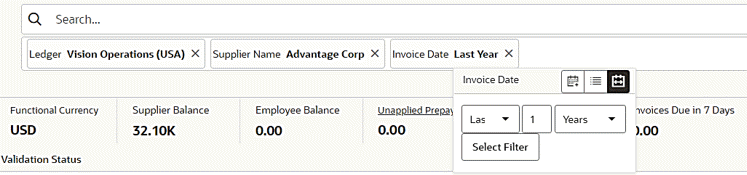
Relative Date Filter
Beginning with V7, a Relative Date Filter allows the business users to filter on the dashboard based on a sliding window of time. Users can also take advantage of the default saved search with the relative date.
Users can apply time-based filters to any date and DateTime column in the dashboard with the relative date filter. For example, users can use the relative date filter to show only sales data that has occurred within the last 30 days (calendar months). From the available refinement; the user can filter by relative date filter from any date attribute by clicking on the relative date icon.
The default filter is "Today" and the user can switch between the different variations of relative dates. Also, the user can specify a relative date period as either an explicit number of past or future time units (for example, 2 years) or specify a previous period. For example, Year To Date, which includes data from 1-January this year to the current date, and Month To Date, which includes data from the beginning of the month to the current date.
Relative Date Filter in Available Refinements
Relative Date Filter in Selected Refinements
Visualization Components
Oracle Enterprise Command Center Framework has a set of graphs and charts that provide a powerful way of summarizing and presenting data that are critical in decision making. The user can thus find insights, detect outliers, filter the data directly from the charts, and drill down to a deeper level of detail. The following sections describe these components.
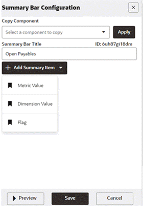
Summarization Bar
The Summarization Bar (also called the Summary Bar) allows users to get their footing into a particular business area by viewing metric or dimension values that summarize important aspects about the business area covered by the dashboard.
In V5, the summarization bar also displays abbreviated numbers for values of flag and metrics above 1000. The abbreviation is language-sensitive.
An entry in the summarization bar can be one of the types in the following table:
| Summary Item | Description |
|---|---|
| Metric | Displays the value of a specific metric, such as total sales or average profit. Can be used to navigate to a destination dashboard or tab and optionally invoke a refinement action. Supported types of aggregation for metric: SUM, AVERAGE, MIN, MAX, COUNT and COUNT DISTINCT |
| Dimension | The dimension value associated with either the top or bottom value of an associated metric value, such as the product category with the highest total sales. |
| Flag | Flags display the count of the configured dimension. Additional metrics are displayed in the pop-up. |
Summarization Bar

Configuration
The general configuration options and item-specific configuration options are listed below.
General Configuration
| Option | Description |
|---|---|
| + Add Summary Item | Click the drop-down arrow beside + Add Summary Item and select the type of summary item to add from the list. |
| Title | Summary item title |
| Data Set | Select data set |
Notes:
-
To determine the order for displaying summary items, drag each item in the list to the desired order.
-
To delete a summary item, click its 'x' icon.
Configuration Steps for Summary Bar
-
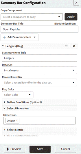
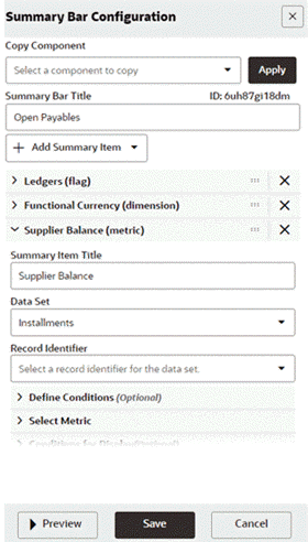
Enter the summary bar title and add Flag as a summary item.
Example of Defining the Summary Bar Title and Adding Flag as a Summary Item
-
Enter the following:
-
Define the flag title.
-
Define the data set name.
-
Enter a record identifier if needed.
-
Enter a flag color if needed.
-
Define conditions if any.
-
Select the dimension.
Example of Additional Configuration Fields for a Summary Bar
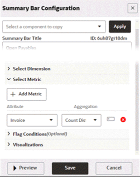
-
-
Define a metric (optional).
Example of a Metric for a Summary Bar
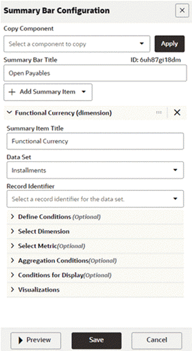
-
Add another summary bar item - Dimension.
Define the summary item title.
Define the data set.
Example of Defining Another Summary Bar Item
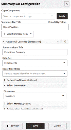
-
Select the attribute to be used as the dimension.
Example of Selecting an Attribute as a Dimension
-
Add a new summary bar item - Metric.
Define a title and data set.
Example of Adding Another Summary Bar Item (Metric)
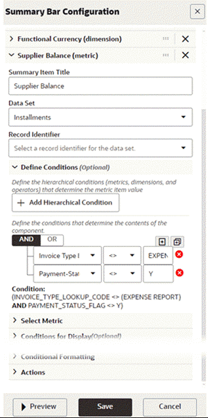
-
Add conditions as required.
Example of Defining Conditions for a Summary Bar
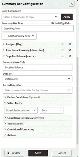
-
Define metrics.
Example of Selecting a Metric
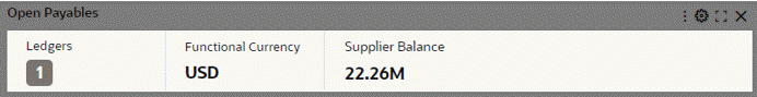
-
Preview the summary bar.
Preview of a Summary Bar
Specific configuration per item
Visualization:
| Option | Description |
|---|---|
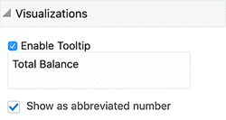
| Enable Tooltip | Allow adding a tooltip to describe the summary item. |
| Tooltip Text | Use the {Value}token to represent the value. |
Abbreviated numbers can be shown, with the following characteristics:
-
Supported for flag and metric
-
Allows display of abbreviated numbers instead of actual values
-
Actual values are displayed as a tooltip with any tooltip text beneath it
-
Values above 1000 are abbreviated till displaying till two decimal points
-
The abbreviation is language-sensitive
| Option | Description |
|---|---|
| Show as abbreviated number | From Visualizations accordion, Enable Show as abbreviated number |
Visualization Configuration Option
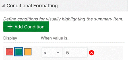
Conditional Formatting
-
Supported only in the Metric item
-
Enables displaying the metric values in different colors based on specific conditions
| Option | Description |
|---|---|
| Add Condition | Add one or more conditions |
| Formatting |
|
Conditional Formatting Configuration
Conditional Formatting at Runtime

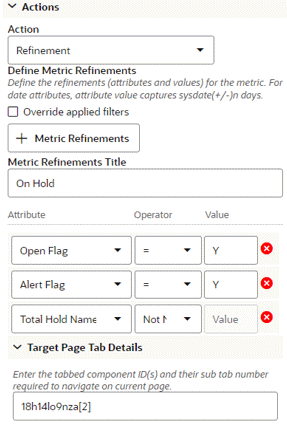
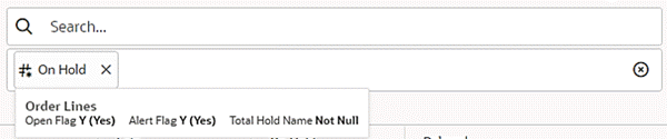
Action
-
Supported only in the Metric item.
-
Allows users to click the metric value to navigate to a different dashboard or apply a refinement action.
-
Introduced in V12, aliasing is supported in metric refinements. This is an optional parameter. If not specified, the component title will be used for aliasing. This feature enhances user experience by showing a meaningful name in the selected refinement. Upon hover, user can find out details of the refinements applied under the metric refinement.
| Option | Description |
|---|---|
| Action | From the action type list, select the action. |
| Refinement Action |
|
Metric Refinement Action Configuration
Metric Refinement in Runtime
| Option | Description |
|---|---|
| Hyperlink Action |
|
In V16, the hyperlink action is enhanced to support opening the target URL in a drawer. Conditional action display can be configured.
Hyperlink Action Configuration
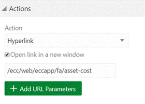
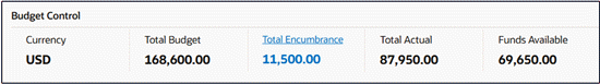
In addition, the metric item look and feel is enhanced to give the business user an indication that there is a hyperlink defined.
Metric Item "Total Encumbrance" with Hyperlink Indication
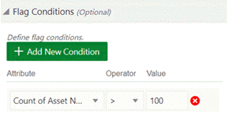
Flag Condition
-
Use the Flag Conditions to add a condition that must be met for the flag summary item to display.
-
A flag summary item is only displayed on the end user view if at least one value matches the condition defined.
| Option | Description |
|---|---|
| + Add Condition |
|
Flag Condition Configuration
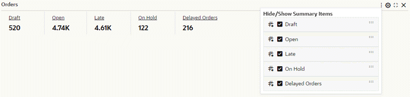
Beginning with V10, users can personalize the Summarization Bar component by including, excluding, or reordering items using the runtime options window. For more information, see User Personalization.
Example of Summarization Bar Personalization Through Runtime Options
The Flag Search feature is introduced in V12. This search capability within a flag pop-up allows users to search within the entire list, rather than being restricted to the 100 items displayed. This search functionality inherits the capabilities available in the Available Refinement feature. It is important to note that this search functionality is applicable exclusively to dimensions.
Example of Searching within the Flag Pop-up Window
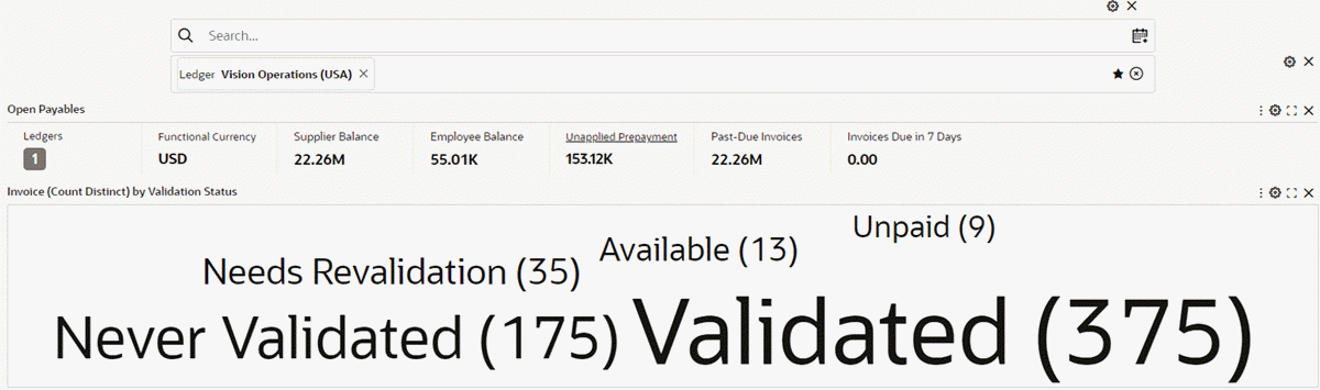
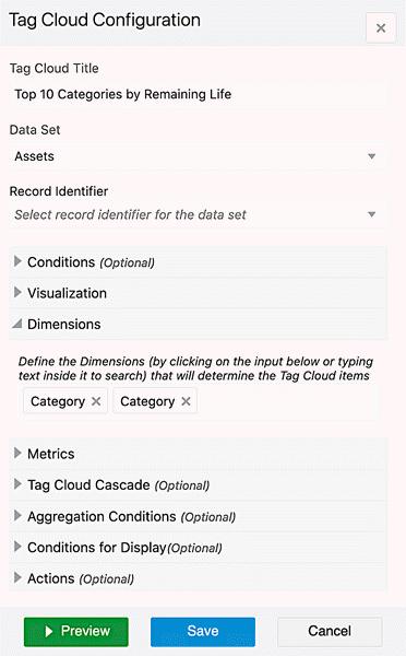
Tag Cloud
The Tag Cloud component allows users to compare a set of displayed terms based on the value of an associated metric. The component can optionally display the metric value associated with each term.
Tag Cloud Example
Configuration
Configuration information for a tag cloud is listed below.
General configuration
The terms displayed on the Tag Cloud are values from a selected dimension. You can configure a list of available dimensions for users to select from.
The value of the selected metric determines the relative size of the Tag Cloud terms.
Tag Cloud Configuration
Specific configuration
Specific configuration options for the Tag Cloud are listed below.
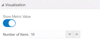
Visualization
Provide additional display configuration options for the Tag Cloud.
| Option | Description |
|---|---|
| Show Metric Value | Turn on this option to display the calculated metric value for each Tag Cloud term. |
| Number of Items | Type or select the maximum number of terms to display on the Tag Cloud. |
Tag Cloud Visualization Configuration
Tag Cloud Cascading
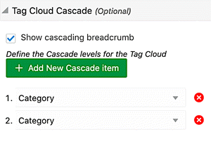
Cascading levels are displayed as a trail of breadcrumbs, called cascading breadcrumbs, on the top right corner of tag cloud giving a better understanding of drill-downs applied to reach the current state.
| Option | Description |
|---|---|
| Show cascading breadcrumb | Disable to not display cascading breadcrumbs |
| + Add Cascading |
Note: To add a cascading level, all dimensions should be redefined in the dimension section. |
Tag Cloud Cascading Configuration
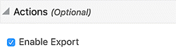
Export in Tag Cloud
Underlying data of the Tag Cloud component can be exported in a CSV file. Exported data honors all runtime changes. As the underlying data needs to be holistic, exported data of the chart contains all the data irrespective of how many dimensions are displayed. The Export feature is controlled from the Actions accordion.
Tag Cloud Export Configuration
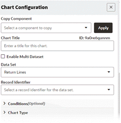
Chart
The Chart component displays a graphical chart based on the application data. It supports several sub-types and includes options for selecting the specific data to display.
The chart subtypes are described below.
-
Bar Chart
Bar charts show one or more metric values aggregated across a series dimension or group dimension.
Bar Chart Example
They are useful for precise comparisons of one or more values.
-
Bar/Line Chart
Bar/Line charts show metric values aggregated across group or series dimensions on two different scales.
Bar/Line Chart Example
They are useful for showing quantity alongside changes in trends over time.
-
Line Chart
Line charts show one or more metric values aggregated across series dimension or group dimension.
Line Chart Example
They are useful for showing changes or trends.
-
Percentage (Percent) Chart
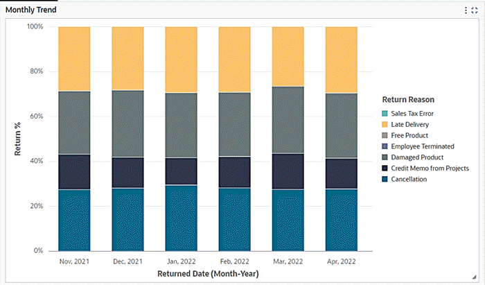
Introduced in V10, a percentage chart (also called a percent chart) allows for visualizing the relative percentage of multiple data series in stacked bars, where the total of each stacked bar always equals 100%. Similar to a pie chart, a percentage-stacked bar chart displays the part-to-whole relationship. However, unlike a pie chart, it can also illustrate how proportions change over time. Users have the flexibility to switch the stacked bar chart to a percent chart using runtime options. Additionally, setting the percent chart as the default view is subject to the designer's choice, as it is controlled from the configuration.
Example of a Percentage Chart
A user can change the stacked bar chart to percent chart using runtime options. Setting percent chart as the default view is subject to designer's choice as it is controlled by the configuration.
Percent Chart Configuration Options Option Description Show as Percentage Converts a stacked bar chart to a percent chart, and it is used to set up a percent chart as the default view. -
Time Series Chart
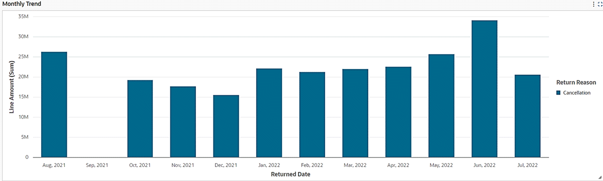
Introduced in V10, additional configuration options are available for bar and bar/line charts to visualize a series of data points collected over time. This time series chart feature aids in aggregating daily data to monthly, quarterly, or yearly levels, thus facilitating time-based analysis. The time (monthly, quarterly, or yearly) buckets are created dynamically without making any changes to metadata level configurations as in the case of date subset. In V11, the time series chart is enhanced to support finer time grains such as Week, Day, Hour, and Minute. Hour and Minute time grains are only supported during cascading. Cascading is explained in detail under the section on common chart features.
Example of a Time Series Chart with Data on a Monthly Level
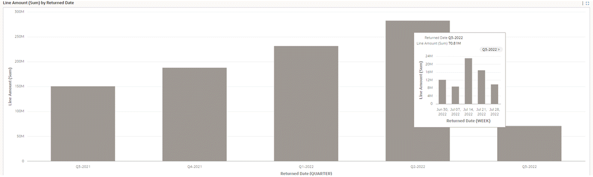
Beginning with V11, the time series chart supports finer time grains such as Week, Day, Hour, and Minute. Hour and Minute time grains are only supported during cascading. The cascading drop-down list has auto-bucketed time grain from the start point till the end based on the attribute profile.
Example of a Time Series Chart with Data on Quarterly and Weekly Levels
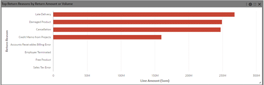
Time Series Chart Configuration Options Option Description Time Dimension Used to define any date or date-time attribute as a time dimension. The date or date-time attribute must have been configured as a dimension. Time Grain Used to set the aggregation for the time dimension. -
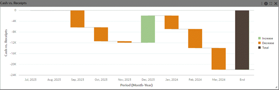
Waterfall Chart
Introduced in V6, the waterfall chart joins the chart family in ECC, offering a valuable tool to illustrate changes to a value over a period of time or dimension.
They are useful in displaying how the initial state and ending state has changed over a dimension while signifying the major contributors to this change.
Waterfall Chart Example
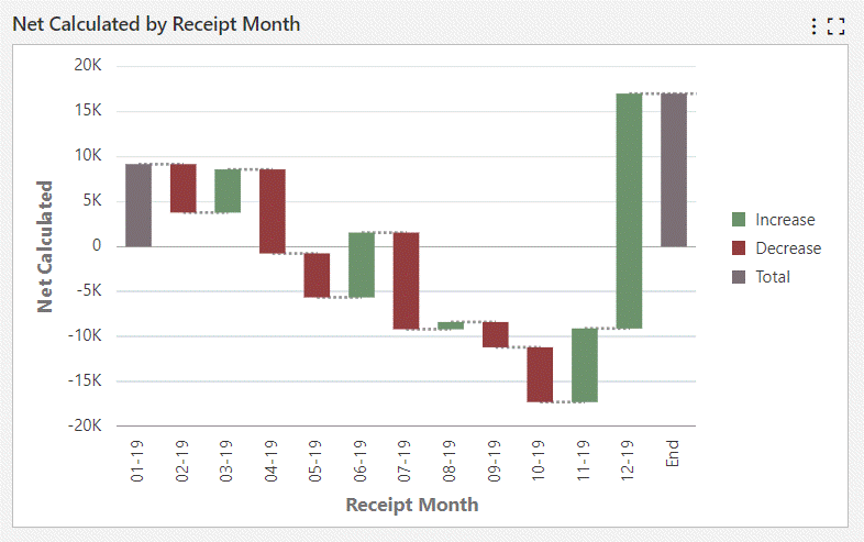
A waterfall chart can be controlled to display the beginning and ending totals. The value of first dimension is depicted as the beginning total and a dummy "End" bar is added to show the final value.
A waterfall chart can also display connecting lines to connect each bars in so that the user understands what is starting value and ending value for every dimension.
The waterfall chart is a subset of the Bar chart and honors the common functionalities of charts.
-
Pie/Donut Chart
Pie/Donut charts show a single metric aggregated across a series dimension.
Pie Chart Example
Donut Chart Example
They are useful for showing how each value contributes towards a total.
-
Scatter/Bubble Chart
Scatter/Bubble Chart
Scatter charts display data points, with each point representing a dimension value. Points can also be aggregated into bins in a binned scatterplot, or measured against a third metric and displayed as scaled bubbles in a bubble chart.
Bubble Chart Example
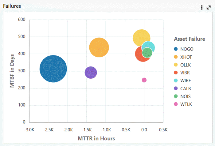
These charts are useful for showing correlations between metrics.
-
Trellis Chart
Introduced in V10, the Trellis Chart displays a series of sub-charts that use the same scale and axes, making relationships among the data easier to understand. A trellis chart splits a chart into multiple versions of itself, presented side-by-side (or one above the other), with its data partitioned across these versions by a chosen series dimension (for example, splitting a "sales by category" column chart across product lines or country). The following example has two versions of a chart for period-to-date balances over journal date, one for expenses and the other for revenue.
Example of a Trellis Chart
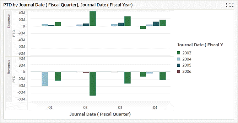
Based on the configuration, end users can choose to flip between trellis rows and trellis columns, or choose to remove the Trellis option from the Chart Visualization completely.
Beginning with V11, Pie and Donut charts are also supported in Trellis.
The Trellis Chart runtime options are:
-
When user clicks on runtime options, they can see Trellis row/ Trellis column dropdowns if they were configured by the designer respectively. In below example Trellis Row was configured by the designer.
-
Trellis rows: If configured by designers, the end user can use runtime options to flip the Trellis into a Row Trellis, example: Add Account type in Trellis rows. End users can then scroll vertically to view all account types with PTD respectively.
-
Trellis Columns: If configured by designers, end user can use runtime options to flip the Trellis into a Column Trellis, example: Add Account type in Trellis column. End users can then scroll horizontally to view all account types with PTD respectively.
A trellis chart can be exported to a CSV file but image export for the trellis chart component is not supported in V10.
For configuration, when a designer selects the chart component, they are given a Trellis rows and Trellis columns input box in a new Trellis accordion. They can select any dimension as trellis rows or trellis columns.
-
Multi Data Set Support
Bar and Bar/Line charts support display of metrics from multiple data sets over the common dimensions. The common dimensions should have the same attribute display name and an association should be defined on these data sets.
Association takes care of refining the dashboard appropriately when a filter is applied from the chart. Metrics are aggregated according to the data corresponding to the data set. If a dimension value is missing from any of the data set, it is shown with a corresponding zero value.
Multi data Set Support is applicable for multi-metric charts and honors the existing functionalities of a multi-metric chart.
Once Multi Data Set Support is enabled, a designer can configure the conditions and record identifier for each data set.
Multi Data Set Support also allows users to configure metrics from the same data set but with different conditions or record identifiers.
General Configuration
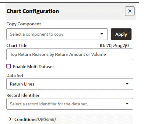
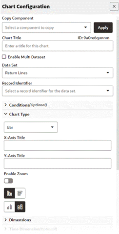
Configuration options for charts are described below.
| Option | Description |
|---|---|
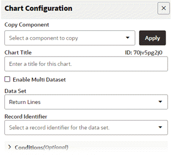
| Title | The title of the chart. |
| Data Set | Select a data set to associate with the chart. |
| Enable Multi Data Set | Use this flag to enable configuration support to multiple data sets. |
| Chart Type | Select a chart type. |
| Dimension | Series dimension: The series dimension is mandatory (M) in most of the chart types, as described in the table below. |
| Time Dimension (Optional) | Provision to set a date or date-time attribute as a time dimension and to set its aggregation (Daily, Weekly, Monthly, Quarterly and Yearly). |
| Type | Group Dimension | Series Dimension |
|---|---|---|
| Bar | N/A | (M) Category axis |
| Stacked Bar | Category axis | (M) Color |
| Stacked Bar Percentage | Category axis | (M) Color |
| Multi-Metric Bar | N/A | (M) Category axis |
| Line | N/A | (M) Category axis |
| Stacked Line | Category axis | (M) Color |
| Bar/Line | Category axis | (M) Category axis |
| Stacked Bar/Line | Category axis | (M) Color |
| Multi-Metric Bar/Line | N/A | (M) Category axis |
| Bubble | (M) Color | Number of Bubbles |
| Scatter | (M) Shape and Color | Number of Shapes |
| Pie/Donut | N/A | (M) Wedge color |
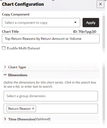
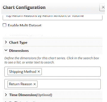
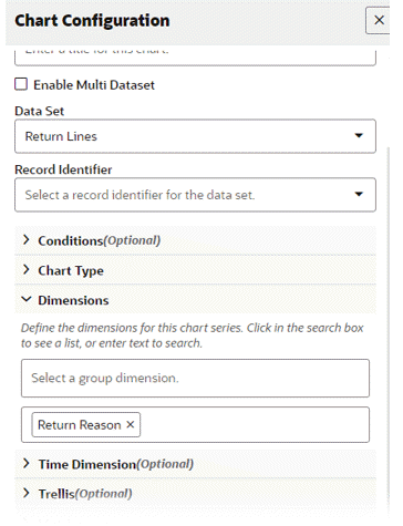
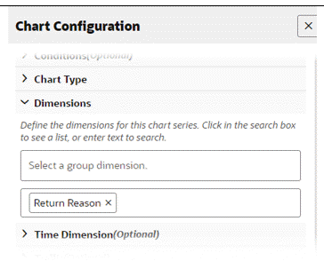
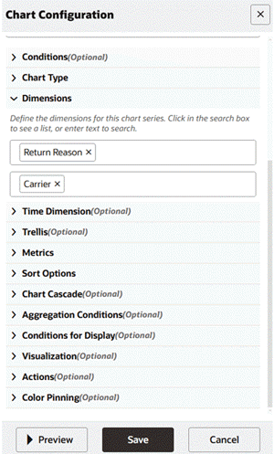
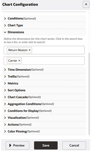
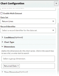
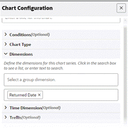
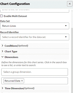
In the Chart Dimensions window, you can define the dimensions for a chart. Click in the search box to see a list of dimensions, or enter text to search for a specific dimension.
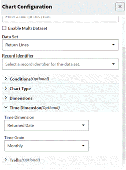
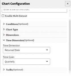
Use the Time Dimension configuration window to optionally define the options for the time dimension. For example, the Time Dimension could be 'Returned Date' and the Time Grain could be "Monthly'.
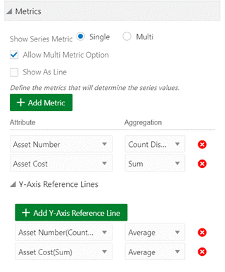
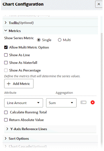
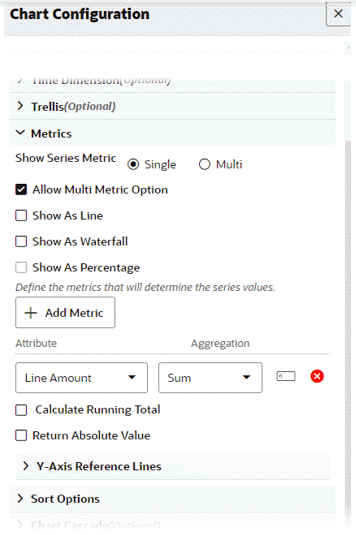
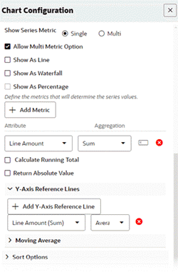
| Option | Description |
|---|---|
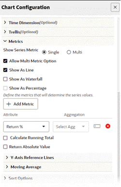
| Metric | The metric to be displayed in the chart. |
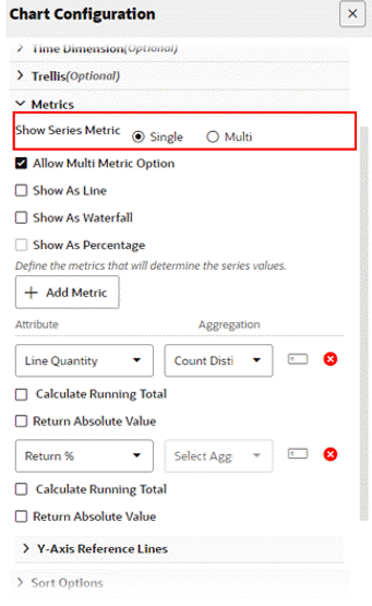
| Show Series Metric (Single vs. Multi) | Controls the display of metric values all at once on a chart, or controlled by the user through chart runtime options. |
| Allow Multi Metric Option | Allow business users at runtime to change the chart from single to multi- metric. This option is checked by default. |
| Show as Line | Convert a bar chart to a line chart. |
| Show as Waterfall | Convert a bar chart to a waterfall chart. The waterfall chart component supports only a bar chart with a single dimension and a single metric. |
| + Add Metric | Select metric attribute + aggregation function as below:
|
| Return Absolute Value | Convert negative values to absolute values. |
| + Add Y Axis Reference Line |
|
Chart Metric Calculation
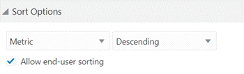
Sort Options:
-
Control sort order and sort attribute. Either the dimension or the metric can be specified as the sort key. Alphabetical sorting applies to dimensions while numerical applies to metrics.
-
Allows end user sorting; enables the end user to change the default sorting at runtime
Chart Sort Option
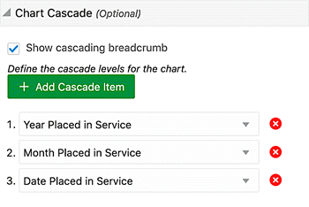
Cascading levels are displayed as a trail of breadcrumbs, called cascading breadcrumbs, on the top right corner of a chart. This feature gives the user a better understanding of drill-downs applied to reach the current state.
| Option | Description |
|---|---|
| Show cascading breadcrumb | Disable to not display cascading breadcrumbs. |
| + Add Cascading Item | Select the first dimension (the top level of the cascade). To add another cascade level, click +Add Cascading Item and select second dimension (The new dimension is added to the end of the cascade). Note: To add a cascading level; all dimensions should be redefined in the series dimension section. |
Chart Cascading Configuration
Additional Options for Line and Bar/Line Charts
This section describes configuration options for line charts. For more information on line charts, refer to Data Visualization, Oracle E-Business Suite User's Guide.
| Option | Description |
|---|---|
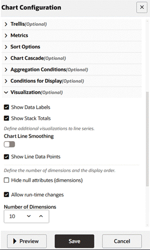
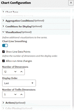
| Chart Line Smoothing | Enable the flag to display a smooth line with curvature. Applicable for line and bar/line charts. |
| Show Line Data Points | Controls the display of data points on the line. Applicable for line and bar/line charts. |
Visualization Configuration for Line and Bar/Line Chart Options
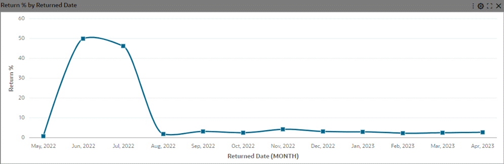
Example of a Line Chart with Smoothing and Data Points
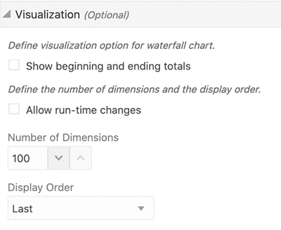
Additional Options for Waterfall Charts
| Option | Description |
|---|---|
| Show as Waterfall | Converts bar chart to waterfall chart. Note: Group dimension should not be configured as waterfall chart does not honor stacking. |
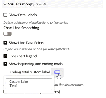
| Show beginning and ending totals | Displays totals in the chart. Also enables the runtime option allowing the user to control the display of total bars. |
| Color Pinning | Controls pinning colors for the increase bar, decrease bar, and total bar. Note: Color pinning in configuration is enabled by default. |
Visualization Configuration for Waterfall Chart
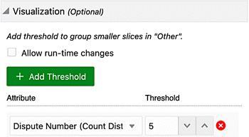
"Other" in Pie/Donut Charts
Dimensions corresponding to a percentage lower than the threshold are grouped into the "Other" group. If configured, the threshold limit is also controlled from runtime options.
"Other" is always displayed last in the legend. "Other" considers sorting based on the metric – when sorted in ascending order, "Other" is the first group and when sorted in descending order, "Other" is the last group.
"Other" is always displayed at the end of the legend regardless of the sorting option on the dimension. A user can filter by "Other" from the chart to drill down to data grouped in "Other". Also, the user cannot filter by "Other" from the chart legend.
| Option | Description |
|---|---|
| Allow run-time changes | Enable the flag to allow the business user to make changes to the threshold. |
| + Add Threshold | Select each metric and configure threshold corresponding to that metric. The dimensions with metric values below this threshold will be grouped into “Other”. Click + Add Threshold for adding a threshold to another metric. |
Visualization Options for "Other" Feature in Pie/Donut Charts
Example of "Other" in a Pie Chart
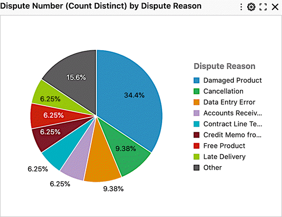
Chart Configuration in Action with Examples
-
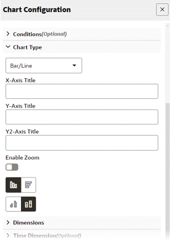
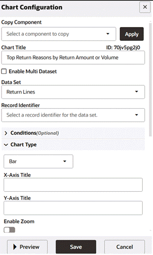
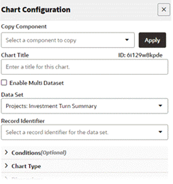
Define the chart title and data set.
Note: The chart title is an optional parameter. Unless it is explicitly set, Enterprise Command Center Framework generates a title based on the dimensions and metrics used in the chart.
Configuration for Chart Title and Data Set
-
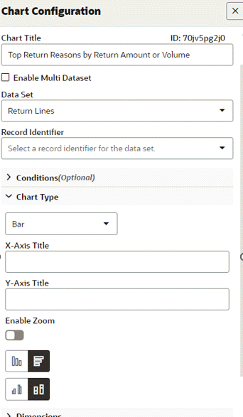
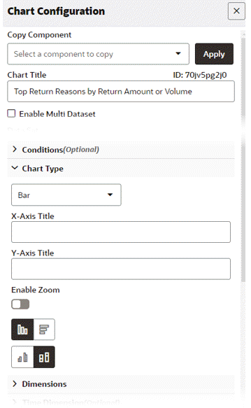
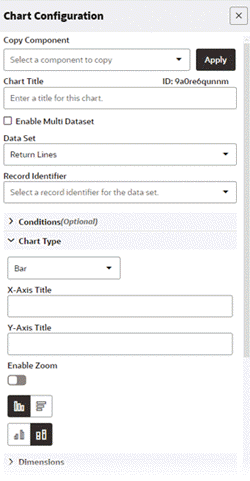
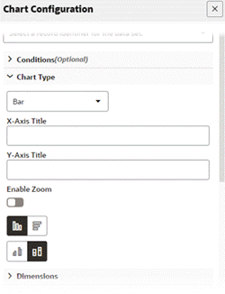
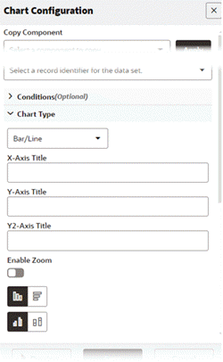
Define the chart type.
The x-axis and y-axis titles are optional as ECC can generate them from the dimensions and metric selected.
Enable zoom if required. Enabling zoom allows the user to zoom in at runtime. Zooming helps enhance the readability of the chart when the metric values are small.
Define the layout:
-
Horizontal versus Vertical
-
Stacked versus Unstacked (applicable to a stacked chart only)
Configuration of the Chart Type
-
-
Set the series dimension.
Configuration of the Series Dimension
-
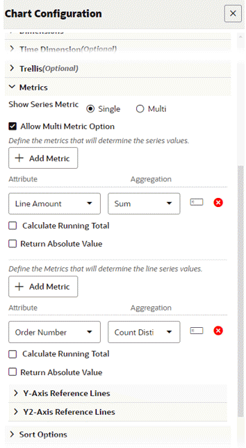
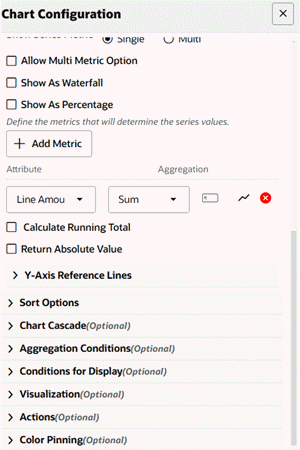
Set the metric.
Chart Configuration of Metrics
-
Preview the chart.
Preview of a Bar Chart
Stacked Bar Chart
-
Define the chart title and data set.
Note: The chart title is an optional parameter. Unless it is explicitly set, Enterprise Command Center Framework generates a title based on the dimensions and metrics used in the chart.
Configuration of the Chart Title and Data Set
-
Define the chart type.
The x-axis and y-axis titles are optional as ECC can generate them from the dimensions and metric selected.
Enable zoom if required. Enabling zoom allows the user to zoom in at runtime. Zooming helps enhance the readability of the chart when the metric values are small.
Define the layout:
-
Horizontal versus Vertical
-
Stacked versus Unstacked (applicable to a stacked chart only)
Configuration of the Chart Type
-
-
Set the group and series dimension.
Chart Configuration of the Group and Series Dimensions
-
Set the metric.
Chart Configuration of Metrics
-
Preview the chart.
Preview of a Stacked Bar Chart
Bar/Line Chart
-
Define the chart title and data set.
Note: The chart title is an optional parameter. Unless it is explicitly set, Enterprise Command Center Framework generates a title based on the dimensions and metrics used in the chart.
Configuration of the Chart Title and Data Set
-
Define the chart type.
The x-axis and y-axis titles are optional as ECC can generate them from the dimensions and metric selected.
Enable zoom if required. Enabling zoom allows the user to zoom in at runtime. Zooming helps enhance the readability of the chart when the metric values are small.
Define the layout:
-
Horizontal versus Vertical
-
Stacked versus Unstacked (applicable to a stacked chart only)
Configuration of the Chart Type
-
-
Set the series dimension.
Configuration of the Series Dimension
-
Set the metric for the bar and the metric for the line.
Configuration of the Metrics for the Bar and the Line
-
Preview the chart.
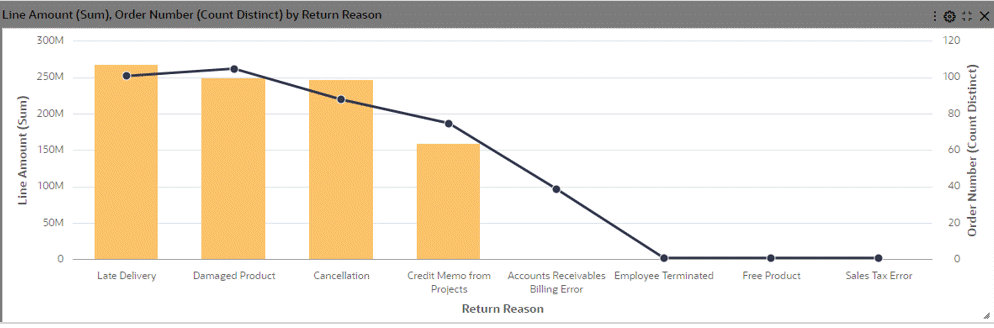
Preview of a Bar/Line Chart
Single Metric versus Multi-Metric View
-
Define the chart title and data set.
Note: The chart title is an optional parameter. Unless it is explicitly set, Enterprise Command Center Framework generates a title based on the dimensions and metrics used in the chart.
-
Define the chart type.
The x-axis and y-axis titles are optional as ECC can generate them from the dimensions and metric selected.
Enable zoom if required. Enabling zoom allows the user to zoom in at runtime. Zooming helps enhance the readability of the chart when the metric values are small.
Define the layout:
-
Horizontal versus Vertical
-
Stacked versus Unstacked (applicable to a stacked chart only)
-
-
Set the series dimension.
Configuration of the Series Dimension
-
Set multiple metrics.
Note here that for "Return %", no aggregation has been defined. It is a calculated attribute, and hence the aggregation is already defined for it in metadata.
Toggle between values of "Show Series Metric: Single Vs Multi."
Configuration of Multiple Metrics
-
Preview the chart.
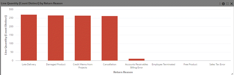
When the Show Series Metric value is set to Single, the chart displays values for that single metric.
Preview of a Bar Chart for a Single Metric
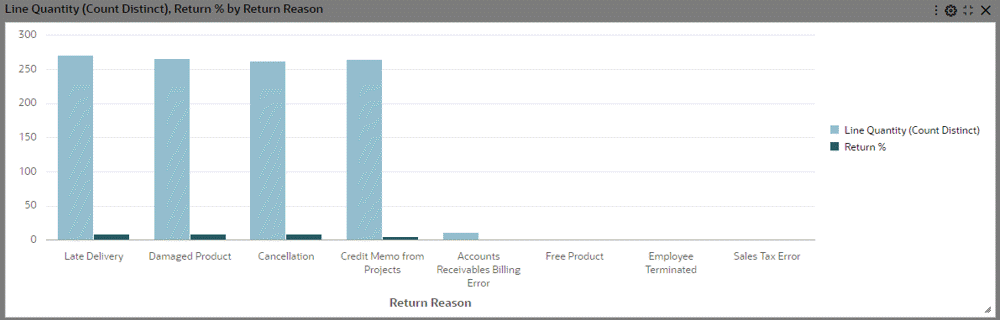
When the Show Series Metric value is set to Multi, the chart displays data for multiple metrics.
Preview of a Bar Chart for Multiple Metrics
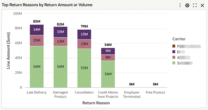
Data Label Support in Bar and Bar/Line Charts
Introduced in ECC V14, Data Label support in Charts allows users to display precise values directly on visualization, enabling quick interpretation of chart data without the need to hover over elements. Data labels are supported in Bar and Bar/Line charts, including their variations such as percentage charts and waterfall charts. Additionally, Data Label support extends to the trellis view.
| Option | Description |
|---|---|
| Show Data Labels | Controls display of metric labels on chart. |
| Show Stack Totals | Controls display of stack totals. Applicable only for stacked chart. |
Important: The effective use of data labels is a shared responsibility between the framework and the designer. ECC automatically hides data labels when space is limited, such as in cases of narrow column widths. Similarly, designers should make a conscious decision to keep data labels hidden when the viewport is crowded with multiple dimensions and metrics, as enabling them in such scenarios may lead to visual clutter for the end user.
-
Configure the data set and chart type.
Configuration of Data Set and Chart Type
-
Set the dimensions.
Setting the Dimensions
-
Set the metric.
Setting the Metric
-
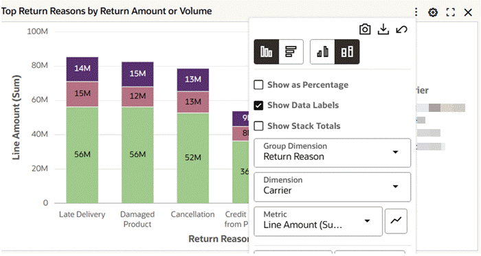
Enable Show Data Labels and Show Stack Totals under Visualization.
Setting Visualization Options
-
Preview the chart.
Example of Data Labels at Runtime
-
At runtime, the user can enable or disable data labels using the Show Data Labels checkbox.
Runtime Option for Data Labels
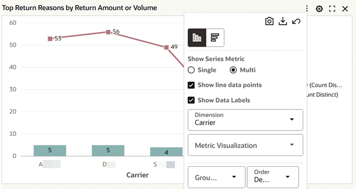
Multi-Metric Chart Features in V14
ECC V14 introduces multi-metric chart enhancements to provide users with greater flexibility in visualizing data by allowing individual metrics to be displayed as either bars or lines within the same chart. Previously, all metrics in a chart followed a uniform format, and while the bar/line combo chart offered some flexibility, it introduced a secondary y-axis, leading to confusion. To address this, V14 enables users to convert specific bar metrics into line representations while maintaining a single, unified y-axis. This applies to both bar and bar/line charts, as well as single and multi-metric views.
Additionally, the global "Show as Line" option has been removed, and metric-level control has been introduced for more granular customization. Users can now modify the visualization style both during configuration and at runtime.
For backward compatibility, To maintain backward compatibility, this option will be enabled for all metrics where "Show as Line" was previously selected.
-
Configure the data set and chart type.
Configuration for the Data Set and Chart Type
-
Set the dimensions.
Setting the Dimensions
-
Set the metric and its visualization style.
Configuration of the Metric
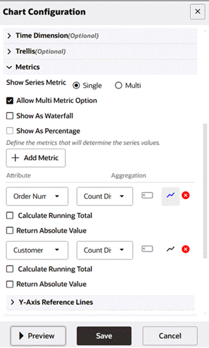
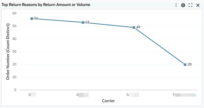
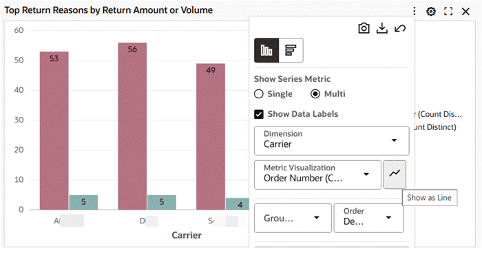
Note that in V14, the global "Show as Line" option is absent. The "Order number (Count Distinct)" metric is marked as line and hence the icon has turned blue. Finally, note that the “Customer (Count Distinct)” metric is kept in the form of bars.
-
The runtime view as a single metric is shown.
Runtime View Example: Single Metric View
-
At runtime, you can switch the chart from a line chart to a bar chart. When this feature is disabled, the button reverts to its original color from blue.
Example of Switching from a Line Chart to a Bar Chart
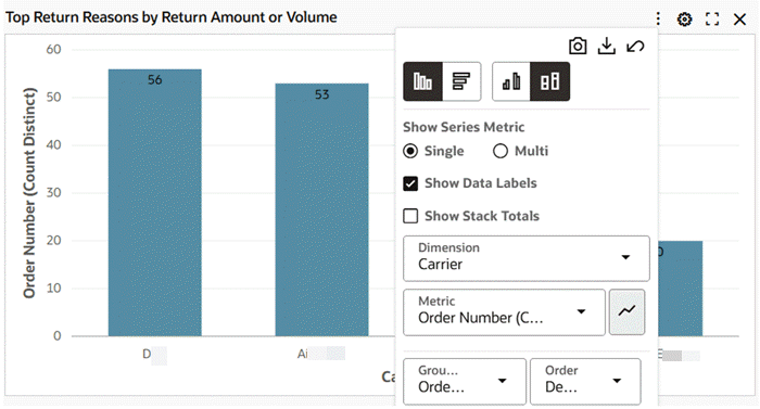
Multi-Metric View: Runtime Switch
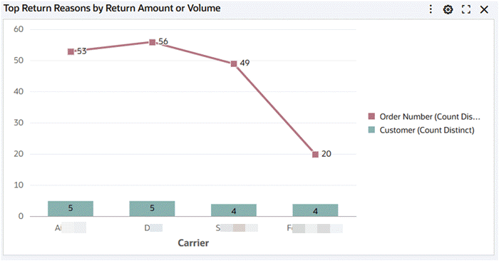
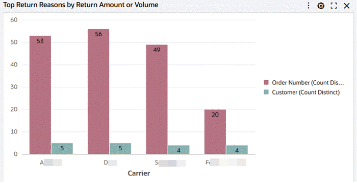
Example of a Multi-Metric Chart
-
Prior to V14, in the multi-metric view, metrics are not displayed.
-
From V14 onwards, metric visualization can be set using runtime option.
-
To set the metric visualization, follow these steps:
-
Open the runtime menu.
Example of Runtime Options Menu
-
Select the metric whose visualization style needs to be switched from bar to line or line to bar. Only one change can be done at once.
In the following example, the Order Number metric is selected.
Example of Selection of Metric
-
-
The updated chart reflect the change from a bar/line chart to a bar chart.
Example of Updated Bar Chart
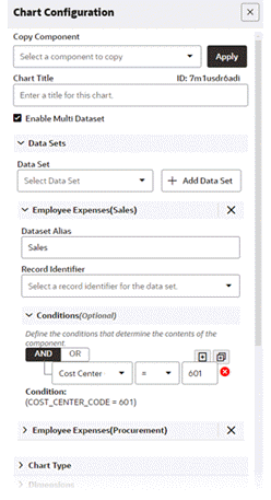
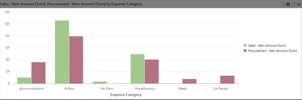
Multi-Data Set Support in Bar and Bar/Line Charts
Bar and Bar/Line charts support the display of metrics from multiple data sets over the common dimensions. The common dimensions should have the same attribute display name, and an association should be defined on these data sets.
The association takes care of refining the dashboard appropriately when a filter is applied from the chart. Metrics are aggregated according to the data corresponding to the data set.
If a dimension value is missing from any of the data sets, it is shown with a corresponding zero value.
Multi Data Set support is applicable for multi-metric charts and honors the existing functionalities of multi-metric chart. Once Multi Data Set support is enabled, the designer can configure conditions and record identifier for each data set. Multi Data Set support also allows users to configure metrics from the same data set but with different conditions or record identifiers.
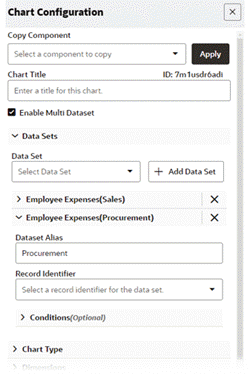
-
Define a Data Set 1 with a condition.
Define a meaningful alias for the data set.
Note: In this example, we are trying to compare expense across categories for Sales and procurement cost centers.
Define First Data Set for Chart Configuration
-
Define a Data Set 2 with a condition. Set a meaningful alias for the data set.
Define Second Data Set for Chart Configuration
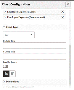
-
Set the chart type and its associated settings. Only Bar and Bar/Line charts support the multi data set feature.
Configuration of the Chart Type
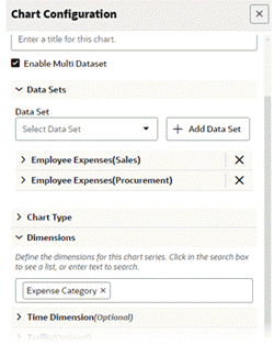
-
Set the common dimension across data sets.
Configuration of a Common Dimension across Data Sets
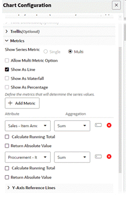
-
Set the metrics for both data sets.
Configuration of Metrics for Both Data Sets
-
Preview the chart.
Preview of a Bar Chart with Multi Data Set Support
Waterfall Chart
| Option | Description |
|---|---|
| Show as Waterfall | Converts a bar chart to a waterfall chart. Note that the Group dimension should not be configured because the waterfall chart does not honor stacking. |
| Show beginning and ending totals | Displays totals in the chart. This option also enables a runtime option for the user to control the display of the total bars. |
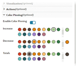
| Color Pinning | This option controls pinning colors for the increase bar, decrease bar, and total bars. Color pinning in configuration is enabled by default. |
-
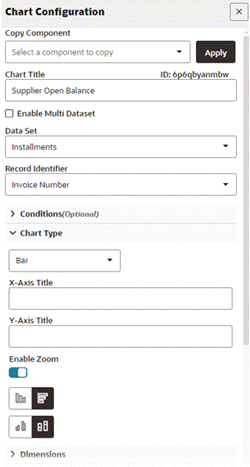
Define the chart title and data set.
Configuration of Chart Title and Data Set
-
Define the chart type.
Configuration of Chart Type
-
Set the series dimension.
Setting the Series Dimension
-
Set the metric.
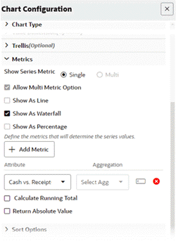
Check Show as Waterfall.
In the following figure, the "Cash Vs Receipt" attribute is a calculated attribute. Therefore, there is no aggregation defined on it.
Setting the Metrics Configuration
-
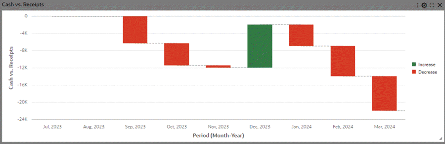
Preview the chart.
Preview of a Waterfall Chart
-
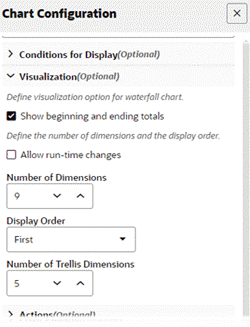
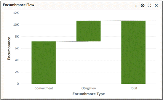
Inside the Visualization accordion in the Chart Configuration window, select the Show beginning and ending totals checkbox.
Selection of the "Show Beginning and Ending Totals" Box
-
Enable color pinning.
Enabling Color Pinning
-
Preview the chart again.
Preview of A Waterfall Chart with Totals and Color Pinning
Adding a Custom Label
-
In ECC V16, you can also add a custom label for the total bar in a waterfall chart. Use the Ending Total Custom Label field under Visualization.
Visualization Window with Ending Total Custom Label Field
-
This meaningful label for the Total bar provides better alignment with business terminology and reporting context. This enhancement thus increases clarity and flexibility in presenting cumulative results.
Example of a Waterfall Chart with a Custom Label for Total Bar
-
Percent Chart
-
Define the chart title and data set.
Define the record identifier.
Set the chart type as Bar.
Set the orientation.
Note: Most of the data sets are stored in a denormalized form. This means that if there are two holds for a single invoice, there would be two records for that invoice. Every other attribute may remain the same. In such cases, if we don’t define a record identifier and try to calculate Invoice amount per Supplier, we may end up in miscalculating the invoice amount because an invoice may appear more than once in denormalized form. Hence, if we define a record identifier, which is Invoice Number in this example, only one record corresponding to that invoice will be selected at random.
Configuration of Chart Title, Data Set, Record Identifier, Type, and Orientation
-
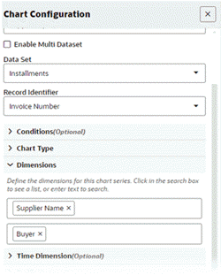
Define the group and series dimensions.
Note: A percent chart only works in a stacked setup. Therefore it is necessary to define both the group and series dimensions.
Configuration of Dimensions
-
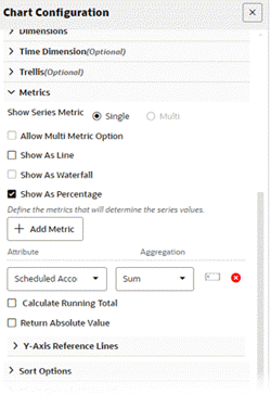
Set metrics.
Select the Show as Percentage checkbox.
Configuration of Metrics
-
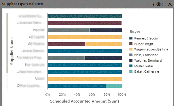
Preview the chart.
Preview of a Percent Chart
Time Series Chart
| Option | Description |
|---|---|
| Time Dimension | To define any date or date-time attribute as a time dimension. The date or date-time attribute must have been configured as a dimension. |
| Time Grain | To set the aggregation for the time dimension. |
-
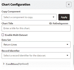
Define the data set.
Configuration for Data Set
-
Define the chart type.
Note that time series charts are supported in bar and bar/line charts only.
Configuration of Chart Type
-
Set a date or date-time attribute as a dimension.
Configuration of Dimension
-
Explicitly declare the dimension as a time dimension.
Set the time grain.
Note: Available time grains are:
-
Daily
-
Weekly
-
Monthly
-
Quarterly
-
Yearly
For a date-time attribute, the hours and minute label time grain is supported only during cascading. Cascading examples are mentioned later in this section.
Declaration of Time Dimension and Setting of the Time Grain
-
-
Set the metric.
Select the Show as Line checkbox.
-
Return % is a calculated attribute and hence aggregation is not defined on it during configuration. Aggregation is already defined in metadata.
-
Show as Line is an optional setting here. It is more meaningful to see time trends in a line chart rather in a bar form.
Note: Beginning with V14, the global "Show as Line" option has been removed and replaced with a per-metric setting for finer control. To maintain backward compatibility, this option will be enabled for all metrics where "Show as Line" was previously selected. Refer to the section on multi-metric charts for more information.
Metrics Configuration
-
-
Preview the chart.
Preview of a Time Series Chart
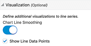
Additional Configuration for Smoothing a Line Chart
| Option | Description |
|---|---|
| Chart Line Smoothing | Enable the flag to display a smooth line with curvature. Applicable for line and bar/line charts. |
| Show Line Data Points | Controls the display of data points on the line. Applicable for line and bar/line charts. |
-
Continue in the same example and make the relevant changes in visualization accordion to smooth the line chart.
Ensure that the Chart Line Smoothing checkbox is selected.
Visualization Configuration Options
-
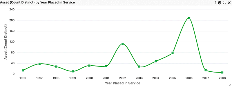
Preview the chart.
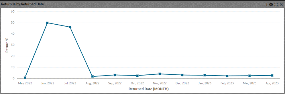
Preview of a Chart with Line Smoothing
Examples of Configurations for Analytical Functions in Charts
| Option | Description |
|---|---|
| + Add Y Axis Reference Line |
|
-
Define the data set.
Configuration of the Data Set
-
Define the chart type.
Time series charts are supported only in bar and bar/line charts.
Configuration of the Chart Type
-
Set a date or date-time attribute as a dimension.
In this example, Returned Date is set as a dimension.
Configuration of a Date as a Dimension
-
Explicitly declare the dimension as a time dimension. In this example, Returned Date is declared as the time dimension.
Set the time grain. In this example, the time grain is Quarterly.
Configuration of Time Dimension and Time Grain
-
Set the metric.
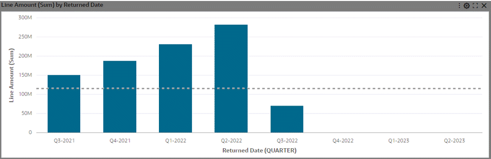
Set the reference line to indicate an average of returned order amount per quarter.
Configuration of Metrics
-
Preview the chart.
Preview of a Reference Line in a Chart
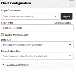
Simple Moving Average
Introduced in ECC V12, the simple moving average (SMA) functionality emerged as a pivotal feature for data analysis and decision-making. By smoothing trends and providing a more stable representation of data, the SMA facilitated the identification of underlying patterns and trends within time series data. Its ability to reduce the impact of short-term volatility enabled users to make more informed decisions with greater confidence over time.
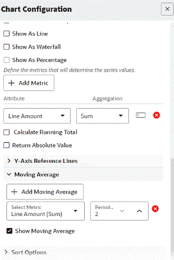
The Simple Moving Average, supported in bar and bar/line charts, is specifically designed for time series data, with the overlaid dotted line enhancing visual clarity without detracting from the original metric. Configuration of the Simple Moving Average is user-friendly, allowing for the definition of the moving average within the metric settings, adjustment of the rolling window, and the option to enable it as a default view.
| Option | Description |
|---|---|
| + Add Moving Average | Allows displaying the moving average on the chart based on a predefined metric. Users need to select the metric and define the moving average window. The default window is two (2) periods. |
| Show Moving Average | Enables the display of the moving average on the default view. |
-
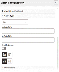
Define the data set.
Configuration of the Data Set
-
Define the chart type.
Note that time series charts are supported only in bar and bar/line charts.
Configuration of the Chart Type
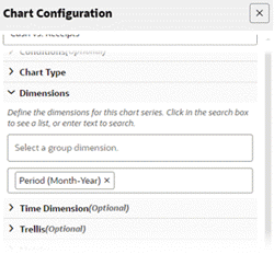
-
Set a date or date-time attribute as a dimension.
In this example, Returned Date is set as a dimension.
Setting the Dimension
-
Explicitly declare the dimension as a time dimension. In this example, Returned Date is declared as the time dimension.
Set the time grain. In this example, the time grain is Quarterly.
Setting the Time Dimension
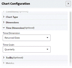
-
Set the metric.
Set the moving average period.
Configuration of Metrics Information
-
Preview the chart.
Preview of a Simple Moving Average in a Chart

Running Total
Introduced in V12, the running total enhancement offers users a powerful tool for gaining comprehensive insights into cumulative metrics across various data aggregations. This feature, accessible through a new checkbox within the metric accordion, allows users to calculate running totals on any type of aggregation, including calculated attributes. With support extending to all bar and bar/line charts except for the Stacked Bar chart, users can now leverage this functionality to enhance their decision-making processes and gain deeper understanding from different perspectives.
| Option | Description |
|---|---|
| Calculate Running Total | Enables the display of the running total on the chart based on a predefined metric. Designers need to define the metric and check the Show running total box. |
-
Define the data set.
Configuration of the Data Set
-
Define the chart type.
Configuration of the Chart Type
-
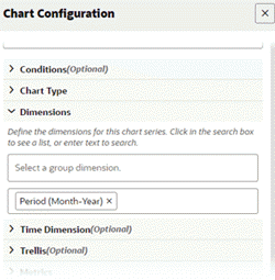
Set the dimension.
Setting the Dimension
-
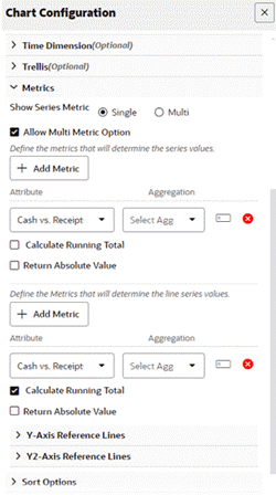
Set the bar metric.
Set the line metric with a running total.
-
"Cash vs. Receipts" in this example is a calculated attribute and hence there is no aggregation.
-
In the bar metric, the metric is used without running total.
-
In the line metric, running total of the same metric is used.
Configuring the Metrics Information
-
-
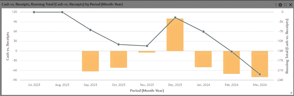
Preview the chart.
Preview of a Running Total in a Chart
Examples of Configuration Steps for Pie and Donut Charts
-
Define the data set.
Configuration of the Data Set
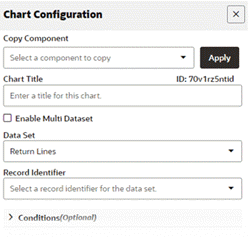
-
Set the chart type to Pie.
Configuration of the Chart Type as Pie
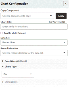
-
Set the dimension.
Configuration of the Dimension
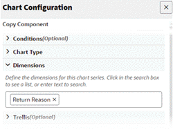
-
Set metric.
Configuration of Metric Information
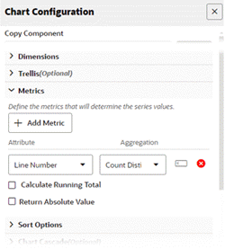
-
Preview the chart.
Preview of a Pie Chart
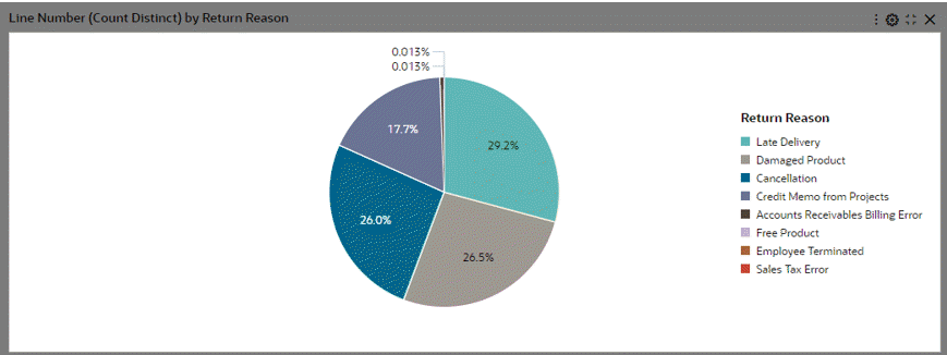
-
Now change the chart type in Step 2 to Donut and preview the chart.
Preview of a Donut Chart
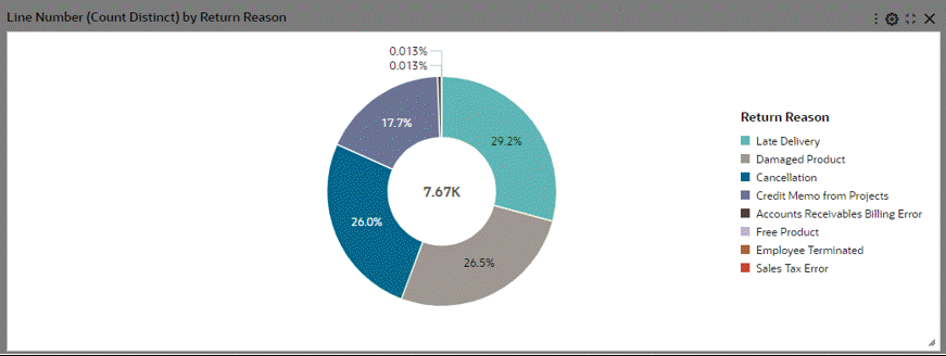
Thresholding using the "Other" Option in Pie/Donut Charts
Dimensions corresponding to a percentage lower than a specified threshold are grouped into a group called "Other." If configured, the threshold limit is also controlled from runtime options. "Other" is always displayed last in the legend. A user can filter by "Other" from the chart to drill down to data grouped in the "Other" group; however, the user cannot filter by "Other" from the chart legend.
| Option | Description |
|---|---|
| Allow runtime changes | Enable this flag to allow the business user to make changes to the threshold. |
| + Add Threshold | Select each metric and configure threshold corresponding to that metric. The dimensions with metric values below this threshold will be grouped into "Other." Click + Add Threshold for adding a threshold to another metric. |
-
Configure a donut chart as described in the steps above.
-
Add a threshold. In the example below, the segments of "Return Reasons" that contribute to less than 5% of the whole will be grouped as "Other." .
Configuration of Threshold Options
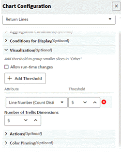
-
Preview the chart.
Preview of a Chart with Thresholding
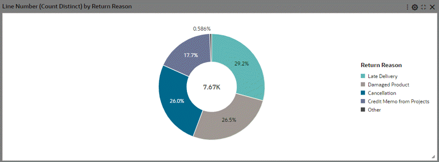
Common Chart Features
Introduced in V10, the support for the Trellis Chart brings forth an alternative chart type designed to enhance data visualization. The Trellis Chart presents a series of sub-charts, all utilizing the same scale and axes, thereby simplifying the comprehension of data relationships. This chart type effectively splits a single chart into multiple versions, arranged side-by-side, with data partitioned across these versions based on a chosen series dimension, such as product lines or country for a "sales by category" column chart.
| Option | Description |
|---|---|
| Trellis Row | Allows displaying data partitioned vertically by the chosen dimension. |
| Trellis Column | Allows displaying data partitioned horizontally by the chosen dimension. |
The support for pie and donut charts with trellis is introduced in V11.
Trellis Chart with Pie Charts
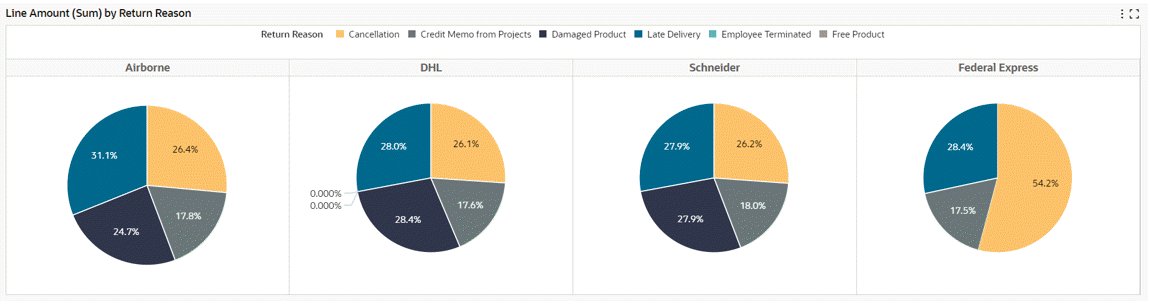
-
Define the data set.
Configuration of the Data Set
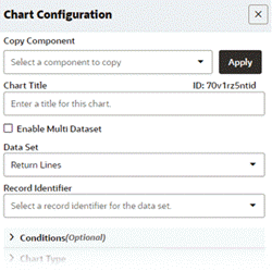
-
Set the chart type to Pie or Donut.
Configuration of the Chart Type
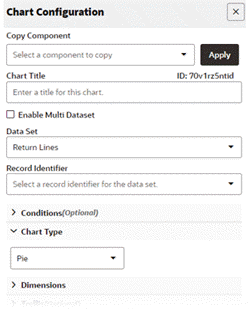
-
Set the dimension.
Configuration of Dimension
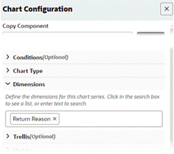
-
Set the metric.
Configuration of Metric Information
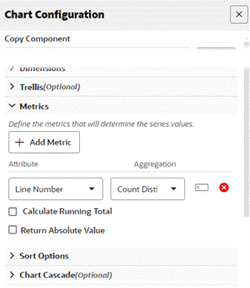
-
Preview the chart.
Preview of Pie Chart
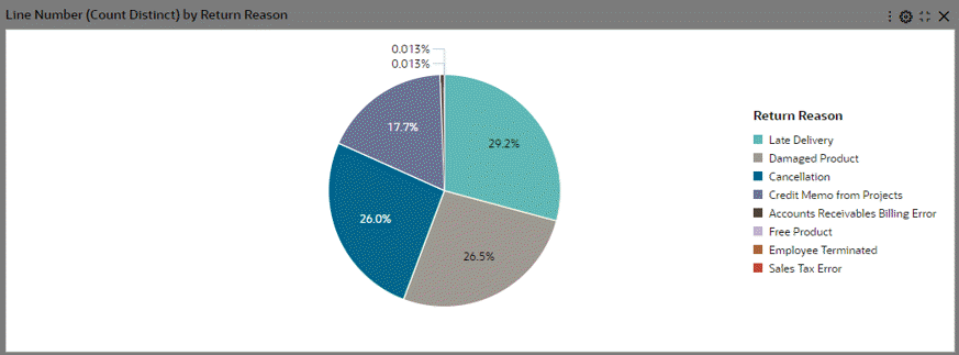
-
Add a trellis row with the attribute "Shipment Method."
Trellis Configuration with Trellis Row
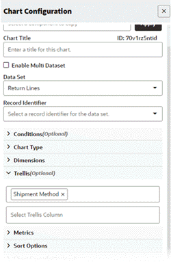
-
Preview the new trellis chart.
Preview of a Trellis Chart with Trellis Row Configured
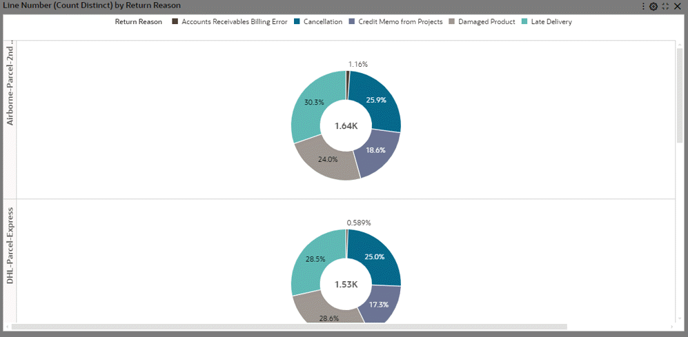
-
Add a trellis column.
Note that in this example, we have removed the attribute "Shipment Method" from Trellis Row and added it under Trellis Column.
Trellis Configuration with Trellis Column
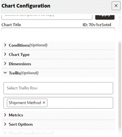
-
Preview the chart.
Preview of a Trellis Chart with Trellis Column Configured
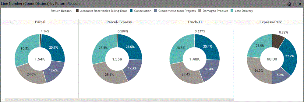
Chart Cascading Option
Introduced in ECC V7, the enhancement of the chart tooltip empowers business users to anticipate the next level of available detail on the chart, thereby enhancing their information discovery experience. For charts with cascading enabled, users can hover over the chart series to visualize the subsequent level of details in a similar chart type.
With the Cascading Breadcrumb feature, cascading levels are displayed as a trail of breadcrumbs on the top right corner of the chart, giving a better understanding of drill-downs applied to reach the current state.
| Option | Description |
|---|---|
| Show cascading breadcrumb | Disable to not display cascading breadcrumbs. |
| + Add Cascading Item | Select the first dimension (the top level of the cascade). To add another cascade level, click +Add Cascading Item and select second dimension. The new dimension is added to the end of the cascade. Note: To add a cascading level; all dimensions should be redefined in the series dimension section. |
-
Define the data set.
Configuration of the Data Set
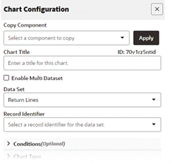
-
Set the chart type to pie or donut (donut in the example here).
Configuration of Chart Type
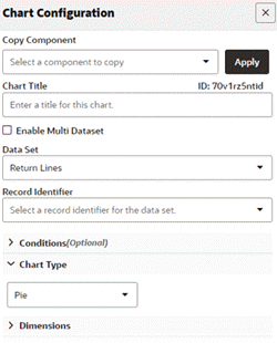
-
Set more than one series dimension to cascade.
Configuration of Dimensions
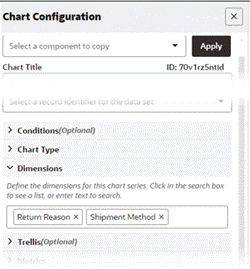
-
Set the metric.
Configuration of the Metric
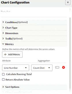
-
Define cascading.
Chart Cascade Configuration
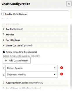
-
Preview the chart.
Preview of a Chart with Cascading
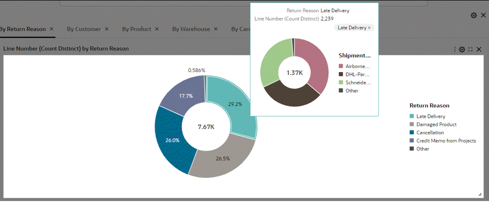
Cascading in a Time Series Chart
In V11, the time series chart has been improved to accommodate finer time grains including Week, Day, Hour, and Minute. Hour and Minute time grains are exclusively available during cascading. The cascading drop-down list now features auto-bucketed time grains from the start point to the end, determined by the attribute profile.
-
Define the data set.
Configuration of the Data Set
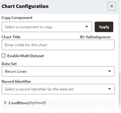
-
Define the chart type. In this example, the chart type is Bar.
Note: Time series charts are only supported in bar/bar-line charts.
Configuration of the Chart Type
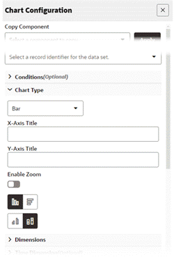
-
Set a date or date-time attribute as the dimension.
Configuration of Dimension
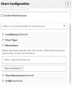
-
Explicitly declare the dimension as a time dimension.
Set the time grain.
Note: Available time grains are:
-
Daily
-
Weekly
-
Monthly
-
Quarterly
-
Yearly
For a date-time attribute, the hours and minute label time grain is supported only during cascading.
Configuration of Time Dimension
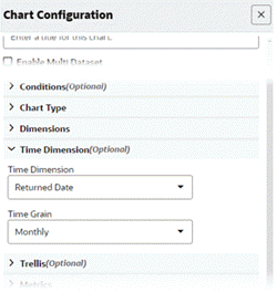
-
-
Set the metric.
Configuration of Metric
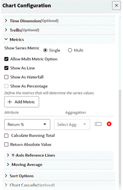
-
Set the monthly to weekly cascading.
Configuration of Chart Cascade
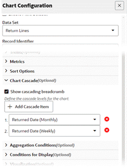
-
Preview the chart. Hover over any bar in previewing.
Preview of Cascading in a Time Series Chart
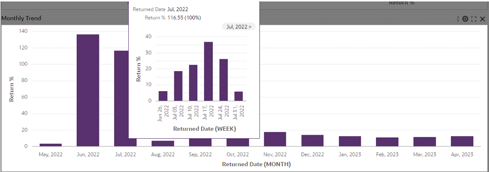
Sorting
Sorting has the following options:
| Option | Description |
|---|---|
| Group Sort | Enable sorting either by group dimension or metric. |
| Series Sort | Enable sorting on series dimension. |
| Trellis Row Sort | To sort by the dimension configured as the trellis row. |
| Trellis Column Sort | To sort by the dimension configured as the trellis column. |
-
Sorting is not possible in a time series chart. A time series chart is always sorted by an ascending order of time dimension.
-
Introduced in V11, alphanumeric sorting enhancements in ECC utilize the link between the code and the meaning attribute for sorting "alphanumeric values" across the dashboard.
Example of Sorting in the Metadata Page
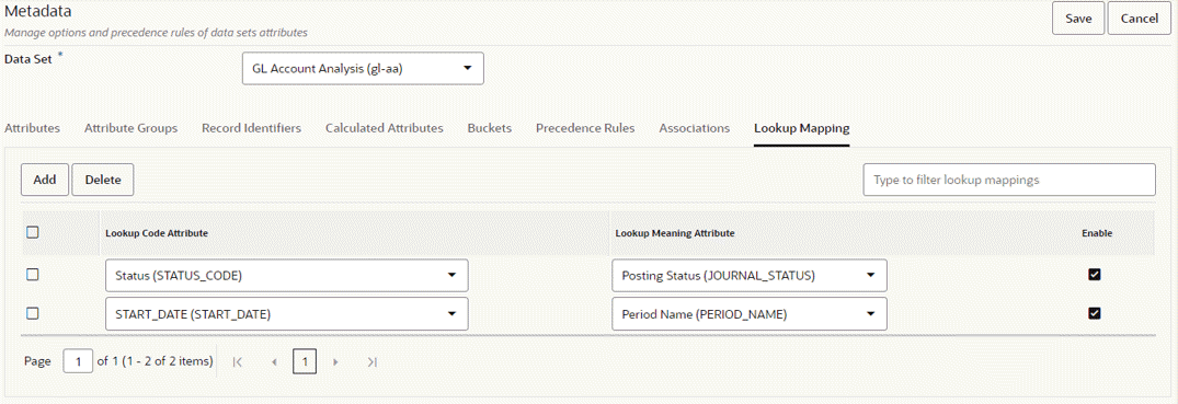
Top N in Charts
For chart types other than Pie and Donut, the Top N feature can be used to include just the essential information by rendering the chart with a subset of dimensions to display only the first N dimensions in the chart. Top N takes the Sort definition into account for considering the first or last N dimensions.
Top N is applicable for all chart types apart from pie and donut chart types, if the group dimension is configured.
In Bar and Bar/Line chart types, if the chart has group dimension, then Top N considers the group dimension; otherwise the series dimension. In Bubble and Scatter chart types, Top N always considers the group dimension.
| Option | Description |
|---|---|
| Number of Dimensions | Controls the number of dimensions displayed on the chart. If the group dimension is configured, the number of dimensions is used to control the number of group dimensions displayed; otherwise, the series dimension is used. |
| Order of Display | Order of display controls whether to display the first or last dimensions after considering sorting. Applicable only if sorting is configured. |
| Number of Trellis Dimension | Controls the number of trellis dimensions displayed on the chart. By default, it is set to five (5). |
Visualization Options for the Top N Feature
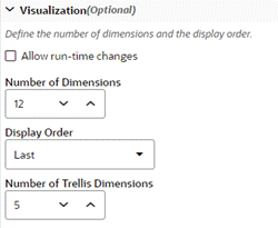
Example of Top N in a Bar Chart
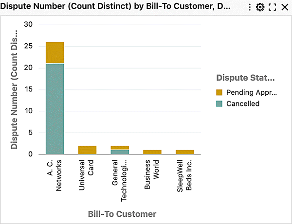
Export in Charts
A chart can be exported as a PNG image that contains a snapshot of the chart. The snapshot contains the chart as-is -- as seen on the dashboard to honor runtime changes and any change in size with chart maximization.
Underlying data of the chart component can also be exported in a CSV file. Exported data also honors all the runtime changes. As the underlying data needs to be holistic, the exported data of chart will contain all the data even if Top N is configured.
Export can be configured from Actions accordion.
| Option | Description |
|---|---|
| Enable Export as Image | This option allows the business user to export a snapshot of the chart. Disable this option to change the default option. |
| Enable Export | Enable this flag to allow the business user to export underlying data of the chart. Disable to change the default option. |
A trellis chart cannot be exported in the form of an image.
Actions Configuration
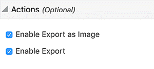
Color Pinning in Charts
Beginning with V6, chart colors can be pinned with context-specific colors. These colors remain intact irrespective of user session.
The following table describes the instances in which color pinning is supported: The availability for color pinning in a group dimension, series dimension, or metric plus threshold is listed for each chart type.
| Chart Type | Group Dimension | Series Dimension | Metric +Threshold |
|---|---|---|---|
| Pie | N/A | Available | N/A |
| Donut | N/A | Available | N/A |
| Bar | N/A | Available | Available |
| Multi-Metric Bar | N/A | N/A | Available |
| Stacked Bar | N/A | Available | Available |
| Line | N/A | Available | Available |
| Multi-Metric Line | N/A | N/A | Available |
| Stacked Line | N/A | Available | Available |
| Bar/Line | N/A | N/A | Available |
| Stacked Bar/Line | N/A | Available | Available |
| Scatter | Available | N/A | N/A |
| Bubble | Available | N/A | N/A |
A color pinned on a dimension (for example, in a pie chart) honors configuration from the metadata. Colors pinned on metrics (for example, in a multi-metric bar chart) honor the component configuration.
Example of Color Pinning
| Option | Description |
|---|---|
| Enable Color Pinning | This control enables configuration for color pinning. |
| Add Color | This option adds an option for color pinning on a metric. |
| Select Metric | Select one of the configured metrics. |
| Select Color | Select one of the colors in color palette. |
| Increase, Decrease, Totals | This option applies to the waterfall chart only. Select colors for each change in waterfall chart. |
| Preview Color | This option applies to the waterfall chart only. The selected color appears for preview. |
Example of Actions Configuration for Color Pinning
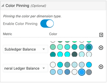
Example of Actions Configuration for a Waterfall Chart
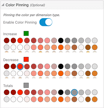
Introduced in ECC V10, a new color palette has been introduced for data set color, summary bar, flag color, and metric colors in components:
Color Palette for Selected Components

In addition, a new color palette is introduced for color pinning in metadata, which will then reflect changes in components such as the Results Grid, and the Results Table.. The following is the color palette for color pinning in metadata:
Color Palette for Color Pinning in Metadata

Aggregated Table
An aggregated table tabulates aggregations across dimensions of interest. The displayed metrics are aggregations defined at design time. The aggregate table displays ten records per page, but when maximized, it displays up to 50 records per page. The aggregated table also displays abbreviated values with actual values displayed in the tooltip. The abbreviation is also language-sensitive.
Example of an Aggregated Table
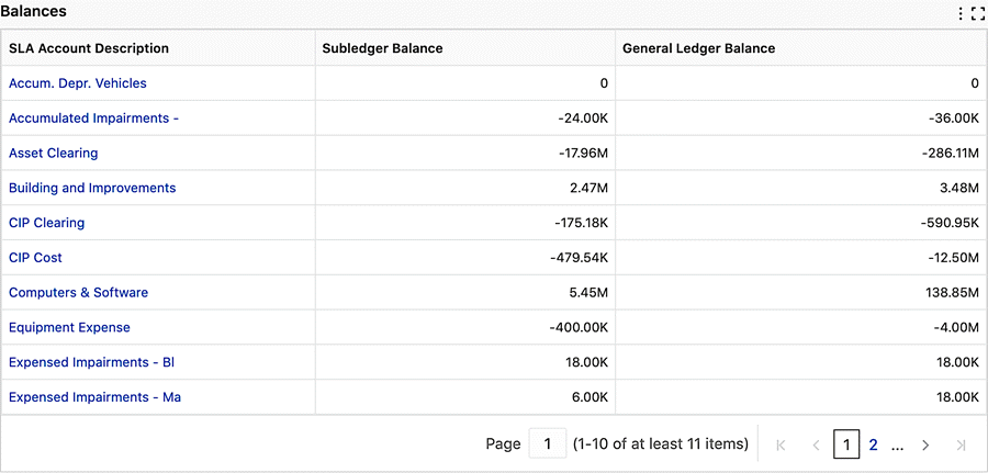
A business user can adjust the data displayed in the aggregated table from a runtime option.
Example of Adjusting Data for the Aggregated Table Runtime Option
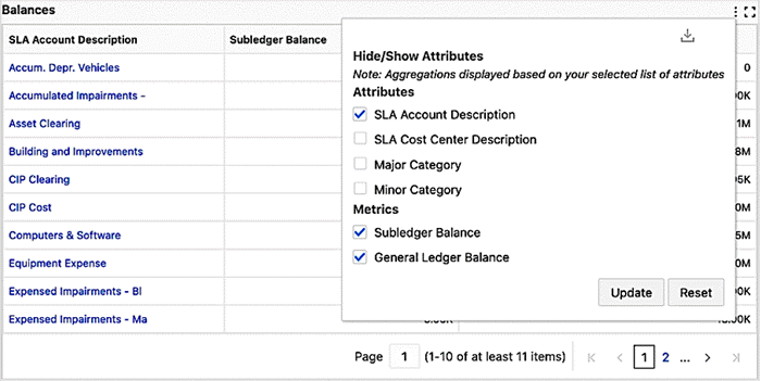
Specific Configuration
| Option | Description |
|---|---|
| Add Attribute | Click + Add Attribute The attribute list contains the dimensions used to aggregate the metrics. Dimension columns are always displayed to the left of the table. Beginning with V10, conditional formatting for attributes is driven by metadata colors. |
| Add Metric | Click + Add Metric The metric attribute has a default aggregation function assigned per attribute type. You can change the default aggregation. Beginning with V10, the metric attribute also has a provision to set conditional formatting based on the metric value. |
| Show as abbreviated number | This flag controls the display of aggregated metrics as abbreviated values instead of actual values. Actual values are displayed as a tooltip. You can disable the flag to change the default option. |
| Show as Data Bars | In ECC V14, Data Bar support is introduced in aggregated tables. The highest value displays as a fully shaded bar, while others are proportionally shaded, enabling quick relative comparisons. Data Bars integrate with conditional formatting rules - when conditions are met, the bars automatically display in the colors defined in the configuration settings, making it easy to identify important data patterns and exceptions. |
| Conditional Formatting | Enables users to apply visual rules and color indicators to data in aggregated tables based on specific conditions or thresholds. Users can configure multiple rules using various operators and assign distinct colors to each condition. The conditions are evaluated in priority order from top to bottom, with the first matching condition's color being applied to the cell. |
| Actions | Enable Export This flag controls the ability of the business user to export the data in the aggregate table. Export honors granularity in the aggregate table by including all the selected attributes and metrics. You can disable the flag to change the default option. |
| Enable Aggregated Table Summary | Enable displaying summary of all metrics. The summary is impacted by selected refinements and local filters. |
Export for Aggregated Tables
Enable the Export option to export the contents of the aggregated table. Export considers granularity of the aggregated table set from runtime options.
Export can be configured from the Actions accordion.
| Option | Description |
|---|---|
| Enable Export | Controls whether a business user can export the underlying data in the aggregated table. Disable to change the default option. |
Aggregated Table Actions Option
Example of Configuration in Action
The following steps outline the configuration of an aggregated table.
-
Define the title and the data set.
Defining the Title and Data Set for an Aggregated Table
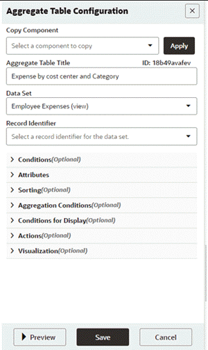
-
Add the attributes and metrics. The checkbox Show as abbreviated number is checked by default.
Configuring Attributes and Metrics for an Aggregated Table
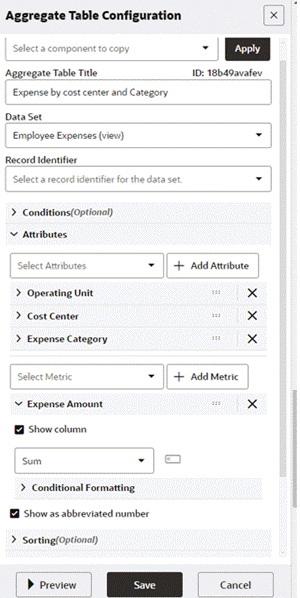
-
Enable the aggregated table summary by selecting its checkbox.
Enabling the Aggregated Table Summary
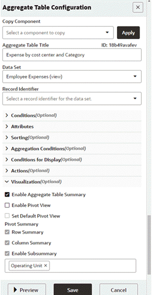
-
Preview the aggregated table.
Preview of an Aggregated Table
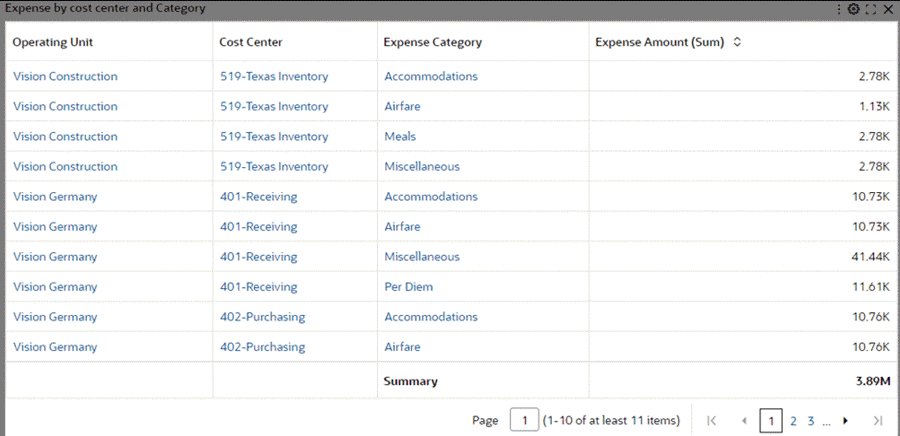
Example of an Aggregated Table with Data Bars
The following is an example of configuring an aggregated table with data bars.
-
Define the data set, attributes and metric.
Enable Data bar for the metric and select an appropriate color.
Initial Configuration Settings for the Aggregated Table with Data Bars
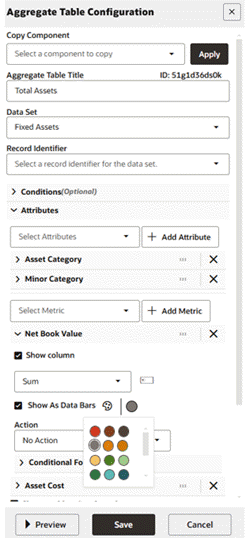
-
Define conditional formatting according to the business needs.
Conditional Formatting Configuration
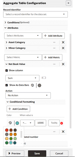
-
Preview the aggregated table.
Preview of the Aggregated Table with Data Bars
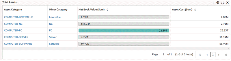
-
At runtime the user can disable the data bar.
Using Runtime Options to Disable the Data Bars
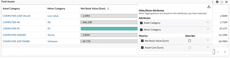
-
A preview of the aggregated table without the data bars would be the following:
Preview of the Aggregated Table with Data Bars Disabled
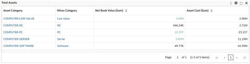
Contextual Drill Down
Introduced in ECC V14, the Contextual Drill Down feature has transformed navigation by dynamically passing visible context attributes to linked pages. This ensures that users always carry forward relevant data, enabling seamless transitions between views. While the initial implementation provided static parameter passing, we recognized the need for a more flexible and dynamic approach. This enhancement allows users to opt into dynamic context passing, ensuring a richer and more intuitive experience.
The Need for Dynamic Context Passing
Traditionally, drill-down links rely on pre-configured static parameters, which means only a fixed set of attributes are passed when a user clicks a hyperlink. However, enterprise applications are inherently dynamic, with visible attributes often varying based on filters, user roles, or data set configurations.
Without dynamic context passing:
-
Users may lose relevant filtering criteria when navigating.
-
Important contextual attributes visible on the screen are ignored if not pre-configured.
-
Manual updates to hyperlinks become necessary when additional attributes become relevant.
Dynamic Contextual Drill Down
ECC V14 has an "Enable Dynamic Context Passing" checkbox within the hyperlink configuration menu. When enabled, all visible attributes preceding the selected dimension are automatically passed during runtime, ensuring a comprehensive drill-down experience. This applies to both ECC Deep Links and standard URLs used for redirection.
Dynamic Contextual Drill Down works in the following way:
-
Configuration:
-
Users can enable the "Enable Dynamic Context Passing" option in the Aggregate Table Configuration Panel.
-
URLs must include a token placeholder (
{CONTEXT_DEEPLINK_TOKEN}for deep links,{CONTEXT_PARAM_TOKEN}for standard URLs).
-
-
Runtime Behavior:
-
When the feature is enabled, the system collects all visible contextual attributes before passing them.
-
These attributes are appended to the URL dynamically, ensuring all relevant filters are maintained.
-
-
Developer Considerations:
-
If a user is configuring a deep link, they must add the token
{CONTEXT_DEEPLINK_TOKEN}in the exact position within the deep link structure where contextual parameters should be added.
-
-
At runtime, this token will be replaced with a dynamically generated list of contextual attributes in the following format:
{"attributeKey":"ATTRIBUTE_NAME","values":["VALUE"],"operator":"=="} -
For standard URLs, the token
{CONTEXT_PARAM_TOKEN}is used instead, and attributes are passed as key-value pairs.
Examples
Example 1: Static versus Dynamic Drill-Down
-
User clicks on an Account Code in a financial report.
-
Static Mode: Only Account Code, Ledger, and Period Name are passed.
-
Dynamic Mode: In addition to the static parameters, additional attributes such as Cost Center and Balancing Segment (if visible) are also passed dynamically.
Configured URL (Before Runtime Processing):
/ecc/web/eccComponent/gl/gl-dd/3mrt75sjkx?eccDeepLink=[{"gl-aa":[{"attributeKey":"GL_ACCOUNT_CODE","values":["{0}"],"operator":"=="},{"attributeKey":"LEDGER","values":["{1}"],"operator":"=="},{"attributeKey":"PERIOD_NAME","values":["{2}"],"operator":"=="},{CONTEXT_DEEPLINK_TOKEN}]}]
Final URL After Runtime Processing:
/ecc/web/eccComponent/gl/gl-dd/3mrt75sjkx?eccDeepLink=[{"gl-aa":[{"attributeKey":"GL_ACCOUNT_CODE","values":["1250"],"operator":"=="},{"attributeKey":"LEDGER","values":["EOPSFI Ledger"],"operator":"=="},{"attributeKey":"PERIOD_NAME","values":["01-08"],"operator":"=="},{"attributeKey":"GL_BALANCING","values":["Operations"],"operator":"=="},{"attributeKey":"FA_COST_CTR","values":["No Department"],"operator":"=="}]}]
Example 2: Contextual Drill-Down with Standard URL Redirection
-
User configures a regular hyperlink for navigation with
{CONTEXT_PARAM_TOKEN}in the URL. -
At runtime, this token is replaced with visible contextual parameters in key-value format.
Configured URL:
OA.jsp?Func_id=1234&{CONTEXT_PARAM_TOKEN}
Final Processed URL:
OA.jsp?Func_id=1234&GL_BALANCING=Operations&FA_COST_CTR=No Department
Benefits of Dynamic Context Passing
-
Improved usability: Users no longer need to manually configure every possible attribute in hyperlinks.
-
Seamless navigation: Ensures filters and context remain intact across pages.
-
Scalability: Works across both ECC Deep Links and general URL-based navigation.
-
Governance and compliance: Keeps filtering logic consistent and prevents data misinterpretation.
Pivot View
Introduced in V8, the Pivot View feature presents an alternative visualization to aggregated table. A pivot view can be configured to include a grand summary row and grand summary columns.
Example of a Pivot View
In addition to viewing the Pivot View data, users can change the pivot layout by show/hide attributes and metrics using runtime options.
Introduced in ECC V9, enhancements to both the Aggregated Table component and Pivot View now support the reordering of attributes and metrics from runtime. This capability allows users to pivot an aggregate table on any attribute, enabling them to view aggregations by setting any attribute as the column attribute. Additionally, in runtime options for Pivot view, to help users in the identification of attribute types of unique icons are displayed. Row attributes, column attributes and unselected attributes have distinct icons.
Introduced in ECC V10, enhancements to the Pivot view now offer sub-summary support for attributes outlined in the configuration. Additionally, users can conveniently enable or disable pivot sub-summary during runtime.
Enhancements in V11 to the runtime option allow an end user to enable or disable the sub-summary based on their preferred attribute.
Example of Pivot View Runtime Options
The Pivot View component allows for sorting by dimension (from A to Z or Z to A) or grand summary (from smallest to largest or largest to smallest).
Example of Pivot with Grand Summary and Sub-Summary
Enhancements in V12 allow users to sort by a metric in a pivot view. The sorted view is presented in an inline view, and it shows only up to 100 records after sorting.
Example of a Pivot Sorted by Expense Amount (Sum)
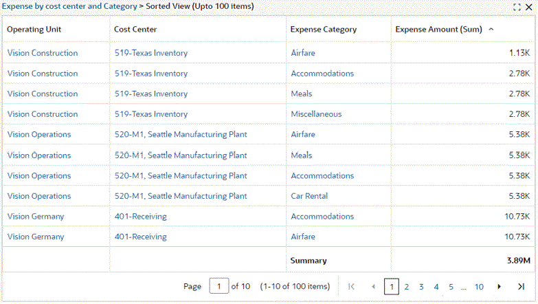
Note: Metadata-level color pinning is extended to the Aggregate Table component and corresponding Pivot View in V10. This feature is used in conditional formatting display. For example, an attribute such as "Posting Status" could have conditional formatting enabled from the metadata.
Configuration Options Specific to the Pivot View
Configuration options for Pivot View only are listed in the table below.
| Option | Description |
|---|---|
| Enable Pivot View | Enable Pivot View support. Allow switching between the aggregate table and the pivot view at runtime. |
| Set Default Pivot View | Set the pivot as the default view of the aggregated table. |
| Pivot Summary: Row Summary | Display a grand summary row. |
| Pivot Summary: Column Summary | Display grand summary columns. |
| Pivot Summary: Enable Subsummary | Display subsummary specific to the selected attributes. |
Configuration Example
-
Define the title and data set.
Defining the Title and Data Set for Pivot View
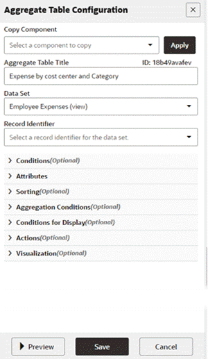
-
Add the attributes and metrics. Show as abbreviated number is checked by default.
Configuring Attributes and Metrics for Pivot View
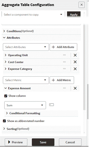
-
Enable Pivot View and its associated settings.
Configuring the Pivot View Settings
-
Preview the pivot view.
Preview of a Pivot View
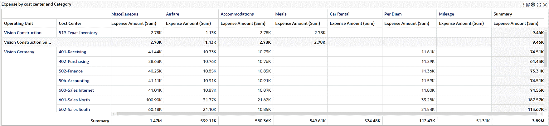
Dynamic Attribute Label in Pivot View
Beginning with V9, designers can establish precedence rules in metadata, and these rules subsequently affect the behavior of the pivot view. Users can assign a label to a target attribute based on a predefined value of a trigger attribute, and dynamically, the corresponding defined label will be shown in the pivot view.
Note: This feature is supported in only the Pivot View component, and not in the Aggregate Table component.
Cross-Data Set Calculation in Pivot View
Introduced in ECC V16, this feature enables ECC to compute variances, highlight mismatches, and support conditional formatting and filtering. The improvement significantly enhances comparison capability across financial and operational data.
This feature is targeted to do the following:
-
Introduce calculated attributes that reference multiple data sets.
For example: Variance = Receivables Net – GL Net (cross–data set calculation)
-
Provide a formula builder with operators.
-
Allow highlighting and filtering based on mismatches or thresholds.
-
Support drill-down navigation for detailed variance investigation.
-
Enhance reconciliation and comparison across ECC dashboards (for example: finance, procurement, projects).
To configure this feature, navigate to Attributes and then Metrics in the configuration window.
In the following example, we add a new calculate attribute for Variance, that is, the difference between Receivables Net and General Ledger Net.
Thus, Variance = Receivables Net - GL Net
-
Add the calculation.
Add Calculation
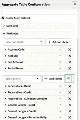
-
A new attribute is created with a default title. You can change the label.
Configuration of the Attribute Label
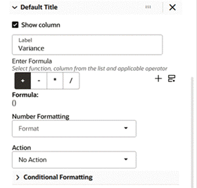
-
Enter the formula. For a simple formula:
-
Select the operator, then click on the plus sign icon (+) to create a simple formula.
-
Select the attribute from the list.
Example of a Simple Formula
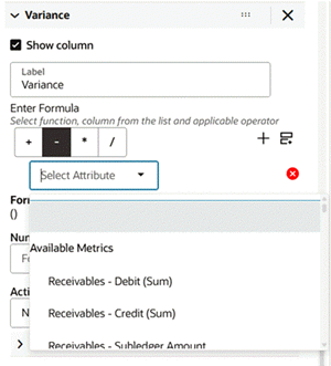
There are three types of attributes in this list:
-
Available metrics, for the list of attributes already configured in the pivot table.
-
Calculated attributes, the list of predefined calculated attributes defined in the metadata.
-
Attributes, the list of standard attributes in the data set.
Note: Select aggregation is only available when you are selecting an attribute from the standard attribute list.
-
-
Define the formula.
Example of Defining a Formula
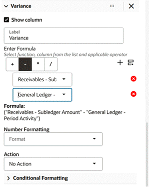
The complete formula is displayed to allow you to review the formula entered.
-
-
For a compound formula, do the following:
-
Click on "Add Group" to add compound or complex formula, for example,
((Receivables Debit - Receivables Credit) - (GL Debit - GL Credit))Example of Adding a Group for a Compound Formula
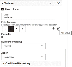
-
Then click the plus sign icon (+) to start building the formula.
Example of Building a Compound Formula
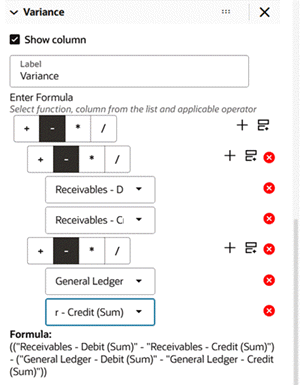
-
-
Under Number Formatting, you can select the number formatting.
Number Formatting
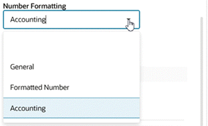
-
Under Conditional Formatting, you can add the indicator color based on the specified condition.
Conditional Formatting
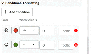
Skipping Null Attributes in the Aggregate Table Component and Pivot View
Beginning with V9, the "skip null" feature is extended to the Aggregate Table component and Pivot view.
Designers can create an Aggregate table component or Pivot view and based on the presence of values in the attributes, the respective attributes will be displayed. That is, if an attribute has null values only, then the attribute will not be displayed. Any attribute that at least has one non-null value will be displayed.
Local Filters in Aggregate Table
Introduced in ECC V12, local filters for aggregated table empowers users to focus only the records of interest without affecting the global context.
For example, in an aggregated table displaying records for expenses, a user could apply a local filter for only those expenses in the categories of "Airfare" and "Meals." With those filters applied, only the expenses in those categories are displayed.
Example of Applying Local Filters to an Aggregated Table
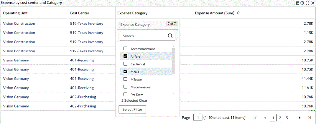
Example of an Aggregated Table with Local Filters Applied
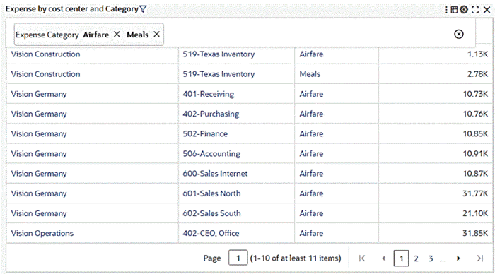
An improvement in Oracle Enterprise Command Center Framework V13 addresses an issue concerning attribute visibility within the aggregated table. Previously, attributes designed for hyperlink actions were omitted from real-time display but remained accessible through the Show/Hide context menu, against the designer's intent to conceal them. The V13 enhancement removes this restriction, allowing attributes to be included in hyperlinks even if they are not part of the aggregated table's configuration. This change ensures attribute visibility aligns with user expectations and design objectives, thereby enhancing the usability of the aggregated table.
Beginning with V15, the Pivot View feature can display the dimension name as the column header when a dimension is used as a column. This change improves the clarity of grouped data, especially with complex pivot configurations. The column header now dynamically reflects the selected dimension, such as "Supplier" or "Period." This enhancement brings several usability improvements to the Pivot View. Column headers now clearly indicate the dimension used for grouping, enabling you to quickly understand the context behind each set of values. The look and feel of headers is consistent with existing pivot formatting, ensuring a seamless visual experience. Localization is also supported, allowing dimension names to appear in the preferred language when available. Additionally, local filters can now be applied to both column and row attributes, so the user can focus on relevant subsets of data while the grouped view retains clarity and context.
Example of Period Name Dimension Used as a Column Header
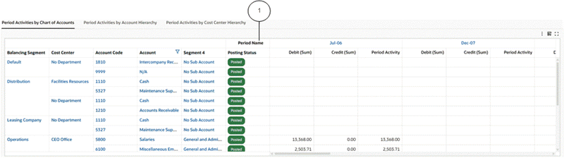
-
Dimension name as a column header
In V15, local filters are supported on both column and row attributes within the Pivot View, so a user can apply more targeted filters directly within the pivot structure.
Example of Filter Jul-06 on the Pivot View Column Period Name
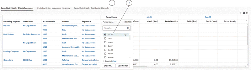
-
Column header
-
Local filter
After the filter is applied, the pivot view shows only the filtered data.
Example of Application of the Jul-06 Filter
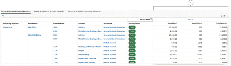
-
Data for
Jul-06only
Beginning in V15, multi-data set support in the Pivot component allows users to analyze and compare metrics from two different data sets within a single, unified view. This enhancement empowers dashboard designers to define shared dimensions and independently select metrics from each data set, enabling rich, side-by-side analysis without requiring external tools or manual reconciliation. Common business scenarios such as subledger versus general ledger reconciliation or forecast versus actuals analysis can now be handled directly within ECC dashboards. Filters applied to the shared dimensions automatically apply to both data sets, preserving consistency across the view. Note that multi-data set support is currently available only in the Pivot View and not in the Aggregate Table.
The configuration steps are:
-
In the Aggregate Table Configuration window, enable the multi data set functionality.
-
Define each data set.
-
Define the dimension and metrics.
For a pivot view supporting multiple datasets, the runtime option will have dataset alias name as a prefix to metric definition.
Detailed Insight Components
Oracle Enterprise Command Centers offer detailed insights into the data though results tables and grids. This allows users to take the required action to resolve a process bottleneck, address an exception, or progress a business transaction.
Results Table
The Results Table component displays a set of data in a table format. A results table displays ten records in each page and when expanded at runtime, the results table displays up to 50 records per page.
Descriptive flexfield attributes can be configured as an attribute group in a results table.
The data displayed in the Results Table component is either:
-
A flat list of records from a selected data set. Each row represents a single record. The columns contain attribute values for that record.
Results Table - Flat List
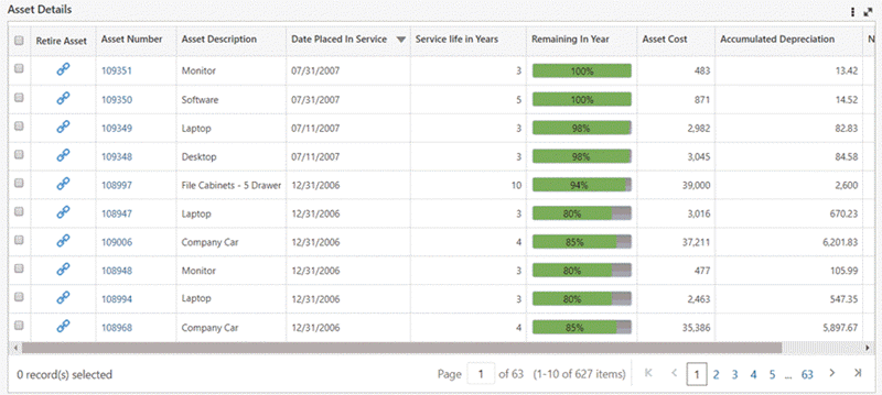
-
A grouped list of attributes. Each group represents a functional or logical grouping for a set of attributes.
Results Table - Attribute Groups
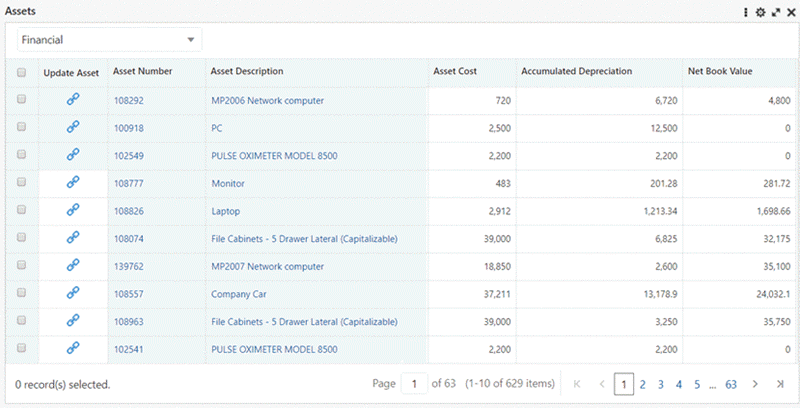
The Results Table component supports several new features in V10, including: conditional formatting, freezing of columns, grouping of row actions under one icon, flexibility in selecting rows, and end user personalization capabilities, These features are described below.
The Results Table component supports conditional formatting. For categorical attributes, the conditional formatting is driven by metadata color pinning. For numerical attributes, the conditional formatting is supported from the component's configuration.
The Results Table component supports freezing of columns:
-
Default Freezing: Row selection checkbox column, Displayed detail columns are frozen by default. In the case of attribute groups, the persistent attributes are frozen by default, but the designer has the flexibility to alter this in the configuration.
-
User-Defined Freezing: Every attribute in the results table has a configuration allowing for freezing. In the case of persistent attributes, the freezing is enabled by default.
The Results Table component displays all the row actions grouped under the horizontal overflow icon (…). This column is also frozen by default. No such grouping exists for result tables having only one row action.
The Result Table offers flexibility in selecting rows with the following options:
-
Multiple: Multiple rows can be selected. This is the default option.
-
Single: Only one row can be selected a time.
-
Disable: Row selection is disabled. This option is useful in scenarios where the results table appears on a single page and there is no need to perform any action on the table.
Beginning in V10, the Results Table component allows end users to hide, show, reorder, and delete attributes in runtime. When multiple records are selected during runtime, the user can access summary statistics (sum and average) related to numerical attributes. This information appears in the footer of the results table. Both of these features are considered in the scope of End User Personalization and are preserved for a user from session to session.
Hide/Show Attributes Window for a Results Table
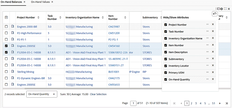
Beginning with V11, a local filter is supported in a results table to focus only the records of interest without affecting the global context. Except for calculated attributes, all attributes support local filtering at runtime. Local filtering is also applicable for the inline results tables.
A user can hover over a column title to view and select local filters.
Example of a Local Filter for a Column in a Results Table

Example of a Results Table with Local Filters Selected

Introduced in ECC V11, the Show Selected Records view is supported in results tables. The footer of the result table is enhanced to show a hyperlink when records are selected. Upon clicking the hyperlink, a user can access all the selected records under a single view. The selected records are overlaid on the original table with a breadcrumb on the table title so the user can go back to the original table.
Example of a Results Table with Three Records Selected across Pages and Hyperlink in Footer
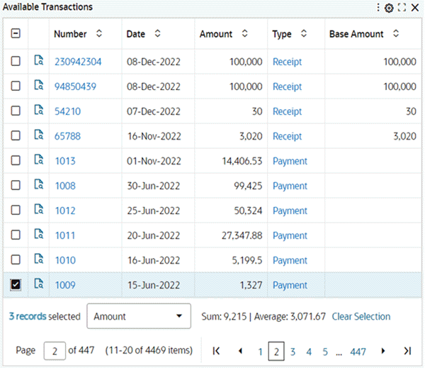
Upon clicking the hyperlink, a user can access all the selected records under a single view. The selected records are then overlaid on the original table with a breadcrumb in the table title to go back to the original table.
Example of Selected Records in a Results Table
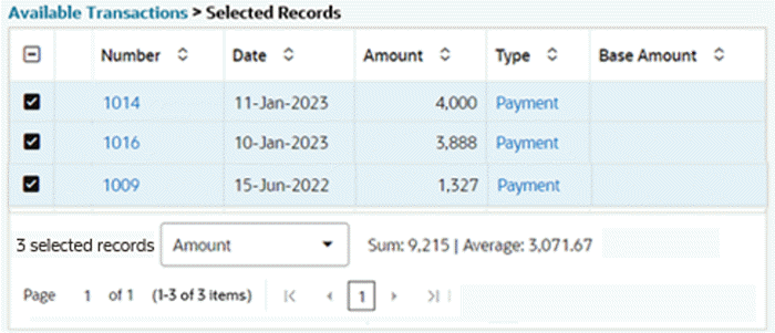
Oracle Enterprise Command Center Framework V13 includes an improvement regarding attribute visibility within the results table. Previously, specific attributes tailored for hyperlink actions were intentionally omitted from real-time display, in accordance with ECC standards. However, this approach led to a discrepancy where these attributes remained accessible to business users via the show/hide context menu, contrary to the designer's intent to conceal them. In response, the enhancement removes the restriction and allows attributes to be included inside hyperlinks even if they are not part of the results table configuration. This modification eliminates the need for a design change while ensuring that attribute visibility aligns with user expectations and design objectives.
Configuration for a Results Table
Configuration options are listed below.
| Option | Description |
|---|---|
| Title | Component title. |
| Data Set | Select one data set. |
Flat List Configuration
| Option | Description |
|---|---|
| Attributes | Select an attribute and click + Add Attribute. |
| Indicators | Click + Add Indicator to add an Indicator. |
Results Table - Flat List Configuration
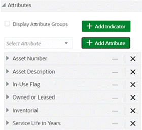
Attribute Group and Attribute Level Configuration
| Option | Description |
|---|---|
| Display Attribute Group | Select Display Attribute Group to allow the display of attribute groups in the results table. |
| Persistent Attributes | Click + Add Attribute in the persistent attribute section.
|
| Interchangeable Attributes | Click + Add Group in Interchangeable Attributes section. Add attribute groups:
|
Results Table - Attribute Group Configuration
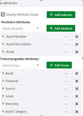
| Option | Description |
|---|---|
| Show Column Checkbox | To show or hide the indicator column in the result table. |
| Freeze Columns | To apply or remove freezing to a column. This option is enabled for persistent columns. |
| Conditional Formatting | To enable conditional formatting for numerical attributes based on the column value. |
Indicator Configuration
Beginning with V9, the Results Table component supports displaying indicators in order to highlight vital parameters with visual cues rather than text, so that a user can quickly spot them. In an 'attribute group' setup, indicators can only be added in the section of persistent attributes.
| Option | Description |
|---|---|
| Show Column Checkbox | This box is used to show or hide the Indicator Column in the results table. |
| Display Name Text Box | The name of the indicator. The same name is used as a column name for the indicator. |
| Image URL Text Box | The URL to retrieve an image as a thumbnail. The URL can include attribute values as parameters |
| Add URL Parameter Button | The + Add URL Parameters option defines the attribute passed as a parameter to dynamically retrieve the indicator. |
| Tooltip Text Box | This box is used to provide additional details for the attribute value. The description can include tokens to represent the value of the attribute. |
| Conditional Hide Attribute Text Box | This box provides a Boolean attribute based on which indicators can be shown/hidden dynamically at runtime. |
Results Table Indicator Configuration
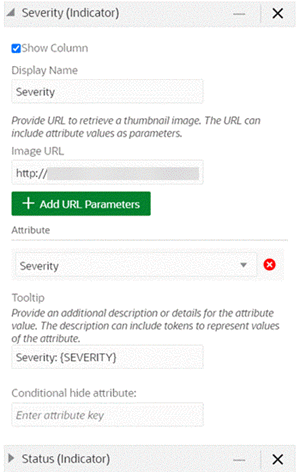
Specific Configurations
Actions - Row Action
Select +Add Action and select Action Type: Hyperlink.
-
In the Action Name field, type a name for the action.
-
To display the hyperlink as an icon, check the Display Default Icon box.
-
To display the hyperlink in a separate browser window, check the Open link in a new window box.
-
In the URL field, type the URL to link to.
-
To add attribute values to the URL:
-
Click Add URL Parameters.
-
Select the attribute name.
-
-
To add a conditional action display, select the following:
-
Attribute
-
Operator
-
Value
-
Enable or disable the action
-
Row Action Configuration
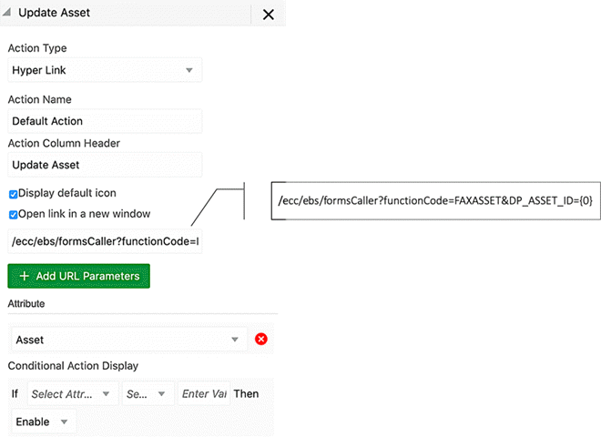
Actions - Row Action
Select +Add Action and Action Type: Js Function Call.
-
In the Action Name field, type a name for the action. This will serve as a tooltip.
-
In the Function field, type the function name.
-
To add arguments to the function:
-
Click Add Parameters.
-
Select attribute name(s).
-
-
To add a conditional action display, select the following:
-
Attribute
-
Operator
-
Value
-
Enable/disable the action
-
Row Action (Js Function Call) Configuration
Actions - Action Menu
Select + Add Action and select Action Type: Pass Parameters
-
In the Action Name field, type a name for the action.
-
To display the hyperlink in a separate browser window, check the Open link in a new window box.
-
In the URL field, type the URL to link to.
-
To allow applying a bulk action on all the records:
-
Select 'Pass Filter State'.
-
Note: The user will be warned if the results table contains more than the supported number of records.
-
-
To add attribute values to the URL:
-
Click Add URL Parameters.
-
Select the attribute name.
-
-
To add a conditional action display, select the following:
-
Attribute
-
Operator
-
Value
-
Enable/disable the action
-
Results Table Action Menu Configuration
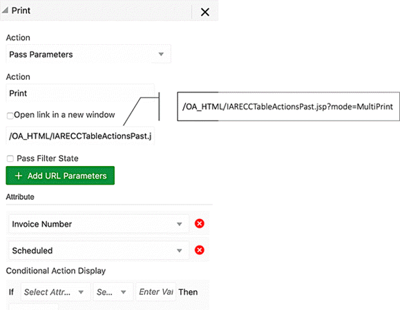
Sorting
Sorting allows a user to configure the default sort order to use for the table. To add a new sort rule:
-
Click + Add Sort.
-
Select an attribute and the Ascending or Descending sorting option.
Results Table Sorting Configuration
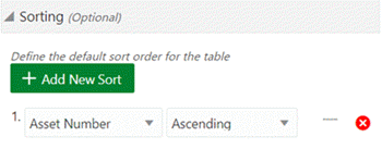
Visualization Configuration
Visualization configuration is optional. There are three options for Record Selection Mode.
| Options | Description |
|---|---|
| Multiple | The default option. Multiple rows can be selected at a time. |
| Single | Only one record can be selected at a time. |
| Disable | Row selection is disabled. This option is useful where the results table is on a single page and there is no need to perform any action on the table. |
Compare Configuration
The Results Table component includes a Compare option on the Actions menu for comparing selected items. The configuration options for the Compare option are described below.
| Options | Description |
|---|---|
| Enable Compare | Checkbox to enable compare at runtime |
| Compare Header | Allow adding static test as a compare header |
| Header Attribute | Display compare header as a tokenized attribute |
| Show Attribute Display Name | Flag to display both attribute label and value |
Compare Configuration
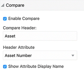
Configuration Matrix
The options to display the column header are described in the following table.
| Header | Attribute Header | Display | Example |
|---|---|---|---|
| Empty | Empty | Record n | Record 1 |
| Text | Empty | Text n | Item 1 |
| Text | Attribute Name | Text: Attribute Value | Item: LCD Thin Panel Monitor |
| Empty | Attribute Name | Attribute Display Name: Attribute Value | Description: LCD Thin Panel Monitor |
The options to control the display of attribute groups in the Compare window are listed in the following table.
| Option | Description |
|---|---|
| In Metadata Attribute Groups, Include in user actions |
Checkbox to enable groups to be displayed in Compare window |
| In Results Grid Configuration, Use Attribute Groups |
Checkbox to enable groups to be displayed in Compare window (Groups configured in metadata will be displayed) |
The options to control the display of grid attributes in the Compare window header are listed in the following table.
| Option | Description |
|---|---|
| In Results Grid Cell Configuration, accessible in Compare and Record Details (Available for grid items: Text Input and Button) | Checkbox to display grid item in Compare window header |
Record Details Configuration
The Record Details option allows you to view all the significant information of a record in a tabular format. The Record Details option displays the details in a window similar to the Compare option window . Attributes in a record details window can also be organized into respective groups, if configured. Similar to the Compare window, a Record Details window also supports dynamic titles and column header grid actions.
| Options | Description |
|---|---|
| Add action | Row action type: Record details |
| Record Details Header | Allow adding static test as a compare header |
| Header Attribute | Display record details title as a tokenized attribute |
| Show Attribute Display Name | Flag to display both attribute label and value |
Record Details Configuration for Results Table
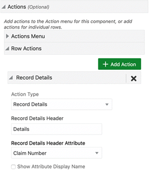
The options to display the column header are described in the following table.
| Header | Attribute Header | Display | Example |
|---|---|---|---|
| Empty | Empty | Record n |
Record 1 |
| Text | Empty | Text n |
Item 1 |
| Text | Attribute Name | Text: Attribute Value | Item: LCD Thin Panel Monitor |
| Empty | Attribute Name | Attribute Display Name: Attribute Value | Description: LCD Thin Panel Monitor |
The options to control the display of attribute groups are described in the following table.
| Option | Description |
|---|---|
| In Metadata Attribute Groups: Include in user actions |
Checkbox to enable groups to be displayed in the record details. |
| In Results Table Configuration: Display Attribute Groups |
Checkbox to enable groups to be displayed in the results table and record details. (Groups displayed will be a union between the ones configured in metadata and in the results table.) |
Timeline View
Introduced in ECC V8, Timeline view is supported in results table as an alternative visualization to the default results table. The timeline view is an interactive data representation of a time period, with key events marked along in chronological order. A user can quickly navigate forward and backward within a defined time range. Events are represented as timeline items, and each event can have a duration based on the start and end date of that event. A user can switch between the results table and the timeline view using the timeline icon.
Example of a Timeline View
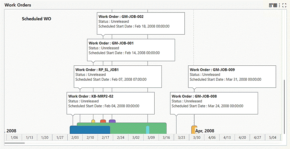
The full range of available dates is based on the earliest and latest available dates for the date attributes displayed on the timeline. The timeline can have more than one event; a user can select which event to be displayed or display more than one event using the runtime options. Also, a user can control the event limit displayed on the timeline with the option to enable/disable the overview marque.
Example of Timeline Runtime Options
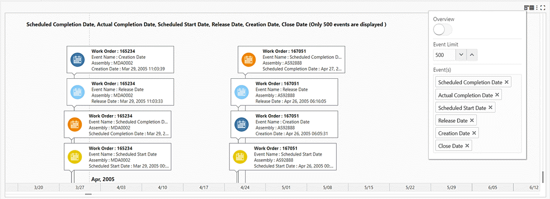
A user can view a set of actions from the timeline through the timeline context menu by right-clicking on the timeline event.
Note: The timeline supports only row actions configured at the result table level.
Example of Timeline Runtime Options
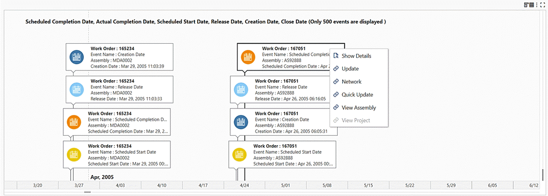
Beginning with V8, designers are empowered with the ability to regulate the granularity of events displayed on the timeline through an event identifier. This capability enables designers to show only unique events based on Title, Description 1, Description 2, Start Date, and End Date.
Example of Timeline Events Before Application of Event Identifier
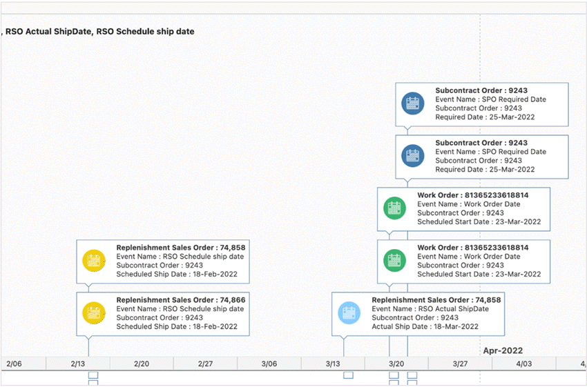
Example of Timeline Events after Application of Event Identifier
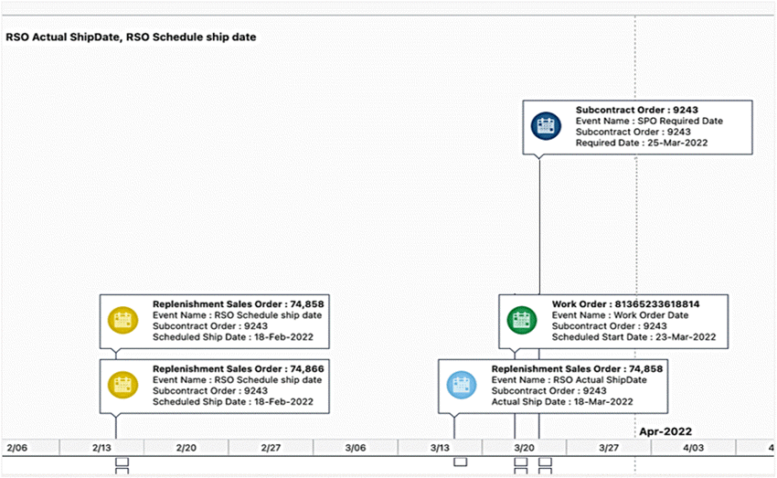
Beginning with V9, support for displaying indicators is added in timeline view. A timeline can display as many as four indicators during runtime. However, there is no restriction on a designer to specify a fixed number of indicators. Only the indicators configured in Results Table can be added in a timeline event. In addition to this, the timeline supports a configuration-driven tooltip to provide additional information for each timeline event. Only the attributes configured in Results Table can be added as a tooltip.
Example of Timeline View with Indicators
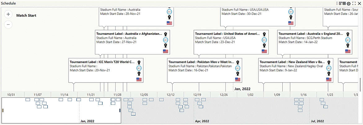
The timeline does not support images in Internet Explorer; the event title and description are only displayed in the event bubble, and full event details are displayed in the event tooltip.
Example of Timeline in Internet Explorer Browser
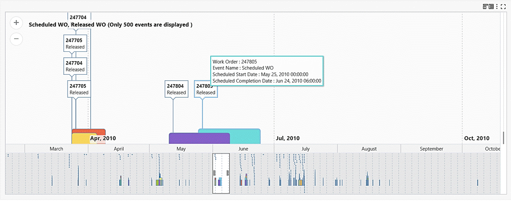
Oracle Enterprise Command Center Framework includes the following enhancements in V13:
-
Timeline event bubbles with dynamic height and dynamic width: The maximum width of the timeline event bubble now considers mandatory parameters such as Event Name, Title, and Start Date to ensure that they are fully visible without truncation. Additionally, considerations are made for the timeline image and indicators, with dynamic height adjustments based on event parameters to optimize visibility.
-
Enhanced tooltips for improved appearance and readability. One key improvement involves the application of run-length encoding for event identifiers, a technique that efficiently represents repeated values without unnecessary duplication. Additionally, special attention is given to comma separators within tooltips, ensuring clear differentiation between thousand separators and delimiters for improved data comprehension.
-
Current date reference marker: The timeline now features a distinct 'Today' marker, facilitating easier identification of the current day. This enhancement provides users with a clear reference point within the timeline.
-
Reserved space for timeline overview: A designated space is now allocated for the timeline overview to prevent it from encroaching on the main component, effectively creating more room for timeline events. This adjustment minimizes the need for excessive scrolling. Furthermore, when the overview feature is enabled, the additional 90 pixels from the component's height is utilized, ensuring seamless integration without compromising functionality.
Specific Configuration Options for Timeline View
The following table lists general timeline configuration options.
| Option | Description |
|---|---|
| Enable Timeline View | Box to enable timeline view. |
| Default View | Makes the timeline the default view of the results table. |
| Timeline Overview | Enables draggable timeline and overview to pan around the Viewport. |
| Event Limit | Sets the limit of the number of events displayed on the timeline. This number can be changed at runtime. |
| Component Height | Sets the timeline height in pixels. |
The following table lists configuration options for specific events.
| Option | Description |
|---|---|
| + Add Event | Click on the Event button to add timeline events. |
| Event Name | Enter the event title that will be displayed on the timeline. |
| Title | Select the main attribute that will be timeline event. |
| Description 1 | Specify a description attribute. |
| Description 2 | Specify another description attribute. |
| Start Date | Specify the event start date. |
| End Date (optional) | Specify the event end date. If this option is configured, the timeline displays the event duration based on the start and end dates. |
| Apply Event Identifier | Enable this option to show only unique events based on Title, Description 1, Description 2, Start Date, and End Date. |
| Show Label | Use this box to show or hide the attribute label. |
| Display Image | Select this option to display an image in the timeline. Note that the image will be visible only in the case of multiple events being configured and being present during runtime. |
| Image URL | Use this option to specify the URL for the image. |
| + Add URL Parameters | Specify any parameters for the URL above. |
| Indicators | Use this multi-select box to configure indicators for the timeline event. |
| Additional Tooltip | Use this multi-select box to configure attributes for tooltip. |
Example of Timeline Event Configuration
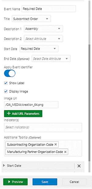
Grid
The Grid component displays a list of records in any configurable layout that best highlights different elements of the record. It has powerful capabilities for listing long textual values as well as images, indicator icons, buttons and star ratings.
Specific Configuration
| Option | Description |
|---|---|
| Layout Template |
|
| Add items in a cell | Click +Add item drop-down list and select one of the values:
|
-
Set the number of columns and rows for the grid.
Setting the Number of Columns and Rows
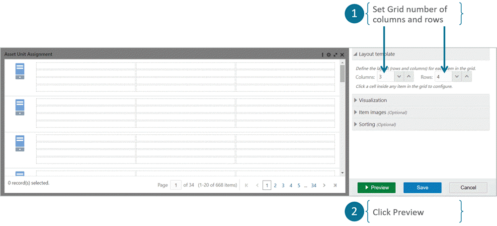
-
Click Preview.
-
Click a cell to configure it.
-
A Cell Configuration panel is shown.
Cell Configuration Panel
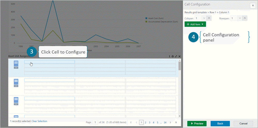
-
Click + Add Item and select Attribute Value.
Selecting Attribute Value
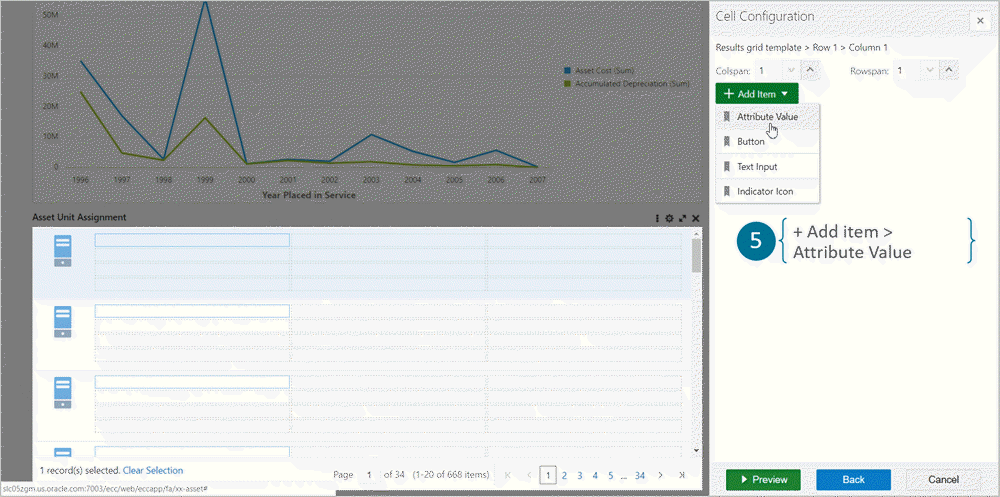
-
Select a cell.
-
Set "Colspan" to 2 to merge two columns.
Merging Two Columns for a Cell
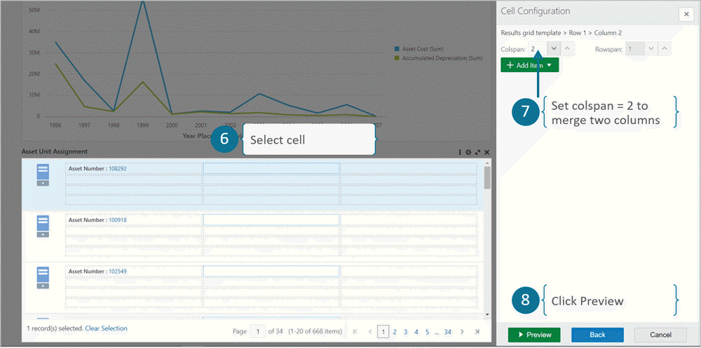
-
Click Preview.
-
Toggle the Show label setting to hide the label.
Hiding a Label
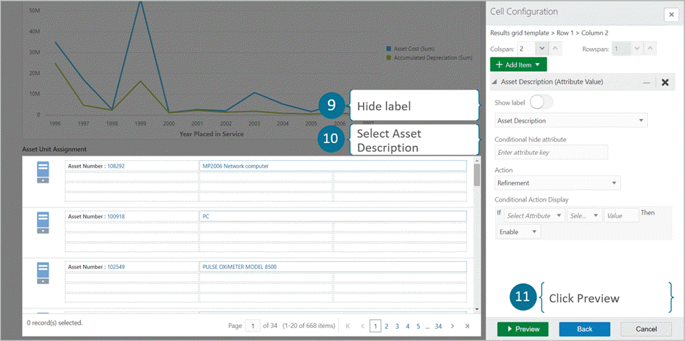
-
Select Asset Description.
-
Click Preview.
-
Click a cell.
-
Select + Add Item to add a Value item.
Adding a Value Item
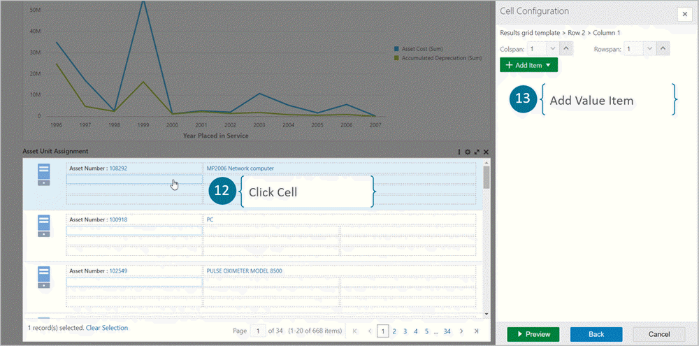
-
Select Current Age in Years.
-
Select Show as Star Rating.
-
Set the range from 1 to 30, and select Display rating value.
-
Select Current Age in Years.
Grid Star Rating Configuration
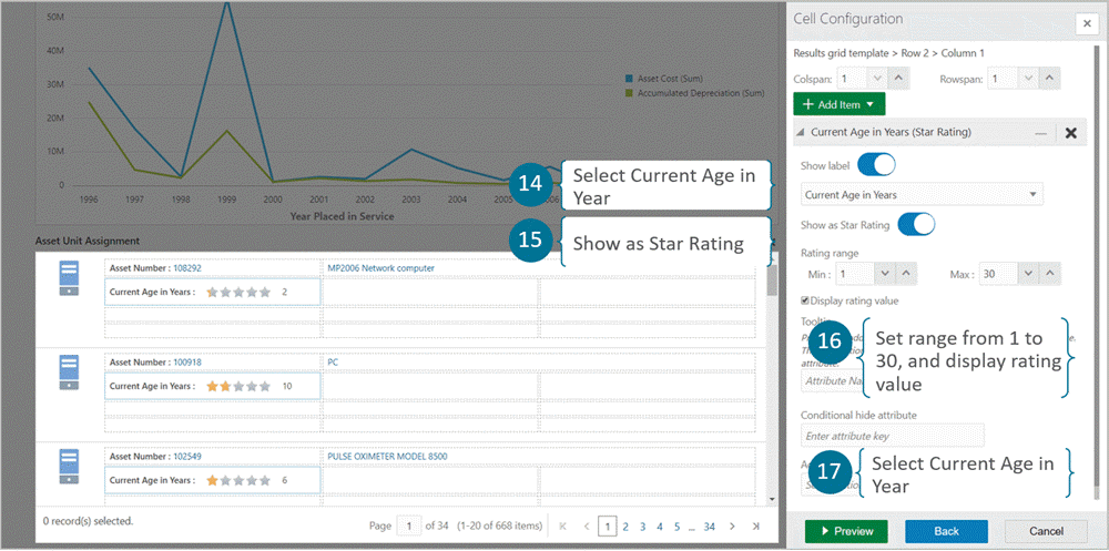
-
You can then add more attribute values.
Adding More Attribute Values
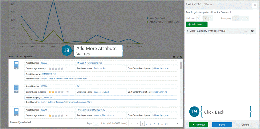
-
Click Back.
-
Click Visualization.
Set the following grid visualization options:
-
To control component height, set the height in pixels.
-
Set the number of grid columns.
-
Set the number of items per page.
-
To enable the Compare feature, check the Enable Compare checkbox.
Add the Compare Header display name.
-
To set the record selection mode, choose one of the following:
-
Multiple: This is the default option, where multiple records of the grid can be selected
-
-
Single: Only one record can be selected at a time.
-
Disable: Record selection is disabled.
Selecting Visualization
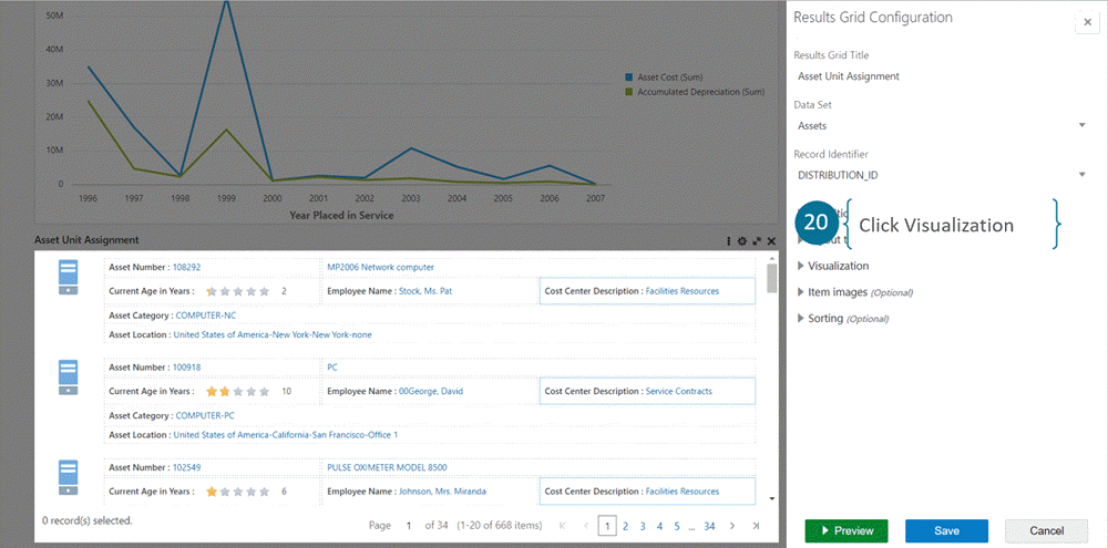
-
-
Visualization is set to the following:
-
Number of grid columns is 2
-
Number of items per page is 10
Edit the Compare Header 'Asset'.
Grid Visualization Configuration
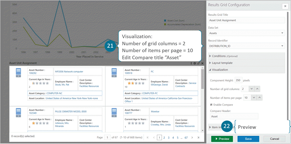
-
-
Click Preview.
-
Set the Item Image URL.
Grid Visualization Configuration Options Option Description Item Image Enable image, to allow displaying image in the grid -
Set image position
-
Image URL
-
-
Click Save.
Grid Item Image Configuration
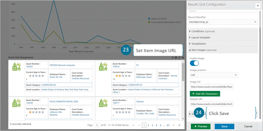
Grid Component
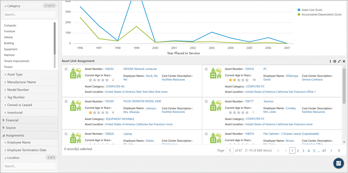
| Option | Description |
|---|---|
| Formatting Note: Is part of attribute value configuration |
Control the formatting of text in grid from 'formatting' accordion after selecting the cell Format the text with options:
|
Example of Text Formatting in a Grid
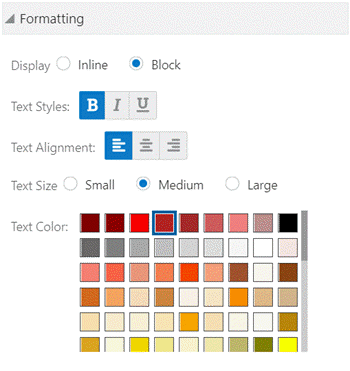
Text Formatting at Runtime
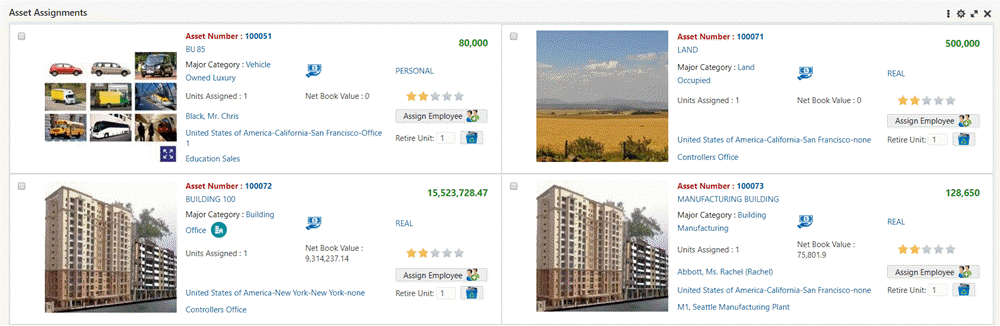
Beginning with V16, Grid text formatting is applied exclusively to label columns and not data value columns. This enhancement improves readability and the visual hierarchy by keeping analytical values clean and consistently formatted based on the action defined whether it is a refinement or hyperlink. The styling thus emphasizes descriptive labels only. This change also prevents unintended visual distortion of numeric or transactional data and aligns the grid behavior with standard dashboard design principles.
Example of Text Formatting in Label Columns Only
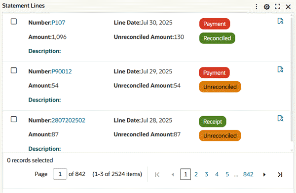
| Option | Description |
|---|---|
| Sorting |
|
Grid Sort Option
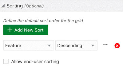
A user can change the method of sorting using the Options icon.
Allow End-User Sorting
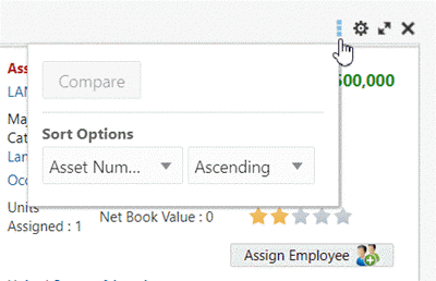
| Option | Description |
|---|---|
| Visualization |
|
Example of Visualization Configuration
Example of Grid without Controls and Record Selection
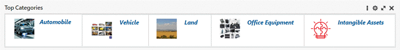
Beginning with V9, the Grid component is more compact. All attributes are top-aligned.
Example Grid with Compact Design
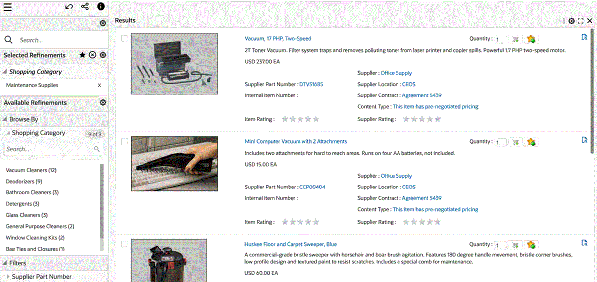
Beginning with V10, metadata-level color pinning is extended to the Grid component. Color pinning is used in the conditional formatting of categorical attributes in a grid.
Example of a Results Grid in Single Record Selection Mode with Conditional Formatting Enabled
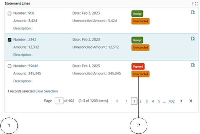
-
Single record selected
-
Badge with a specific color pinned to its attribute
In ECC V10, the Results Grid component's "Button" styling options were enhanced. With the introduction of additional styling options of "Button" in the Results Grid component, designers are able to customize buttons to suit their requirements in an ECC dashboard. These options provide more flexibility to the designer and help make the look and feel more intuitive to the end user.
The following are enhancements in V10:
-
New Button "Size" option which allows designers to customise the size of the button. The default size is medium and is preselected.
-
"Hide Runtime options" under the visualization accordion. This will hide runtime options, maximization, and the component border.
Beginning with V11, the Grid component shows all the selected records under a single view. The footer of the grid is enhanced to include a hyperlink when records are selected. Upon clicking the hyperlink, a user can access all the selected records under a single view. The selected records are overlaid on the original grid with a breadcrumb in the grid title to go back to the original grid.
Local Filters
Beginning with V16, the Grid component supports local filters, thus enabling column-level filtering directly within the Grid. This enhancement allows end users to apply filters that impact only the selected Grid component without affecting the overall dashboard context. This enhancement also ensures behavioral consistency with existing local filtering capabilities available in the Results Table, Pivot, and Aggregate Table components. By introducing localized filtering within the Grid, this feature enhances usability and user control -- particularly in complex data scenarios such as Unapplied Cash Receipts in the Cash Application Dashboard and detailed item lists in iProcurement -- and allows users to refine data instantly while maintaining the broader dashboard view unchanged. No additional configuration is required for end users.
To apply a local filter on a grid:
-
Select the Filter Column icon.
Example of Applying a Local Filter on a Grid: Select the Filter Column Icon

-
Select the value for the filter.
Example of Applying a Local Filter on a Grid: Select the Value for the Filter

-
The filter is applied on the grid.
Example of a Local Filter on a Grid

Compare Configuration
Configuration options for the Compare feature are listed in the table below.
| Options | Description |
|---|---|
| Enable Compare | Checkbox to enable the Compare feature at runtime. |
| Compare Header | Allows adding a static test as a Compare header. |
| Header Attribute | Displays the Compare header as a tokenized attribute. |
| Show Attribute Display Name | Flag to display both the attribute label and the value. |
Compare Configuration
The options to display the column header are described in the following table.
| Header | Attribute Header | Display | Example |
|---|---|---|---|
| Empty | Empty | Record n |
Record 1 |
| Text | Empty | Text n |
Item 1 |
| Text | Attribute Name | Text: Attribute Value | Item: LCD Thin Panel Monitor |
| Empty | Attribute Name | Attribute Display Name: Attribute Value | Description: LCD Thin Panel Monitor |
The options to control the display of attribute groups in the Compare window are listed in the following table.
| Option | Description |
|---|---|
| In Metadata Attribute Groups, Include in user actions |
Checkbox to enable groups to be displayed in the Compare window. |
| In Results Grid Configuration, Use Attribute Groups |
Checkbox to enable groups to be displayed in the Compare window. (Groups configured in metadata will be displayed) |
The option to control the display of grid attributes in the Compare window header is listed in the following table.
| Option | Description |
|---|---|
| In the Results Grid Cell Configuration, Accessible in Compare and Record Details (Available for grid items: Text Input and Button) | Checkbox to display a grid item in the Compare window header. |
Results Grid Configuration
For the configuration of a results grid, the Record Details option allows you to view all the significant information of a record in a tabular format.
| Options | Description |
|---|---|
| Enable Record Details | Checkbox to enable record details. |
| Record Details Header | Allows adding a static test as a compare header. |
| Header Attribute | Display the record details title as a tokenized attribute. |
| Show Attribute Display Name | Flag to display both the attribute label and the value. |
Record Details Configuration for a Results Grid
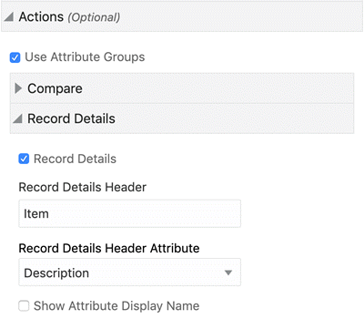
The options to display the column header are described in the following table.
| Header | Attribute Header | Display | Example |
|---|---|---|---|
| Empty | Empty | Record n |
Record 1 |
| Text | Empty | Text n |
Item 1 |
| Text | Attribute Name | Text: Attribute Value | Item: LCD Thin Panel Monitor |
| Empty | Attribute Name | Attribute Display Name: Attribute Value | Description: LCD Thin Panel Monitor |
The options to control the display of attribute groups in the record details are described in the following table.
| Option | Description |
|---|---|
| In Metadata Attribute Groups, Include in user actions |
Box to enable groups to be displayed in record details |
| In Results Grid Configuration, Use Attribute Groups |
Box to enable groups to be displayed in record details (Groups configured in metadata will be displayed) |
The option to control the display of grid attributes in the record details title is described in the table below.
| Option | Description |
|---|---|
| In Results Grid Cell Configuration, Accessible in Compare and Record Details (Available for grid items: Text Input and Button) | Box to specify display of a grid item in the Compare window header. |
Aggregated Grid
Beginning with V5, the Grid feature supports the display of aggregated metrics. All dimensions in the grid control the aggregation level. Aggregation leverages all the visible grid items driven by attributes, including image and indicator icons. The Aggregated Grid feature has all the flexible layout and formatting options available for the grid.
Users can not filter by aggregated value. Also, aggregated grids do not support the compare, record details, and attribute actions.
The Aggregated Grid feature supports language-sensitive abbreviation. Also, aggregate conditions and condition for display can be configured for Aggregated Grid.
Example of an Aggregated Grid
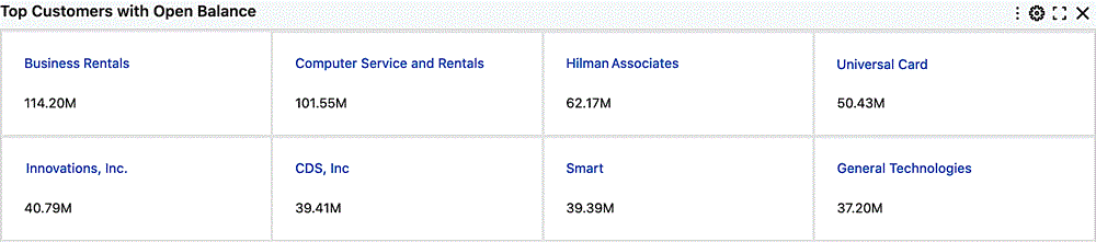
Visualization Options for Aggregated Grid
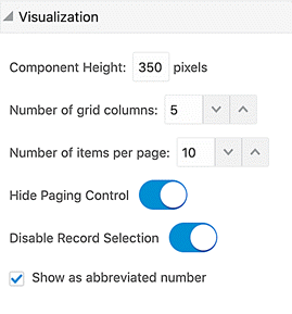
| Option | Description |
|---|---|
| Visualization | Show as Abbreviated Number Enable the flag to show abbreviated numbers instead of actual values for aggregated values. Actual values are displayed as a tooltip. The option is visible if at least one aggregated attribute is configured. You can change the default option by disabling the flag. |
| Add aggregated items in a cell | Click the +Add item list and select one of the values:
|
Configuration of an Aggregated Grid
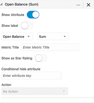
Layout Components
Tabbed Component Container
The Tabbed Component Container feature allows you to group components on a dashboard. Containers cannot be nested within each other and you cannot move components inside or outside a tabbed component.
Tabbed Component Container
Configuration
The Tabbed Container groups components into multiple tabs. Each tab may contain one or more components.
By default, the container includes two tabs.
| Option | Description |
|---|---|
| Title | Add a title for the component |
| + Create Tab | To add a new tab |
| Tab Title | Add a title for the tab |
Only the administrator user at runtime can delete tabs and reorder the tabs within the Tabbed Container.
The Delete icon is displayed only if the tab contains more than two tabs.
Tabbed Component Configuration
Deleting Tabs
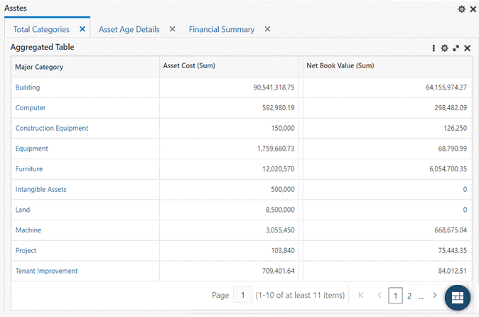
Diagram
Introduced in V6, the diagram component provides immediate insights into a business flow or a process lifecycle through a network view. It allows a fast and efficient analysis and reporting of specific process flow. For example, tracking critical quality issues during the manufacturing and distribution cycle: a diagram simplifies tracing the origination of raw materials, manufacturing process, and shipping products to customers. Another example is tracking purchase order and related lots, work orders, and serial numbers for items, in which you can trace the relationships between one another.
Example of a Diagram
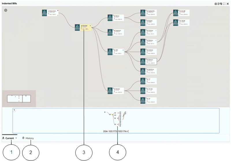
-
Current tab
-
History tab
-
Anchor node
-
Pagination control
You can zoom in to focus on an intermediate process or zoom out to get a perspective of the entire process.
Beginning with V9, the Diagram supports visualizing events from multiple data sets in a timeline view.
The diagram enables the designer/developer to configure the process flow/cycle flexibly; the main two elements in the diagram configuration are:
-
Business entities, represented in the data sets
-
Entity relationships, represented in the data set relationships
Configuration of diagram contains three major sections:
-
Data set
-
Data set relationship
-
Visualization
Data set configuration includes options to create business entities as data sets and represents these business entities as nodes. A designer can configure the attributes required for the diagram and can set text formatting and configure hyperlink actions for every attribute. These attributes are described in the table below.
| Category | Option | Description |
|---|---|---|
| Data Set | Add Data Set | Configuration for adding multiple data sets. |
| Data Set | Show on the node | Control to display node title. |
| Data Set | Node Title | Free text to set Node Title, defaults with data set name, if left empty. |
| Data Set | Node Identifier | Control to set granularity of data set. More than one attribute can be selected. |
| Data Set | Record Identifier | Attribute to be selected as record identifier. |
| Data Set | Conditions | Compound conditions with OR/AND operators among conditions/groups of condition. |
| Attribute | Show Attribute | Control to enable display of attribute display name on a node. |
| Attribute | Show Label | Control to enable display of attribute display name on a node. |
| Attribute | Aggregation | Used to define aggregation of an attribute. |
| Attribute | Apply Hierarchical Aggregation | Control to calculate hierarchical aggregation. |
| Attribute | Custom Label | Used to define a business-friendly label for the aggregated metric. |
| Attribute Actions | Action | Control to define a hyperlink action. |
| Attribute Actions | Display Action Description in Tooltip | Control to display tooltip for Action (Available when Action is "Hyperlink"). |
| Attribute Actions | Open link in new window | Control to open actions in new browser window (Available when Action is "Hyperlink") |
| Attribute Actions | Display in a Pop-Up | Control to open actions in ECC Pop-up (Available when Action is "Hyperlink"). |
| Attribute Actions | Conditional Action Display | Control for defining when an Action should be available. |
| Indicators | Show as item image | Control to show indicator as an image for the node. |
| Indicators | Image URL | Control to provide URL in order to retrieve a thumbnail image. URL can include attribute values as parameters. |
| Indicators | Default Image | Control to display default image when another image is not available. |
| Indicators | + Add URL Parameters | Control to add parameter for the URL above. |
| Indicators | Tooltip | Control to provide additional detail for the attribute value. |
| Indicators | Action | Control to define a hyperlink action. |
| Indicators | Display Action Description in Tooltip | Control to display tooltip for Action (Available when Action is "Hyperlink"). |
| Indicators | Open link in new window | Control to open actions in new browser window (Available when Action is "Hyperlink"). |
| Indicators | Display in a Pop-Up | Control to open actions in an ECC Pop-Up (Available when Action is "Hyperlink"). |
| Indicators | Display in a Drawer | Control to open actions in ECC Drawer (Available when Action is "Hyperlink"). |
| Indicators | Display inline | Control to open actions in as an overlay on parent component (Available when Action is "Hyperlink"). |
| Indicators | Conditional Action Display | Control for defining when an Action should be available. |
| Formatting | Text Style | Control to set font style of attribute label, value displayed on node. |
| Formatting | Text Size | Control to set font size of attribute label, value displayed on node. |
| Formatting | Text Color | Control to set font color of attribute label, value displayed on node. |
| Record Details | Record Details Header | Text to display as record details pop-up header. |
| Record Details | Record Details Header Attribute | Attribute to be displayed as record details pop-up header. |
Data Set Relationship Configuration
The Diagram component requires configuration of relationships among data sets to display appropriate links among the nodes.
Configuration allows defining multiple relationships among data sets based on one or more attributes. It also allows defining relationship between same data sets but with different attributes
A diagram displays related nodes and links in a single page and automatically creates another page to show other related nodes.
| Option | Description |
|---|---|
| Select Source Data Set | Control for selecting one of the configured data sets as source data set of a relationship. |
| Select Target Data Set | Control for selecting one of the configured data sets as target data set of a relationship. |
| Select Attribute | Control to select attributes for defining relationship between the data. |
Beginning with V7, the concept of an alias provides the ability to define a data set more than once in a diagram. Every alias is treated as a virtual data set and can be configured as a different node.
Note: The alias name for a data set node in a diagram is used as a key for diagram processing and cannot be translated. Consequently, when a user hovers over a data set node icon in the user interface, the alias name is always displayed in Roman letters.
Hierarchical View
An Hierarchical View accordion allows a user to use a hierarchical query instead of a diagram and subsequent hierarchical query settings, including the ability to create a data set view.
| Option | Description |
|---|---|
| Use Hierarchical Query | Allow the diagram to represent a hierarchical structure in a vertical layout. Tree/vertical layout is supported with expanding and collapsing the hierarchy level by level for better readability. |
| Show level | Control to show the level. |
| Display as card type | Control to align nodes as a card; that is, center-align the nodes. |
| Create Data Set View | Control to create Data Set View from the Hierarchical Query. |
Visualization Configuration
Visualization configuration allows designers to control the UI clutter while improving the performance. Designers can set an appropriate number of nodes to be displayed and control the maximum number of pages a diagram can be spanned across.
Beginning with V8, the Diagram component supports a "Row Expander" feature, which allows business users to switch between a diagram display and a multilevel hierarchy layout display.
Beginning with V9, the Diagram component supports three kinds of visualization:
-
Diagram: To show insights into a business flow through a network view
-
Timeline: To show the chronological sequence of related events in a business flow
-
Hybrid: To show both - the business flow through a network view and chronological sequence of related events in a timeline view
Configuration options are described in the table below.
| Option | Description |
|---|---|
| Visualization Option | List for selecting the type of visualization for the component. |
| Component Height | Number to set the height of component in pixels. |
| Page Limit | Upper limit on number of pages allowed to be displayed. |
| Nodes Limit Per Page | Upper limit on number of nodes displayed on page (Appropriate number has to be configured in order to avoid UI clutter). |
| Timeline as Default View | Control to set Timeline view as the default view in Hybrid Case (Applicable only when the component's visualization type is Hybrid). |
| Visualize Node Grouping | Visualizes grouped nodes that control the display aspects of the diagram nodes at a different level of detail; also allows for the grouping redundant nodes. |
| Show Zoom Window | Enables the display of the overview window rendered within the diagram. |
| Row Expander as Default View | Control to set 'multilevel hierarchy layout' as the default display option (Applicable only when the component's visualization is either of type Diagram or Hybrid). |
| Default Display Option | Control to select the default data set for the row expander context. |
Configuration options specifically for the Timeline View are listed in the table below.
| Option | Description |
|---|---|
| Timeline Overview | Enable the draggable timeline and overview to pan around the Viewport. |
| + Add Event | Click on the Event button to add timeline events. |
| Event Name | Enter the event title that will be displayed on the timeline. |
| Title | Select the main attribute that will be timeline event. |
| Description 1 | Specify a description attribute. |
| Description 2 | Specify another description attribute. |
| Start Date | Event start date. |
| End Date (optional) | Event end date. If this option is configured, the timeline displays the event duration based on the start and end dates. |
| Apply Event Identifier | Enable this option to show only unique events based on Title, Description 1, Description 2, Start Date, and End Date |
| Show Label | Box to show or hide the attribute label. |
| Display Image | Enable this option for displaying an image in the timeline. Note that the image will be visible only in the case of multiple events being configured and are present during runtime. |
| Image URL | The URL for the image. |
| + Add URL Parameters | Any parameters for the URL above. |
| Indicators | Multi-select box to configure indicators for the timeline event. |
| Additional Tooltip | Multi-select box to configure attributes for tooltip. |
In the case of the Hybrid visualization, a designer is presented with separate accordions for the timeline view and diagram view, with an option to set default view in the common accordion.
Row Expander Freeze
The Row Expander Freeze feature, introduced in V10, allows the designer to freeze or lock attributes so that when a user scrolls the context of the node is maintained. This feature is available for both the network diagram and hierarchical queries. Every attribute in the configuration for diagram has a flag for "Freeze in row expander" so a designer can set any attribute to be frozen/locked in row expander by selecting this box. Once an attribute is checked as "Freeze in row expander," that attribute will be frozen, When an end user scrolls within a row expander view, they will still see the frozen attributes. A light grey background appears for the frozen attributes. If the designer selects an attribute which is in the middle or last and chooses to freeze it, then that attribute will move to the front.
Search Within
Beginning with V10, the Diagram component includes the Search Within capability. This feature was previously only available for Hierarchical Query. This feature allows users to investigate a subset of the larger network diagram they are viewing to focus on a problem area, perform root cause analysis, or identify an opportunity within the overall network diagram.
Users can view a specific business flow and apply a filter to create a diagram to visualize that flow. This filter is known as the "Driving Filter." After applying a Driving Filter, the user can use a "Search Within" filter to refine the diagram further and focus on a subset of the diagram. Nodes that satisfy the Search Within condition are highlighted with a more prominent and noticeable border color, and the path connecting (either directly or indirectly) path is also highlighted. The nodes and links that are not connected to qualifying nodes are dimmed. This display makes the nodes and the path stand out, and the user can then focus on this subset of the diagram while being in the same larger context.
The following is the result once a Search Within filter has been applied:
-
The nodes which have satisfied the criteria are highlighted with a dark blue border.
-
The nodes which do not directly satisfy but have a child node or children nodes that do are left as is.
-
The nodes that do not satisfy either of the above conditions are dimmed out.
-
The nodes with multiple paths connected to them are highlighted in blue.
-
A user can click on the funnel icon and view which Search Within filters have been applied.
Highlight Path versus Search Within in a Network Diagram
The Highlight Path feature is used for a particular node in the network diagram. Users can see the chosen node and anything connected to it only; anything that is not directly or indirectly connected to this node is dimmed. The highlighted path is applied only to one node. The Search Within feature searches for any attribution on any node within the network diagram. Therefore, more than one node can satisfy the criteria, and all the nodes directly or indirectly connected to these nodes (that satisfy the criteria) are highlighted. Also, the Traversal filter, in the Available Refinements component, behaves like Search Within from Network Diagram, with the only difference being that the funnel icon is not displayed. Instead, the filter appears in the Selected Refinements box.
Search Within in a Hierarchical Query versus Search Within in a Network Diagram
With Hierarchical Query, because of the presence of only one data set and therefore all nodes have the same attributes, whatever node satisfies the criteria will be displayed along with nodes that do not directly satisfy the criteria but have a child or children that do (although these nodes are dimmed). Any node that neither directly satisfies the filter criteria nor has a child or children that do will be removed from the display.
In a Network Diagram, because of the possibility of the presence of multiple data sets and therefore different sets of attributes, only the node that satisfies the filter criteria will be highlighted. Even in cases where the Network Diagram has only one data set the node that satisfies the filter criteria will be highlighted.
What happens when the user applies a Search Within from the network diagram and then, from available refinements, applies another Traversal filter or another filter from the same data set?
Search within is a local component. Whenever the selected refinement is affected by the user either by applying another traversal filter or other filter from the same data set, or by removing a filter, the Search Within filter is removed. In addition, the item filter selected from available refinements is then applied. Thus, if a Traversal Filter is applied from available refinements, then that filter replaces the prior Search Within filter.
What happens when a user applies a traversal filter from available refinements and then from the network diagram applies a Search Within filter?
The Search Within filter will be applied on top of the Traversal Filter. The two filters will form an AND condition if the Search Within fitler was applied on a different attribute, and will form an OR condition if the Search Within was applied on the same attribute.
How can a user reset a Search Within filter?
A user can click on the funnel icon to view the Search Within filters as in a Hierarchical Query. Also as with a Hierarchical Query, a user can click on the Clear button to reset the diagram to its initial state and remove the Search Within filter. This reset affects only the Diagram and not the whole page as the Search Within filter is local and only affects the Diagram/ Hierarchical Query component.
Traversal Filter in Hierarchical Query
Beginning with V9, the concept of a "Search Within" filter, that is, a local filter to the Diagram within the Hierarchical Query, is supported. This filter is local to the Diagram component and will not affect other components.
Once a "Search within" filter has been applied on a node, then the root node and the nodes that satisfy the condition are displayed. Any nodes that do not themselves satisfy the condition but have child/children nodes that do are also displayed but grayed out.
A funnel icon is displayed to indicate that a "Search Within" filter has been applied.
The following is an example of how a user can create a traversal filter in an hierarchical query:
-
Right-click on any node and select Show Details.
-
Select any attribute value and then choose Search Within. This creates a local filter and that is only applied to current diagram locally. For example, select 'Manufacturing' as the Organization and click Search Within. You can select multiple attribute values as well.
-
Upon the selection of the "Search Within" filter, only the nodes that satisfy the condition, that is, have 'Manufacturing' as the Organization, are displayed. Those that do not have "Manufacturing as the Organization but have child/children nodes that do are displayed but grayed out.
The funnel icon denotes that the "Search Within" filter is applied.
You can click on the funnel icon to view the details of the "Search within" filter. You can click on the funnel icon and then the Clear button to remove the "Search Within" filter.
If you selects a new node as the anchor node, then the "Search Within" filter is removed as well.
Export to PDF
Users can export a hierarchical query diagram to a PDF.
Users can see that the "Search Within" is applied and, in the example above, see that the node with Organization that is not 'Manufacturing' has a different background to differentiate it.
Row Expander
The funnel icon indicates that a "Search Within" filter has been applied. A node with an Organization that is not 'Manufacturing' has a different background to differentiate it. When a user clicks on the funnel icon, the applied filters are shown, as in a Network diagram.
Users can remove the filter by hovering over the filter and clicking the Clear button in the Applied Filters window.
Considerations for Hierarchical Query
When a new node is selected as the anchor node, then the "Search Within" filter or filters are removed.
The "Search Within" filter or filters are not part of the Selected Refinement component and likewise do not impact or refine other components.
A user must filter only on the attribute/value found in a given node. A user cannot edit the filter as well in V9. User capabilities will be extended in a future release.
Aggregations are impacted when the user filters out nodes.
A user can apply multiple filters only in one attempt. That is, if a user wants to apply a filter of location 'US' and total reports '4', then the user must find a node that has both values and apply the two filters together.
If a user applies one filter and then applies another filter, then the most recent filter will override the previously-applied filter. Both this point and the preceding one will be addressed in a future release where users will be allowed to choose from facets instead of finding the node with the required value.
In the row expander view, the display option list is not displayed for the hierarchical query diagram view.
Filters displayed at the top of the row expander in a hierarchical query diagram view are wrapped.
In V10, the Hierarchical Query design is changed. Updates include a new icon to indicate the Hierarchy. When this Hierarchy icon is clicked, the respective node becomes the anchor node. A deep link traversal filter is also introduced.
Starting with V11, designers can configure a Hierarchical Query to display a default image if there were no other image to be found for a node.
Support for Hierarchical Aggregation in Hierarchical Query
Beginning with V11, Hierarchical Query supports Hierarchical Aggregation to present a consolidated view of parent- and child-level information under a single tree structure. The row expander view also supports hierarchical aggregation.
Note the following:
-
Node-level aggregation applies to all nodes, and it signifies the consolidation specific to an individual node.
-
Hierarchy-level aggregation applies to parent nodes, and it signifies the consolidation encompassing both the node and its child nodes.
-
The introduction of custom labels helps make a clear distinction between node-level aggregation and hierarchy-level aggregation.
-
Custom labels can only be defined for aggregated attributes.
-
Hierarchical aggregation is calculated when the following conditions are met:
-
Node identifier is defined.
-
Apply Hierarchical aggregation" is marked.
-
The Hierarchical Query view is selected.
-
Deep Link Traversal Filter in Hierarchical Query
Until ECC V9, Traversal Filter via Deep Link was possible only in a network diagram and not in a hierarchical query. This V10 feature brings the same functionality in a hierarchical query so that designers can set up the dashboard in way which leads business users to the intended diagram with all the relevant driving and traversal filters without the users having to apply those themselves. Designers can submit a deep link in a hierarchical query just like in a network diagram; that is, a designer can append the "istraversal" flag with the value of 'true in the deep link URL for the respective attribute.
For example:
eccDeepLink=[{"ECC-BOM-
ASSCOMP":[{"attributeKey":"ORG_CODE","values":["V1"],"operator":" ="},{"at
tributeKey":"COMPONENT_NAME","values":["AT Work
Station"],"operator":"=="},{"attributeKey":"ALTERNATE_BOM_DESIGNATOR","val
ues":["Primary"],"operator":"=="},{"attributeKey":"REVISION","values":[1],
"operator":"==","isTraversalFilter":true}]}]
Data Set Views
Beginning in V11, users have the ability to create Data Set Views which are created based on the Hierarchical Query configuration (data set and data set joins).
A Data Set View is an alternative to a data set. Any component can be configured using the Data Set View instead of a regular data set. The difference in using a Data Set View instead of a Data Set is that the component will reflect its hierarchical nature; that is, since the self-join is inherent to the Data Set View, this would impact the resulting component.
An example from Human Resources would be: Let's say we have a Data Set View with an employees and managers relationship. When an individual is searched for, the resulting component will not simply show the records for that individual, as was the case previously with using a data set, but will also display all rows for all employees under this individual's organization.
Previously the usage of a Hierarchical Query was limited to only the Diagram component. With this enhanced feature the hierarchical display behavior is extended to all components.
Aggregation will not be used when creating the hierarchical view. A user can apply aggregations separately on the component later. All attributes from the selected data set will be included.
Only when the "Use Hierarchical Query" checkbox is enabled will the user see the "Create Data Set View" checkbox along with View key and View Name fields.
Components that use Data Set View should display all rows/items even if they do not contain data. For example, an Aggregate Table should show everyone in the organization even if they do not have any data, unlike they usual behavior.
Examples of Data Set View Options for Chart Configuration and Diagram Configuration
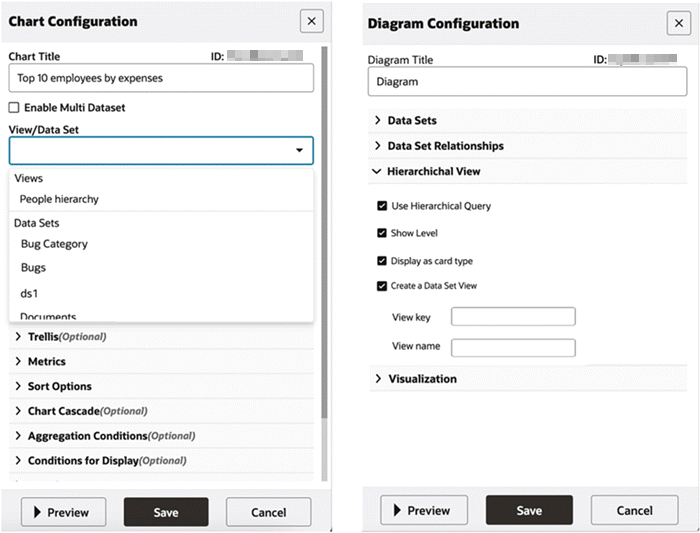
ECC Pop-up
Beginning with Oracle Enterprise Command Center Framework V6, the ECC Pop-up component allows users to perform an Oracle E-Business Suite transaction on an Oracle Application Framework page within the dashboard itself. Users can review additional information or access a third-party website related to any record in the pop-up without navigating to any other page.
Note: Some external websites may not be loaded because of browser security issues (such as cross-origin requests or mixed content issues).
An ECC Pop-up can be configured for hyperlink actions in the Diagram, Results Table, and Grid components to support display of the hyperlink contents in a pop-up.
Designers can combine the push model feature with ECC Pop-up so that the dashboard can immediately reflect the changes applied by a user's action in the ECC Pop-up.
Note: Adding the property eccPopupMode=Y to the link in the respective component's configuration will hide the Oracle Application Framework global headers, footers, and buttons.
Example of an ECC Pop-up
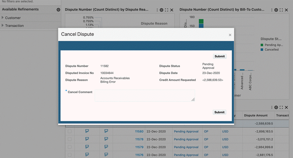
| Option | Description |
|---|---|
| Display in a Pop-up | Available only for Action Type: Hyperlink. |
| Pop-up Title | Free text for setting a header/title on ECC Pop-up. Ex: 'Cancel Dispute'. |
| Lock Dashboard | This option locks the dashboard controls when ECC Pop-up is opened. |
| Refresh on Close | This option allows the configuration of refreshing dashboard contents or the entire dashboard. |
| Refresh Contents | Refreshes contents of every component in the dashboard that allows the changes made in pop-up to be reflected. |
| Refresh Dashboard | Refreshes the page to reflect changes. |
| Action Url | Hyperlink for the pop-up contents. |
| URL Parameters | Allows configuration of attribute values as parameters to the hyperlink. |
ECC Drawer
In ECC V8, the Results Table, Grid, and Diagram components support linking contents through an ECC Drawer. A drawer is a panel that slides in and out from the side. It helps users complete tasks faster and more efficiently. As an example, users can use drawers to navigate to another ECC page or any other Oracle Application Framework page. Using an ECC Drawer is recommended for linking to another ECC dashboard.
ECC Drawer is accessible from any hyperlink configured on a Results Table, Grid, and Diagram.
Designers can combine the push model feature with ECC Drawer so that the dashboard can immediately reflect the changes applied by the user's action in the ECC Drawer.
Example of an ECC Drawer
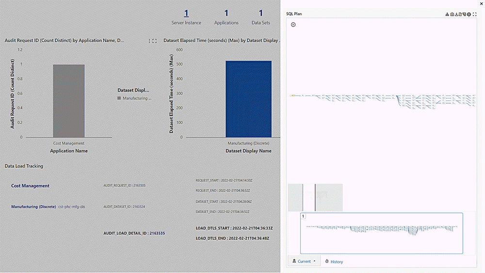
Beginning with V11, the default size of the drawer component is set to 90% of the page size. An end user has the ability to reduce the size to 50%.
The configuration of an ECC Drawer is the same as that for an ECC Pop-up. Note that by default, the dashboard is locked for the drawer, and the option in the configuration is disabled.
Beginning with V16, a Navigation Path Tracking mechanism within the drawer component enhances the end user's orientation, streamlines navigation, and provides data-driven insights into navigation behavior. In multi-level navigations, users often navigate through several layers of options within a drawer navigation panel to reach detailed insights. Without a clear mechanism to track their navigation path, the users can easily lose context or face friction when attempting to return to the dashboard's main view. This feature provides a method for a user to go back to the previous page by clicking on the drawer title. No additional configuration is required; the navigation path is inherited from the drawer title.
For example, say a user has navigated to an ECC drawer from a diagram. The user can navigate back to the diagram by clicking the drawer title.
Example of a Drawer Title "Account Inquiry" with a Navigation Link
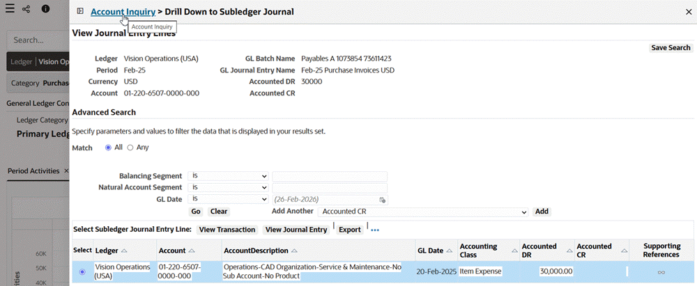
By doing so, the user navigates back to the diagram.
Example of Navigating Using Drawer Title Link
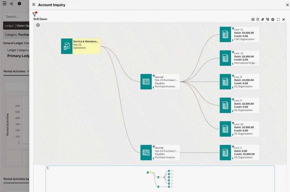
ECC Inline View
Beginning with V9, the Results Table and Diagram components support linking information through the Inline View component. An inline view acts an overlay on top of the parent component. It helps the user to access related information without leaving the original context, leading to shorter turnaround time and better user experience. Through an intuitive breadcrumbs feature, an inline view provides seamless navigation between the parent, or source component and the target component. The primary use case for an inline view is providing access to context-specific information from detailed components: Results Table, Results Table-based Timeline (Single Data Set), Diagram-based timeline (Multiple Data Sets).
| Source Component | Supported Detail Target Component |
|---|---|
| Results Table | Results Table, Single Data Set Timeline, Multi-Dataset Timeline |
| Diagram | Results Table, Single Data Set Timeline, Multi-Dataset Timeline |
| Single Data Set Timeline | Results Table, Single Data Set Timeline, Multi-Dataset Timeline |
| Multiple Data Set Timeline | Results Table, Single Data Set Timeline, Multi-Data Set Timeline |
A Single Data Set Timeline is a timeline that shows events from a single data set. Such timelines are based on the Results Table component.
A Multiple Data Set Timeline is a timeline that shows events from multiple data sets. Such timelines are based on the Diagram component.
The inline view is accessible from any attribute-level hyperlink action configured on a Results Table or Diagram.
For example, an inline view could have a source or parent component of General Ledger Journals in a results table. The target component could then be the Journal Lines, also as a results table.
Example of an Inline View: General Ledger Journals Source Component
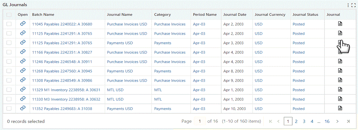
Example of an Inline View: Journal Lines Target Component
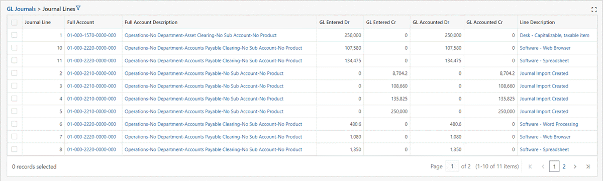
Beginning in V15, inline views triggered from main components such as a Results Table can be exported as part of a CSV download. This enhancement allows you to extract not just the primary data but also the contextual details linked to the selected record. The export file clearly labels the parent-child relationship, includes metadata such as export timestamp and applied filters, and retains pagination or selection-based exports where applicable. This feature is particularly valuable for audit trails, offline analysis, and cross-functional collaboration because it ensures no loss of detail between what is shown onscreen and what is shared externally.
Exporting Line-Level Journal Information from an Inline View
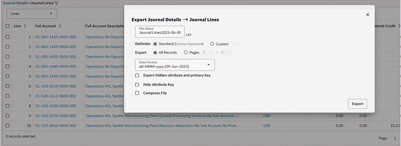
Example Snapshot of Exported Inline Data

Support for Time Stamps and Time Zones
Business users can leverage the dashboard to view information detail down to the seconds level and Enterprise Command Center dashboards can also display the time difference from the current time to the seconds level.
Example of a Time Stamp for Action Date
Oracle Enterprise Command Center Framework also considers the Oracle E-Business Suite user's time zone for displaying time-sensitive data. This capability improves information accuracy and reliability.
Common Component Controls
Pagination Controls
Components that display detailed data includes pagination controls that allow navigation between pages. The following components include pagination controls:
-
Results Table
-
Aggregated Table
Pagination Controls
Runtime Options
In some components, the runtime options includes several options that enable the business user to control how the data is displayed in the component. . Starting with V11, the runtime options support inline labels to improve form usability. The following components include a runtime option:
-
Tag Cloud
-
Chart
-
Search Component
-
Available Refinements
-
Summarization Bar
-
Results Table
-
Timeline View
-
Aggregated Table
-
Pivot View
-
Results Grid
Tag Cloud
A tag cloud can be used if there are dimensions and multiple metrics available (based on the configuration). From the runtime option, the user can select a metric or dimension from the drop-down list to select the dimension or metric to be displayed.
Tag Cloud Runtime Options

Chart
Configuration options include:
-
A chart may be used if there are dimensions and multiple metrics available (based on the configuration). The user can select a metric or dimension from the drop-down list to select the dimension or metric to be displayed.
-
Control the chart display either vertically or horizontally, stacked or unstacked.
-
Control display of only one metric, or multiple metrics if more than metric is defined.
-
Show the chart as a line instead of a bar.
-
Show/hide refinement line (if configured).
-
Change chart sorting as runtime (if enabled).
Chart Runtime Options
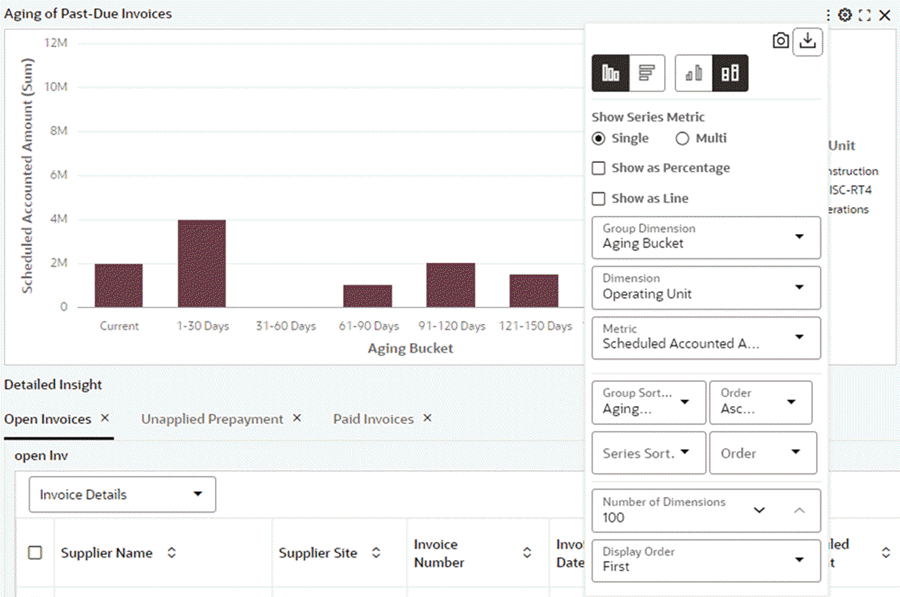
Search Component
A user can switch among the data sets to search for values from each data set and apply as filters.
The name of the data set appears in the component title.
Search Component Runtime Options
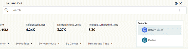
Available Refinements
A user can switch among the data sets to apply attribute values as filters.
The name of the data set appears in the component title.
Available Refinements Runtime Options
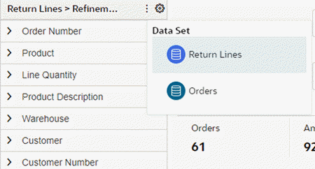
Summarization Bar
Beginning with V10, users can select, deselect, or reorder summary bar items to be displayed through runtime options.
Summarization Bar Runtime Option
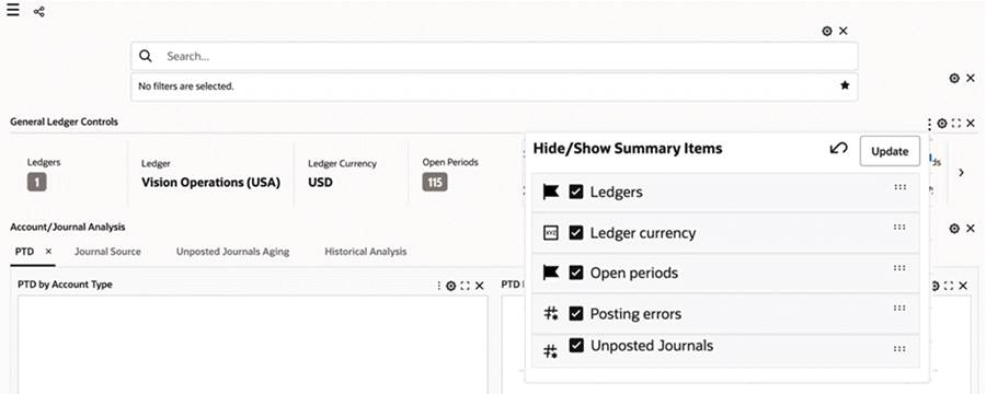
Results Table
Beginning with V10, users can hide, show, or reorder the result table attributes they want to view through runtime options.
Results Table Runtime Options
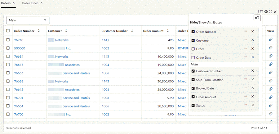
Timeline View
End users can do the following through runtime options:
-
Add or remove the timeline events
-
Enable or disable the overview
-
Set the event limit
Timeline View Runtime Options
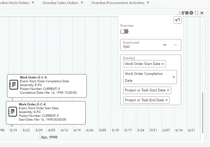
Aggregated Table
Users can hide, show, and rearrange the attributes and metrics using the runtime options.
Aggregated Table Runtime Options
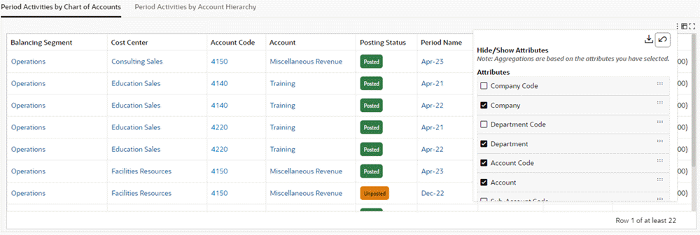
Pivot View
Users can hide, show, and rearrange the attributes and metrics using the runtime options.
Users can also enable or disable the subsummary for an attribute.
Pivot View Runtime Options
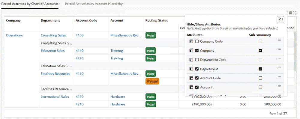
Results Grid
Users can compare multiple records (if enabled).
Users can reorder the appearance of records (If enabled).
Results Grid Runtime Options
Copy Value
Beginning with V16, ECC supports copying individual field values directly from dashboard visualizations.
When a user hovers over a value, a Copy icon appears, allowing the user to copy the selected value to the clipboard with a single click. This lightweight and intuitive interaction makes it easy to transfer information from ECC dashboards into emails, spreadsheets, or other business applications.
This feature is currently supported in the following components:
-
Selected Refinements
-
Summarization Bar items
-
Results Table
-
Aggregate Table / Pivot
-
Grid / Aggregate Grid
Example of the Copy Icon when Hovering over a Value
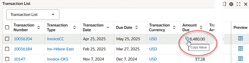
Message Indicating a Value is Copied
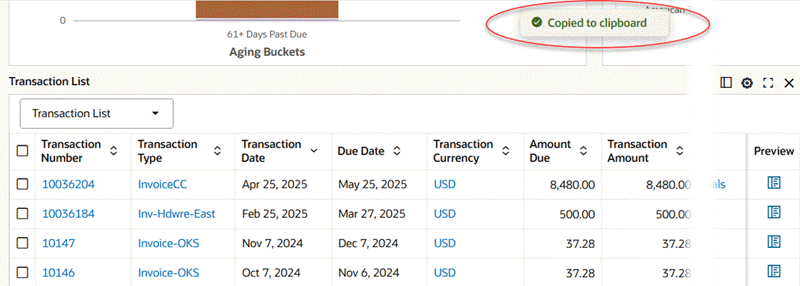
This enhancement improves the overall user experience and streamlines common workflows that require quick data extraction from visual components.
Retain Selected Refinements across Dashboards
Beginning with V10, designers can configure a component to preserve selected refinements across dashboards. With this feature enabled, when the end user scrolls away from a page (via a component) and then returns to it, the selected refinements will be preserved. This new feature spans across all components that support hyperlinks: Results Grid, Search, Results Table, Aggregate Table, Aggregate Grid, Summarization bar, and Diagram. Designers can choose to preserve selected refinements in the component's configuration by selecting the Retain Existing Refinement State on Source Page checkbox.
ECC Hyperlinks
Hyperlinks in ECC are primarily used to facilitate navigation by providing links that redirect users to specific destinations. Integrating hyperlinks into ECC dashboards greatly enhances interactivity, leading to an improved user experience.
Hyperlinks in ECC are supported in the summary bar (metric item), aggregated table, result table, grid, and diagram.
Depending on the business case, the structure of the hyperlink differs. There are essentially three distinct hyperlink structures within ECC.
Navigating to a Form
Follow these steps to enable links for an Oracle E-Business Suite window in Oracle Forms.
The syntax for the link is:
/ecc/ebs/formsCaller?functionCode={form function}
The properties used in the link are:
-
functionCode: The form function associated with the form. -
Parameter: Optional. Use this property to pass an argument to the form function.
For example: To pay an open invoice, the payables manager wants to click on the invoice number of the result table component to navigate to the Invoice Workbench form. The hyperlink needs to be configured on the attribute (invoice number) to facilitate seamless navigation to the Invoice Workbench form.
Example of a Results Table with a Link to the Invoice Workbench
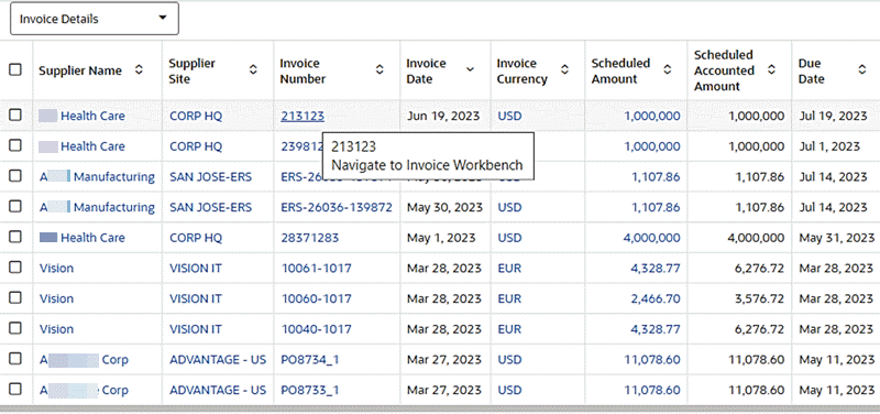
The steps to configure this link are:
-
For the Invoice Number attribute, Set the column action to "Column Action."
-
Set the action as "Hyperlink."
-
Enable Display action description in tooltip.
-
Provide business-friendly text, such as "Navigate to Invoice Workbench," for the tooltip.
-
Select Open Link in a new window to open the form.
-
Select Add URL MACing.
-
Set the Hyperlink URL:
/ecc/ebs/formsCaller?functionCode=AP_APXINWKB&INVOICE_ID={0}where
AP_APXINWKBis the form function of the Invoice Workbench. -
Set the URL Parameter to "Invoice." The INVOICE_ID that is used in the URL is the attribute key for the attribute
Invoice.
Example of the Results Table Configuration for the Link to the Invoice Workbench
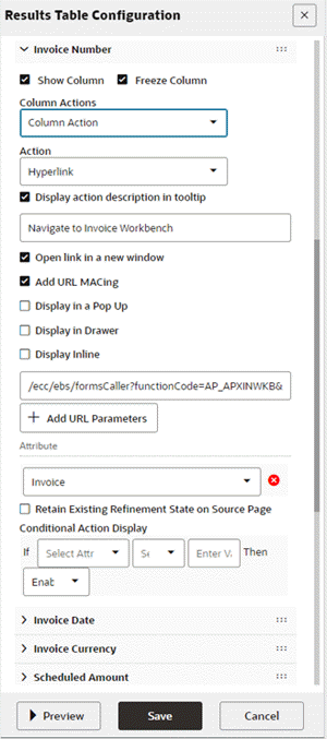
Navigating to an Oracle Application Framework Page
Follow these steps to enable links for Oracle Application Framework (OAF) pages.
The syntax for the link is:
/OA_HTML/OA.jsp?OAFunc={OA Page}
The properties of the link are:
-
OAFunc: the FND function associated with OA Page. -
Parameter: Optional. Use a parameter to apply a refinement on the target OAF page.
For example: While reviewing the "Work Order Schedule exceptions" in an results table, a Project Manufacturing user wants to review the genealogy of a specific work order. A hyperlink thus needs to be configured as a row action. It will be called "Network," as shown below.
The steps to configure this sample link are:
-
Inside the Action accordion of Row Actions, add a Row Action.
-
Define the action type as Hyper Link.
-
Define the Action Name "Network."
-
Define Action Column header "Network."
-
Select Display default icon to prefix the action with an icon
-
Select Add URL MACing.
-
Define the Hyperlink URL:
/OA_HTML/OA.jsp?OAFunc=PJM_ECC_GNT_PG&workOrder={0} -
Set the URL parameter to "Work Order."
Example of the Results Table Configuration with a Link to a Work Order Page
Navigating to an Oracle Enterprise Command Center Framework Page using Deep Links
A deep link in ECC serves as a specialized hyperlink that enables seamless navigation to another dashboard while preserving pre-set filters. This functionality is pivotal for maintaining context within a specific business area. Deep links accommodate various ECC refinements and even allow the configuration of hidden filters within chosen refinements. They are especially valuable when users need to retain filter context across dashboards to carry out related tasks by offering a smooth transition to different dashboards for these activities.
Configuring Deep Links
Oracle Enterprise Command Center Framework supports the following filters as part of deep links:
-
Selection filter
-
Range filter
-
Search filter
-
Clear filter
The generic syntax for configuring a deep link is as follows:
eccDeepLink=[{"dataset_key": [<filters>]}]
For configuring a selection filter, the syntax is
eccDeepLink=[{"dataset_key":[{"attributeKey":"<attribute_key>","values":["<values>"],"operator":"=="}]}]
| Property | Description |
|---|---|
| attributeKey | The attribute key of the data set. |
| values | The attribute value to use for the refinement. |
| operator | One of the operations to apply on the data set attribute: ==, null, !null, !=, >,<,>=,<= |
| hide | Optional. Set this to true to hide the selected attribute on the selected refinement UI. |
For a range filter, an example of the syntax for configuration is:
eccDeepLink=[{" dataset_key ":[{"from":"2001-02-26","to":"2006-12-13","attributeKey":"< attribute_key >"},{"from":"720","to":"90000","attributeKey":"<attribute_key>"}]}]
| Property | Description |
|---|---|
| attributeKey | The attribute key of the data set. |
| from | The lower bound number or date. The date should be in canonical format. |
| to | The upper bound number or date. The date should be in canonical format. |
An example of the syntax for configuring a search filter is:
eccDeepLink=[{"fa-asset":[{"search":["cip“,”computer”]}]}]
| Property | Description |
|---|---|
| search | Array of search keywords, comma-separated; every keyword should be at least three characters long. |
| hide | Optional. Set this to true to hide the selected attribute on the selected refinement UI. |
The syntax to clear the filters in the target dashboard is
-
To reset all the selected refinements:
eccDeepLink=[] -
To reset filters from a data set:
eccDeepLink=[“<dataset_key>”:{}]
Example of a Deep Link
For example, say in Project Manufacturing, the Project Manufacturing Execution Genealogy diagram is utilized for tracking detailed project manufacturing activities. When dealing with a particular work order, it's essential to review the work order's specific timeline to grasp its start and completion. The solution here is to implement a hyperlink action for the work order attribute, enabling direct access to the work order's dedicated timeline without the need for cumbersome manual filtering.
The steps to configure the link are:
-
Set the Action Type as "Hyperlink" for Work Order attribute.
-
Select "Display action description in tooltip"
-
Set the tooltip description with a business-friendly name "View Timeline"
-
Select "Add URL MACing"
-
Select "Display Inline" as the preferred medium to access timeline. Timeline is a component, rather an ECC page. Hence, accessing it using inline view makes more sense as it will allow the user to see the timeline while remaining in context of the dashboard
-
Set the URL as below:
/ecc/web/eccComponent/pjm-gnt/timeline/9mo5xgsyt1r?eccDeepLink=[{"pjm-gnt-wo":[{"attributeKey":"JOB_NAME","values":["{0}"],"operator":"=="}]}]In cases where a deep link is required to provide direct navigation to a component within the target page, the URL path is constructed with a page URL followed by the unique component ID, such as "/ecc/web/eccComponent/pjm-gnt/timeline/9mo5xgsyt1r."
Example of a Diagram Configuration with a Link for a Work Order's Timeline
However, in certain situations where the entire page's content needs to be displayed instead of just a specific component, a different URL structure is employed. For instance, when accessing an associate's expenses, the entire expense analysis dashboard associated with that associate is presented, and the URL takes the form of "/ecc/web/eccapp/ap-emp-exp/ap-exp-ana."
In this alternate structure, "eccApp" is used instead of "eccComponent," and there is no inclusion of a specific component ID since the objective is to present the entire page's content.
-
Set the URL parameter to "Work Order".
An example of a deep link with multiple parameters is:
/ecc/web/eccComponent/gl/gl-dd/3mrt75sjkx?eccDeepLink=[{"gl-aa":[{"attributeKey":"GL_ACCOUNT_CODE","values":["{0}"],"operator":"=="},{"attributeKey":"LEDGER","values":["{1}"],"operator":"=="},{"attributeKey":"PERIOD_NAME","values":["{2}"],"operator":"=="}]}]
Example of an Aggregate Table Configuration with Multiple Parameters
In scenarios where a deep link incorporates multiple attributes, these attributes are assigned sequential numbers for their values. It is crucial that the URL parameters adhere to the exact same sequence used in the URL.
An example of a deep link with a Hide parameter is:
/ecc/web/eccapp/ap-emp-exp/ap-exp-ana?eccDeepLink=[{"ap-emp-exp":[{"attributeKey":"EMPLOYEE_ID","values":["{0}"],"operator":"==","hide":true}]}]
In certain situations, concealing the applied refinement from end user becomes necessary. In such instances, the "hide" parameter proves to be valuable.
Custom Label
Introduced in ECC V12, the Custom Label feature enhances effective communication by enabling users to align aggregated data with their organization's or team's internal language and conventions. Additionally, it enhances flexibility and adaptability by accommodating diverse user requirements, ensuring that visualizations are relevant and meaningful to their specific use cases.
| Component | UI Elements |
|---|---|
| Summary Bar | Flag pop-up metric title |
| Chart | Axis title Tooltip Default chart title Chart legend Runtime option Export Cascaded chart |
| Aggregated Table (Pivot view) | Column headers Runtime option Export |
| Tag Cloud | Default component title Runtime option |
| Network Diagram | Node Tooltip Row expander Export Show detail Compare |
| Grid | Cell label Export |
An example of a custom label for a chart could be one defined as follows:
-
Chart Type: Bar/Line
-
Bar Metric: Order Number (Count Distinct)
-
Custom Label for Bar Metric: Total Orders
-
Line Metric: Running Total (Line Quantity (Count Distinct))
Note: For the line metric, a custom label is not defined. Hence, the icon is not active. Note how the custom label icon has turned blue for the Bar Metric, indicating that a custom label is set.
Configuration Options for a Chart with a Custom Label
Note the effect of a custom label in the axis title, tooltip, and chart title.
Preview of a Custom Label in a Chart
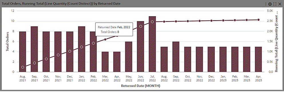
For an example with an Aggregated Table, a custom label could be defined on the metric "Expense Amount (Sum)".
Example of Aggregated Table Configuration with a Custom Label
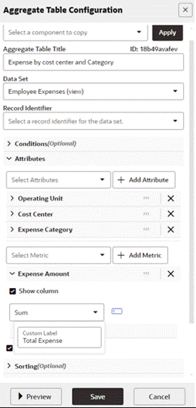
A preview of the aggregated table shows the effect on the runtime context menu and column headers.
Example of an Aggregated Table with a Custom Label
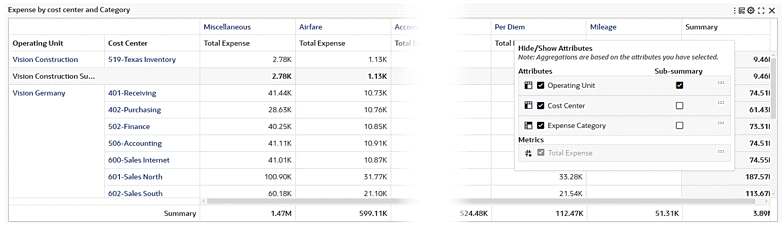
The following is an example of a network diagram (Hierarchical Query).
The custom label "Organization Expense" is set where hierarchical aggregation is enabled:
Diagram Configuration with a Custom Label where Hierarchical Aggregation is Enabled
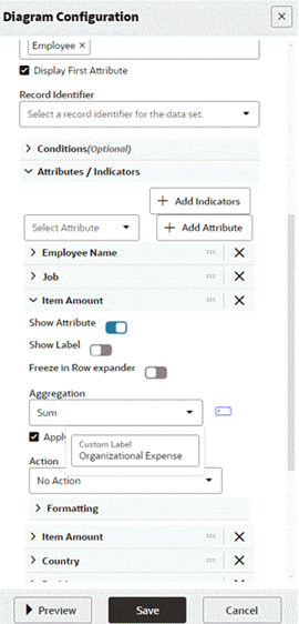
The custom label "Own Expense" is set where hierarchical aggregation is not enabled.
Diagram Configuration with a Custom Label where Hierarchical Aggregation is Disabled
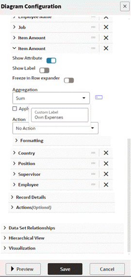
In the Row Expander view of the diagram, the custom labels "Organizational Expense" and "Own Expenses" are used as column headers.
Example of Custom Labels in a Diagram's Row Expander View
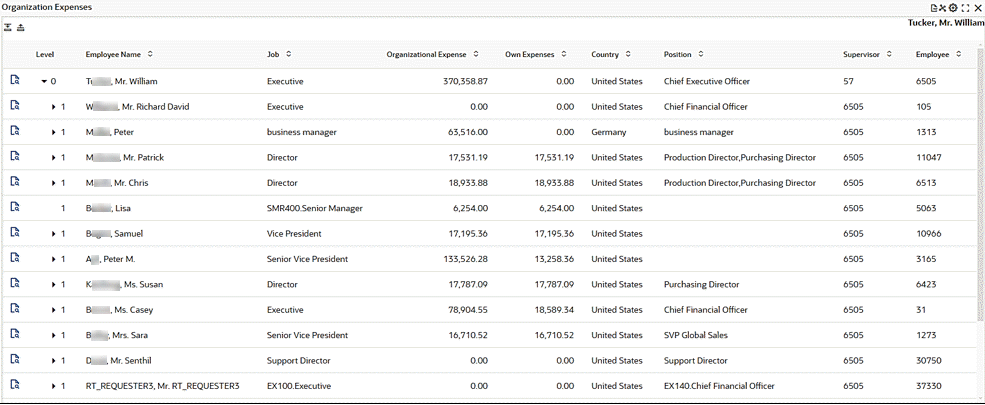
Personalization
User Personalization was introduced in V10. It consists of two types:
-
End User Personalization, formally known as User Preferences
-
Power User Personalization
End User Personalization
End User Personalization allows end users to make changes in the dashboard that will suit their preferences. End users can do the following:
-
Enhance business user experience by editing components in the dashboard
-
User changes are preserved across the session.
-
The component displays according to each user's preferences.
End user personalization is available across visualization components such as Summary Bar, Tag Cloud and Charts, and across detailed insights and aggregated components like Results Table/ Timeline, Aggregate Table/ Pivot and Grid/ Aggregated Grid. Each component locally has a reset option under runtime options that the user can use to return to the default view of the component. End user personalization can be reset either at the Component level or at the Page level. Below are examples of end user personalization done at the Component level.
Chart
Users can personalize the chart to suit their needs by flipping the chart layout or using a different metric/dimension.
Tag Cloud
User can personalize the Tag Cloud to suit their needs by using different metric/dimension.
Summarization Bar
User can personalize the Summarization Bar to suit their needs by reordering summary items, showing/hiding summary items from the view.
Results Table
User can personalize the Results Table to suit their needs by reordering attributes, showing/hiding attributes from the view.
Aggregate Table/Pivot
User can personalize the Aggregate Table/Pivot to suit their needs by reordering attributes, showing/hiding attributes, enabling/hiding sub-summary from the view.
Timeline
User can personalize the Timeline to suit their needs by changing the event limit, or choosing the types of events shown the view.
Reset End User Personalization at Page Level
End User Personalization can be reset at Page level, this would reset End User Personalization for all components in the dashboard, as this is performed at the Page level.
Power User Personalization
Power users can modify the dashboard to tailor it based on their business requirements.
Examples:
-
A Credit Manager wants to track top past-due customers based on their profile class so that they can revisit the customers' credit ratings and manage or update the payment terms.
-
A Payables Accountant wants to track the cash outflow for invoice payments per bank account so that they can analyze payments trends.
Characteristics of a power user's capabilities and UI experience include:
-
Same designer experience as an administrator user.
-
Enabled at the user level using the profile option "FND: ECC Power User Enabled"
-
All personalizations are saved without any deployment.
-
No access to the Oracle Enterprise Command Center Framework Administration UI.
Beginning with V11, an "i" icon on the dashboard is available. Clicking this icon opens a window with additional information as well as a Personalize button to enable personalization and an Exit button to exit personalization.
| Can Perform | Cannot Perform |
|---|---|
| Add a new component | Create a new data set |
| Modify an existing component | Create a new dashboard |
| Delete a component | Configure a component from a data set that is not part of the application data sets |
| Change dashboard layout Enable or remove the Above the Fold layout |
Create a public saved search |
The following table summarizes the differences between the two types of personalization.
| End User Personalization | Power User Personalization |
|---|---|
| All business users | Power users only |
| Runtime changes | Configuration changes (components) |
| Implicit saving as user utilizes run-time options | Explicitly saving for configuration changes |
| Involves no efforts from the user | Involves efforts from the user |
Power User Personalization: After Patching
Power user personalization is preserved during patching.
A user is notified when a new version is available. Users can apply the new version and lose all the personalizations, or they can cancel and keep the personalized version.
Personalizing a Page as a Power User
-
When personalization is enabled for a user (that is, the FND:ECC Power User Enabled profile option is enabled at the user level), a new icon placed inside the (i) icon to indicate that user can personalize the dashboard. The power user can do so by clicking on the Edit Dashboard Icon. This icon is black by default.
Example of the Edit Dashboard Icon
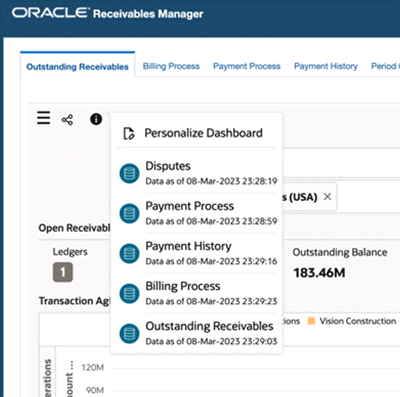
-
Once the user clicks on the icon, the icon color changes from black to blue, and the page is enabled for editing.
Example of the Edit Dashboard Icon before Editing the Page
-
When the user applies a personalization on the dashboard, the icon becomes red, indicating that this page is personalized.
Example of the Edit Dashboard Icon after Personalization
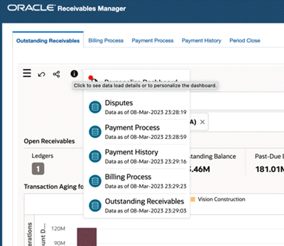
-
When the user hovers over the icon, a tooltip, "Personalized Dashboard," is displayed to indicate that the dashboard is personalized.
Tooltip Indicating the Dashboard is Personalized
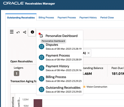
-
The user can reset the personalization by clicking on the Reset icon at the dashboard level.
-
When the user enables a personalization on a page, applies personalization on one of the existing components in the dashboard, or adds a new component, a new icon is displayed at the component level identifying that the component is personalized (this icon is visible only in personalization mode).
Example of the "Personalized" Icon at the Component Level
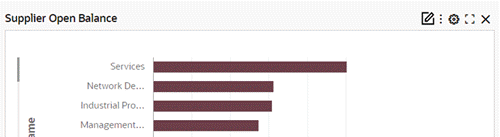
-
When the user hovers over the icon, the "Personalized" tooltip is displayed to indicate that the component is personalized.
Tooltip for the "Personalized" Icon at the Component Level
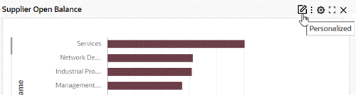
-
A notification message is shown inside the information icon and has options to accept or cancel options. This icon has a red dot to indicate a new notification is present for the user.
-
Once the power user applies the change, the red dot will disappear and the dashboard will be the latest version from the administrator.
-
If the power user selects Cancel, then the icon is closed. If the power user opens the "i" icon again, they can see the message again inside it.
-
At any time, the power user can click on the Reset icon to go to the latest version from the administrator.
-
The power user can use the scrollbar to see all the data sets.
Example of Options after Personalization
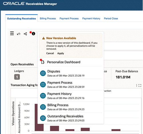
-
"Copy Component" Feature for Power Users
The Copy component feature is added in V11. Power users can copy any component in a page that belongs to the same application.
To copy a component: In the Configuration window, a power user can:
-
Click on the Copy Component field to select which component to copy and from which page to copy.
-
Click Apply.
The source component's configuration will be copied over, and the power user can choose to either save the configuration as is, or choose to edit the component further and then save the configuration.
All configuration and all runtime options will be copied from source component in the target component.
Only 1:1 mapping of components is possible; that is, from a results table component the Copy Component list will display only results table components across dashboards in that application to copy. For example: if you are copying within a Chart component: The list will display only chart components across dashboards within the current application.
Personalization Tracking
Beginning with V11, administrators can track and revert personalization changes made by power users.
Admins can revert all personalization made by power users at the page level to the site level dashboard or revert individual component updates.
Personalization Tracking Tab
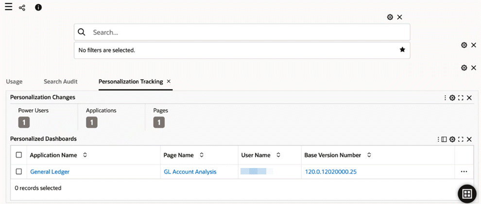
Collaboration
Collaboration: Export
Beginning with V11, an administrator can export a subset of pages when exporting an application. This flexibility allows the administrator to change only the pages that they intend to modify without affecting other pages within the destination application during the import process. Previously, an update to a single page necessitated exporting the entire application, with unintended updates to other pages in the process.
All pages are initially selected by default; administrators can remove this filter and choose specific pages.
All views associated with exported data sets are automatically included in the export.
Export/Import Page
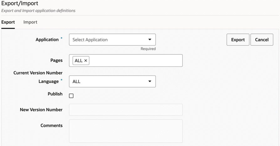
Collaboration: Move/Copy Pages
Beginning with V11, an administrator can move a page from one application to another or copy a page from one application to another. A "copy" action will copy the page in the destination application while maintaining the page in the source, and a "move action will remove the page from the source application and add it to the destination application.
The steps to move or copy a page are:
-
An administrator can click on the Move icon within any page section under any particular application to move or copy the page.
-
From the pop-up window, the administrator can select to which application to move or copy the page.
-
To copy and not move the page, the administrator should select the Create a copy checkbox. If this checkbox is not selected, the page will be moved in its entirety to the target application.
Move Page
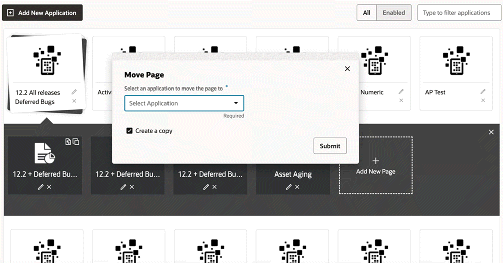
Sharing Personalizations
Introduced in V12, the Share Personalization functionality presents enhanced user engagement and fosters improved collaboration and communication. It enables users to share personalized dashboards seamlessly across an Oracle E-Business Suite responsibility.
Share Personalization Process Example
-
A power user has requested an administrator to share their personalization with everyone using their responsibility.
The administrator visits the activity audit dashboard and filters by Page name and username to find the personalization detail.
The administrator accesses the corresponding row action "Share Personalization."
Share Personalizations Action Selected on Personalizations Tracking Tab
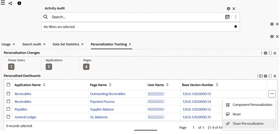
-
As soon as share personalization is clicked, the page is copied.
A message with the page key provided upon successful copy of page appears upon the successful copying of page.
The message disappears only when user explicitly click on close button corresponding to the message.
Example of "Page Copied Successfully" Message
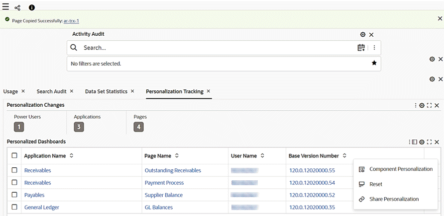
-
Upon a user clicking the hyperlink, a drawer opens with page detail of the copied page and the user can make amendments and save the changes.
The naming convention of the copied page is as follows:
-
Page short name:
<existing name> <-> <personalized>-1 -
Page Name:
<existing name> <space> <Personalized (1)>
Note that the first copy has the number 1, and the nth copy would have the number n.
Edit Page for the Copied Page
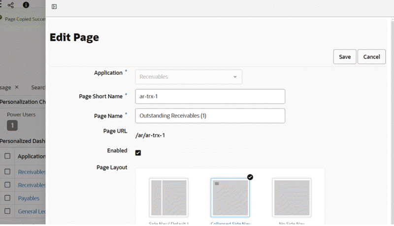
-
-
If the user amends the name, key, or orientation and then clicks Save, a message appears inside the drawer indicating that the changes are saved.
The drawer is closed automatically.
If the user clicks Cancel, the drawer is closed immediately.
"Saved Successfully" Message for an Updated Page
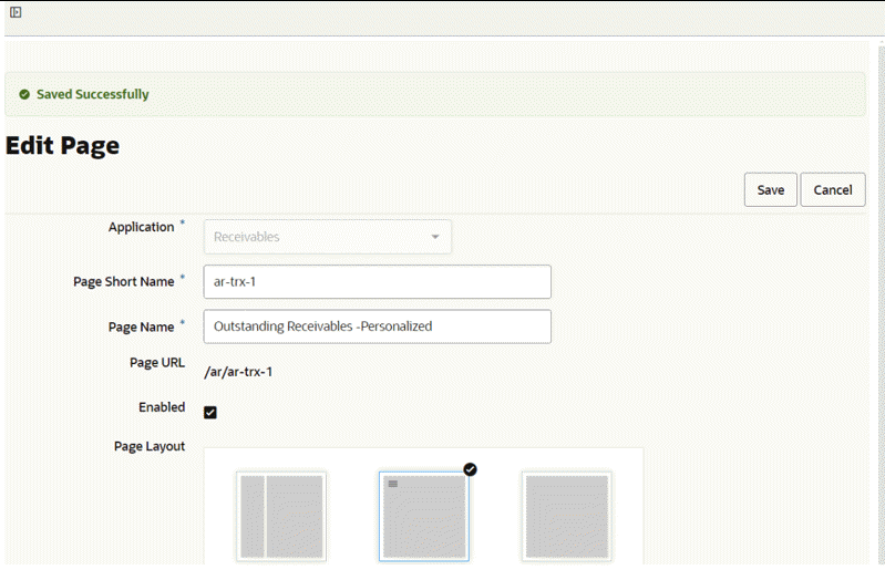
-
The administrator then continues with the rest of the process, such as creating new FND function and assigning a permission set in an Oracle E-Business Suite environment to complete the process.
Once the personalization is shared, if any of the users using the shared version of personalized wants to use the original version of the dashboard then they need to collaborate with the administrator. In a situation where a few users want the personalized version of the dashboard and a few want the shipped version of the dashboard, the administrator needs to create different responsibilities to handle those scenarios.
Important: When a newer product version is adopted, there will be no automatic notification since the shared personalization page is essentially a copied page. Therefore, any communication pertaining to the newer shipped version must be handled offline between the administrator and the business users. It is essential to ensure that all relevant parties are informed and updated regarding any changes or updates to the product version to maintain effective collaboration and workflow management.
Applying Personalizations at the Site Level
Introduced in ECC V14, the Apply Personalization at Site feature enables administrative users to share a power user's personalized dashboard at the site level, eliminating the need for OA personalization. Previously, applying personalizations at the site level required administrators to go through the OA personalization route. With this enhancement, administrators can now seamlessly apply power user personalizations across the experience for all business users. This feature thus ensures a more consistent and efficient experience without requiring individual updates.
Once an administrator applies a power user's personalization at the site level, all business users using the default dashboard layout will see the updated version, while other power users' personalized dashboards remain unchanged to preserve individual customizations. A new attribute has been introduced to indicate the scope of personalization within the Personalization Tracking section of the Activity Audit page. If a power user's personalization has been shared across the site, the Personalization Scope will be marked as "Site." Otherwise, for individual customizations that have not been applied site-wide, the scope will be marked as "User."
This distinction helps administrators efficiently track and manage personalization requests, ensuring clarity in whether a dashboard layout has been globally applied or remains specific to an individual power user.
A typical user journey using the "Apply Personalization at Site" feature is described below.
-
A power user has requested that an administrator share their personalization with everyone at the site.
The administrator visits the activity audit dashboard and filters by page name and user name to find the personalization details. The administrator accesses the corresponding row action "Apply Personalization at Site."
Personalization Tracking Tab with "Apply Personalization at Site" Option
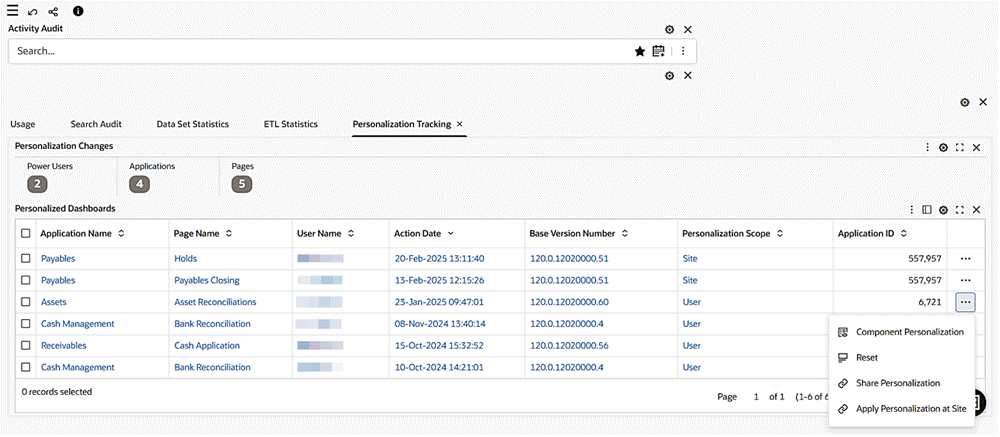
-
As soon as administrator clicks "Apply Personalization at Site," the site level layout is updated with the personalized layout.
A message appears indicating success and the Personalization Scope for the corresponding record is updated to Site.
Confirmation for the Application of a Personalization at the Site Level
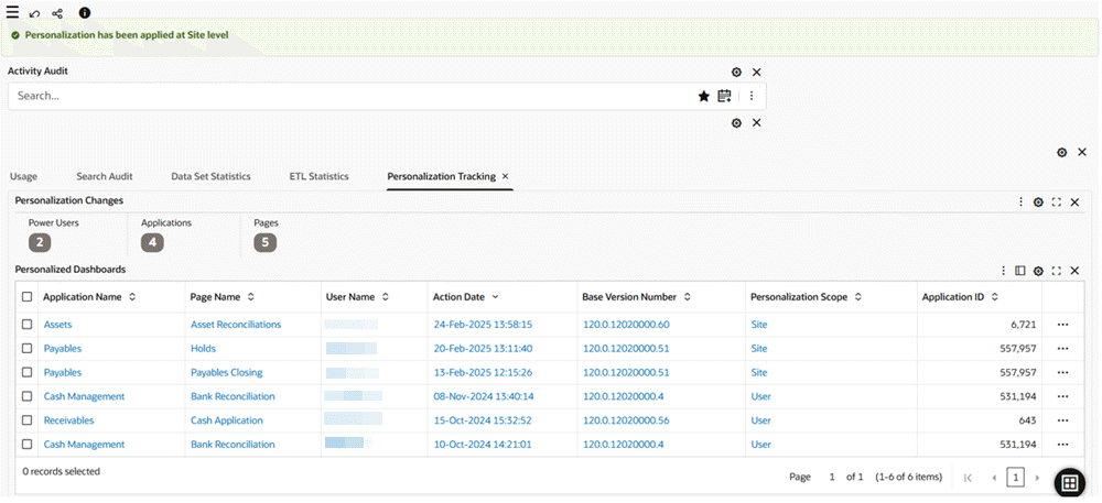
-
Note that if the site-level personalization fails to apply due to a technical issue, a message appears, notifying the administrator of the failure.
Message Indicating Failure to Apply a Personalization at the Site Level
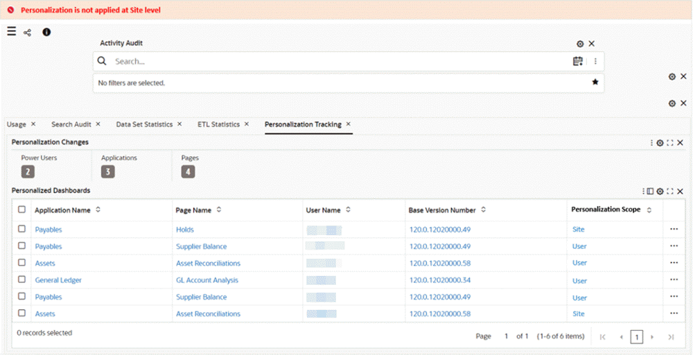
-
Note that the reset option is disabled for pages with the Personalization Scope set to "Site."
Additionally, the reset option has been removed from the "Component Personalization" table to ensure consistency in personalization management.
Disablement of the Reset Option
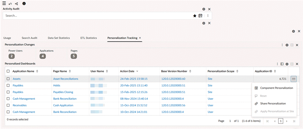
-
A power user will continue to receive notifications about the availability of a new version as long as their personalization differs from the site-level personalization.
Notification to Power Users regarding a New Version of the Dashboard
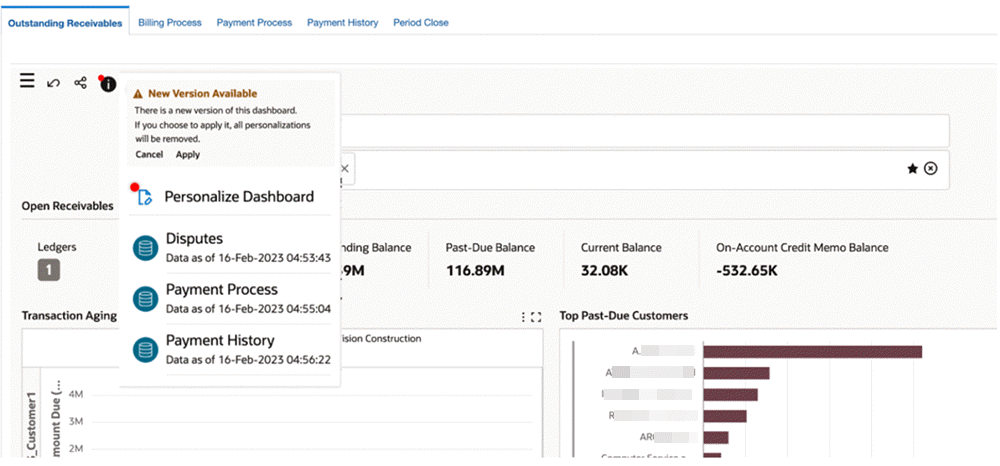
Merging Personalizations
For information on merging personalizations, a feature available to power users, see Merging Personalizations, Oracle E-Business Suite User's Guide.