| Skip Navigation Links | |
| Exit Print View | |

|
Oracle ZFS Storage Appliance Administration Guide |


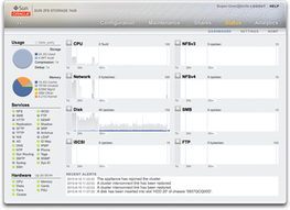
The Dashboard summarizes appliance status
The Status Dashboard provides links to all the main screens of the browser user interface (BUI). Over 100 visible items on the Dashboard link to associated BUI screens indicated by a border or highlighted text that appears on mouse-over. The sections that follow describe the areas of the Dashboard in detail.
The Usage area of the Dashboard provides a summary of your storage pool and main memory usage. The name of the pool appears at the top right of the Usage area. If multiple pools are configured, use the pull-down list to select the desired pool to display.
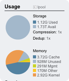
The total pool capacity is displayed at the top of this area. The Storage pie-chart details the used, available, and free space. To go to the Shares screen for the pool, click the Storage pie-chart.
The total system physical memory is displayed at the top of this area. To the left is a pie-chart showing memory usage by component. To go to the Analytics worksheet for dynamic memory usage broken down by application name, click the Memory pie-chart.
| ||||||||||||
| ||||||||||||
Note that users need the analytics/component create+read authorization to view the memory usage. Without this authorization, the memory details do not appear on the Dashboard.
This area of the Dashboard shows the status of services on the
appliance, with a light icon to show the state of each service.
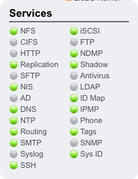
Most services are green to indicate that the service is online, or grey to indicate that the service is disabled. See the icon status section for a reference of all possible states and icon colors.
To go to the associated configuration screen, click on a service name. The Properties screen appears with configurable fields, restart, enable, and disable icons, and a link to the associated Logs screen for the service.
This area of the Dashboard shows an overview of hardware on the
appliance. 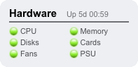
If there is a known fault, the amber fault  icon appears.
To go to the Hardware Maintenance screen for a detailed look at hardware state, click the name of a hardware component.
The activity area of the Dashboard shows graphs of eight performance statistics by default. The example in this section shows Disk operations/sec. The statistical average is plotted in blue and the maximum appears in light grey.
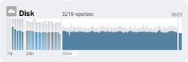
To go to the Analytics worksheet for an activity, click one of the four graphs (day, hour, minute, second) for the statistic you want to evaluate.
To view the average for each graph, mouse-over a graph and the average appears in the tooltip. The weather icon in the upper-left provides a report of activity according to thresholds you can customize for each statistic on the Status Settings screen.
| ||||||||||
The average for the selected plot is shown numerically above the graph. To change the average that appears, select the average you want, either 7d, 24h, or 60m.
The vertical scale of all graphs is printed on the top right, and all graphs are scaled to this same height. The height is calculated from the selected graph (plus a margin). The height will rescale based on activity in the selected graph, with the exception of utilization graphs which have a fixed height of 100 percent.
Since the height can rescale, 60 minutes of idle activity may look similar to 60 minutes of busy activity. Always check the height of the graphs before trying to interpret what they mean.
Understanding some statistics may not be obvious - you might wonder, for a particular appliance in your environment, whether 1000 NFSv3 ops/sec is considered busy or idle. This is where the 24-hour and 7-day plots can help, to provide historic data next to the current activity for comparison.
The plot height is calculated from the selected plot. By default, the 60-minute plot is selected. So, the height is the maximum activity during that 60-minute interval (plus a margin). To rescale all plots to span the highest activity during the previous 7 days, select 7d. This makes it easy to see how current activity compares to the last day or week.
The weather icon is intended to grab your attention when something is unusually busy or idle. To go to the weather threshold configuration page, click the weather icon. There is no good or bad threshold, rather the BUI provides a gradient of levels for each activity statistic. The statistics on which weather icons are based provide an approximate understanding for appliance performance that you should customize to your workload, as follows:
Different environments have different acceptable levels for performance (latency), and so there is no one-size-fits-all threshold.
The statistics on the Dashboard are based on operations/sec and bytes/sec, so you should use Analytics worksheets for an accurate understanding of system performance.

This section shows the last four appliance alerts. Click the box to go to the maintenance logs screen to examine all recent alerts in detail.
A text version of the Status > Dashboard screen is available from the CLI by typing status dashboard:
cuttlefish:> status dashboard
Storage:
   pool_0:
      Used     497G bytes
      Avail    8.58T bytes
      Free     8.43T bytes
      State          online
      Compression    1x

Memory:
   Cache        30.1G bytes
   Unused       2.18G bytes
   Mgmt         343M bytes
   Other       474M bytes
   Kernel      38.9G bytes

Services:
   ad                disabled               smb              disabled
   dns               online                 ftp               disabled
   http              online                 identity          online
   idmap             online                 ipmp              online
   iscsi             online                 ldap              disabled
   ndmp              online                 nfs               online
   nis               online                 ntp               online
   routing           online                 scrk              maintenance
   snmp              online                 ssh               online
   tags              online                 vscan             online

Hardware:
   CPU               online                 Cards             online
   Disks             faulted                Fans              online
   Memory            online                 PSU               online

Activity:
   CPU             1 %util                  Sunny
   Disk           32 ops/sec                Sunny
   iSCSI           0 ops/sec                Sunny
   NDMP            0 bytes/sec              Sunny
   NFSv3           0 ops/sec                Sunny
   NFSv4           0 ops/sec                Sunny
   Network       13K bytes/sec              Sunny
   SMB             0 ops/sec                Sunny

Recent Alerts:
   2013-6-15 07:46: A cluster interconnect link has been restored.
The previous descriptions in the BUI section apply, with the following differences:
The activity plots are not rendered in text (although we have thought about using aalib).
The storage usage section will list details for all available pools in the CLI, whereas the BUI only has room to summarize one.
Separate views are available, for example status activity show:
caji:> status activity show
Activity:
   CPU            10 %util                  Sunny
   Disk          478 ops/sec                Partly Cloudy
   iSCSI           0 ops/sec                Sunny
   NDMP            0 bytes/sec              Sunny
   NFSv3         681 ops/sec                Partly Cloudy
   NFSv4           0 ops/sec                Sunny
   Network     22.8M bytes/sec              Partly Cloudy
   SMB             0 ops/sec                Sunny
caji:>
You might experience browser memory issues if you leave the Dashboard screen open in a browser continuously (24x7). The browser will increase in size (memory leaks), and need to be closed and reopened. Browsers are fairly good at managing memory when browsing through different websites (and opening and closing tabs). The issue is that the Dashboard screen is left running and not closed, which opens and reopens images for the activity plots, thus degrading image rendering performance.
If you experience this problem while using Firefox, disable the memory cache as follows:


|