| Oracle® WebCenter Content User's Guide for Imaging 11g Release 1 (11.1.1) Part Number E12783-04 |
|
|
PDF · Mobi · ePub |
| Oracle® WebCenter Content User's Guide for Imaging 11g Release 1 (11.1.1) Part Number E12783-04 |
|
|
PDF · Mobi · ePub |
This section contains information about the interface used with Oracle WebCenter Content: Imaging. All pages and page elements are detailed.
This section covers the following topics:
The following icons are used in the Imaging user interface and may not be explicitly identified. Note that a description of each icon is displayed when holding your cursor over it. The following table provides the names and graphics of some unidentified icons. The graphics may change slightly depending on the skin chosen in the Personal Settings Section of the Preferences Page.
| Icon | Description |
|---|---|
| Collapse/Restore pane | |
| Close current window or tab | |
| More options | |
| Click to display icon that does not fit in toolbar |
The home page is displayed after logging in to Imaging. The navigator pane displays panels to which you have access, such as the Searches panel which contains predefined searches. If you have administrative rights, there may also be links to administrative panels such as Manage Searches. For more information about administrative tasks, see the Oracle WebCenter Content Administrator's Guide for Imaging.
Next to the navigator pane is the page region. It is used to display search forms, search results, and the user Preferences page. Above the page region is the banner area, with links to the Preferences page and other functionality, such as the ability to refresh the page or log out of Imaging. Both the navigator pane and banner area can be hidden or exposed by clicking the Collapse Panel icons at the edge of each area.
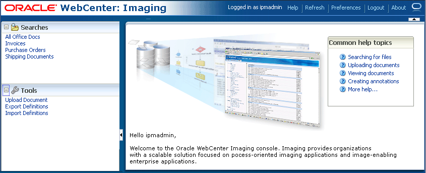
The following table describes the elements available on the page.
| Element | Description |
|---|---|
| Help | Displays online help. |
| Refresh | Refreshes the information in the page region. Note that if a Search Form Criteria and Search Results Table is displayed in the page region, it is not updated when clicking Refresh, as this does not execute the search again. If you or another user updates document metadata, the new metadata is not displayed in the search results table until you run the search again by clicking Search in the search page. |
| Preferences | Displays Preferences page where you can add or update Personal Information and Viewer Settings. |
| Logout | Logs you out of Imaging. |
| About | Displays Imaging version information. |
| Panel headings | Click the panel name or icon when closed to expand the panel and view its contents. Click the panel name or icon when open to collapse the panel and hide its contents. |
The Preferences page is used to set various aspects of the Imaging interface. It is accessed by clicking Preferences in the global links region of the Home page. In addition to information unique to you, such as preferred user interface skin, you can also control aspects of the user interface. When you open the Preferences page, it is displayed over the previous page. Closing the Preferences page uncovers the Home Page if you have not executed a search, or search tabs, if you have. This way you can access the Preferences page at any time without navigating away from your current search results.
The Preferences page is divided into three main sections: the Security Information Section, Personal Settings Section and the Viewer Settings Section.
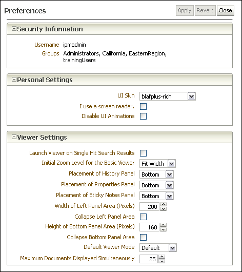
The following table describes the elements available on the page.
| Element | Description |
|---|---|
| Apply | Applies the updated setting changes. |
| Revert | Cancels any changes and restores previous settings. |
| Close | Closes the Preferences page. |
The Security Information section lists the user name of the person logged into the system, as well as the security groups to which they belong.

The Personal Settings section lets you specify information unique to you and modify how the Imaging user interface looks using pre-installed formats called skins. Click the Expand or Collapse icon next to the Personal Settings section to hide or display the fields for modifying your personal information.

The following table describes the elements available on the page.
| Element | Description |
|---|---|
| UI Skin | Skins determine how the Imaging user interface looks, including the color and shape of menus, tabs, fonts, and other aspects of the interface. Select a skin from the pick list and click Apply to view the new user interface skin. |
| I use a screen reader. | Enable if you use a screen reader. |
| Disable UI Animations | Enable this box to disable animated menus and speed display performance on some systems. |
The Viewer Settings section lets you modify various aspects of the viewer used to view documents and annotations. Click the Expand or Collapse icon next to the Viewer Settings section to hide or display the fields for modifying how information about a document is displayed in the document viewer.
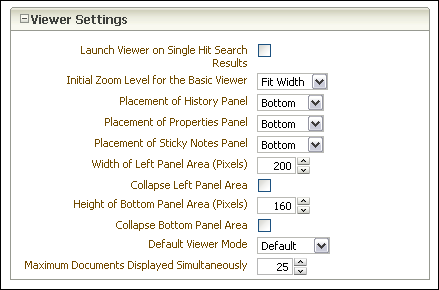
The following table describes the elements available on the page.
| Element | Description |
|---|---|
| Launch Viewer on Single Hit Search Results | Enable to open a document in the default viewer automatically if it is the only search result. |
| Initial Zoom Level for the Basic Viewer | Specify the magnification at which documents are displayed when opened in the basic viewer. Options include a percentage of the document's original size, or the following:
Note that these settings do not apply to the advanced viewer mode. |
| Placement of History Panel | Specify where the history panel is displayed in the viewer. Options are:
|
| Placement of Properties Panel | Specify where the properties panel is displayed in the viewer. Options are:
|
| Placement of Sticky Notes Panel | Specify where the sticky notes panel is displayed in the viewer. Options are:
|
| Width of Left Panel Area (Pixels) | Specify the width of the left panel area in pixels. |
| Collapse Left Panel Area | Enable to hide the left panel area when a document is first opened. The panel can be expanded after the document is opened by clicking the expand icon. |
| Height of Bottom Panel Area (Pixels) | Specify the height of the bottom panel area in pixels. |
| Collapse Bottom Panel Area | Enable to hide the bottom panel area when a document is first opened. The panel can be expanded after the document is opened by clicking the expand icon. |
| Default Viewer Mode | Specify the viewer mode used to open a document by default. Options are:
|
| Maximum Documents Displayed Simultaneously | Specifies the maximum number of documents displayed in a single viewer window. |
The Upload Document Page is used to upload new documents to Imaging. It is accessed from the navigation pane by clicking Tools and then Upload Document.
The information on an Upload Document page is dependent on how it is accessed and on the information requirements of the application in which the document resides. If an application requires more information, additional fields are displayed after you select an application from the Select an Application field.
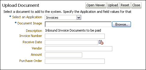
The following table describes the elements available on the page.
| Element | Description |
|---|---|
| Open Viewer | Opens the document viewer so you can open, review, and annotate a document before uploading. |
| Upload | Submits the specified document image to Imaging. |
| Reset | Cancels any changes and restores previous settings. |
| Close | Cancels the upload and closes the Upload Document page. |
| Select an Application | Select an application in which this document is to reside. This field is required. Once an application is selected, additional metadata fields unique to the application are displayed. |
| Document Image | Specify an electronic file to upload to the system. Click Browse to navigate through your file system to select the file. The document image file can be any electronic file, but must conform to a format capable of being converted for display in the document viewer to be viewed.This field is required. Note that this field is hidden if you click Open Viewer. If using the viewer to upload a document, navigation to the electronic file is done through the Viewer Toolbar.
Note that if using your keyboard rather than your mouse to select the Browse button, use the Space bar to execute the Browse button function and open the dialog box. The Enter key does not execute the Browse button function. |
| Description | A description of the application is displayed if one was specified when the application was created. It cannot be edited. |
| Metadata fields | Additional metadata fields are displayed on the Upload Document page when an application is selected. The additional fields are unique to each application and are defined by the person who created the application. Required fields are noted with an asterisk (*). |
| Confirmation Message | Once a document is successfully uploaded, a confirmation message is displayed at the bottom of the page. Clicking the message opens the document in the Viewer. |
Use search pages to locate and access content in Imaging. Click a search link in the navigator pane to display the search page. Click another search link to display a new tab. Using multiple tabs can be useful when comparing content, such as an invoice with a purchase order.
Each search page has two sections: the search form criteria section and the search results section that displays after a search has been executed. The criteria section is a predefined form where you input the criteria for which you want to search. The results section displays a list of all content in Imaging to which the user has access that matches the specified criteria. The criteria section can be collapsed or expanded by clicking the collapse pane icon.
The criteria in the search form is predefined by the person who creates the search. This criteria is based on the metadata of the application in which the document resides and can be different for each search. For example, you may have an Invoices search defined that uses an invoice number or issue date, and a Contracts search that allows searching by company ID or business unit.

This section covers the following topics:
The following operators may be available using picklists to aid in your search. These picklists will be between the existing search parameter name and the search field. Note that valid operators are symbols for numeric fields and text for text fields.
| Operator | Description |
|---|---|
| Equals (for text fields)
= (for numeric fields) |
Search for the equivalent value of the one entered. Note that wildcard characters work for text fields. The * character matches 0 to many and the ? matches exactly any one character. For example, you can enter Sm?th to find Smith but not Smythe or Smooth. Entering Sm*th? would find Smythe and Smiths but not Smithee. Entering Sm*th* would find Smith, Smythe, and Smithee. |
| Begins with (text fields only) | Type a letter or number that is at the beginning of the parameter name. Any text character is allowed. This is identical to setting the operator to Equals and entering the first letters followed by the wildcard character *. For example, setting the operator to Begins with and enter And is the same as setting the operator to Equals and entering And*. Each would return Anderson, Andersons, and Andreeson. |
| Ends with (text fields only) | Type a letter or number that is at the end of the parameter name. Any text character is allowed. This is identical to setting the operator to Equals and entering the wildcard character * followed by the last letters. Wildcard characters are accepted in text fields and behave as described in the the operators Begins with and Equals. |
| Contains (text fields only) | Type a letter or number that is contained in the parameter name. Any text character is allowed. This is identical to setting the operator to Equals and entering the wildcard character * followed by the letters and another wildcard character *. Wildcard characters are accepted in text fields and behave as described in the the operators Begins with and Equals. |
| > (numeric fields only) | Search for values greater than the one entered. |
| >= (numeric fields only) | Search for values that exceed or equal the one entered. |
| < (numeric fields only) | Search for vaules less than the one entered. |
| <= (numeric fields only) | Search for values less than or equal the one entered. |
| Not Equal (text fields)
<> (numeric fields) |
Search for values not equivalent to those entered. Note that wildcard characters work for text fields. Null entries (when there is no data in the field) are not returned. For example, assume that the following is true:
If using Not Equal as the operator, entering the following text in the text field returns the listed documents as follows (remember that null entries are not returned):
|
The columns in the results section are based on the application or applications being searched. A single search may span more than one application, and columns from each application are merged. Like the search criteria, they are different for each search. The columns displayed in the results can be reordered or hidden using options in the View menu. Actions can be taken on a single document or multiple documents in the search results section by selecting a document or documents and using either the Search Results Toolbar or the Search Results Contextual Menu.
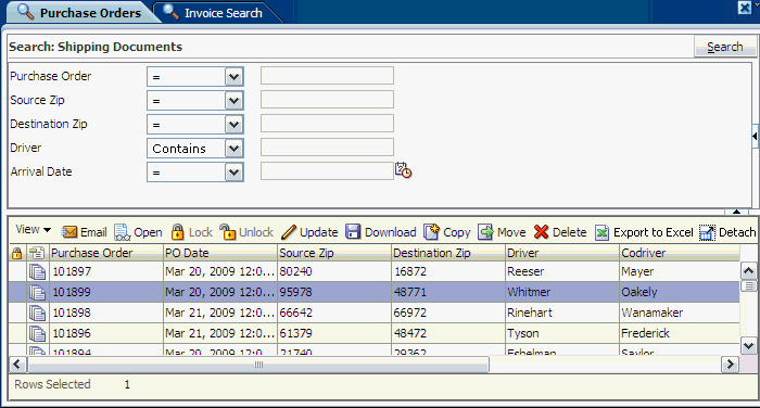
The following table describes the elements available on the page.
| Element | Description |
|---|---|
| Search Tabs | Click a search tab to highlight the tab and display the associated search. |
| Close Tab icon | Click the Close Tab icon on the highlighted search tab to close the tab. |
| More Options contextual menu | Right-click on a tab to display the More Options contextual menu with the following options:
|
| Search fields | Search fields are dependent on the application or applications being searched and are defined by the person who created the search. A single search may span more than one application. |
| Search Results | Displays a list of documents matching the entered criteria to which a user has access once the search run. |
The search results toolbar enables you to act on selected documents in a search results listing. It is located above every search result.
| Element | Description |
|---|---|
| View | Clicking View displays the following options:
|
| Opens a new e-mail message using your default e-mail client that contains a link to the search results.The recipient must log in and have permissions to the search and to the documents in order to view the results. | |
| Open | Opens the document in a separate browser window. |
| Lock | Locks a document and prevents it from being updated, annotated, or moved by anyone other than the user that has it locked. |
| Unlock | Unlocks a document. Only the Lock Administrator or the user who previously locked it can unlock the document. Once unlocked, others can perform lock-restricted actions. |
| Update | Displays the Update Document Page where you can replace a document and update its metadata. Depending on the configuration of the application, an updated document is overwritten or a new version is created. |
| Download | Displays the Download Document Page, allowing you to save a copy of the original document without annotations, or an annotated TIFF image of the document, dependant on your security rights. |
| Copy | Displays the Copy Document Page where you can create a copy of the document and its metadata as a new content item. Note that to copy a document between applications, you must have security rights to create a document in the destination application. |
| Move | Displays the Move Document Page where you can update the metadata and move the document to a new application without making a copy. For example, you can move an invoice in the Outstanding Invoice Application to the Paid Invoice Application. Note that to move a document between applications, you must have security rights to delete a document from the source application and security rights to create a document in the destination application. |
| Delete | Deletes a document from Imaging provided you have rights to do so. A dialog box is displayed for you to confirm or cancel the deletion. When a document is deleted, it and all associated metadata and annotations are permanently removed from Imaging and are no longer available for access through search results. |
| Detach | Maximizes the search results table to fill the current window. |
| Export to Excel | Exports the search results table to a separate .xls file. Note that the exported .xls file is in an HTML format. This can cause Microsoft Excel to display an error message when opening the file that it is of a different format than that specified by the file extension. This message can be ignored and the file opened. |
| Column Headers | Displays a descriptive name of the column. Clicking a column header sorts the column sequentially in ascending order. Clicking the header again resorts the column sequentially in descending order. |
Right-click a specific content item in search results to display a contextual menu containing the same options specific to content as the Search Results Toolbar.
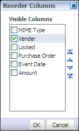
The Reorder Columns page is displayed when selecting View, then Columns, and then Reorder Columns from the Search Results Toolbar. Enable a column and click the appropriate arrow to reposition the column in the display order. Click OK to apply the change.
The Copy Document page is used to copy an existing document, its metadata and annotations either within the same application or into a different application. If being copied into the same application, the metadata fields are populated with values from the original document when the application is selected. If copying to a different application, metadata fields that have the same name in each application are populated with the existing document metadata, but metadata fields unique to the new application are left blank. To access the Copy Document page, select a document from a Search Form Criteria and Search Results Table then select Copy from either the Search Results Toolbar or the Search Results Contextual Menu.

The following table describes the elements available on the page.
| Element | Description |
|---|---|
| Select an Application | Select an application in which the new document is to reside. This field is required. Additional metadata fields are displayed once an application is selected. |
| Metadata fields | Additional metadata fields are displayed on the Copy Document page when an application is selected. The additional fields are unique to each application and are defined by the person who created the application. Required fields are noted with an asterisk (*). |
| Copy existing annotations | Enable this to copy existing annotations with the document. |
| Copy | Click to submit the document copy request. |
| Confirmation | The confirmation message is displayed after the document copy request has been submitted and the document has been successfully copied. |
The Move Document page is used to move an existing document, its metadata and annotations out of the current application and into a different application. When moving, shared metadata fields are populated with the existing document metadata, but metadata fields unique to the new application are left blank. To access the Move Document page, select a document from a Search Form Criteria and Search Results Table and then select Move from either the Search Results Toolbar or the Search Results Contextual Menu.

The following table describes the elements available on the page.
| Element | Description |
|---|---|
| Select an Application | Select an application in which this document is to reside. This field is required. Additional metadata fields are displayed once an application is selected. |
| Metadata fields | Additional metadata fields are displayed on the Move Document page when an application is selected. The additional fields are unique to each application and are defined by the person who created the application. Required fields are noted with an asterisk (*). |
| Move | Click to submit the document move request. |
| Confirmation | The confirmation message is displayed after the document move request has been submitted and the document has been successfully moved. |
The Update Document page is used to update the metadata of an existing document or to replace it with a new document. Depending on the application versioning settings, a new version of the document may be created or the document may be replaced by the updated one. To access the Update Document page, select a document from a Search Form Criteria and Search Results Table and then select Update from either the Search Results Toolbar or the Search Results Contextual Menu.
Note:
You can also update the document metadata by clicking Update on the Properties Panel of the Viewer. This does not display the Update Document page, but instead enables the metadata fields in the properties panel to be modified. Once changes have been made to the fields, click Update again to submit the changes.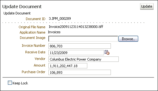
The following table describes the elements available on the page.
| Element | Description |
|---|---|
| Document ID | The unique document identifier automatically generated by the system. |
| Original File Name | Original name of the file that is being updated. |
| Application Name | Name of the application in which the document resides. |
| Document Image | Enter the name of the updated file to upload. Click Browse to navigate to the file and select it to populate the field. Leave this field blank if updating the document metadata fields only.
Note that if using your keyboard rather than your mouse to select the Browse button, use the Space bar to execute the Browse button function and open the dialog box. The Enter key does not execute the Browse button function. |
| metadata fields | Metadata fields differ based upon the application selected. |
| Keep Lock or Lock Document | After updating a document, enable this to keep a previously locked document locked (Keep Lock) or to lock it (Lock Document). Locking a document prevents it from being updated or moved by anyone other than the user that has it locked. |
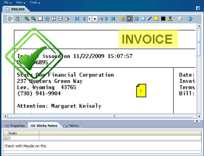
The viewer is used to display documents and annotations you have permissions to see. It is accessed from a Search Form Criteria and Search Results Table by clicking the icon in the MIME Type column, or selecting a document from the search results and clicking Open in the Search Results Toolbar. Additionally, all metadata associated with a document is displayed in the Properties panel of the viewer, and all actions taken on a document are displayed in the History panel.
The viewer can switch between a basic mode, used to view documents and annotations, and an advanced mode, which additionally allows you to add and edit annotations, provided you have the security permissions to do so. You can specify which mode to use by default in the Preferences Page.
This section covers the following topics:
In addition to viewing a document, the viewer can be used to print, download, or e-mail documents. The following menus and options are available in the viewer above the document tabs.

The following table describes the elements available on the page.
| Element | Description |
|---|---|
| File | Use the File menu to download, print, or close displayed documents. It has the following options:
|
| View | The View menu allows you to change viewer modes and show or hide document history and properties. It has the following options:
|
| Tools | The Tools menu allows you to e-mail a displayed document or view a list of previous versions of a document.
|
The properties panel displays all metadata associated with a document, and provides the option to update metadata. Clicking Update displays the Update Document Page within the properties panel. The properties panel can alternately be displayed or hidden dynamically by selecting the View menu then enabling or disabling Show Properties. Similarly, placement of the properties panel can be alternated between the left side and the bottom of the page by selecting the View menu then enabling or disabling Properties on Left. The entire bottom or left pane can dynamically resized by clicking on the pane border and dragging the border to the desired location. A default size can be specified in the Viewer Settings Section of the Preferences Page. Also, the entire bottom or left pane can be collapsed by clicking the Collapse pane icon, or expanded by clicking the Restore pane icon. See the section "Icons" to see an image of the icons.
Each action performed on a document in Imaging is tracked and displayed in the history panel. The following events are tracked:
When a document is created
When a document is copied
When a document is moved
When a new version of document is made
When document metadata is updated
When a document has annotations added or modified
The history panel can alternately be displayed or hidden dynamically, resized, or collapsed in the same manner as the properties panel. See the Properties Panel section for details.
Displays a list of all sticky note annotations to which you have access on a document. Sticky Note annotations are numbered and listed numerically in the list. Text formatting is retained, but any inserted graphics are stripped from display in the list. Inserted graphics are maintained in the actual annotation.
The sticky notes panel can alternately be displayed or hidden dynamically, resized, or collapsed in the same manner as the properties panel. See the Properties Panel section for details.
Several icons are used throughout the viewer user interface without explicit identification. These icons provide functionality when clicked. Identifying text is displayed when hovering your cursor over an icon. Options on the viewer toolbar change depending on if you are using the basic or advanced mode. This section details both the Basic Viewer Toolbar Options and the Advanced Viewer Toolbar Options.
Note:
Using browser navigation such as Forward, Back, and Refresh does not provide navigation within a document, a document's panels, or between document tabs open in the viewer. Instead, browser controls navigate outside of the Imaging viewer. When viewing a document, it is recommended that all navigation within the viewer be done using the navigation controls in the viewer toolbar.The basic viewer toolbar offers options to zoom and rotate documents as well as navigate multiple pages.
| Name | Icon | Function |
|---|---|---|
| Rotate Left 90 Degrees | Rotates the current page 90 degrees counter clockwise. Once rotated, clicking the Save the Current Page Annotations icon on the Advanced Viewer Toolbar saves the rotated orientation for display the next time you view the document. | |
| Rotate Right 90 Degrees | Rotates the current page 90 degrees clockwise. Once rotated, clicking the Save the Current Page Annotations icon on the Advanced Viewer Toolbar saves the rotated orientation for display the next time you view the document. | |
| Zoom In | Enlarges the current page in predefined increments in the viewer page region. Predefined increments go from 25% to 200%, increasing by 25% each time the icon is clicked.
Note that if the current page is at a zoom level that is not a predefined increment, clicking this icon enlarges the current page to the closest predevined level. For example, if clicking the Zoom to Fit the Height icon displays the current page at a 43% zoom level, then clicking the Zoom In icon once enlarges the current page to a 50% zoom level. |
|
| Zoom Out | Reduces the current page in predefined increments in the viewer page region. Predefined increments go from 200% to 25%, decreasing by 25% each time the icon is clicked.
Note that if the current page is at a zoom level that is not a predefined increment, clicking this icon reduces the current page to the closest predevined level. For example, if clicking the Zoom to Fit the Height icon displays the current page at a 43% zoom level, then clicking the Zoom Out icon once reduces the current page to a 25% zoom level. |
|
| Restore default size | Returns the current page size to 100 percent of the original size. | |
| Zoom to Best Fit | Enlarges or reduces the current page to fit into the viewer page region. | |
| Zoom to Fit the Height | Enlarges or reduces the current page to fit the height of the current page in the viewer page region. | |
| Zoom to Fit the Width | Enlarges or reduces the current page to fit the width of the current page in the viewer display area. | |
| Start Rubberband Zoom Mode | Enlarges the selected area of the current page to fit in the viewer page region. | |
| Go to First Page | Click to view the first page of a multi-page document. | |
| Go to Previous Page | Click to view the page preceding the current page of a document. | |
| Go to Page Number | Select a page to go to of a multi-page document. If the number of pages in the document exceeds the length of the menu, a scroll bar in the menu allows you to scroll to the required page number. | |
| Go to Next Page | Click to view a page following the current page of a document. | |
| Go to Last Page | Click to view the last page of a multi-page document. | |
| Help | Click call up the product help. When in basic mode, clicking the icon displays the Viewer help in a separate window. When in advanced mode, clicking the icon enables a question mark cursor to position over an existing annotation or other toolbar icon. Using the question mark cursor to click on an existing annotation or toolbar icon displays contextual help about the item in a separate window. |
In addition to the display and navigation options available on the basic viewer toolbar, the advanced viewer toolbar adds options to add and edit annotations if you have rights to do so, as well as open and print documents.
| Name | Icon | Function |
|---|---|---|
| Open a Local File | Displays a standard dialog box to open a local file. This also allows for opening files in networked directories if the networked directory is mapped as a local drive letter. Note that this option is only available when the viewer is opened from the Upload Document Page. | |
| Show/Hide Annotations | Click to switch between showing and hiding annotations. Printing a document when viewing in advanced mode with the annotations hidden causes the document to print without the annotations. | |
| Cursor | Enables the user to select an existing annotation in the viewer page region. | |
| Text | Select then drag on document to display the Edit Annotation Content dialog box to add a text annotation. | |
| Highlight | Select then drag on the current page to highlight a portion of the current page. Opacity and color are controlled by the accompanying toolbar. | |
| Line | Select then drag on the current page to add a line notation for underlining or striking through a word or image on the current page. Color and inclusion of arrowheads are controlled by the accompanying toolbar. | |
| Sticky note | Select then click the current page to display the Rich Text Editor for adding a sticky note annotation to the current page. Note color is controlled by the accompanying toolbar. | |
| Redaction | Select then drag on the current page to cover a portion of the current page. | |
| Stamp | Select then click the current page to add a predefined watermark annotation to the current page. There are four default stamp options:
The stamp message, size, orientation, and opacity is controlled by the accompanying toolbar. |
|
| Save the Current Page Annotations | Click to save modifications to the current page annotations. If the icon has a lock on it, the document is locked by someone else and saving the annotations may fail unless you first contact them and have them unlock the document. | |
| Help | Click call up the product help. When in basic mode, clicking the icon displays the Viewer help in a separate window. When in advanced mode, clicking the icon enables a question mark cursor to position over an existing annotation or other toolbar icon. Using the question mark cursor to click on an existing annotation or toolbar icon displays contextual help about the item in a separate window. |
Permissions are assigned for the different levels of annotations: standard, restricted and hidden as described in the section Assigning Annotation Security Level. If you need a permission level you do not have, talk to the person who manages security for Imaging. If you have the proper permissions to do so, you can annotate documents and view or edit the annotations made by others, as well as view when and by whom an annotation was created and last modified using the Creator/Last Modifier Icon and Dialog. You can create the following annotations:
Sticky Note annotations, as described in Section A.9.6.6, "Sticky Note Annotation Rich Text Editor" and Section A.9.6.7, "Sticky Note Annotation Toolbar"
You must assign each annotation a security level. After you create an annotation, a toolbar appears listing the security options to which you have access for the annotation. Only security permissions assigned to you are listed. For example, if you are assigned only the standard security level, only the standard security level will be listed in the menu as an option for you to assign. To assign a security level to an annotation, select the security level from the toolbar menu. Note that Redaction annotations cannot be marked Hidden.
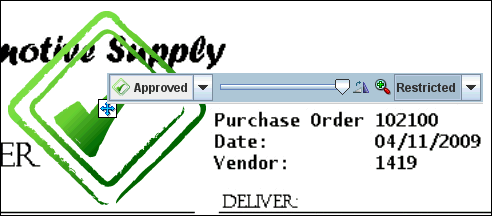
The following table describes the elements available on the page.
| Element | Description |
|---|---|
| Standard | Standard annotations appear on the document page for all users. They may be applied and changed by users granted permission to Standard annotations. |
| Restricted | Restricted annotations appear to all users but cannot be modified by users who have not been granted permission to Restricted annotations. When viewing, exporting, or rendering, restricted annotations will be burned into the image if the user does not have Restricted permission. |
| Hidden | Hidden annotations appear to users who have been granted permission to view Hidden annotations. Redaction annotations cannot be marked Hidden. |
When selected, all annotation toolbars have an icon to the right of the security level in the toolbar menu. Clicking the icon displays when and by whom the annotation was first created and last modified.

The following table displays the Creator/Last Modifier icon and describes its function.
| Icon | Description |
|---|---|
| Click to display the Creator/Last Modifier dialog with details on the annotation history. |
Text annotations allow you to leave notes on a document. To add a text annotation, select the text tool, then click and drag the mouse in the Viewer to define the size, shape, and position of the annotation. After releasing the mouse button, the Edit Text dialog box is displayed.

The following table describes the elements available on the page.
| Element | Description |
|---|---|
| Current Date | Click to insert the current date into the text field. |
| Current User | Click to insert your name in the text field. |
| OK | Click to save changes to the text annotation. |
| Cancel | Click to cancel creation of a new text annotation or changes to an existing text annotation. |
Once created, a text annotation can be selected by clicking on it in the document in the Viewer. Selecting a text annotation displays the bounding box defining the size of the annotation, which you can use to move, resize, or delete it. Selecting a text annotation also displays the Text Annotation Toolbar that enables you to format text within the text annotation.
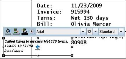
The following table describes the elements available on the toolbar.
| Icon | Description |
|---|---|
| Click to display the Color Palette from which to choose the background color of the selected text annotation. | |
| Click to display the Color Palette from which to choose the border color of the selected text annotation. | |
| Click to display the Color Palette from which to choose the font color of the selected text annotation. | |
| Click to display the Edit Annotation Content dialog box to add or edit text in the selected text annotation. | |
| Click the font name to choose from a list of available fonts for the text in the selected text annotation. Click the number to select the point size of the text. | |
| Click and drag to move the text annotation to another location on the document. | |
| Click and drag to resize the text annotation. |
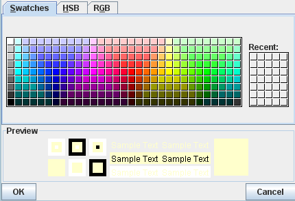
The following table describes the elements available on the page.
| Element | Description |
|---|---|
| Palette Tabs | Used to define the color being used. Depending on the context used to display the color palette, it controls the color of text, backgrounds, notes, borders, and lines. Colors can be defined using several methods, one for each tab:
|
| Preview Area | Displays an example of how the selected setting will display. |
| OK | Click to save the settings. |
| Cancel | Click to cancel changes made and return to previous settings. |
Highlight annotations overlay a translucent highlight to an area of a document. They are added by selecting the highlight tool, then clicking and dragging over the document in the Viewer to create a highlight annotation. Doing so displays the Highlight Annotation Toolbar.

The following table describes the elements available on the toolbar.
| Icon | Element |
|---|---|
| Click to display the Color Palette from which to choose the background color of the selected highlight annotation. | |
| Click and drag to change the opacity of the selected highlight annotation. Moving the slider to the left makes the highlight more translucent. Moving the slider to the right makes the highlight more opaque. | |
| Click and drag to move the highlight annotation to another location on the document. | |
| Click and drag to resize the highlight annotation. |
Line annotations draw a line on a document. Lines can be used to underline, strike through, or point to text or other objects in a document. They are added by selecting the line tool, then clicking and dragging over the document in the Viewer to create a line. Doing so displays the Line Annotation Toolbar.

The following table describes the elements available on the toolbar.
| Icon | Description |
|---|---|
| Click to display the Color Palette from which to choose the line color of the selected line. | |
Click to select an option for terminating the line annotation with an arrowhead.
|
|
| Click and drag to move the highlight annotation to another location on the document. | |
| Click and drag to resize the highlight annotation. |
Sticky note annotations can be longer than text annotations and allow more formatting options. In addition to being placed on a document, they are also displayed in the Sticky Notes Panel in the Viewer. You add them by selecting the sticky note tool, then clicking on the document in the Viewer. Doing so displays the Rich Text Editor. After a note is created, clicking on it displays the Sticky Note Annotation Toolbar.
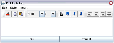
The following table describes the elements available on the toolbar.
| Item | Description |
|---|---|
| Edit | Enables selected text to be moved around a note.
|
| Style | Enables the appearance of selected text to be modified.
|
| Insert | Enables insertion of additional objects.
|
The Rich Text Editor lets you quickly and easily select text formatting options.
The following table describes the elements available on the toolbar.
| Icon | Description |
|---|---|
| Deletes the selected text and copies it to memory for insertion at another point in the note. | |
| Copies the selected text to memory for use at another point in the note. | |
| Inserts text that was either cut or copied into memory at the cursor position in the note. | |
| Click the font name to choose from a list of available fonts for the selected text. Click the number to select the point size of the text. | |
| Displays the Color Palette from which to choose the color of the selected text. | |
| Makes the selected text appear bold. | |
| Displays the selected text in italics. | |
| Underlines the selected text. | |
| Justifies the text to the left of the note. | |
| Center the text in the note. | |
| Justifies the text to the right of the note. | |
| Spaces the text so that text is justified to both the left and right sides of the note. |
The Sticky Note Annotation Toolbar lets you open the color palette and the Rich Text Editor, allowing you to edit and format the rich text content of the annotation. Sticky Note annotations are placed after clicking one time on the document surface.

The following table describes the elements available on the toolbar.
| Icon | Description |
|---|---|
| Click to display the Color Palette from which to choose the color of the selected note. | |
| Click to display the Rich Text Editor. | |
| Click and drag to move the note to another location on the document. |
Redaction annotations behave like highlight annotations, except that they are completely opaque and cannot be brightened or darkened. They are used to cover up sensitive information in a document or another annotation. They are added by selecting the redaction tool, then clicking and dragging over the document in the Viewer to create an opaque redaction annotation. Doing so displays the Redaction Annotation Toolbar. If you have rights to modify a redaction annotation, it becomes transparent when you select it in the advanced viewer mode. If you do not have rights to modify the annotation, you cannot select it. The security level for redaction annotations cannot be designated as hidden.
| Icon | Description |
|---|---|
| Click and drag to move the redaction annotation to another location on the document. | |
| Click and drag to resize the redaction annotation. |
Stamp annotations allow you to overlay and save predefined watermarks on a viewed document page. They are added by selecting the stamp tool, then clicking on the document in the Viewer to apply the selected watermark. The Stamp Annotation Toolbar displays which you use to manipulate the watermark.
The following table describes the elements available on the toolbar.
| Icon | Description |
|---|---|
Click to select which watermark to use. There are four stamp options:
|
|
| Slide pointer left and right to lighten and darken the opacity of the watermark. | |
| Click to rotate watermark 45 degrees clockwise. Repeat as many times as necessary to orient the watermark in 45 degree increments. | |
| Click to cycle through three different size options for the watermark. | |
| Click and drag to move the watermark to another location on the document. |
The Document Page is displayed by clicking Download on the Search Results Toolbar or selecting Download from either the Search Results Contextual Menu or the Viewer Menus. It is used to save a copy of the document to a local or shared network drive.

The following table describes the elements available on the page.
| Element | Description |
|---|---|
| Download Original | Saves the original document that was uploaded or indexed into the system to a local or networked drive. If the document has annotations the user does not have rights to modify, an error will be shown and the download will be canceled. |
| Download TIFF | Saves a TIFF file representation of the original document to a local or networked drive. Annotations will be burned into the TIFF image according to user permissions. If the document has annotations that the user does not have rights to see, the document is downloaded without the hidden annotations. |
| Lock Document | If you had the document locked, check the box to keep documented locked after updating If the document is not locked, check the box to lock the document after updating it. If the document is locked by someone else, this option is disabled. |