64 Contributor Interface: Customizing the Dashboard
This chapter describes how to customize the dashboard of the WebCenter Sites Contributor interface. It familiarizes you with the dashboard configuration and provides sample code, which you can use while you perform the procedures described in this chapter.
This chapter contains the following topics:
64.1 Overview of Dashboard Customization
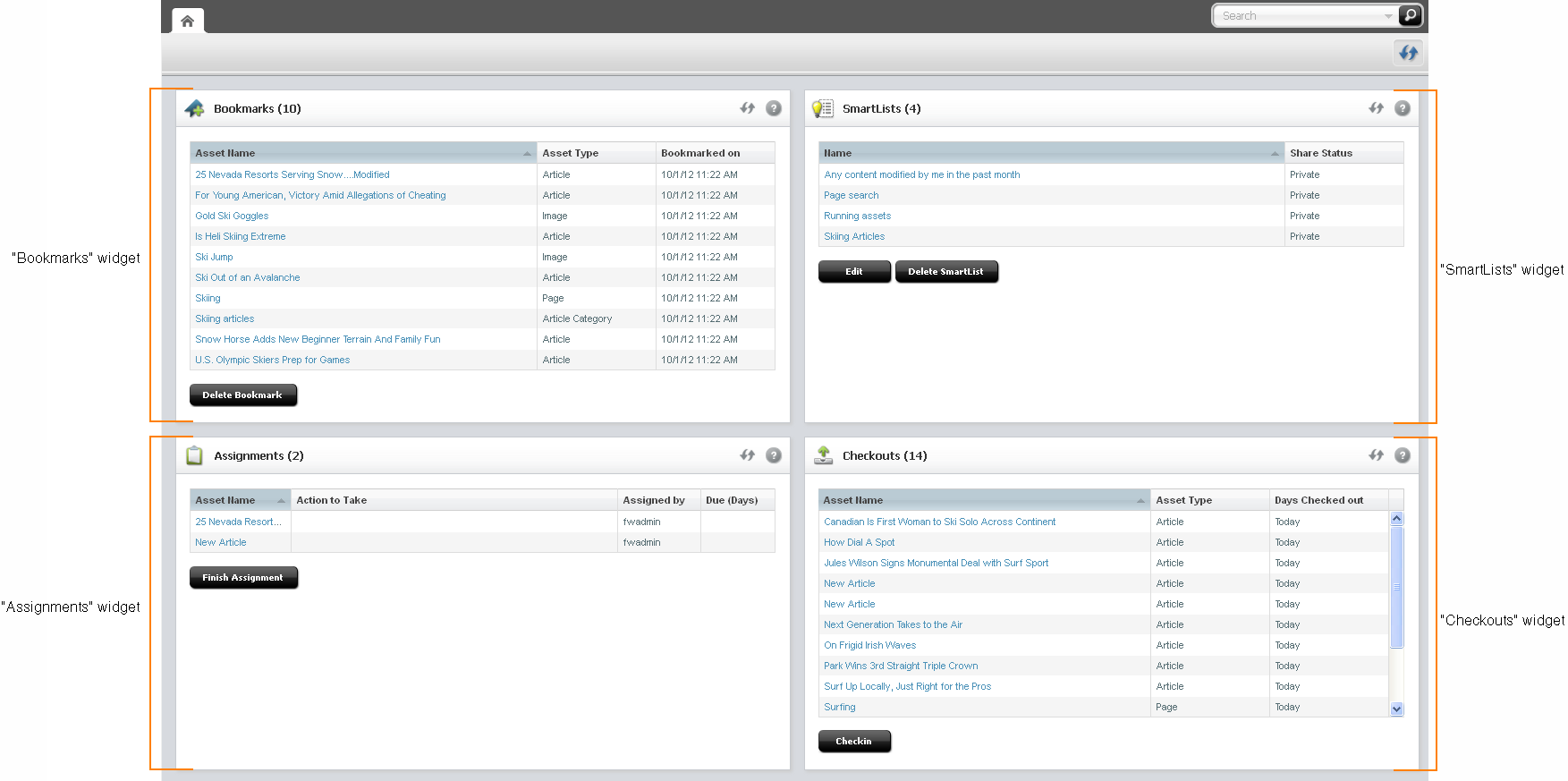
When you log in to the Contributor interface, the dashboard is displayed. By default, the dashboard displays the following ready-to-use widgets: Bookmarks, SmartLists, Checkouts, and Assignments, as shown in Figure 64-1.
Figure 64-1 Dashboard with Default Widgets

Description of "Figure 64-1 Dashboard with Default Widgets"
You can customize the following portions of the dashboard and its widgets:
-
Number of columns
-
Column width
-
Widget's display name, height, and position on the dashboard
-
You can also add new widgets.
64.2 Customizing the Dashboard
The system-defined dashboard is generated by the controller element UI/Layout/CenterPane/DashboardContentsConfig. You can override this element.
Your dashboard configuration can be global or site-specific. You can customize the default widgets, add new widgets, and delete the ones not required.
Override the element UI/Layout/CenterPane/DashBoardContentsConfig by creating your own DashBoardContentsConfig.jsp under CustomElements and customizing its properties.
Note:
When a new widget is added or an existing widget is updated, you must clear user preferences in the WEM UI for the changes to take place.
The UI/Layout/CenterPane/DashBoardContentsConfig element is shown next, followed by property descriptions in Table 64-1.
Element UI/Layout/CenterPane/DashboardContentsConfig
<dashboardconfig>
   <dashboardlayout>
      <numberofcolumns></numberofcolumns>
      <columnwidths></columnwidths>
   </dashboardlayout>
   <components>
      <component id="widgetId">
         <name>widgetName</name>
         <url>widgetURL</url>
         <height>height_in_px</height>
         <dragRestriction>true | false </dragRestriction>
         <column>number_of_column_in_which_to_display_widget</column>
     </component>
         …
         …
         …
   </components>
</dashboardconfig>
Table 64-1 Properties in UI/Layout/CenterPane/DashBoardContentsConfig.jsp
| Property | Description | Value |
|---|---|---|
|
|
Number of columns in the dashboard display. |
Integer greater than 0. The system default is |
|
|
Comma-separated widths of columns. |
For example, if there are |
|
|
This section is used to define dashboard widgets. |
N/A |
|
|
Used to define a single widget. |
N/A |
|
|
ID of the widget. |
Alpha-numeric value unique across widgets. Special characters are not allowed. |
|
|
Displayed name of the widget. |
Arbitrary string. |
|
|
Controller URL. |
The file location of the widget in the |
|
|
Height of the widget. |
Height in pixels. For example, |
|
|
Restricts dragging of the widget. |
|
|
|
The column in which the widget is displayed. |
|
64.3 Examples of Customizing the Dashboard
You can add new widgets to the WebCenter Sites Contributor dashboard. Adding a new widget involves two basic steps:
-
Creating the widget element.
-
Registering the new widget in your custom
DashBoardContentsConfig.jspelement.
This section illustrates the process of adding a widget to the dashboard. This section contains the following examples:
64.3.1 Adding a 'Hello World' Widget
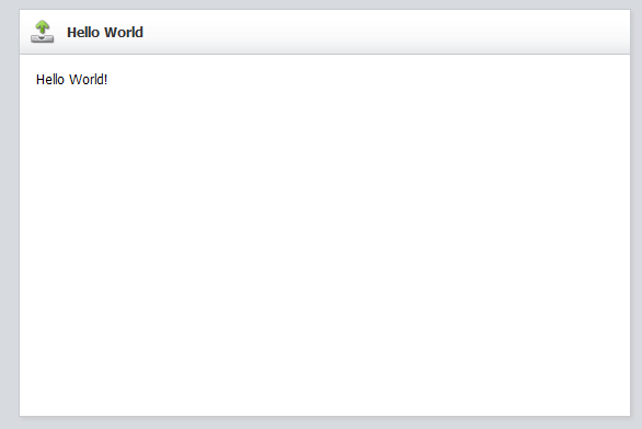
In this section, you will create and register a simple widget, shown in Figure 64-2.
To add your widget to the dashboard
-
Create your widget:
-
Create a JSP element under CustomElements. In this example, we name the element
HelloWorldHtml. -
For widget code, you can navigate to the sample file provided with this guide and copy its content.
-
-
Register your widget (add it to the dashboard):
-
Open your custom
DashBoardContentsConfig.jsp, locate the<components>section, and add the newly created widget's specifications. For example:<component id="helloworld"> <name>Hello World</name> <url>Path_to_your_widget_under_CustomElements</url> <height>300px</height> <closable>false</closable> <open>true</open> <dragRestriction>true</dragRestriction> <style>checkoutPortlet</style> <column>2</column> </component>
-
Go to the
<applicationServer_install_directory>/webapps/<cs_context>/WEB-INF/classes/ReqAuthConfig.xmlfile and add the path to the sample element, under theexcludedControllerElementslist. In our example, the path is:<property name="excludedControllerElements"> <list> <value>/UI/Layout/CenterPane/DashBoard/HelloWorld</value> </list> </property> -
Refresh the home page of your Contributor interface. The new widget is displayed on your dashboard (Figure 64-2).
-
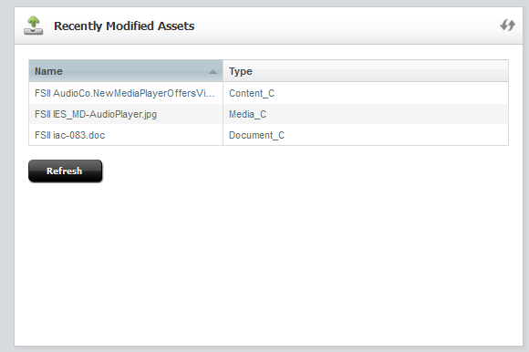
64.3.2 Adding a Widget that Shows Recently Modified Assets
In this section, you will create a widget that shows which assets were modified in the past week. After completing the steps in this section, your dashboard will display a widget similar to the one in Figure 64-3.
Figure 64-3 'Recently Modified Assets' Widget

Description of "Figure 64-3 'Recently Modified Assets' Widget"
To add your widget to the dashboard
-
Create your widget:
-
Create an
ActionJSP element underCustomElements. In this example, we name the elementRecentlyModifiedAssetsAction.jsp. For the widget code, you can navigate to the sample file provided with this guide and copy its content. -
Create a
JsonJSP element for the Action element created in the previous step. In this example, we name the elementRecentlyModifiedAssetsJson.jsp. For the code, you can navigate to the sample file provided with this guide and copy its content. Place the element in the same location as theRecentlyModifiedAssetsAction.jspelement. -
Create a presentation element under CustomElements for your widget. Name the element after the widget element. In this example, we name the display element
RecentlyModifiedAssetsHtml.jsp. For the code, you can navigate to the sample file provided with this guide and copy its content.Note:
The presentation element will call the
RecentlyModifiedAssetsAction.jspelement. Enter the path to that element.
-
-
Register your widget (add it to the dashboard):
-
Open your custom
DashBoardContentsConfig.jsp, locate the<components>section, and add the newly created widget's specifications. For example:<component id="myrecent"> <!-- a unique identifier for the component. This must be unique among all the components. It can be alpha numeric but no special characters allowed --> <name>Recently Modified Assets</name> <url>Path_to_your_custom_widget's presentation_element</url> <height>300px</height> <closable>false</closable> <open>true</open> <dragRestriction>false</dragRestriction> <style>checkoutPortlet</style> <column>2</column> </component> -
Go to the
<applicationServer_install_directory>/webapps/<cs_context>/WEB-INF/classes/ReqAuthConfig.xmlfile and add the path to the sample element, under theexcludedControllerElementslist. In our example, the path is:<property name="excludedControllerElements"> <list> <value>/UI/Layout/CenterPane/DashBoard/RecentlyModifiedAssets</value> </list> </property> -
Refresh the dashboard to see the newly configured widget. For example, see Figure 64-3.
-
