7 Creating ADF Mobile AMX Pages
This chapter describes how to create the ADF Mobile AMX application feature.
This chapter includes the following sections:
7.1 Introduction to the ADF Mobile AMX Application Feature
ADF Mobile AMX is a subframework within ADF Mobile that provides a set of UI components that enable you to create an application feature whose behavior is identical on all supported platforms. While ADF Mobile AMX maintains the same development experience as ADF Faces by allowing you to drag these components into an editor from the Component palette or from the Data Control palette, these components are not equivalents to their ADF Faces counterparts: ADF Mobile AMX components do not support every property and behavior of ADF Faces components.
Note:
When developing interfaces for mobile devices, always be aware of the fact that the screen space is very limited. In addition, touchscreen support is not available on some mobile devices.
For more information, see the following:
7.2 Creating Task Flows
Task flows allow you to define the navigation between ADF Mobile AMX pages. Using your application workspace in JDeveloper (see Section 4.2, "Creating an Application Workspace"), you can start creating the user interface for your ADF Mobile AMX application feature by designing task flows. As with any standard JSF application, ADF Mobile AMX uses navigation cases and rules to define the task flow. These definitions are stored in a file with the default name of ViewController-task-flow.xml (see Section 7.2.3, "What You May Need to Know About the ViewController-task-flow.xml File").
An ADF Mobile sample application called Navigation (located in the PublicSamples.zip file within the jdev_install/jdeveloper/jdev/extensions/oracle.adf.mobile/Samples directory on your development computer) demonstrates how to use various navigation techniques, such as circular navigation, routers, and so on.
ADF Mobile enables you to create ADF Mobile AMX application features that have both bounded and unbounded task flows. As described in the "Task Flow Types" section of Oracle Fusion Middleware Fusion Developer's Guide for Oracle Application Development Framework, a bounded task flow is also known as a task flow definition and represents the reusable portion of an application. In ADF Mobile, bounded task flows have a single entry point and no exit points. They have their own collections of activities and control-flow rules, as well as their own memory scope and managed-bean life span.
You use the ADF Mobile AMX Task Flow Designer to create bounded task flows for your feature. When designing an ADF Mobile AMX task flow, JDeveloper maintains the same experience as designing an ADF task flow, as described in the "Creating a Task Flow" section of Oracle Fusion Middleware Fusion Developer's Guide for Oracle Application Development Framework. Like the overview editor for task flows, this tool includes a diagrammer (see Section 7.2.4, "What You May Need to Know About the ADF Mobile Task Flow Diagrammer") in which you build the task flow by dragging and dropping activities and control flows from the Components editor. You then define these activities and the transitions between them using the Property Inspector.
Unless a task flow has already been created, ADF Mobile automatically generates a default unbounded task flow (adfc-mobile-config.xml file) when a new ADF Mobile AMX page is created. For an example of the unbounded task flow, see the adfc-mobile-config.xml file from a sample application called Navigation located in the PublicSamples.zip file within the jdev_install/jdeveloper/jdev/extensions/oracle.adf.mobile/Samples directory on your development computer.
For more information, see the "Creating ADF Task Flows" part of Oracle Fusion Middleware Fusion Developer's Guide for Oracle Application Development Framework.
7.2.1 How to Create a Task Flow
You use the navigation diagrammer to declaratively create a task flow for your ADF Mobile AMX application feature. When you use the diagrammer, JDeveloper creates the XML metadata needed for navigation to work in your feature in the ViewController-task-flow.xml file (default).
To design a task flow, the ADF Mobile application must include a View Controller project file (see Chapter 4, "Getting Started with ADF Mobile Application Development").
There are two ways to create a task flow in ADF Mobile:
-
You can create a bounded task flow from the
admf-feature.xmlfile. For more information, see Section 5.9.1, "How to Define the Application Content." -
You can use the New Gallery in JDeveloper. For more information, see "To create a task flow from the New Gallery:"
To create a task flow from the New Gallery:
-
From the top-level menu in JDeveloper, click File, and then select New > From Gallery.
-
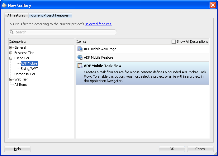
In the New Gallery, expand the Client Tier node, select ADF Mobile, and then ADF Mobile Task Flow (see Figure 7-1). Click OK.
-
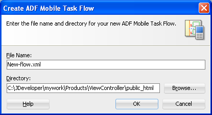
In the Create ADF Mobile Task Flow dialog (see Figure 7-2), specify the file name and location for your new task flow, and then click OK to open the new
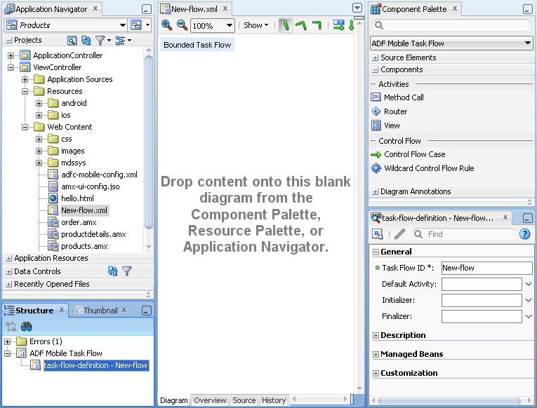
<Name>-flow.xmlfile in the navigation diagrammer that Figure 7-3 shows.Note:
Task flows should be created within the View Controller project of your ADF Mobile application.
Note:
JDeveloper increments the number of the task flow according to the number of task flows that already exist in the same pattern.
-
In the Component Palette, select ADF Mobile Task Flow (see Figure 7-3), and then select the component you wish to use and drag it onto the diagram.
Tip:
If the Component Palette is not displayed, choose View > Component Palette from the main menu. By default, the Component Palette is displayed in the upper right-hand corner of JDeveloper.
JDeveloper creates a bounded task flow and redraws the diagram with the newly added component.
You can also open the Overview tab and use the overview editor to create navigation rules and navigation cases. Press F1 for details on using the overview editor to create navigation.
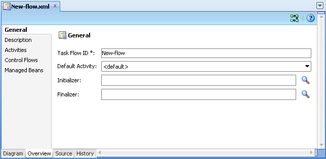
Additionally, you can manually add elements to the task flow file by directly editing the page in the Source editor. To open the file in the Source editor, click the Source tab.
Once the navigation for your ADF Mobile AMX feature is defined, you can create the pages and add the components that will execute the navigation.For more information about using navigation components on a page, see Section 7.2.8, "How to Enable Page Navigation Using Control Flow Case."
After you define the task flow for the ADF Mobile AMX application feature, you can double-click a view file to access the ADF Mobile AMX view. For more information, see Section 7.3, "Creating Views."
7.2.2 What You May Need to Know About Supported Activities and Control Flows
The ADF Mobile Task Flow designer supports a subset of ADF activities and control flows that are listed in Table 7-1.
Table 7-1 Supported Activities
| Activity | Description |
|---|---|
|
Method Call |
Invokes a method (typically a method on a managed bean). You can place a method call activity anywhere in the control flow of an ADF Mobile AMX application feature to invoke logic based on control flow rules. For additional information, see the "Using Method Call Activities" in Oracle Fusion Middleware Fusion Developer's Guide for Oracle Application Development Framework. You can also specify parameters that you pass into a method call that is included in a task flow. These include standard ADF parameters for a method call action in an ADF Mobile AMX task flow. When you use the designer to generate a method, it adds the required arguments and type. For more information, see the following sections of Oracle Fusion Middleware Fusion Developer's Guide for Oracle Application Development Framework: At run time, you can define parameters for a method call in a task flow and pass parameters into the method call itself for its usage. For more information on passing method call parameters, see the following sections of Oracle Fusion Middleware Fusion Developer's Guide for Oracle Application Development Framework: |
|
Router |
Evaluates an Expression Language (EL) expression and returns an outcome based on the value of the expression. These outcomes can then be used to route control to other activities in the task flow. For more information, see the "Using Router Activities" section in Oracle Fusion Middleware Fusion Developer's Guide for Oracle Application Development Framework. |
|
View |
Displays an ADF Mobile AMX page. For more information, see the "Using View Activities" section in Oracle Fusion Middleware Fusion Developer's Guide for Oracle Application Development Framework. |
|
Task flow call |
Calls a bounded task flow from either an unbounded task flow or from a bounded task flow. While a task flow call activity allows you to call a bounded task flow located within the same ADF Mobile AMX application feature, you can also call a bounded task flow from a different ADF Mobile AMX application feature or from a Feature Archive file (FAR) that has been added an Oracle ADF library (see Section 5.12, "Working with Feature Archive Files"). The task flow call activity supports task flow input parameters and return values. For more information, see the "Using Task Flow Call Activities" section in Oracle Fusion Middleware Fusion Developer's Guide for Oracle Application Development Framework. |
7.2.3 What You May Need to Know About the ViewController-task-flow.xml File
The ViewController-task-flow.xml file is the ADF Mobile AMX counterpart to ADF's task-flow-definition.xml and enables you to design the interactions between views (ADF Mobile AMX pages) by dragging and dropping the ADF Mobile AMX task flow components from the Component Palette into the diagrammer.
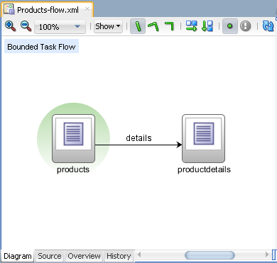
Figure 7-4 shows a sample task flow file called Products-flow.xml. In this file, the control flow is directed from the products page to the productdetails page. To return to the products page from the productdetails page, the built-in __back navigation is used.
7.2.4 What You May Need to Know About the ADF Mobile Task Flow Diagrammer
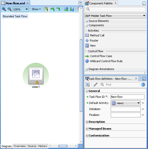
As illustrated in Figure 7-4, the task flow diagram and Component Palette display automatically after you create a task flow using the ADF Mobile Task Flow Creation utility. The task flow diagram is a visual editor onto which you can drag and drop activities and task flows from the Component Palette or from the Application navigator. For more information, see Section 7.2.5, "How to Add ADF Mobile Activities."
7.2.5 How to Add ADF Mobile Activities
As in ADF application development, you use the task flow diagrammer to drag and drop activities, views, and control flows.
You must select ADF Mobile Task Flow from the Component Palette, as Figure 7-5 shows.
To add an activity to an ADF Mobile task flow:
-
In the Application Navigator, double-click a task flow source file (such as
ViewController-task-flow.xml) to display the task flow diagram and the Component Palette, as Figure 7-5 shows. The diagrammer displays the task flow editor. The Component Palette automatically displays the components available for an ADF Mobile task flow. -
Drag an activity from the Component Palette onto the diagram. If you drag a view activity onto the diagram, you can invoke the Create ADF Mobile AMX File wizard (see Section 7.2.6, "How to Add View Activities").
Note:
There is a default activity that is associated with each task flow.
7.2.6 How to Add View Activities
The view activity is associated in metadata with an actual ADF Mobile AMX page. You add a view activity by dragging and dropping it from the Component Palette. A view activity displays an ADF Mobile AMX page. You can create an actual ADF Mobile AMX page by double-clicking the view activity in the Diagram window. You can also create a view activity by dragging and dropping an ADF Mobile AMX file in the Application navigator into the overview editor's Diagram tab.
7.2.7 How to Add a Wildcard Control Flow Rule
ADF Mobile task flows support the wildcard control flow rule, which represents a control flow from-activity-id that contains a trailing wildcard (foo*) or a single wildcard character. You can add a wildcard control flow rule by dragging and dropping it from the Component Palette. To configure your wildcard control flow rule, use the Property Inspector.
7.2.8 How to Enable Page Navigation Using Control Flow Case
You can create navigation using the Control Flow Case component, which identifies how control passes from one activity to the next. To create a control flow, select Control Flow Case from the Component Palette. Next, connect the control flow case to the source activity, and then to the destination activity. JDeveloper creates the following after you connect a source and target activity:
-
control-flow-rule: Identifies the source activity using afrom-activity-id. -
control-flow-case: Identifies the destination activity using ato-activity-id.
To define a control flow case directly in the ADF Mobile task flow diagram:
-
In the Application navigator, double-click a task flow source file to display the task flow diagram.
-
Select Control Flow Case from the Component Palette.
-
On the diagram, click a source activity and then a destination activity. JDeveloper adds the control flow case to the diagram. Each line that JDeveloper adds between an activity represents a control flow case. The
from-outcomecontains a value that can be matched against values specified in the action attribute of the UI components. -
To change the
from-outcome, select the text next to the control flow in the diagram. By default, this is a wildcard character. -
To change the
from-activity-id(the identifier of the source activity), or theto-activity-id(the identifier for the destination activity), drag either end of the arrow in the diagram to a new activity.For more information, see the "What Happens When You Create a Control Flow Rule" section in Oracle Fusion Middleware Fusion Developer's Guide for Oracle Application Development Framework.
7.2.9 How to Specify Action Outcomes Using UI Components
Using the Property Inspector, you can specify an action outcome by setting the action attribute of one of the following UI components to the corresponding control flow case from-outcome leading to the next task flow activity:
-
Command Button (see Section 8.3.5, "How to Use Buttons")
-
Command Link (see Section 8.3.6, "How to Use Links")
-
List Item
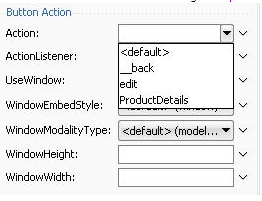
You use the UI component's Action field (see Figure 7-6) to make a selection from a list of possible action outcomes defined in one or more task flow for a specific ADF Mobile AMX page.
A Back action (__back) is automatically added to every list to enable navigation to the previously visited page.
Note:
An ADF Mobile AMX page can be referenced in both bounded and unbounded task flows, in which case actions outcomes from both task flows are included in the Action selection list.
7.2.10 How to Create and Reference Managed Beans
You can create and use managed beans in your ADF Mobile application to store additional data or execute custom code. You can use JDeveloper's usual editing mechanism to reference managed beans and create references to them for applicable fields. For more information, see the "Using a Managed Bean in a Fusion Web Application" section in Oracle Fusion Middleware Fusion Developer's Guide for Oracle Application Development Framework.
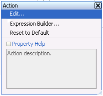
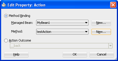
Figure 7-7 shows the Edit option for an action property in the Property Inspector. You click this option to invoke the Edit Property dialog that Figure 7-8 shows.
Table 7-5 lists ADF Mobile AMX attributes for which the Edit option in the Property Inspector is available.
| Property | Element |
|---|---|
|
|
|
|
|
|
|
|
|
|
|
|
|
|
|
|
|
|
|
|
|
|
|
|
|
|
|
|
|
|
|
|
|
|
|
|
|
|
|
|
|
|
|
|
|
|
|
|
|
|
|
|
|
|
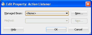
Clicking Edit for all other properties invokes a similar dialog, but without the Action Outcome option, as Figure 7-9 shows.
The preceding dialogs demonstrate that you can either create a managed bean, or select an available action outcome for the action property.
The Action Outcome list shown in Figure 7-8 contains the action outcomes from all task flows to which a specific ADF Mobile AMX page belongs. In addition, this list contains a __back navigation outcome to go back to the previously visited page (see Section 7.2.9, "How to Specify Action Outcomes Using UI Components" for more information). If a page is not part of any task flow, the only available outcome in the Action Outcome list is __back. When you select one of the available action outcomes and click OK, the action property value is updated with the appropriate EL expression, such as the following for a commandButton:
<amx:commandButton action="goHome"/>
The Method Binding option (see Figure 7-8) allows you to either create a new managed bean class, or select an existing one.
To create a new managed bean class:
-
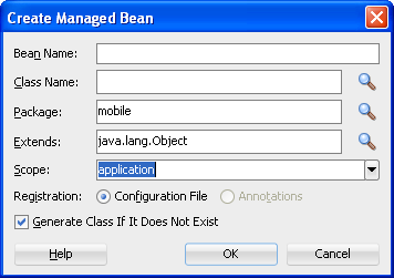
Click New next to the Managed Bean field to open the Create Managed Bean dialog that Figure 7-10 shows.
ADF Mobile supports the following scopes:
-
application -
view -
pageFlow
When you declare a managed bean to an ADF Mobile application or the ADF Mobile AMX application feature, the managed bean is instantiated and identified in the proper scope, and the bean's properties are resolved and its methods are called through EL. For more information, see Section 9.2, "Understanding EL Support."
-
-
Provide the managed bean and class names, and then click OK.
Example 7-1 shows the newly created managed bean class. The task flow that this ADF Mobile AMX page is part of is updated to reference the bean.
Example 7-1 New Managed Bean Class
<managed-bean id="__3">
   <managed-bean-name>MyBean</managed-bean-name>
   <managed-bean-class>mobile.MyBean</managed-bean-class>
   <managed-bean-scope>application</managed-bean-scope>
</managed-bean>
Note:
If a given ADF Mobile AMX page is part of bounded as well as unbounded task flows, both of these task flows are updated with the managed bean entry.
-
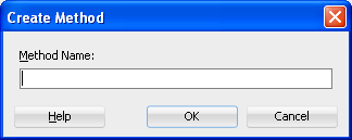
Click New next to the Method field (see Figure 7-8 and Figure 7-9) to open the Create Method dialog that Figure 7-11 shows. Use this dialog to provide the managed bean method name.
Upon completion, the selected property value is updated with the appropriate EL expression, such as the following for a
commandButton.:<amx:commandButton action="#{MyBean.getMeHome}"/>The managed bean class is also updated to contain the newly created method, as Example 7-2 shows.
To select an existing managed bean:
-
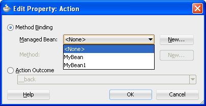
Make a selection from the Managed Bean list that Figure 7-12 shows.
Similar to the action outcomes, the Managed Bean list is populated with managed beans from all task flows that this ADF Mobile AMX page is part of.
Note:
If the ADF Mobile AMX page is not part of any task flow, you can still create a managed bean.
For more information, see the following:
-
JavaDemo, an ADF Mobile sample application located in the
PublicSamples.zipfile within thejdev_install/jdeveloper/jdev/extensions/oracle.adf.mobile/Samplesdirectory on your development computer.
7.2.11 How to Specify the Page Transition Style
By defining the page transition style on the task flow, you can specify how ADF Mobile AMX pages transition from one view to another. The behavior of your ADF Mobile AMX page at transition can be as follows:
-
fading in
-
sliding in from left
-
sliding in from right
-
sliding up from bottom
-
sliding down from top
-
flipping up from bottom
-
flipping down from top
-
flipping from left
-
flipping from right
-
none
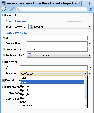
You set the transition style by modifying the transition attribute of the control-flow-case (Control Flow Case component), as Example 7-3 shows.
Example 7-3 Setting Transition Style
<control-flow-rule id="__1">
   <from-activity-id>products</from-activity-id>
   <control-flow-case id="__2">
      <from-outcome>details</from-outcome>
      <to-activity-id>productdetails</to-activity-id>
      <transition>fade</transition>
   </control-flow-case>
</control-flow-rule>
In the Property Inspector, the transition attribute is located under Behavior, as Figure 7-13 shows. The default transition style is slideLeft.
7.3 Creating Views
You can start creating the ADF Mobile AMX view by doing the following:
-
Getting familiar with the ADF Mobile AMX page structure
-
Using the preview
-
Dragging and dropping components into the ADF Mobile AMX page
-
Adding data controls to a view
7.3.1 How to Work with ADF Mobile AMX Pages
An ADF Mobile AMX page is represented by an XML file similar to a JSPX file in Oracle ADF Faces.
7.3.1.1 Interpreting the ADF Mobile AMX Page Structure
The following is a basic structure of the ADF Mobile AMX file:
<amx:view>
   <amx:panelPage id="pp1">
      <amx:facet name="header">
         <amx:outputText id="ot1" value="Welcome"/>
      …
      </amx:facet>
   </amx:panelPage>
</amx:view>
With the exception of data visualization components (see Section 8.5, "Providing Data Visualization"), UI elements are declared under the <amx> namespace.
For more information, see Section 7.3.1.3, "What Happens When You Create an ADF Mobile AMX Page."
7.3.1.2 Creating ADF Mobile AMX Pages
ADF Mobile AMX files are contained in the View Controller project of the ADF Mobile application. You create these files using the Create ADF Mobile AMX Page dialog.
ADF Mobile offers two alternative ways of creating an ADF Mobile AMX page:
-
From the New Gallery
-
From an existing task flow
To create an ADF Mobile AMX page, the ADF Mobile application must include a View Controller project file (see Chapter 4, "Getting Started with ADF Mobile Application Development").
To create an ADF Mobile AMX page from the New Gallery:
-
From the top-level menu in JDeveloper, click File, and then select New > From Gallery.
-
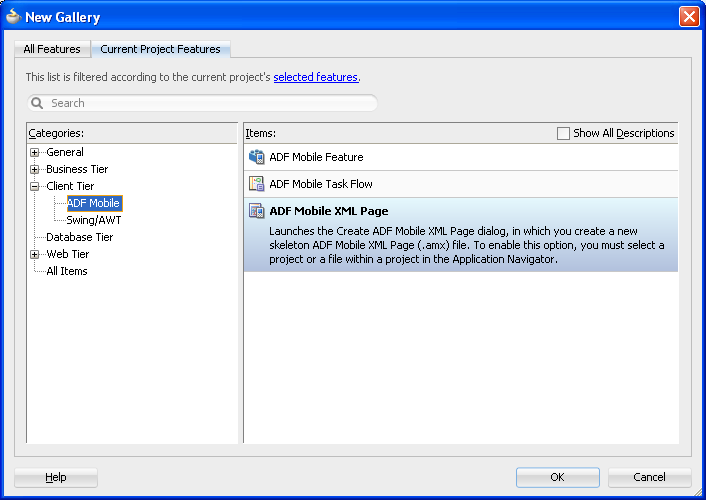
In the New Gallery, expand the Client Tier node, select ADF Mobile, and then ADF Mobile AMX Page (see Figure 7-14). Click OK.
-
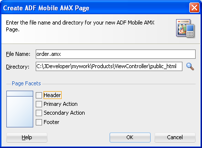
In the Create ADF Mobile AMX Page dialog, enter a name and, if needed, a location for your new file, as Figure 7-15 shows.
-
Optionally, you may select which facets your new ADF Mobile AMX page will include as a part of the page layout:
-
Header
-
Primary
-
Secondary
-
Footer
For more information, see Section 7.3.1.3, "What Happens When You Create an ADF Mobile AMX Page" and Section 8.2.6, "How to Use a Facet Component."
Note that when you select or deselect a facet, the image representing the page changes dynamically to reflect the changing appearance of the page.
Note:
ADF Mobile persists your facet selection and applies it to each subsequent invocation of the Create ADF Mobile AMX Page dialog.
-
-
Click OK on the Create ADF Mobile AMX Page dialog.
To create an ADF Mobile AMX page from a View Component of the Task Flow:
-
Open a task flow file in the diagrammer (see Figure 7-5, "The Diagrammer for the Task Flow Editor", Section 7.2.1, "How to Create a Task Flow" and Section 7.2.4, "What You May Need to Know About the ADF Mobile Task Flow Diagrammer")
-
Double-click a View component of the task flow to open the Create ADF Mobile AMX Page dialog that Figure 7-15 shows, and then enter a name and, if needed, a location for your new file. Click OK.
7.3.1.3 What Happens When You Create an ADF Mobile AMX Page
When you use the Create ADF Mobile AMX Page dialog to create an ADF Mobile AMX page, JDeveloper creates the physical file and adds it to the Web Content directory of the View Controller project.
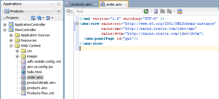
In the Application navigator that Figure 7-16 shows, the Web Content node contains a newly created ADF Mobile AMX file called order.amx.
JDeveloper also adds the code necessary to import the component libraries and display a page. This code is illustrated in the Source editor shown in Figure 7-16.
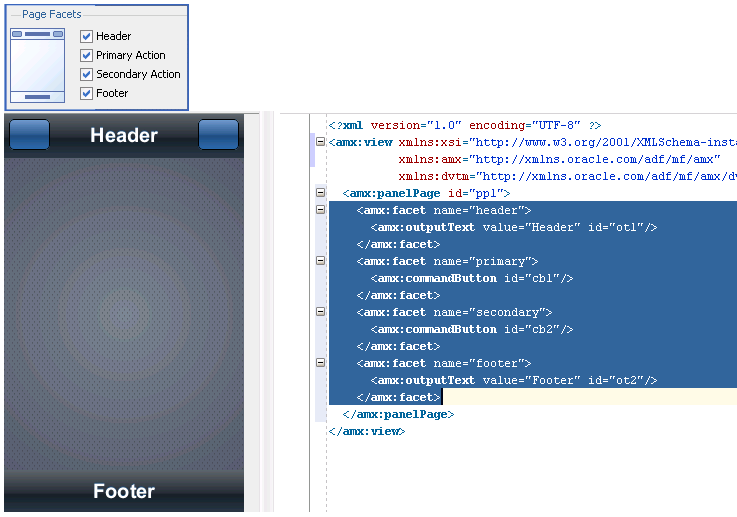
Figure 7-17 shows how the Preview pane and the generated ADF Mobile AMX code would look like if you selected all facet types listed in the Page Facet section of the Create ADF Mobile AMX Page dialog when creating the page.
In the page created with all the facets selected (see Figure 7-17), note the following:
-
The header is created with an Output Text component because this component is typically used for the page title.
-
The primary and secondary actions are created with Button components because it is a typical pattern.
-
Since there is no single dominant pattern for the footer, it is created with an Output Text component by default because that component is used in some patterns and it prevents JDeveloper from generating the initial code with audit violation.
-
Adding either the primary or secondary action without adding the header facet still causes the header section to appear in the Page Facets section of Create ADF Mobile AMX Page dialog.
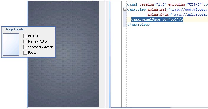
Figure 7-18 shows the Page Facet section of the Create ADF Mobile AMX Page dialog without any facets selected, the Preview pane, and the generated ADF Mobile AMX code (which is also shown in Figure 7-16).
7.3.1.4 Using UI Editors
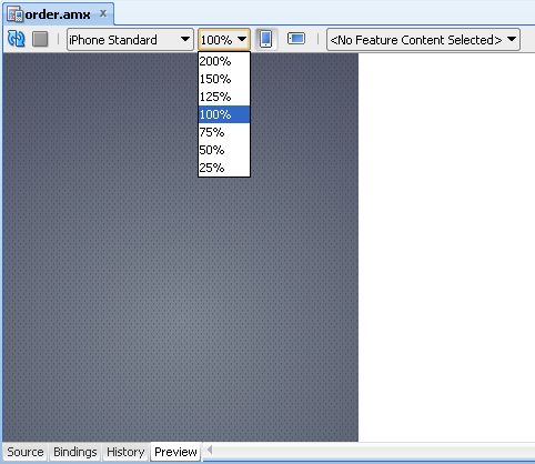
When the page is first displayed in JDeveloper, it is displayed in the Source editor. To view the page in a WYSIWYG environment, use the Preview pane (accessed by clicking the Preview tab). Figure 7-19 shows the Preview tab selected for a newly created ADF Mobile AMX page called order.amx. This page is blank because it has not yet been populated with ADF Mobile AMX UI components or data controls.
Using the Preview pane's toolbar that Figure 7-19 shows, you can do the following:
-
Refresh the display of the ADF Mobile AMX page by clicking Refresh Page.
-
Stop loading of the page by clicking Stop Loading Page.
-
Modify the form factor for the page by selecting a different form factor from the dropdown list. For more information on form factors, see Section 3.3.1.1, "Configuring the Environment for Form Factors."
-
Modify the scaling of the display by selecting a different percentage value from the dropdown list. Since mobile device displays can be of various sizes and densities, the Preview pane allows you to see the effect of scaling on your ADF Mobile AMX pages.
Note:
Scaling is available for both Portrait and Landscape mode.
-
Change orientation for the display to portrait and landscape by selecting Show Portrait Orientation or Show Landscape Orientation respectively.
-
Select the feature content for your ADF Mobile AMX page form the dropdown list of available application features. By default, <No Feature Content Selected> is displayed.
To view the source for the page in the Source editor, click the Source tab that Figure 7-16, "ADF Mobile AMX File in Application Navigator" shows. The Structure window, located in the lower left-hand corner of JDeveloper (shown in Figure 7-16 and Figure 7-19), provides a hierarchical view of the page. For more information, see Section 7.3.2.2, "Using the Preview."
7.3.1.5 Accessing the Page Definition
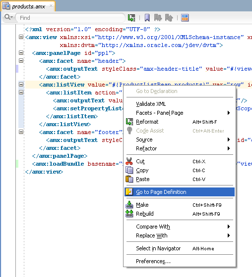
ADF Mobile AMX supports JDeveloper's Go to Page Definition functionality that enables you to navigate to the page definition of an ADF Mobile AMX page by using a context menu that allows you to locate and edit the binding information quickly.
You can invoke the context menu that contains the Go to Page Definition option from the following:
-
Source editor, as Figure 7-20 shows.
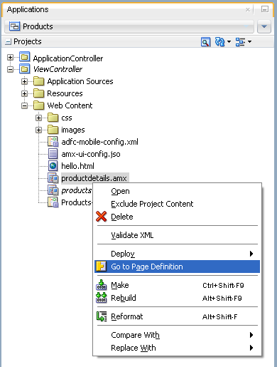
-
Application navigator, as Figure 7-21 shows.
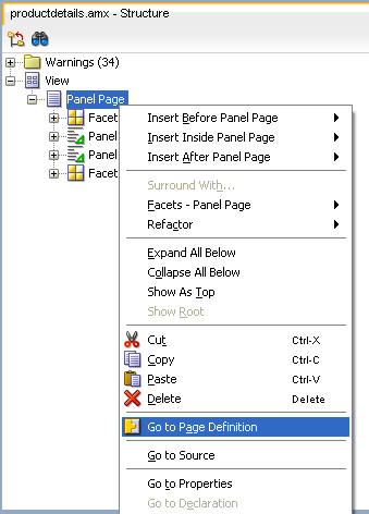
-
Structure pane, as Figure 7-22 shows.
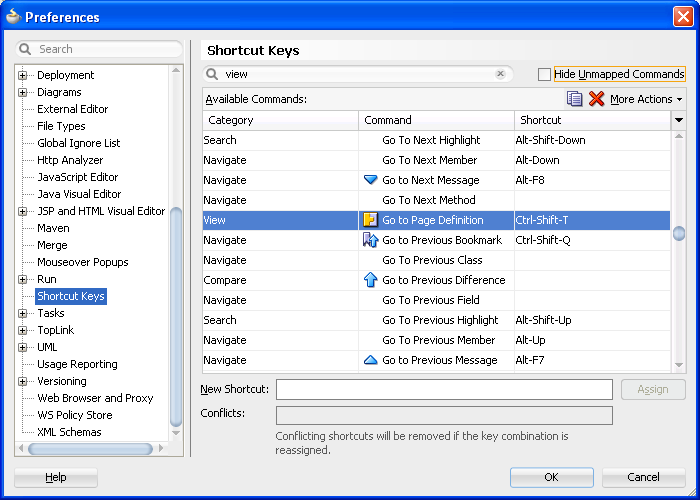
In addition, you can open the Page Definition file using the Go to Page Definition shortcut key defined under Tools > Preferences on the main menu, as Figure 7-23 shows.
7.3.2 How to Add UI Components and Data Controls to an ADF Mobile AMX Page
After you create an ADF Mobile AMX page, you can start adding ADF Mobile AMX UI components and data controls to your page.
7.3.2.1 Adding UI Components
You can use the Component Palette to drag and drop ADF Mobile AMX components onto the page. JDeveloper then adds the necessary declarative page code and sets certain values for component attributes.
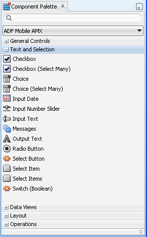
The Component Palette displays ADF Mobile AMX components by categories (see Figure 7-24):
-
General Controls
-
Text and Selection
-
Data Views
-
Layout, with the following subcategories:
-
Interactive Containers and Headers
-
Secondary Windows
-
Core Structure
-
-
Operations, with the following subcategories:
-
Behavior
-
Listeners
-
Validators and Converters
-
For information on adding and using specific components, see Section 8.3, "Creating and Using UI Components."
The ADF Mobile application must include a View Controller project, which may or may not contain an ADF Mobile AMX page or ADF Mobile AMX page task flow from which to create a page.
As described in Section 7.3.1.2, "Creating ADF Mobile AMX Pages," you can invoke the Create ADF Mobile AMX Page dialog by double-clicking a view icon in a task flow diagram or by selecting Client Tier > ADF Mobile > ADF Mobile AMX Page from the New Gallery.
To add UI components to a page:
-
Open an ADF Mobile AMX page in the Source editor (default).
-
In the Component Palette, use the menu to choose ADF Mobile AMX, as Figure 7-24 shows.
Tip:
If the Component Palette is not displayed, choose View > Component Palette from the main JDeveloper menu. By default, the Component Palette is displayed in the upper right-hand corner of JDeveloper.
-
Select the component you wish to use, and then drag and drop it onto the Source editor or Structure window. You cannot drop components onto the Preview pane.
Note:
When building an ADF Mobile AMX page, you can only drop UI components into UI containers such as, for example, a Panel Group Layout.
JDeveloper redraws the page in the Preview pane with the newly added component.
7.3.2.2 Using the Preview
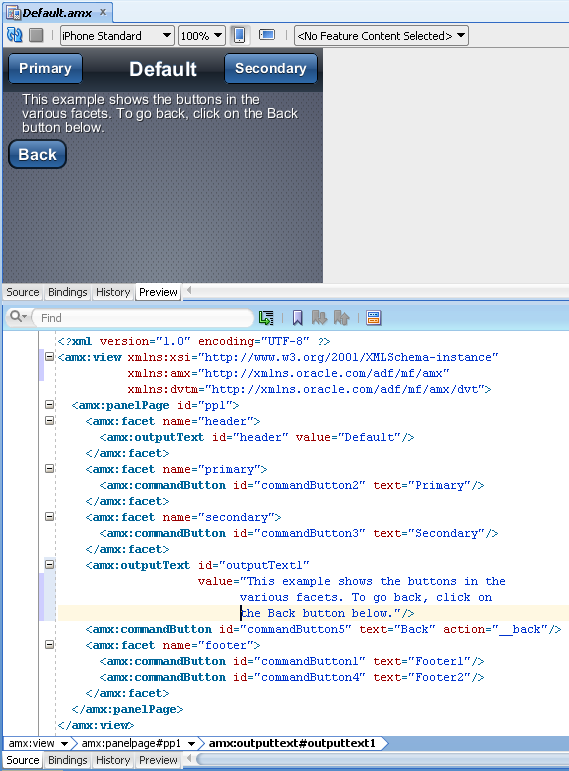
JDeveloper's preview provides WYSIWYG support for both the iOS and Android platforms when you build the user interface using ADF Mobile AMX files. As illustrated in Figure 7-25, splitting a view while adding the ADF Mobile AMX components to the ADF Mobile AMX file enables you to see both the code view through the Source editor and a UI view through the Preview pane. As a result, you can modify the source and get instant feedback in terms of the look and feel of that application on both the iOS and Android platforms.
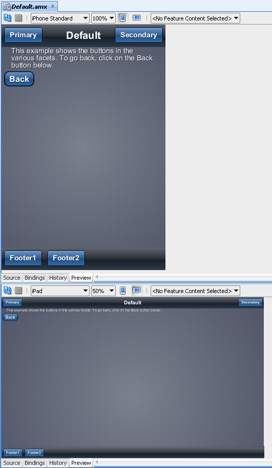
In addition to being able to see the design and source views simultaneously, you can also open and work with multiple design views at the same time, as well as set each one to a different platform and screen size. By opening a combination of design views for different devices, you can develop applications simultaneously for different platforms and form factors using different orientation. Figure 7-26 shows a split screen with iPhone Standard on the top and iPad with 50% scaling on the bottom. You can split the Preview pane using the default split functionality of JDeveloper.
Note:
An ADF Mobile AMX page is rendered even for an invalid ADF Mobile AMX file. Errors are indicated by the error icon on a component. By moving the mouse over the error icon, you can view the error details.
7.3.2.3 Configuring UI Components
Once you drop UI components onto a page, you can use the Property Inspector (displayed by default at the bottom right of JDeveloper) to set attribute values for each component.
Tip:
If the Property Inspector is not displayed, choose Window > Reset to Default Factory Settings from JDeveloper's main menu.
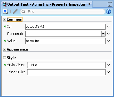
Figure 7-27 shows the Property Inspector displaying the attributes for an Output Text component.
-
Select the component for which you want to set attributes. You can select the component in the Structure window or you can select its tag directly in the Source editor.
-
In the Property Inspector, expand the section that contains the attribute you wish to set.
Tip:
Some attributes are displayed in more than one section. Entering or changing the value in one section will also change it in any other sections. You can search for an attribute by entering the attribute name in the search field at the top of the Property Inspector.
-
In the Property Inspector, either enter values directly into the fields, or if the field contains a list, use that list to select a value. You can also use the list to the right of the field, which launches a popup containing tools you can use to set the value. These tools are either specific property editors (opened by choosing Edit) or the Expression Builder, which you can use to create EL expressions for the value (opened by choosing Expression Builder). For more information about using the Expression Builder, see the "Creating EL Expressions" section in Oracle Fusion Middleware Web User Interface Developer's Guide for Oracle Application Development Framework.
When you use the Property Inspector to set or change attribute values, JDeveloper automatically changes the page source for the attribute to match the entered value.
Tip:
You can always change attribute values by directly editing the page in the Source editor. To view the page in the Source editor, click the Source tab at the bottom of the page.
7.3.2.4 Adding Data Controls to the View
You can create databound UI components in an ADF Mobile AMX view by dragging data control elements from the Data Controls panel and dropping them into either the Structure window or the Source editor. When you drag an item from the Data Controls panel to either of these places, JDeveloper invokes a context menu of default UI components available for the item that you dropped. When you select the desired UI component, JDeveloper inserts it into an ADF Mobile AMX page. In addition, JDeveloper creates the binding information in the associated page definition file. If such file does not exist, then JDeveloper creates one. ADF Mobile provides a visual indicator for dropping data controls to inform you of the location of the new data control.
Note:
A data control can only be dropped at a location allowed by the underlying XML schema.
Depending on the approach you take, you can insert different types of data controls into the Structure window of an ADF Mobile AMX page.
Dropping an attribute of a collection lets you create various input and output components. You can also create Buttons and Links by dropping a data control operation on a page.
The respective action listener is added in the ADF Mobile AMX Button for each of these operations. The EL expression in the actionListener is the same as the one created on the drop of an operation into an Oracle ADF Faces application.
The data control attributes and operations can be dropped as one or more of the following ADF Mobile AMX UI components (see Section 8.3, "Creating and Using UI Components"):
-
Button
-
Link
-
Input Date
-
Input Date with Label
-
Input Text
-
Input Text with Label
-
Output Text
-
Output Text with Label
-
Iterator
-
List Item
-
List View
-
Select Boolean Checkbox
-
Select Boolean Switch
-
Select One Button
-
Select One Choice
-
Select One Radio
-
Select Many Checkbox
-
Select Many Choice
-
Convert Date Time
-
Convert Number
-
Form
-
Read Only Form
-
Parameter Form
The following Date and Number types are supported:
-
java.util.Date -
java.sql.Timestamp -
java.sql.Date -
java.lang.Number -
java.lang.Integer -
java.lang.Long -
java.lang.Float -
java.lang.Double
7.3.2.4.1 Dragging and Dropping Attributes
If your ADF Mobile AMX page already contains a Panel Form Layout component or does not require to have all the fields added, you can drop individual attributes from a data control. Depending on the attributes types, different data binding menu options are provided, as follows:
-
Date: this category provides options for creating ADF Mobile Input Date and ADF Mobile Input Date with Label controls. Figure 7-28 shows the context menu for adding date controls that appears when you drag an attribute from the Data Controls panel into the Structure window of an ADF Mobile AMX page.
-
Single Selection: this category provides options for creating the following controls:.
-
ADF Mobile Select One Button
-
ADF Mobile Select One Choice
-
ADF Mobile Select One Radio
-
ADF Mobile Select Boolean Checkbox
-
ADF Mobile Select Boolean Switch
Figure 7-29 shows the context menu for adding selection controls that appears when you drag an attribute from the Data Controls panel into the Structure window of an ADF Mobile AMX page.
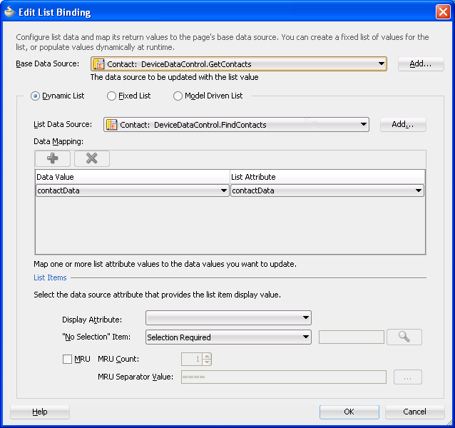
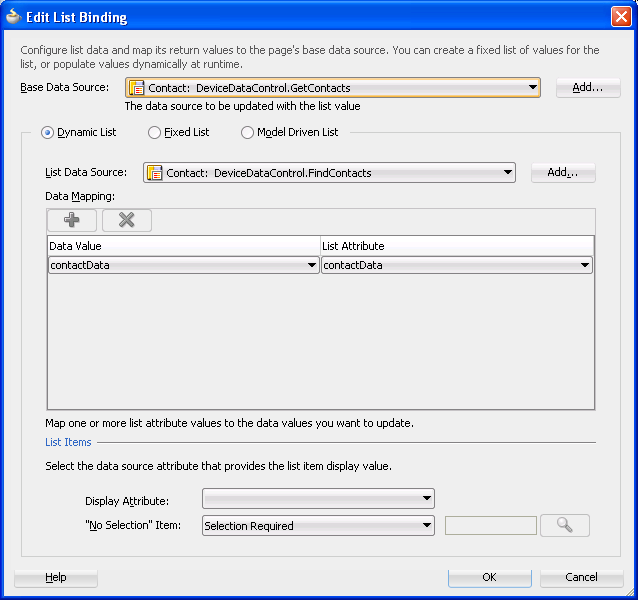
If you are working with an existing ADF Mobile AMX page and you select ADF Mobile Select One Button or ADF Mobile Select One Choice option, an appropriate version of the Edit List Binding dialog is displayed (see Figure 7-30). If you drop a control onto a completely new ADF Mobile AMX page, the Edit Action Binding dialog opens instead. After you click OK, the Edit List Binding dialog opens.
Note:
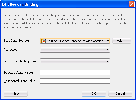
The Edit List Binding or Edit Boolean Binding dialog appears every time you drop any data control attributes as any of the single selection or boolean selection components, respectively.
If you select ADF Mobile Select One Radio option, another version of the Edit List Binding dialog is displayed, as shown in Figure 7-31.
If you select ADF Mobile Select Boolean Checkbox or ADF Mobile Select Boolean Switch option, another version of the Edit List Binding dialog is displayed, as shown in Figure 7-32.
-
-
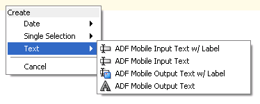
Text: this category provides options for creating the following controls:
-
ADF Mobile Input Text
-
ADF Mobile Input Text with Label
-
ADF Mobile Output Text
-
ADF Mobile Output Text with Label
Figure 7-29 shows the context menu for adding selection controls that appears when you drag an attribute from the Data Controls panel into the Structure window of a ADF Mobile AMX page.
-
7.3.2.4.2 Dragging and Dropping Operations
In addition to attributes, you can drag and drop operations or custom methods. Depending on the type of operation or method, different data binding menu options are provided, as follows:
-
Operation: this category is for data control operations. It provides the following options (see Figure 7-34):
-
ADF Mobile Button
-
ADF Mobile Link
-
ADF Mobile Parameter Form
Note:
If you drop an operation or a method as a child of the List View control, the context menu does not appear and the List Item is created automatically because no other valid control can be dropped as a direct child of the List View control. JDeveloper creates a binding similar to the following for the generated List Item:
<amx:listItem actionListener="#{bindings.getLocation.execute}"/> -
-
Method: this category is for custom methods. It provides the following options (see Figure 7-34):
-
ADF Mobile Button
-
ADF Mobile Link
-
ADF Mobile Parameter Form
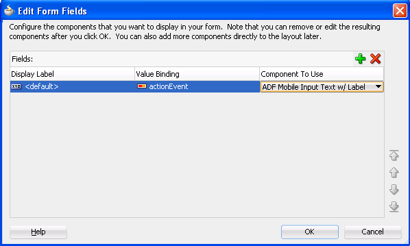
The ADF Mobile Parameter Form option allows you to choose the method or operation arguments to be inserted in the form, as well as the respective controls for each of the arguments (see Figure 7-36).
The following data bindings are generated after you select the appropriate options in the Edit Form Fields dialog:
<amx:panelFormLayout id="pfl1">
   <amx:inputText id="it1"
                  value="#{bindings.actionEvent.inputValue}"
                  label="#{bindings.actionEvent.hints.label}"
                  required="#{bindings.actionEvent.hints.mandatory}"
                  maximumLength="#{bindings.actionEvent.hints.precision}"/>
</amx:panelFormLayout>
<amx:commandButton id="cb1"
                   actionListener="#{bindings.cleanInputParameter.execute}"
                   text="cleanInputParameter"
                   disabled="#{!bindings.cleanInputParameter.enabled}"/>
For more information about generated bindings, see Section 7.3.2.4.4, "What You May Need to Know About Generated Bindings."
The following are supported control types for the ADF Mobile Parameter Form:
-
ADF Mobile Input Date
-
ADF Mobile Input Date with Label
-
ADF Mobile Input Text
-
ADF Mobile Input Text with Label
-
ADF Mobile Output Text with Label
-
7.3.2.4.3 Dragging and Dropping Collections
You can drag and drop collections. Depending on the type of collection, different data binding menu options are provided, as follows:
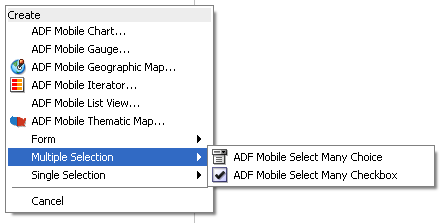
-
Multiple Selection: this category provides options for creating multiple selection controls. The following controls can be created under this category (see Figure 7-37):
-
ADF Mobile Select Many Checkbox
-
ADF Mobile Select Many Choice
-
-
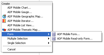
Form: this category is used to create the ADF Mobile AMX Panel Form controls. The following controls can be created under this category (see Figure 7-38):
-
ADF Mobile Form
-
ADF Mobile Read-only Form
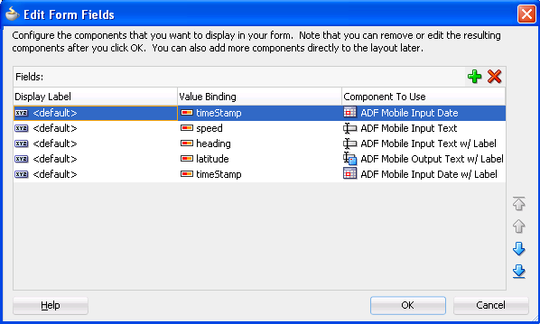
If you select ADF Mobile Form as the type of the form you want to create, a JDeveloper wizard is invoked that lets you choose the fields to be inserted in the form, as well as the respective controls for each of the fields (see Figure 7-39).
The following data bindings are generated after you select the appropriate options in the Edit Form Fields dialog:
<amx:panelFormLayout id="pfl1">
   <amx:inputDate id="id1"
                  value="#{bindings.timeStamp.inputValue}"
                  required="#{bindings.timeStamp.hints.mandatory}">
      <amx:convertDateTime pattern="#{bindings.timeStamp.format}"/>
   </amx:inputDate>
   <amx:inputText id="it1"
                  value="#{bindings.speed.inputValue}"
                  simple="true"
                  required="#{bindings.speed.hints.mandatory}"
                  maximumLength="#{bindings.speed.hints.precision}"/>
   <amx:inputText id="it2"
                  value="#{bindings.heading.inputValue}"
                  label="#{bindings.heading.hints.label}"
                  required="#{bindings.heading.hints.mandatory}"
                  maximumLength="#{bindings.heading.hints.precision}"/>
   <amx:panelLabelAndMessage id="plm1"
                             label="#{bindings.latitude.hints.label}">
      <amx:outputText id="ot1" value="#{bindings.latitude.inputValue}"/>
   </amx:panelLabelAndMessage>
   <amx:inputDate id="it3"
                  value="#{bindings.timeStamp.inputValue}"
                  label="#{bindings.timeStamp.hints.label}"
                  required="#{bindings.timeStamp.hints.mandatory}">
      <amx:convertDateTime pattern="#{bindings.timeStamp.format}"/>
   </amx:inputDate>
</amx:panelFormLayout>
For more information about generated bindings, see Section 7.3.2.4.4, "What You May Need to Know About Generated Bindings."
The following are supported controls for ADF Mobile Form:
-
ADF Mobile Input Date
-
ADF Mobile Input Date with Label
-
ADF Mobile Input Text
-
ADF Mobile Input Text with Label
-
ADF Mobile Output Text with Label
Note:
Since ADF Mobile Output Text is not a valid Panel Form Layout child element as defined by the ADF Mobile schema, it is not supported.
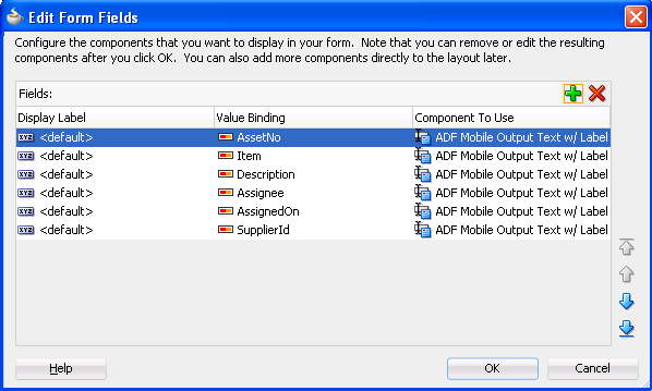
If you select ADF Mobile Read-only Form as the type of the form you want to create, a JDeveloper wizard is invoked that lets you choose the fields to be inserted in the form, as well as the respective controls for each of the fields (see Figure 7-40).
The following data bindings are generated after you select the appropriate options in the Edit Form Fields dialog:
<amx:panelFormLayout id="pfl1">
   <amx:panelLabelAndMessage id="plm1" label="#{bindings.AssetNo.hints.label}">
      <amx:outputText id="ot1" value="#{bindings.AssetNo.inputValue}"/>
   </amx:panelLabelAndMessage>
   <amx:panelLabelAndMessage id="plm2" label="#{bindings.Item.hints.label}">
      <amx:outputText id="ot2" value="#{bindings.Item.inputValue}"/>
   </amx:panelLabelAndMessage>
   <amx:panelLabelAndMessage id="plm3"
                             label="#{bindings.Description.hints.label}">
      <amx:outputText id="ot3" value="#{bindings.Description.inputValue}"/>
   </amx:panelLabelAndMessage>
   <amx:panelLabelAndMessage id="plm4"
                             label="#{bindings.Assignee.hints.label}">
      <amx:outputText id="ot4" value="#{bindings.Assignee.inputValue}"/>
   </amx:panelLabelAndMessage>
   <amx:panelLabelAndMessage id="plm5"
                             label="#{bindings.AssignedOn.hints.label}">
      <amx:outputText id="ot5" value="#{bindings.AssignedOn.inputValue}"/>
   </amx:panelLabelAndMessage>
   <amx:panelLabelAndMessage id="plm6"
                             label="#{bindings.SupplierId.hints.label}">
      <amx:outputText id="ot6" value="#{bindings.SupplierId.inputValue}"/>
   </amx:panelLabelAndMessage>
</amx:panelFormLayout>
For more information about generated bindings, see Section 7.3.2.4.4, "What You May Need to Know About Generated Bindings."
The ADF Mobile Read-only Form only supports the ADF Mobile Output Text with Label control.
-
-
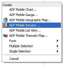
Iterator: this provides an option for creating the ADF Mobile AMX Iterator with child components (see Figure 7-41).
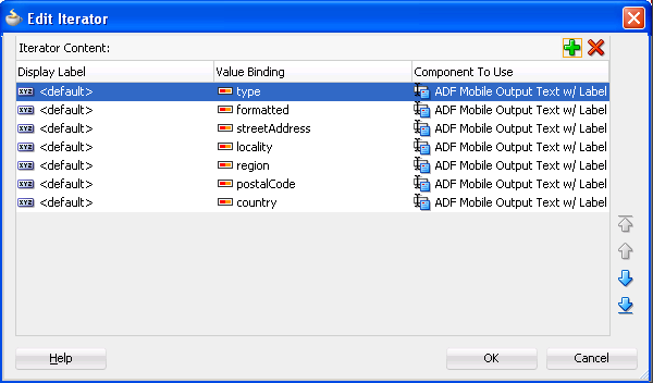
If you select ADF Mobile Iterator as the type of the control to create, a JDeveloper wizard is invoked that lets you choose the fields to be inserted in the iterator, as well as the respective controls for each of the fields, with ADF Mobile Output Text w/Label being a default selection (see Figure 7-42).
The following data bindings are generated after you select the appropriate options in the Edit Iterator dialog:
<amx:iterator var="row"
              value="#{bindings.addresses.collectionModel}"
              id="iterator1">
   <amx:panelLabelAndMessage label="#{bindings.addresses.hints.type.label}"
                             id="panelLabelAndMessage6">
      <amx:outputText value="#{row.type}" id="outputText6"/>
   </amx:panelLabelAndMessage>
   <amx:panelLabelAndMessage label=
                             "#{bindings.addresses.hints.formatted.label}"
                             id="panelLabelAndMessage2">
      <amx:outputText value="#{row.formatted}"/>
   </amx:panelLabelAndMessage>
   <amx:panelLabelAndMessage label=
                             "#{bindings.addresses.hints.streetAddress.label}"
                             id="panelLabelAndMessage5">
      <amx:outputText value="#{row.streetAddress}" id="outputText5"/>
   </amx:panelLabelAndMessage>
   <amx:panelLabelAndMessage label="#{bindings.addresses.hints.locality.label}"
                             id="panelLabelAndMessage4">
      <amx:outputText value="#{row.locality}" id="outputText4"/>
   </amx:panelLabelAndMessage>
   <amx:panelLabelAndMessage label="#{bindings.addresses.hints.region.label}"
                             id="panelLabelAndMessage7">
      <amx:outputText value="#{row.region}" id="outputText7"/>
   </amx:panelLabelAndMessage>
   <amx:panelLabelAndMessage label=
                             "#{bindings.addresses.hints.postalCode.label}"
                             id="panelLabelAndMessage1">
      <amx:outputText value="#{row.postalCode}" id="outputText1"/>
   </amx:panelLabelAndMessage>
   <amx:panelLabelAndMessage label="#{bindings.addresses.hints.country.label}"
                             id="panelLabelAndMessage3">
      <amx:outputText value="#{row.country}" id="outputText3"/>
   </amx:panelLabelAndMessage>
</amx:iterator>
For more information about generated bindings, see Section 7.3.2.4.4, "What You May Need to Know About Generated Bindings."
The following are supported controls for ADF Mobile Iterator:
-
ADF Mobile Input Text
-
ADF Mobile Input Text with Label
-
ADF Mobile Output Text
-
ADF Mobile Output Text with Label
-
-
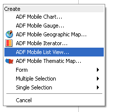
List View: this provides an option for creating the ADF Mobile AMX List View with child components (see Figure 7-43).
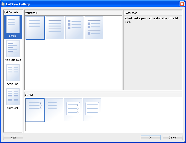
If you select ADF Mobile List View as the type of the control to create, the ListView Gallery opens that allows you to choose a specific layout for the List View, as Figure 7-44 shows.
Table 7-3 lists the supported List Formats that are displayed in the ListView Gallery.
Format Element Row Values Simple
-
Text
Main-Sub Text
-
Main Text
-
Subordinate Text
Start-End
-
Start Text
-
End Text
Quadrant
-
Upper Start Text
-
Upper End Text
-
Lower Start Text
-
Lower End Text
The Variations presented in the ListView Gallery (see Figure 7-44) for a selected list format consist of options to add either dividers, a leading image, or both:
-
Selecting a variation with a leading image adds an Image row to the List Item Content table (see Figure 7-45).
-
Selecting a variation with a divider defaults the Divider Attribute field to the first attribute in its list rather than the default No Divider value, and populates the Divider Mode field with its default value of All.
The Styles options presented in the ListView Gallery (see Figure 7-44) allow you to suppress chevrons, use an inset style list, or both:
-
The selections do not modify any state in the Edit List View dialog (see Figure 7-45). They only affect the generated ADF Mobile AMX markup.
-
Selecting a style with the inset list sets the
adfmf-listView-insetListstyle class on thelistViewelement in the generated ADF Mobile AMX markup. -
Selecting a style without chevrons sets the
showLinkIconattribute on thelistItemelement tofalsein the generated ADF Mobile AMX markup.
The following is an example of the Simple format with the inset list and chevrons:
<amx:listView var="row"
              value="#{bindings.employees.collectionModel}"
              fetchSize="#{bindings.employees.rangeSize}"
              styleClass="adfmf-listView-insetList"
              id="listView2">
   <amx:listItem id="li2">
      <amx:outputText value="#{row.employeename}" id="ot3"/>
   </amx:listItem>
</amx:listView>
The ListView Gallery's Description pane is updated based on the currently selected Variation. The format will include a brief description of the main style, followed by the details of the selected variation. Four main styles with four variations on each provide sixteen unique descriptions detailed in Table 7-4.
Table 7-4 List View Variations and Styles
List Format Variation Description Simple
Basic
A text field appears at the start side of the list item."
Simple
Dividers
A text field appears at the start side of the list item, with items grouped by dividers."
Simple
Images
A text field appears at the start side of the list item, following a leading image.
Simple
Dividers and Images
A text field appears at the start side of the list item, following a leading image. The list items are grouped by dividers.
Main-Sub Text
Basic
A prominent main text field appears at the start side of the list item with subordinate text below.
Main-Sub Text
Dividers
A prominent main text field appears at the start side of the list item with subordinate text below. The list items are grouped by dividers.
Main-Sub Text
Images
A prominent main text field appears at the start side of the list item with subordinate text below, following a leading image.
Main-Sub Text
Dividers and Images
A prominent main text field appears at the start side of the list item with subordinate text below, following a leading image. The list items are grouped by dividers.
Start-End
Basic
Text fields appear on each side of the list item
Start-End
Dividers
Text fields appear on each side of the list item, with the items grouped by dividers.
Start-End
Images
Text fields appear on each side of the list item, following a leading image.
Start-End
Dividers and Images
Text fields appear on each side of the list item, following a leading image. The list items are grouped by dividers.
Quadrant
Basic
Text fields appear in the four corners of the list item.
Quadrant
Dividers
Text fields appear in the four corners of the list item, with items grouped by dividers.
Quadrant
Images
Text fields appear in the four corners of the list item, following a leading image.
Quadrant
Dividers and Images
Text fields appear in the four corners of the list item, following a leading image. The list items are grouped by dividers.
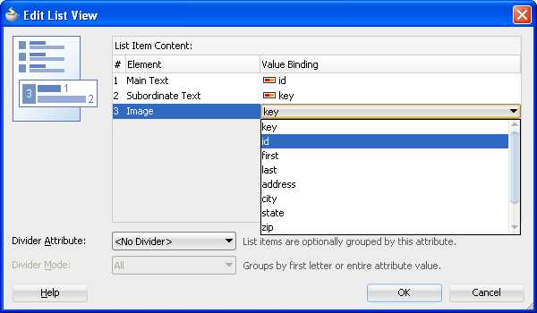
After you make your selection from the ListView Gallery and click OK, the Edit List View wizard is invoked that lets you create the contents of a List Item by mapping binding attributes to the elements of the selected List View format, as Figure 7-45 shows.
When completing the dialog that Figure 7-45 shows, consider the following:
-
The image at the start reflects the main content elements from the selected List View format and provides a mapping from the schematic representation to the named elements in the underlying table.
-
The read-only cells in the Element column derive from the selected List View format.
-
The editable cells in the Value Binding column are based on the data control node that was dropped.
-
The List Item is generated as either an Output Text or Image component, depending on whichever is appropriate for the particular element.
-
Since the number of elements (rows) is predetermined by the selected List View format, rows cannot be added or removed.
-
The order of elements cannot be modified.
-
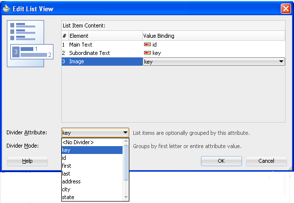
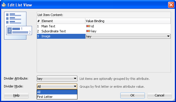
The default value of the Divider Attribute field is No Divider, in which case the Divider Mode field is disabled. If you select value other than the default, then you need to specify Divider Mode parameters, as Figure 7-46 and Figure 7-47 show.
For more information on List View dividers, see Section 8.2.7, "How to Use List View and List Item Components."
The following ADF Mobile AMX markup and data bindings are generated after you select the appropriate options in the Edit List View dialog:
<amx:listView var="row"
              value="#{bindings.contacts.collectionModel}"
              fetchSize="#{bindings.contacts.rangeSize}"
              dividerAttribute="key"
              dividerMode="all"
              id="listView1">
   <amx:listItem showLinkIcon="false" id="listItem1" >
      <amx:panelGroupLayout layout="horizontal"
                            id="panelGroupLayout1">
         <amx:image source="#{row.key}" id="image1"/>
         <amx:panelGroupLayout id="panelGroupLayout2">
            <amx:outputText value="#{row.id}"
                            styleClass="adfmf-listItem-maintext"
                            id="outputText2"/>
            <amx:outputText value="#{row.key}"
                            styleClass="adfmf-listItem-subtext"
                            id="outputText1"/>
         </amx:panelGroupLayout>
      </amx:panelGroupLayout>
   </amx:listItem>
</amx:listView>
For more information about generated bindings, see Section 7.3.2.4.4, "What You May Need to Know About Generated Bindings."
The following are supported controls for ADF Mobile List View:
-
ADF Mobile Output Text
-
ADF Mobile Image
-
7.3.2.4.4 What You May Need to Know About Generated Bindings
Table 7-5 shows sample bindings that are added to an ADF Mobile AMX page when components are dropped.
Table 7-5 Sample Data Bindings
| Component | Data Bindings |
|---|---|
|
Button |
actionListener="#{bindings.FindContacts.execute}"
text="FindContacts" disabled="#{!bindings.FindContacts.enabled}"
|
|
Link |
actionListener="#{bindings.FindContacts.execute}"
text="FindContacts" disabled="#{!bindings.FindContacts.enabled}"
|
|
Input Date with Label |
<amx:inputDate id="inputDate1"
               value="#{bindings.timeStamp.inputValue}"
               label="#{bindings.timeStamp.hints.label}"
               required="#{bindings.timeStamp.hints.mandatory}">
</amx:inputDate>
|
|
Input Date |
<amx:inputDate id="inputDate1"
               value="#{bindings.timeStamp.inputValue}"
               required="#{bindings.timeStamp.hints.mandatory}">
</amx:inputDate>
|
|
Input Text with Label |
value="#{bindings.contactData.inputValue}"
label="#{bindings.contactData.hints.label}"
required="#{bindings.contactData.hints.mandatory}"
maximumLength="#{bindings.contactData.hints.precision}"
|
|
Input Text |
value="#{bindings.contactData.inputValue}"
simple="true"
required="#{bindings.contactData.hints.mandatory}"
maximumLength="#{bindings.contactData.hints.precision}"
|
|
Output Text |
value="#{bindings.contactData.inputValue}"
|
|
Output Text with Label |
<amx:panelLabelAndMessage id="panelLabelAndMessage1"
          label="#{bindings.contactData.hints.label}">
   <amx:outputText value="#{bindings.contactData.inputValue}"/>
</amx:panelLabelAndMessage>
|
|
Select Boolean Checkbox |
value="#{bindings.contactData.inputValue}"
label="#{bindings.contactData.label}"
|
|
Select Boolean Switch |
value="#{bindings.contactData.inputValue}"
label="#{bindings.contactData.label}"
|
|
Select One Button |
<amx:selectOneButton id="selectOneButton1"
           value="#{bindings.contactData.inputValue}"
           label="#{bindings.contactData.label}"
           required="#{bindings.contactData.hints.mandatory}">
   <amx:selectItems value="#{bindings.contactData.items}"/>
</amx:selectOneButton>
|
|
Select One Choice |
<amx:selectOneChoice id="selectOneChoice1"
                value="#{bindings.contactData.inputValue}"
                label="#{bindings.contactData.label}"
                required="#{bindings.contactData.hints.mandatory}">
   <amx:selectItems value="#{bindings.contactData.items}"/>
</amx:selectOneChoice>
|
|
Select Many Checkbox |
<amx:selectManyCheckbox id="selectManyCheckbox1"
                      value="#{bindings.AssetView.inputValue}"
                      label="#{bindings.AssetView.label}">
   <amx:selectItems value="#{bindings.AssetView.items}"/>
</amx:selectManyCheckbox>
|
|
Select One Radio |
<amx:selectOneRadio id="selectOneRadio1"
               value="#{bindings.contactData.inputValue}"
               label="#{bindings.contactData.label}"
               required="#{bindings.contactData.hints.mandatory}">
   <amx:selectItems value="#{bindings.contactData.items}"/>
</amx:selectOneRadio>
|
|
Select Many Choice |
<amx:selectManyChoice id="selectManyChoice1"
                      value="#{bindings.AssetView.inputValue}"
                      label="#{bindings.AssetView.label}">
   <amx:selectItems value="#{bindings.AssetView.items}"/>
</amx:selectManyChoice>
|
7.3.2.4.5 What You May Need to Know About Generated Drag and Drop Artifacts
The first drag and drop event generates the following directories and files:
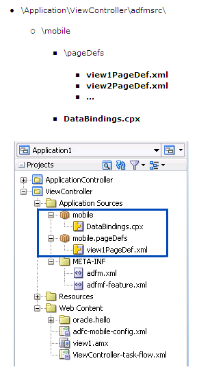
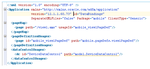
Figure 7-48 shows a sample DataBindings.cpx file generated upon drag and drop.
For more information, see the "Working with the DataBindings.cpx File" section in Oracle Fusion Middleware Fusion Developer's Guide for Oracle Application Development Framework.
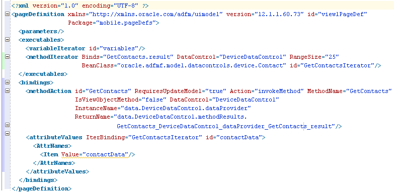
Figure 7-49 shows a sample PageDef file generated upon drag and drop.
For more information, see the "Working with Page Definition Files" section in Oracle Fusion Middleware Fusion Developer's Guide for Oracle Application Development Framework.
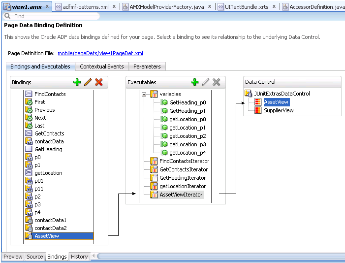
7.3.2.4.6 Using the ADF Mobile AMX Editor Bindings Tab
JDeveloper's Bindings tab (see Figure 7-50) is available in the ADF Mobile AMX Editor. It displays the data bindings defined for a specific ADF Mobile AMX page. If you select a binding, its relationship to the underlying Data Control are shown and the link to the PageDef file is provided.
7.3.2.4.7 What You May Need to Know About Removal of Unused Bindings
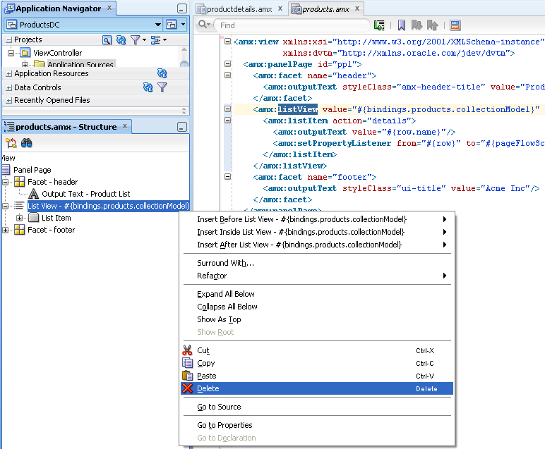
When you delete or cut an ADF Mobile AMX component from the Structure pane, unused bindings are automatically removed from your page.
Note:
Deleting a component from the Source editor does not trigger the removal of bindings.
Figure 7-51 demonstrates the deletion of a List View component that references bindings. Upon deletion, the related binding entry is automatically removed from the corresponding PageDef.xml file.
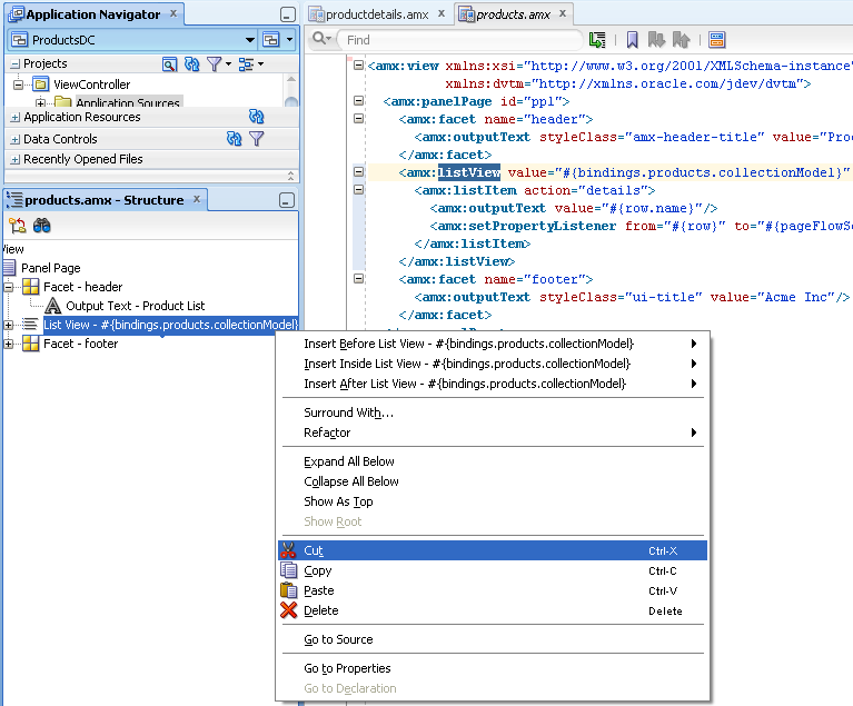
Figure 7-52 demonstrates the removal of the List View component by cutting it from the page.
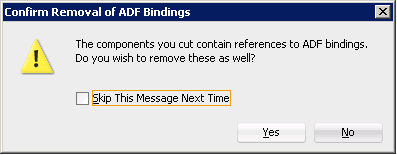
After clicking Cut, you are presented with the Confirm Removal of Bindings dialog that prompts you to choose whether or not to delete the corresponding bindings, as shown in Figure 7-53.
7.3.2.5 What You May Need to Know About Element Identifiers and Their Audit
ADF Mobile generates a unique element identifier (id) and automatically inserts it into the ADF Mobile AMX page when an element is added by dropping a component from the Component palette, or by dragging and dropping a data control. This results in a valid identifier in the ADF Mobile AMX page that differentiates each component from others, possibly similar components within the same page.
ADF Mobile provides an identifier audit utility that does the following:
-
Checks the presence and uniqueness of identifiers in an ADF Mobile AMX page.
-
If the identifier is not present or not unique:
-
for a required
idattribute of an element, an error is reported; -
for an optional
idattribute of an element, a warning is reported.
-
-
Provides an automatic fix to generate a unique
idfor the element when a problem with the identifier is reported.
Figure 7-54 and Figure 7-55 show the identifier error reporting in the Source editor and Structure pane respectively.
In addition to the id, the audit utility checks the popupId and alignId attributes of the Show Popup Behavior operation (see Section 8.2.8, "How to Use a Popup Component").
Figure 7-56 and Figure 7-57 show the Show Popup Behavior's Popup Id and Align Id attributes error reporting in the Source Editor respectively.
For more information, see the "Auditing and Profiling Applications" and "Understanding Auditing" in Oracle Fusion Middleware User's Guide for Oracle JDeveloper.
