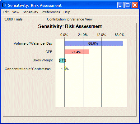
Sensitivity charts show the influence of each assumption cell on a particular forecast cell. During a simulation, Crystal Ball ranks the assumptions according to their importance to each forecast cell. The sensitivity chart displays these rankings as a bar chart, indicating which assumptions are the most important or least important in the model (Figure 43, Assumptions and Their Effects on Toxicity Risk). You can output print the sensitivity chart on the report or copy it to the clipboard.
Sensitivity charts provide these key benefits:
You can find out which assumptions are influencing the forecasts the most, reducing the amount of time needed to refine estimates.
You can find out which assumptions are influencing the forecasts the least, so that they can be ignored or discarded altogether.
As a result, you can construct more realistic spreadsheet models and greatly increase the accuracy of the results because you know how the assumptions affect the model.