Sensitivity charts show the influence of each assumption cell on a particular forecast cell. During a simulation, Crystal Ball ranks the assumptions according to their correlation (or sensitivity) to each forecast cell. The sensitivity chart displays these rankings as a bar chart, indicating which assumptions are the most or least important in the model. You can print the sensitivity chart or copy it to the clipboard.
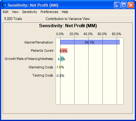
The chart in Figure 4, Effects of Assumptions on Net Profit, following, shows the effects of several assumptions on forecasted net profits for the pharmaceutical company discussed in Tutorial 2 — Vision Research. Market penetration accounts for about 84% of variation of net profits for a new product under consideration.
The Tornado Chart tool provides alternate ways to measure and chart sensitivity. For more information, see Tornado Chart.