Scatter charts show correlations, dependencies, and other relationships between pairs of forecasts and assumptions plotted against each other. You can plot scatter charts directly through the Analyze menu, or you can create a sensitivity chart and choose Sensitivity, then Open Scatter Chart to create a chart showing how the assumptions with the greatest impact relate to the target forecast.
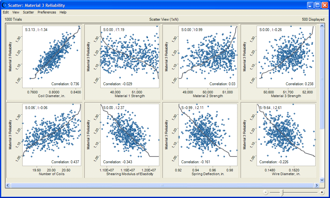
In its basic form, a scatter chart (Figure 5, Scatter Chart with Correlations Displayed) contains one or more plots of a target variable mapped against a set of secondary variables. Each plot is displayed as a cloud of points or symbols aligned in a grid within the scatter chart window. Optional correlation coefficients indicate the strength of the relationship.
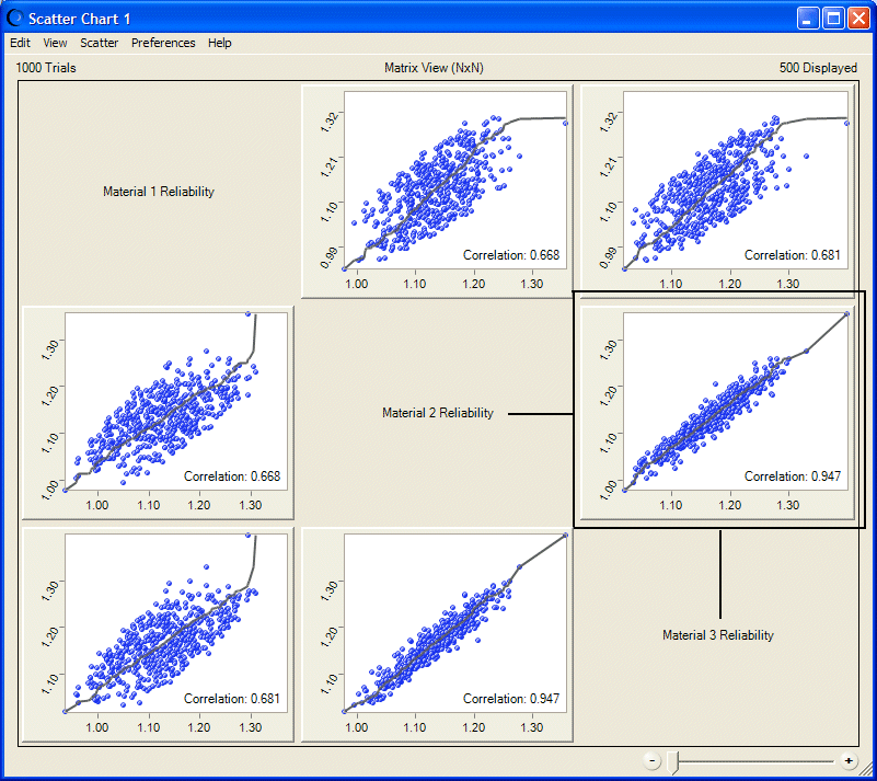
In another form of scatter chart, called the Matrix view, each selected variable is plotted against the other selected variables to show the relationships among them, as shown in Figure 6, Scatter Chart in Matrix View.