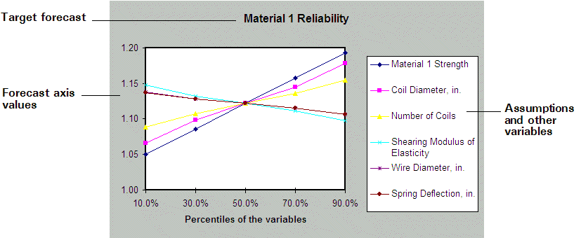
The spider chart (Figure 67, Spider chart) illustrates the differences between the minimum and maximum forecast values by graphing a curve through all the variable values tested. Curves with steep slopes, positive or negative, indicate that those variables have a large effect on the forecast, while curves that are almost horizontal have little or no effect on the forecast. The slopes of the lines also indicate whether a positive change in the variable has a positive or negative effect on the forecast.
A maximum of 250 variables can be displayed in these charts.