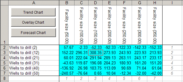
For this example, the Decision Table tool ran 42 simulations, one for each combination of wells to drill and facility sizes. The simulation that resulted in the best mean NPV was the combination of 12 wells and a facility size of 150 mbd (Figure 76, Decision table for Oil Field Development Results).
To view one or more of the forecasts in the decision table, select the cells and click Forecast Chart. To compare one or more forecasts on the same chart, select the cells and click the Trend Chart or Overlay Chart button in column A (Figure 77, Trend chart of 150 mbd Forecasts).
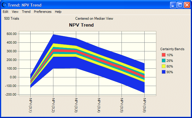
You can create the trend chart shown in Figure 77, Trend chart of 150 mbd Forecasts by selecting all the forecast cells in the Facility Size (150.00) column of the results table and clicking on Trend Chart. This chart shows that the forecast with the highest mean NPV also has the largest uncertainty compared to other forecasts with smaller NPVs of the same facility size. This indicates a higher risk that you could avoid with a different number of wells (although the lower risk is accompanied with a lower NPV).
If you have the Probability Above A Value option selected in the Run Preferences, then Options panel, the percentiles will be reversed in meaning, so that the 1st percentile represents the uppermost 1% and the 99th percentile represents the lowest 1%. For more information on this reversal, Setting Statistics Preferences. |