In this example, the simulation generated 1,000 forecast values. Since you selected to analyze the percentiles from 95 to 100, the resulting table lists 51 forecast values, or the top 5% of the forecast range, including the endpoints. The table sorts the forecast values from lowest to highest value along with the assumption values that Crystal Ball generated for each trial.
If you selected Probability above a value in the Run Preferences dialog, the percentiles are reversed in meaning, so that the 1st percentile represents the uppermost 1% and the 99th percentile represents the lowest 1%.
One way to analyze the Scenario Analysis results is to identify a particular forecast value and see what assumption values created that forecast value.
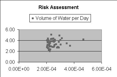
Another way to analyze the Scenario Analysis results is to generate a scatter chart in Microsoft Excel with the data. For example, you might create a scatter chart comparing the risk assessment with the CPF (Figure 80, Scatter Chart of Risk Assessment and CPF).