To run the Data Analysis tool:
In Microsoft Excel with Crystal Ball loaded, open the workbook Magazine Sales.xls.
Choose Run, then More Tools, then Data Analysis. (In Microsoft Excel 2007 or later, select More Tools in the Tools group.)
If this is the first time you have opened the Data Analysis tool, the Welcome panel opens.
If the Welcome panel opens, click Next.
The Data Analysis data selector attempts to select relevant data and indicate its orientation.
The Input Data panel shows a cell range with four data series and 360 rows of data. The tool determined that the data is in columns with headers in the first row. There are no labels in the first column.
Examine the Sales Data tab of the Magazine Sales workbook to confirm that this information is correct.
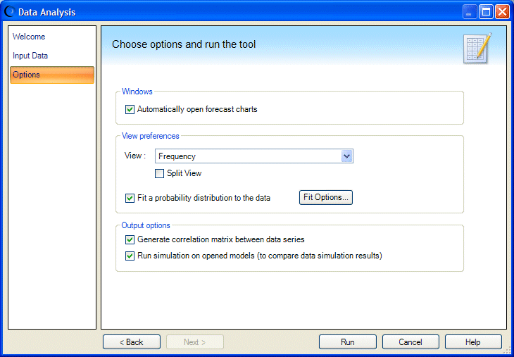
Click Next to display the Options panel, similar to Figure 88, Options panel, Data Analysis Tool.
Confirm that the settings are as shown in Figure 88, Options panel, Data Analysis Tool. Change them if necessary:
Click Fit Options to specify which distributions and ranking statistics to use for fitting.
Choose AutoSelect for both Distributions To Fit and Rank By Goodness-of-Fit Statistic.
If you know location, shape, or other parameter values that might help create a more accurate fit with certain distributions, check Lock Parameters and enter appropriate values in the Lock Parameters dialog. For details, see Locking Parameters When Fitting Distributions.
When the Data Analysis tool runs, it creates:
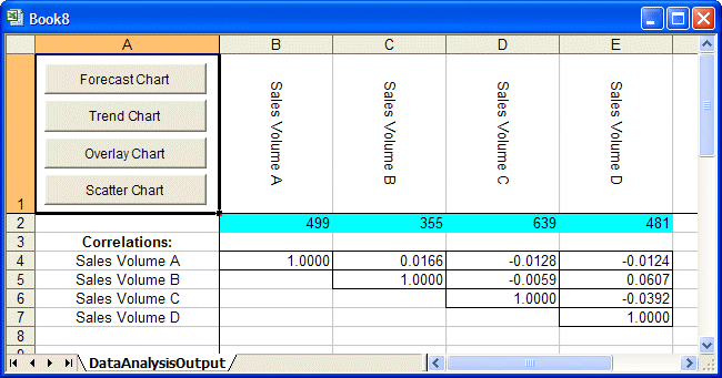
A new workbook with data and buttons on a worksheet named DataAnalysisOutput.
The new worksheet is similar to Figure 89, Data Analysis Output worksheet.
Cells B2 through E2 contain forecasts, one for each series of magazine data.
Below that is a correlation matrix, showing the relationship of each forecast to the other three.
Cell A1 contains four buttons you can use to display forecast, trend, overlay, and scatter charts.
Select all four forecast cells in row 2 and click the Forecast Chart button.
A chart is displayed for each forecast, in Frequency view. You can customize them as usual, changing the view or setting other chart preferences as described in Chapter 6.
To see which type of distribution fit best, select a chart and choose View, then Goodness of Fit.
Experiment with the other chart buttons as well. Select two or more forecasts and click a button. You can create new charts of the selected type just as if you used the Analyze command or clicked a chart icon.