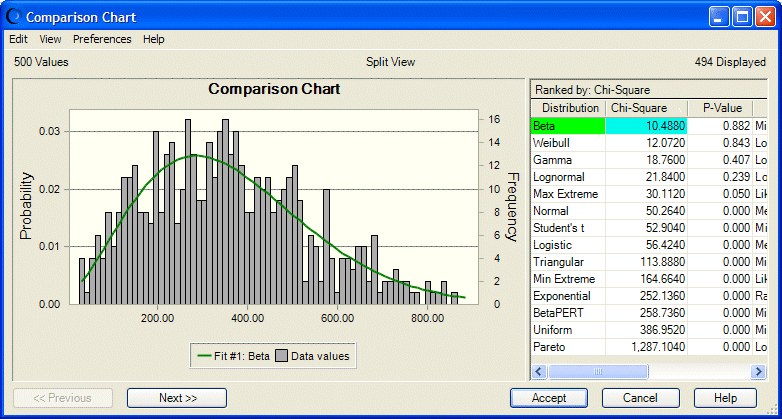
When the Comparison Chart opens (Figure 16, Comparison Chart with Goodness of Fit View, Chi-Square Ranking Statistic), the fitted distributions are displayed in the Comparison Chart dialog, starting with the highest-ranked distribution (best fit) down through to the lowest (worst fit).
 To confirm which of the selected distributions to use for an assumption:
Use the Comparison Chart dialog to visually compare the quality of the fits or to view the goodness-of-fit statistics. You can:
Use the Next and Previous buttons to scroll through the fitted probability distributions. Each probability distribution is shown superimposed over the data.
Choose Preferences, then Chart to change chart features so that similarities or differences are more clearly accentuated.
Click Cancel to return to the Fit Distribution dialog.
To use the currently displayed distribution, either the best fit or another of the choice, click Accept.
The Assumption dialog opens with the parameter entries taken from the chosen distribution. You can change the distribution parameters before you click OK.