The example model used in this section, Toxic Waste Site.xls, illustrates the risk assessment of a toxic waste site. The sensitivity chart created in the steps below displays, in descending order, the assumptions in this model. The assumption with the highest level of sensitivity can be considered as the most influential assumption in the model.
 To create a sensitivity chart:
Open the spreadsheet to analyze.
Toxic Waste Site.xls is used in these instructions. You can choose Help, then Crystal Balll, then Examples Guide to choose the model from a list.
(In Microsoft Excel 2007 or later, choose Resources, then Examples Guide in the Help group.)
Make sure Store Assumption Values For Sensitivity Analysis is checked and click OK.
Sensitivity analysis requires that all of the random numbers from the simulation be kept for comparison with forecast values.
Choose Analyze, then Sensitivity Charts.

(If you are using Crystal Ball in Microsoft Excel 2007 or later, choose Analyze, then View Charts, then Sensitivity Charts.)
The Sensitivity Charts dialog opens. If you have not yet created any sensitivity charts for the active spreadsheet or restored results file, the dialog is blank.
The Choose Forecast dialog opens.
By default, this dialog opens in a hierarchical Tree view. If you prefer, click the List box to change the view from a tree to a list. For more information on the Choose Forecast dialog, click the Help button.

Check the box in front of the forecast name to include it in the sensitivity chart.
Click OK to create a new sensitivity chart as shown in Figure 44, Sensitivity Chart for the Selected Forecast.
The illustrated chart has a transparency effect applied using the chart preferences to make sensitivity values easier to read. For instructions, see Setting Special Chart Effects.
The assumptions are listed beside the bar chart, starting with the assumption with the highest sensitivity. If necessary, use the scroll bar to view the entire bar chart. You can drag the edges of the chart to resize it — make it narrower, wider, taller, or shorter. This often changes the tick labels along the top of the chart.

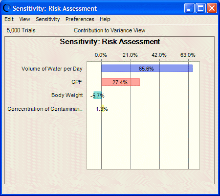
In this example, Figure 44, Sensitivity Chart for the Selected Forecast, there are four assumptions listed in the sensitivity chart. The first assumption, Volume Of Water Per Day, accounts for approximately 65% of the variance in forecast values and can be considered the most important assumption in the model. A researcher running this model would want to investigate this assumption further in the hopes of reducing its uncertainty and, therefore, its effect on the target forecast. The last assumption, Concentration Of Contaminant In Water, contributes the least to forecast variance (about 2%). In fact, this assumption has such a small effect, it could be ignored or altogether eliminated by clearing it from the spreadsheet.
Sensitivity charts like this one illustrate that one or two assumptions typically have a dominant effect on the uncertainty of a forecast.