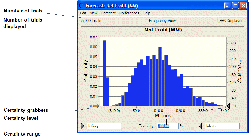
Forecast charts use frequency distributions to show the number (frequency) of values occurring in a given interval. The highest value on the frequency scale of the chart is the frequency for the interval that contains the greatest number of forecast values — the mode of the graphed distribution. You can estimate the frequency for other points on the forecast chart using this frequency scale.
Note: | You can now display forecast charts in Split View, which shows charts and statistics side by side. For more information about Split View and its features, see Using Split View. |
The highest value on the Probability scale is the probability for the mode. You can estimate the probability for other points on the forecast chart using this probability scale.
In the example below, the mode (the x-axis value that occurred the most frequently) has a frequency of about 300, meaning that there are 300 values in the interval expressed by that column. The mode has a probability of about 0.06 (or 6%), meaning that there is a 6% chance of a value falling within this interval.
Figure 22, Forecast chart shows the elements of the forecast chart.
Crystal Ball forecasts the entire range of results for a given situation. However, the forecast chart shows only the display range, which is a subset of the whole. By default, the display range includes all trials within 2.6 standard deviations of the mean (approximately 99% of the forecast values). Crystal Ball then rounds the display range to the next even number of units. For this reason, outlying trials might be excluded from the display range.
To display all trials, change the chart axis preferences to display fixed endpoints between –Infinity and +Infinity (Focusing On the Display Range). |
The number of trials run for a forecast are displayed at the top of the forecast chart, near the Probability scale. The number of trials actually shown (the number of trials run minus the number of outlying values) are displayed at the top of the chart near the Frequency scale (right vertical axis). The display range is the linear distance between the minimum and maximum trials on the chart (from about -$15.00 to $35.00 in Figure 22, Forecast chart).
The following sections provide details about reading and analyzing forecast charts: