Gauges measure a number for a column in a table or results section. A set of gauges provides comparisons between table rows for a given column. For efficiency and convenience, a section contains one row for each gauge.
For example, Figure 13, Summary Table of Performance Rows Returned by a Query is a summary of the performance rows returned by a query. The four row summary is used to drive a set of four gauges—one for each region.
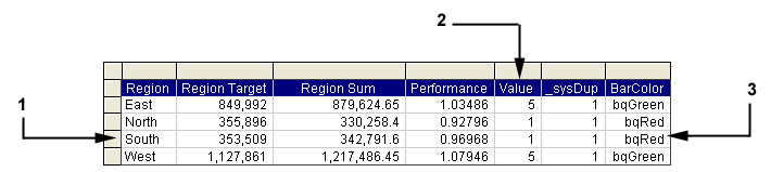
The table describes the features numbered in Figure 13, Summary Table of Performance Rows Returned by a Query.
Column ID | Column Name | Description |
|---|---|---|
1 | Region | Identifies the row that is associated with an image |
2 | Value | Identifies the image to be visible in the gauge |
3 | BarColor | Chart Spotlighter column |
The Chart Spotlighter feature uses a column (called BarColor in this example) to provide visualization based on color and not the visible property of images. For example, based on the data in Figure 13, Summary Table of Performance Rows Returned by a Query, the Chart Spotlighter sets the FillColor property of a bar or segment according to the values in the BarColor column. And specific gauge images are visible based on the Value column.
The Graphic Gauges component works with the Checkpoint control to store and restore comparisons between table rows for a given column in a table or results section. See “Using Checkpoint Control” in the Hyperion Interactive Reporting – Object Model and Dashboard Development Services Developer's Guide, Volume 5: Dashboard Studio.