Visual Explorer provides Essbase users with powerful analytics in a highly graphical format. It enables users to unlock the information stored in multidimensional databases using a free-form canvas for exploring and analyzing data. Visual Explorer is launched directly from the Essbase menu in Spreadsheet Add-in, using the Visualize & Explore command. With its drag and drop interface, Essbase users can quickly summarize and visualize data from an Essbase database.
Visual Explorer gives users a quick and simple path to analysis by providing these benefits:
Making Essbase databases approachable—Average business people find that pictures of data are "friendly" and approachable. The graphical quality of Visual Explorer encourages people to interact with data. It pushes interactive reporting and analysis deeper into the organization.
Simplifying reports—Multidimensional problems require multidimensional views. Visual Explorer enables you to easily present sophisticated problems in simple graphical displays.
Fast ad hoc analysis—Ad hoc analysis is time consuming. It typically involves the generation of a wide variety of various "slices" of a problem. Visual Explorer provides an exploratory canvas that enables users to easily find trends, outliers, correlations, and comparisons.
Visual Explorer offers users the option to pass data back to the active Excel worksheet from which it was launched, or to insert the data into a worksheet in the active Excel workbook where additional analysis can be performed.
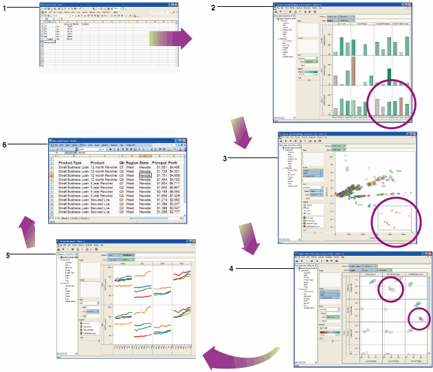
Visual Explorer Workflow Example
Meredith is a loan manager for a large financial institution.
Meredith is asked to investigate falling profit margins. She opens Excel and connects to Essbase using Spreadsheet Add-in.
She launches Visualize & Explore from Excel. By dragging fields onto a visual canvas, she creates a snapshot of the business in seconds. The chart shows loan principal and profit for every product in every region. Two areas of the business immediately grab her attention.
She drills in and finds a handful of negative outliers. She filters the visualization so it only shows loans made by her division.
She creates a visual table, rerunning the prior analysis by State by just dragging the State field. It is now clear that the problematic transactions occurred in Nevada and California; and only for certain products.
She runs profitability trends for these products (for every region and every month). The total time required to do this: 90 seconds. She discovers that the transactions are affecting general trends for those regions. She never found ad hoc analysis of cubes this easy.
She presses the Update Excel icon and all data behind the Essbase visualization is automatically retrieved into Excel for further work and collaboration.
Figure 1, Visual Explorer Workflow illustrates this Visual Explorer workflow, clockwise starting with step 1.
Essbase System Login Dialog Box for Visual Explorer