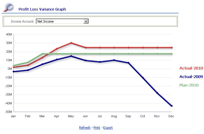
The report provides a graphical representation of the variances calculated for the income accounts selected within the report. The report helps you understand the variance calculation for the different Scenario and Year combinations.
 To compile the Profit and Los Variance Graph report:
From the Oracle BI EE Global Header, select the Dashboards link, then select the OFMA menu list, and then select Oracle Financial Management Analytics.
From Oracle Financial Management Analytics, select the Profit and Loss dashboard tab.
From POV Selector, select the required POV dimensions that you want to use for the dashboard, and then click Apply.
See Setting the Point of View in Oracle Financial Management Analytics.
In the Variance Analysis POV selector, select the following dimension members from the list:
Scenario 2 and Year 2 dimension combinations
Scenario 3 and Year 3 dimension combinations
Click Apply to view the changes in the report.
The Profit Loss Variance Graph report is displayed at the bottom of the screen. Scroll down to see the results.
The report displays the following information:
Table 13. Profit Loss Variance Graph – Report Details
| Report in Detail | Description |
|---|---|
| Income Accounts | The displayed accounts are mapped from the Financial Management applications. Note: In the Profit Loss Variance Graph report, if you change the Income Accounts drop-down (report prompt)[1], the corresponding changes are viewed within the report. |
| Period | The periods are displayed on the x-axis. These period are selected from the dashboard POV selector. |
| Financial Values | The Financial Management values are displayed on the y-axis. |