For charts that can display multiple metrics at once, each option in the end user Metric drop-down list is a group of metrics. For each metric group, you can configure the labels to use in the drop-down list and on the data axis. You also configure the minimum and maximum values for the axis, and the format to use for the axis and tooltip values.
To configure a metric group:
-
On the
Metric Group dialog, under
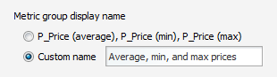
Metric group display name, the default setting
uses a comma-separated list of the series metric display names. To provide a
custom display name for the group:
-
In the field, type the display name.
-
In the field, type the display name.
-
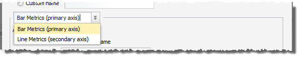
If you are configuring a dual-axis Bar-Line chart, then you
configure each axis separately. From the drop-down list, select the axis to
work with.
-
Under
Axis title, the default setting uses the
metric group display name as the axis title. To provide a custom axis title:
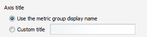
- Click the Custom title radio button.
- In the field, type the axis title.
-
For charts other than Pie charts, you can configure the minimum
and maximum values to display on the value axis.
If you know that your values always fall within a specific range, then setting a range can give the chart a consistent scale, even if the values are all large or all small. For example, because credit scores fall between 300 and 850, if you are displaying credit score values, you might want to set the minimum value to 300 and the maximum value to 850.
Under Limit metric axis range:
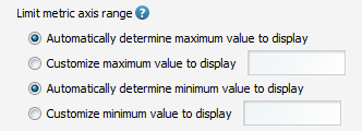
- To have the chart set the maximum value, click the Automatically determine maximum value to display radio button.
- To set a specific maximum value, click the Customize maximum value to display radio button. In the field, enter the maximum value.
- To have the chart set the minimum value, click the Automatically determine minimum value to display radio button.
- To set a specific minimum value, click the Customize minimum value to display radio button. In the field, enter the minimum value.
-
Under
Axis and Tooltip Formats, use the
Value Formatting fields to specify the metric
value format.
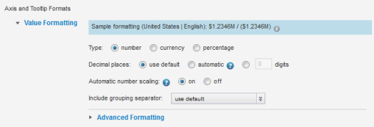
For details on formatting displayed values, see Configuring the format of values displayed on a component.
For the Chart component, the formatting configuration includes whether to automatically scale numbers. For example, if automatic scaling is enabled, the value 1,500 might display as 1.5K.
By default, automatic scaling is enabled. To always display the actual value without scaling, under Automatic number scaling, click the off radio button.
