Designing Forms
This section describes designing forms using the Form Design Wizard component (FORM_DESIGN_WIZARD) and discusses how to:
Define basic information.
Provide user instructions.
Specify the fields for a form.
Define field edit details.
Associate file attachments.
Specify the menu location.
Assign approval workflow.
Preview and activate the form.
Note: Access to the Form Design Wizard component is limited to form designers and form administrators. In addition, only form owners can modify existing forms.
Pages Used to Design Forms
|
Page Name |
Definition Name |
Navigation |
Usage |
|---|---|---|---|
|
Design Form - Step 1: Basic Information |
FORM_DSN_WZR_MAIN |
|
Define a form's basic information. |
|
Design Form - Step 2: Instructions |
FORM_DSN_WZR_INST |
Click Next on the Design Form - Step 1: Basic Information page of the Forms Design Wizard. |
Provide instructions for users that describe how to complete and submit a form. |
|
Design Form - Step 3: Form Fields |
FORM_DSN_WZR_FLDS |
Click Next on the Design Form - Step 2: Instructions page of the Forms Design Wizard. |
Define the fields that appear on the form. |
|
Form Field Edits |
FORM_L_FLD_SEC |
Click the Details link for a field on the Design Form - Step 3: Form Fields page. |
Define additional requirements for fields. |
|
Design Form - Step 4: Attachment Templates |
FORM_DSN_WZR_ATCH |
Click Next on the Design Form - Step 3: Form Fields page of the Forms Design Wizard. |
Associate file attachments with a form. |
|
Design Form - Step 5: Publish to Menu |
FORM_DSN_WZR_PRTL |
Click Next on the Design Form - Step 4: Attachment Templates page of the Forms Design Wizard. |
Specify the menu location for a form. |
|
Design Form - Step 6: Approval Process |
FORM_DSN_WZR_AW |
Click Next on the Design Form - Step 5: Publish to Menu page of the Forms Design Wizard. |
Assign the approval workflow required for a form. |
|
Design Form: Complete |
FORM_DSN_WZR_DONE |
Click OK on the Design Form - Step 6: Approval Process page. |
Preview and activate or redesign a form. |
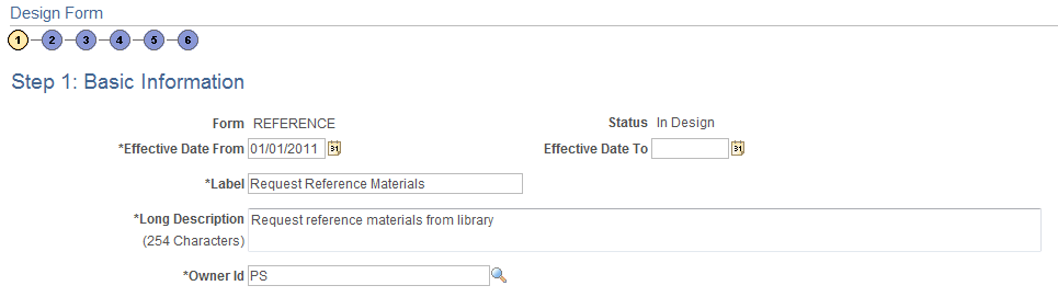
Design Form - Step 1: Basic Information Page
Use the Design Form - Step 1: Basic Information page (FORM_DSN_WZR_MAIN) to define a form's basic information.
Image: Design Form - Step 1: Basic Information page
This example illustrates the fields and controls on the Design Form - Step 1: Basic Information page. You can find definitions for the fields and controls later on this page.
Design Form - Step 2: Instructions Page
Use the Design Form - Step 2: Instructions page (FORM_DSN_WZR_INST) to provide instructions for users that describe how to complete and submit a form.
Click Next on the Design Form - Step 1: Basic Information page of the Forms Design Wizard.
Image: Design Form - Step 2: Instructions page
This example illustrates the fields and controls on the Design Form - Step 2: Instructions page. You can find definitions for the fields and controls later on this page.
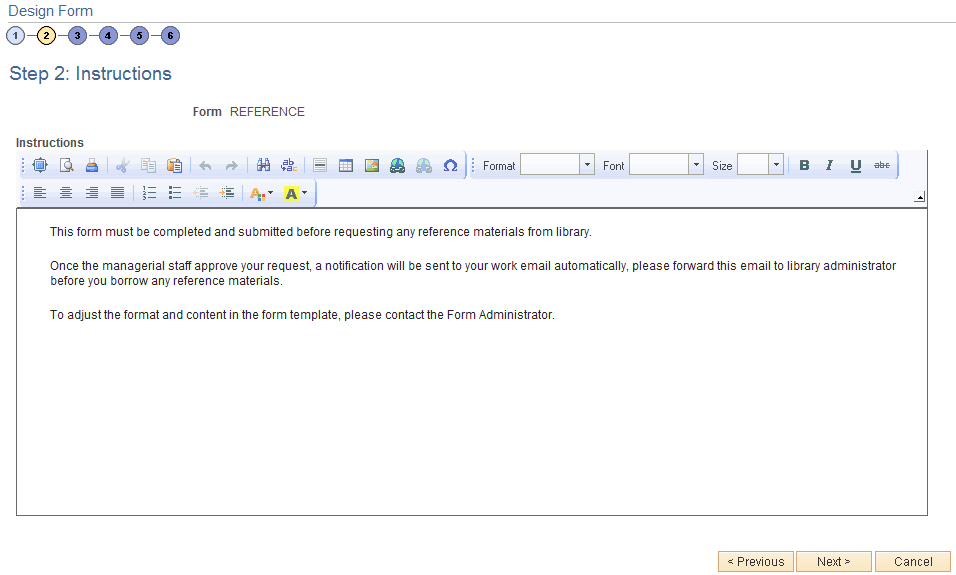
Enter instructions for completing the form using the HTML editor. Use the toolbar buttons to copy and paste, format text, and insert graphics or links.
Design Form - Step 3: Form Fields Page
Use the Design Form - Step 3: Form Fields page (FORM_DSN_WZR_FLDS) to define the fields that appear on the form.
Image: Design Form - Step 3: Form Fields page
This example illustrates the fields and controls on the Design Form - Step 3: Form Fields page. You can find definitions for the fields and controls later on this page.
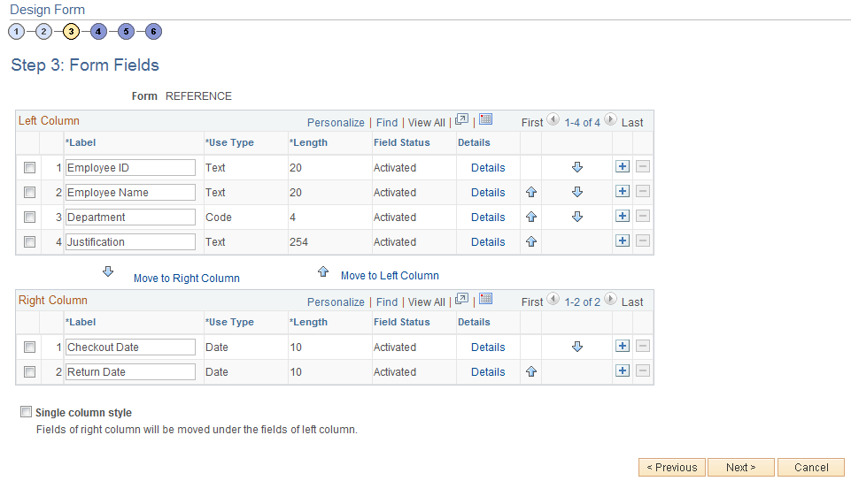
Insert rows within the Left Column and Right Column grids to define the fields that appear on the left and right columns of the form.
For each row, specify values for the following parameters to define the requirements for that field.
- Label
-
Enter the label to use for this field.
- Use Type
-
Select the field type, and field length, if required (depends on the Use Type). Values are:
Code: Use to define a code field that allows the form user to select a response from a list of codes.
Date: Use for dates.
Number: Use for numeric entries (only positive values are allowed).
Prompt: Defines a prompt field that allows the user to select data from existing PeopleSoft database tables.
Section: Use to separate a form into sections. The section can include a header with instructive text, and an HTML editor is provided for you to define the section.
Signed: Use for signed numeric entries (values can be positive or negative).
Text: Use for text entries.
Time: Use for time entries.
Y/N: Use for yes/no responses.
- Length
-
Select the field length. You can modify this field only for Number, Prompt, Signed, and Text fields; the remaining field types use a preset length.
The syntax for numeric fields is X.Y, where the value before the decimal (X) is the number of integer digits allowed, the value after the decimal (Y) is the number of decimal places allowed.
- Field Status
-
Indicates the status of the field, either Activated or In Design.
- Details
-
Click to access the Form Fields Details page, where you define additional requirements for the field, including whether the field is required, and edits for the field when a user completes the form.
 and
and 
-
Click the arrow icons to reposition a field.
- Move to Right Column
-
Click to move selected fields to the right column.
- Move to Left Column
-
Click to move selected fields to the left column.
- Single column style
-
Select to create a form that contains a single column. Any fields that are defined in the right column will appear under the left column fields when you view the form.
Form Field Edits Page
Use the Form Field Edits page (FORM_L_FLD_SEC) to define additional requirements for fields.
Image: Form Field Edits page displaying an example for a prompt field
This example illustrates the fields and controls on the Form Field Edits page example for a prompt field. You can find definitions for the fields and controls later on this page.
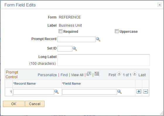
Image: Form Field Edits page displaying an example for a code field
This example illustrates the fields and controls on the Form Field Edits page example for a code field. You can find definitions for the fields and controls later on this page.
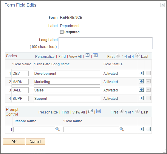
The fields that appear on this page differ depending on the field's Use Type. The examples provided show how the page appears for a Prompt field and a Code field. The following information lists all of the possible fields that can appear on this page.
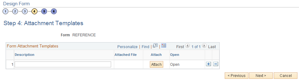
Design Form - Step 4: Attachment Templates Page
Use the Design Form - Step 4: Attachment Templates page (FORM_DSN_WZR_ATCH) to associate file attachments with a form.
Image: Design Form - Step 4: Attachment Templates page
This example illustrates the fields and controls on the Design Form - Step 4: Attachment Templates page. You can find definitions for the fields and controls later on this page.
Design Form - Step 5: Publish to Menu Page
Use the Design Form - Step 5: Publish to Menu page (FORM_DSN_WZR_PRTL) to specify the menu location for a form.
Click Next on the Design Form - Step 4: Attachment Templates page of the Forms Design Wizard.
Image: Design Form - Step 5: Publish to Menu page (1 of 2)
This example illustrates the fields and controls on the Design Form - Step 5: Publish to Menu page (1 of 2). You can find definitions for the fields and controls later on this page.
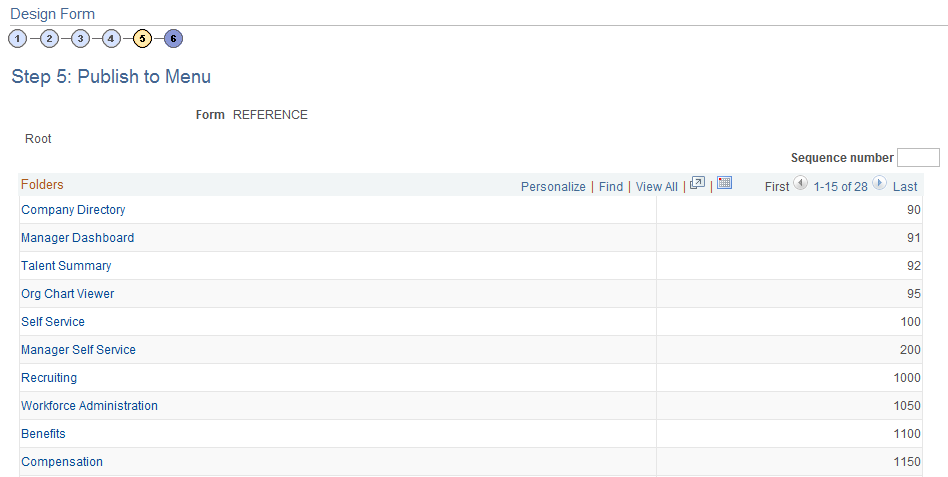
Image: Design Form - Step 5: Publish to Menu page (2 of 2)
This example illustrates the fields and controls on the Design Form - Step 5: Publish to Menu page (2 of 2). You can find definitions for the fields and controls later on this page.
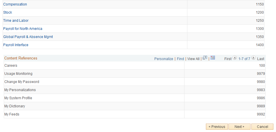
The menu hierarchy appears near the top of the page, below the form name; the highest level, Root, is equivalent to Main Menu in the menu hierarchy. Click the links to navigate to the level of the menu hierarchy in which you want the form to appear. Then, enter a value in the Sequence number to control the order in which it appears in the menu. In the example shown, the form will appear as the last item under Main Menu, Manager Self-Service, along with Review Forecasted Time and Travel and Expense Center.
Design Form - Step 6: Approval Process Page
Use the Design Form - Step 6: Approval Process page (FORM_DSN_WZR_AW) to assign the approval workflow required for a form.
Image: Design Form - Step 6: Approval Process page
This example illustrates the fields and controls on the Design Form - Step 6: Approval Process page. You can find definitions for the fields and controls later on this page.
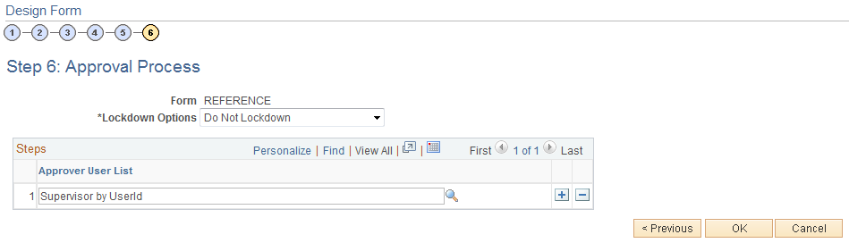
- Lockdown Options
-
Specify if a form instance can be modified after it has been submitted, and under what conditions. Values are:
Do not lockdown: Select this option to allow changes to be made to the form instance at any time. This option enables users to update a form even after it has been submitted and approved.
Lockdown after submit: Select this option to prevent any changes to the form instance after it has been submitted (the approval status is Pending, or Approved.)
Lockdown after approval: Select this option to prevent any changes to the form instance after it has been approved (the approval status is Approved). Changes can still be made after it has been submitted, up until the time it is approved.
Note: If a form is integrated with PeopleSoft applications, the form cannot be modified after it has been posted to PeopleSoft transactional tables.
- Approver User List
-
Insert rows and select the Approver User Lists required for this form. Approver paths must be sequential, branching is not supported.
Approver user lists are established using the User List Definition page ().
See Defining Users for Approval Framework.
After you have specified all the required Approver User Lists, click OK. The system automatically creates the approval Process Definition ID using the same name as the form name.
The predefined form approval configuration supports the following notification events: Route for Approval, Route for Review, On Final Approval and On Final Denial.
Design Form: Complete Page
Use the Design Form: Complete page (FORM_DSN_WZR_DONE) to preview and activate or redesign a form.
Image: Design Form: Complete page
This example illustrates the fields and controls on the Design Form: Complete page. You can find definitions for the fields and controls later on this page.
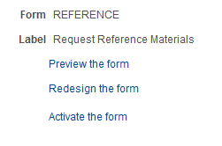
This page enables you to preview your form, modify it, if needed, and activate it when you've finalized the design by using the following links: