Understanding the Scorecard and KPI Monitoring Pages
After you process KPIs and scorecards, you can use the pages that are discussed in this topic to monitor the success of your strategy. These pages provide graphs, buttons, and links that you click to reveal varying levels of detail or to access pages with related information. On some pages, you navigate through the strategy hierarchy to view each component's performance. Other pages enable you to override assessments, enter comments, send emails, and view attachments. These pages are very intuitive, so we don't explain every page in detail. Instead, we summarize the type of information the pages provide, define the common elements they use, review the pages, and describe how to perform the administrative tasks that you can accomplish by using these pages.
Many of these pages have a similar layout, and include some or all of the following elements:
|
Object |
Description |
|---|---|
|
Scorecard Control Panel |
This collapsible group box enables you to:
This group box appears on the following pages: Details by Strategic Thrust, KPI List, Portfolios, Scorecard at a Glance, Strategies by Perspective, Strategy. |
|
Scorecard Information |
Information about the current scorecard, including its owners, the calendar used, and the period being viewed. |
|
Component Information |
Information about the current component. |
|
Graphs |
Various graphs. |
|
Links and buttons |
Links to other related pages or to view different chart types. Also buttons to perform tasks such as sending emails or entering comments. |
|
Grids |
Detailed fields that are related to the current object. Some pages contain multiple grid areas; each grid is labeled so that you can easily understand the information that is presented. |
Charts
You can interact with many of the charts that appear on these pages by moving your mouse pointer over a data point to view its details, such as the x and y values and a description. Also, on the variance chart (an applet chart), you can rotate the chart by clicking an axis and dragging it with your mouse, and move the chart floor by clicking and dragging the floor's surface. On some pages, you select which data to chart by selecting the check box in the Chart column.
For KPI charts, the y-axis scale is controlled by the values in the Y Axis - - Min Value and Y Axis - - Max Value fields on the Dimension Members page.
Note: For performance reasons, only KPIs that are less than their target values appear on the 3D variance chart.
Several bar graphs include the following overlay lines:
|
Overlay Line |
Description |
|---|---|
|
Last Year Actuals |
Shows last year's results, if available. |
|
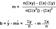
Trajectory |
Extrapolates results into the future, using simple linear regression to compute the data points. This provides a statistically based prediction of the future results. |
The linear regression formula that is used to compute the trajectory line (where the equation for a line is y = mx + b) is:
Image: Linear regression formula
Linear regression formula
Printing
To generate an optimal printout of the scorecard viewing pages, you need to set your internet browser to print background colors and images. In Internet Explorer, you can check this setting by selecting Tools, Internet Options, selecting the Advanced tab, then scrolling through the list of settings to view the printing options. Select the Print background colors and images check box, and click OK.