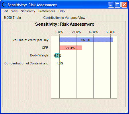
Sensitivity charts show the influence of each assumption cell on a particular forecast cell. The overall sensitivity of a forecast to an assumption is a combination of two factors:
During a simulation, Crystal Ball ranks the assumptions according to their importance to each forecast cell. Sensitivity charts display these rankings as a bar chart, indicating which assumptions are the most important or least important in the model (Figure 35, Assumptions and Their Effects on Toxicity Risk). You can add sensitivity charts to reports or copy them to the clipboard.
Note: | For more information about what sensitivity charts display, see Sensitivity Chart Views. |
