Trend charts summarize and display certainty levels from multiple related forecasts, making it easy to discover and analyze forecast trends. The trend chart in Figure 34, Upward Trending Sales Figures, By Quarter displays certainty ranges on a quarterly basis over a three year period.
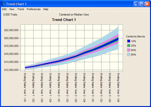
Trend charts display certainty ranges for multiple forecasts in a series of colored bands. Each band represents the certainty ranges into which the actual values of the forecasts fall. For example, the band that represents the 90% certainty range shows the range of values into which a forecast has a 90% chance of falling. By default, the bands are centered around the median of each forecast. The bands grow wider as forecast standard deviations increase. In this way, they show how uncertainty increases as predictions move into the future.