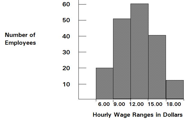
To begin to understand probability, consider this example: You want to look at the distribution of non-exempt wages within one department of a large company. First, you gather raw data, in this case the wages of each non-exempt employee in the department. Second, you organize the data into a meaningful format and plot the data as a frequency distribution on a chart. To create a frequency distribution, you divide the wages into groups (also called intervals or bins) and list these intervals on the chart’s horizontal axis. Then you list the number or frequency of employees in each interval on the chart’s vertical axis. Now you can easily see the distribution of non-exempt wages within the department.
A glance at the chart illustrated in Figure 75, Raw Frequency Data for a Probability Distribution reveals that the most common wage range is $12.00 to $15.00.
Approximately 60 employees (out of a total of 180) earn from $12 to $15.00 per hour.
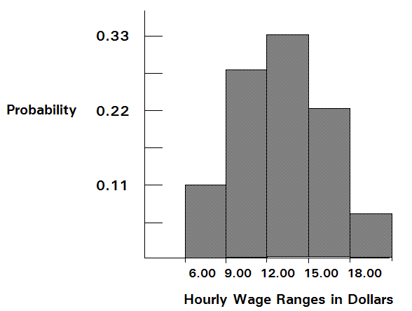
You can chart this data as a probability distribution. A probability distribution shows the number of employees in each interval as a fraction of the total number of employees. To create a probability distribution, you divide the number of employees in each interval by the total number of employees and list the results on the chart’s vertical axis.
The chart illustrated in Figure 76, Probability Distribution of Wages shows you the number of employees in each wage group as a fraction of all employees; you can estimate the likelihood or probability that an employee drawn at random from the whole group earns a wage within a given interval. For example, assuming the same conditions exist at the time the sample was taken, the probability is 0.33 (a 1 in 3 chance) that an employee drawn at random from the whole group earns between $12 and $15 an hour.
Compare the probability distribution in the previous example to the probability distributions in Crystal Ball (Figure 77, Distribution Gallery Dialog).
The probability distribution in the example in Figure 76, Probability Distribution of Wages has a shape similar to many of the distributions in the Distribution Gallery. This process of plotting data as a frequency distribution and converting it to a probability distribution provides one starting point for selecting a Crystal Ball distribution. Select the distributions in the gallery that is displayed similar to the probability distribution, then read about those distributions in this chapter to find the correct distribution.


