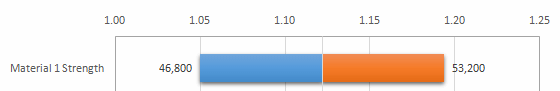
By default, the labels on the tornado chart and spider chart show the absolute values of the input variable’s test range (Figure 52, Tornado Chart) In the example figure, the absolute values are 46,800 and 53,200 for the top variable. You can use the Chart Options dialog to show the data labels in terms of the forecast’s test range, or show a difference amount from the base case (net impact) instead of an absolute amount.
Table 10. Tornado Chart Option Settings
| Chart | Option Settings |
|---|---|
| Tornado chart variable showing absolute values of the input variable's test range. |
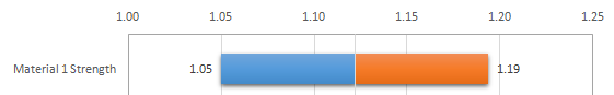
| Tornado chart variable showing absolute values of the target forecast. |
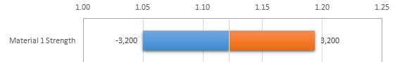
| Tornado chart variable showing difference values of the input variable's test range. |
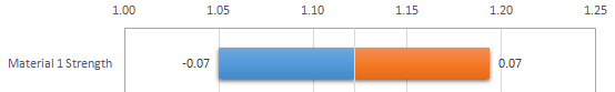
| Tornado chart variable show difference values of the target forecast. |
You can also customize the chart legend labels from Upside and Downside to labels that suit your data better.
 To set tornado chart options:
Review and edit chart content as follows:
Indicate whether to show labels in terms of:
The test range of the Input variables (the default)
The Target forecast or cell
Note:
Refer to table above for examples.
Indicate whether to show labels as:
Absolute values (the default)
Differences from base case
Optionally: enter custom legend labels for Downside (negative impact on the target) and Upside (positive impact).