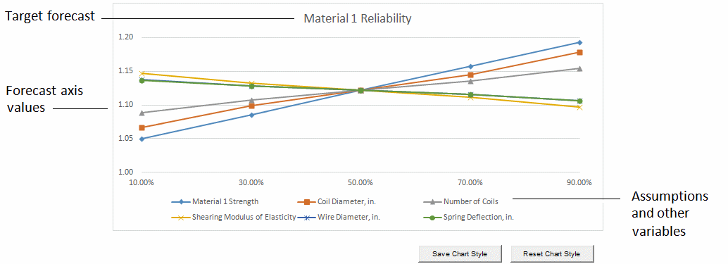
The spider chart (Figure 54, Spider Chart) illustrates the differences between the minimum and maximum forecast values by graphing a curve through all the variable values tested. Curves with steep slopes, positive or negative, indicate that those variables have a large effect on the forecast, while curves that are almost horizontal have little or no effect on the forecast. The slope of the lines, also called the elasticity of the forecast with respect to the input variables, indicates whether a positive change in the variable has a positive or negative effect on the forecast.
A maximum of 250 variables can be displayed in these charts.