Note: | This feature is available in Crystal Ball 11.1.2.4.400 and later. For information on new features in these releases and on updating, see the Crystal Ball Readme for releases 11.1.2.4.400 and later, and My Oracle Support. |
When you run a prediction, a set of random values is generated for each time period using the best of all forecasting methods selected in the Methods panel of the Predictor wizard, or manually selected in the Method list in the Predictor Results window. The characteristics of the generated values are determined by the forecasting method. The prediction interval sets bounds for the values, although outliers can occur.
For analytic, training, and demonstration purposes, you can view a set of the random values generated for each time period. These plots are shown as animations plotted successively in the predicted values section of the chart.
 To display an animated plot of prediction simulations, in the Predictor Results window:
Simulation plots are displayed in the predicted data portion of the chart (Figure 8, Predicted Values for Usage (ft3), Toledo Gas Model). If you point with the mouse to an area within the set of plots, a tooltip indicates the prediction value and date or other time period. You can also click  .
.
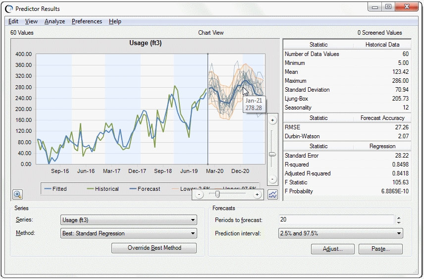
You can determine the number of simulations to display and how quickly they should plot.
To customize the predicted value simulation charting, click in the lower right corner of the chart. Use the vertical and horizontal sliders to control the number and speed of simulations. The vertical slider controls simulation speed and the horizontal slider controls the number of simulations. Try working with slower speeds and lower simulation numbers to learn more about prediction calculations.
Note: | You can select Preferences, and then Chart Preferences to view or change the Forecast chart color, line type, and line size. |
To test the simulation settings, click .