12 Testing and Tuning Models
Testing a model enables you to estimate how accurate the predictions of a model are. You can test Classification models and Regression models, and tune Classification models.
This section contains the following topics:
12.1 Testing Classification Models
Classification models are tested by comparing the predicted values to known target values in a set of test data. The historical data for a Classification project is typically divided into two data sets:
-
One for building the model
-
One for testing the model
The test data must be compatible with the data used to build the model and must be prepared in the same way that the build data was prepared.
These are the ways to test Classification and Regression models:
-
By splitting the input data into build data and test data. This is the default. The test data is created by randomly splitting the build data into two subsets. 40 percent of the input data is used for test data.
-
By using all the build data as test data.
-
By attaching two Data Source nodes to the build node.
-
The first data source that you connect to the build node is the source of the build data.
-
The second node that you connect is the source of the test data.
-
-
By deselecting Perform Test in the Test section of the Properties pane and using a Test node. The Test section define how tests are done. By default, all Classification and Regression models are tested.
Oracle Data Miner provides test metrics for Classification models so that you can evaluate the model.
After testing, you can tune the models.
See Also:
12.1.1 Test Metrics for Classification Models
Test metrics assess how accurately the model predicts the known values. Test settings specify the metrics to be calculated and control the calculation of the metrics. By default, Oracle Data Miner calculates the following metrics for Classification models:
-
Performance measurements, Predictive Confidence, Average Accuracy, Overall Accuracy, and Cost
-
Performance Matrix, also know as Confusion Matrix
You can change the defaults using the preference setting.
To view test results, first test the model or models in the node:
-
If you tested the models using the default test in the Classification node:
-
Run the Classification node.
-
Right-click the node and select View Test Results.
-
To view the model, select the model that you are interested in. The Classification Model Test View opens.
-
To compare the test results for all models in the node, select Compare Test Results.
-
-
If you tested the models using a Test node:
-
Run the Test node.
-
Right-click the node and select View Test Results.
-
To view the model, select the model that you are interested in. The Classification Model Test View opens.
-
To compare the test results for all models in the node, select Compare Test Results.
-
12.1.1.1 Performance
The following performance measures are calculated:
You can view these values separately and view all of them at the same time. To view the performance measures:
-
Select the measure that you want to display. Alternately, click All Measures from the Measures list.
-
Use the Sort By lists to sort the measures. You can sort by:
-
Name (default)
-
Measures
-
Creation date.
The sort can be by descending order (default) or ascending order.
-
12.1.1.1.1 Predictive Confidence
Predictive Confidence provides an estimate of accurate the model is. Predictive Confidence is a number between 0 and 1. Oracle Data Miner displays Predictive Confidence as a percentage. For example, the Predictive Confidence of 59 means that the Predictive Confidence is 59 percent (0.59).
Predictive Confidence indicates how much better the predictions made by the tested model are than predictions made by a naive model. The naive model always predicts the mean for numerical targets and the mode for categorical targets.
Predictive Confidence is defined by the following formula:
Predictive Confidence = MAX[(1-Error of model/Error of Naive Model),0]X100
Where:
Error of Model is (1 - Average Accuracy/100)
Error of Naive Model is (Number of target classes - 1) / Number of target classes
-
If the Predictive Confidence is
0,then it indicates that the predictions of the model are no better than the predictions made by using the naive model. -
If the Predictive Confidence is
1,then it indicates that the predictions are perfect. -
If the Predictive Confidence is
0.5,then it indicates that the model has reduced the error of a naive model by 50 percent.
12.1.1.1.2 Average Accuracy
Average Accuracy refers to the percentage of correct predictions made by the model when compared with the actual classifications in the test data. The formula to calculate the Average Accuracy is:
Average Accuracy = (TP/(TP+FP)+TN/(FN+TN))/Number of classes*100
Where:
-
TP is True Positive.
-
TN is True Negative.
-
FP is False Positive.
-
FN is False Negative.
The average per-class accuracy achieved at a specific probability threshold that is greater than the accuracy achieved at all other possible thresholds.
12.1.1.1.3 Overall Accuracy
Overall Accuracy refers to the percentage of correct predictions made by the model when compared with the actual classifications in the test data. The formula to calculate the Overall Accuracy is:
Overall Accuracy = (TP+TN)/(TP+FP+FN+TN)*100
Where:
-
TP is True Positive.
-
TN is True Negative.
-
FP is False Positive.
-
FN is False Negative.
12.1.1.1.4 Cost
In a classification problem, it may be important to specify the costs involved in making an incorrect decision. By doing so, it can be useful when the costs of different misclassifications vary significantly.
For example, suppose the problem is to predict whether a user is likely to respond to a promotional mailing. The target has two categories: YES (the customer responds) and NO (the customer does not respond). Suppose a positive response to the promotion generates $500 and that it costs $5 to do the mailing. Then, the scenarios are:
-
If the model predicts YES, and the actual value is YES, then the cost of misclassification is $0.
-
If the model predicts YES, and the actual value is NO, then the cost of misclassification is $5.
-
If the model predicts NO, and the actual value is YES, then the cost of misclassification is $500.
-
If the model predicts NO, and the actual value is NO, then the cost of misclassification is $0.
Algorithms for classification use the cost matrix during scoring to propose the least expensive solution.If you do not specify a cost matrix, then all misclassifications are counted as equally important.
If you are building an SVM model, then you specify costs using model weights instead of a cost matrix.
12.1.1.2 Performance Matrix
A Performance Matrix displays the number of correct and incorrect predictions made by the model compared with the actual classifications in the test data. It is calculated by applying the model to a hold-out sample (the test set, created during the split step in a classification activity) taken from the build data. The values of the target are known. The known values are compared with the values predicted by the model. Performance Matrix does the following:
-
Measures the likelihood of the model to predict incorrect and correct values
-
Indicates the types of errors that the model is likely to make
The columns are predicted values and the rows are actual values. For example, if you are predicting a target with values 0 and 1, then the number in the upper right cell of the matrix indicates the false-positive predictions, that is, predictions of 1 when the actual value is 0.
12.1.1.3 Receiver Operating Characteristics (ROC)
Receiver Operating Characteristics (ROC) analysis is a useful method for evaluating Classification models. ROC applies to binary classification only. ROC is plotted as a curve. The area under the ROC curve measures the discriminating ability of a binary Classification model. The correct value for the ROC threshold depends on the problem that the model is trying to solve.
ROC curves are similar to lift charts in that they provide a means of comparison between individual models and determine thresholds that yield a high proportion of positive results. An ROC curve does the following:
-
Provides a means to compare individual models and determine thresholds that yield a high proportion of positive results.
-
Provides insight into the decision-making ability of the model. For example, you can determine how likely the model is to accurately predict the negative or the positive class.
-
Compares predicted and actual target values in a Classification model.
See Also:
"How to Use ROC"12.1.1.3.1 How to Use ROC
Receiver Operating Characteristics (ROC) supports what-if analysis. You can use ROC to experiment with modified model settings to observe the effect on the Performance Matrix. For example, assume that a business problem requires that the false-negative value be reduced as much as possible within the confines of the requirement that the number of positive predictions be less than or equal to some fixed number. You might offer an incentive to each customer predicted to be high-value, but you are constrained by a budget with a maximum of 170 incentives. On the other hand, the false negatives represent missed opportunities, so you want to avoid such mistakes.
To view the changes in the Performance Matrix:
-
Click Edit Custom Operating Point at the upper right corner. The Specify Custom Threshold dialog box opens.
-
In the Specify Custom Threshold dialog box, mention the desired settings and view the changes in the Custom Accuracy field.
As you change the Performance Matrix, you are changing the probability that result in a positive prediction. Typically, the probability assigned to each case is examined and if the probability is 0.5 or higher, then a positive prediction is made. Changing the cost matrix changes the positive prediction threshold to some value other than 0.5, and the changed value is displayed in the first column of the table beneath the graph.
12.1.1.4 Lift
Lift measures the degree to which the predictions of a Classification model are better than randomly-generated predictions. Lift applies to binary classification and non-binary classifications.
Lift measures how rapidly the model finds the actual positive target values. For example, lift enables you to figure how much of the customer database you must contact to get 50 percent of the customers likely to respond to an offer.
The x-axis of the graph is divided into quantiles. To view exact values, place the cursor over the graph. Below the graph, you can select the quantile of interest using Selected Quantile. The default quantile is quantile 1.
To calculate lift, Oracle Data Mining does the following:
-
Applies the model to test data to gather predicted and actual target values. This is the same data used to calculate the Performance Matrix.
-
Sorts the predicted results by probability, that is, the confidence in a positive prediction.
-
Divides the ranked list into equal parts, quantiles. The default is
100. -
Counts the actual positive values in each quantile.
You can graph the lift as either Cumulative Lift or as Cumulative Positive Cases (default). To change the graph, select the appropriate value from the Display list. You can also select a target value in the Target Value list.
12.1.1.5 Profit and ROI
Profit uses user-supplied values for startup cost, incremental revenue, incremental cost, budget, and population to maximize the profit.
Oracle Data Miner calculates profit as follows:
Profit = -1 * Startup Cost + (Incremental Revenue * Targets Cumulative - Incremental Cost * (Targets Cumulative + Non Targets Cumulative)) * Population / Total Targets
Profit can be positive or negative, that is, it can be a loss.
To view the profit predicted by this model, select the Target Value that you are interested in. You can change the Selected Population%. The default is 1 percent.
Return on Investment (ROI) is the ratio of money gained or lost (whether realized or unrealized) on an investment relative to the amount of money invested. Oracle Data Mining uses this formula:
ROI = ((profit - cost) / cost) * 100

where profit = Incremental Revenue * Targets Cumulative, cost = Incremental Cost * (Targets Cumulative + Non Targets Cumulative)
12.1.1.5.1 Profit and ROI Example
This example illustrates how profit and ROI are calculated.
To calculate profit:
-
Profit is calculated for a quantile. In this example, profit and ROI for quantile 20 is calculated.
-
Find the value of Targets Cumulative for Quantile 20 by looking at the lift chart data. Suppose that this value is
18. -
Suppose that the value of Non Targets Cumulative for Quantile 20 is
2.Find this value by looking at the lift chart. -
Calculate Total Targets which is Targets Cumulative at last Quantile plus Non Targets Cumulative at last Quantile. Suppose that this value is
100. -
These values are all user provided. You must provide values based on the business problem:
-
Startup cost = 1000
-
Incremental revenue = 10
-
Incremental cost = 5
-
Budget = 10000
-
Population = 2000
-
-
Calculate profit using this formula
Profit = -1 * Startup Cost + (Incremental Revenue * Targets Cumulative - Incremental Cost * (Targets Cumulative + Non Targets Cumulative)) * Population / Total Targets
Substituting the values in this example results in
Profit = -1 * 1000 + (10 * 18 - 5 * (18 + 2) * 2000 / 100 = 600
To calculate ROI, use the formula
ROI = ((profit - cost) / cost) * 100

profit = Incremental Revenue * Targets Cumulative, cost = Incremental Cost * (Targets Cumulative + Non Targets Cumulative)
Substituting the values in this example results in
ROI = ((180 - 100) / 100) * 100 = 80
12.1.1.5.2 Profit and ROI Use Case
This use case depicts how to interpret results for profit and ROI calculations.
Suppose you run a mail order campaign. You will mail each customer a catalog. You want to mail catalogs to those customers who are likely to purchase things from the catalog.
Here is the input data from Profit and ROI Example
-
Startup cost = 1000. This is the total cost to start the campaign.
-
Incremental revenue = 10. This is estimated revenue that results from a sale or new customer.
-
Budget = 10000. This is the total amount of money that you can spend.
-
Population = 2000. This is the total number of cases.
Therefore, each quantile contains 20 cases:
total population /number of quantiles = 2000/100 = 20
The cost to promote a sale in each quantile is (Incremental Cost * number of cases per quantile) = $5 * 20 = $100).
The cumulative costs per quantile are as follows:
-
Quantile 1 costs $1000 (startup cost) + $100 (cost to promote a sale in Quantile 1) = $1100.
-
Quantile 2 costs $1100 (cost of Quantile 1) + $100 (cost in Quantile 2).
-
Quantile 3 costs $1200.
If you calculate all of the intermediate values, then the cumulative costs for Quantile 90 is $10,000 and for Quantile 100 is $11,000. The budget is $10,000. If you look at the graph for profit in Oracle Data Miner, then you should see the budget line drawn in the profit chart on the 90th quantile.
In the Profit and ROI Example, the calculated profit is $600 and ROI is 80 percent, which means that if you mail catalogs to first 20 quantiles of the population (400), then the campaign will generate a profit of $600 (which has ROI of 80 percent).
If you randomly mail the catalogs to first 20 quantiles of customers, then the profit is
Profit = -1 * Startup Cost
         + (Incremental Revenue * Targets Cumulative - Incremental Cost
           * (Targets Cumulative + Non Targets Cumulative))
           * Population / Total Targets
Profit = -1 * 1000 + (10 * 10 - 5 * (10 + 10)) * 2000 / 100 = -$1000
In other words, there is no profit.
12.1.2 Classification Model Test and Results Viewers
This section about Classification models includes:
12.1.2.1 Classification Model Test Viewer
Open the test viewer by selecting either View Test Results or Compare Test Results in the context menu for a Classification node or a Test node that tests Classification models. Select the results to view.
The Classification model test viewer shows the following tabs:
See Also:
"Test Metrics for Classification Models"12.1.2.1.1 Performance
The Performance tab provides an overall summary of the performance of each model generated. It displays test results for several common test metrics. It displays the following:
-
All Measures (default). The Measure list enables you to select the measures to display. By default, all measures are displayed. The selected measures are displayed as graphs. If you are comparing test results for two or more models, then different models have graphs in different colors.
-
Cost, if you specified costs or the system calculated costs
In the Sort By fields. you can specify the sort attribute and sort order. The first list is the sort attribute: measure, creation date, or name (the default). The second list is the sort order: ascending or descending (default).
Below the graphs, the Models table supplements the information presented in the graph. You can minimize the table using the splitter line. The Models table summarizes the data in the histograms:
-
Name, the name of the model along with color of the model in the graphs
-
Predictive Confidence percent
-
Overall Accuracy percent
-
Average Accuracy percent
-
Cost, if you specified cost (costs are calculated by Oracle Data Miner for decision trees)
-
Algorithm (used to build the model)
-
Creation date
By default, results for the selected model are displayed. To change the list of models, click ![]() and deselect any models for which you do not want to see results. If you deselect a model, then both the histogram and the summary information are removed.
and deselect any models for which you do not want to see results. If you deselect a model, then both the histogram and the summary information are removed.
See Also:
"Test Metrics for Classification Models"12.1.2.1.2 Performance Matrix
The Performance Matrix displays the number of correct and incorrect predictions made by the model compared with the actual classifications in the test data. You can either view the detail for a selected model, or you can compare performance matrices for all models.
-
Click Show Detail to view test results for one model.
-
Click Compare Models to compare test results.
12.1.2.1.3 Show Detail
First, select a model. If you are viewing test results for one model, the details for that model are displayed automatically.
-
In the top pane, Average Accuracy and Overall Accuracy are displayed with a grid that displays the correct predictions for each target value. Cost information is displayed if you have specified costs.
-
In the bottom pane, a Performance Matrix with rows showing actual values and columns showing predicted values is displayed for the selected model. The percentage correct and cost are displayed for each column.
Select Show totals and cost to see the total, the percentage correct, and cost for correct and incorrect predictions.
12.1.2.1.4 Compare Models
This option compares performance information for all models in the node that were tested.
-
The top pane lists the following for each model:
-
Percentage of correct predictions
-
Count of correct predictions
-
Total case count
-
Cost information
To see more detail, select a model.
-
-
The bottom pane displays the target value details for the model selected in the top pane. Select the measure.
-
Correct Predictions (default): Displays correct predictions for each value of the target attribute
-
Costs: Displays costs for each value of the target
-
12.1.2.1.5 ROC
Receiver Operating Characteristics (ROC) compares predicted and actual target values in a binary Classification model.
To edit and view an ROC:
-
Select the Target value. The ROC curves for that value are displayed.
-
Click Edit Custom Operating Point to change the operating point. The ROC graph displays a line showing ROC for each model. Points are marked on the graph indicating the values shown in the key at the bottom of the graph. Below the graph, the ROC Summary results table supplements the information presented in the graph. You can minimize the table using the splitter line.
-
The Models grid, in the lower pane, contains the following summary information:
-
Name
-
Area under the curve
-
Maximum Overall Accuracy Percentage
-
Maximum Average Accuracy Percentage
-
Custom Accuracy Percentage
-
Model Accuracy Percentage
-
Algorithm
-
Creation Date and Time
-
-
Select a model and click
 to see the ROC Detail Dialog box, which displays the statistics for probability thresholds.
 -
To change the list of models, click
 to open the Edit Test Result Selection dialog box. By default, results for all models in the node are displayed.
-
See Also:
"How to Use ROC"12.1.2.1.6 Edit Test Result Selection
Deselect the check box for those models for which you do not want to see results. If you deselect a model, then both the ROC curve and the details for that model are not displayed.
Click OK when you have finished.
12.1.2.1.7 ROC Detail Dialog
The ROC Detail Dialog displays statistics for probability thresholds. For each probability threshold, the following are displayed:
-
True Positive
-
False Negative
-
False Positive
-
True Negative
-
True Positive Fraction
-
False Positive Fraction
-
Overall Accuracy
-
Average Accuracy
Click OK to dismiss the dialog box.
12.1.2.1.8 Lift
The lift graph displays at least three lines:
-
A line showing the lift for each model
-
A red line for the random model
-
A vertical blue line for threshold
The x-axis of the graph is divided into quantiles. The graph shows the lift from the model (or models) and also shows the lift from a naive model (Random) and the ideal lift.
The Lift viewer compares lift results for a given target value in two or more models. It displays either the Cumulative Positive Cases or the Cumulative Lift.
If you are comparing the lift for two or more models, then the lines for different models are in different colors. The table below the graph shows the name of the model and the color used to display results for that model.
The viewer has the following controls:
-
Display: Selects the display option, either Cumulative Positive Cases (default) or Cumulative Lift.
-
Target Value: Selects the target value for comparison. The default target value is the least frequently occurring target value.
The threshold is a blue vertical line used to select a quantile. As the threshold moves, the details for each test result in the Lift Detail table changes to the point on the Lift Chart that corresponds to the selected quantile. You move the threshold by dragging the indicator on the quantile line. Here is the quantile set to 20:

Description of the illustration quantileline.gif
Below the graph, a data table supplements the information presented in the graph. You can minimize the table using the splitter line.
The table has the following columns:
-
Name, the name of the model along with color of the model in the graph
-
Lift Cumulative
-
Gain Cumulative Percentage
-
Percentage Records Cumulative
-
Target Density Cumulative
-
Algorithm
-
Creation Date (date and time)
Above the Models grid is the Lift Detail Dialog icon ![]() . Select a model and click the icon to open the Lift Detail dialog box, which displays lift details for 100 quantiles.
. Select a model and click the icon to open the Lift Detail dialog box, which displays lift details for 100 quantiles.
To change the list of models, click ![]() and deselect any models for which you do not want to see results. If you deselect a model, then both the lift curve and the detail information for that model are not displayed. By default, results for all models in the node are displayed.
and deselect any models for which you do not want to see results. If you deselect a model, then both the lift curve and the detail information for that model are not displayed. By default, results for all models in the node are displayed.
See Also:
"Test Metrics for Classification Models"12.1.2.1.9 Lift Detail
The Lift Detail Dialog displays statistics for each quantile from 1 to 100. Click OK to dismiss the dialog box.
Threshold probability does not always reflect standard probability. For example, the Classification node enables you to specify three different performance settings:
-
Balanced: Apply balance weighting to all target class values.
-
Natural: Do not apply any weighting.
-
Custom: Apply user- created custom weights file.
The default for Classification models is Balanced. Balanced is implemented by passing weights or costs into the model, depending on the algorithm used.
The threshold probability actually reflects cost rather than standard probability.
To see the difference between Balanced and Natural:
-
Create a Classification model.
-
Select the performance setting options and view the lift details:
-
Natural: The threshold probability values are the greatest probabilities for each quantile.
-
Balanced: The threshold reflects cost. You see the lowest cost value for each quantile.
-
12.1.2.1.10 Profit
The Profit graph displays at least three lines:
-
A line showing the profit for each model
-
A line indicating the budget
-
A line indicating the threshold
The threshold is a blue vertical line used to select a quantile. As the threshold moves, the details for each test result in the Lift Detail table changes to the point on the Lift Chart that corresponds to the selected quantile. You can move the threshold by dragging the indicator on the quantile line. Here is the quantile set to 20:
Description of the illustration quantileline.gif
To specify the values for profit, click Profit Settings to open the Profit Setting Dialog.
If you are comparing the profit for two or more models, then the lines for different models are different colors. The table below the graph shows the name of the model and the color used to display results for that model.
The bottom pane contains the Models grid and supplements the information presented in the graph. You can minimize the table using the splitter line.
The table has the following columns:
-
Name, the name of the model along with color of the model in the graphs
-
Profit
-
ROI Percentage
-
Records Cumulative Percentage
-
Target Density Cumulative
-
Maximum Profit
-
Maximum Profit Population Percentage
-
Algorithm
-
Creation Date (and time)
Above the Models grid is the Browse Detail icon. Select a model and click ![]() to see the Profit Detail Dialog box which displays statistics for each quantile from 1 to 100.
to see the Profit Detail Dialog box which displays statistics for each quantile from 1 to 100.
To change the list of models, click ![]() and deselect any models for which you do not want to see results. If you deselect a model, then both the profit curve and the detail information for that model are not displayed. By default, results for all models in the node are displayed.
and deselect any models for which you do not want to see results. If you deselect a model, then both the profit curve and the detail information for that model are not displayed. By default, results for all models in the node are displayed.
12.1.2.1.11 Profit Detail Dialog
Displays statistics about profit for quantiles 1 to 100. Click OK to dismiss the dialog box.
12.1.2.1.12 Profit Setting Dialog
Click Profit Settings to change the following values:
-
Startup Cost: The cost of starting the process that creates the profit. The default is
1. -
Incremental Revenue: Incremental revenue earned for each correct prediction. The default is
1. -
Incremental Cost: The cost of each additional item. The default is
1. -
Budget: A total cost that cannot be exceeded. The default value is
1. -
Population: The number of individual cases that the model is applied to. The default is
100.
Click OK to save the settings.
12.1.2.2 Compare Classification Test Results
To compare test results for all of the models in a Classification Build node:
-
If you tested the models when you ran the Classification node: Right-click the Classification node that contains the models and select Compare Test Results.
-
If you tested the Classification models in a Test node: Right-click the Test node that tests the models and select Compare Test Results.
The Classification Model Test Viewer that compares the test results opens. The comparison enables you to select the model that best solves a business problem.
The graphs on the Performance tab for different models are in different colors. On the other tabs, the same color is used for the line indicating measures such as lift.
The color associated with each model is displayed in the bottom page of each tab.
12.1.2.2.1 Compare Test Results
Compare Test Results for Classification displays these subtabs:
-
Performance: Compares performance results in the top pane for the models listed in the bottom panel.
To edit the list of models, click
above pane that lists the models. This opens the Edit Test Selection (Classification and Regression) dialog box. By default, test results for all models are compared. -
Performance Matrix: Displays the Performance Matrix for each model. You can display either Compare models (a comparison of the performance matrices) or Details (the Performance Matrix for a selected model).
-
ROC: Compares the ROC curves for the models listed in the lower pane.
To see information for a curve, select a model and click.
To edit the list of models, click
above pane that lists the models. This opens the Edit Test Selection (Classification and Regression) dialog box. -
Lift: Compares the lift for the models listed in the lower pane. For more information about lift, see Lift.
To edit the list of models, click
above pane that lists the models. This opens the Edit Test Selection (Classification and Regression) dialog box. -
Profit: Compares the profit curves for the models listed in the lower pane.
To edit the list of models, click
above pane that lists the models. This opens the Edit Test Selection (Classification and Regression) dialog box.
See Also:
12.1.2.2.2 Edit Test Selection (Classification and Regression)
By default, test results for all successfully built models in the build node are selected. If you do not want to view test results for a model, then deselect the model.
Click OK when you have finished.
12.2 Tuning Classification Models
When you tune a model, you select one of several ways to create a derived cost matrix. The derived cost matrix is used for any subsequent test and apply operations. Each tuning dialog box has a different goal in how the tuning is performed.
Note:
To tune models, you must test the models in the same node that you build them.If necessary, you can remove tuning and then re-run the node.
To tune a model:
-
Open the Properties pane for the Build node. Right-click the node and select Go to Properties.
-
Go to the Test section. Select Generate Select Test Results for Model Tuning.
The model test operation then generates the unbiased test results (no cost matrix used) for the corresponding test results. The unbiased test results are determined by the Tune Settings dialog box to initialize tuning options. For example, if only ROC is selected for Test Results, then the test operation generates the regular ROC result and the unbiased ROC result. -
Run the Build node. You must test the models in the Build node. This is the default behavior of the Classification Build node.
-
In Properties pane for the Build node, go to the Models section. Select the models that you want to tune and click the tune icon
 in the menu bar.
Select Tune from the drop-down list.
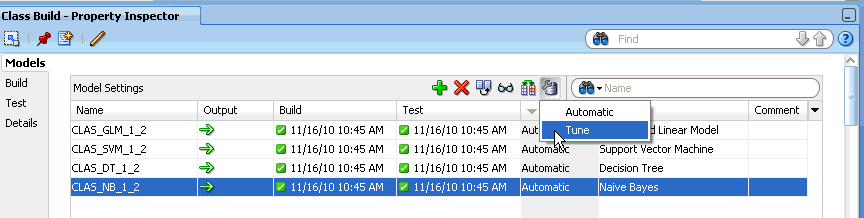
Description of the illustration tunenb.gif
-
The Tune Settings dialog box opens with all the available test results.
You can tune a model using one technique. For example, you can tune using costs or using lift, but not using both costs and lift at the same time.
-
If you are tuning more than one model, then select a model from the Models list in the bottom pane of the dialog box. After you tune the first model, return to this pane and select another model.
-
Click the tab for the test result to tune. The tabs are:
-
When you finish tuning a model, click Tune in the pane on the right to generate tuning. In the Models list in the bottom pane, the Tune setting changes from Automatic to the new setting.
-
Tune as many models in the node you want. Go to other tuning tabs and perform tuning from there. When you have finished tuning, click OK.
-
All models that have tuning specifications changed during the session have their test results marked as not run. When you run the node again:
-
The new cost matrix is generated and inserted into the model.
-
A new test result is generated showing full test result information for the behavior of the current model.
-
-
Run the tuned model. After running of the model is complete, the Models section of Properties indicates how each model was tuned. For example, if you tune a model by changing costs, then the Tune entry for that model is Tune - Cost.
-
Right-click the Build node and select View Test Results for the tuned model to see the effects of the tuning.
You may have to repeat the tuning steps several times to get the desired results. If necessary, you can remove tuning for a model.
See Also:
"Remove Tuning"12.2.1 Remove Tuning
To remove tuning for a model:
-
Right-click the node and select Go to Properties.
-
Go to the Models section and click
. -
Select Automatic.
-
Run the node.
12.2.2 Cost
The Cost tab of Tune Settings enables you to specify costs for target for scoring purposes.
By default the cost matrix is initially generated based on all the known target values in the Build Data Source. The cost matrix is set to cost values of 1 to start with.
To specify costs:
-
Open the Properties pane for the Build node. Right-click the node and select Go to Properties.
-
In the Test section, select Generate Select Test Results for Model Tuning and run the node.
-
In the Models section, select the models that you want to tune and click
. -
Select Tune from the drop-down list. The Tune Settings dialog box opens.
-
In the Tune Settings dialog box, go to the Cost tab.
-
If you are tuning more than one model, then select a model from the Models list in the bottom pane. After you tune the first model, return to this pane and select another model.
-
Select the target value for which to specify costs.
-
Select the appropriate option:
-
False Positive: Incorrectly identifying a case as a target. (Default)
-
False Negative: Incorrectly identifying a case as a non-target.
-
-
In the Weight field, specify a weight for the cost.
-
Click Apply to add the cost that you just specified to the cost matrix.
-
Define costs for all target values that you are concerned about.
-
To apply the matrix, click Tune in the upper right pane.
-
Click Derived Matrix to view the cost matrix that you created. Examine the derived cost matrix. You can continue tuning by changing any selections that you made.
-
When you have finished, click OK to accept the tuning. Click Cancel to cancel the tuning
To cancel the tuning, click Reset. Tuning returns to Automatic.
To see the impact of the tuning, rerun the model node.
12.2.2.1 Costs and Benefits
In a classification problem, it is often important to specify the cost or benefit associated with correct or incorrect classifications. By doing so, it can be valuable when the cost of different misclassification varies significantly.
You can create a cost matrix to bias the model to minimize the cost or maximize the benefit. The cost/benefit matrix is taken into consideration when the model is scored.
See Also:
12.2.2.1.1 Costs
For example, suppose the problem is to predict whether a customer is likely to respond to a promotional mailing. The target has two categories: YES (the customer responds) and NO (the customer does not respond). Suppose a positive response to the promotion generates $500 and that it costs $5 to do the mailing. After building the model, you compare the model predictions with actual data held aside for testing. At this point, you can evaluate the relative cost of different misclassifications:
-
If the model predicts YES and the actual value is YES, then the cost of misclassification is $0.
-
If the model predicts YES and the actual value is NO, then the cost of misclassification is $5.
-
If the model predicts NO and the actual value is YES, then the cost of misclassification is $495.
-
If the model predicts NO and the actual value is NO, then the cost is $0.
12.2.2.1.2 Benefits
Using the same costs, you can approach the relative value of the outcomes from a benefits perspective. When you correctly predict a YES (a responder), the benefit is $495. When you correctly predict a NO (a non-responder), the benefit is $5.00 because you can avoid sending out the mailing. Because the goal is to find the lowest cost solution, benefits are represented as negative numbers.
12.2.3 Benefit
The Benefit tab enables you to:
-
Specify a benefit for each value of the target. The values specified are applied to the cost benefit matrix. Specifying benefits is useful when there are many target values.
-
Indicate the most important values.
To tune a model using the Benefit tab:
-
Open the Properties pane for the Build node. Right-click the node and select Go to Properties.
-
In the Test section, select Generate Select Test Results for Model Tuning and run the node.
-
In the Models section, select the models that you want to tune and click
. -
Select Tune from the drop-down list. The Tune Settings dialog box opens in a new tab.
-
In the Tune Settings dialog box, click Benefit.
-
If you are tuning more than one model, then select a model from the Models list in the bottom pane. After you tune the first model, return to this pane and select another model.
-
Select the target value for tuning from the Target Value list.
-
Specify benefit values for the target value selected. Benefit values can be positive or negative. If there is more benefit from a target value, then the benefit value should be higher than other benefit values. The default benefit value for each target value is
0.Enter the benefit value for the selected target in the Benefit box and click Apply to update the Cost Benefits matrix.
-
When you have finished specifying benefit values, click Tune in the right-hand column.
-
Click View to see the derived cost matrix.
-
When you have finished, click OK to accept the tuning, or click Cancel to cancel the tuning.
12.2.4 ROC
ROC is only supported for binary models. The ROC Tuning tab adds a side panel to the standard ROC Test Viewer. The following information is displayed:
-
Performance Matrix in the upper right pane, enables you to display these matrices:
-
Overall Accuracy: Cost matrix for the maximum Overall Accuracy point on the ROC chart.
-
Average Accuracy: Cost matrix for the maximum Average Accuracy point.
-
Custom Accuracy: Cost matrix for the custom operating point.
You must specify a custom operating point for this option to be available.
-
Model Accuracy: The current Performance Matrix (approximately) of the current model.
You can use the following calculation to derive Model Accuracy from the ROC result provided:
If there is no embedded cost matrix, then find the 50 percent threshold point or the closest one to it. If there is an embedded cost matrix, then find the lowest cost point. For a model to have an embedded cost matrix, it must have either been tuned or it has a cost matrix or cost benefit defined by the default settings of the Build node.
-
-
The Performance Matrix Grid shows the Performance Matrix for the option selected.
-
Click Tune to:
-
Select the current performance option as the one to use to tune the model.
-
Derive a cost matrix from the ROC result at that probability threshold.
Tune Settings, in the lower part of this panel, is updated to display the new matrix.
-
-
Click Clear to clear any tuning specifications and set tuning to Automatic. In other words, no tuning is performed.
12.2.4.1 ROC Tuning Steps
To perform ROC tuning:
-
Open the Properties pane for the Build node. Right-click the node and select Go to Properties.
-
In the Test section, select Generate Select Test Results for Model Tuning and run the node. See "Tuning Classification Models" for more information.
-
In the Models section, select the models that you want to tune and click
. -
Select Tune from the drop-down list. The Tune Settings dialog box opens in a new tab.
-
In the Tune Settings dialog box, go to the ROC tab.
-
If you are tuning more than one model, select a model from the Models list in the bottom pane. After you tune the first model, return to this pane and select another model.
-
Select a target value. In the case of ROC, there are only two values.
-
Select a custom operating point if you do no want to use the default point. See "Select Custom Operating Point" for more information.
-
Select the kind of Performance Matrix to use:
-
Overall Accuracy (default)
-
Average Accuracy
-
Custom Accuracy. Fill in the values for the Performance Matrix if you select this option.
-
Model Accuracy
-
-
Click Tune. New Tune settings are displayed in the same panel as the Performance Matrix. Examine the Derived Cost Matrix. You can continue tuning by changing any selections that you made.
-
When you have finished, click OK to accept the tuning, or click Cancel to cancel the tuning.
-
To reset the tuning, click Reset.
-
To see the impact of the tuning, run the Model node.
-
12.2.4.1.1 Select Custom Operating Point
The Specify Custom Threshold dialog box enables you to edit the custom operating point for all the models in the node.
-
To change the Hit Rate or False Alarm, click the appropriate option and adjust the value that you want to use.
-
Alternatively, you can specify the False Positive or False Negative ratio. To do this, click the appropriate option and specify the ratio.
Click OK when you have finished.
12.2.4.2 Receiver Operating Characteristics
Receiver Operating Characteristics (ROC) is a method for experimenting with changes in the probability threshold and observing the resultant effect on the predictive power of the model.
-
The horizontal axis of an ROC graph measures the False Positive Rate as a percentage.
-
The vertical axis shows the True Positive Rate.
-
The top left corner is the optimal location in an ROC curve, indicating a high TP (True Positive) rate versus low FP (False Positive) rate.
-
The area under the ROC curve measures the discriminating ability of a binary Classification model. This measure is especially useful for data sets with an unbalanced target distribution (one target class dominates the other). The larger the area under the curve, the higher the likelihood that an actual positive case is assigned a higher probability of being positive than an actual negative case.
ROC curves are similar to lift charts in that they provide a means of comparison between individual models, and then determine thresholds that yield a high proportion of positive hits. ROC was originally used in signal detection theory to gauge the true hit versus false alarm ratio when sending signals over a noisy channel.
12.2.5 Lift
Lift measures the degree to which the predictions of a Classification model are better than randomly generated predictions.
To tune a model using Lift:
-
Open the Properties pane for the Build node. Right-click the node and select Go to Properties.
-
In the Test section, select Generate Select Test Results for Model Tuning and run the node.
-
In the Models section, select the models that you want to tune and click
. -
Select Tune from the drop-down list. The Tune Settings dialog box opens in a new tab.
-
In Tune Settings dialog box, go to the Lift tab.
-
If you are tuning more than one model, then select a model from the Models list in the bottom pane. After you tune the first model, return to this pane and select another model.
-
Select the target value for tuning from the Target Value list.
-
Decide whether to tune using the Cumulative Positive Cases chart, the default or the Cumulative Lift Chart. Select the chart from the Display list.
Either chart displays several curves: the lift curve for the model that you are tuning, ideal lift, and random lift, which is the lift from a model where predictions are random.
The chart also displays a blue vertical line that indicates the threshold, the quantile of interest.
-
Selected a quantile using the slider in the quantile display below the lift chart. As you move the slider, the blue vertical bar moves to that quantile, and the tuning panel is updated with the Performance Matrix for that point.
-
Click Tune, below the Performance Matrix. New tune settings are displayed in the same panel as the Performance Matrix. Examine the Derived Cost Matrix. You can continue tuning by changing any selections that you made.
-
When you have finished, click OK to accept the tuning, or click Cancel to cancel the tuning.
-
To reset the tuning, click Reset.
-
To see the impact of the tuning, run the Model node.
-
See Also:
12.2.5.1 About Lift
Lift is the ratio of positive responders in a segment to the positive responders in the population as a whole. For example, if a population has a predicted response rate of 20 percent, but one segment of the population has a predicted response rate of 60 percent, then the lift of that segment is 3 (60 percent/20 percent). Lift measures the following:
-
The concentration of positive predictions within segments of the population and specifies the improvement over the rate of positive predictions in the population as a whole.
-
The performance of targeting models in marketing applications. The purpose of a targeting model is to identify segments of the population with potentially high concentrations of positive responders to a marketing campaign.
The notion of lift implies a binary target: either a Responder or a Non-responder, which means either YES or NO. Lift can be computed for multiclass targets by designating a preferred positive class and combining all other target class values, effectively turning a multiclass target into a binary target. Lift can be applied to both binary and non-binary classifications as well.
The calculation of lift begins by applying the model to test data in which the target values are already known. Then, the predicted results are sorted in order of probability, from highest to lowest Predictive Confidence. The ranked list is divided into quantiles (equal parts). The default number of quantiles is 100.
12.2.6 Profit
The Profit tab provides a method for maximizing profit.
-
Open Properties for the Build node. Right-click the node and select Go to Properties.
-
In the Test section, select Generate Select Test Results for Model Tuning and run the node.
-
In the Models section, select the models that you want to tune and click
. -
Select Tune from the drop-down list. The Tune Settings dialog box opens in a new tab.
-
In the Tune Settings dialog box, go to the Profit tab.
-
If you are tuning more than one model, select a model from the Models list in the bottom pane. After you tune the first model, return to this pane and select another model.
-
Select the target value for tuning from the Target Value list.
-
Click Profit Settings and specify the values in the Profit Settings dialog box.
-
After you specify Profit Settings, the graph reflects the values that you specified.
-
Use the slider below the chart to adjust the Threshold (blue vertical line).
-
Click Tune, below the Performance Matrix. New tune settings are displayed in the same panel as the Performance Matrix. Examine the Derived Cost Matrix. You can continue tuning by changing any selections that you made.
-
When you have finished, click OK to accept the tuning, or click Cancel to cancel the tuning.
-
To reset tuning, click Reset.
-
To see the impact of the tuning, run the Model node.
-
12.2.6.1 Profit Setting
The default values for Startup Cost, Incremental Revenue, Incremental Cost, and Budget are all 1. The default value for Population is 100. Change these values to ones appropriate for your business problem.
Click OK.
12.3 Testing Regression Models
Regression models are tested by comparing the predicted values to known target values in a set of test data. The historical data for a regression project is typically divided into two data sets:
-
One for building the model
-
One for testing the model
The test data must be compatible with the data used to build the model and must be prepared in the same way that the build data was prepared.
The ways to test Classification and Regression models:
-
By splitting the input data into build data and test data. This is the default. The test data is created by randomly splitting the build data into two subsets. 40 percent of the input data is used for test data.
-
By using all the build data as the test data.
-
By attaching two Data Source nodes to the build node.
-
The first data source, that you connect to the build node, is the source of build data.
-
The second node that you connect is the source of test data.
-
-
By deselecting Perform Test in the Test section of the Properties pane and then using a Test Node. By default, all Classification and Regression models are tested.
Test settings specify which metrics to calculate and control the calculation of the metrics.
Oracle Data Mining provides several kinds of information to assess Regression models:
To view test results, first test the model or models in the node:
-
If you tested the models using the default test in the Regression node, then run the node and then right-click the node. Select View Test Results and select the model that you are interest in. The Regression Model Test Viewer starts. To compare the test results for all models in the node, select Compare Test Results.
-
If you tested the models using a Test node, then run the Test node and then right-click the node. Select View Test Results and select the model that you are interested in. The Regression Model Test Viewer starts. To compare the test results for all models in the node, select Compare Test Results.
You can also compare test results by going to the Models section of the Properties pane of the Build node where you tested the models and click ![]() .
.
12.3.1 Residual Plot
The residual plot is a scatter plot of the residuals. Each residual is the difference between the actual value and the value predicted by the model. Residuals can be positive or negative. If residuals are small (close to 0), then the predictions are accurate. A residual plot may indicate that predictions are better for some classes of values than others.
12.3.2 Regression Statistics
Oracle Data Mining calculates the following statistics to help assess the overall quality of Regressions models:
-
Root Mean Squared Error: The square root of the average squared distance of a data point from the fitted line.
-
Mean Absolute Error: The average of the absolute value of the residuals (error). The Mean Absolute Error is very similar to the Root Mean Square Error but is less sensitive to large errors.
12.3.3 Regression Model Test Viewers
The help for Regression models includes:
12.3.3.1 Regression Model Test Viewer
To view information in the Regression Model Test Viewer:
-
Right-click a Regression node or a Test node (that tests Regression Models) and select View Test Results or Compare Test Results.
-
The Regression Model Test Viewer opens, and displays the following tabs:
-
Click OK.
See Also:
"Regression Statistics" for an overview of the test metrics that Oracle Data Miner calculates.12.3.3.1.1 Performance (Regression)
The Performance tab displays the test results for several common test metrics.
The Performance tab for Regression model show these measures for all models:
-
All Measures (default). The Measure list enables you to select the measures to display. By default, All Measures are displayed. The selected measures are displayed as graphs. If you are comparing test results for two or more models, then the different models have graphs in different colors.
-
Predictive Confidence: Measures how much better the predictions of the mode are than those of the naive model. Predictive Confidence for regression is the same measure as Predictive Confidence for classification.
-
Mean Absolute Error
-
Root Mean Square Error
-
Mean Predicted Value: The average of the predicted values.
-
Mean Actual Value: The average of the actual values.
Two Sort By lists specify sort attribute and sort order. The first Sort By list contains Measure, Creation Date, or Name (the default). The second Sort By list contains the sort order: ascending or descending (default).
The top pane displays these measures as histograms.
The bottom pane contains the Models grid that supplements the information presented in the graphs. You can minimize the table using the splitter line.
The Models grid has the following columns:
-
Name, the name of the model along with color of the model in the graphs.
-
Predictive Confidence
-
Mean Absolute Error
-
Root Mean Square Error
-
Mean Predicted Value
-
Mean Actual Value
-
Algorithm
-
Creation Date (and time)
By default, results for the selected model are displayed. To change the list of models, click ![]() and deselect any models for which you do not want to see results. If you deselect a model, both the histograms and the detail information for that model are not displayed.
and deselect any models for which you do not want to see results. If you deselect a model, both the histograms and the detail information for that model are not displayed.
See:
"Regression Statistics"for more information about Mean Absolute Error and Root Mean Square Error.12.3.3.1.2 Residual
The Residual Plot tab show the Residual Plot on a per-model basis. By default, the residual plots are displayed as graph.
-
To see numeric results, click
. -
To change the display back to a graph, click
 .
. -
To see the plot for another model, select the model from the Show list and click Query.
You can control how the plot is displayed in several ways:
-
Select the information displayed on the y-axis and on the x-axis. The default depictions are:
-
X axis: Predicted Value
-
Y axis: Residual
To change this, select information from the lists.
-
-
The default sample size is
2000.You can make this value larger or smaller. -
You can compare plots side by side. The default is to not compare plots.
If you change any of these fields, then click Query to see the results.
To compare plots side by side, select the model to compare with the current model from the Compare list and click Query. The residual plots are displayed side by side.
The bottom pane show the Residual result summary table. The table contains the Models grid which supplements the information presented in the plots. You can minimize the table using the splitter line.
The table has the following columns:
-
Model, the name of the model along with color of the model in the graphs
-
Predictive Confidence
-
Mean Absolute Error
-
Root Mean Square Error
-
Mean Predicted Value
-
Mean Actual Value
-
Algorithm
-
Creation Date (and time)
By default, results for all models in the node are displayed. To change the list of models, click ![]() to open the Edit Test Selection (Classification and Regression) dialog box.
to open the Edit Test Selection (Classification and Regression) dialog box.
12.3.3.2 Compare Regression Test Results
To compare test results for all the models in a Regression Build node:
-
If you tested the models when you ran the Regression node:
-
Right-click the Regression node that contains the models.
-
Select Compare Test Results.
-
-
If you tested the Regression models in a Test node:
-
Right-click the Test node that tests the models.
-
Select Compare Test Results.
-
12.3.3.2.1 Compare Test Results
When you compare test results for two or more Regression models, each model has a color associated with it. This color indicates the results for that model. For example, if model M1 has purple associated with it, then the bar graphs on the Performance tab for M1 is displayed in purple.
By default, test results for all models in the node are compared. If you do not want to compare all test results, then click ![]() . The Edit Test Results Selection dialog box opens. Deselect results that you do not want to see. Click OK when you have finished.
. The Edit Test Results Selection dialog box opens. Deselect results that you do not want to see. Click OK when you have finished.
Compare Test Results opens in a new tab. Results are displayed in two tabs:
-
Performance tab: The following metrics are compared on the Performance tab:
-
Predictive Confidence for Classification Models
-
Mean Absolute Error
-
Mean Predicted Value
By default, test results for all models are compared. To edit the list of models, click
above pane that lists the models to open the Edit Test Selection (Classification and Regression dialog box. -
-
Residual tab: Displays the residual plot for each model.
-
You can compare two plots side by side. By default, test results for all models are compared.
-
To edit the list of models, click
above pane that lists the models to open the Edit Test Selection (Classification and Regression dialog box.
-
See Also:
-
"Predictive Confidence" for more information about Mean Absolute Error.