This chapter explains the reports available under each tab in the Corporate Performance Dashboard.
The following tabs are present in the Corporate Performance Dashboard:
· Corporate Performance Summary
· Lines of Business Performance
The following screenshots display the essential nature of the available reports as per each tab:
Figure 10: Corporate Performance Dashboard Tabs
The Corporate Performance Summary tab includes information at the corporate level. The information contained in the reports generated summarizes how the entire organization is performing. The filters for this tab include:
· Time
· Company
· Geography
The various reports available under this tab are discussed in the following sections.
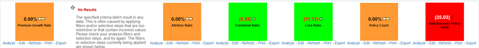
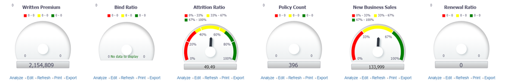
This report shows snapshots of key performance indicators represented through flash boxes for the current period.
Figure 11: Key Performance Indicators Flash
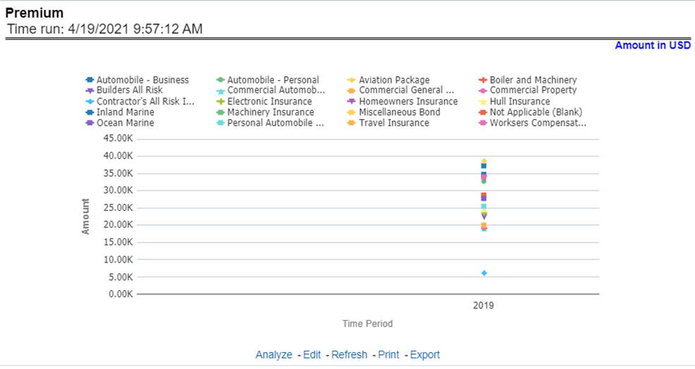
This report shows premium revenue across all lines of businesses and underlying products through a time series. This report can be viewed over various periods, entities, and geographies selected from page-level prompts.
Figure 12: Premium
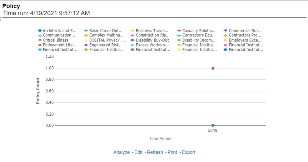
This report shows policy-related expenses across all lines of businesses and underlying products through a time series. This report can be viewed over various periods, entities, and geographies selected from page-level prompts.
Figure 13: Policy
This report shows investment revenue across all lines of businesses and underlying products through a time-series graph. This report can be viewed over various periods, entities, and geographies selected from page-level prompts.
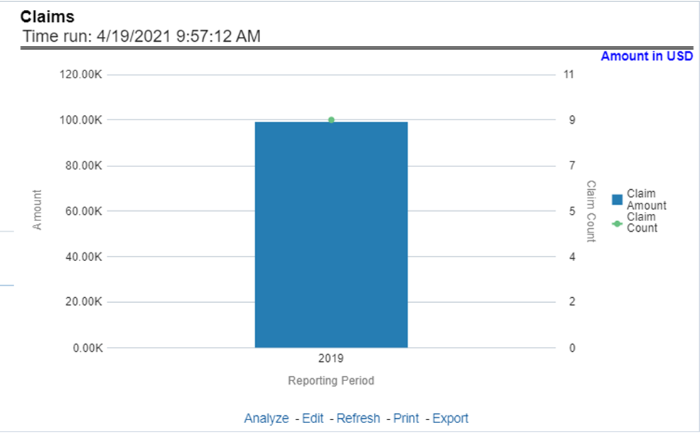
This report shows expense towards claim payments across all lines of businesses and underlying products through a time series. This report can be viewed over various periods, entities, and geographies selected from page-level prompts.
Figure 14: Claims
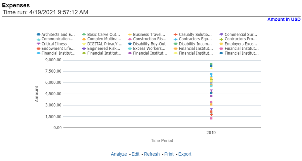
This report shows policy-related expenses across all lines of businesses and underlying products through a time series. This report can be viewed over various periods, entities, and geographies selected from page-level prompts.
Figure 15: Expenses
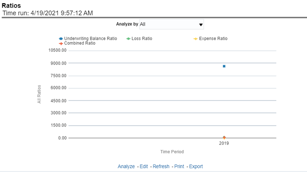
This report shows key business indicator ratios across all lines of businesses and underlying products through a time series. The key ratio indicator report contains various report level filters such as Combined Ratio, Loss ratio, Expense Ratio, and Underwriting Balance Ratio, and can be viewed by individual ratio or all ratios together. This report can be analyzed over various periods, entities, and geographies selected from page-level prompts.
Figure 16: Ratios
All reports on this tab focus on the policy performance perspective. The reports represent business performance through a policy performance perspective. The filters of this tab include:
· Time
· Company
· Geography
The various reports available under this tab are discussed in the following sections.
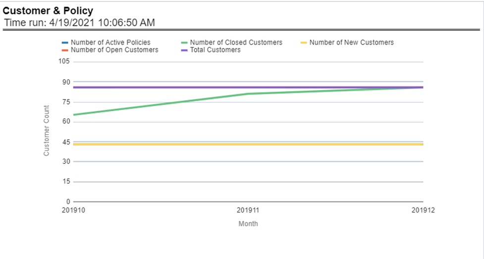
This report provides enterprise-wide performance with customer and policy information overtime a period. Various performance metrics-based measures, for example, the number of New Customers, Number of Closed Customers, and so on for the reporting period selected, are compared with the previous periods and displayed. It shows enterprise performance through customers and policies. This report can be viewed and tracked through control areas like Time, Company, and Geography. The values are in the Line Graph.
Figure 17: Customer and Policy
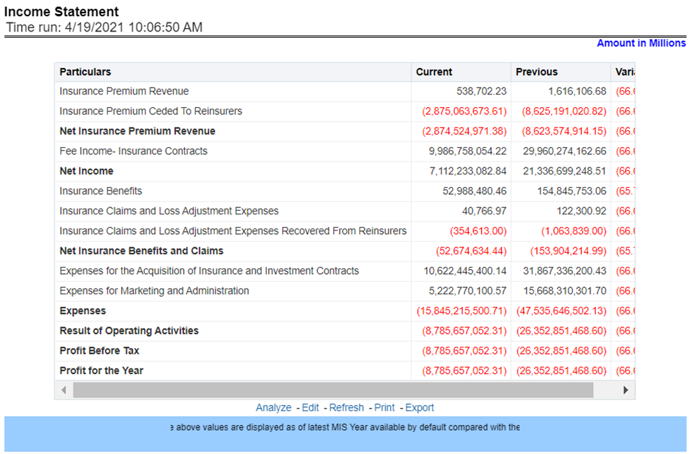
At an enterprise level, performance through various financial indicators can be tracked through an Income Statement. This helps to understand the company's financial position at a given point in time. This report can be analyzed over various periods, entities, and geographies selected from page-level prompts. The values are in a table.
Figure 18: Income Statement
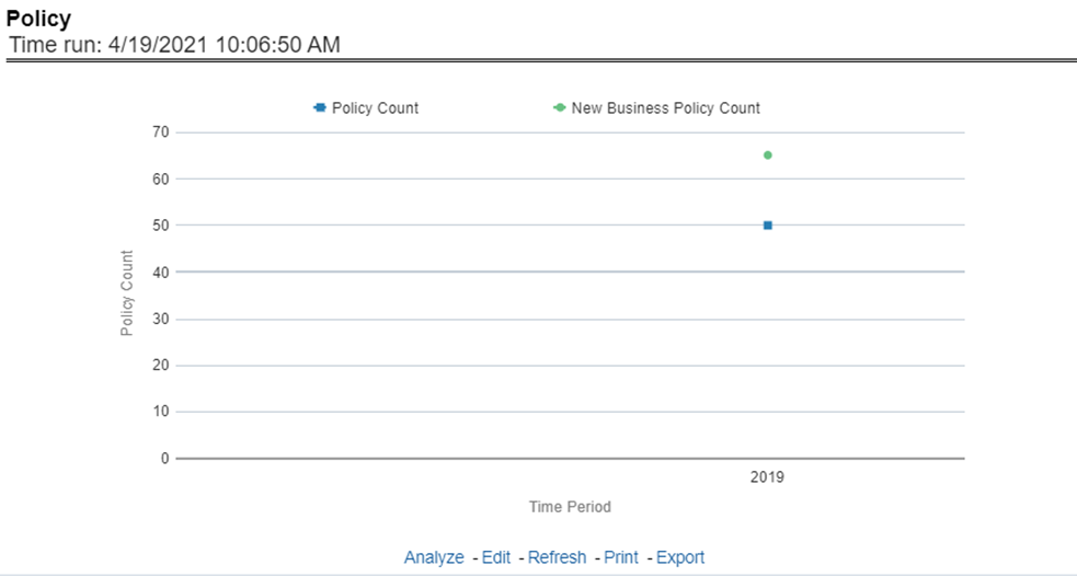
This report shows counts of policies for all lines of businesses and underlying products through a time series. This report can be analyzed over various periods, entities, and geographies selected from page-level prompts.
Figure 19: Policy
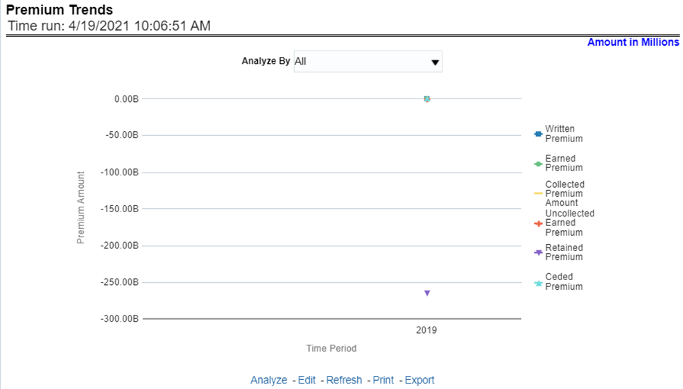
This report shows a trend in revenue through different types of premium, for example, Written Premium, Earned Premium, and Ceded Premium, at an enterprise level, for all lines of businesses and underlying products through a time series. The Premium Trends report contains the following report level filters:
· Written Premium
· Earned Premium
· Collected Premium
· Uncollected Earned Premium
· Retained Premium
· Ceded Premium
This report can be viewed by individual premium type or all types together through a line graph. This report can be analyzed over various periods, entities, and geographies selected from page-level prompts.
Figure 20: Premium Trends
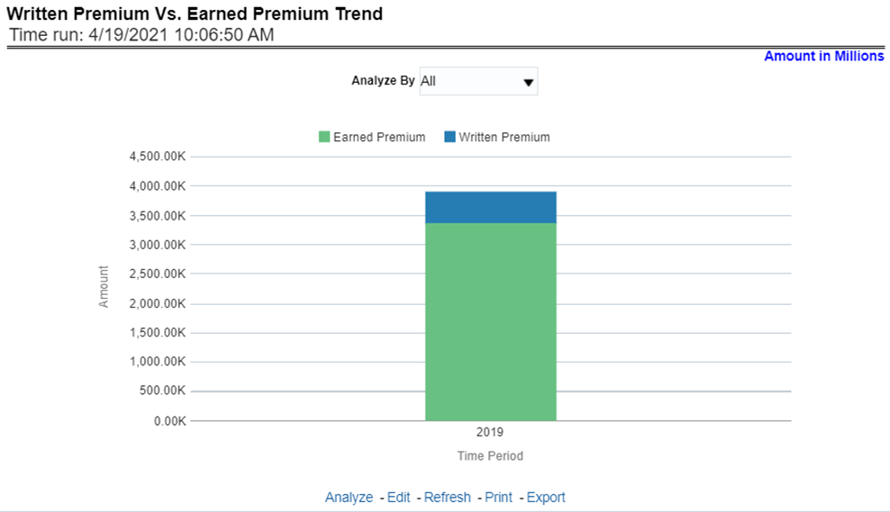
This report shows the trend in revenue and a comparison between Written Premium and Earned Premium, at an enterprise level, for all lines of businesses and underlying products through a time series. This Trend can further be viewed and analyzed through report level filters like Lines of business and Products for more granularities, through a stacked bar graph. This report can be analyzed over various periods, entities, and geographies selected from page-level prompts.
Figure 21: Written Premium vs. Earned Premium Trend
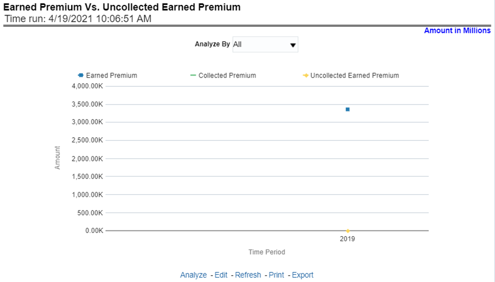
This report shows a trend in the actual collection of earned premium through a comparison between earned premium, collected premium, and uncollected earned premium. This report shows at an enterprise level, for all lines of businesses and underlying products through a time series. This Trend can further be viewed and analyzed through report level filters like Lines of business and Products for more granularities. The values are in a stacked bar graph. This report can be analyzed over various periods, entities, and geographies selected from page-level prompts.
Figure 22: Earned Premium vs. Uncollected Earned Premium
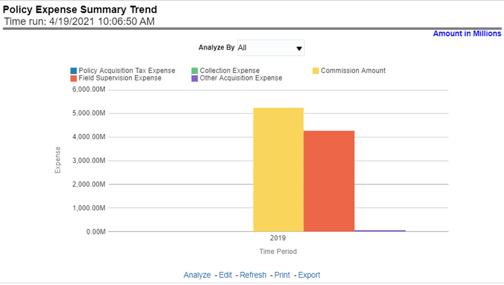
This report shows policy-related expenses under different expense heads at an enterprise level, for all lines of businesses and underlying products through a time series. This Trend can further be viewed and analyzed through report level filters like Lines of business and Products for more granularities. The values are in a clustered bar graph. This report can be analyzed over various periods, entities, and geographies selected from page-level prompts.
Figure 23: Policy Expense Summary Trend
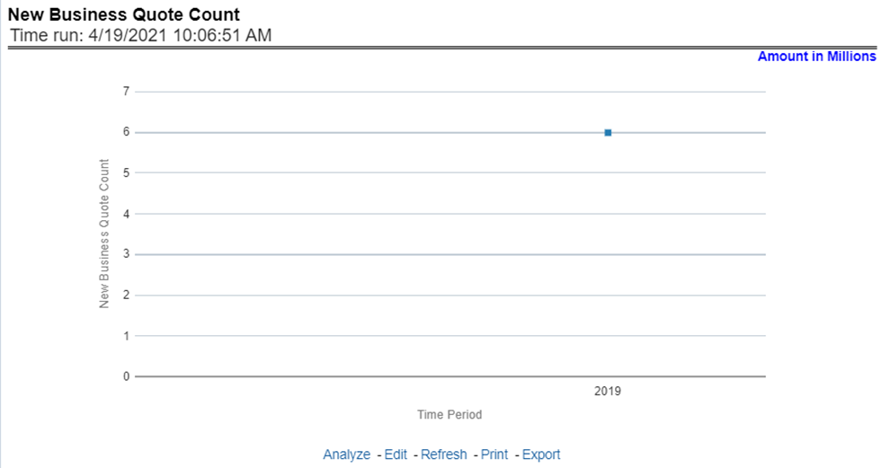
This report shows the number of quotes generated for new business, at an enterprise level, for all lines of businesses and underlying products through a time series. This report can be analyzed over various periods, entities, and geographies selected from page-level prompts.
Figure 24: New Business Quote Count
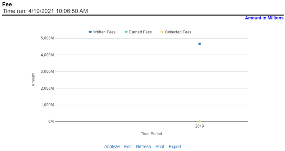
This report shows fee income generated, earned, collected, and refunded, at an enterprise level, for all lines of businesses and underlying products through a time series. This report can be analyzed over various periods, entities, and geographies selected from page-level prompts.
Figure 25: Fee
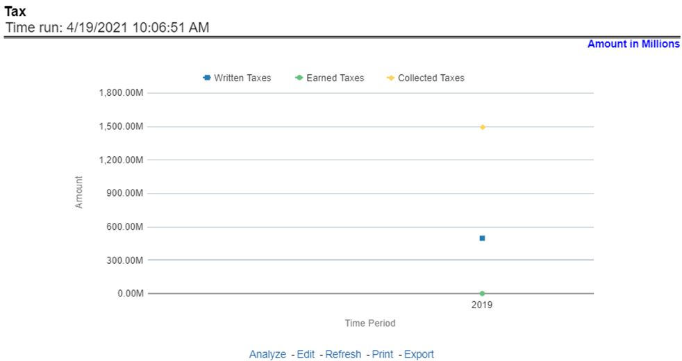
This report shows the premium tax trend for tax generated, earned, and collected, at an enterprise level, for all lines of businesses and underlying products through a time series. This report can be analyzed over various periods, entities, and geographies selected from page-level prompts.
Figure 26: Tax
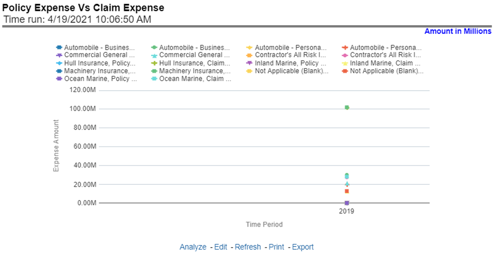
This trend report shows a comparison between policy expenses and claim expenses, at an enterprise level, for all lines of businesses and underlying products through a time series. This report can be analyzed over various periods, entities, and geographies selected from page-level prompts.
Figure 27: Policy Expense versus. Claim Expense
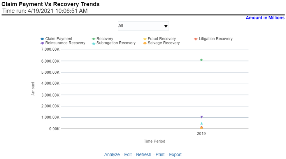
This report shows a comparison between claim payments and recoveries made as well as the trend in various types of recoveries at an enterprise level, for all lines of businesses and underlying products through a time series. This Trend can further be viewed and analyzed through the following report level filters for more granularities:
· Claim Payments
· All recovery Payments
· Fraud Recovery
· Litigation Recovery
· Reinsurance Recovery
· Subrogation Recovery
· Salvage Recovery
The values are in a line graph. This report can also be analyzed over various periods, entities, and geographies selected from page-level prompts
Figure 28: Claim Payment versus Recovery Trends
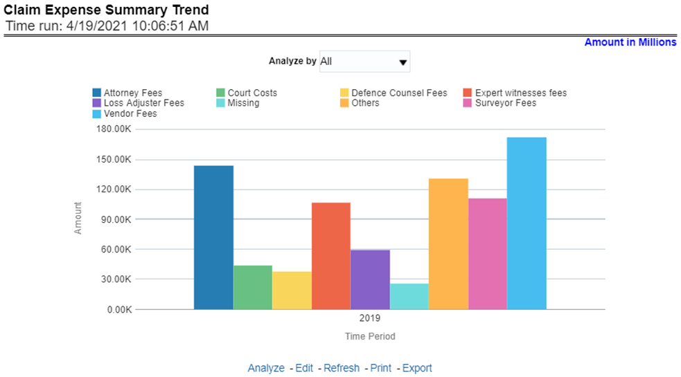
This report shows a trend and comparison between various types of claim expenses at an enterprise level, for all lines of businesses and underlying products through a time series. This Trend can further be viewed and analyzed through the report level filters, Lines of business and products, for more granularities. The values are in a clustered bar graph. This report can also be analyzed over various periods, entities, and geographies selected from page-level prompts.
Figure 29: Claim Expense Summary Trend
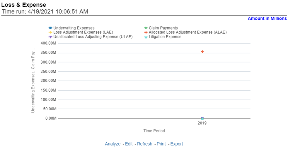
This report shows a trend and comparison between underwriting expense and various types of loss adjustment expenses along with actual claim payments and litigation expenses at an enterprise level, for all lines of businesses and underlying products through a time series. The values are in a line graph. This report can also be analyzed over various periods, entities, and geographies selected from page-level prompts.
Figure 30: Loss and Expense
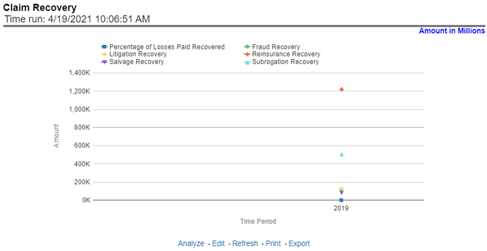
This report shows a trend in various types of recoveries as well as the extent of recoveries against paid losses, at an enterprise level, for all lines of businesses and underlying products through a time series. The values are in a line graph. This report can also be analyzed over various periods, entities, and geographies selected from page-level prompts.
Figure 31: Claim Recovery
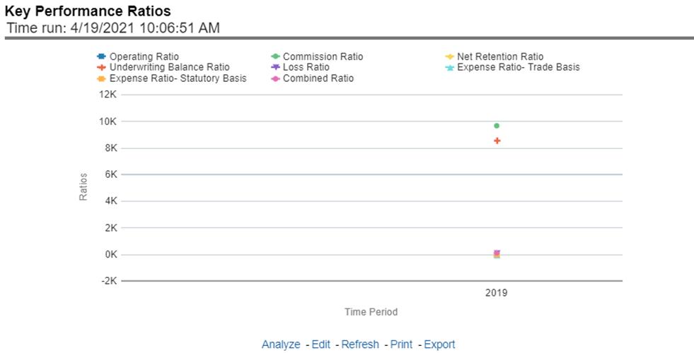
This report shows the trend in various key performance metrics, that is, combined ratio, operating ratio, commission ratio, loss ratio, and so on for all lines of businesses and underlying products over a selected period. Values are in a line graph. This report can also be analyzed over various periods, entities, and geographies selected from page-level prompts.
Figure 32: Key Performance Ratios
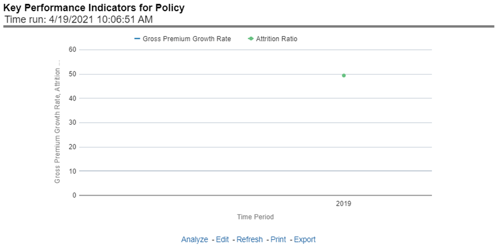
This report shows the trend in two key policy performance indicators that is the gross premium growth rate and attrition ratio, for all lines of businesses and underlying products through a time series. The values are in a line graph. This report can also be analyzed over various periods, entities, and geographies selected from page-level prompts.
Figure 33: Key Performance Indicators for Policy
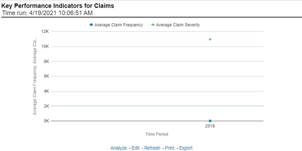
This report shows a trend in two key claim performance indicators, average values of claim frequency and claim severity, for all lines of businesses, and underlying products through a time series. The values are in a line graph. This report can also be analyzed over various periods, entities, and geographies selected from page-level prompts.
Figure 34: Key Performance Indicators for Claims
The Lines of business overview tab includes reports that focus on an overview of Key Performance Indicators for Lines of businesses. The filters for this tab allow the report results to be focused on selected lines of business for comparison and targeted analysis.
Following are the filters available for this tab:
· Time
· Company
· Geography
· Lines of business
The various reports available under this tab are discussed in the following sections.
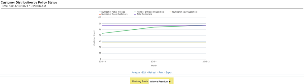
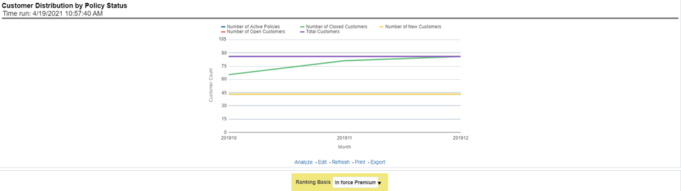
This report provides customer and policy information through time series. Various performance metrics-based measures, for example, the Number of New Customers, the Number of Closed Customers, and so on for the reporting period selected, are displayed on a year-on-year basis. This report can be analyzed over various periods, entities, geographies, and lines of business selected from page-level prompts.
Figure 35: Customer Distribution by Policy Status
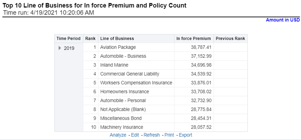
This report provides ranking for the Top 10 lines of businesses in terms of in-force written premium and policy count with previous period ranking.
Figure 36: Top 10 Lines of Business for In-force Premium and Policy Count
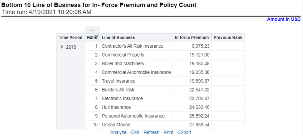
This report provides ranking for the Bottom 10 lines of businesses in terms of in-force, written premium, and policy count with previous period ranking.
Figure 37: Bottom Ten Lines of business for In-force Premium and Policy Count
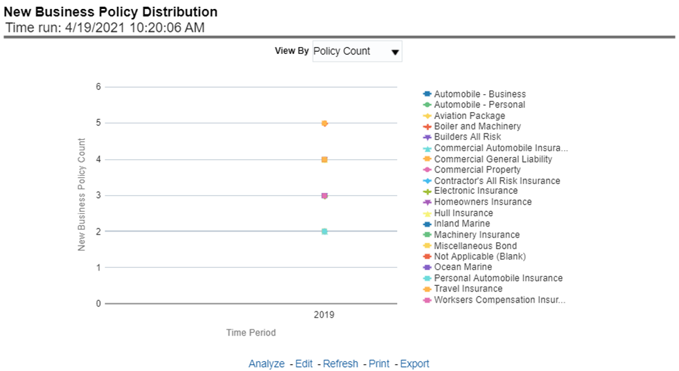
This report provides Policy Count or Written Premium for all new business policies, as selected from the report level view option, during the reporting period across Lines of business through time series.
Figure 38: New Business Policy Distribution
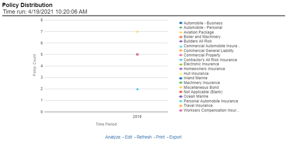
This report provides a policy count of all active policies through a time series.
Figure 39: Policy Distribution
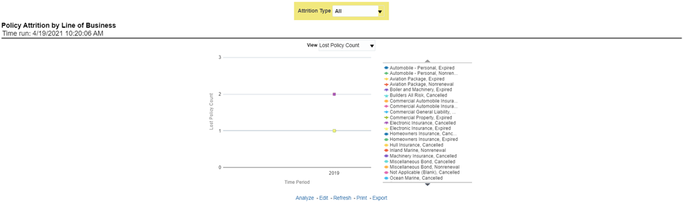
The objective of the report is to show Attrition Policy Count and Attrition Written Premium across Lines of businesses over a period. The Attrition Policy count and attrition written premium values can be filtered and analyzed through report level filters on various attrition types, for example, Cancellation, nonrenewal, and expiration.
Figure 40: Policy Attrition by Lines of Business
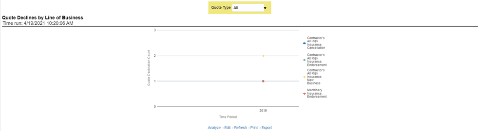
The objective of the report is to show the count of quote declines across lines of businesses. This report displays declines by various quote types through a time series. The report can be analyzed by all declined quotes as well as by various quote types, that is, New Business Quotes, Endorsement Quotes, Renewal Quotes, Reinstatement Quotes, and Cancellation Quotes.
Figure 41: Quote Declines by Lines of Business
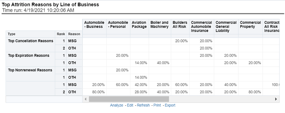
The objective of the report is to show the top three attrition reasons for each attrition type, that is, Cancellation, Nonrenewal, and Expiration in terms of percentage contribution to total attrition across Lines of businesses. These are reported for all lines of businesses in which the insurer writes business.
Figure 42: Top Attrition Reason by Lines of Business
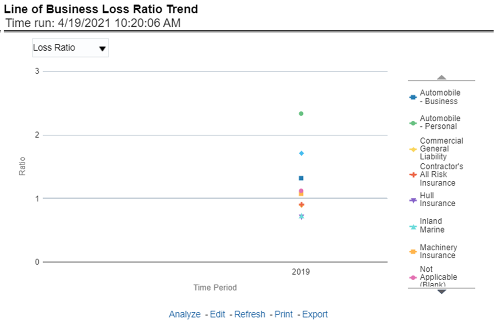
This report shows Combined Ratio or Incurred Loss Ratio, as selected from the view option, across all lines of businesses through a time series.
Figure 43: Lines of Business Loss Ratio Trend
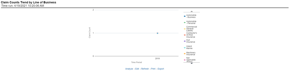
This report displays the count of claims through a time series for all or the selected lines of businesses.
Figure 44: Claim Counts Trend by Lines of business
The Lines of business performance tab includes reports that focus on the Performance of each Line of business. The filters for this tab allow the report results to be focused on selected lines of business for comparison and targeted analysis. The filters include:
· Time
· Company
· Geography
· Lines of business
The various reports available under this tab are discussed in the following sections.
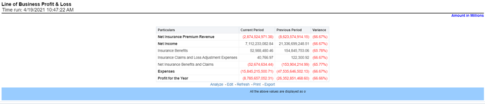
This tabular report provides a snapshot of financial profitability by all or specific lines of business selected for the period. The financial performance window displays net income through premium, expenses through claims, and benefits paid with overall profitability. This report also shows the previous period figures along with a variance between the current and the previous period.
Figure 45: Lines of Business Profit and Loss
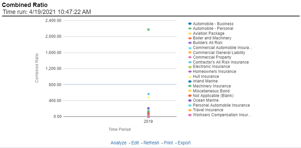
This report shows the combined ratio for all or selected lines of business through a time series. This report can be viewed over various periods, entities, and geographies selected from page-level prompts.
Figure 46: Combined Ratio
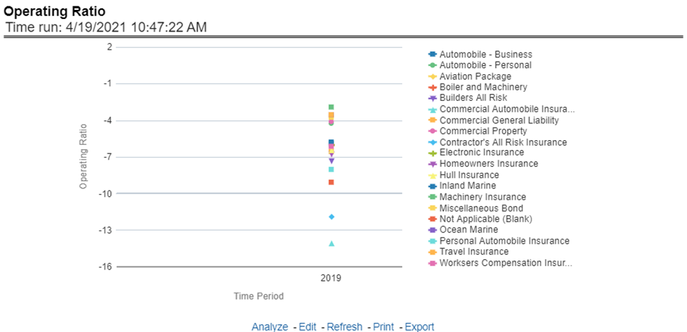
This report shows the operating ratio for all or selected lines of business through a time series. This report can be viewed over various periods, entities, and geographies selected from page-level prompts.
Figure 47: Operating Ratio
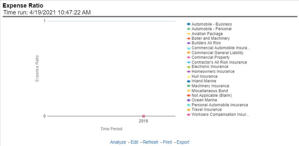
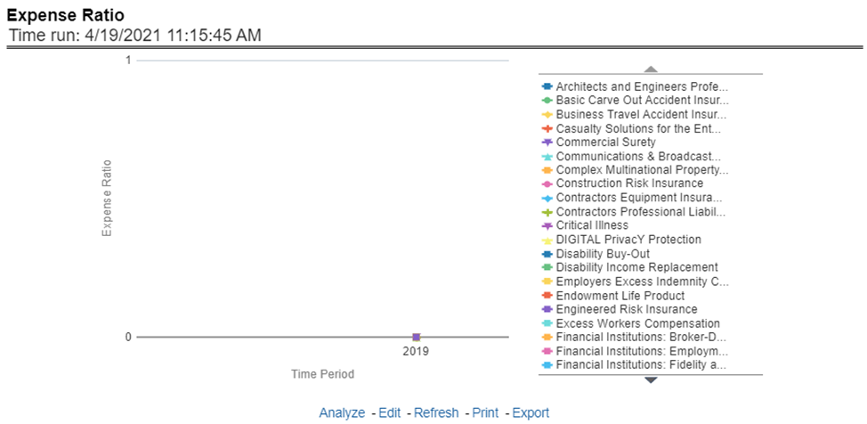
This report shows the expense ratio for all or selected lines of business through a time series. This report can be viewed over various periods, entities, and geographies selected from page-level prompts.
Figure 48: Expense Ratio
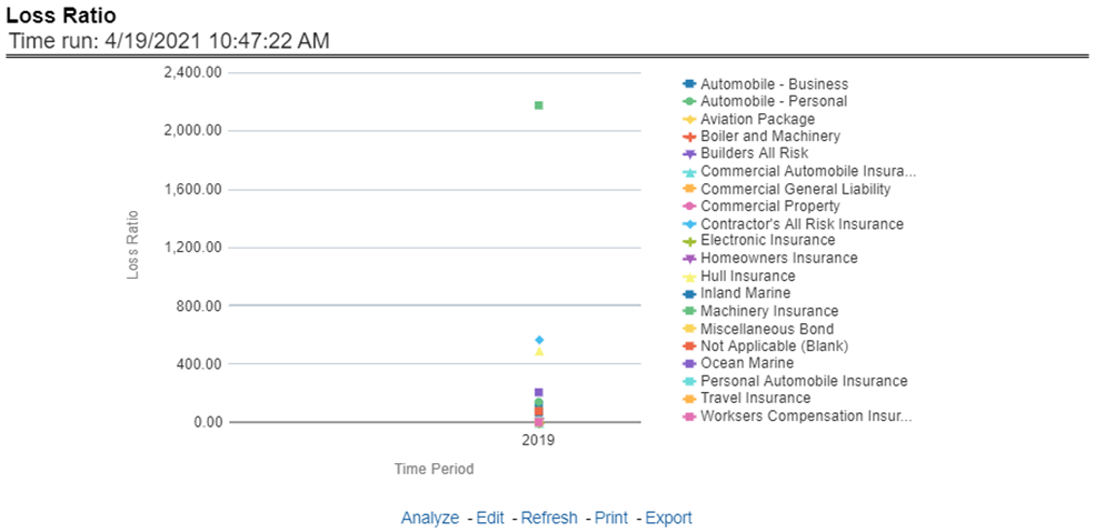
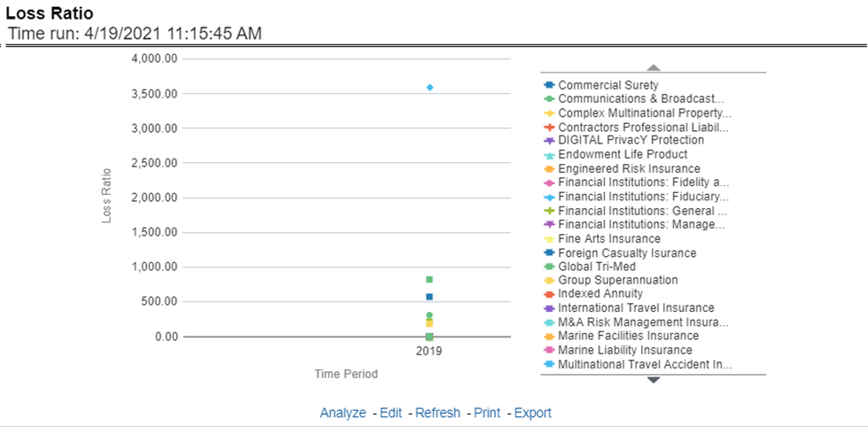
This report shows the loss ratio for all or selected lines of business through a time series. This report can be viewed over various periods, entities, and geographies selected from page-level prompts.
Figure 49: Loss Ratio
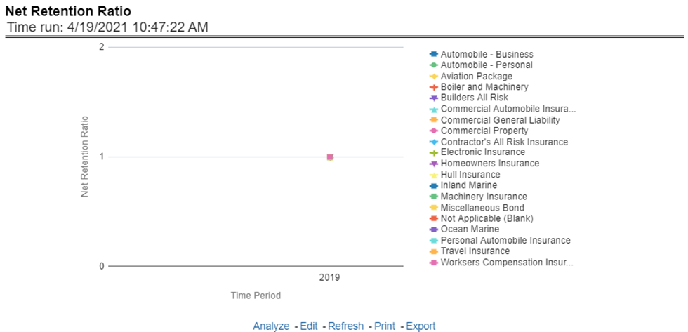
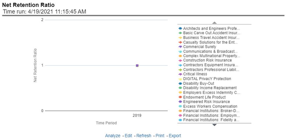
This report shows the net retention ratio for all or selected lines of business through a time series. This report can be viewed over various periods, entities, and geographies selected from page-level prompts.
Figure 50: Net Retention Ratio
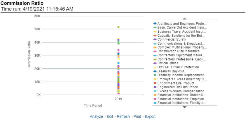
This report shows the commission ratio for all or selected lines of business through a time series. This report can be viewed over various periods, entities, and geographies selected from page-level prompts.
Figure 51: Commission Ratio
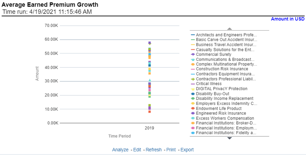
This report shows the growth in average earned premium for all or selected lines of business through a time series. This report can be viewed over various periods, entities, and geographies selected from page-level prompts.
Figure 52: Average Earned Premium Growth
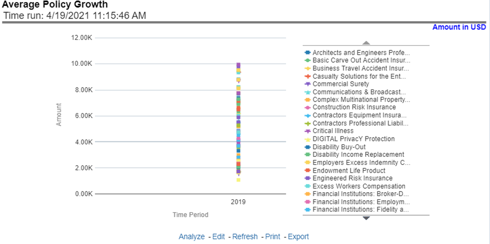
This report shows growth in policy counts for all or selected lines of business through a time series. This report can be viewed over various periods, entities, and geographies selected from page-level prompts.
Figure 53: Average Policy Growth
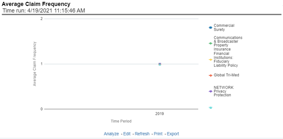
This report shows the average number or frequency of reported claims for all or selected lines of business through a time series. This report can be viewed over various periods, entities, and geographies selected from page-level prompts.
Figure 54: Average Claim Frequency
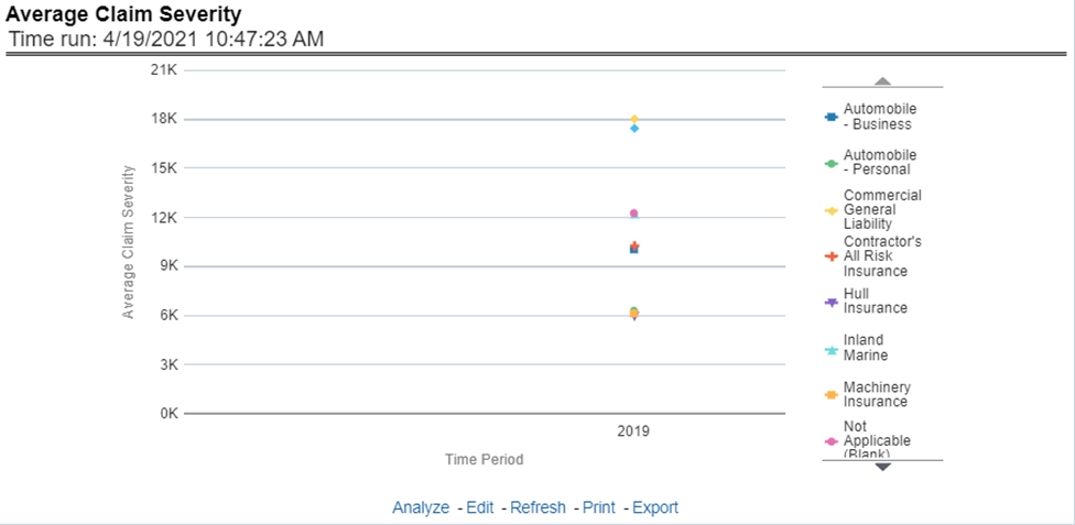
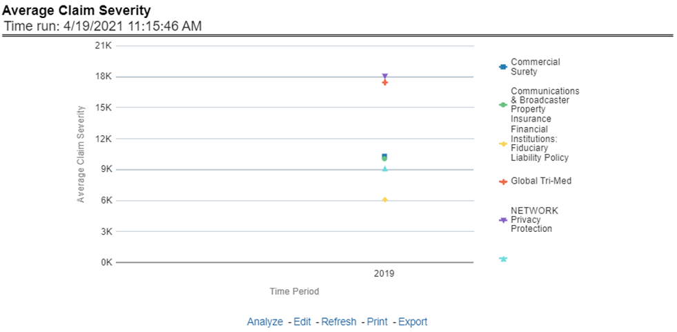
This report shows the average size or severity of reported claims for all or selected lines of business through a time series. This report can be viewed over various periods, entities, and geographies selected from page-level prompts.
Figure 55: Average Claim Severity
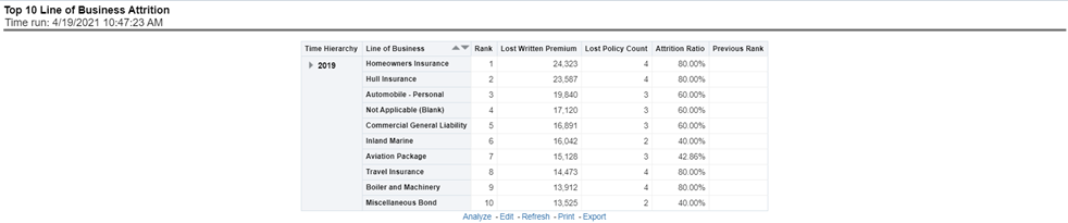
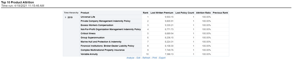
This report ranks the top ten lines of business in terms of various key attrition measures like loss policy count, lost written premium, and corresponding attrition ratio.
Figure 56: Top 10 Lines of Business Attrition
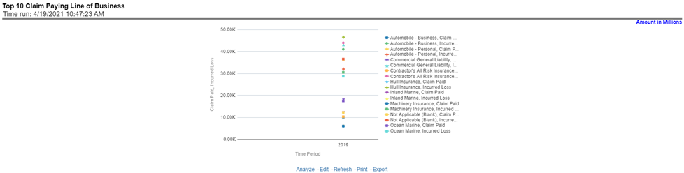
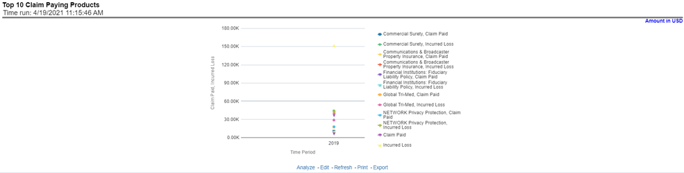
This report ranks the top ten lines of business in terms of claim payments.
Figure 57: Top 10 Claim Paying Lines of Business
The Product tab includes reports that focus on the overview of Performances for Products. The filters for this tab allow the report results to be focused on selected products for comparison and targeted analysis. The filters include:
· Time
· Company
· Geography
· Lines of business
· Products
The various reports available under this tab are discussed in the following sections.
This report provides customer and policy information through time series. Various performance metrics-based measures, for example, the Number of New Customers, Number of Closed Customers, and so on for the reporting period selected, are displayed on a year-on-year basis. This report can be analyzed over various periods, entities, geographies, products, and lines of business selected from page-level prompts.
Figure 58: Customer Distribution by Policy Status
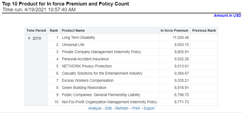
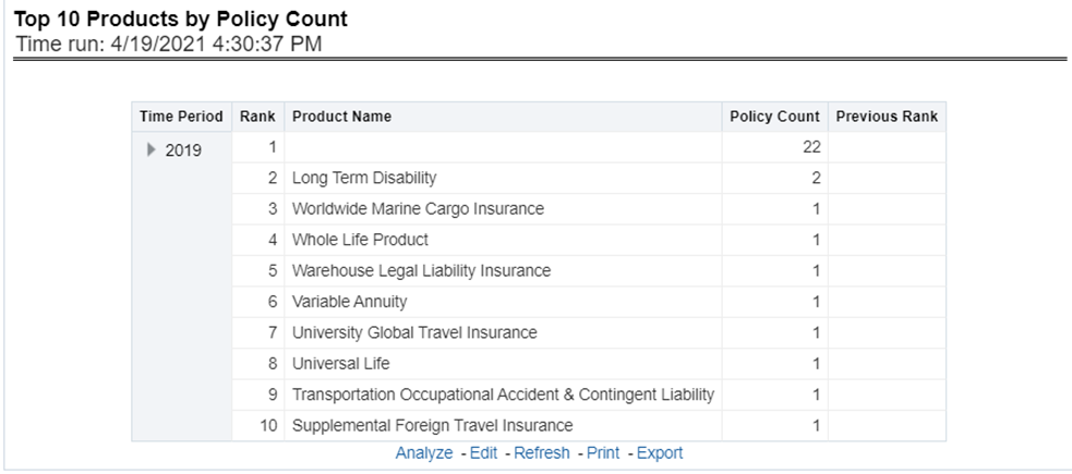
This report provides ranking for Top 10 products in terms of in-force written premium and policy count with previous period ranking.
Figure 59: Top 10 Products for In-force Premium and Policy Count
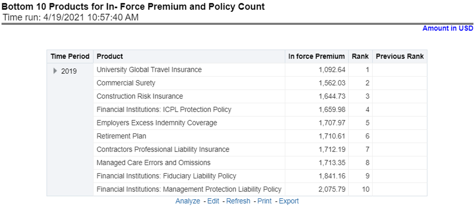
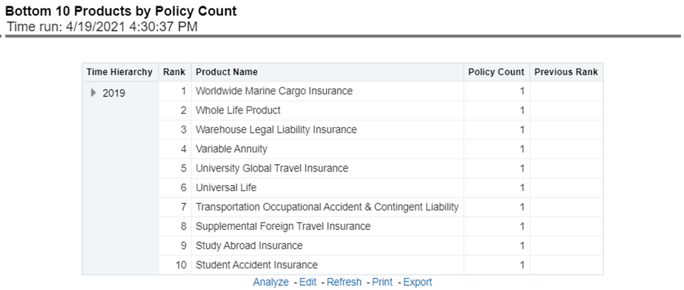
This report provides ranking for the Bottom 10 products in terms of in-force written premium and policy count with previous period ranking.
Figure 60: Bottom 10 Products for In-force Premium and Policy Count
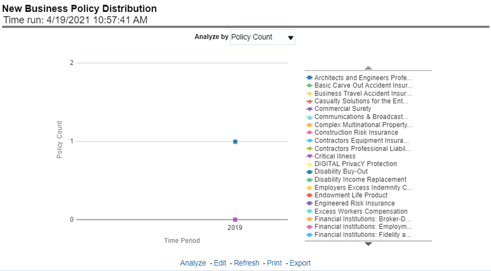
This report provides Policy Count or Written Premium for all new business policies (as selected from the report level view option) during the reporting period across products through time series.
Figure 61: New Business Policy Distribution
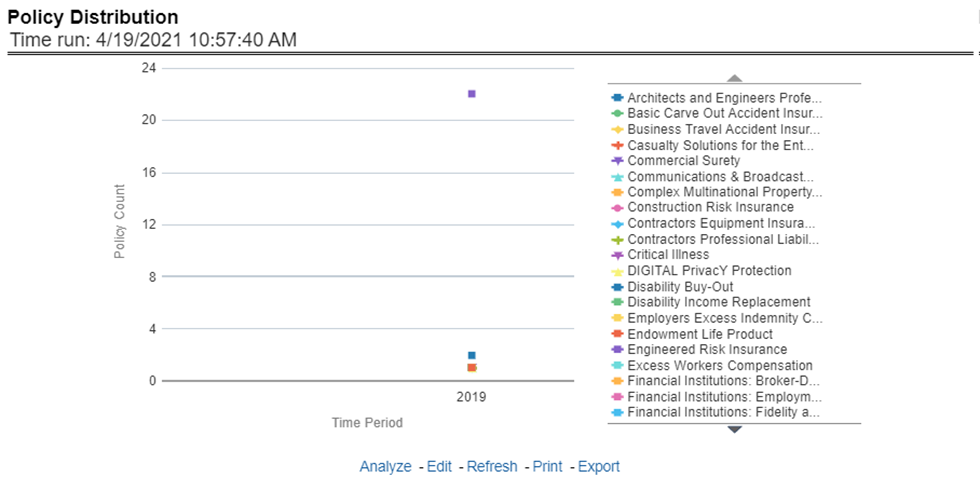
This report provides a policy count of all active policies through a time series.
Figure 62: Policy Distribution
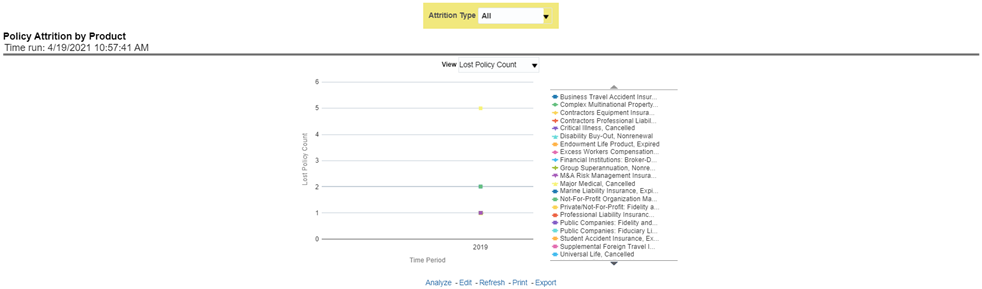
The objective of the report is to show the Attrition Policy Count and Attrition Written Premium across products over a period. The Attrition Policy count and attrition written premium values can be filtered and analyzed through report level filters on various attrition types, that is, Cancellation, nonrenewal, and expiration.
Figure 63: Policy Attrition by Product
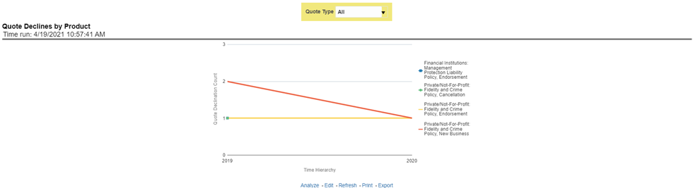
The objective of the report is to show the count of quote declines across products. This report displays declines by various quote types; through a time series. The report can be analyzed by all declined quotes as well as by various quote types:
· New Business Quotes
· Endorsement Quotes
· Renewal Quotes
· Reinstatement Quotes
· Cancellation Quotes
Figure 64: Quote Declines by Product
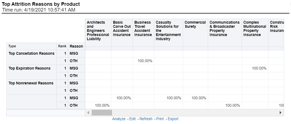
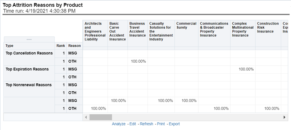
The objective of the report is to show the top three attrition reasons for each attrition type, that is, Cancellation, Non-renewal, and Expiration in terms of percentage contribution to total attrition products. These are reported for all products and lines of businesses in which the insurer writes business.
Figure 65: Top Attrition Reasons by Product
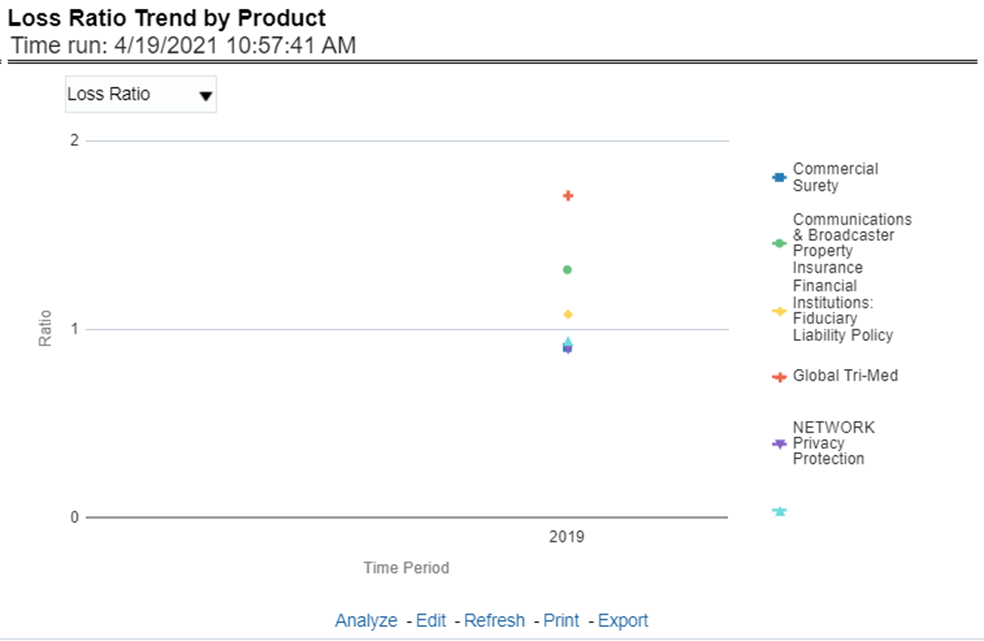
This report shows Combined Ratio or Incurred Loss Ratio, as selected from the view option, across products and lines of businesses through a time series.
Figure 66: Loss Ratio Trend by Product
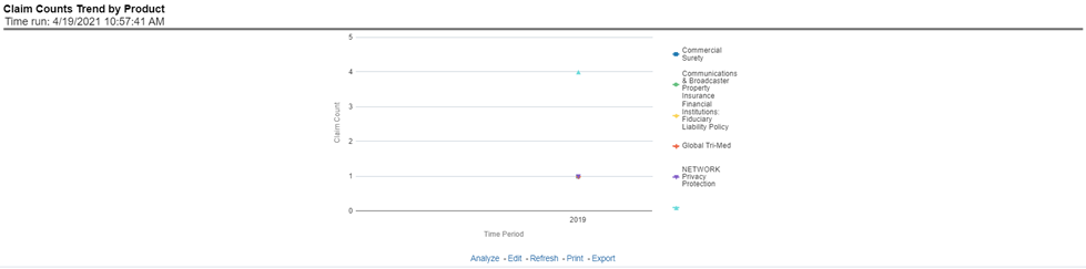
This report displays the count of claims through a time series for all products and lines of businesses selected.
Figure 67: Claim Counts Trend by Product
The Product performance tab includes reports that focus on the Performance of each product under each Line of business. The filters for this tab allow the report results to be focused on selected products for comparison and targeted analysis. The filters include:
· Time
· Company
· Geography
· Lines of business
· Products
The various reports available under this tab are discussed in the following sections.
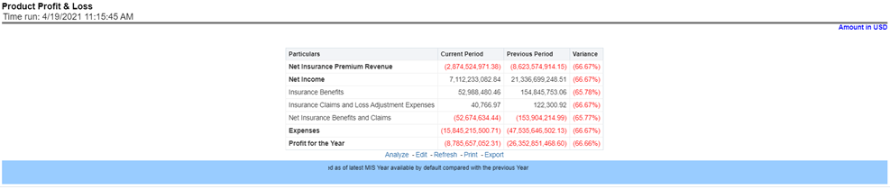
This tabular report provides a snapshot of financial profitability by all or a specific product for or specific lines of business selected for the period. The financial performance window displays net income through premium, expenses through claims, and benefits paid with overall profitability. This report also shows the previous period figures along with a variance between the current and the previous period.
Figure 68: Product Profit and Loss
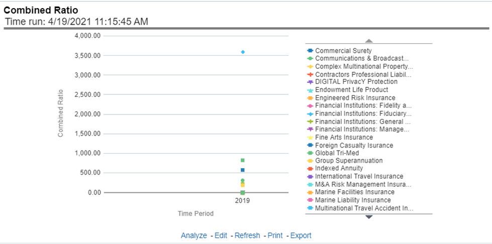
This report shows the combined ratio for all or a specific product for or specific lines of business through a time series. This report can be viewed over various periods, entities, and geographies selected from page-level prompts.
Figure 69: Combined Ratio
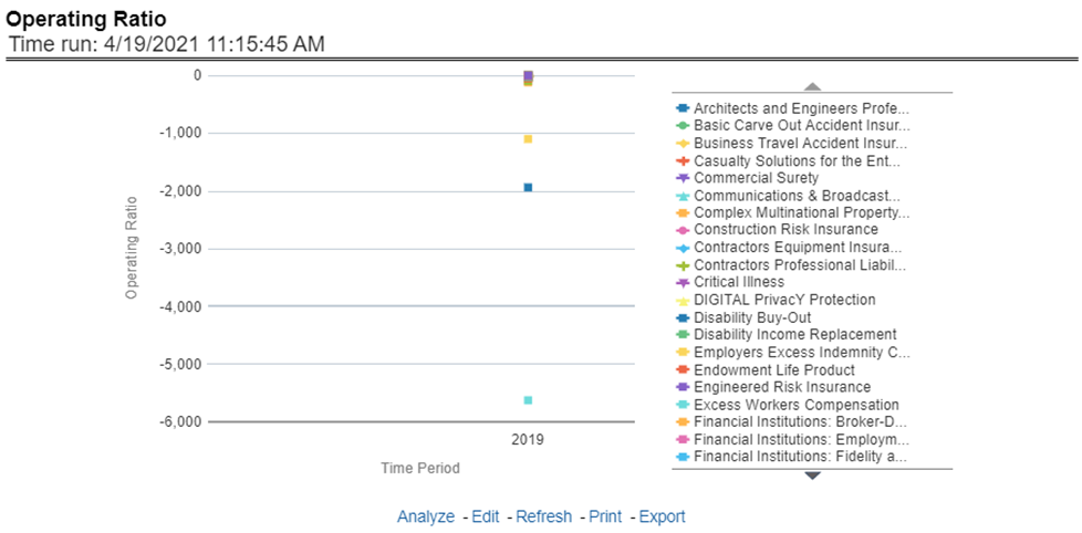
This report shows the operating ratio for all or a specific product for or specific lines of business through a time series. This report can be viewed over various periods, entities, and geographies selected from page-level prompts.
Figure 70: Operating Ratio
This report shows the expense ratio for all or a specific product for or specific lines of business through a time series. This report can be viewed over various periods, entities, and geographies selected from page-level prompts.
Figure 71: Expense Ratio
This report shows a loss ratio for all or a specific product for or specific lines of business through a time series. This report can be viewed over various periods, entities, and geographies selected from page-level prompts.
Figure 72: Loss Ratio
This report shows the net retention ratio for all or a specific product for or specific lines of business through a time series. This report can be viewed over various periods, entities, and geographies selected from page-level prompts.
Figure 73: Net Retention Ratio
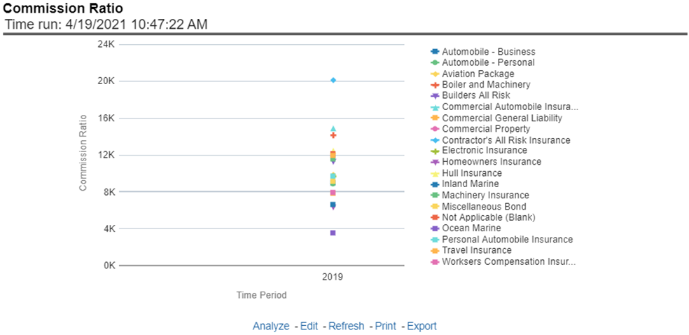
This report shows the commission ratio for all or a specific product for or specific lines of business through a time series. This report can be viewed over various periods, entities, and geographies selected from page-level prompts.
Figure 74: Commission Ratio
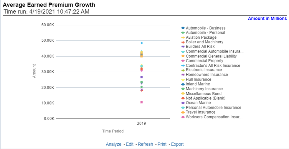
This report shows growth in average earned premium for all or a specific product for or specific lines of business through a time series. This report can be viewed over various periods, entities, and geographies selected from page-level prompts.
Figure 75: Average Earned Premium Growth
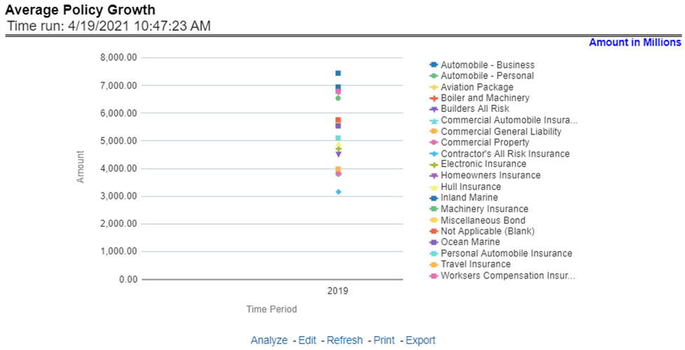
This report shows growth in policy counts for all or a specific product for or specific lines of business through a time series. This report can be viewed over various periods, entities, and geographies selected from page-level prompts.
Figure 76: Average Policy Growth
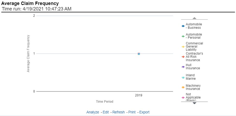
This report shows the average number or frequency of reported claims for all or a specific product for or specific lines of business through a time series. This report can be viewed over various periods, entities, and geographies selected from page-level prompts.
Figure 77: Average Claim Frequency
This report shows the average size or severity of reported claims for all or a specific product for or specific lines of business through a time series. This report can be viewed over various periods, entities, and geographies selected from page-level prompts.
Figure 78: Average Claim Severity
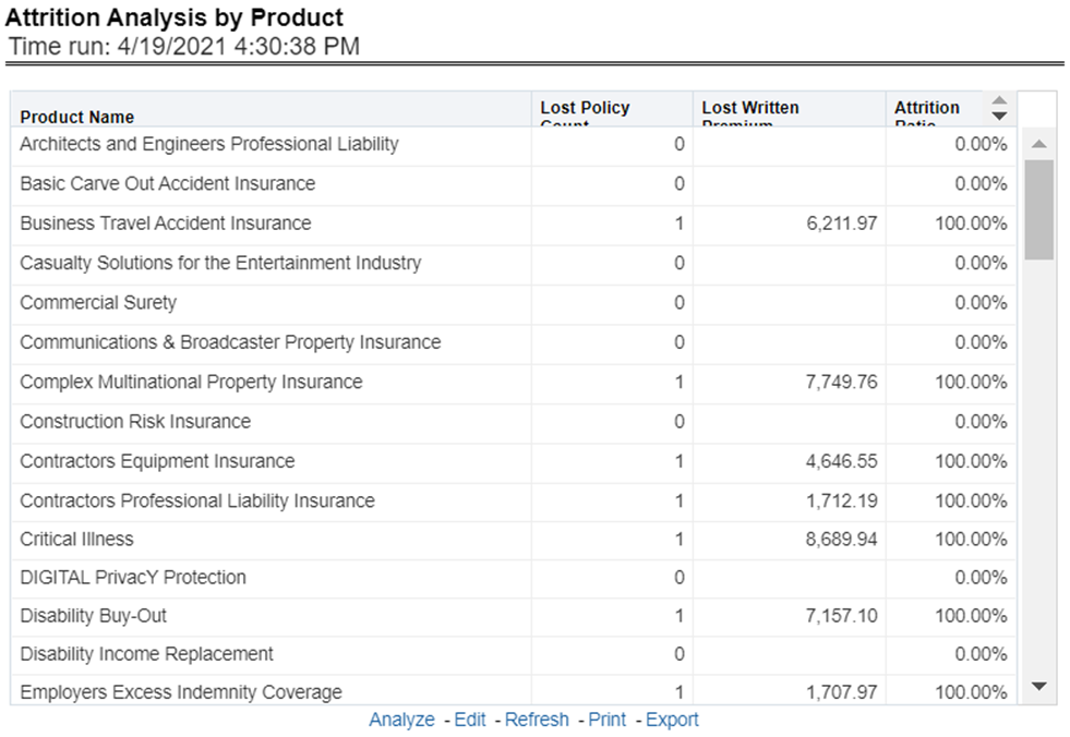
This report ranks the top ten products in terms of various key attrition measures like loss policy count, lost written premium, and corresponding attrition ratio.
Figure 79: Top 10 Product Attrition
This report ranks the top ten products in terms of claim payments.
Figure 80: Top 10 Claim Paying Products
This chapter explains the reports available under each tab in the Quote Performance Dashboard.
The following tabs are present in the Quote Performance dashboard:
· Summary
· Product
· Region
The following screenshots display the essential nature of the available reports as per each tab:
Figure 81: Quote Performance Dashboard Tabs

This tab includes information at the corporate level. The information contained in the reports generated summarizes how the entire organization is performing. Following are the filters available for this tab.
· Time
· Company
· Geography
The various reports available under this tab are detailed in the following sections.
This report shows snapshots of key performance indicators represented through flash boxes for the current period.
Figure 82: Key Quote Performance Indicators Flash
Each of these Flash boxes is drillable to further corresponding detailed report as follows:
· Flash Box: Quote Count Percentage Change: Quote Count Trends (Drill-down report): This report summarizes the count and distribution of the types of quotes generated during the reported period and compares those amounts to the previous reporting period. The comparisons available include a previous period or a previous year(s).
· Flash Box: Quote Expenses Percentage Change: Quote Expenses Summary Trend (Drill-down report): This report summarizes the total amount of expenses by each type of quote for the reporting period and compares those amounts to the previous reporting period. The comparisons available include a previous period or a previous year(s).
· Flash Box: New Business Bind ratio Percentage Change: New Business Quote to Bind Ratio (Drill-down report): This report presents the ratios of Total New Business Quotes that were generated vs. the New Business Quotes that were accepted and generated a new policy. The ratios are presented for the current and previous reporting periods. Also, it isolates and presents the binding ratio for quotes that had reports received for the current reporting period and the previous reporting period.
· Flash Box: Quote to Canceled Ratio Percentage Change: Endorsement Quote to Canceled Ratio (Drill-down report): This report summarizes the ratio of policies where an endorsement quote was generated and remained in force until policy expiration and the policies where an endorsement quote was generated and the policy was later canceled. The ratios are presented for the current and previous reporting period and are exhibited in both tabular and graphical displays.
· Flash Box: Quote to Expired Ratio Percentage Change: Renewal Quote to Expired Ratio (Drill-down report): This report summarizes the ratio of policies where a renewal quote was generated and the policy renewed and the policies where a renewal quote was generated and the policy later expired. The ratios are presented for the current and previous reporting period and are exhibited in both tabular and graphical displays.
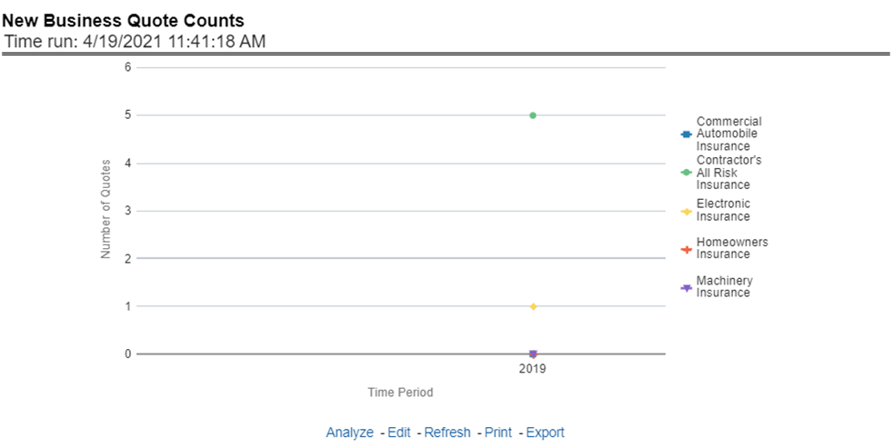
This line graph illustrates the total number of New Business quotes generated over time. Each Line of business is represented by a unique line.
Figure 83: New Business Quote Counts
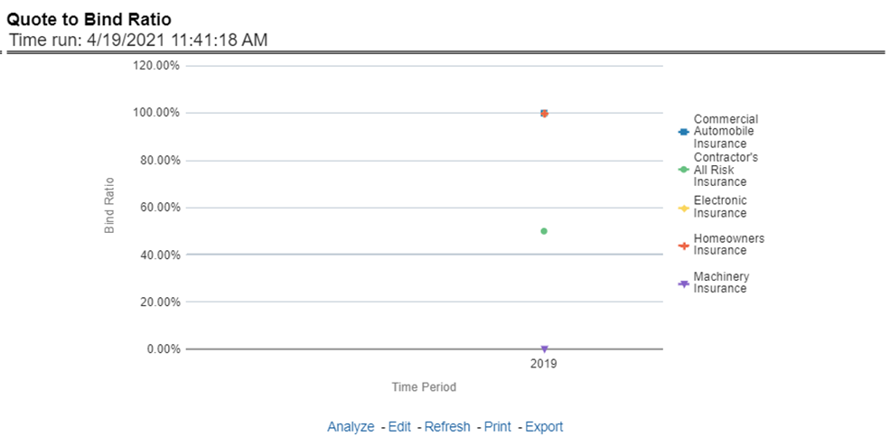
This line graph illustrates the Binding ratio, the ratio of total quotes generated to those quotes that resulted in a policy transaction including but not limited to new business policy or endorsement, over time. Each Line of business is represented by a unique line.
Figure 84: Quote to Bind Ratio
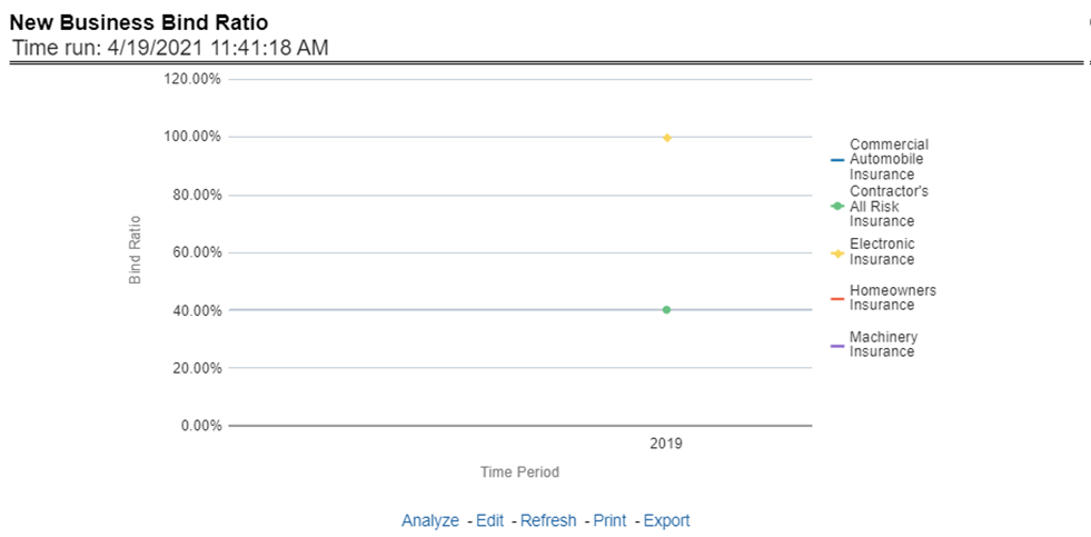
This line graph illustrates the New Business Bind ratio, the ratio of total New Business quotes generated to those quotes that resulted in a new business policy transaction, over time. Each Line of business is represented by a unique line.
Figure 85: New Business Bind Ratio
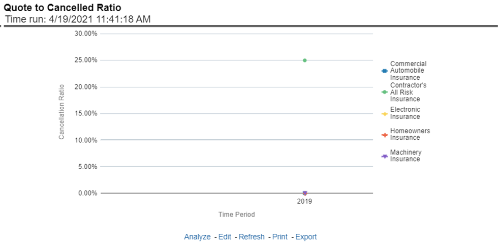
This line graph illustrates the Quote to Canceled ratio, the ratio of total policies with endorsements quotes generated to those policies with an endorsement quote that eventually canceled, over time. Each Line of business is represented by a unique line.
Figure 86: Quote to Cancelled Ratio
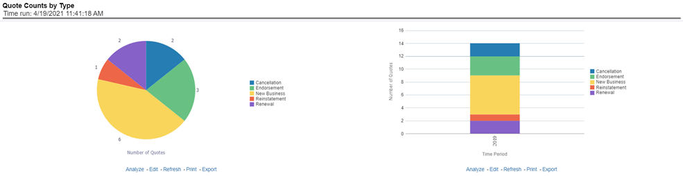
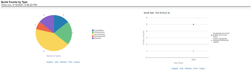
This pie graph illustrates the count of quotes by the type of quote. The types of quotes illustrated include the following:
· New Business
· Endorsement
· Cancellation
· Reinstatement
· Renewal
The corresponding stacked bar graph shows the total quotes stacked by the type of quotes over a time series.
Figure 87: Quote Counts by Type
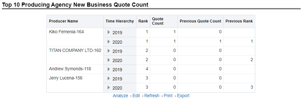
This chart lists the Producing Agencies with the 10 highest New Business Quote Count for the reporting period. This chart also lists the agencies' prior quote count for reference. The Rank of 1 is for the highest quote count of the top 10, the Rank of 10 is for the lowest quote count for the count of the top 10.
Figure 88: Top Ten Producing Agency New Business Quote Count
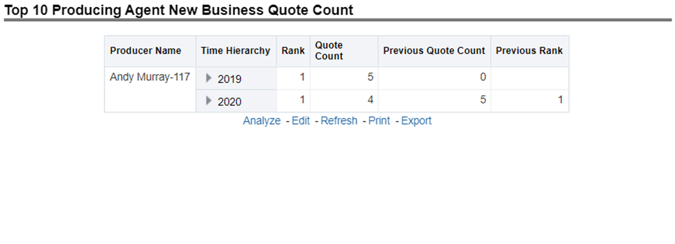
This chart lists the Producing Agents with the 10 highest New Business Quote Count for the reporting period. This chart also lists the agents' prior quote count for reference. The Rank of 1 is for the highest quote count of the top 10, the Rank of 10 is for the lowest quote count for the count of the top 10.
Figure 89: Top Ten Producing Agents New Business Quote Count
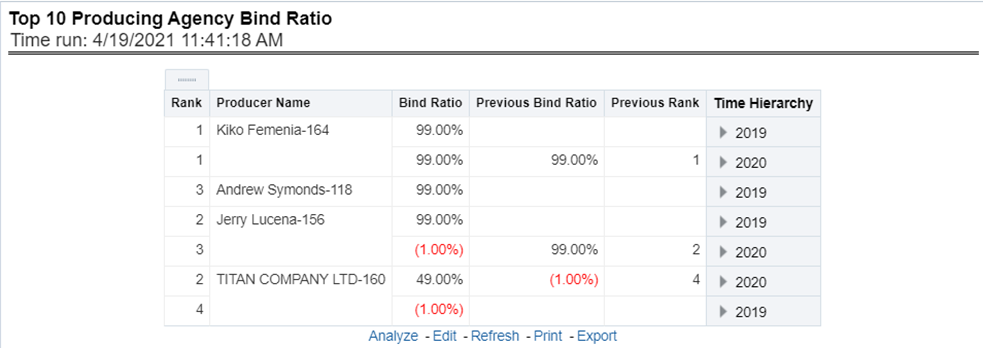
This chart lists the Producing Agencies with the 10 highest Binding Ratio, the ratio of total quotes generated to those quotes that resulted in a policy transaction including but not limited to new business policy or endorsement, for the reporting period. This chart also lists the agencies' prior binding ratio for reference. The Rank of 1 is for the highest binding ratio of the top 10, the Rank of 10 is for the lowest binding ratio for the count of the top 10.
Figure 90: Top 10 Producing Agency Binding Ratio
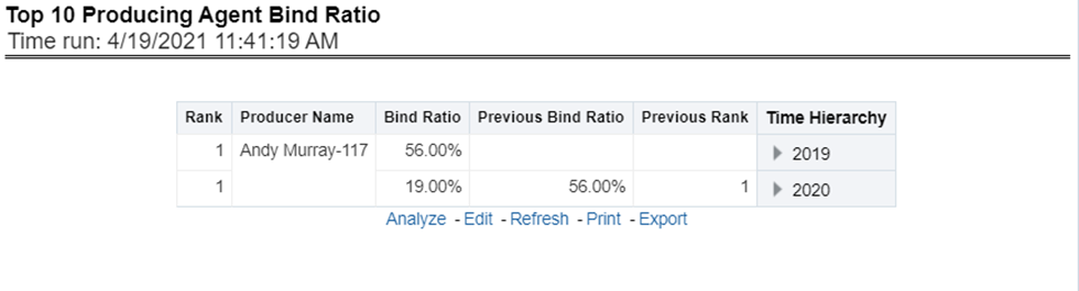
This chart lists the Producing Agents with the 10 highest Binding Ratio, the ratio of total quotes generated to those quotes that resulted in a policy transaction including but not limited to new business policy or endorsement, for the reporting period. This chart also lists the agents' prior binding ratio for reference. The Rank of 1 is for the highest binding ratio of the top 10, the Rank of 10 is for the lowest binding ratio for the count of the top 10.
Figure 91: Top 10 Producing Agents Binding Ratio
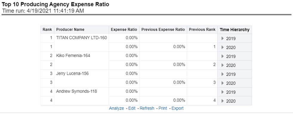
This chart lists the Producing Agencies with the 10 highest Expense Ratio, the ratio of total expenses generated for an agency's policies to the written premium for the same policies, for the reporting period. This chart also the agencies' prior expense ratio for reference. The Rank of 1 is for the highest expense ratio of the top 10 and the Rank of 10 is for the lowest expense ratio for the count of the top 10.
Figure 92: Top 10 Producing Agency Expense Ratio
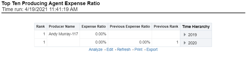
This chart lists the Producing Agents with the 10 highest Expense Ratio, the ratio of total expenses generated for an agent's policies to the written premium for the same policies, for the reporting period. This chart also lists the agents' prior expense ratio for reference. The Rank of 1 is for the highest expense ratio of the top 10 and the Rank of 10 is for the lowest expense ratio for the count of the top 10.
Figure 93: Top 10 Producing Agents Expense Ratio
The Key Fact tab includes Key Performance Indicator Reports at the corporate level. The filters for this tab allow the report results to be focused on selected combinations for comparison and targeted analysis. The filters include:
· Time
· Company
· Lines of business
· Product
The various reports available under this tab are detailed in the following sections.
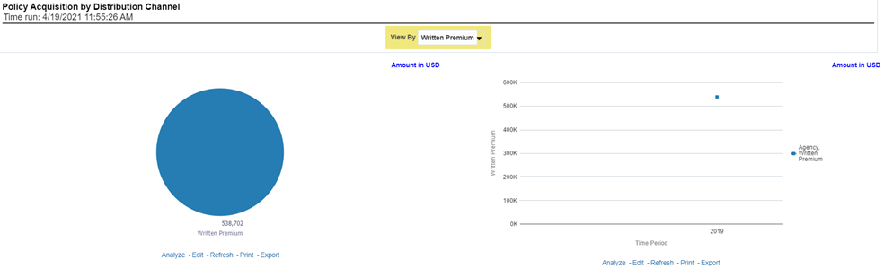
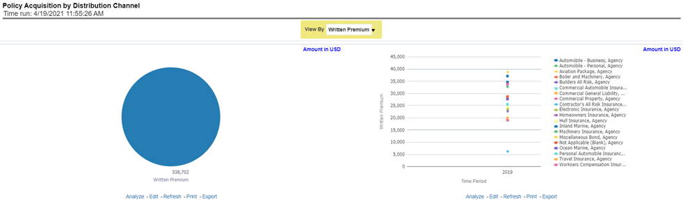
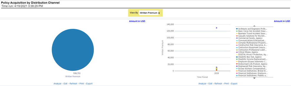
This pie chart illustrates the percentage of policy count or written premium attributed based on the distribution channels for the corporation. The corresponding line graph illustrates the similar value, as selected by the filter, over time with a line for External Agents and Agencies and a line for Company Employees.
Figure 94: Policy Acquisition by Distribution Channel
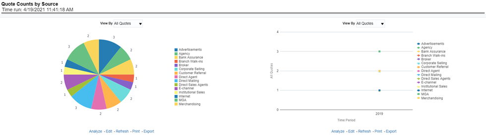
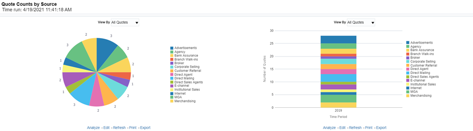
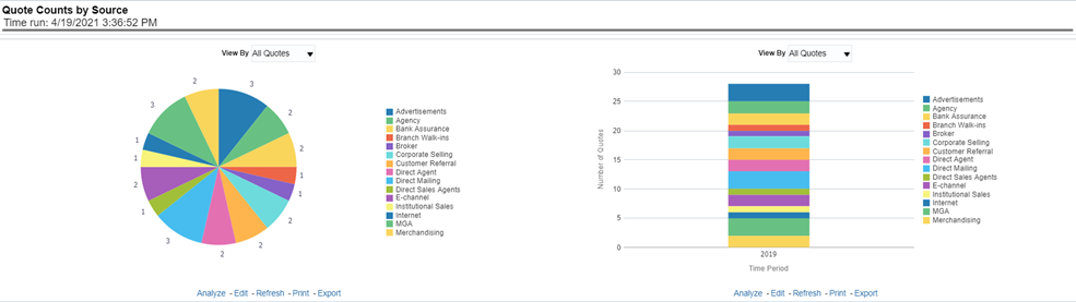
This pie chart illustrates the percentages of quotes for each quote source at the reporting period and can be viewed by the Quote Types. The corresponding line graph illustrates the similar value, as selected by the filter, over time with a line for each source.
Figure 95: Quote Counts by Source
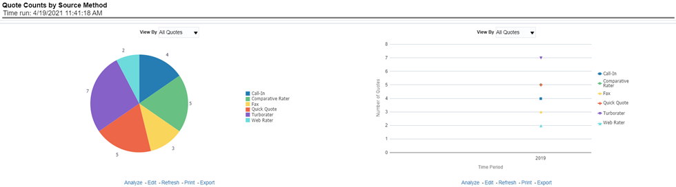
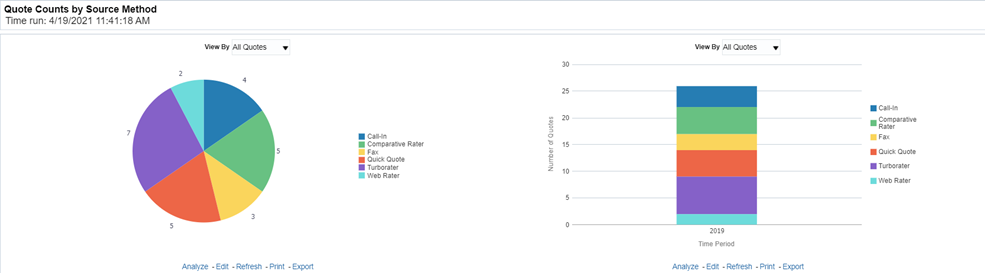
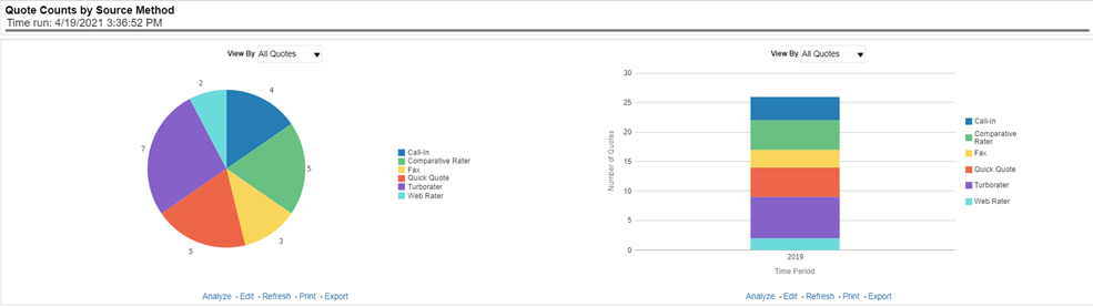
This pie chart shows the percentage of quotes for each quote source method at the reporting period and can be viewed by the Quote Types. The corresponding line graph illustrates the similar value, as selected by the filter, over time with a line for each source method.
Figure 96: Quote Counts by Source Method
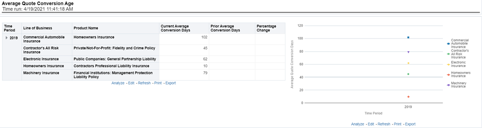
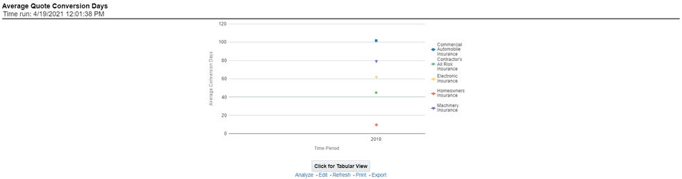
This line graph illustrates the number of days from the initiation of the quote to the binding transaction such as new business policy submission, endorsement transaction, and so on over time.
Figure 97: Average Quote Conversion Age
The Lines of business tab includes reports that focus on the Key Performance Indicators for each Line of business. The filters for this tab allow the report results to be focused on selected lines of business for comparison and targeted analysis. The filters include:
· Time
· Company
· Lines of business
The various reports available under this tab are detailed in the following sections.
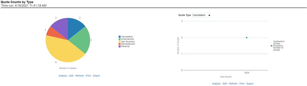
This pie chart illustrates the percentages of quotes for each quote type at the reporting period. The corresponding line graph illustrates the similar value, as selected by the filter, over time with a line for each Line of business. The filter allows the user to select the quote type.
Figure 98: Quote Counts by Type
This pie chart illustrates the percentage of policy count or written premium attributed based on the distribution channels for the corporation. The corresponding bar graph has a stacked bar for each Line of business. Each bar is stacked by distribution channel types and is repeated over time.
Figure 99: Policy Acquisition by Distribution Channel
This pie chart illustrates the percentages of quotes for each quote source at the reporting period and can be viewed by the Quote Types. The corresponding bar graph has a stacked bar for each Line of business over time that is stacked with each quote source.
Figure 100: Quote Counts by Source
This pie chart shows the percentage of quotes for each quote source method at the reporting period and can be viewed by the Quote Types. The corresponding bar graph has a stacked bar for each Line of business over time that is stacked with each quote source method.
Figure 101: Quote Counts by Source Method
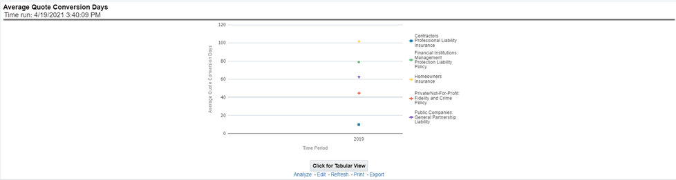
This is a time-series graphical trend report where producers' performance is measured by average days required in converting from a quote to a policy. This acts as a performance indicator for producers' efficiency in business conversion.
Drill Down: The report can be further analyzed by Lines of business or Product-wise by clicking the Click for Graphical View button.
Figure 102: Average Quote Conversion Days
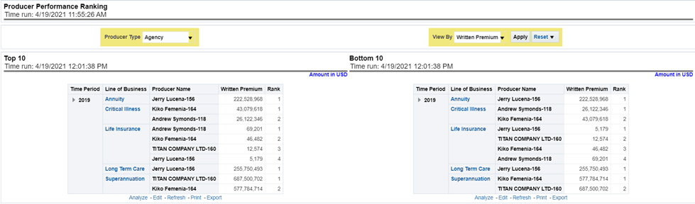
This tabular report displays the top 10 and bottom 10 in performance based on the following View By options:
· Written Premium
· Average Written Premium
· Bind Ratio
· Policy Count
· Quote Count
· Attrition Ratio
· Claim Count
· Loss Ratio Excluding ULAE
· Loss Payments
The table can be populated based on the View options, Producing Agent or Producing Agency. This report shows performance based on the Lines of business focus.
Figure 103: Top 10 and Bottom 10
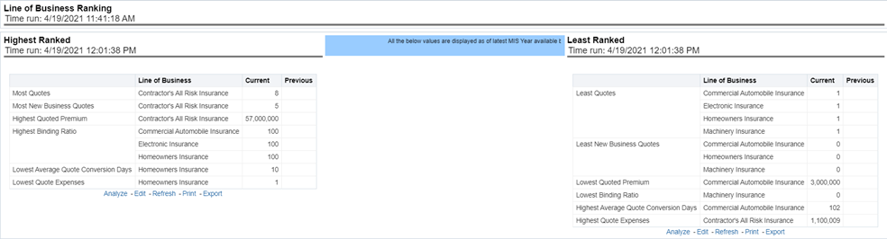
This is a tabular report where quotes are ranked by Lines of businesses through various performance parameters like the number of quotes, quoted premium, conversion days, expenses, and so on. This report lists the best and least performers.
Figure 104: Lines of Business Ranking
The Product tab includes reports that focus on the Key Performance Indicators for each Product. The filters for this tab allow the report results to be focused on selected products for comparison and targeted analysis. The filters include:
· Time
· Company
· Product
The various reports available under this tab are detailed in the following sections.
This pie chart illustrates the percentages of quotes for each quote type at the reporting period. The corresponding line graph illustrates the similar value, as selected by the filter, over time with a line for each Product. The filter allows the user to select the quote type.
Figure 105: Quote Counts by Type
This pie chart illustrates the percentage of policy count or written premium attributed based on the distribution channels for the corporation. The corresponding bar graph has a stacked bar for each product. Each bar is stacked by distribution channel type and is repeated over time.
Figure 106: Policy Acquisition by Distribution Channel
This pie chart illustrates the percentages of quotes for each quote source at the reporting period and can be viewed by the Quote Types. The corresponding bar graph has a stacked bar for each Line of business over time that is stacked with each quote source.
Figure 107: Quote Counts by Source
This pie chart shows the percentage of quotes for each quote source method at the reporting period and can be viewed by the Quote Types. The corresponding bar graph has a stacked bar for each product over time that is stacked with each quote source method.
Figure 108: Quote Counts by Source Method
This is a time-series graphical trend report where producers' performance is measured by average days required in converting from a quote to a policy. This acts as a performance indicator for producers' efficiency in business conversion.
Drill Down: The report can be further analyzed by Lines of business or Product-wise by clicking the Click for Graphical View button.
Figure 109: Average Quote Conversion Days
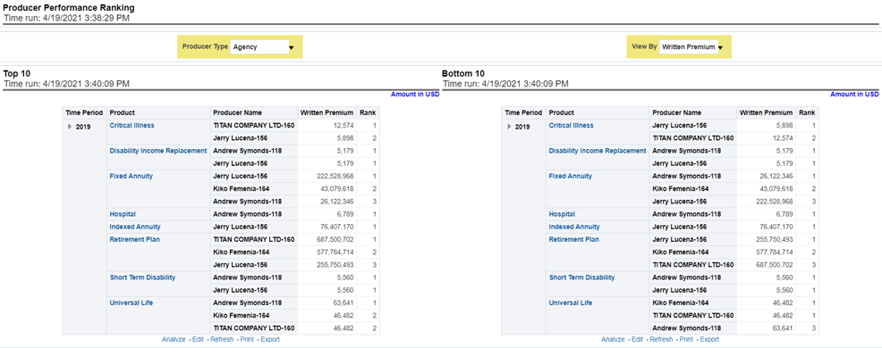
This tabular report displays the top 10 and bottom 10 in performance based on the following View By options:
· Written Premium
· Average Written Premium
· Bind Ratio
· Policy Count
· Quote Count
· Attrition Ratio
· Claim Count
· Loss Ratio Excluding ULAE
· Loss Payments
The table can be populated based on the View options, Producing Agent or Producing Agency. This report shows performance based on the Product focus.
Figure 110: Producer Performance Ranking
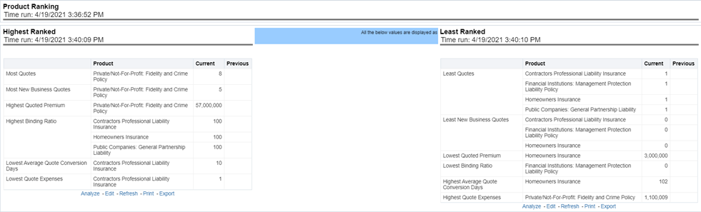
This is a tabular report where quotes are ranked by Lines of businesses through various performance parameters like the number of quotes, quoted premium, conversion days, expenses, and so on. This report lists the best and least performers.
Figure 111: Product Ranking
The Region tab includes reports represented in tabular and map format that summarizes results for geographical regions. The filters for this tab allow the report results to be focused on selected combinations for geographical comparison. The filters include:
· Time
· Company
· Lines of business
· Product
· Geography
The various reports available under this tab are detailed in the following sections.
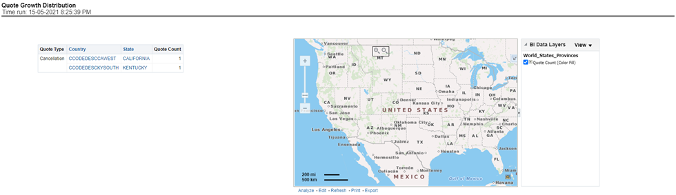
This is a geographic heat map that illustrates the count of quotes over geographic regions with areas of similar amounts colored similarly.
Figure 112: Quote Growth Distribution
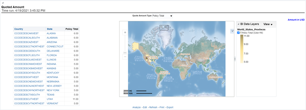
This is a geographic heat map that illustrates the quoted amount over geographic regions with areas of similar amounts colored similarly. The following quoted amount type can be viewed by selecting the specific types from the quoted amount type selection field:
· Policy Total
· Written Fee
· Written Taxes
· Written Premium
Figure 113: Quoted Amount
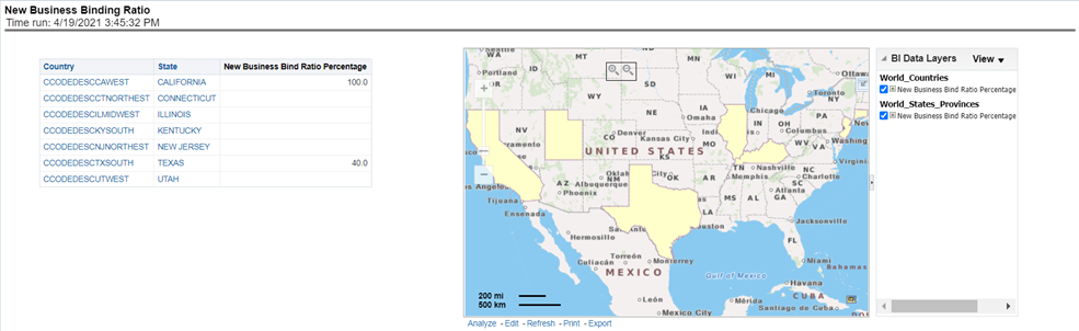
This is a geographic heat map that shows the new business quote to bind ratio performance over geographic regions with areas of similar areas colored similarly.
Figure 114: New Business Binding Ratio
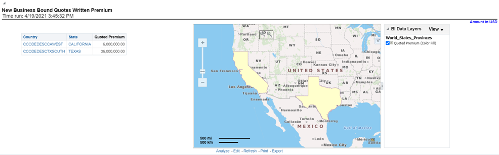
This is a geographic heat map that illustrates the new business performance in terms of the written premium over geographic regions with areas of similar areas colored similarly.
Figure 115: New Business Bound Quotes Written Premium
This is a geographic heat map that summarizes the ratio of policies where an endorsement quote was generated and remained in force until policy expiration and the policies where an endorsement quote was generated and the policy was later canceled. The ratios are distributed over geographic regions with areas of similar areas colored similarly.
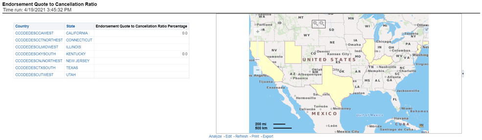
Figure 116: Endorsement Quote to Cancellation Ratio
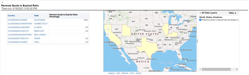
This is a geographic heat map that summarizes the ratio of policies where a renewal quote was generated and the policy renewed and the policies where a renewal quote was generated and the policy later expired. The ratios are distributed over geographic regions with areas of similar areas colored similarly.
Figure 117: Renewal Quote to Expired Ratio
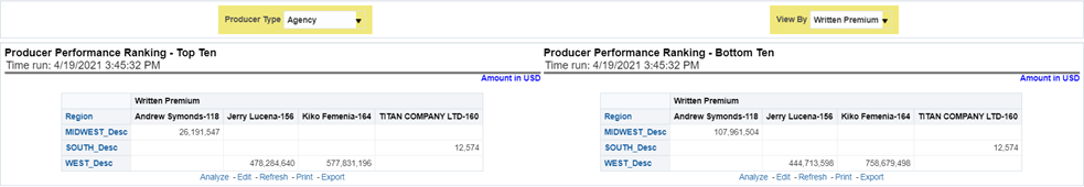
This tabular report displays the top 10 and bottom 10 in performance based on the following View By options:
· Written Premium
· Average Written Premium
· Bind Ratio
· Policy Count
· Quote Count
· Attrition Ratio
· Claim Count
· Loss Ratio Excluding ULAE
· Loss Payments
The performance is based on each region producer's performance in the region for the selected view. The table can be populated based on the View options, Producing Agent or Producing Agency.
Figure 118: Producer Performance Ranking
The Producer Performance tab focuses on the results of the Producing Agents and Producing Agencies. The filters for this tab allow the report results to be focused on selected combinations for comparison or more targeted analysis. The filters include:
· Time
· Company
· Lines of business
· Product
· Geography
The various reports available under this tab are detailed in the following sections.
This tabular report displays the top 10 and bottom 10 in performance based on the following View By options:
· Written Premium
· Average Written Premium
· Bind Ratio
· Policy Count
· Quote Count
· Attrition Ratio
· Claim Count
· Loss Ratio Excluding ULAE
· Loss Payments
The View determines whether Producing Agent or Producing Agency is illustrated in the tabular report.
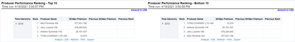
Figure 119: Producer Performance Ranking – Top 10 and Bottom 10
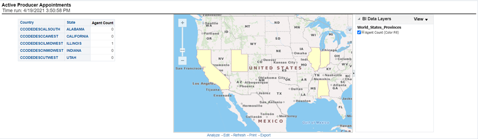
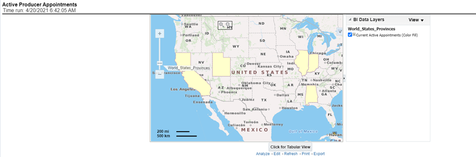
This map plots the count of agents or agencies with active appointments to write new business. The agent or agency address is the basis for the location of the agent.
Figure 120: Active Producer Appointments
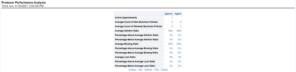
This tabular report provides a summary of Key Performance Metrics for the agents and agencies and averages the results for each of the respective classifications. This provides the basis for comparison when looking at individual producer performances.
Figure 121: Producer Performance Analysis
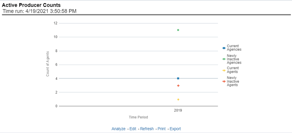
This line graph illustrates the different segmentations of agents with active agent appointments over time. Each segment line represents the count of agents that have an active appointment to write business at that point in time.
Figure 122: Active Producer Counts
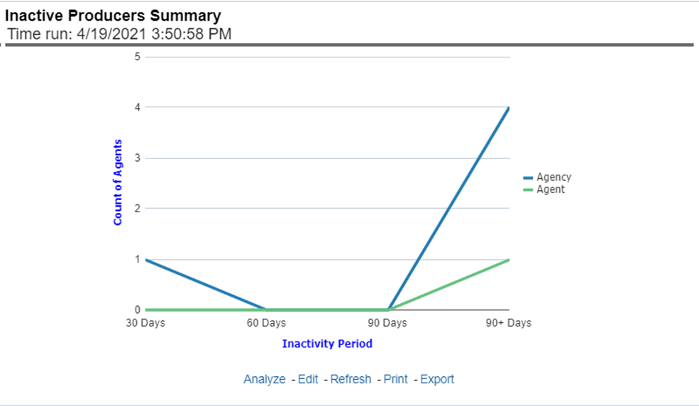
This line graph illustrates the count of agents or agencies over time that have not written a new business policy within either 30, 60, or 90 days since the reporting period start date. These producers have current appointments but are not currently placing new policies with the organization.
Figure 123: Inactive Producers Summary
This tabular report illustrates the performance in key performance areas. The results are populated based on the values selected in the agency and producing agent filters. This allows multiple columns to present for multiple view selections.
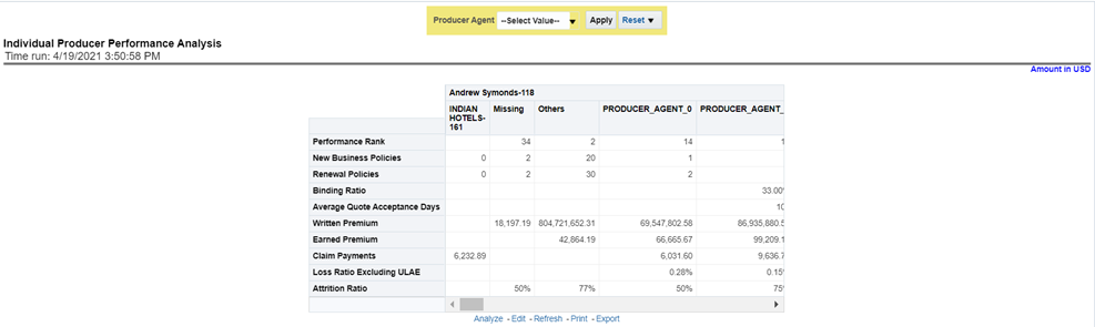
Figure 124: Individual Producer Performance Analysis
This chapter explains the report available under each tab in the Policy Performance Dashboard.
The following tabs are present in the policy performance dashboard:
· Summary
· Product
· Region
· Producer
The following screenshots display the essential nature of the available reports as per each tab:
Figure 125: Policy Performance Tabs

The Summary tab includes information for lines of businesses at the corporate level. The information contained in the reports generated summarizes how the entire organization is performing for all the lines of businesses. Following are the filters available for this tab.
· Time
· Company
· Geography
· Lines of business
The various reports available under this tab are detailed in the following sections.
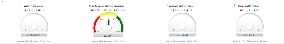
This report shows snapshots of key performance indicators represented through flash boxes for the current period.
Figure 126: Key Policy Performance Indicators Flash

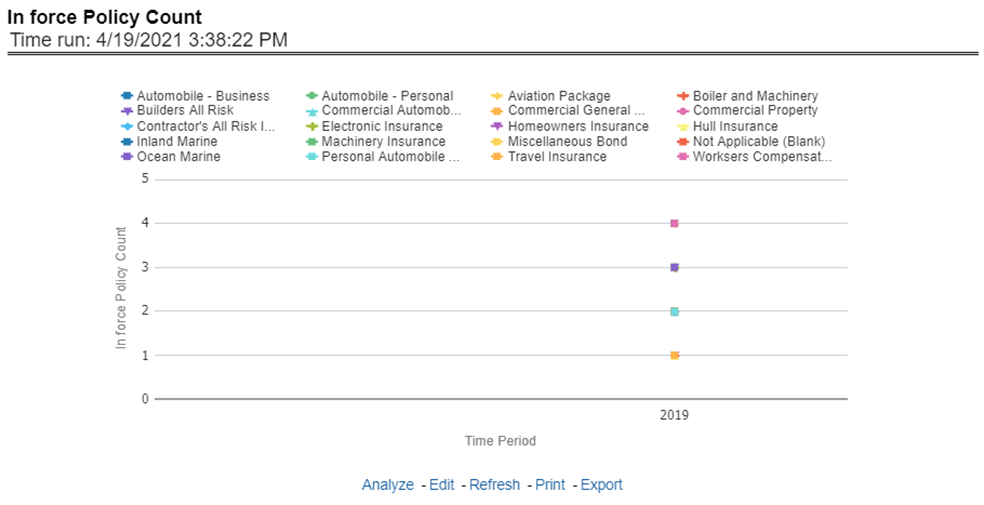
This report shows active in-force policy counts across all lines of businesses and underlying products through a time series. This report can be viewed over various periods, company, geography, and lines of business selected from page-level prompts.
Figure 127: In-force Policy Count
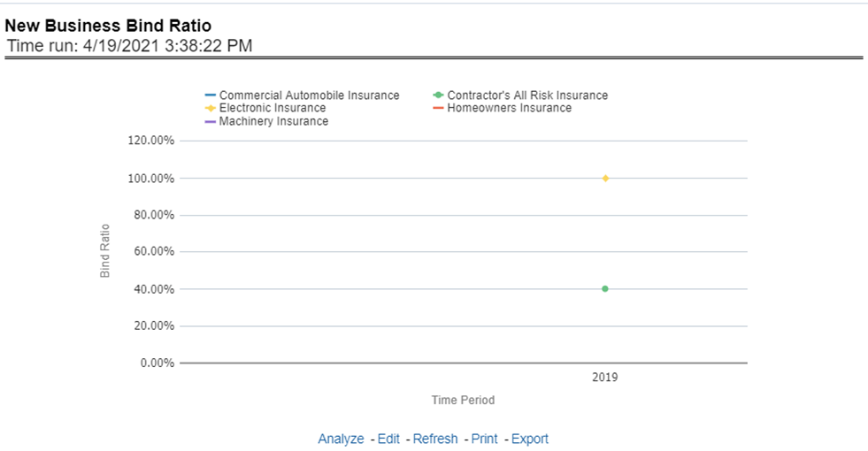
This report shows a new business quote to bind ratio performance across lines of business through a time series. This report can be viewed over various periods, company, geography, and lines of business selected from page-level prompts.
Figure 128: New Business Bind Ratio
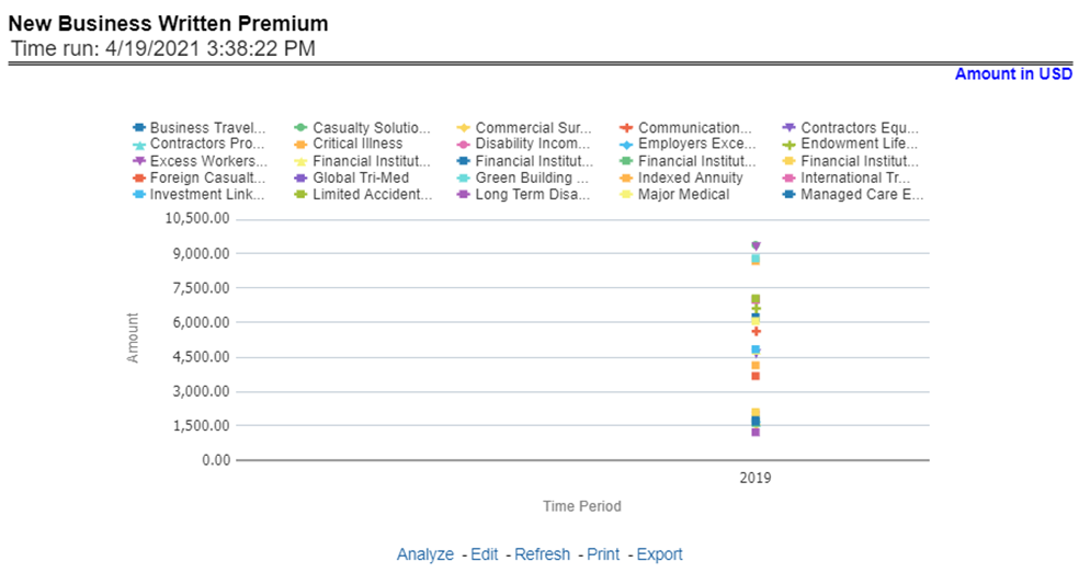
This report shows new business performance in terms of written premium across all lines of business and underlying products through a time series. This report can be viewed over various periods, company, geography, and lines of business selected from page-level prompts.
Figure 129: New Business Written Premium
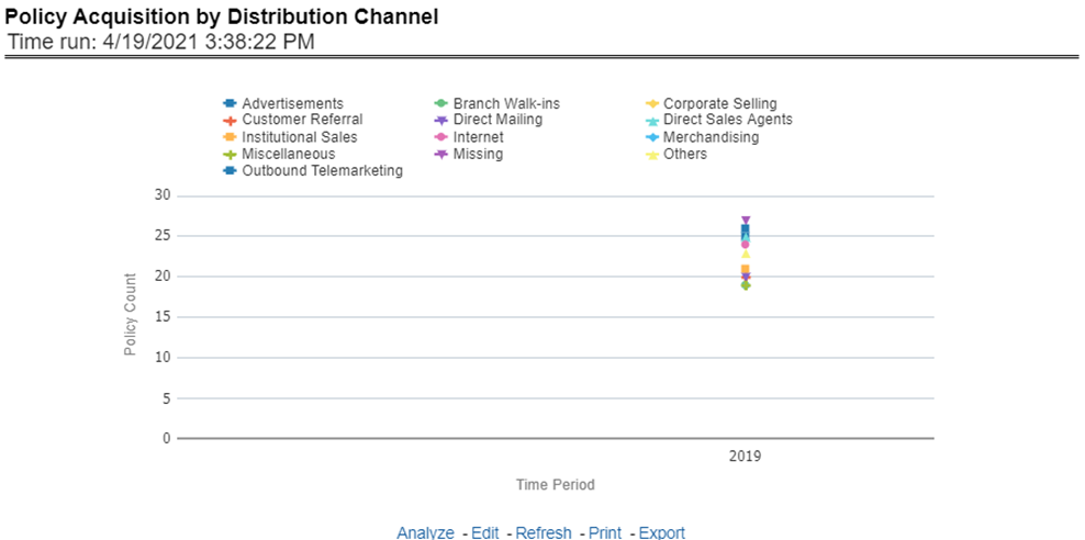
This report shows policy performance in terms of new business acquisition through different distribution channels through a time series. This report can be viewed over various periods, company, geography, and lines of business selected from page-level prompts.
Figure 130: Policy Acquisition by Distribution Channel
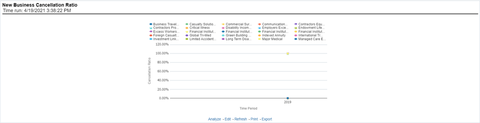
This report shows policy performance in terms of loss of new business through cancellation over a time series. This report can be viewed over various periods, company, geography, and lines of business selected from page-level prompts.
Figure 131: New Business Cancellation Ratio
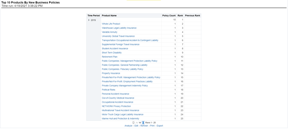
This report shows policy performance by ranking top selling ten products acquiring new business policies. This report shows policy counts and can be analyzed by report level filters, product name, and product category. This report can be viewed over various periods, company, geography, and lines of business selected from page-level prompts.
Figure 132: Top 10 Products by New Business Policies
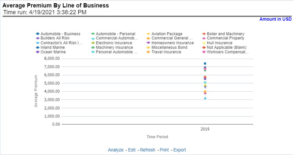
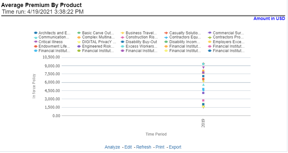
This report shows policy performance in terms of the average premium generated by lines of business through a time series. This report can be viewed over various periods, company, geography, and lines of business selected from page-level prompts.
Figure 133: Average Premium by Lines of Business
This report shows policy performance in terms of the average premium generated by-products through a time series. This report can be viewed over various periods, company, geography, and lines of business selected from page-level prompts.
Figure 134: Average Premium by Product
The Key Fact tab includes Key Performance Indicator Reports for lines of businesses at the corporate level. The filters for this tab allow the report results to be focused on selected combinations for comparison and targeted analysis. The filters include:
· Time
· Company
· Geography
· Lines of business
The various reports available under this tab are detailed in the following sections.
This report shows snapshots of current key performance areas against a target.
Figure 135: Key Policy Performance Indicators
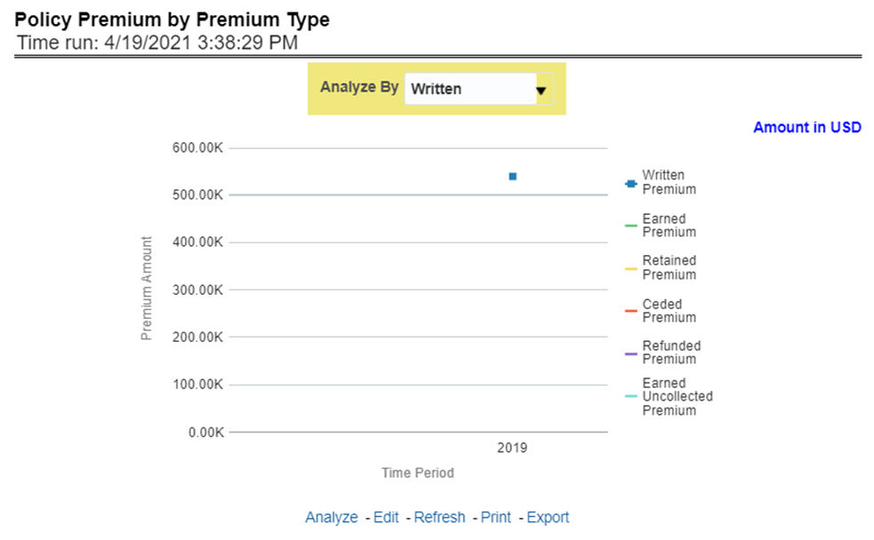
This report shows business revenue in terms of premium generated through different premium types over a time series. Various types of premium options such as written, earned, ceded, retained, earned uncollected, and refunded are available as report-level filters. This report can be viewed over various periods, company, geography, and lines of business selected from page-level prompts.
Figure 136: Policy Premium by Premium Type
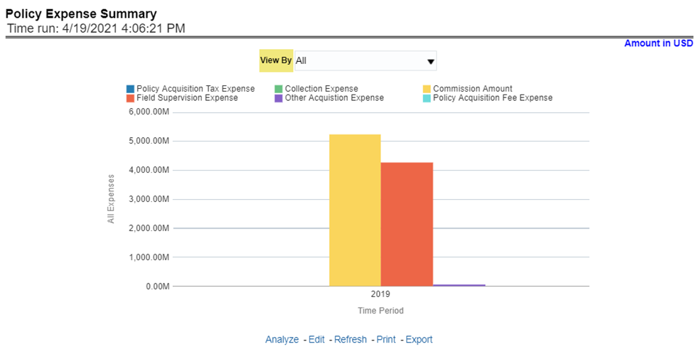
This report shows different policy-related expenses incurred over the period. The report can be analyzed by report level filters for different expense types. This report can be viewed over various periods, company, geography, and lines of business selected from page-level prompts.
Figure 137: Policy Expense Summary
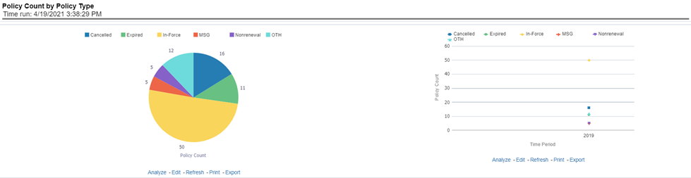
This report shows the count of policies through different policy types, that is, active in-force, reissue, rewritten, canceled, and non-renewed policies through a time series. This report can be viewed over various periods, company, geography, and lines of business selected from page-level prompts. The pie chart shows policy count by current in-time values whereas the line graph represents the values through a time series.
Figure 138: Policy Count by Policy Type
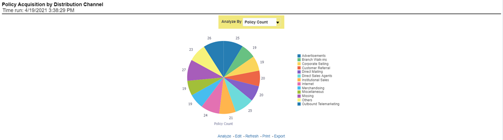
This report shows the percentage of policies acquired through different sales and distribution channels maintained by the company and can be analyzed by report level filters, policy count, and premium amount. This report can be viewed over various periods, company, geography, and lines of business selected from page-level prompts.
Figure 139: Policy Acquisition by Distribution Channel
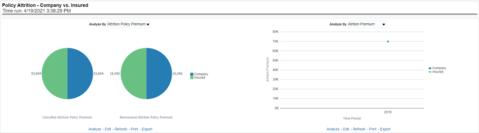
This report shows a loss of business through policy attrition through a time series. Attrition analysis can be done by percentage between company initiated and insured initiated attrition through the attrition types such as cancellation, non-renewal, and expiry, as well as attrition policy premium amount and attrition policy count. This report can be viewed over various periods, company, geography, and lines of business selected from page-level prompts. The pie chart shows policy count by current in-time values whereas the line graph represents the values through a time series.
Figure 140: Policy Attrition - Company versus Insured
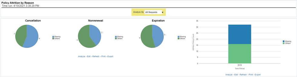
This report shows policy attrition occurred due to various attrition reasons. Attrition reason analysis can be done by percentage between company initiated and insured initiated attrition through the attrition types such as cancellation, non-renewal, and expiry as well by attrition reasons. This report can be viewed over various periods, company, geography, and lines of business selected from page-level prompts. The pie chart shows policy count by current in-time values whereas the line graph represents the values through a time series.
Figure 141: Policy Attrition by Reason
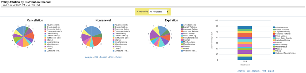
This report shows policy attrition by various distribution channels. Attrition analysis can be done by percentage between company initiated and insured initiated attrition through the attrition types such as cancellation, non-renewal, and expiry as well by distribution channels. This report can be viewed over various periods, company, geography, and lines of business selected from page-level prompts. The pie chart shows policy count by current in-time values whereas the line graph represents the values through a time series.
Figure 142: Policy Attrition By Distribution Channel
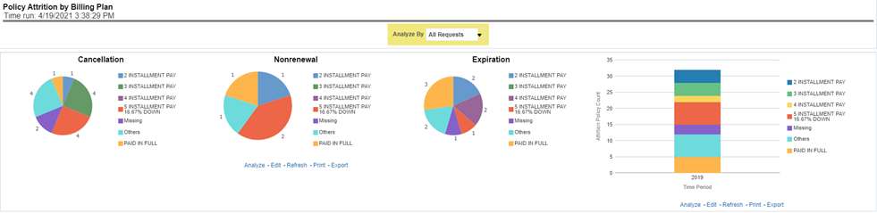
This report shows policy attrition by various distribution channels. Attrition analysis can be done by percentage between company initiated and insured initiated attrition through the attrition types such as cancellation, non-renewal, and expiry as well by billing plan type. This report can be viewed over various periods, company, geography, and lines of business selected from page-level prompts. The pie chart shows policy count by current in-time values whereas the line graph represents the values through a time series.
Figure 143: Policy Attrition By Billing Plan
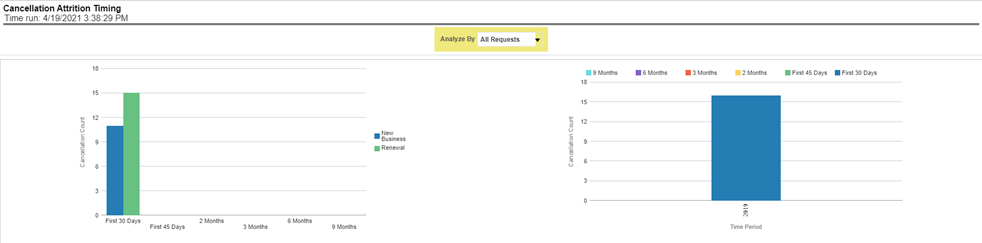
This report shows policy attrition by cancellation timings. Attrition analysis can be done by percentage between company initiated and insured initiated attrition through the attrition types such as cancellation, non-renewal, and expiry as well by cancellation attrition periods, for example, "First 30 days" and "First 45 days". This report can be viewed over various periods, company, geography, and lines of business selected from page-level prompts. The pie chart shows policy count by current in-time values whereas the line graph represents the values through a time series.
Figure 144: Cancellation Attrition Timing
The Lines of business tab includes reports that focus on the Key Performance Indicators for each Line of business. The filters for this tab allow the report results to be focused on selected lines of business for comparison and targeted analysis. The filters include:
· Time
· Company
· Geography
· Lines of business
The various reports available under this tab are detailed in the following sections.
This report shows snapshots of current key performance areas against the target.
Figure 145: Key Lines of Business Performance Indicators Flash
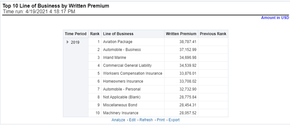
This report ranks the top ten lines of business in terms of written premium and their previous ranking. This report can be viewed over various periods, company, geography, and lines of business selected from page-level prompts.
Figure 146: Top 10 Lines of Business by Written Premium
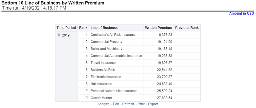
This report ranks the lowest-performing bottom ten lines of business in terms of written premium and their previous ranking. This report can be viewed over various periods, company, geography, and lines of business selected from page-level prompts.
Figure 147: Bottom 10 Lines of business by Written Premium
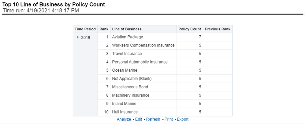
This report ranks the best performing top ten lines of business in terms of policy counts and their previous ranking. This report can be viewed over various periods, company, geography, and lines of business selected from page-level prompts.
Figure 148: Top 10 Lines of Business by Policy Count
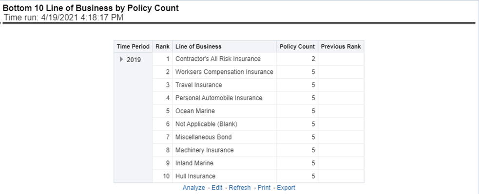
This report ranks the lowest-performing bottom ten lines of business in terms of policy counts and their previous ranking. This report can be viewed over various periods, company, geography, and lines of business selected from page-level prompts.
Figure 149: Bottom 10 Lines of Business by Policy Count
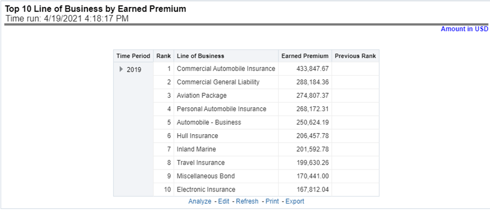
This report ranks best performing top ten lines of business in terms of earned premium and their previous ranking. This report can be viewed over various periods, company, geography, and lines of business selected from page-level prompts.
Figure 150: Top 10 Lines of Business by Earned Premium
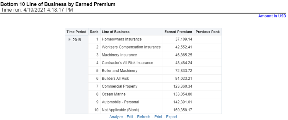
This report ranks the lowest-performing bottom ten lines of business in terms of earned premium and their previous ranking. This report can be viewed over various periods, company, geography, and lines of business selected from page-level prompts.
Figure 151: Bottom 10 Lines of Business by Earned Premium
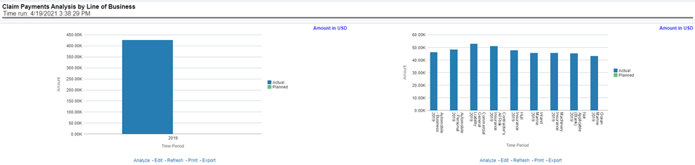
This report shows claim payments by lines of business through a comparison between actual and planned values. This report can be viewed over various periods, company, geography, and lines of business selected from page-level prompts. The pie chart shows policy count by current in-time values whereas the line graph represents the values through a time series.
Figure 152: Claim Payment Analysis by Lines of Business
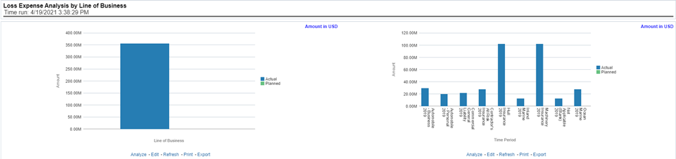
This report shows loss expenses by lines of business through a comparison between actual and planned values. This report can be viewed over various periods, company, geography, and lines of business selected from page-level prompts. The pie chart shows policy count by current in-time values whereas the line graph represents the values through a time series.
Figure 153: Loss Expense Analysis by Lines of Business
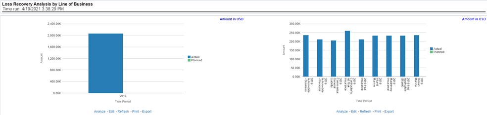
This report shows loss recovery by lines of business through a comparison between actual and planned values. This report can be viewed over various periods, company, geography, and lines of business selected from page-level prompts. The pie chart shows policy count by current in-time values whereas the line graph represents the values through a time series.
Figure 154: Loss Recovery Analysis by Lines of Business
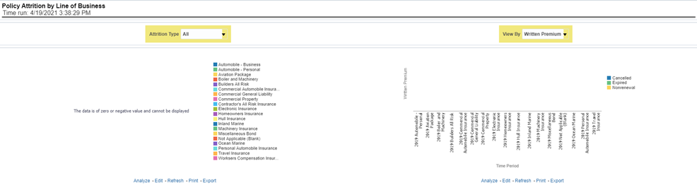
This report shows policy attritions by lines of business. This report can be viewed for current performance by different attrition types such as cancellation, expiry, and non-renewals. This report can also be analyzed both in terms of lost policy counts and lost written premium. This report can be viewed over various periods, company, geography, and lines of business selected from page-level prompts. The pie chart shows policy counts by current in-time values wherein the line graph represents the values through a time series.
Figure 155: Policy Attrition by Lines of Business
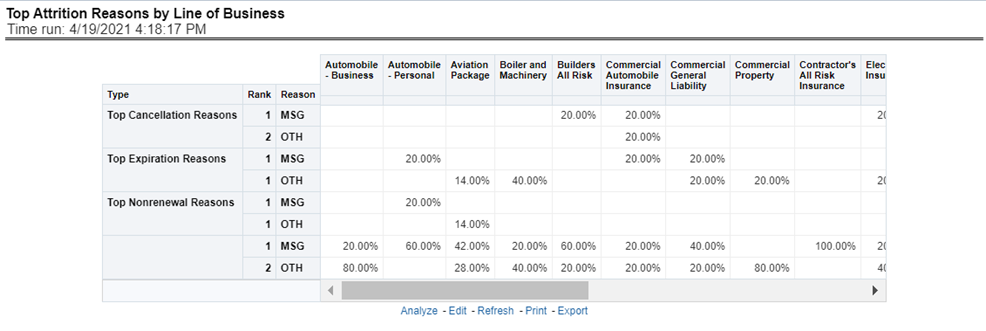
This report analyzes policy attrition reasons and ranks them by each attrition reason and by lines of business.
Figure 156: Top Attrition Reasons by Lines of Business
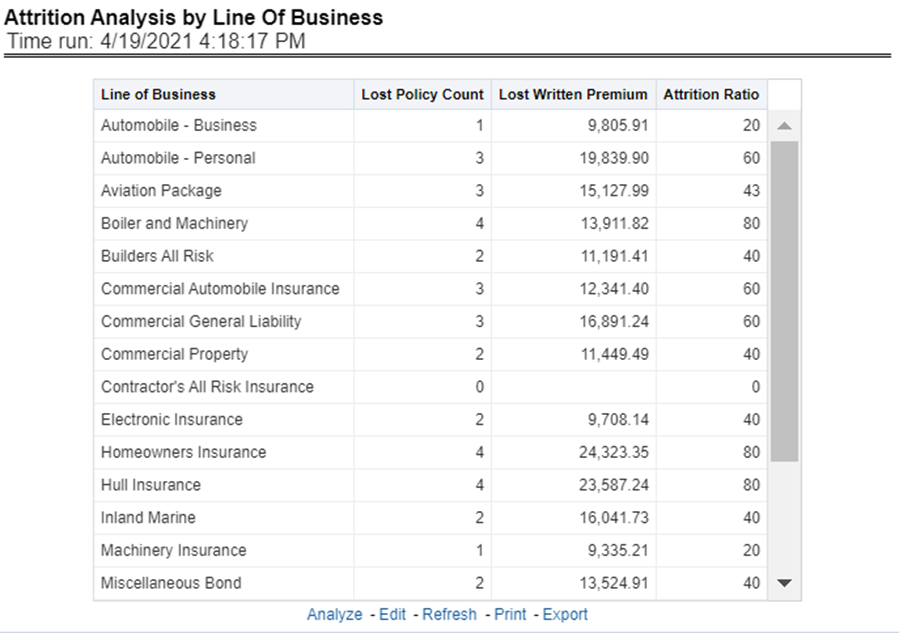
This report analyzes policy attrition reasons by lines of business and shows attritions through the three key parameters such as lost policy count, lost premium count, and attrition ratio.
Figure 157: Attrition Analysis by Lines of Business
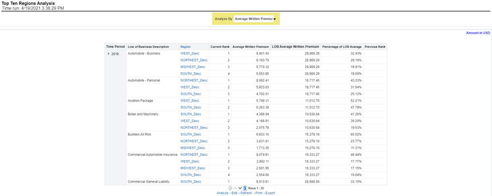
This report analyzes policy business at a regional level and displays top-performing Lines of business and regions. The lines of business and region-wise ranking can be further analyzed through the following performance indicators:
· Written Premium
· Average Written Premium
· Bind Ratio
· Policy Count
· Quote Count
· Attrition Ratio
· Loss Ratio
Figure 158: Top Ten Regions Analysis
The Product tab includes reports that focus on the Key Performance Indicators for each Product. The filters for this tab allow the report results to be focused on selected products for comparison and targeted analysis. The filters include:
· Time
· Company
· Geography
· Lines of business
The various reports available under this tab are detailed in the following sections.
This report shows snapshots of current key performance areas against the target.
Figure 159: Key Product Performance Indicators Flash
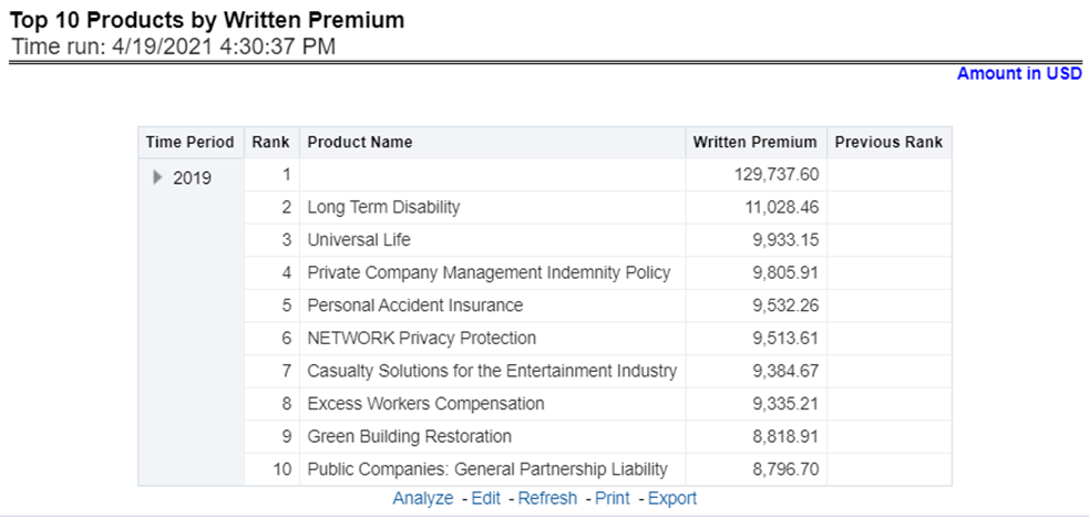
This report ranks the top ten products in terms of written premium and their previous ranking. This report can be viewed over various periods, company, geography products, and lines of business selected from page-level prompts.
Figure 160: Top 10 Products by Written Premium
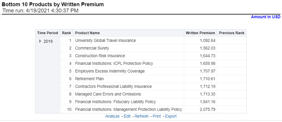
This report ranks the lowest-performing bottom ten products in terms of written premium and their previous ranking. This report can be viewed over various periods, company, geography, product, and lines of business selected from page-level prompts.
Figure 161: Bottom 10 Products by Written Premium
This report ranks the best performing top ten products in terms of policy counts and their previous ranking. This report can be viewed over various periods, company, geography, product, and lines of business selected from page-level prompts.
Figure 162: Top 10 Products by Policy Count
This report ranks the lowest-performing bottom ten products in terms of policy counts and their previous ranking. This report can be viewed over various periods, company, geography, products, and lines of business selected from page-level prompts.
Figure 163: Bottom 10 Products by Policy Count
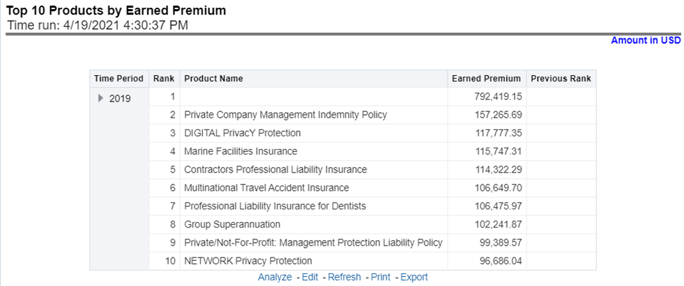
This report ranks the best performing top ten products in terms of earned premium and their previous ranking. This report can be viewed over various periods, company, geography, products, and lines of business selected from page-level prompts.
Figure 164: Top 10 Products by Earned Premium
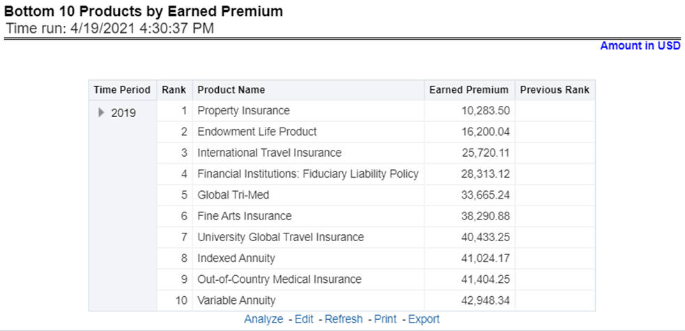
This report ranks the lowest-performing bottom ten products in terms of earned premium and their previous ranking. This report can be viewed over various periods, company, geography, products, and lines of business selected from page-level prompts.
Figure 165: Bottom 10 Products by Earned Premium
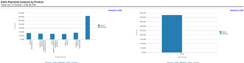
This report shows claim payments by-products through a comparison between actual and planned values. This report can be viewed over various periods, company, geography, product, and lines of business selected from page-level prompts. The pie chart shows policy count by current in-time values whereas the line graph represents the values through a time series.
Figure 166: Claim Payment Analysis by Product
This report shows the loss of expenses products through a comparison between actual and planned values. This report can be viewed over various periods, company, geography, products, and lines of business selected from page-level prompts. The pie chart shows policy count by current in-time values whereas the line graph represents the values through a time series.
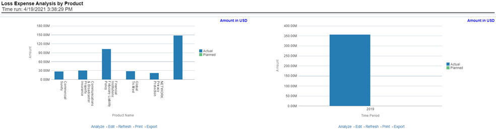
Figure 167: Loss Expense Analysis by Product
This report shows loss recovery by-products through a comparison between actual and planned values. This report can be viewed over various periods, company, geography, product, and lines of business selected from page-level prompts. The pie chart shows policy count by current in-time values whereas the line graph represents the values through a time series.
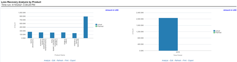
Figure 168: Loss Recovery Analysis by Products
This report shows policy attritions by Products. This report can be viewed for current performance by different attrition types like cancellation, expiry, and non-renewals. This report can also be analyzed both in terms of lost policy counts and lost written premium. This report can be viewed over various periods, company, geography, Product, and lines of business selected from page-level prompts. The pie chart shows policy counts by current in-time values wherein the line graph represents the values through a time series.
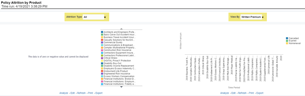
Figure 169: Policy Attrition by Product
This report analyzes policy attrition reasons and ranks them by each attrition reason and by lines of business.
Figure 170: Top Attrition Reasons by Product
This report analyzes policy attrition reasons by-products and shows attritions through the three key parameters lost policy count, lost premium count, and attrition ratio.
Figure 171: Attrition Analysis by Product
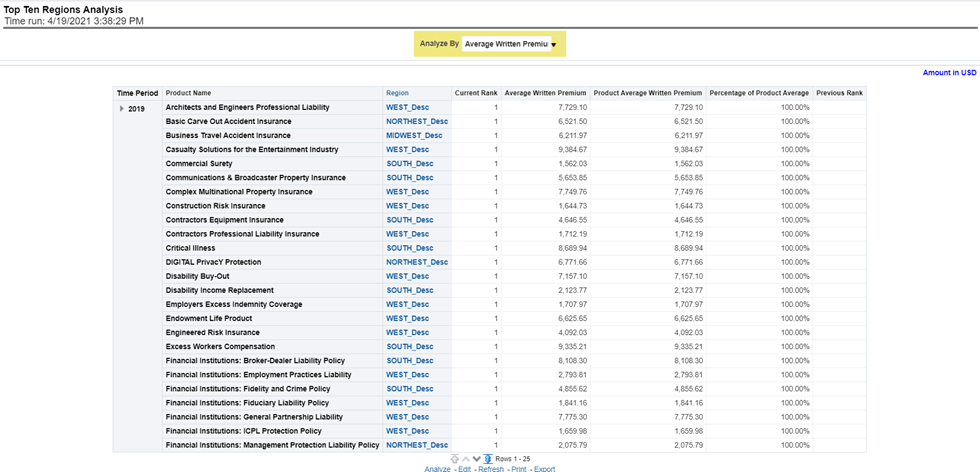
This report analyzes policy business at a regional level and displays top-performing Products and regions. The product and region wise ranking can be further analyzed through the following performance indicators:
· Written Premium
· Average Written Premium
· Bind Ratio
· Policy Count
· Quote Count
· Attrition Ratio
· Loss Ratio
Figure 172: Top Ten Regions Analysis
The Region tab includes reports represented in tabular and map format that summarizes results for geographical regions. The filters for this tab allow the report results to be focused on selected combinations for geographical comparison. The filters include:
· Time
· Company
· Geography
· Lines of business
· Product
The various reports available for this tab are discussed in the following sections.
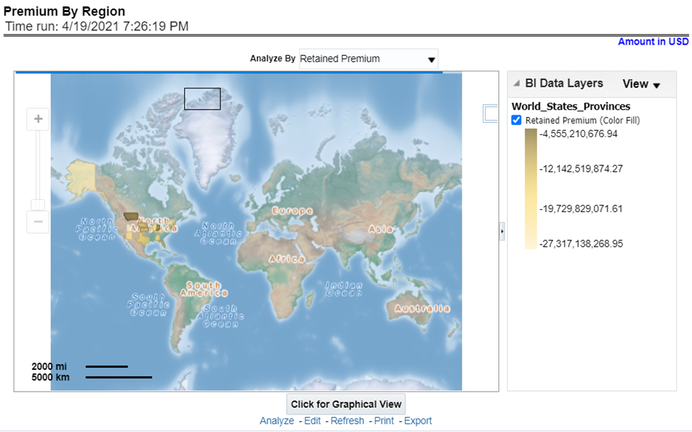
This report shows different types of premium revenue by various geographical regions. This report can be viewed over various periods, company, geography, product, and lines of business selected from the page-level prompts. This report shows premium income through the following premiums.
· Written premium
· Earned premium
· Ceded premium
· Retained premium
· Refund premium
· Uncollected earned premiums
Drill Down: The report Premium By Region can be further analyzed by regions, period, and premium types, for example, written premium, earned premium, ceded premium, retained premium, refund premium, and uncollected Earned Premium. Click any premium type to view the report in the drill-down mode.
Figure 173: Premium by Region
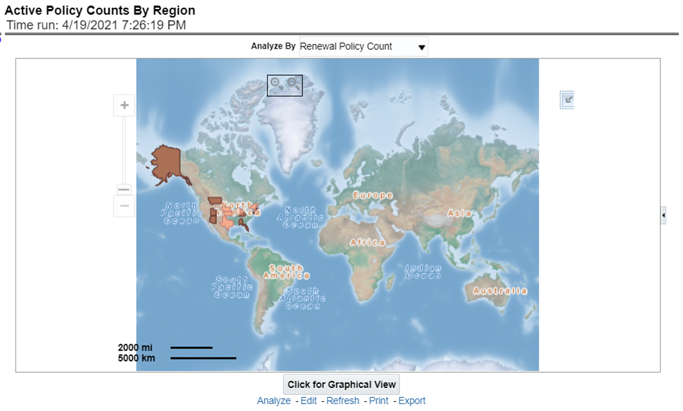
This report shows the count of policies written by different policy types, that is, total policy count, new business policy count, and renewal policy count. This report can be viewed over various periods, company, geography, product, and lines of business selected from the page-level prompts.
Drill Down: The report can be further analyzed by regions, period, and policy counts of different policy statuses, for example, policy count, new business policy count, and renewal policy count. Click any policy status to view the report in the drill-down mode.
Figure 174: Active Policy Counts By Region
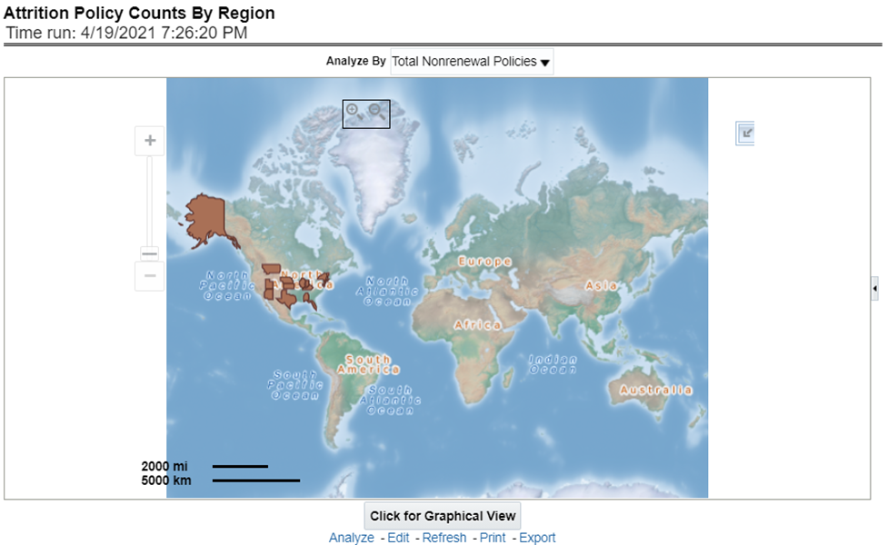
This report illustrates the count of attrition policies by different attrition types type, that is, canceled policy, expired, and non-renewal policies. This report can be viewed over various periods, company, geography, product, and lines of business selected from page-level prompts.
Drill Down: The report can be further analyzed by regions, period, and counts by different attrition policy types, for example, canceled, non-renewed, and expired policies. Click any attrition policy type to view the report in the drill-down mode.
Figure 175: Attrition Policy Counts By Region
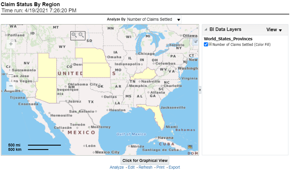
This report illustrates the count of claims by claims in a different status, for example, claims reported, claims settled, and claims in litigation. This report can be viewed over various periods, company, geography, product, and lines of business selected from page-level prompts.
Drill Down: The report can be further analyzed by regions, period, claim status, and counts, for example, Number of Claims Reported, Number of Claims Settled, and Litigation Claims. Click any claim status to view the report in the drill-down mode.
Figure 176: Claim Status By Region
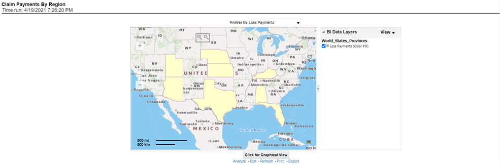
This report illustrates the claim payment like loss payments, catastrophic claim payments, and litigation claim payments through the geographical map and a drill through time series. This report can be viewed over various periods, company, geography, product, and lines of business selected from page-level prompts.
Drill Down: The report can be further analyzed by regions, period, and claims, for example, Number of loss payments, catastrophic claim payments, and litigation claim payments. Click any claim payment to view the report in the drill-down mode.
Figure 177: Claim Payments by Region
This report shows the ranking for the top ten best performing and least performing producers. This also shows the region-wise ranking.
Drill Down: This report can be further analyzed by clicking each region where top or bottom 10 producers are ranked for each region and their performance measurement for each ranked producer through the following performance key indicators:
· Policy Count
· Written Premium
· Bind Ratio
· Conversion Aging
· Claim Count
· Claims Payments
· Loss Ratio
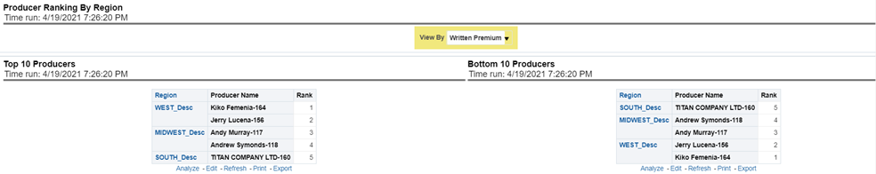
Figure 178: Producer Ranking By Region
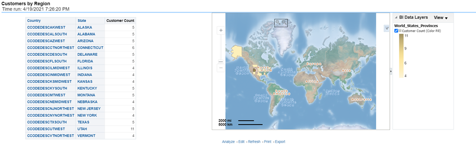
This report shows the customer by the region. This also shows the region-wise customers count.
Figure 179: Customers by Region
The Producer Performance tab focuses on the results of the Producing Agents and Producing Agencies. The filters for this tab allow the report results to be focused on selected combinations for comparison or more targeted analysis. The filters include:
· Time
· Company
· Geography
· Lines of business
· Product
· Producer
The various reports available for this tab are discussed in the following sections.
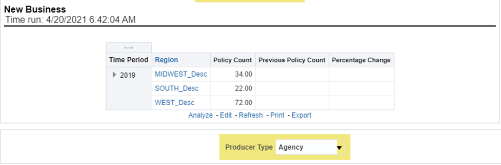
This is a tabular report where the status of a new business can be monitored through a new business in comparison with the business for the previous period for each region. This report can be viewed by policy count and written premium.
Figure 180: New Business
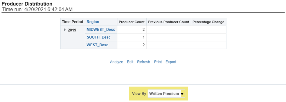
This is a tabular report where the count of producers can be monitored in comparison with the number of producers for the previous period for each region.
Figure 181: Producer Distribution
This is a tabular report where the top-performing producers are ranked through business measures generated by each of them in comparison with the previous period business measures and previous rank. This report also records the upward and downward movement of the producer's rank compared between current and previous ranking. This ranking can be viewed by the following business measures and each of these options can be selected from report level drop-down filters.
· Written Premium
· Bind Ratio
· Policy Count
· Attrition Ratio
· Claim Count
· Loss Ratio
· Loss Payments
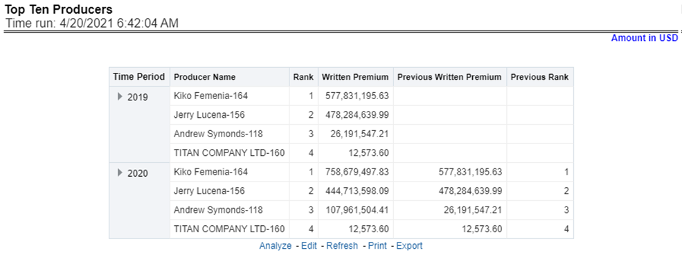
Figure 182: Top Ten Producers
This is a tabular report where the least performing producers are ranked through business measures generated by each of them in comparison with the previous period business measures and previous rank. This report also records the upward and downward movement of the producer's rank compared between current and previous ranking. This ranking can be viewed by the following business measures and each of these options can be selected from report level drop-down filters.
· Written Premium
· Bind Ratio
· Policy Count
· Attrition Ratio
· Claim Count
· Loss Ratio
· Loss Payments
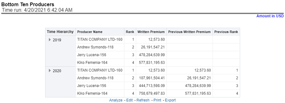
Figure 183: Bottom Ten Producers
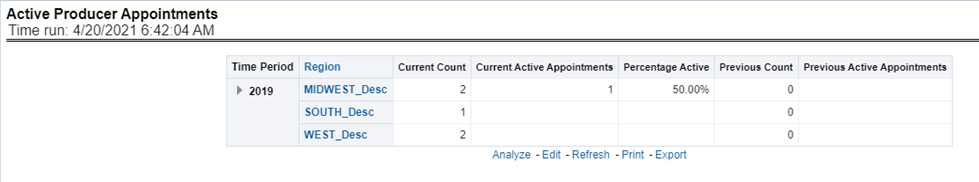
This tabular report records and shows the region-wise count for all producers, the number of producers with active appointments, the active percentage in comparison with previous counts, and previous period active appointments for each region.
Figure 184: Active Producer Appointments
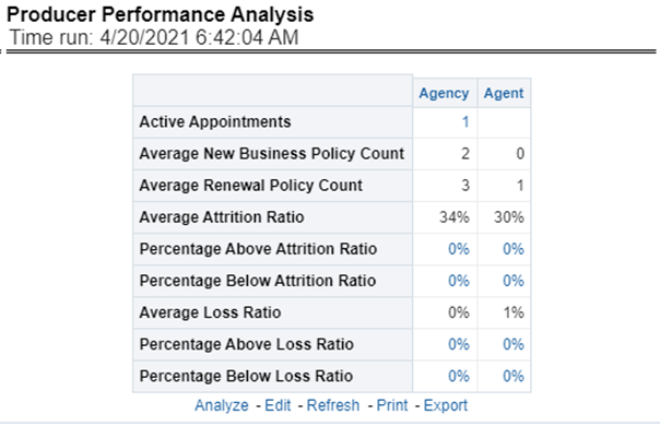
This tabular report shows the producers' performance through the following performance measures.
· Average New Business Policy Count
· Average Renewal Policy Count
· Average Attrition Ratio
· Percentage Above Average Attrition Ratio
· Percentage Below Average Attrition Ratio
· Average Loss Ratio
· Percentage Above Average Loss Ratio
· Percentage Below Average Loss Ratio
Drill Down: Each of the performance measures numbered from 4..8 can be further analyzed individually where a comparison is done between the current performance measure and previous business measure selected for further analysis.
Figure 185: Producer Performance Analysis
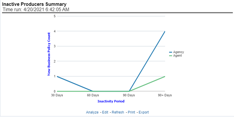
This line graph report illustrates the inactivity period in terms of days ranging from 30-90 days for agents and agencies.
Figure 186: Inactive Producer Summary
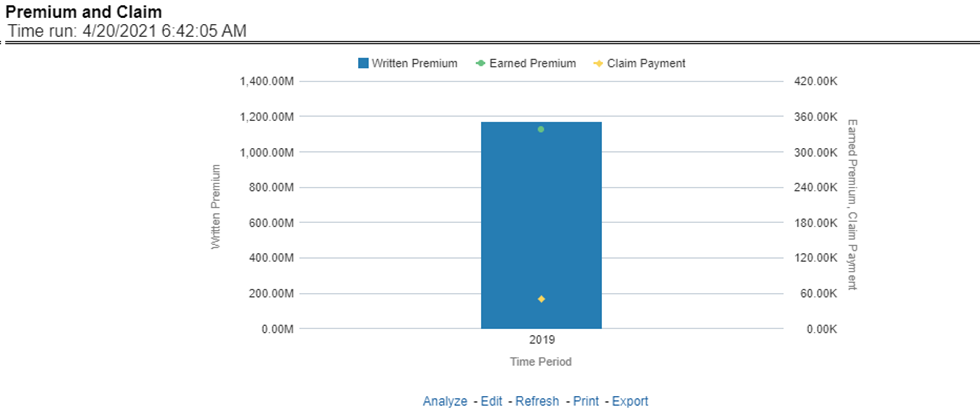
This report shows the business through premium revenue with regards to claims payments for the business over a time series. This report illustrates and shows the periodic analysis for written premium and earned premium revenue with claim payments made for the periods.
Figure 187: Premium and Claim
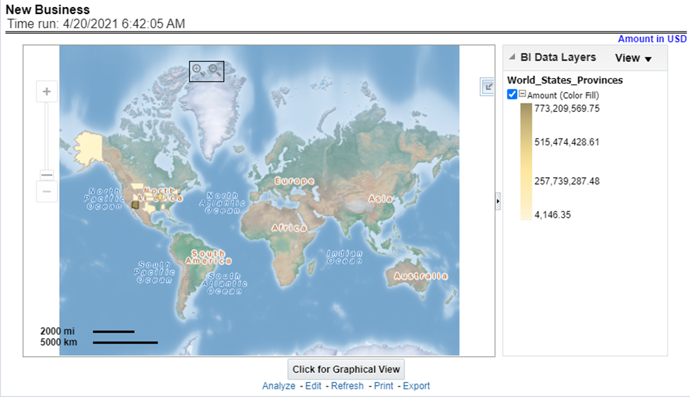
This is a map report where New Business volume is measured across regions. This report can be viewed over various periods, company, geography, product, and lines of business selected from page-level prompts.
Drill Down: The report can be further analyzed by Lines of business or Product-wise by clicking the Click for Graphical View button and the areas of the map.
Figure 188: New Business
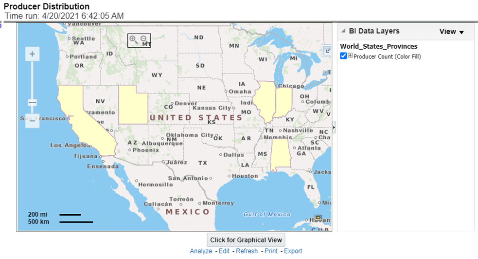
This is a map report where Producer Distribution is measured across regions. This report can be viewed over various periods, company, geography, product, and lines of business selected from page-level prompts.
Drill Down: The report can be further analyzed by Lines of business or Product-wise by clicking the Click for Graphical View Mode button and the areas of the map.
Figure 189: Producer Distribution
This is a map report where the active producer availability by appointment status (Active Status) is measured across regions. This report can be viewed over various periods, company, geography, product, and lines of business selected from page-level prompts.
Drill Down: The report can be further analyzed by Lines of business or Product-wise by clicking the Click for Tabular View button and the areas of the map.
Figure 190: Active Producer Appointments
This chapter explains the report available under each tab in the Claim Performance Dashboard.
The following tabs are present in the Claim Performance Dashboard.
· Summary
· Product
The following screenshots display the essential nature of the available reports as per each tab:
Figure 191: Claim Performance Tabs
The Summary tab includes information at the corporate level. The information contained in the reports generated summarizes how the entire organization is performing. The filters for this tab include:
· Time
· Company
· Catastrophe
· Geography
The various reports available for this tab are discussed in the following sections.
This report shows snapshots of key performance indicators represented through flash boxes for the current period.
Figure 192: Key Claim Performance Indicators Flash

Claim Expense is a line graph that displays the Claim Expense Ratio, the ratio of the amount of expenses to the total amount of the claim paid, at the point in time of the reporting period and over a time series. Each insurance company is represented by its own line.
Figure 193: Claim Expenses Ratio
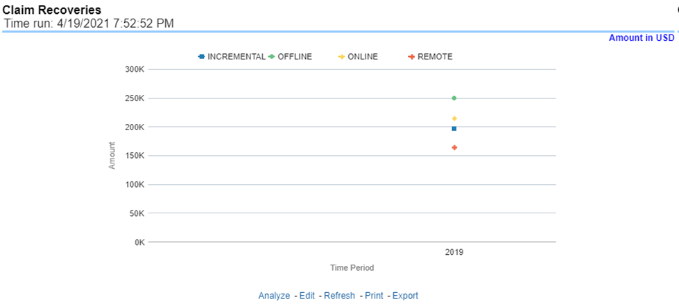
This is a line graph that displays the monetary amount of claim recovery payments received by a company at the point in time of the reporting period and over a time series. Each insurance company is represented by its own line.
Figure 194: Claim Recoveries
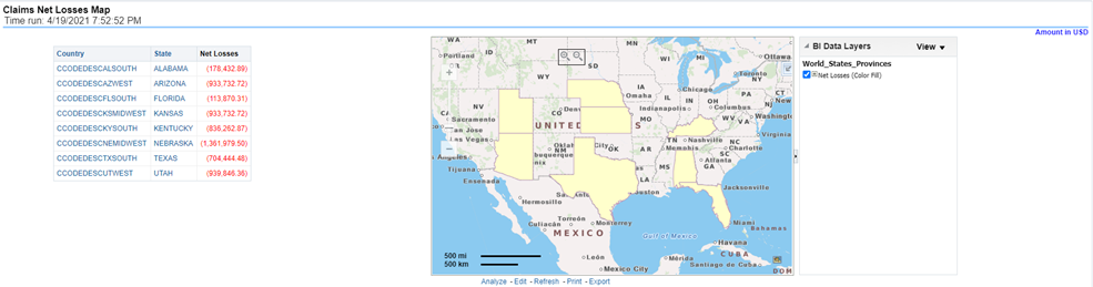
Claim Net Losses Map is a geographic heat map that illustrates the monetary amount of Net Losses, that is, paid Losses exclusive of Expenses, over geographic regions with areas of similar amounts colored similarly. The Location of Loss provides the basis for geographical mapping.
Figure 195: Claim Net Losses Map
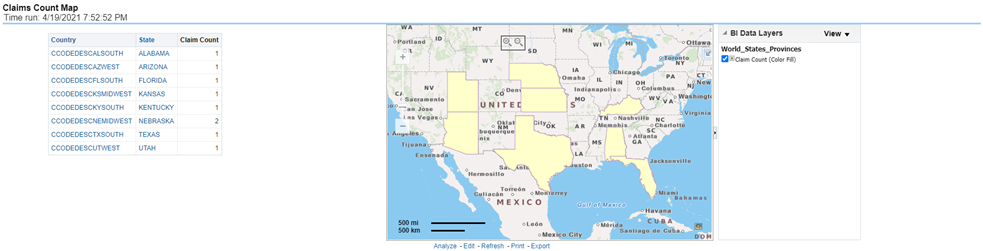
This is a geographic heat map that illustrates the count of claim occurrences over geographic regions with areas of similar amounts colored similarly. The Location of Loss provides the basis for geographical mapping.
Figure 196: Claim Count Map
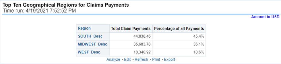
This is a table that ranks the geographical regions with the highest monetary amount total claim payments for a given reporting period. The percentage of all payments represents the amount of all claim payments generated during the same reporting period in comparison to those only for the given region.
Figure 197: Top Ten Geographical Regions for Claim Payments
This is a table that ranks the geographical regions with the highest claim counts for a given reporting period. The percentage of all occurrences represents the amount of all claim counts generated during the same reporting period in comparison to those only for the given region.
Figure 198: Top Ten Geographical Regions for Claims Reported

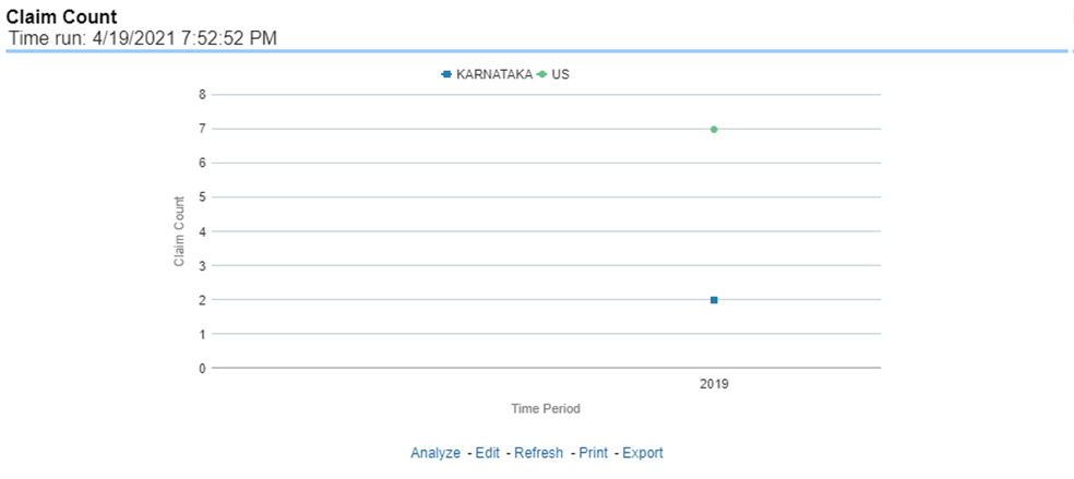
This report is a line graph that illustrates the count of claims added to the system over a time series and has a line for each Line of business.
Figure 199: Claim Count
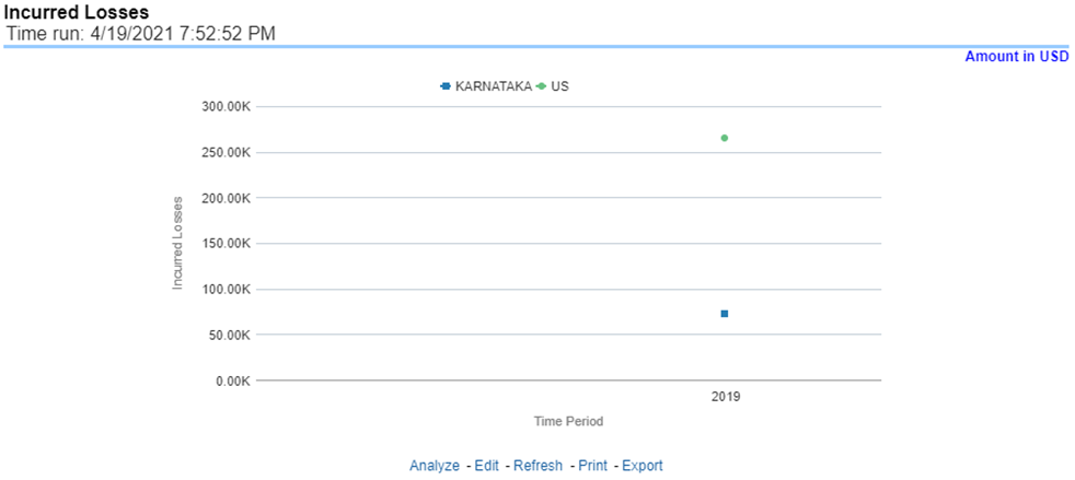
This represents the incurred losses, the total amount of paid claims, and loss reserves associated with a reporting period over a time series. This report is generated for the corporation as a whole and illustrates each Line of business with its own line.
Figure 200: Incurred Losses
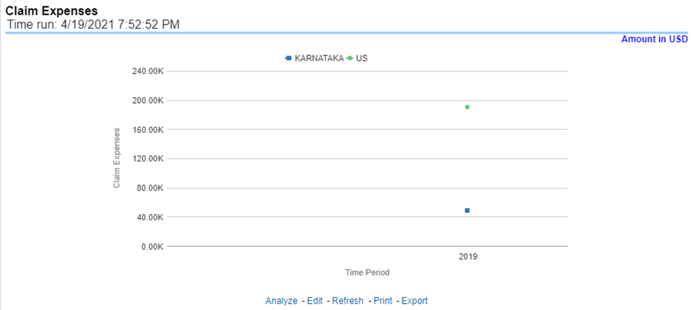
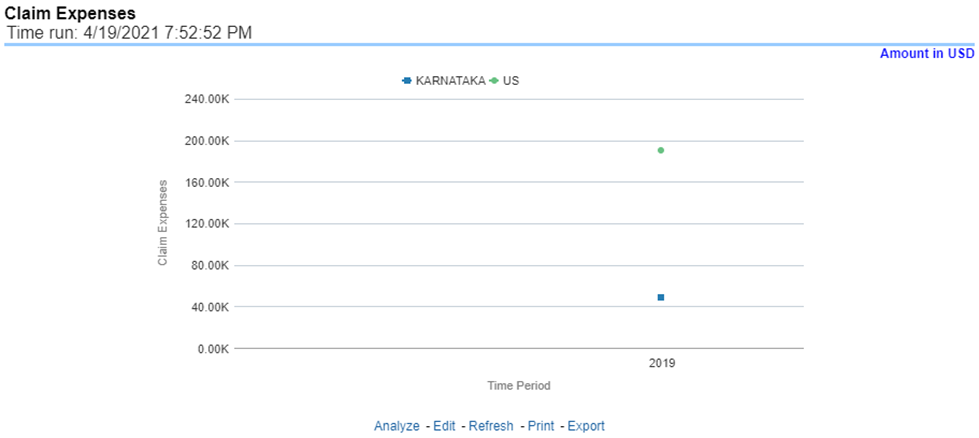
This report is a line graph that illustrates the monetary amount of claim expenses, payments made for services, and other non-loss-related costs, issued over a time series. Each insurance company is represented by its own line.
Figure 201: Claim Expenses
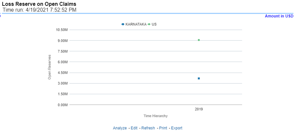
This is a line graph that displays the monetary amount in claim reserves at the point in time of the reporting period and over a time series. Each insurance company is represented by its own line.
Figure 202: Loss Reserve on Open Claims
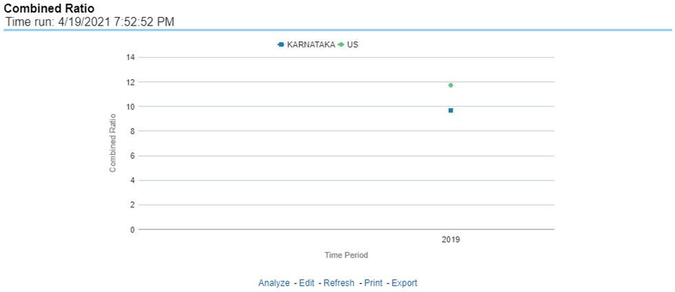
This report is a line graph that illustrates the Combined Ratio, that is, the sum of two ratios, one calculated by dividing incurred losses plus loss adjustment expense (LAE) by earned premiums, and the other calculated by dividing all other expenses by either earned premiums, over time. Each Insurance Company is represented by its own line.
Figure 203: Combined Ratio
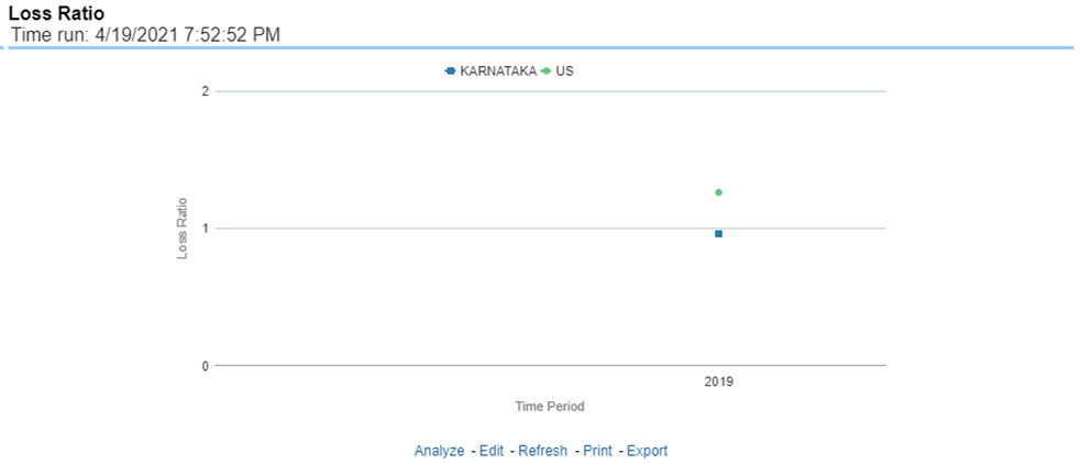
This report is a line graph that illustrates the Loss Ratio, the ratio of incurred losses to earned premiums, over a time series. In this report, each insurance company is represented by its own line.
Figure 204: Loss Ratio
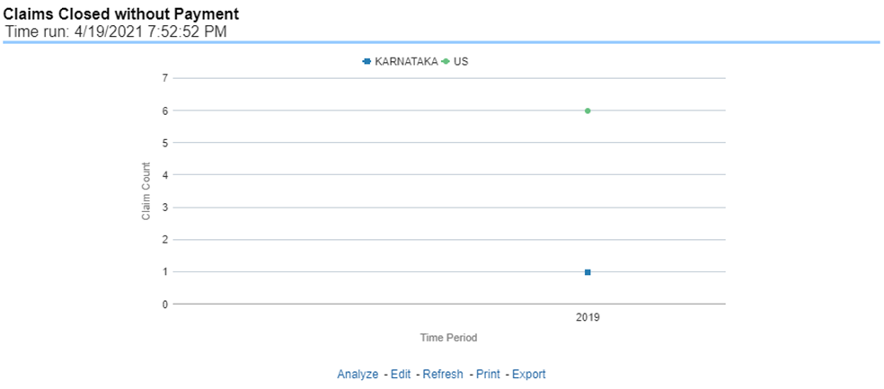
This report is a line graph that illustrates the count of claims that were closed during the reporting period without any loss payments generated for the claim.
Expenses may have been paid for these claims. Each insurance company is represented by its own line.
Figure 205: Claims Closed without Payment
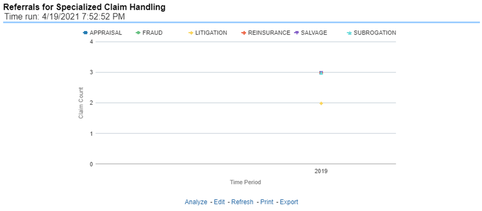
This report is a line graph that illustrates the count of claims that were referred for specialized handling during a reporting period and are shown over a time series. Each referral reason is represented by its own line.
Figure 206: Referrals for Specialized Claim Handling
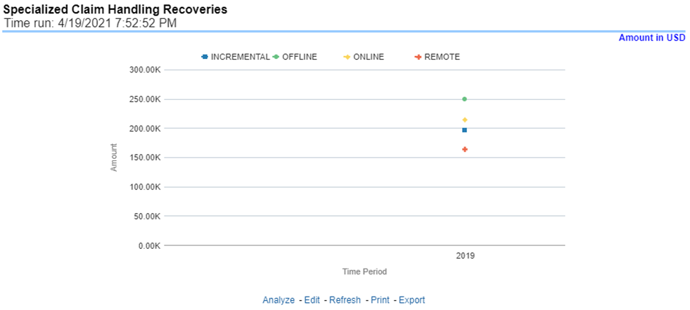
This report is a line graph that illustrates Claim Recovery Payments. Claim Recovery Payments is the monetary amount of payments received to reimburse the insurance company for payments it generated for losses and claims that were handled in a specialized manner. These manners include fraud investigation, litigation, subrogation, and so on. Each specialized claim handling method is represented by its own line and amounts are shown over a time series.
Figure 207: Specialized Claim Handling Recoveries
The Claim Handling tab includes information at the corporate level and focuses on the manner and quality by which the handling of a claim is measured. The filters for this tab include:
· Time
· Company
· Geography
The various reports available for this tab are discussed in the following sections.
This report is a line graph that illustrates the average number of days between the day a claim is opened in the system and the date that the status of the same claim is changed to "Closed". This average is shown over a time series for each insurance company.
Figure 208: Average Days until Closed
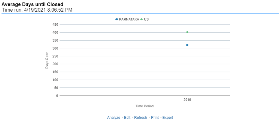
This report is a line graph that illustrates the count of claims that were closed during the reporting period without any loss payments generated for the claim.
Expenses may have been paid for these claims. Each Insurance Company is represented by its own line.
Figure 209: Closed Without Payment
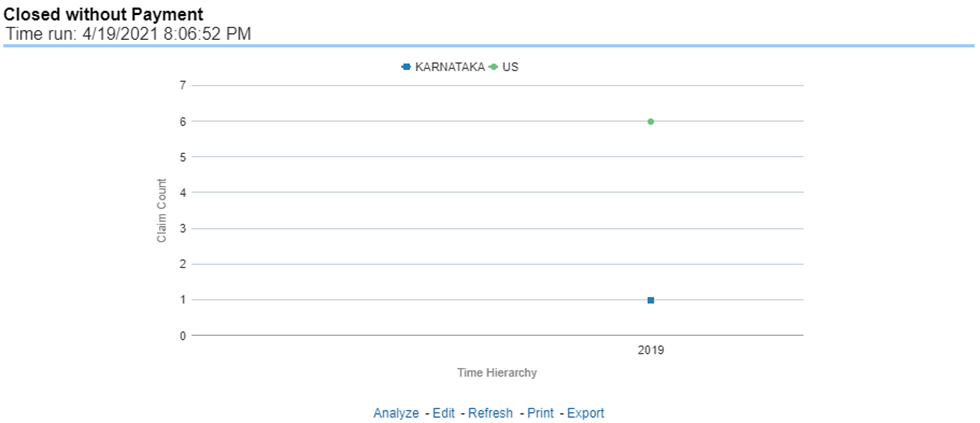
This report is a line graph that illustrates the count of claims that, after an investigation, were deemed to be fraudulent. In this report, the count is exhibited over a time series with each insurance company represented by its own line.
Figure 210: Claims Closed Due to Fraud
This report is a line graph that illustrates the count of claims that were changed back to an "Opened" status after it was previously closed. This report shows affected claims during the reporting periods over a time series with each insurance company represented with its own line.
Figure 211: Reopened Claims
This report is a line graph that displays the count of claims that resulted in a judicial litigation case being initiated. This shows the count of claims per Line of business where this process occurred over time.
Figure 212: Litigation Claims
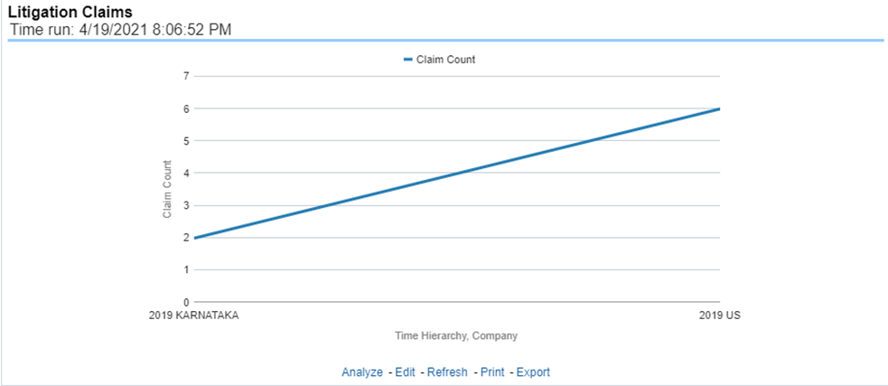
This report is a line graph that represents the count of claims where subrogation, a process by which a payment arrangement has been agreed where a non-insured at-fault party agrees to reimburse the insurer for payments it made for damages an insured suffered due to the actions of the at-fault party, was initiated for the claim during the reporting period. This report illustrates the count of the affected claims over a time series with each insurance company being represented by its own line.
Figure 213: Subrogation Claims
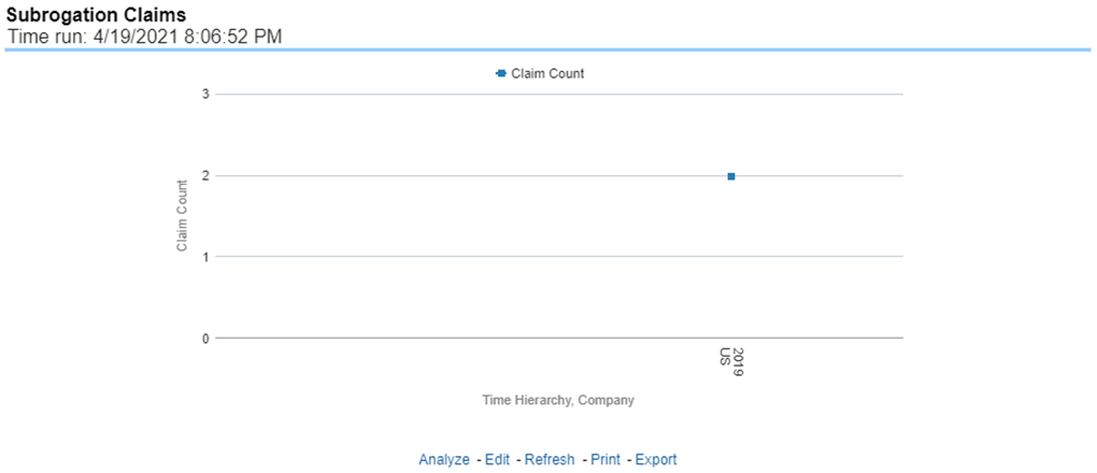
The Lines of business tab includes reports that focus on the Key Performance Indicators for each Line of business. The filters for this tab allow the report results to be focused on selected combinations for comparison and targeted analysis.
· Time
· Company
· Lines of business
· Geography
The various reports available under this tab are detailed in the following sections.
This is a tabular report that lists the Lines of Business in the order of greatest value to least value based on the Grade Basis selected. The information provided includes Key Performance Indicators for Claim Performance.
Figure 214: Claim Ranking by Lines of Business
This is a tabular report that provides a summary of the effects of a Catastrophe on the Claims Performance for the Lines of business. The total Claim Payments, Net Losses, and Claim Count are presented for each Line of business for each Catastrophic Event.
Figure 215: Catastrophe Claim by Lines of Business
This report is a line graph that illustrates the Loss Ratio, the ratio of incurred losses to earned premiums, over a time series. In this report, each Line of business is represented by its own line.
Figure 216: Lines of Business Loss Ratio
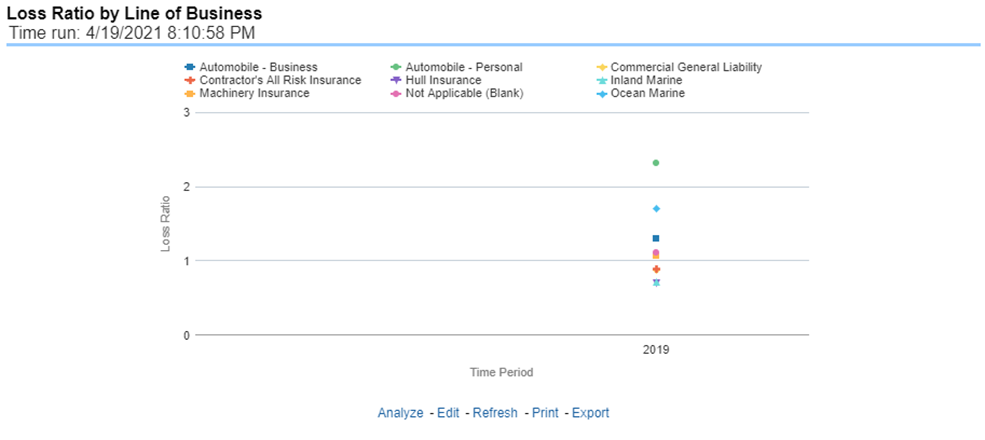
This report is a line graph that represents the Incurred Losses, total amount of paid claims, and loss reserves associated with a reporting period, over a time series. This also illustrates each Line of business with its own line.
Figure 217: Lines of Business Incurred Loss
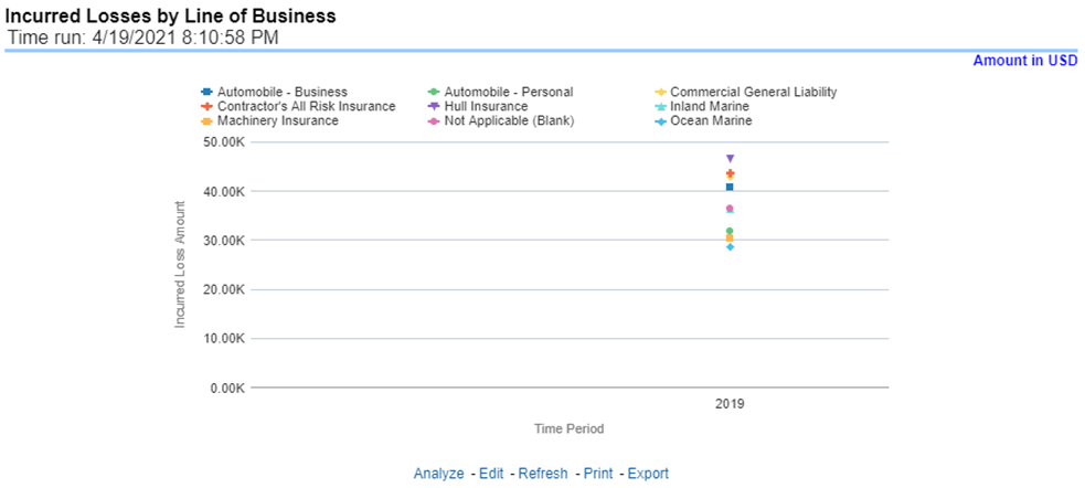
This report is a line graph that summarizes the monetary amount of payments that have been made for losses reported for each Line of business. The loss types can be further filtered to see the specific loss type details. Each Line of business is represented by its own line.
Figure 218: Claim Payments by Loss Type
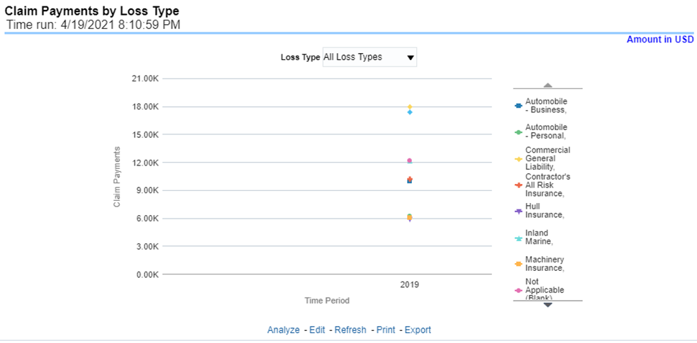
This report is a Bar/Line graph that illustrates the relationship between the amount of payments made by the insurer and those that were received by the reinsurers.
Figure 219: Payments by Reinsurance Company
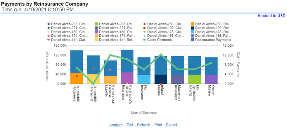
This report is a line graph that illustrates the monetary payment totals generated for Expenses on claims based on the cause of the loss. Each Expense amount is categorized by Lines of business and type of Loss. Additional Details can be reviewed by selecting a specific Loss Type from the Loss Type selection field.
Figure 220: Expenses by Loss Type
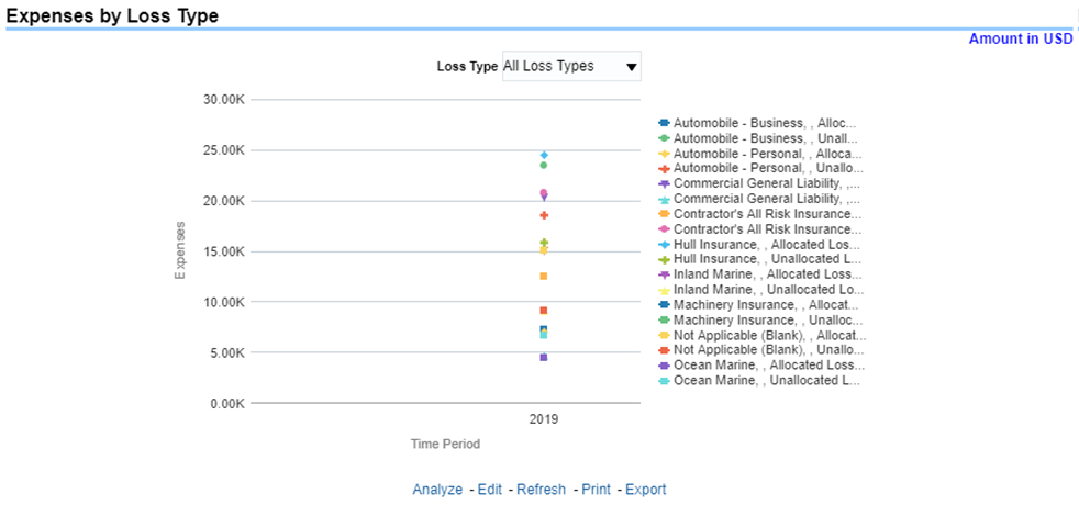
This report is a line graph that illustrates the monetary payment totals generated for Expenses on claims based on the categorization of the expense. Each expense amount is categorized by the Lines of business and type of Expense. Additional Details can be reviewed by selecting a specific Expense Type from the Expense Type selection field.
Figure 221: Expenses by Expense Type
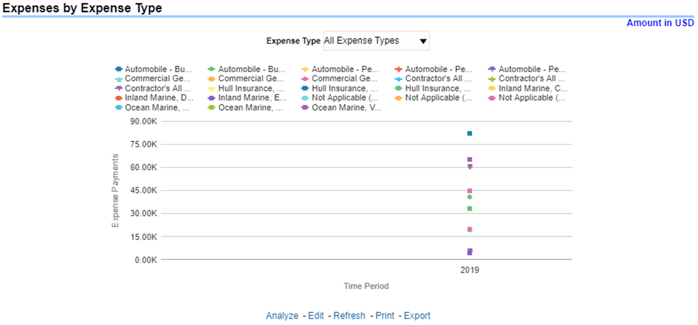
This report is a tabular representation illustrating the performance of Recovery Referral for each Line of business and the performance of those efforts.
Figure 222: Recovery Overview by Lines of Business
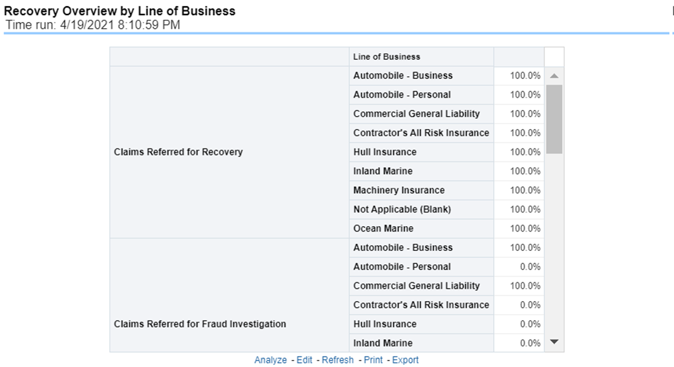
This report is a line graph that illustrates the total monetary amount of Recovery Payments, payments received by an insurer that reimburse it for losses it paid, received during a reporting period and shown over a period for each Line of business. Each Line of business is represented by its own line.
Figure 223: Recovery Payments by Lines of Business
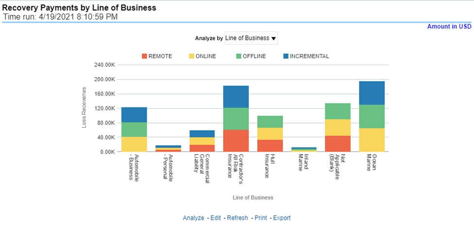
This report is a line graph that illustrates the average number of days between the day a claim is opened in the system and the date that the status of the same claim is changed to "Closed". This average is shown over a time series for each Line of business.
Figure 224: Average Days until Closed
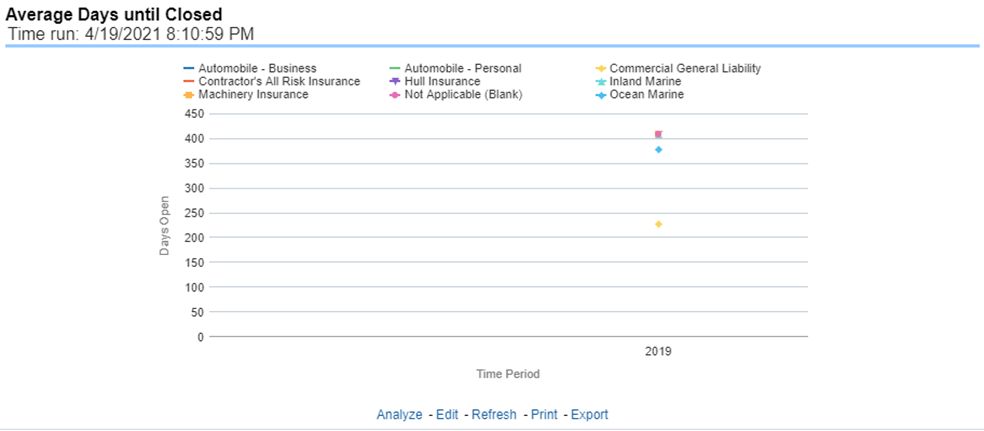
This report is a line graph that illustrates the count of claims that were closed during the reporting period without any loss payments generated for the claim.
Expenses may have been paid for these claims. Each Line of business is represented by its own line.
Figure 225: Claims Closed without Payment
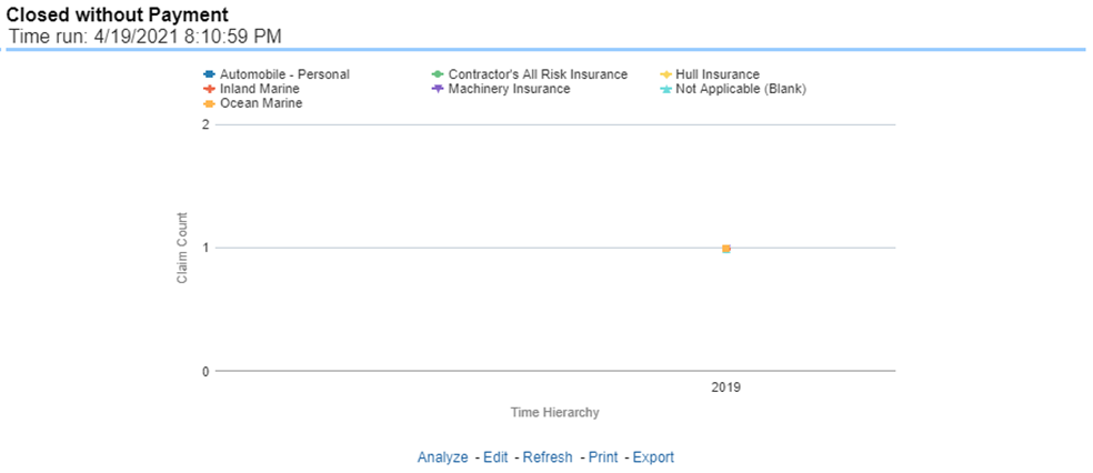
This report is a line graph that illustrates the count of claims that, after an investigation, were deemed to be fraudulent. In this report, the count is exhibited over a time series with each Line of business represented by its own line.
Figure 226: Claims Closed Due to Fraud
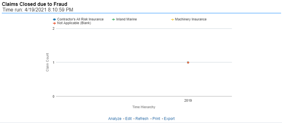
This report is a line graph that illustrates the count of claims that were changed back to an "Opened" status after it was previously closed. This report shows affected claims during the reporting periods over a time series with each Line of business represented with its own line.
Figure 227: Reopened Claims
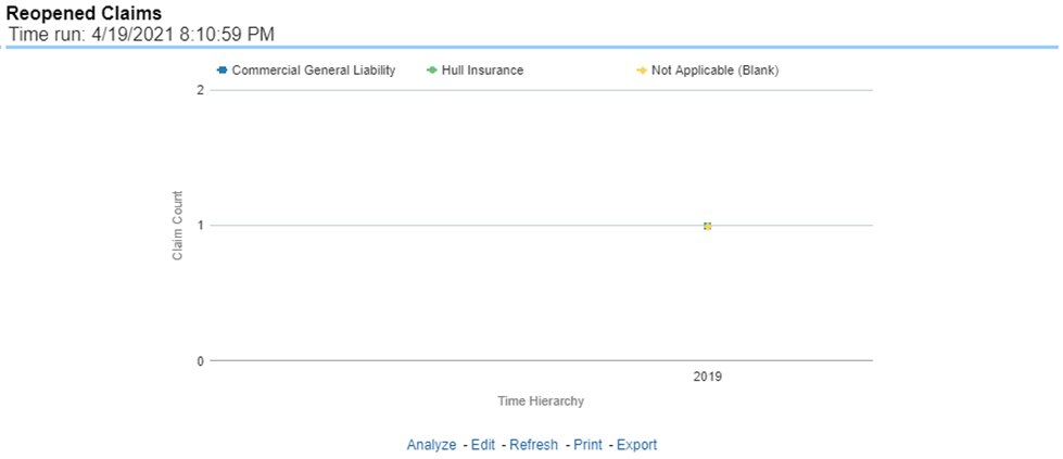
This report is a line graph that represents the count of claims where a judicial litigation case was initiated for the claim during the reporting period. This report illustrates the count of the affected claims for over a time series with each Line of business being represented by its own line.
Figure 228: Litigation Claims

The Product tab includes reports that focus on the Key Performance Indicators for each Product. The filters for this tab allow the report results to be focused on selected combinations for comparison and targeted analysis. The filters include:
· Time
· Company
· Product
· Geography
The various reports available under this tab are detailed in the following sections.
This is a tabular report that lists the Product in the order of greatest value to least value based on the Grade Basis selected. The information provided includes Key Performance Indicators for Claim Performance.
Figure 229: Claim Ranking by Product
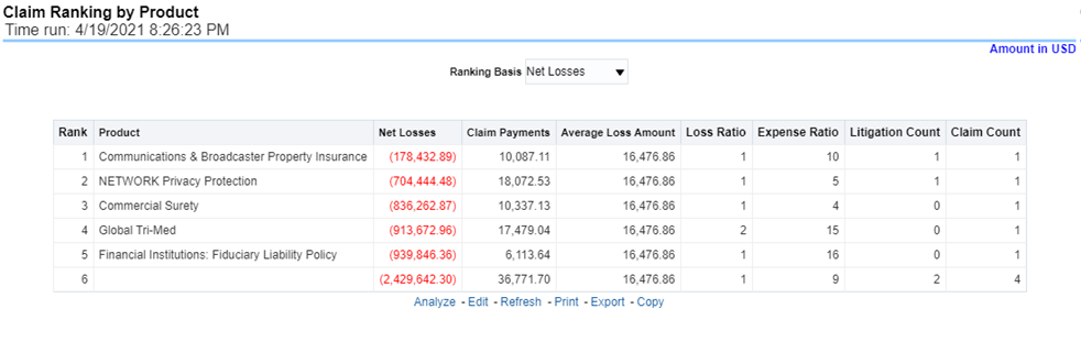
This is a tabular report that provides a summary of the effects of a Catastrophe on the Claims Performance for the Product. The total Claim Payments, Net Losses, and Claim Count are presented for each Product for each Catastrophic Event.
Figure 230: Catastrophe Claim by Product
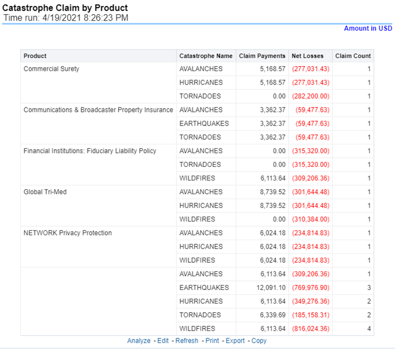
This is a line graph that illustrates the Loss Ratio, the ratio of incurred losses to earned premiums, over a time series. In this report, each Product is represented by its own line.
Figure 231: Loss Ratio by Product
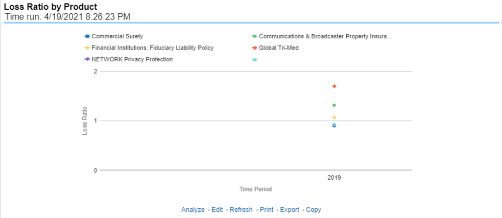
This report represents the Incurred Losses, the total amount of paid claims, and loss reserves associated with a reporting period, over a time series. This report is generated for the corporation as a whole and illustrates each product with its own line.
Figure 232: Incurred Losses by Product
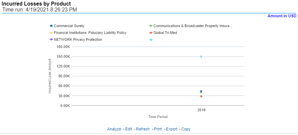
This report is a line graph that summarizes the monetary amount of payments that have been made for losses reported for each product. The loss types may be further filtered to see specific loss type detail. Each Product is represented by its own line.
Figure 233: Claim Payments by Loss Type
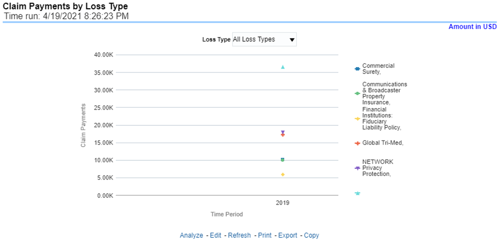
This report is a bar/line graph that illustrates the relationship between the amount of payments made by the insurer and those that were received by the reinsurers.
Figure 234: Payments by Reinsurance Company
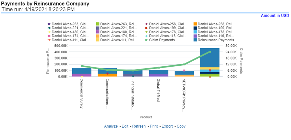
This report is a line graph that illustrates the monetary payment totals generated for Expenses on claims based on the cause of the loss. Each Expense amount is categorized by the Product and type of Expense Allocation. Additional Details can be reviewed by selecting a specific Loss Type from the Loss Type selection field.
Figure 235: Expenses by Loss Type
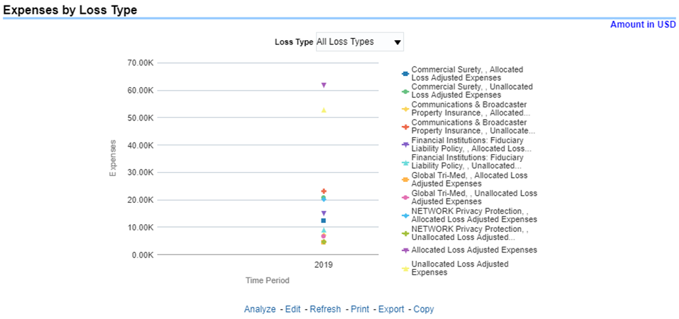
This report is a line graph that illustrates the monetary payment totals generated for Expenses on claims based on the categorization of the expense. Each Expense amount is categorized by the Product and type of Expense. Additional Details can be reviewed by selecting a specific Expense Type from the Expense Type selection field.
Figure 236: Expenses by Expense Type
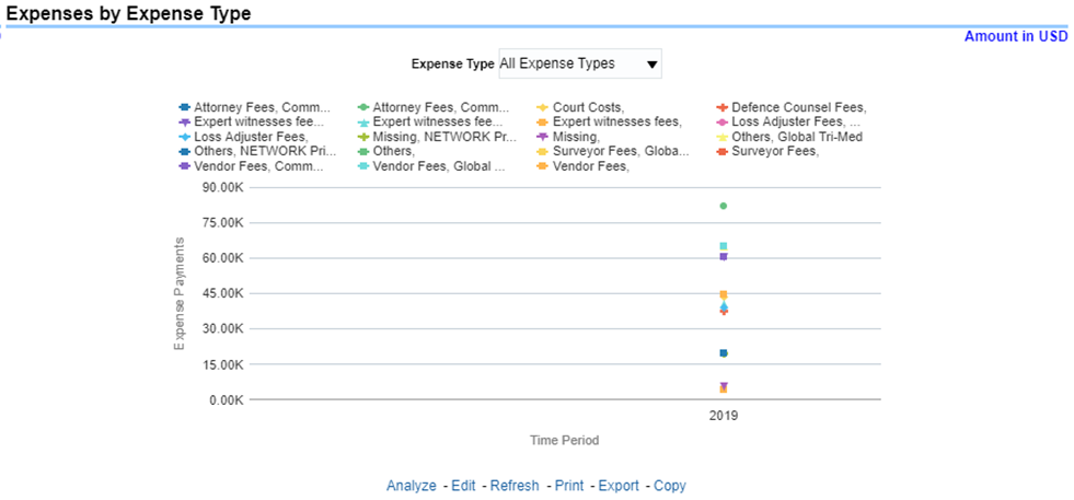
This report is a tabular representation illustrating the performance of Recovery Referral for each Product and the performance of those efforts.
Figure 237: Recovery Overview by Product
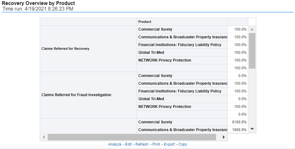
This report is a line graph that illustrates the total monetary amount of Recovery Payments, payments received by an insurer that reimburse it for losses it paid, received during a reporting period and shown over a period for each Product. Each Product is represented by its own line.
Figure 238: Recovery Payments by Product
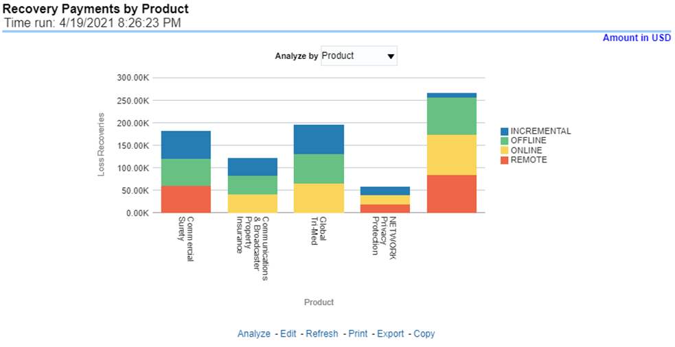
This report is a line graph that illustrates the average number of days between the day a claim is opened in the system and the date that the status of the same claim is changed to "Closed". This average is shown over a time series for each Product.
Figure 239: Average Days until Closed
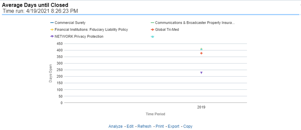
This report is a line graph that illustrates the count of claims that were closed during the reporting period without any loss payments generated for the claim.
Expenses may have been paid for these claims. Each Product is represented by its own line.
Figure 240: Claims Closed without Payment
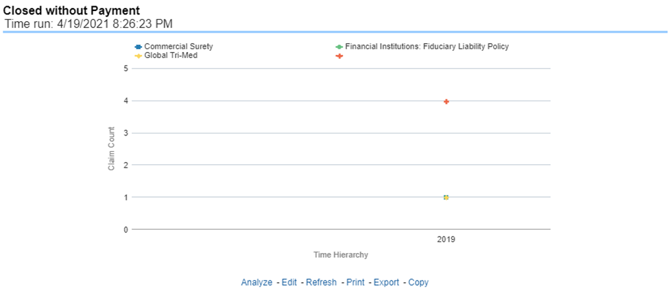
This report is a line graph that illustrates the count of claims that, after an investigation, were deemed to be fraudulent. In this report, the count is exhibited over a time series with each Product represented by its own line.
Figure 241: Claims Closed Due to Fraud
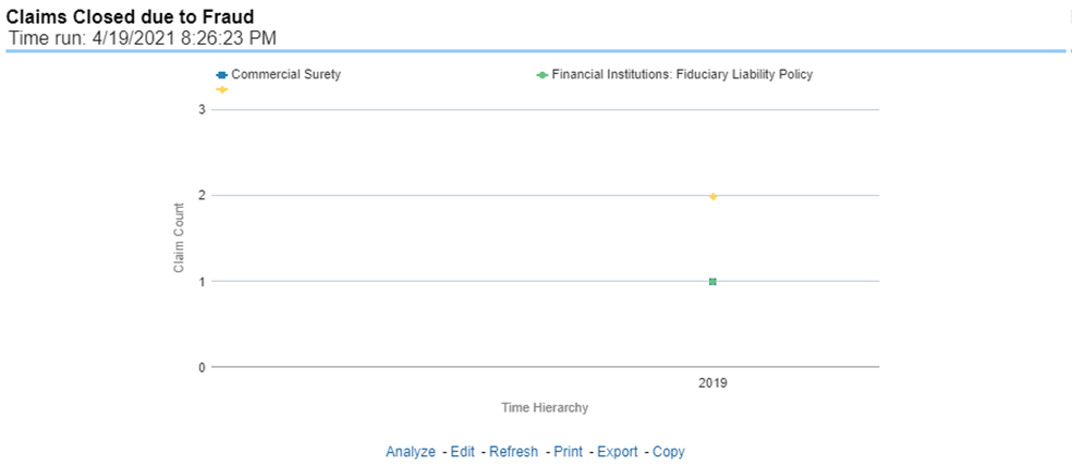
This report is a line graph that illustrates the count of claims that were changed back to an "Opened" status after it was previously closed. This report shows affected claims during the reporting periods over a time series with each Product represented with its own line.
Figure 242: Reopened Claims
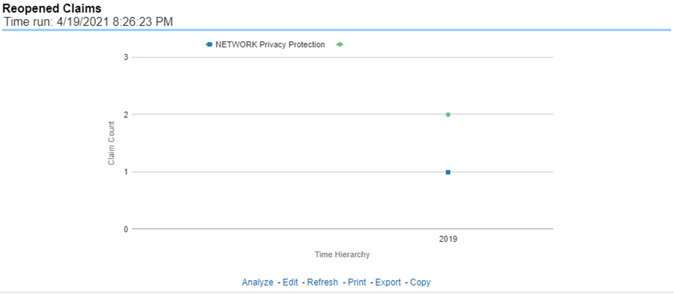
This report is a line graph that represents the count of claims where a judicial litigation case was initiated for the claim during the reporting period. This report illustrates the count of the affected claims for over a time series with each Product being represented by its own line.
Figure 243: Litigation Claims

The Catastrophe tab includes reports that focus on the Key Performance Indicators for declared Catastrophe. The filters for this tab allow the report results to be focused on selected combinations for comparison and targeted analysis. The filters include:
· Time
· Company
· Catastrophe
· Geography
The various reports available under this tab are detailed in the following sections.
This report is a Geographic Heat Map that illustrates the monetary amount of Net Losses, that is, Paid Losses exclusive of Expenses, for Catastrophe Claims over geographic regions with areas of similar amounts colored similarly. The Location of Loss provides the basis for geographical mapping.
Figure 244: Catastrophe Net Losses Map
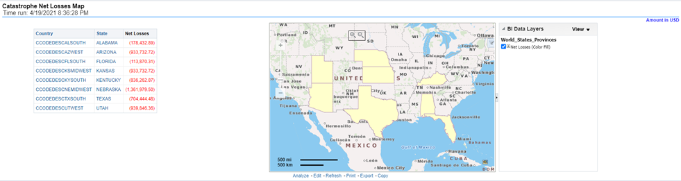
An assessment and ranking of catastrophe losses can be measured by various performance measures like net losses, claim payments, and through the number of claims across regions and catastrophes. This report contains both tabular and geographical map that lists the catastrophe in the order of greatest value to the least value based on the grade basis selected.
Figure 245: Catastrophe Claim Ranking
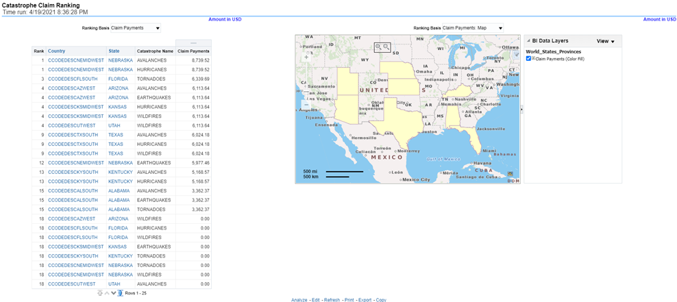
This is a tabular report that provides a summary of the effects of a catastrophe on the claim performance for the lines of business. The total claim payments, net losses, and claim count are presented for each Line of business for each catastrophic event.
Figure 246: Catastrophe Lines of Business Impact
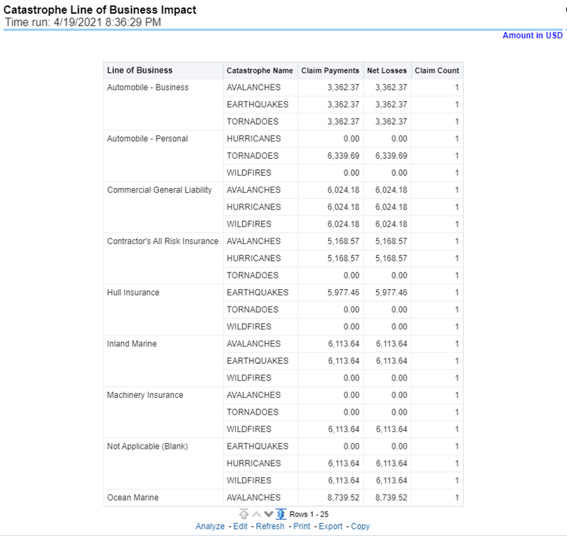
This is a tabular report that provides a summary of the effects of a catastrophe on the claim performance of the product. The total claim payments, net losses, and claim count are presented for each Line of business for each catastrophic event.
Figure 247: Catastrophe Product Impact
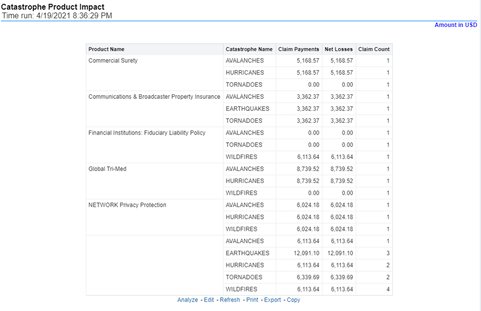
This is a tabular report that summarizes the key performance factors for Claims performance for each Catastrophe.
Figure 248: Catastrophe Overview
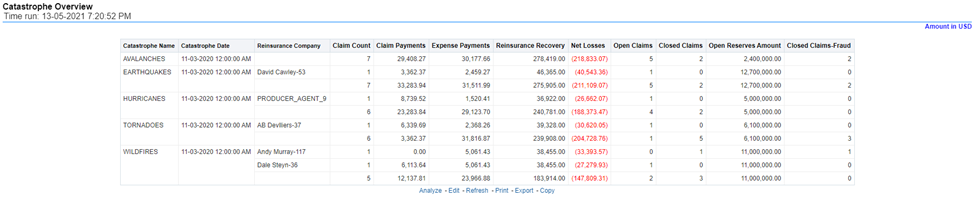
This report is a line graph that displays the monetary amount of payments that have been made for losses reported for each catastrophe. The loss types can be further filtered to see the specific loss type details. Each catastrophe is represented by its own line.
Figure 249: Catastrophe Claim Payments by Loss Type
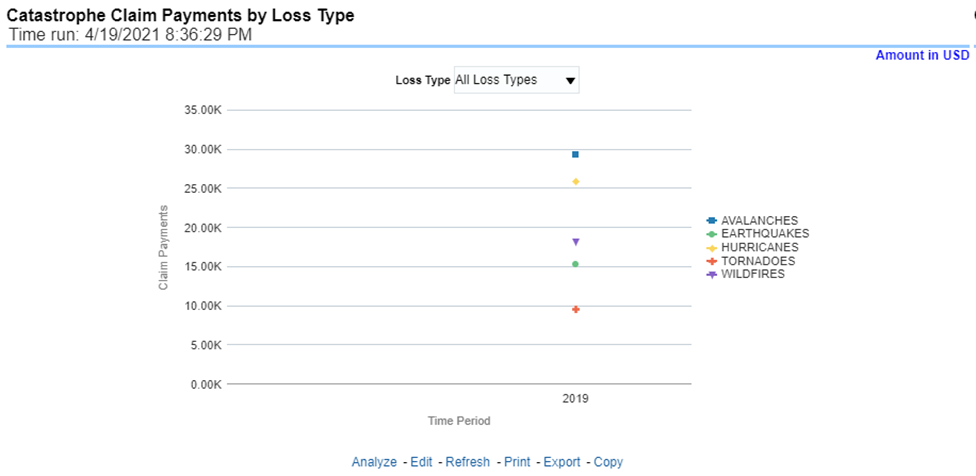
This report is a bar/line graph that illustrates the relationship between the amount of payments made by the insurer and those that were received by the reinsurers for each Catastrophe.
Figure 250: Catastrophe Payments by Reinsurance Company
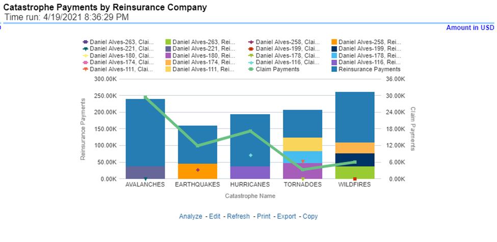
This report is a line graph that illustrates the monetary payment totals generated for Expenses on claims based on the cause of the loss. Each Expense amount is categorized by the Catastrophe and type of Loss. Additional Details can be reviewed by selecting a specific Loss Type from the Loss Type selection field.
Figure 251: Catastrophe Expenses by Loss Type
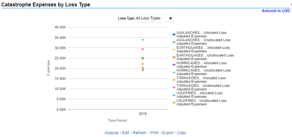
This report is a line graph that illustrates the monetary payment totals generated for expenses on claims based on the categorization of the expense. Each expense amount is categorized by the catastrophe and type of expense. Additional details can be reviewed by a specific expense type from the expense type selection field.
Figure 252: Catastrophe Expenses by Expense Type
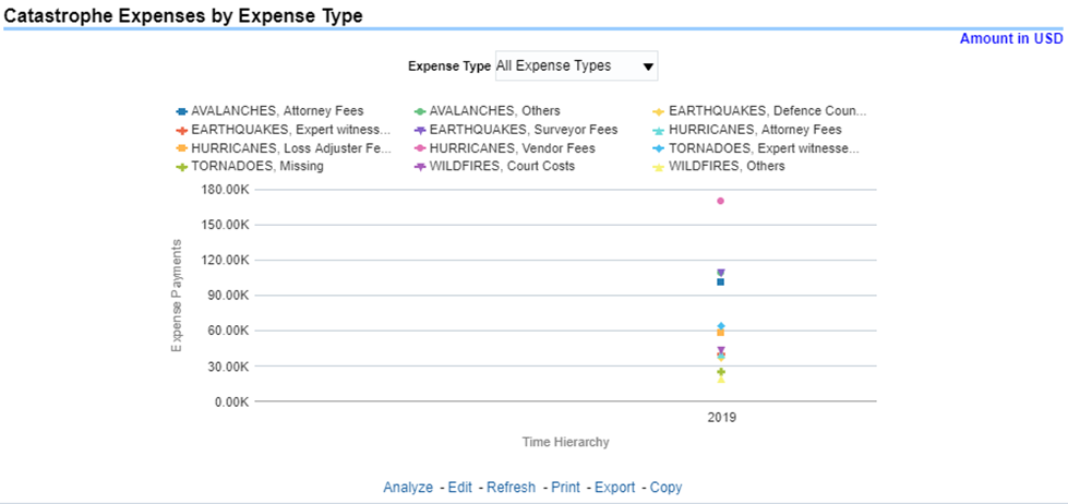
This report is a tabular representation illustrating the performance of Recovery Referral for each Catastrophe and the performance of those efforts.
Figure 253: Catastrophe Recovery Overview by Catastrophe
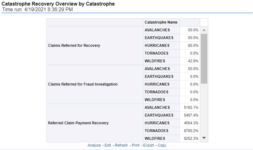
This report is a line graph that illustrates the total monetary amount of Recovery Payments, payments received by an insurer that reimburses it for losses it paid, received for Catastrophe Claims during a reporting period and shown over a period for each Catastrophe. Each Catastrophe is represented by its own line.
Figure 254: Catastrophe Recovery Payments
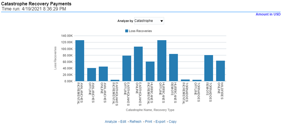
This report is a line graph that illustrates the average number of days between the day a catastrophe claim is opened in the system and the date that the status of the same claim is changed to "Closed". This average is shown over a time series for each catastrophe.
Figure 255: Average Days until Closed
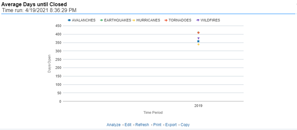
This report displays the count of catastrophe claims that were closed without any payments for losses being issued to claimants. The graph shows the average count of days for these claims per catastrophe over time.
Figure 256: Closed Without Payment
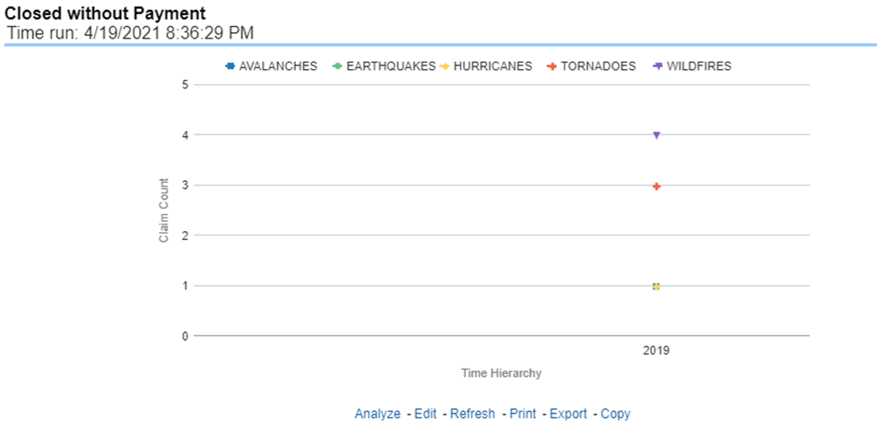
This report is a line graph that displays the count of catastrophe claims that were closed after an investigation determined that fraudulent activity occurred and no losses were paid to the claimant due to the fraud activity. The graph shows the count of these claims per catastrophe over time.
Figure 257: Claims Closed Due to Fraud
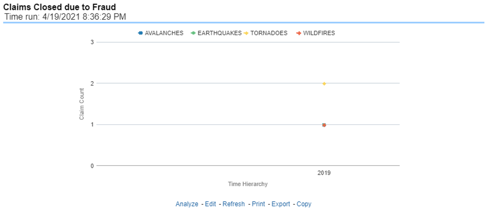
This report displays the count of catastrophe claims that were initially closed and then opened again for further processing. This shows the count of claims per catastrophe where this process occurred over time.
Figure 258: Reopened Claims
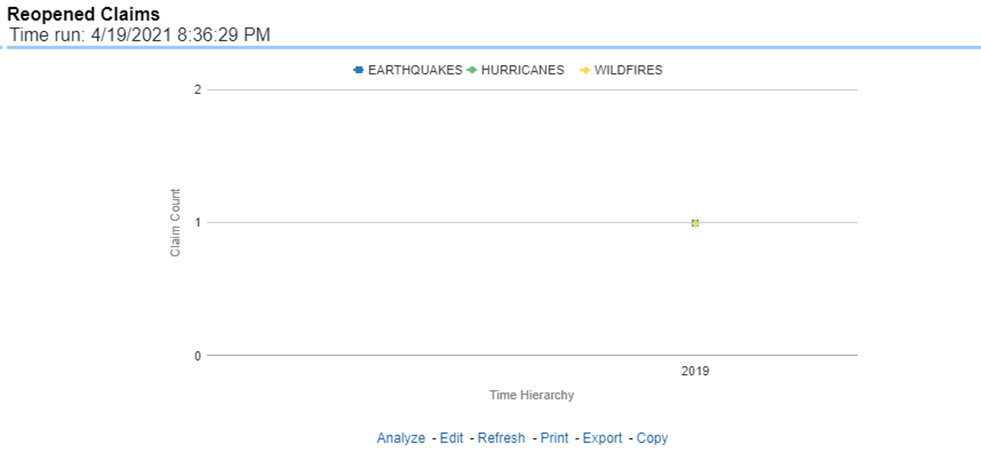
This report is a line graph that displays the count of catastrophe claims that resulted in a judicial litigation case being initiated. This shows the count of claims per catastrophe where this process occurred over time.
Figure 259: Litigation Claims