| Siebel CRM Configuring Siebel Open UI Siebel Innovation Pack 2015 E52417-01 |
|


 Previous |
 Next |
View PDF |
| Siebel CRM Configuring Siebel Open UI Siebel Innovation Pack 2015 E52417-01 |
|
Previous |
Next |
View PDF |
This task is a step in "Roadmap for Customizing Siebel Open UI".
To customize a plug-in wrapper, do the following tasks:
"Customizing the Plug-in Wrapper to Display the Control Differently".
"Customizing the Plug-in Wrapper to Bind Custom Events to a Control".
"Customizing the Plug-in Wrapper to React to Value Changes of a Control".
This task is a step in "Process of Customizing the Plug-in Wrapper".
The plug-in wrapper uses the Init method to configure the properties, methods, and bindings. For more information about these methods, see "Life Cycle of User Interface Elements".
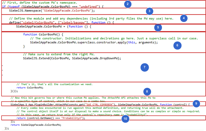
Figure 4-12 illustrates the code you use to create the plug-in wrapper. Each number in this figure identifies the corresponding step number in the numbered task list that this book includes immediately after this figure.
This topic describes how to modify code that resides in the ColorBoxPW.js file. It is recommended that you get a copy of this file to assist in your understanding of how to implement the example that this topic describes. This file includes all the code in this example. It also includes more comments that describe code functionality. To get a copy of this file, see Article1494998.1 on My Oracle Support.
For more information about the folders you can use to store your customizations, see "Organizing Files That You Customize". For more information about the language_code, see "Languages That Siebel Open UI Supports".
To create the plug-in wrapper
Create the plug-in wrapper file:
Download a copy of the ColorBox.js file to the following folder:
INSTALL_DIR\eappweb\PUBLIC\\language_codefiles\custom
Use a JavaScript editor to open the ColorBoxPW.js file that you downloaded in Step a.
Make sure the ColorBoxPW class does not exist and that you do not configure Siebel Open UI to override this class. You add the following code:
if(typeof(SiebelAppFacade.ColorBoxPW) === "undefined"){
Make sure a namespace exists that Siebel Open UI can use to prevent conflicts:
SiebelJS.Namespace("SiebelAppFacade.ColorBoxPW");
Use the Define method to identify the presentation model file:
define("siebel/custom/ColorBoxPW", [siebel/basePW], function(){
You must use the Define Method to ensure that Siebel Open UI can identify the constructor. You must include the relative path and the name of the presentation model file without the file name extension. For more information, see "Define Method."
|
Note: Any third-party files that the plug-in wrapper uses must be mentioned in the dependencies section of the define statement. |
Define the class:
SiebelAppFacade.ColorBoxPW = (function(){
Define the class constructor:
function ColorBoxPW(){
SiebelAppFacade.ColorBoxPW.superclass.constructor.apply(this,
arguments);
}
Set up the injected dependency:
SiebelJS.Extend(ColorBoxPW, SiebelAppFacade.DropDownPW);
For more information about injected dependency, see "About Dependency Injection".
Return the constructor:
return ColorBoxPW;
} ());
return SiebelAppFacade.ColorBoxPW;
});
Attach the plug-in wrapper:
SiebelApp.S_App.PluginBuilder.AttachPW(consts.get("SWE_CTRL_COMBOBOX"), SiebelAppFacade.ColorBoxPW, function (control) {
Write the condition for which the plug-in wrapper should kick in:
return (control.GetName() === "Probability2");
Save the ColorBoxPW.js file.
This task is a step in "Process of Customizing the Plug-in Wrapper".
In this step, you customize the setup logic of the plug-in wrapper so that it adds a color-box to the control.
In this example, the ShowUI method will be overridden to add a different element on to the DOM as a part of this control. The functionality of the control will remain unaffected, effectively, you will be decorating it with a new element.
This is an optional step: the base functionality of how a control looks and behaves can be completely changed based on your requirements. An out-of-the-box example of this type of modification is a flip switch that appears instead of a check box on touch devices in Siebel Open UI, which is accomplished using a plug-in wrapper.
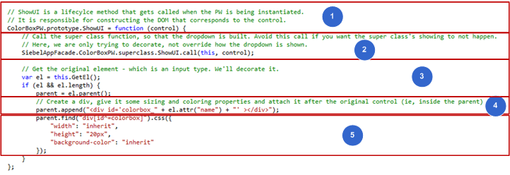
Figure 4-13 illustrates the code you use to customize the ShowUI method of the plug-in wrapper. Each number in this figure identifies the corresponding step number in the numbered task list that this book includes immediately after this figure.
To customize the plug-in wrapper to display the control differently
In the colorboxpw.js file, introduce the ShowUI method that is a part of the life cycle of rendering a control.
ColorBoxPW.prototype.ShowUI = function (control) {
Call the superclass method to get the dropdown to appear:
SiebelAppFacade.ColorBoxPW.superclass.ShowUI.call(this, control);
This will call the ShowUI method of the DropDownPW class, which is responsible for showing the drop down field in the Siebel Open UI client.
Get a reference to the existing element, and if it exists, get the parent element:
var el = this.GetEl();
if (el && el.length) {
parent = el.parent();
|
Note: This step is required to position the new DOM element as a sibling to the current element. |
The GetEl() API framework method is a plug-in wrapper space that retrieves the jQuery element representing the control. parent() is a jQuery call which retrieves the parent node of the element in the DOM. For more information about the GetEl() API method, see Chapter 3, "Architecture of Siebel Open UI."
Add a new HTML div, which will serve as our color box:
parent.append("<div id='colorbox_" + el.attr("name") + "' ></div>");
You must specify a unique name for the element. In the above example, colorbox_ is added to the existing name of the original element. The append() and attr() specifications are both jQuery APIs. The former adds DOM elements at the end of a given element and the latter extracts the specified attribute.
Style the newly created div. This will serve as our colorbox:
parent.find("div[id^=colorbox]").css({
         "width": "inherit",
         "height": "20px",
         "background-color": "inherit"
      });
The css()is a JQuery API that applies CSS styles to the given element. In the above example, the colorbox gets the same width as the original dropdown and a height of 20 pixels. The original background color is inherited from the dropdown.
Save the ColorBoxPW.js file.
This task is a step in "Process of Customizing the Plug-in Wrapper".
In this topic, you attach behavioral methods to the colorbox element that you created in "Creating the Plug-in Wrapper".
In this example, the BindEvent method will be overridden to attach custom handlers to a new element. The event handlers of the control will remain unaffected, and the new element will be decorated with some events.
This is an optional step: the base functionality of how a control looks and behaves can be completely changed based on your requirements. An out-of-the-box example of this type of modification is a flip switch that appears instead of a check box on touch devices in Siebel Open UI, which is accomplished using a plug-in wrapper.
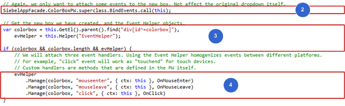
Figure 4-14 illustrates the code you use to customize the BindEvents method of the plug-in wrapper. Each number in this figure identifies the corresponding step number in the numbered task list that this book includes immediately after this figure.
To customize the plug-in wrapper to bind custom events to a control
In the colorboxpw.js file, introduce the BindEvents method that is a part of the life cycle of rendering a control.
ColorBoxPW.prototype.BindEvents = function () {
Call the superclass method to attach the event handlers from the dropdown element:
SiebelAppFacade.ColorBoxPW.superclass.BindEvents.call(this);
This step calls the BindEvents of the DropDownPW class, which is responsible for attaching the events that the drop down field requires to operate correctly.
Get the element that was created and attached as a sibling to the actual dropdown element, and the Event Helper object:
var colorbox = this.GetEl().parent().find("div[id^=colorbox]"),
         evHelper = this.Helper("EventHelper");
         if (colorbox && colorbox.length && evHelper) {
The Helper API is the framework method in the plug-in wrapper space that enables retrieving helper objects by name. For more information about the Helper API, see Chapter 3, "Architecture of Siebel Open UI."
Attach the required events to the new DOM element that was created. In this example, three handlers are attached to one element:
evHelper
      .Manage(colorbox, "mouseenter", { ctx: this }, OnMouseEnter)
      .Manage(colorbox, "mouseleave", { ctx: this }, OnMouseLeave)
      .Manage(colorbox, "click", { ctx: this }, OnClick)
The Helper API is a method in the Event Helper object that takes the following four elements: the DOM element to which events should be attached, the event to be attached, the handler to be run, and other arguments. In this case, you are attaching one event for the each user hovering over the element, exiting the hover, and clicking on the element. For more information about the Helper API, see Chapter 3, "Architecture of Siebel Open UI."
This task is a step in "Process of Customizing the Plug-in Wrapper".
In this topic, you define the behavioral methods that have been attached to the colorbox element that you created in you created in "Creating the Plug-in Wrapper".
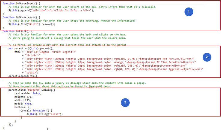
Figure 4-15 illustrates the code you use to define the handlers of the plug-in wrapper. Each number in this figure identifies the corresponding step number in the numbered task list that this book includes immediately after this figure.
To define the event handlers for the plug-in wrapper
In the colorboxpw.js file, introduce the following private methods that will get called when the attached events occur on the element:
The OnMouseEnter handler:
function OnMouseEnter() {
      $(this).append("<div id='info'>Click for Info...</div>");
}
In this example, OnMouseEnter gets called when the mouseenter event occurs on the color box piece of the DOM. The context passed during the attachment of the events will be passed on to the handler method. Consequently, the this definition refers to the plug-in wrapper. In this example, a div is attached with an id of info that displays the following text: Click for Info….
The OnMouseLeave handler:
function OnMouseLeave() {
      $(this).find("#info").remove();
}
This is the complementary method to the OnMouseEnter handler, and gets called when the onmouseleave event occurs on the color box DOM. This method removes the div that was previously added, consequently removing the display text.
|
Note: The two events will not run on touch devices, since they have no equitable actions. |
Introduce the OnClick handler.
Click is standardized by the event helper object to achieve uniformity across different devices. Consequently, it may be translated to different events based on the user's device. The click handler shows a popup that defines the meaning of the different colors that the box can take on. In the first piece of the handler in this example, HTML built of a few styled divs and some corresponding text that forms the content of the information we are trying to show in the popup is constructed. The handler, and the content that is attached to the parent element are displayed here:
var parent = $(this).parent(),
html = "<div id='legend' title='Legend'>"
+ "<br><br>"
+ "<div style='width: 200px; height: 20px; background-color: rgb(255, 0, 0);'>  Do Not Pursue</div><br>"
+ "<div style='width: 200px; height: 20px; background-color: orange;'>  Pursue If Time Permits</div><br>"
+ "<div style='width: 200px; height: 20px; background-color: rgb(255, 255, 0);'>  Pursue</div><br>"
+ "<div style='width: 200px; height: 20px; background-color: rgb(0, 128, 0);'>  Pursue Aggressively</div><br>"
+ "</div>";
parent.append(html);
Make the section into a popup.
For this, use the jQuery-UI provided dialog() API. In this example, the element is located by id using find, and converted to a modal dialog box:
parent.find("#legend").dialog({
   resizeable: false,
   height: 275,
   width: 225,
   modal: true,
   buttons: {
      Cancel: function () {
         $(this).dialog("close");
      }
   }
});
This sets properties for the popup and adds a cancel button that closes the popup.
Attach the required events to the new DOM element that we have created. Here we will attach three handlers on to this element.
evHelper
      .Manage(colorbox, "mouseenter", { ctx: this }, OnMouseEnter)
      .Manage(colorbox, "mouseleave", { ctx: this }, OnMouseLeave)
      .Manage(colorbox, "click", { ctx: this }, OnClick)
The Helper API is a method in the Event Helper object that takes the DOM element in order to attach events. The attached event and the handler are deployed, along with other arguments.n this case, we are attaching one event each for the user hovering over the element, exiting the hover, and clicking on the element. For more information about the Helper API, see Chapter 3, "Architecture of Siebel Open UI."
This task is a step in "Process of Customizing the Plug-in Wrapper".
In this topic, you define behavioral customizations when changes occur in a control value. These changes affect the appearance of the colorbox element that you created in "Creating the Plug-in Wrapper".
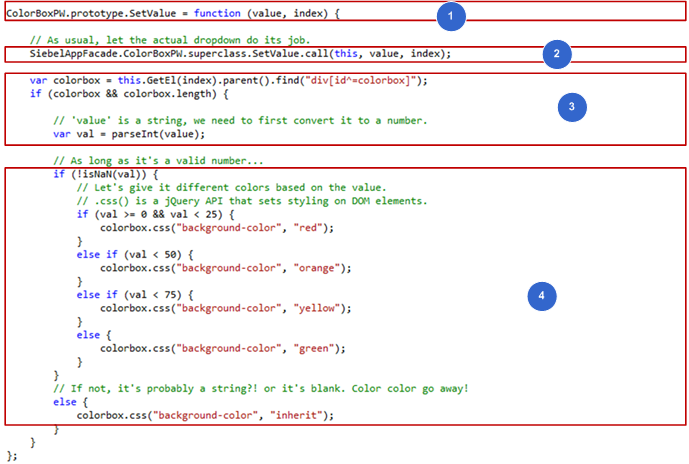
Figure 4-16 illustrates the code you use to style the color box based on the value that is being set on a control. Each number in this figure identifies the corresponding step number in the numbered task list that this book includes immediately after this figure.
To define the value based modifications in the plug-in wrapper
In the colorboxpw.js file, introduce the SetValue method that is a part of the life cycle of a control's existence.
ColorBoxPW.prototype.SetValue = function (value, index) {
The SetValue API is called as part of a control life cycle when a value change occurs on the control, either directly by the user, or by the Siebel application. This call is responsible for the value change to appear in the DOM. In this example, SetValue is overridden in order to read into the value change that is happening on the control, and consequently makes modifications to the color box based on the value. For more information about the SetVAlue API, see Chapter 3, "Architecture of Siebel Open UI."
Call the superclass method to make sure that the dropdown receives the intended value:
SiebelAppFacade.ColorBoxPW.superclass.SetValue.call(this);
This will call the SetValue of the DropDownPW class, which is responsible for applying the correct value on to the dropdown field itself.
Get the new DOM element and the value that is being set:
var colorbox = this.GetEl(index).parent().find("div[id^=colorbox]");
if (colorbox && colorbox.length) {
      var val = parseInt(value);
Since the value is in string form, and our future actions on this value involve treating it as a number, we need to convert it into a number form. The standard JavaScript method that is used for the purpose is parseInt.
Validate the value and specify values that modify the color box in different ways:
if (!isNaN(val)) {
   if (val >= 0 && val < 25) {
      colorbox.css("background-color", "red");
   }
   else if (val < 50) {
      colorbox.css("background-color", "orange");
   }
   else if (val < 75) {
      colorbox.css("background-color", "yellow");
   }
   else {
      colorbox.css("background-color", "green");
   }
}
else {
   colorbox.css("background-color", "inherit");
}
In this example, the value is verified to ensure that it is a number. If it is not, the background color is set to inherit, which sets the color to the same color as the dropdown element. This behavior would be applicable, for example, in cases where the user has entered a blank value, or inadvertently provided a string. If the value is a number, then use an if-else construct to define ranges and apply different colors on to the color box DOM element.
This task is a step in "Process of Customizing the Plug-in Wrapper".
This topic describes how to attach the plug-in wrapper you created in "Creating the Plug-in Wrapper," to a control.
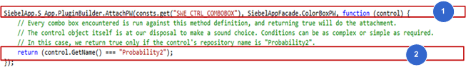
Figure 4-17 illustrates the code you use to attach the plug-in wrapper to a control conditionally. Each number in this figure identifies the corresponding step number in the numbered task list that this book includes immediately after this figure.
To attach the plug-in wrapper to a control conditionally
In the colorboxpw.js file, introduce the AttachPW method from the PluginBuilder namespace that attaches the presently defined plug-in wrapper to a given type of control:
SiebelApp.S_App.PluginBuilder.AttachPW(consts.get("SWE_CTRL_COMBOBOX"), SiebelAppFacade.ColorBoxPW, function (control) {
In this customization, the intention is to apply the plug-in wrapper to a dropdown type of control. To achieve this customization the SWE_CTRL_COMBOBOX is used for the dropdown type. All controls are customizable. With this customization, every dropdown encountered by the Siebel Open UI client will use this method.
Define the condition under which the attachment should occur, and to which specific instance of the control. The return value of the method used in Step 1 decides whether the plug-in wrapper attaches to a particular control. Returning true will mean a positive attachment.
return (control.GetName() === "Probability2");
Use the control object to create this condition. Since the intention is to attach the plug-in wrapper for all repository controls that have a name of Probability2, true will be returned when the name of the condition matches.
|
Note: Plug-in wrappers are not restricted to any Presentation Model or Physical Renderer. Also, a customization defined on a plug-in wrapper will be applicable throughout the Siebel Open UI client, as long as the condition is satisfied. In the above example, any control having a repository name of "Probability2" in any screen or view will be attached to this plug-in wrapper. |
Define conditions for plug-in wrapper attachments. Conditions used can be as complex as necessary, based on the requirements. Use following examples as guidance for defining conditions:
Attach a plug-in wrapper to all TextArea fields in Opportunity List applet:
SiebelApp.S_App.PluginBuilder.AttachPW(consts.get("SWE_CTRL_TEXTAREA"), SiebelAppFacade.CustomPW, function (control) {
      return (control.GetAppplet().GetName() === "Opportunity List Applet");
});
Attach a plug-in wrapper to all Date Fields in Contact Form applet and Account Form Applet:
SiebelApp.S_App.PluginBuilder.AttachPW(consts.get("SWE_CTRL_DATE_PICK"), SiebelAppFacade.CustomPW, function (control) {
      var appletName = control.GetAppplet().GetName();
      return (appletName === "Contact Form Applet" || appletName === "Account Form Applet");
});
Attach a plug-in wrapper to a specific Text Box in a specific applet only:
SiebelApp.S_App.PluginBuilder.AttachPW(consts.get("SWE_CTRL_TEXT"), SiebelAppFacade.CustomPW, function (control) {
      var appletName = control.GetAppplet().GetName();
      return (appletName === "Contact Form Applet" && control.GetName() === "Last Name");
});
Attach a plug-in wrapper to all Dropdowns in a particular application:
SiebelApp.S_App.PluginBuilder.AttachPW(consts.get("SWE_CTRL_COMBOBOX"), SiebelAppFacade.CustomPW, function (control) {
      return (SiebelApp.S_App.GetName() === "Siebel EPharma")
});
Attach a plug-in wrapper to all checkboxes in a view when they are accessed on touch devices:
SiebelApp.S_App.PluginBuilder.AttachPW(consts.get("SWE_CTRL_CHECKBOX"), SiebelAppFacade.CustomPW, function (control) {
      return (SiebelAppFacade.DecisionManager.IsTouch() && control.GetApplet().GetView().GetName === "Opportunity Detail View")
});