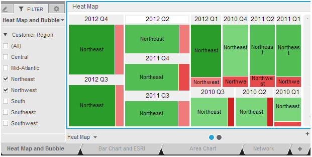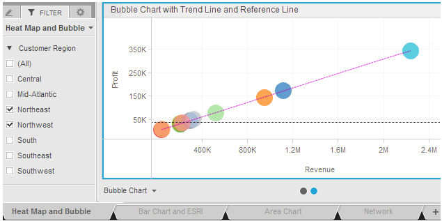
You can create dashboards with multiple layers of organization to view and filter your data in more intuitive and useful ways. The dashboard shown below contains four sheets, each on its own tab. The Heat Map and Bubble sheet contains two pages, with the Heat Map page displayed.

The Heat Map page is filtered to display only the Northeast and Northwest customer geographical regions. When you switch to the Bubble Chart page, note that the same filter is applied. All pages in a sheet are filtered in the same way.

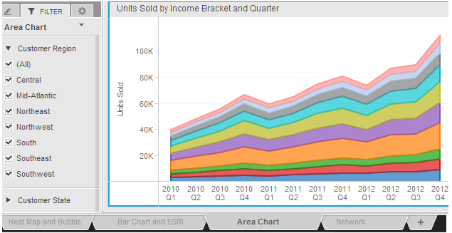
When you switch to the Area Chart sheet, note that all the customer regions are included in the visualization. In addition, another filter has been added, for customer state.

Both sheets and pages can contain multiple visualizations and other dashboard objects such as text and images.
You can:
Create layers of data that are filtered in different ways, by creating a separate sheet (tab) for each layer to be filtered. Each sheet has a separate set of filters. Each sheet is displayed on a separate tab in the dashboard; switch between sheets by clicking the tab of the sheet to display. For steps to create sheets, see Adding, modifying, and deleting sheets in a dashboard.
Create layers of data that are filtered in the same way, by creating pages (or panels) on a sheet. Each sheet in a dashboard can contain multiple pages. When a sheet contains multiple pages, a row of circles or dots, each representing a page, is displayed at the bottom of the sheet. The current page is marked with a blue dot. To change the page that is displayed, click a different dot. For steps to create pages, see Adding, modifying, and deleting pages in a dashboard.
You can also create a new sheet or page when you copy or move a visualization. For steps, see Modifying, duplicating, and deleting visualizations.
Adding, modifying, and deleting sheets in a dashboard
Adding, modifying, and deleting pages in a dashboard
Creating filters for a sheet of data
_____________________________
Copyright © 2019, Oracle and/or its affiliates. All rights reserved.
Legal Notices