Once you have added visualizations to a dashboard, you can enable users to filter, drill on, or select values in one visualization (the source) to update the data displayed in another visualization (the target) on the same page. (A page is a layer of data on a sheet. The data on all the pages on a sheet is filtered in the same way. For background information, see Adding, modifying, and deleting pages in a dashboard.)
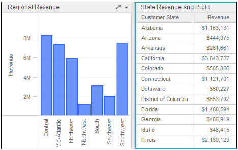
For example, a page contains two visualizations, the Regional Revenue bar graph and State Revenue and Profit grid. (Not all the states are shown in the sample to save space.)
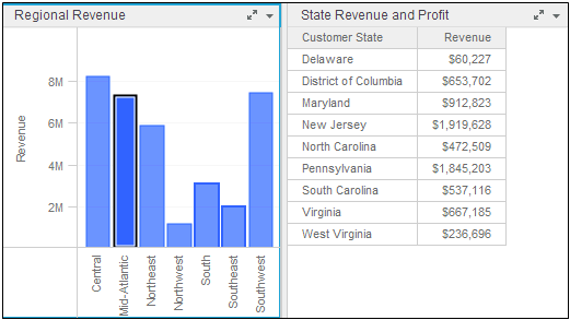
When you click Mid-Atlantic in the Regional Revenue graph, the State Revenue and Profit grid is filtered to include only those states in the Mid-Atlantic region, as shown below. Mid-Atlantic in the Regional Revenue graph is highlighted to indicate that it is selected.
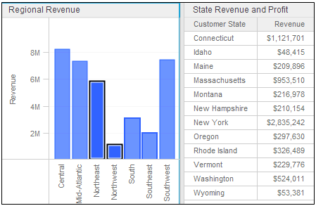
You can also select multiple attribute values in the source visualization. In the example below, both Northeast and Northwest are selected in the Regional Revenue visualization, so all the states belonging to those regions are displayed in the State Revenue and Profit visualization.
You can enable users to:
Filter data in the source visualization to update the data displayed in one or more target visualizations. For example, the source visualization contains a list of product categories. When a user filters data in the source to include only data for the Movies category, the data in the target is automatically updated to display only data for Movies. Filtering data in the target does not affect the data displayed in the source. A user can:
Filter data in the source to display only data for selected values
Filter data in the source to display all data except the data for selected values
Undo filtering in the source
Drill on data in the source visualization to update the data displayed in one or more target visualizations. Drilling allows a user to explore data at additional levels of detail beyond what is immediately visible in the visualization. For example, the source visualization contains a list of product categories. When a user drills from Category to Subcategory in the source, the target will be updated to display data at the Subcategory level. You can undo drilling to return to the original display. Drilling on data in the target does not affect the data displayed in the source.
Restrict the data displayed in one or more targets by selecting values in the source. For example, if the target displays revenue data across several regions and a user selects Northeast in the source, the data in the target is automatically updated to display revenue data for the Northeast only.
Highlight the data displayed in one or more targets by selecting values in the source. For example, if the target is a heat map displaying delayed flights for several airports and a user selects BWI in the source, the rectangles for BWI will be highlighted in the heat map.
For steps to add a filter on a visualization, see Creating a filter on the data in a visualization or another filter. For steps to filter a visualization, see Filtering data in a visualization.
For steps to drill on a visualization, see Analyzing data using visualizations in a dashboard.
You must have the Web Edit Dashboard, Web Create Dashboard, and Web Run Dashboard privileges.
The steps below assume that you have already created a dashboard that contains two or more visualizations. Both the source and target visualizations must be added to the same page in the dashboard. For steps to add a visualization to a dashboard, see About visualizations.
To enable a visualization to update the data displayed in another visualization:
Click the name of the dashboard to run it.
Hover the cursor over the visualization to use as the source, then click the arrow icon in the top right. Select Use as Filter. The Filtering Options dialog box opens.
Under Use VisualizationName to filter the following targets, where VizualizationName is the name of the source visualization, select the check box next to each visualization to use as a target. (The source is the visualization that you filter or drill; the target is the visualization that is updated.)
Select one of the following from the drop-down list next to Data on selection:
To enable users to filter the data in the target by selecting values in the source, select Filter. Only the values selected in the source are displayed in the target.
To enable users to highlight data in the target by selecting values in the source, select Highlight. The target still displays all the values; the values selected in the source are highlighted in the target.
If a second drop-down list is displayed next to the Enable filtering on selection option, the visualization was configured in a previous version to allow users to update data in the target by filtering or drilling on a single, specific attribute in the source. Select one of the following:
To continue allowing users to update data in the target by filtering or drilling based on the attribute already defined for the source, select For Attribute AttributeName, where AttributeName is the name of the attribute.
To allow users to update data in the target by filtering or drilling on any data in the source, select For All Data.
If you selected Filter, you can enable users to clear their selection in the source visualization and display the data for all values at the same time in any target visualizations. For example, if the source is a grid that allows users to select from values of Year to filter data in the target, the user can click the Year header to display data for all years at the same time in the target. Do one of the following:
To allow users to clear their selections in the source, select the Allow users to clear all selections check box.
To disable clearing selections, clear the Allow users to clear all selections check box.
Click OK to apply your changes.
Filtering or highlighting the data in a visualization based on selections in another visualization
Limiting the data displayed in a dashboard: Filters, sheets, and pages
_____________________________
Copyright © 2019, Oracle and/or its affiliates. All rights reserved.
Legal Notices