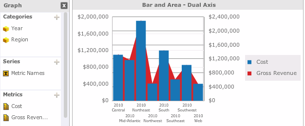
You can add a Graph visualization to a Visual Insight (VI) dashboard, to allow analysts to quickly explore data in a polished graphical display. Steps are provided below to add a dual-axis or combination graph to a VI dashboard. For steps to create a pie or ring graph, see Creating a Graph visualization with pie or ring graphs. For general steps to create all other types of graphs, including bar, area, and line graphs, see Creating a Graph visualization.

The procedures below assume that you have the Edit Dashboard and Run Dashboard privileges.
To create and add a dual-axis or combination graph to a VI dashboard:
Click the name of the VI dashboard to run it.
Click the Add Visualization icon  . An empty visualization is automatically added to the VI dashboard. Click Select a Visualization in the empty visualization. The Select a Visualization dialog box opens, with an icon
  displayed next to the visualization the application recommends based on the data in your VI dashboard. Do one of the following:
To create a dual-axis graph, click the Dual Axis icon, then click the icon of the graph subtype to use to display your data.
To create a combination graph, click the Combination of Bar and Area icon.
Your visualization is created and displayed. The application automatically adds attributes and metrics to the graph for you.
If desired, you can clear the visualization and select each attribute and metric to display in the graph. Perform the following steps:
If the Dataset Objects panel is not displayed, from the Show menu, select Dataset Objects.
From the toolbar, click the Clear Visualization icon ![]() . All data in the visualization is removed.
. All data in the visualization is removed.
From the Dataset Objects panel, click and drag attributes or metrics to the Graph panel, as follows:
To add an attribute to the categories, or groups of data usually found along the X-axis of the graph, drag the attribute to the Categories area.
To add an attribute to the series, or groups of data usually found along the Y-axis of the graph, drag the attribute to the Series area.
To add a metric to the graph, drag the metric to the Metrics area. The Metric Names object, an attribute unique to Visual Insight, is automatically added to the Graph panel. You can change whether the name of each metric in the graph is displayed on the categories or series of the graph by clicking and dragging the Metric Names object to the Categories or Series area.
To save the VI dashboard, click the Save icon ![]() .
.
If you are working on a VI dashboard that has already been saved, a confirmation message appears. If desired, select the Do not ask me again check box to avoid showing this message in the future. Click OK to save your changes and return to the VI dashboard.
If you are saving a new VI dashboard, the Save As dialog box opens. Navigate to the location in which you want to save the VI dashboard, then type a name and description for the VI dashboard in the Name and Description fields. Click OK to save the VI dashboard.
Creating a Graph visualization
Creating a Graph visualization with pie or ring graphs
Formatting a Graph visualization
_____________________________
Copyright © 2019, Oracle and/or its affiliates. All rights reserved.
Legal Notices